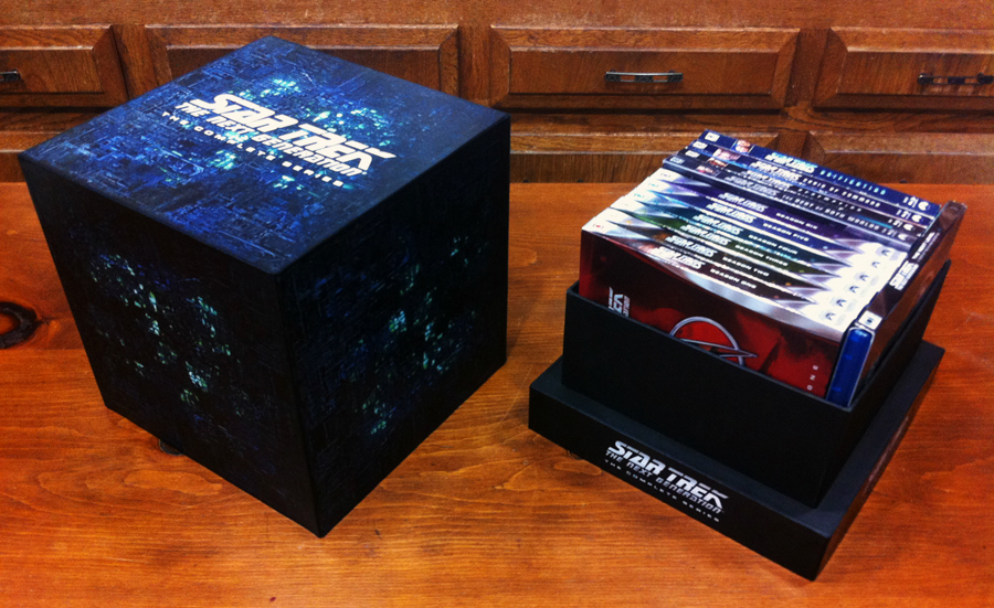
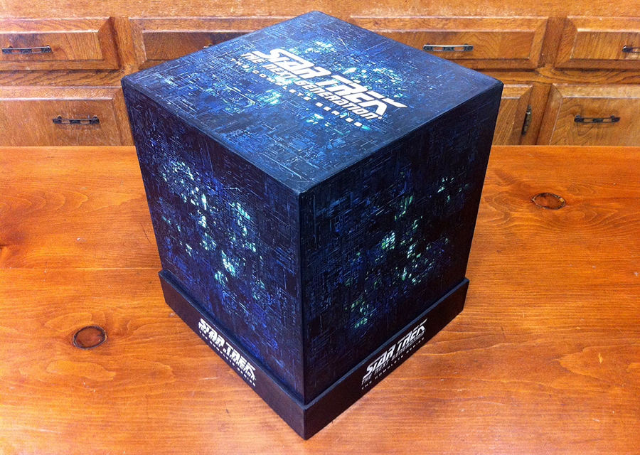
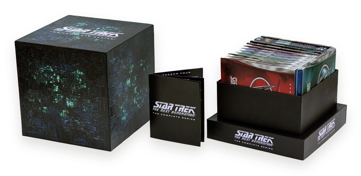
Last week we previewed an amazing custom case designed to hold the complete run of Star Trek: The Next Generation on Blu-ray, and Justin Olson is back today to teach you how to build your own!

Printing the Artwork
Links to the artwork can be found below. They are in PDF format, already converted to CMYK color and suitable for home printing, with embedded text layers and vectorized logos wherever possible.
 The box set artwork must be laser printed on five sheets of “tabloid” sized, 11 x 17 inch paper (32-lb weight).
Make sure to print the designs at 100% size. Absolutely no scaling — the artwork needs to perfectly fit the paper mâché boxes.
The booklet artwork is designed for five sheets of 8.5 x 11-inch paper and must be printed double-sided in the correct orientation and in the appropriate order, folded correctly, and then stapled and trimmed to the indicated size using the provided marks.
The booklet pages can be laser-printed or inkjet printed on double sided photo paper.
To help yourself with the folding, stapling, and cutting, I recommend using five sheets of blank paper. Fold each in half, combine them into a booklet, and write page numbers on them. Then, take it all apart to give you an example of how to fold, combine, and assemble the real booklet.
Download TNG Cube Box Artwork (86mb)
Download TNG Cube Booket Artwork (95mb)
. . .
Buying the Paper Mâché Boxes
The key item here you’ll need is a product made by Darice (Item # 2849-15). You can’t attempt this project without it, I’m afraid. It is a set of seven variously-sized paper mâché boxes with lids. Six of the seven boxes are nested within each other inside the largest box, so it just looks like a single shrink wrapped 9″ box with lid. This largest box is what will become the outside of the Borg cube and its base.
Inside that box is a smaller one that will hold the Blu-rays.
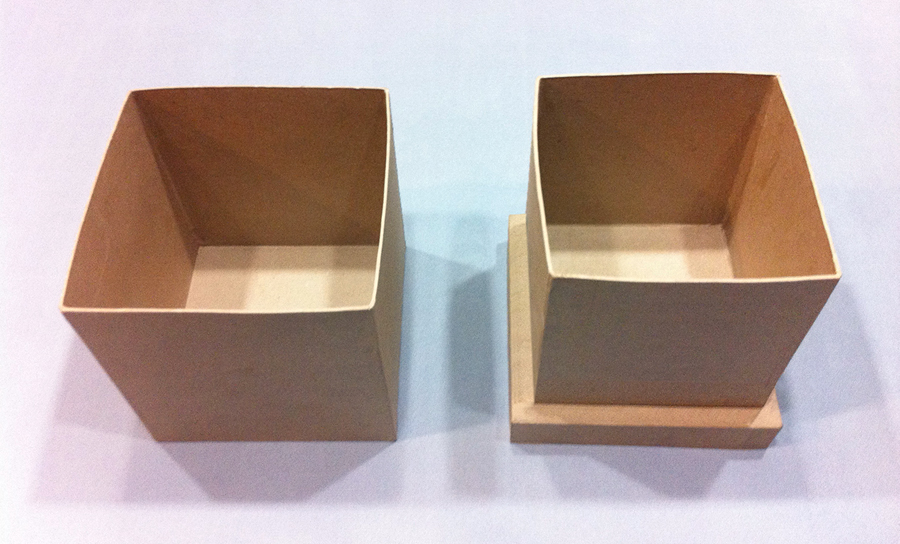
 9″ and 8″ boxes.
I found the seven-piece box package at Michael’s — the largest chain of arts & crafts chain of stores in North America — for around $20. If you don’t have a Michael’s near you, it’s also available online at Consumer Crafts. Most of the other items you’ll need are in the $1 to $5 dollar range. The single most expensive item I bought was the water-based spray finish at it was $13.
Disclaimer
While the following project can be accomplished by just about anyone over a certain age, it helps if you’ve successfully completed arts & crafts projects before and are familiar with the tools and supplies listed below. If not, you might consider asking someone you know who has done things like this before to help you.
I know that might seem ridiculously obvious to point out, but I figure it’s worth mentioning anyway as a potential warning for those who might buy these supplies and all of a sudden find themselves a bit overwhelmed when it comes to putting it all together. Just use common sense.
Also, if you happen to come across this tutorial, the downloadable images provided, or a completed version of this DIY packaging for sale for any price anywhere else on the Internet, please report it to our site administrators.
This project is in no way licensed, sanctioned, or endorsed by CBS or Paramount.
SUPPLIES NEEDED
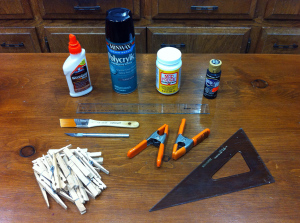 Paper mâché box set
- 3/8” square wood dowel
- Hobby knife
- Brush
- Ruler
- Right-angle triangle or square
- 2 Spring clamps
- Wood glue
- 16-20 Clothespins
- Black acrylic paint
- Decoupage glue/sealer
- Laser printed artwork
- Water-based spray finish
STEP 1
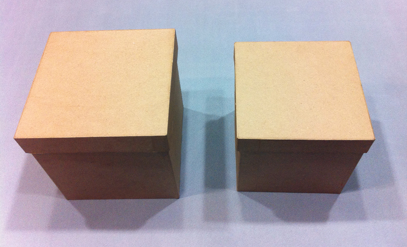
Take the two largest boxes and their lids from the paper mâché box set (one measures 8 and 5/8″ wide on each side, the other 7 and 5/8″). The larger box will become the Borg cube top, and its lid will become the base everything sits on. The smaller box will hold the Blu-rays and be glued on top of the large lid, while the small lid will be glued underneath to both reinforce and add a bottom to the base.
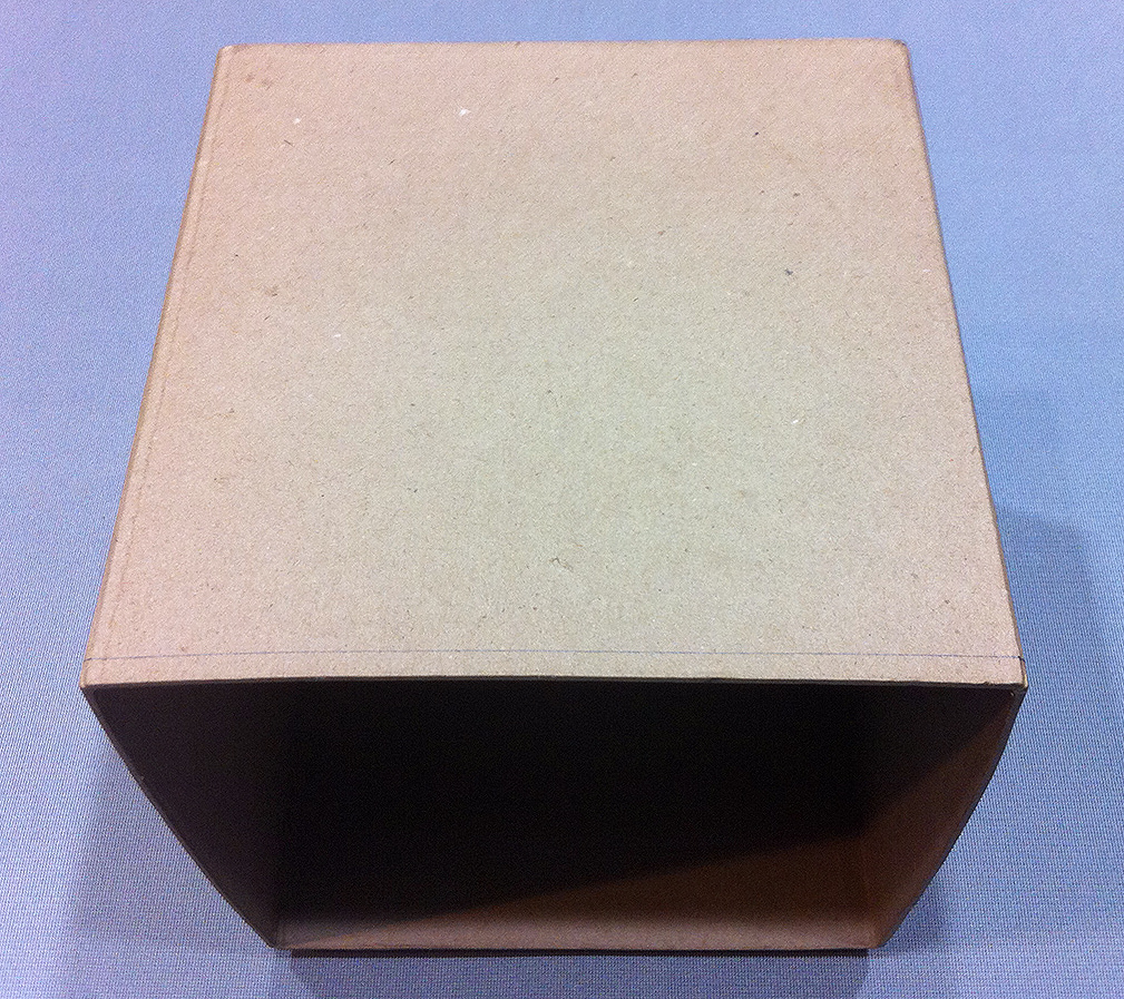
 The paper mâché boxes, arranged properly.
But before you glue the base together, you must first cut the two boxes to the right size.
STEP 2
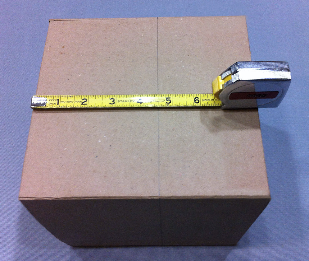
Unfortunately, the larger box is not perfectly square — at least mine wasn’t. It was approximately 1/4″ too tall, so you need to trim this amount from the open end of the box (or whatever amount is required to make your box square).
Measure 1/4″ in from the box’s open ends on each side and draw a pencil line all the way around the box. Place your metal ruler on the line and secure it firmly in place with two spring clamps. Using your hobby knife, carefully score along the ruler between the clamps.
 |
 |
Left: 1/4” line drawn around the outside of the larger box.
Right: Portion cut from the larger box. |
Don’t try to cut all the way through the paper mâché material in one go, just keep scoring carefully with a fresh, sharp blade until you make it through. Do this on all four sides of the box. When you’re done, use the knife to carefully cut the remaining corners free using a sawing motion.
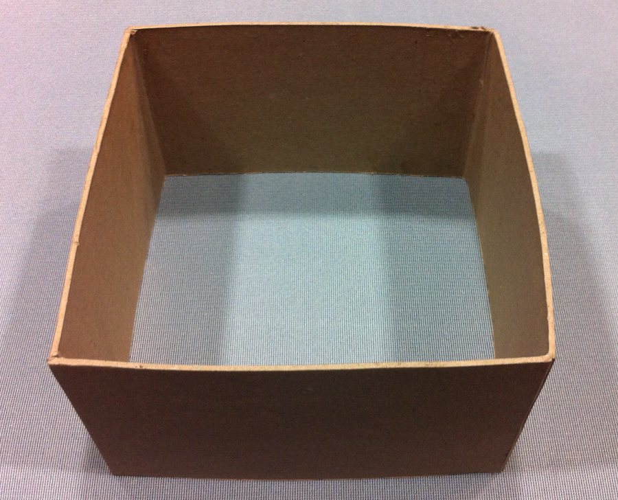
Your large box should now be perfectly square, measuring approximately 8 and 5/8″ on every side and in all directions.
STEP 3
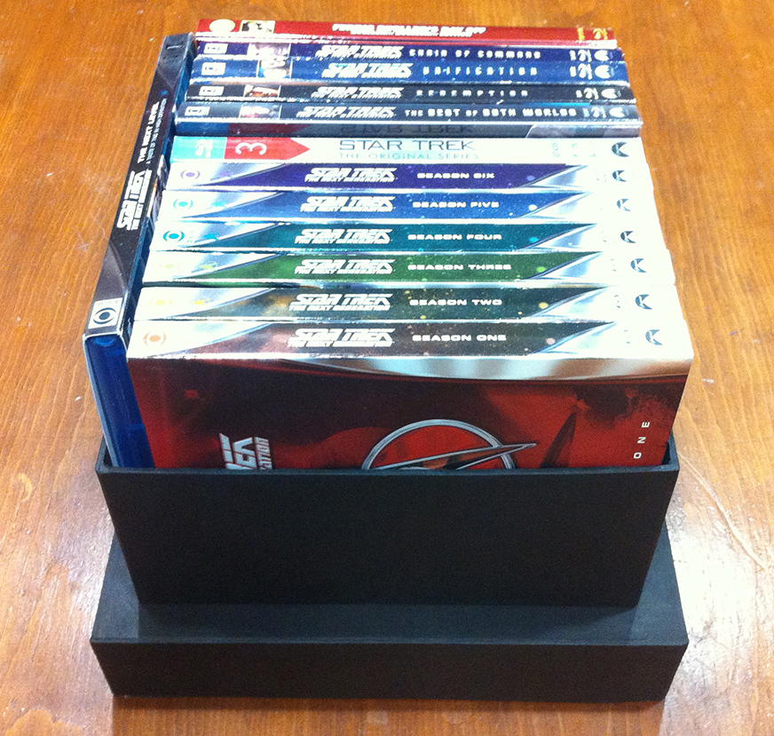
Now for the smaller box — it needs to be cut down more dramatically, roughly in half. The Blu-rays fit just fine as is, but they’re very difficult to remove otherwise.
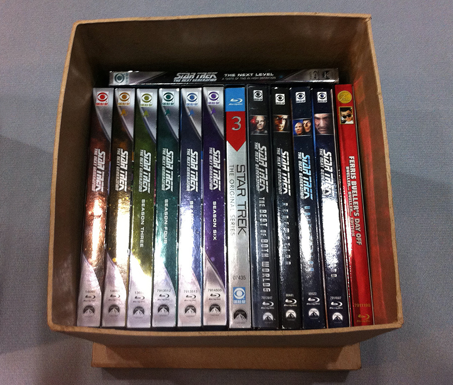 Blu-rays inside the smaller box before cutting it.
I cut 4 and 1/2″ from the open end of the box, leaving the box approximately 3 and 3/8″ in depth. To do this, use the same technique described above in Step 2.
NOTE: The larger the portion you decide to cut away from this box, the larger the clamps you will need to hold your ruler in place (because the ruler will be further away from the open end of the box).
 |
 |
Left: 4 and 1/2” line drawn around the outside of the smaller box.
Right: 4 and 1/2” portion cut from the smaller box. |
Instead of using larger clamps, you could also preemptively cut away most of the open end first (with scissors, for instance) which would then allow your smaller clamps to grip the ruler on the line you drew. Alternatively, you could simply use a much wider piece of flat plastic or metal with a straight edge instead of the ruler.
I chose the latter method and managed to cut the box once.
STEP 4
You’ll probably notice that when you place the larger box down on top of its lid, the bottom sides of the box “cube” appear slightly bent outward and rounded next to the straighter sides of the lid. In order to fix this and provide a snug fit around the smaller inner box, you have to construct an interior wood frame.
Take the 36″ x 3/8″ square wood dowel and cut it into four 8 and 1/8″ lengths, preferably using a powered miter saw or, if necessary, a manual saw with a miter box to make precise square cuts. If you don’t have any of these tools, see if they’ll cut the dowel for you at your local hardware store.
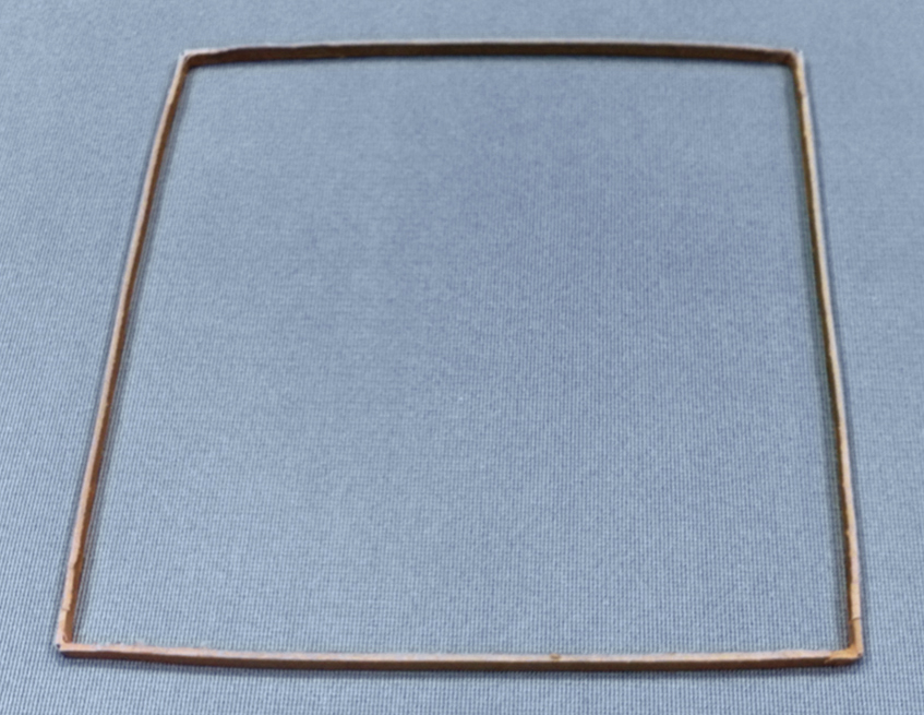
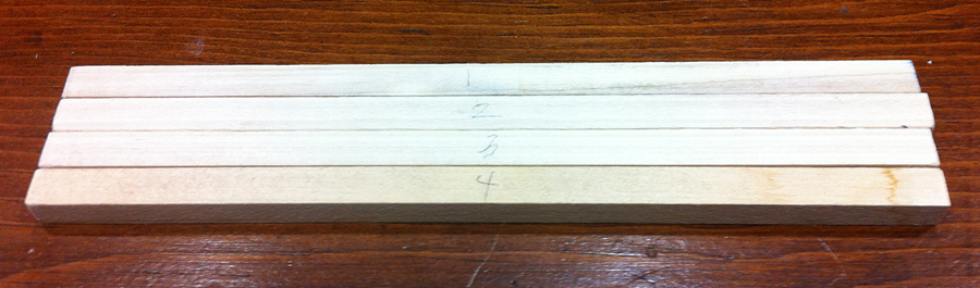 3/8” wood dowel, cut into four pieces.
Arrange these wood pieces around the base of the smaller box you cut in half, overlapping them edge to face to see what it looks like and to check the fit. This square frame should be approximately 8 and 1/2″ wide on the outside and there should be a very small amount of extra room between the wood frame and the box.
Now, you should test how it fits inside the larger box. Take the wood pieces and fit them just inside the open end of the box, again overlapping them edge to face (if you have trouble keeping them in place, temporarily tape the pieces together).
Do they fit? They should all fit in snugly (but not excessively so — you don’t want to damage the box), each overlapping the other, forcing the open end of the larger box into a more perfect square.
I found that I had to slightly shorten the pieces individually to make them fit just right; you’ll probably have to do the same. When you get them fitting the best you possibly can, try to carefully slide this larger box with the wood frame still inside it over the smaller inner box you cut in half. Does it fit snugly over it? If so, then you’re ready to glue the frame together.
 |
 |
Left: Wood dowels placed around the smaller box to check fit.
Right: Wood dowels inside the larger box. |
Mark the wood pieces with numbers (1, 2, 3, 4) and put those numbers on the outside of the box as well to remind you which piece fits where. You can also mark the wood pieces where they meet to indicate how each piece should fit together.
NOTE: You may find that the smaller box is slightly warped out of shape such that you need to push in a side with your fingers every time you try to fit the wood frame over it.
This is normal. As long as you get it to slide over, you’re good to go.
STEP 5
Using your right-angle triangle or square as a guide, bring the first two wood pieces together edge to face with a small amount of wood glue brushed onto one of the ends. Put a hefty book on top of the pieces to hold them in place and let them dry.
Do the same with the last two pieces, making sure each corner is as close to 90 degrees as possible. Then glue these two separate L-shaped halves of the square together.
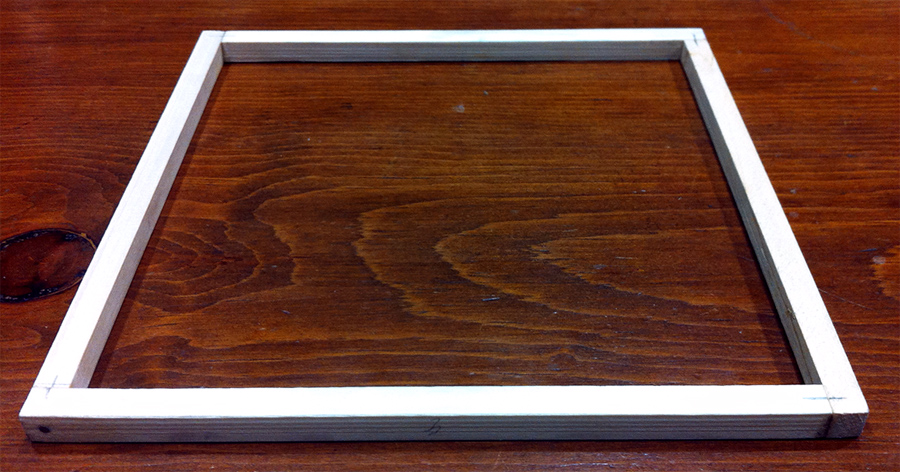 Wood frame assembled and glued.
NOTE: Rather than a triangle or square, I used an aluminum corner clamp to hold the pieces precisely together at 90 degrees while glued and also drilled tiny pilot holes in which I then hammered tiny nails to provide further support.
You don’t have to take these extra steps, I only did it to speed up the process and because I had these items on hand.
STEP 6
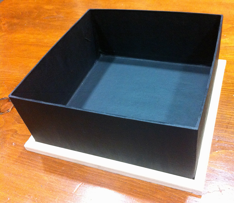
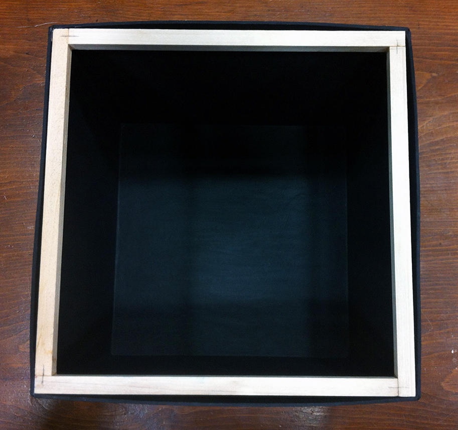
Once the square wood frame has completely dried, it’s time to glue it in place inside the larger box. Put a small bead of wood glue around the inner surface of the open end of the box (you can use a brush to even the glue out) and carefully fit the frame into place, making it flush with the open edge of the box.
Use clothespins to clamp it securely in place. I used five clothespins on each side. Wipe off any excess glue with a damp cloth or paper towel. Let it sit until dry.
 Wood frame glued inside larger box.
NOTE: To avoid possibly denting the paper mâché with the clothespins, you can protect it with folded up sheets of paper on the outside of the box. Take four sheets of paper, fold each three times; first in half, then again, and again.
Place the folded sheets underneath the clothespins on each side of the box. After the glue dries, the clothespins and paper can be removed.
STEP 7
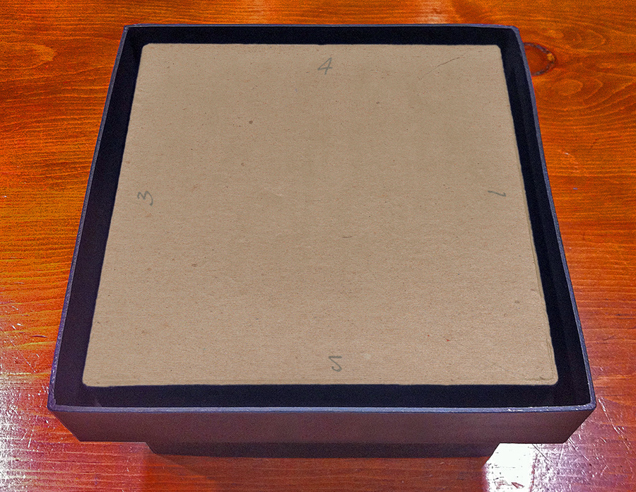
The smaller box can now be glued to the top of the large lid. Place it there and center it. There should be roughly 5/8″ of the base visible around all four sides of the smaller box.
If you put your Blu-rays inside the smaller box to weigh it down and slide the larger box with your wood frame inside over it, you can check the fit and alignment of the cube relative to the base. There should be approximately 1/8″ of the base visible around all four sides of the cube.
 We’re getting there!
Make note of which numbered side you prefer as the front. Take this moment to mark the lid/base with the same numbers on all four sides. Slide the larger box off and double check your measurements. If there is still 5/8″ around all four sides of the smaller box, go ahead and draw a line around it. Before you remove it, mark the smaller box with the corresponding numbers you put on the lid/base.
Apply glue onto the lid/base inside the area you just outlined. Brush the glue on thinly and evenly, then set the smaller box in place. Put a heavy book or two on top of the smaller box to hold it firmly in place while it dries. When the assembled base is dry, turn it over and copy the numbers on the base onto the underside of the lid.
STEP 8
Time for painting!
You’ll notice that I’ve already started to paint mine several steps back — which you can do too — but I decided to keep things as easy to follow as possible by saving that step until now (so you could still read your numbers).
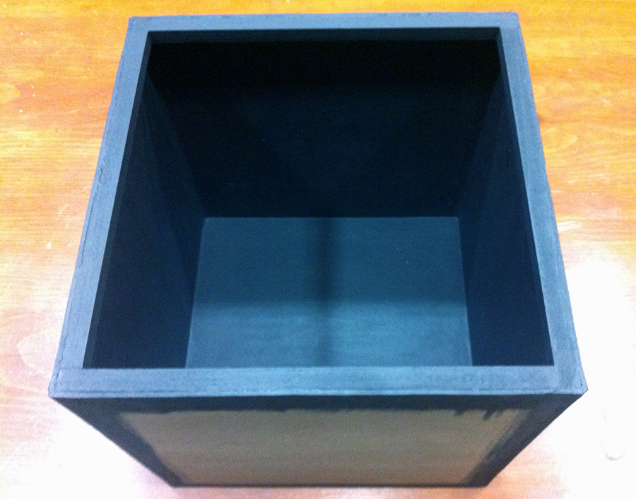
For the outside of the larger box you need only paint the corners and edges black because the artwork will cover all five sides of the cube almost perfectly. It is up to you whether you would like to paint the inside of the cube (I opted to as you can see in the photo for Step 6). You will, however, need to at least paint the wood frame to make it look nice.
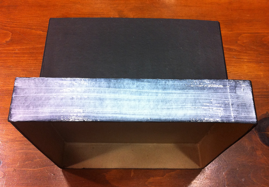
For the assembled base, you need to paint all of it black, including part of the underside. To know how much to paint underneath, take the smaller box’s lid and place it into the underside of the larger lid. There should be an approximately 1/2″ gap on all four sides between them. Trace around the smaller lid with a pencil to indicate how far you need to paint.
 Smaller lid placed into the underside of the base.
Take this opportunity to transfer the numbers on the sides of the base onto the top of the smaller lid. The smaller lid needs to be painted black along the outward facing sides, but you can leave the top of the lid unpainted for now as well as the interior of the lid. When the paint is dry, put a bead of glue along the edge of the smaller box’s lid and place it into the larger lid. Allow it to dry.
NOTE: Use the black paint sparingly, the paper mâché has a tendency to warp very easily when wet. Even so, it will still warp slightly no matter how little paint you use. Don’t panic. As the box dries, it should largely return to its proper shape.
STEP 9
You’re now ready to cut out the artwork. Use your ruler and hobby knife to carefully cut out the designs from the printouts. Do this on a proper cutting surface.
NOTE: After cutting out the designs, I used a black permanent broad-tip marker to blacken the edge of the paper. Just hold the artwork up and run the marker along the edges, turning the artwork as you do. I took this extra step because the paper I opted to print on is 32lb weight and when glued against the black painted box the white edge of the paper would’ve been too obvious.
STEP 10
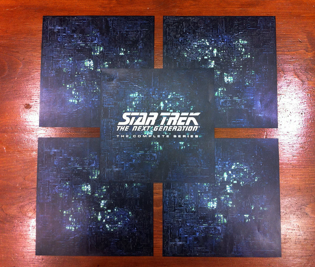
Now, organize your artwork. Decide what goes where based on the numbers you chose to mark on the box. Write those numbers on the back of your artwork and pay particular attention to the artwork representing the four outward facing sides of the Borg cube.
Make sure they are right side up according to how I designed them — I made sure to flip and rotate the images a certain way on each page so when the sides meet in three dimensions on the cube you don’t have the same pattern side by side.
 |
 |
Left: Artwork for the cube.
Right: Artwork for the base. |
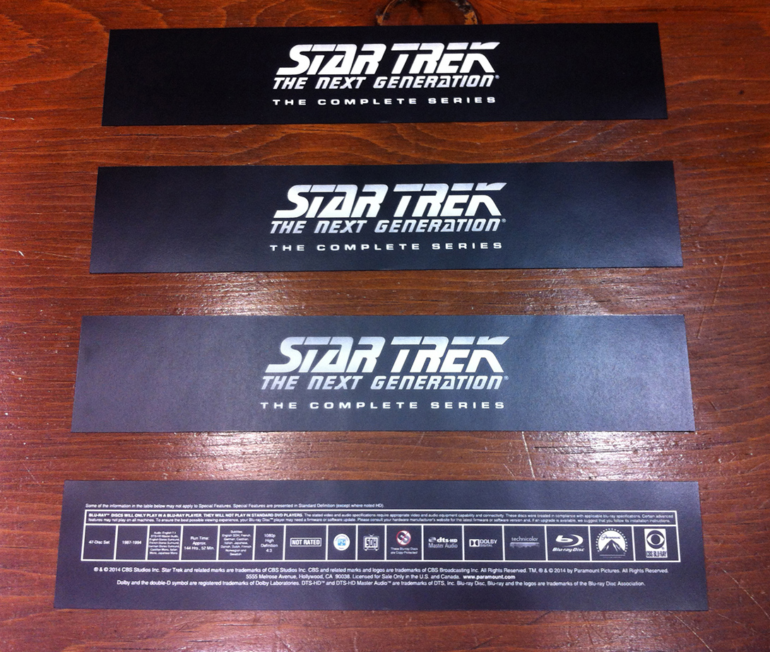
Using your brush, apply a thin layer of decoupage glue (I used matte finish Mod Podge) to the back side of the base where the Blu-ray specifications artwork should go (that’s the one with all the corporate logos and copyright information). Follow the numbers you wrote on the bottom of the base to guide you.
Carefully place the artwork on the box. Try to keep it as straight as possible. If it goes on wrong, you can carefully peel it off and try again.
Use your finger to gently push down on the artwork and carefully smooth out any wrinkles (you can also do this with a soft rubber brayer or roller if you have it). Do this from the center of the artwork outward to push any bubbles of air that become trapped underneath.
 Apply glue to one side of the base.
The surfaces of the box and lid are not perfectly smooth, so you will probably see imperfections and bumps through the artwork; that’s normal, just do the best you can — and don’t go overboard with smoothing things out either, you can actually cause the artwork to bunch up and wrinkle if you tinker with it too much. Use a damp cloth, a paper towel, or even your finger to wipe away any excess glue that might squeeze out. Do this for the three remaining sides of the lid/base with the artwork of the series logo.
Use this same technique with the artwork for the cube. Start with the back artwork and move your way around the box. Do the top last. Because these areas are larger, when you brush the glue on you must do it fairly quickly as the small amount of glue you use might begin to dry out by the time you are ready to place the artwork. If that happens, it’s okay to apply a little more glue to ensure there will be a good bond with the paper.
 Both pieces fully painted and with artwork.
Because you are covering a rather large area with wet glue, the paper mâché box may start to warp. Mine tended to swell outward. Once you get the artwork placed properly, put a flat object (like a piece of plywood or a shelf from a bookcase) on top of it and weigh it down with some heavy objects (glass cookware, bowls, etc.). Let it sit like this for at least 20 minutes before moving to the next side of the box.
NOTE: If the edges of the artwork haven’t adhered to the box in certain areas, try to carefully lift the paper up with a toothpick and apply a small quantity of glue (preferably with a small brush) underneath the paper and press it down again for several seconds.
 Finished! Well, almost…
STEP 11
At this point you’re nearly done. If you notice that some of the sides of the box have warped or bent outward too noticeably after gluing the artwork, you can fix this by applying the following technique.
Place the cube top on a table with the side you’re interested in flattening face down. Using a spray bottle filled with water, lightly spritz inside the box on the reverse side and use your brush to spread the water around evenly so the whole area is uniformly dampened. Then place something heavy (like a heavy glass bowl) inside.
Let it sit like this for 20 minutes and then check it to see if that side of the box has been flattened back into shape. If it didn’t work as well as you’d like, repeat the process again.
STEP 12
You can now finish painting the very bottom of your project black.
 Smaller lid glued in place, and painted black.
STEP 13
It’s now recommended that you seal the project with a water-based finish. While this step is entirely optional, it will help to protect the set from general wear and tear.
Even though you can use the decoupage glue as a sealer, I found with my test swatches that brushing it on top of the artwork left undesirable grooves from the brush bristles on the surface, so I opted to use a spray sealer. I encourage you to test these different techniques yourself with the test swatches included on the artwork and some of your discarded paper mâché pieces. That way you’ll have a better idea of what different sealing techniques on the paper will look like.
NOTE: I used Polycrylic water-based spray with a satin finish. When using an aerosol spray can, it’s important to get a plastic spray grip accessory that converts it into a spray gun. Otherwise, the tip of your finger might inadvertently get in the way of the spray stream and you will end up with ugly dots of sealer splattered on your project.
Follow the directions on the can for proper spraying distance, number of coats, drying time, etc. Use a mask and protect your work area with newspaper. When the sealer dries, you’re done!
If you’ve made it this far, congratulations! Enjoy your custom made Star Trek: The Next Generation: The Complete Series Blu-ray Box Set!
If anyone has any questions about completing the build, please feel free to post a comment below and we’ll try to answer them and help you out as quickly and as best we can!


 Frakes directs Hallie Todd in “The Offspring.” (via
  William Shatner and Nick Meyer on the set of Star Trek VI: The Undiscovered Country.
 Patrick Stewart and Stuart Baird on the set of Star Trek: Nemesis.
 Vin Diesel and director Justin Lin on the set of Fast & Furious 6.
 That has really given our chief curator time to really get a very close look at the model and has allowed us to really narrow in on issues of paint, issues of structure, and to start planning in which directions our conservation efforts are going to go.


")