Home Blog Page 287

Trek Comics Review: “The Primate Directive #3”

Our Trek Comics editor Patrick Hayes is back with a review of this month’s issue of IDW Publishing’s ongoing Star Trek crossover comic series: the third chapter of “The Primate Directive,” where the Enterprise crew visits the Planet of the Apes!

apes3-covers

Order The Primate Directive #3

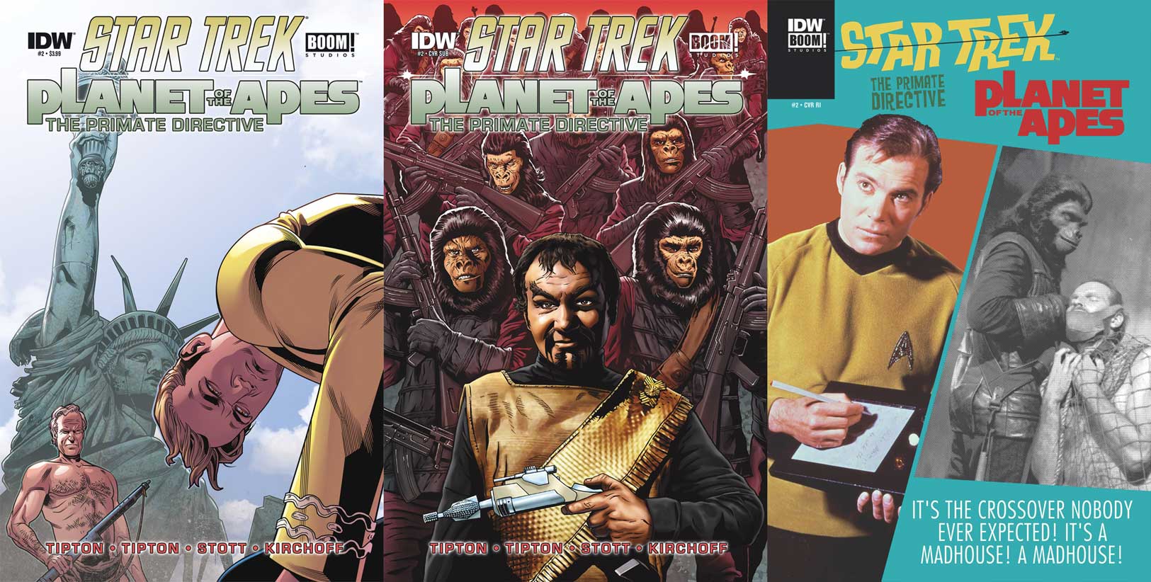
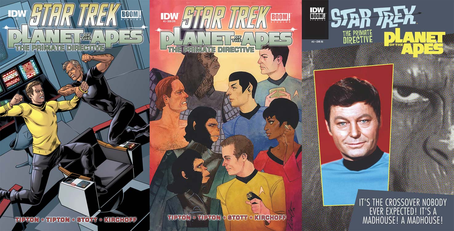
  • The regular cover is by Rachel Stott on art, and Charlie Kirchoff on colors. This is a fantastic image on the bridge of the Enterprise, tilted slightly to suggest the ship is in duress. Kirk and Taylor leap at each other with fists ready to pound one another. I love that they look as though they’re going to simultaneously connect. The characters look great, and the setting is superb. I love this cover!
  • Kevin Wada does the subscription cover and it’s a new look for any Trek book done by IDW. Both casts are facing each other in a very stylized form. The line-up is Marius and McCoy, Taylor and Spock, Cornelius and Uhura, and Zira and Kirk. The likenesses are good, the colors strong, and you can’t miss the vibe that Kirk is sending Zira — wow! Her reaction is also great.
  • The retailer incentive cover is again a classic Dell inspired cover with the madhouse tag at the bottom. This time the smaller image is the famous publicity bust shot of DeForest Kelley as McCoy, while the larger photo is a monstrous close-up of the right side of an ape’s face. It’s okay — I mean, I like it, but the ape photo seems like a hurriedly included piece, given the filter placed over it and its black and white colors.

pota3_story

Dr. Zaius informs readers of the sorry state of ape society, due to their agricultural failures in a time of population growth. The gorillas are getting wound up and the chimpanzees are reluctant to go to war. Only the friendship of Cornelius and Zira are giving him peace of mind. If he was aware of what was transpiring among those friends, he might feel differently.

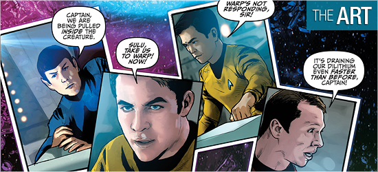
Last issue, Taylor knocked out Chekov to take his communicator. At a distance from the Enterprise crew, he contacts the ship and has himself beamed aboard. With the group, Kirk realizes Taylor and Chekov are missing. The young ensign is found and Taylor’s plans learned.

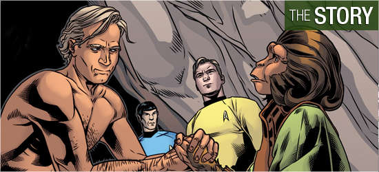
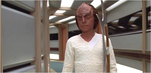
Putting Taylor aboard the Enterprise is the perfect futuristic mix. After all, Taylor is from Earth’s future, as are Starfleet’s finest, but they’re from two different dimensions, and the sole survivor of the crashed ship tries all that he can to help the humans of this ape-run world.

There are some sensational lines, such as in the fourth panel on Page 6 and the second panel on 8. The sequence that begins on Page 11 is everything a Star Trek fan could want in fisticuffs. The way the scene ended in the first three panels on 17 is classic Trek and had me smiling.

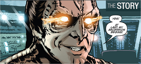
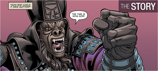
Naturally Scott Tipton and David Tipton couldn’t just focus on the heroes, so both villains make appearances on the final two pages. One character receives the worst possible weapon and a change of clothes. It is a glorious moment and Kor’s dialogue drips with smug pride and venom. Be sure to stand and clap after you read this issue’s final dialogue.

pota3_art

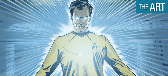
Another sensational installment from Rachel Stott. She masterfully has captured all the characters’ likenesses, human and ape, having them resemble the actors who played them. I have to admit, I was wowed by the sixth panel on Page 2 — I could hear the unstated sound.

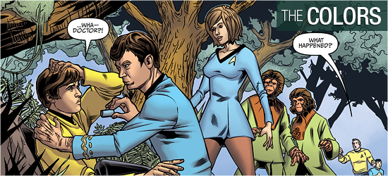
The first page to feature the heroes is spectacular with Taylor in action and McCoy and Nova giving each other not so subtle smiles. In fact, McCoy exchanges similar glances with a smiling officer on Page 8. What’s up with McCoy? It’s cracking me up, but that man’s hormones are raging!

Taylor and Kirk get most of the screen time in this issue, and Taylor is phenomenal. His emotions are right on his sleeves. The fourth panel on page 13 had me hearing Charlton Heston growl. Kirk is also incredible, and I love his distressed look, verifying what was said about the good captain on Futurama. The top three panels on 17 are a signature Trek moment done flawlessly.

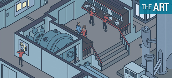
Attention must also be drawn to the settings drawn by Stott. In the monthly ongoing series artists have been using pictures for backgrounds and it’s been horrendous. Stott shows that outstanding backgrounds can be drawn, and not just cut and pasted.

Her Enterprise is gloriously accurate. The angles are beautiful love letters to fans and Page 10 is a wonderful late valentine to fans who treasure cut-aways. Page 7 is a joy.

pota3_colors

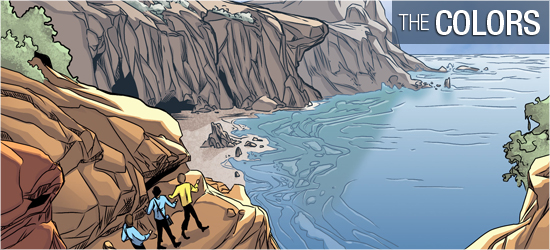
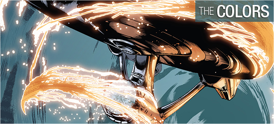
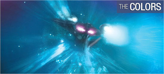
Completing the awesome imagery are the colors by Charlie Kirchoff. The pale violets done for the dim interiors of Zaius’s quarters are wonderful. Contrasted with the pale violets of the apes’ garb, the first two pages pack a strong punch. The colors continue strongly with Taylor’s piercing frosty blue eyes, the chimpanzees’ emerald clothes, and Kirk’s strong yellows.

Once on the Enterprise, bright reds are brought to the front of the color scheme and it’s sensational with Taylor’s sandy locks. The final two pages return to the opening pale violets for the two big bads’ appearances.

pota3_letters

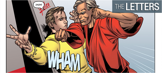
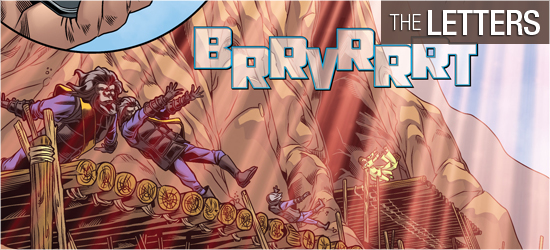
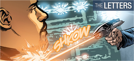
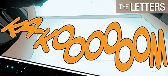
Narration and dialogue (the same font), yells, and sounds are created by Tom B. Long. I needed to have all these sounds in the issue’s slugfest and I’m so happy the Tiptons gave Long the opportunity to punch up these scenes.

WRATH OF KHAN Blu-ray Steelbook Coming May 17

TrekCore has confirmed today that Paramount Home Media will be issuing a new Steelbook release of Star Trek II: The Wrath of Khan on Blu-ray, coming exclusively to Best Buy in May.

khan-steelbook

Outside of the United States, this will be available through Canada’s Future Shop Best Buy Canada, which already has this new release up for preorder at $16.99 CAD. We don’t currently know of any plans for availability outside of North America. Additionally, as of right now, this is the only Trek movie planned for Steelbook release — though of course if that changes we’ll let everyone know.

While this new set will feature the first-ever Steelbook packaging for a classic Trek film, this is expected to be yet another reissue of the 2009 Blu-ray release already available in standalone form and as part of the ‘Stardate’ Trek film collection.

stardate

We don’t have a specific availability date for either Best Buy or Future Shop (or price point for Best Buy’s release) at this time, but we’ll keep our eyes peeled for more information as we we get closer to the May debut.

Trek Comics Review #42: “Behemoth, Part 2”

Our Trek Comics editor Patrick Hayes is back with a review of this month’s issue of IDW Publishing’s Star Trek comic series: the second chapter of “Behemoth,” the next entry in their Five Year Mission.

comic42-covers

Order Star Trek #42:

  • An interesting pair this month. The regular cover is by interior artist Cat Staggs featuring Kirk and Spock looking serious as the Enterprise is about to be swallowed by the titular Behemoth. Starfleet’s finest look good, as does the pink and purple starfield behind them, but the showpiece of this cover is the Behemoth and the Enterprise. The oversized creature’s maw looks designed similarly to the sandworms from David Lynch’s Dune. Coming out of its gullet are several transparent, glowing tentacles which are wrapped around the starship to pull it in. Great looking and exceptional coloring.
  • The photo cover is a horizontal image of McCoy in sick bay looking flustered as he checks a monitor. It’s a decent picture but has absolutely nothing to do with this story, outside of McCoy actually making a few appearances. I’m not thrilled with the huge amount of black space above and below the image. This choice of photo seems extremely random. I don’t understand why IDW doesn’t go with vertical photos to have an image that covers the entire space. Why not have covers that focus on the crew? Retitle the cover “Crew Photo Cover.” At least that would make more sense than an image like this.

trek42-story

This is the concluding chapter of “Behemoth,” with Mike Johnson returning as writer. The crew of the Enterprise is on a ship that dwarfs their own., and they’ve just learned from its sole occupant that something it calls Behemoth destroyed its world. Said planet killer has just arrived and is draining the energy of the Starfleet ship.

Spock, onboard the Enterprise, suggests the away team return. Not willing to leave the injured alien behind, Kirk has it beamed back with them to the hangar bay, since the creature is too tall for the transporter pads. Once aboard, they’re thrown about as Behemoth attacks the ship.

This story went too quickly and concluded abruptly. Page 8 is a good passage of time and advances one character, but the information on 9 could have been told in half a page or edited down to a single panel. An expected debate breaks out on Page 10 but is left entirely unresolved as an action interrupts it. Then another action renders it moot. This was an opportunity to see this crew make a hard decision, advancing their characters, but instead any growth is pushed off for a later book or film. The reveal on 14 made the remainder of the issue predictable. There is a teaser on the final page of the crew being in a new desperate situation. This is good and has me hopeful for next month.

I was really disappointed in the alien that was introduced last month. He was given a good backstory and shown to have a range of emotions, even with his limited vocabulary. To spend that much time on a new character in the first half of this story and not use him until the climax is a disservice to what’s been previously established.

Having him reenact “The Immunity Syndrome” was the final nail in the coffin of this issue.

trek42-art

Last issue had painful visuals because of the nonsensical use of photos employed as backgrounds, and things don’t improve this time around — and things may even be worse here.

The interiors of the Enterprise are painful to look at. The hanger bay is a horrible splotch of gray and black, as if slapped together in seconds. The bridge of the Enterprise on Page 6 shows the problems with the setting: the captain’s chair and the helm and weapon’s console are crisp and clean and look good. All surrounding them, however, are melted shapes and colors that suggest rather than state.

The ship fares much better with its exteriors, though it and a shuttle sometimes resemble the bad rotoscoping of a Ralph Bakshi film.

This traced look appears occasionally on the characters. Carol Marcus looks the best of all, especially in her close-up in the center of Page 10. Kirk and Spock look good, as do Chekov and Sulu. Not faring so well are Uhura and Scotty, with the latter looking like he’s in his early fifties. There is a scene on Page 12 where the crew is tossed about, but rather than going to one side in classic Star Trek fashion, the characters are posed as if the slam the ship endures emanates from the table, as all the crew members are blasted backwards in their seats.

The look of the alien introduced last issue has only grown more on me. This is the type of alien I’d like to see the crew encounter. Behemoth is also well drawn, living up to its daunting name. Each time it appears it is stunning.

Cat Staggs is a tremendous artist based on her previous work on other books. This story looks unlike anything she’d done before. I don’t know if this book was a rush job or IDW mandated the backgrounds, but I can’t believe this wholly came from her.

trek42-colors

I’m really hot and cold on the coloring from Wes Hartman. The away suits that looked excellent first issue come off as clunkily colored, with the face shields looking like a blanketed blue, rather than a layered effect. The colors on people’s faces on this page are very blocky. I don’t know if this is due to Stagg’s shading on her art or Hartman’s colors.

Much better is the Behemoth which glows amazingly in the darkness of space. Lighting effects are also good, such as on Pages 4 and 5.

trek42-letters

The contributions to this book by Neil Uyetake are very good. There are the expected dialogue and sounds, but Uyetake also does transmissions which are in italics, to make them visually different from dialogue. His best font is given to the alien whose dialogue is different from every character, cementing his alien-ness completely.

Star Trek TNG S7 Blu-ray: Deleted Scenes, Part III

It’s been a while, but we’re back with the next round of deleted scenes from TNG Season 7, exclusively available on Blu-ray!

On the Blu-rays, each cut sequence is featured in context with clips from the final episode, and we’ve got a full breakdown and analysis of the first scenes below.

Episode 7.16: “Thine Own Self”

del-thine

Scene 10: Young native Gia explains the history of Data’s new name.

Jaden, the new name given to an disoriented Data, was chosen without explanation in the final cut of this episode. Gia describes the story of Jaden as “a boy who looked different from everyone else… a handsome nobleman who was put under the spell of a demon.”

It’s a nice little bit of backstory for this planet, but it really kind of hits a little too squarely on the theme of the episode. Probably a good elimination.

Episode 7.17: “Masks”

del-masks1

Scene 8: The food and beverages in Ten Forward are getting a bit weird.

An early scene cut from the beginning section of this episode finds Worf, Geordi, and Riker discussing the mysterious comet, when all of a sudden Riker realizes that his snacks and drink order have become far from normal in Ten Forward. Geordi analyzes the blue beverage, and is dismayed to discover it appears to be some type of blood!

It’s an amusing conversation, with Worf announcing how much he likes the new drink (before learning what it has become), and foreshadows the transformation about to sweep through the Enterprise — likely cut for time, this opening sequence would have been nice to keep.

Episode 7.17: “Masks”

del-masks2

Scene 25: The senior staff discuss Data’s surprising new personality changes.

While Beverly and Deanna recap the new personalities beginning to emerge from Data’s positronic brain, Riker wonders why they aren’t able to just wipe the problematic areas of the android’s memory.

This discussion is basically pure redundancy, and was an obvious removal to save both time and story delays.

Episode 7.17: “Masks”

del-masks3

Scene 37: Everybody wonders why the D’Arsay archive is taking over the Enterprise.

While Worft jumps to the conclusion that the alien archive is acting as some sort of weapon — completely invading and disarming the Enterprise — Riker leans more to the peaceful end of things, imagining a culture building the probe as a method of saving some part of an ancient civilization.

It’s nice to see the crew debating the nature of the probe, but since it’s pure speculation with no information — and since the audience, at this point, is just as in the dark as the Enterprise team — the removal of this conversation is of no concern.

Episode 7.19: “Genesis”

del-genesis

Scene 18: Worf’s mysterious aggression continues to build.

Riker arrives on the bridge, only to find that somebody’s turned up the heat — meanwhile, the situation is continuing to escalate Worf’s already-heightened emotions. After complaining to Riker about Troi’s command of the thermostat, he stomps to the turbolift and leaves.

We already saw Worf and Troi fighting over the temperature controls earlier in the episode, and this is just more of the same.

Episode 7.20: “Journey’s End”

del-journeys-end

Scene 5: Picard drops by Wesley’s quarters and receives a very frosty welcome.

When Picard arrives to welcome Wesley back to the Enterprise, he finds the cadet still in bed at what seems to be a fairly late hour of the morning. Though he offers to come again later, Wesley drags himself to the replicator for coffee, and proceeds to give fairly abrupt responses when the captain tries to engage him in conversation.

Look, we know that Wesley’s being a jerk to everybody, and it’s pretty surprising to see him giving off this attitude to Captain Picard — but the screaming match he has with Beverly later on in the story does a much better job of driving home his state of mind. We didn’t need two of those types of scenes in this episode.

Episode 7.21: “Firstborn”

del-firstborn1

Scene 14: K’mtar finds a way to motivate Alexander into continuing bat’leth practice.

Alexander has such little enthusiasm for his father’s planned combat training that he literally drags his bat’leth behind him as the trio of Klingons walk through the corridor. K’mtar does his best to lift the young Klingon’s spirits, as Worf continues his role as taskmaster.

This is a kid that really doesn’t want to be headed to fighting practice — Alexander drags his sword along, letting it hit the floor with a loud *thump*. It’s not a lot of meaningful dialogue, but it’s another layer of insight into just how far away from Worf’s expectations the youngster is.

Episode 7.21: “Firstborn”

del-firstborn2

Scene 23: Troi reminds Worf that he’s been a good father, despite his concerns.

As Deanna does her best to console him, Worf shares his fears for Alexander’s future: if he fails to take hold of his Klingon heritage, the fate of the House of Mogh may be in jeopardy.

This is a much more nuanced discussion showcasing Worf’s concerns for his son’s upbringing than some other times we’ve seen this kind of talk, and really would have been great to save.

Episode 7.22: “Bloodlines”

del-bloodlines

Scene 40: Jason Vigo tries to use his ‘street smarts’ to outwit Daimon Bok.

In an effort to keep his captor from killing him, Jason tries to convince Bok that he’s of no value to Picard; that the captain cares more about the Enterprise crew than the man assumed to be his son.

This elimination is really no big loss; it’s standard hostage/captor fare which does nothing to advance either the characters or the story.

[td_smart_list_end]

div_spacer

There’s more cut footage yet to come, as we’ve still got both “Preemptive Strike” and “All Good Things…” ahead!

Leonard Nimoy Dies At Age 83

After being rushed to the hospital on February 19, the New York Times is now reporting that legendary Star Trek actor Leonard Nimoy has died at age 83 on Friday, February 27.

The actor was diagnosed with Chronic obstructive pulmonary disease (COPD) in 2014, three decades after giving up cigarettes. He discussed his history with smoking on CNN’s Piers Morgan Tonight early last year:

Nimoy, who first appeared as half-Vulcan, half-human science officer Spock in 1965, most recently wore the famous pointed ears in 2013’s Star Trek Into Darkness. His last major television appearance was in the role of mysterious and unscrupulous scientist William Bell on FOX’s Fringe, a role he reprised several times through 2012.

He retired from the Star Trek convention circuit in more than three years ago, last appearing at Creation Entertainment’s Chicago con in October 2011, though he did continue to attend shows remotely via Skype webcasts as recently as this past summer.

Leonard Nimoy is the third member of the original Star Trek cast to pass on, after DeForest Kelley in 1999 and James Doohan in 2005. He is survived by his wife of 26 years, Susan Bay, as well has his children Adam and Julie Nimoy.

Trek Comics Review #41: “Behemoth, Part 1”

Our Trek Comics editor Patrick Hayes is back with a review of this month’s issue of IDW Publishing’s Star Trek comic series: the first chapter of “Behemoth,” the next entry in their Five Year Mission.

comic41-covers

Order Star Trek #41:

  • Interior artist Cat Staggs does a sensational job on the regular cover for this issue. Kirk has a phaser blasting in each hand, with McCoy is on his communicator, and Spock shoots at an unseen foe high up. Sulu is back to back with Spock, shooting in the opposite direction. Below him Chekov ducks from something, as Scotty looks concerned, though his phaser is drawn. Uhura is shooting at something as well, and she’s not sporting her iconic skirt, but pants like the men wear. The Enterprise is above all against an excellently colored nebulae. Beautiful work.
  • The photographic cover is a bust shot of Alice Eve as the new universe’s Carol Marcus. She looks sensational, and her character is a prominent player in this issue.

41-story

This is the first installment of the “Behemoth” two-parter by Mike Johnson, and the first five pages are the calm before the storm and feature some welcome down time for the crew. The issue begins with some nice narration by Chekov, revealing what he does in his leisure time. He finds he’s been joined by Irina Galliulin and they share a brief conversation before he’s summoned to the bridge.

Meanwhile, Kirk and Carol Marcus are spending time together in the crew’s mess. They, too, have a dialogue that’s ended with Kirk being called to the bridge. Once there, Spock informs his captain that they have “detected a recurring signal from the sector. Its non-random nature suggested it was of a sentient origin.”

I was so happy to see an original tale of exploration and to have it start with five pages of two pairs of crew members getting to know each other as the reader gets to know them was great. If the entire issue had just been a down time, character driven installment I would have been just as happy. I was a little bit saddened to have both couples’ moments ended.

When the ship encounters the alien vessel and tries to decipher its message I was impressed with how the four crew members worked together. It’s nice to see the teamwork of this crew reintroduced and reinforced. It was also very welcome to see the return of the crewman on Page 7 — he’s a great character who’s had two issues focus on him, and I’m glad that Johnson hasn’t forgotten him.

The away team mission was very cool — I’m always glad when the crew gets to board ships or explore strange new worlds. Having the crew wear their environmental suits was an added bonus to make the setting more alien. The character that communicates its origin to the crew was very cool, and he/she/it foreshadows the inevitable on Pages 20 and 21.

The cliffhanger on the final page starts a countdown clock that will speed up for next issue.

41-art

I’ve been a fan of Cat Stagg’s art and prints for some time, and learning that she was going to illustrate a Trek story got me excited. Her character work here is okay, with the figures looking very photo referenced (which is fine), and her work on the environmental suits is great. Seeing those suits in action makes me want to see them incorporated into every issue.

The character that first appears on page 12 was humanoid enough, but harkens to Yarnek from “The Savage Curtain” crossed with something from H.P. Lovecraft. Excellent design and his emotions are easy to discern from his/her/its body language.

The backgrounds on this book, however, baffled and angered me. This is the third Star Trek comic storyline where photographs are used for the backgrounds, and it’s painfully obvious for the bridge of the Enterprise. The first panel on Page 6 looks awful.

This is not the quality of work I’ve seen before from Staggs and it’s devastatingly disappointing. When the new environment is first shown on Page 10, it’s impossible not to mistake it for a photo. In fact, on Page 11’s second panel Kirk’s left foot is floating above the ground because it does not match the background. When the flashback occurs, the setting improves considerably because it was drawn and not photocopied.

The double-paged spread of 20 and 21, however, is fantastic — the size and the design is what Star Trek should encounter. It’s both beautiful and frightening. However, it’s not enough to salvage the damage done by the backgrounds.

41-colors

When Wes Hartman colors nebulae or blank backgrounds it’s quite beautiful. The first five pages, especially Pages 4 and 5, have colors that suggest the peacefulness of space. The bottom of page 6 captures the alien-ness of the ship and the space around it. The double-page splash on 20 and 21 is spectacularly colored.

The bridge of the Enterprise is an entirely different experience. Page 7 has smears of color for backgrounds, and it gets even worse on Page 8. I’ve seen Hartman’s work before and he’s better than this. Either the art from Staggs was so poor, which I don’t believe, or smearing the colors for the backgrounds was the only way he could think to disguise the photography.

Things don’t improve when the new character is encountered, but they do improve tremendously in the flashback. Those pages demonstrate the expertise I know Hartman to have. He outdoes himself on 20 and 21, but things become poor again on Page 22.

41-letters

There’s no slighting Neil Uyetake’s work on this book with his dialogue and narration (same font), the undecipherable font of the alien — nicely done, and the alien’s speech when he speaks English.

I’m a huge fan of aliens’ speech looking different from the protagonists’ and Uyetake excels here.

EXCLUSIVE: Inside the Smithsonian’s Enterprise Conservation Project

As we’ve been reporting for the last several months, the Smithsonian’s National Air & Space Museum is undertaking a comprehensive conservation of the classic USS Enterprise filming model — built for the original Star Trek series — to preserve the eleven-foot starship for years to come, under the leadership of Margaret Weitekamp and Malcolm Collum.

openhouse

During an rare open house event at the Smithsonian’s Steven F. Udvar-Hazy Center, the Enterprise model’s home for the next year, we had the unique opportunity to get up close and personal with the Enterprise model, free from the crowds of spectators passing through the museum during the public event.

malcolm-margaretMalcolm Collum, Chief Conservator · Margaret Weitekamp, Lead Curator

Thanks to the generous access provided by the Smithsonian team, TrekCore went behind the public barriers to get some of the most detailed imagery of the starship available, thanks to contributing photographer Kelly Phillips of PixelationPhotography.

Click through to our gallery to see new shots of the Enterprise model, in stunning detail!

gallery

In addition, we had the privilege to be the first to sit down with curator Margaret Weitekamp and lead conservator Malcolm Collum to discuss the Enterprise model’s future in an extended video interview, debuting below, covering everything from the questionable paint application from prior restoration projects to the interior lighting setup used to illuminate the starship.

While no hands-on work has started yet, there’s clearly a long road ahead for the Smithsonian team to get to the 2016 debut of the Boeing Milestones of Flight Hall, where the Enterprise model will return to the public eye — and TrekCore will be along for the ride as this historic undertaking continues over the next several months.

What are your thoughts on the project so far? Let us know in the comments below!

div_spacer

interview1interview2interview3interview3interview3interview3

German “All Good Things” Blu-ray Now Available

Just like “The Best of Both Worlds,” “Redemption,” “Unification,” and “Chain of Command,” German audiences can now pick up a copy of “All Good Things” on Blu-ray — with German-language packaging — through select local supermarkets priced at €9.99.

The single-disc set includes the same foldout slipcover included with the North American release.

AGT-German

We’re pleased that German fans have the opportunity to pick up a copy of “Alle Guten Dinge” in their home territory, but it’s a curious change for German speakers, as this episode has been traditionally known as “Gestern, Heute, Morgen” (“Yesterday, Today, and Tomorrow”) since its original airing in 1994.

div_spacer

Have any of you been able to track down a copy of this release in a market near you? Let us know in the comments below!

Order Star Trek:
TNG Season 7
on Blu-ray!


Order TNG's
"All Good Things..."

on Blu-ray!


Trek Comics Review: “The Primate Directive #2”

Our Trek Comics editor Patrick Hayes is back with a review of this month’s issue of IDW Publishing’s ongoing Star Trek crossover comic series: the second chapter of “The Primate Directive,” where the Enterprise crew finds the Planet of the Apes!

apes2-covers

Order The Primate Directive #2

  • The regular cover, by Rachel Stott and Charlie Kirchoff, has me hearing Shatner saying, “You maniacs! You blew it up! Ah, damn you! God damn you all to Hell!” Love the iconic statue, Taylor looking like Charlton Heston, and Kirk staring at the ground. Excellent layout as the title leads to the statue’s arm, which leads to Kirk, who directs viewers to Taylor as the final revelation.
  • The subscription cover is by the talented Joe Corroney and Brian Miller. Take all my money now! Kor smiles as he displays his phaser, backed by a multitude of gorillas bearing rifles. The Klingon is flawlessly rendered as John Colicos. How could any Trek fan not get warm inside looking at that devious smile? And those apes–fantastic! The coloring is perfect with Kor’s golden sash being the focus and the black and violet of the ape soldiers escalating into a burnt rose sky. This is poster and print quality!
  • The final cover is the retailer incentive design, created to look like a Gold Key Comics cover. Yeah, I need to track this down, too. It’s a split photocover of Shatner and Heston with the copy, “It’s the crossover nobody ever expected. It’s a madhouse! A madhouse!” There’s no credit given on the inside cover for who designed this, but they deserve a lot of thanks for going retro… and maybe a little something extra in their paycheck.

pota2-story

Last month I wanted — needed — more ape interaction with the Enterprise crew. In Scott Tipton and David Tipton’s saga this month I got it, big time!

The previous issue ended with Kirk, Spock, and two security officers (Uh, oh. Red shirts…What could possibly go wrong?) witnessing the gorillas conversing with Kor. The Enterprise crew is discovered by two gorillas that were in the trees. The humans make a run for it, giving the primates a reason to fire at them.

Kirk stuns one with his phaser after a bullet nicks one of his men. The other ape stops his pursuit to aid his fallen comrade, allowing Kor and Mairus to arrive. The general warns Kor that such public actions, “could destroy our entire arrangement.” Kor says he can handle things, “I don’t think my ‘friends’ have the stomach for a fight…”

Far from their enemies, Kirk wonders what’s happened to the humans of this parallel Earth. They soon hear a rustling nearby. A quick trip back to the Enterprise to hash out what’s going on and another landing party returns to the surface where they’re set down next to “something more recognizable as home.” Page 9 has them going to an iconic landmark and encountering legendary characters from the first Apes film.

Taylor’s interactions with Kirk and Co. are phenomenal. Pages 11 and 12 are a gut kick as Taylor bets for help, but fans know from the television series what Kirk’s response will be. The Tiptons have masterfully aped (Sorry, I couldn’t help it) Taylor and all of his companions’ voices. The desires of these characters are strong, with one individual on Pages 18 and 19 being passionate.

What occurs on the final page isn’t really a surprise, but it will have readers wondering for 30 days how his conflict will escalate.

pota2-art

Doing the artwork for a series based on characters from a film or television series must be incredibly daunting. The artist must make the characters and backgrounds similar to what fans are familiar with or they’ll be criticized by an obsessive mob. Artist Rachel Stott does an amazing job that will satisfy fans of both the Apes and Trek franchises.

Last issue she proved she was very adroit at creating Star Trek characters who mirror the actors that portray them. Her Kirk and Spock look great, and getting more time in this story are McCoy and Chekov, with the former having a fantastic silent reaction in the third panel on Page 11. I would expect no less from the good doctor.

The characters from Planet of the Apes look spectacular. Gorillas, chimpanzees, and orangutans all appear in this installment. They all look just as the fans would want them, with the gorillas on Pages 2 and 3 awesome. The leader on Page 4 is amazing — a reader can feel the visual threat given in the third panel. The chimpanzees are also impressive as they resemble the actors who played them. Taylor is a bit fifty-fifty for looking like Heston, with Page 18 being a good example of page where he does and does not look like the Oscar winning actor.

One nit: when the apes appear on Page 2 they have no rifles, but in the second panel they have the weapons on their backs. I originally thought that the Enterprise crew was surrounded by two pairs of gorilla scouts, but that’s not the case. Some rifles need to be added in the first panel for the collected edition.

pota2-colors

Charlie Kirchoff provides a nice depth to the art with his colors. Throughout the book shading on characters’ faces, human and ape, gives the illustrations a three-dimensional effect. I especially like his shadings on the apes shown in the first four pages. He’s also doing a solid job on the backgrounds, such as the forest and fields on Pages 1 – 5.

When the story moves to a cave by a beach, there’s some impressive work done on the rocks, such as on 13. I also like that coloring was used to show a transmission from a communicator. Very nice.

pota2-letters

Dialogue, whispers, sound effects, communicator transmissions, the captain’s log, and a “To be continued!” are crafted by Tom B. Long. I am pleased to see the communicator’s transmission in a different font than that of dialogue–very smart and appropriate.

I know it wasn’t Long’s call, but shouldn’t there have been a sound for the phaser’s fire on Page 3 and not just the hit? Another item to add to the collected edition.

Trek Comics Review #40: “The Q Gambit, Part 6”

Our Trek Comics editor Patrick Hayes is back with a review of this month’s issue of IDW Publishing’s Star Trek comic series: the final chapter of “The Q Gambit,” the last entry in the six-part saga.

comic40-covers

Order Star Trek #40:

  • On the illustrative cover, Gul Dukat — the god — has transported Spock, Kirk, and Q to deep space and released them. They tumble from his hands and into the cosmos, not long to survive in this environment. This is another great cover from interior artist Tony Shasteen. The image is a good representation of what fans are expecting from the Cardassian that’s bonded with a Pah-wraith.
  • The photocover is an extreme close-up of Armin Shimerman as everyone’s favorite Ferengi. His eyes are as wide open as his ears after probably hearing some new tidbit of information that’s upset his plans. This is a great photo, but as Quark is not in this issue, so this choice of photo seems like filler that was handy.

trek40-story

The final chapter of “The Q Gambit” by Mike Johnson, begins with Kirk’s narration (rather than a traditional captain’s log). He’s aboard the Defiant in his future. The Enterprise is under the command of new newly-enhanced Dukat, along with several Jem’Hadar.

Kirk is questioning Q’s motives for pulling him and his crew to this horrific time period. He learns the Q Continuum is going to fall before the Pah-wraiths, so the seemingly-omnipotent being yanked Kirk and company forward to stop them since the Q have been unable to do the deed. “So, yes, captain, though it brings me no joy and no small amount of embarrassment…I need you help.”

Meanwhile, deep inside the wormhole, the captured Enterprise is being swarmed by the tell-tale sign of Pah-wraith energy as its new commander raves with orange eyes, “Yes! At last, my ascension begins!”

How could this get any worse? Instantly! On Page 5, the Pah-wraiths do something that surprises Dukat. The tables are then turned as the Cardassian surprises the Pah-wraiths, and has a proposition for them. When wasn’t Dukat manipulating a situation to his advantage on Deep Space Nine?

Events go quickly on Page 12, with quite a shock occurring on 13. Just as readers may think there’s no hope for our heroes something happens that was standing in front of everyone for some time. Johnson has got each character’s voice ringing true, and it’s impossible not to hear Chris Pine, Avery Brooks, Zachary Quinto, Marc Alaimo, or John de Lancie delivering their lines.

Highlights include the fourth panel on Page 14, the final panel on 15, the second on 18, all of 19, the final dialogue between Q and Kirk (which includes a great admission), the final dialogue between Kirk and Spock, and the final page’s coda which bookends this saga and will leave Next Generation fans smiling.

trek40-art

Tony Shasteen closes this out with the same high standards he began with. The characters look great.

The standouts are Kirk, Q, and Dukat. Much of Shasteen’s work is photo realistic, and this issue is no exception. Dukat is one of my favorite Trek villains and to have him rendered so powerfully — so evilly — makes me want to jump into the book and take him out myself. He looks amazing on Pages 6 – 8, 13, 18, and 19. Kirk looks particularly strong on 10.

Often artists draw character’s faces in two facial poses: mouth open or mouth closed. By adding teeth to Kirk on this page Shasteen has made him more intense. Q steals the book, though. He looks sensational throughout, with Pages 16 and 19 excellent.

I’m finding myself torn with the backgrounds. It’s fairly obvious that photographs are being used for several panels, such as aboard the Enterprise. Is Shasteen choosing his point of view based on what’s available, or does the art come first and a photo is dropped in? Is this a cheat for an artist?

Before the digital revolution artists would draw all of their backgrounds. I wince at some of the backgrounds in this issue because they stick out like poor bluescreen effects. This doesn’t happen all the time, but enough to get picked up on.

With Shasteen doing this, would his character work have suffered if he hadn’t used the pictures? A reader shouldn’t be noticing this or having such thoughts while reading a book.

trek40-colors

There’s some impressive skin tone work on this issue from Davide Mastrolonardo. Faces in close-ups (Spock, Q, and Kirk) look particularly good. On board the Enterprise, backgrounds are pale blue and gray with the prerequisite lens flares. This puts the focus squarely on the characters, but had me wondering if it also wasn’t done to blur the photographs used.

The light effects, used for the characters’ eyes and what transpires on Pages 13, 14, 18, and 19, are great. Those background colors, though, just drew more focus to the photos.

trek40-letters

Neil Uyetake has created narration and dialogue (the same font), sounds, a perfect whisper (Page 15), and the closing word.

All are fine, but I wanted the narration to be a different font from the dialogue as it’s an internal monologue — a different form of communication to the reader. If this were a novel, it would be in italics. A minor nick, but one nonetheless.