Home Blog Page 200

Tarantino TREK: Screenwriter Mark L. Smith to Script

As we reported earlier this month, award-winning filmmaker Quentin Tarantino is working with Paramount Pictures and producer J.J. Abrams to develop a possible Star Trek film, and today sources out of Hollywood are confirming that a scriptwriter has been chosen to bring the story to page.

Mark L. Smith (above left), best known for his work on The Revenant (nominated for Best Picture in 2015), was part of the story pitch group identified in early December and will craft the first script for this yet-unknown story, according to Deadline Hollywood.

Bad Robot and J.J. Abrams are expected to remain as producers on the film (as they have since 2009’s Trek reboot), and Tarantino is reportedly interested in directing the picture.

We’ll continue to bring the news on this developing story to you as it arrives over the next weeks and months, to keep coming back to TrekCore for the latest!

Order
Star Trek Beyond
on Blu-ray!

Order
Star Trek Beyond
on 3D Blu-ray!

Order
Star Trek Beyond
on 4K Blu-ray!

Review — STAR TREK: DISCOVERY ‘Chapter 1’ Soundtrack

Familiar, yet excitingly different, Lakeshore Records‘ first soundtrack release for Star Trek: Discovery provides an instant connection to the tapestry of music in Trek’s history, while also moving much of the series’ scoring in bold and modern directions.

On this initial release of 21 tracks (featuring 53 minutes of music) from the first nine episodes of Star Trek: Discovery — save for “Choose Your Pain” — composer Jeff Russo invokes more strings than probably any collection of Trek music ever heard. Layered throughout the tracks are an interesting mix of violins and cellos (as well as percussion and reed instruments) offset nicely against what can only be described as a traditional Star Trek sound.

The result is a resounding success that somehow seems to mesh elements and tones from every previous Trek incarnation (including the unrivaled work of Michael Giacchino on the Kelvin Timeline films).

“I’ll Go” is a perfectly titled track that grafts the listener into the adrenaline rush being felt by Michael Burnham as she investigates the unidentified beacon in “The Vulcan Hello.” It’s the longest track on the album at 8 minutes and moves you up and down the scale: from heightened anxiety, to feelings of wonder and awe, to trepidation of the unknown, to a final fight or flight crescendo.

And as far as building crescendos go, nothing can top the ceremonial horns that overtake each other as T’Kuvma honors his fallen comrade in “Torchbearer.” The track is a nice companion piece to “We Come in Peace,” one of the album’s signature moments that helps set up the drama behind T’Kuvma’s declaration of war in the series premiere episodes with a thumping drumbeat. The two tracks together effectively serve as a de facto T’Kuvma theme.

On “Persistence,” Russo moves his familiar beats into EDM territory with an inspirational track that will have you running laps around your home or work place — just like Burnham and Cadet Tilly through the saucer section of the Discovery in “Lethe”. Make sure to put this one on loop, though, to expand its far-too-short 64 second running time!

The now well-known Discovery theme earns its place in Trek lore by serving as the building blocks for a number of the album’s tracks, including “The Day Is Saved” and “Undetermined.” The integration is seamless and exhibits the versatility of Russo’s exquisite main theme.

“I Can’t Dance” changes the pace a bit with a soft piano introduction that builds nicely through the pivotal slow dance between Burnham and Lt. Stamets that is destined to end with another timeline reset in “Magic to Make the Sanest Man Go Mad.” That moment is captured poetically as the track comes to a sudden and dramatic close.

From the same episode, “Stella” is bursting with sweeping emotion and drama as Harry Mudd is reconnected with his wife in a ‘heartfelt’ reunion. The track poignantly ends with another classy nod to Alexander Courage’s original Star Trek theme to raise the emotional stakes even higher.

“Facing Off” is perhaps the most impactful track on the album. What sounds like the background music for a showdown between mortal enemies is actually a perfect reflection of the pain being caused by Burnham as she betrays Captain Georgiou and her shipmates in the stunning cliffhanger conclusion to “The Vulcan Hello.” The smattering of oboe on the track hearkens back to Vulcan themes throughout Trek’s past, and the sweeping, emotional horns and percussion of the track’s final 20 seconds literally makes you feel like you are being dropped off a cliff.

“Weakened Shields” is another standout, from “Battle at the Binary Stars,” mixing traditional Trek scoring rhythms with kinetic strings and pulsing brass. It starts fast and then comes to a moody close, as it perfectly tracks the action of Georgiou and Burnham’s infiltration of the Ship of the Dead that results in the sad death of the Shenzhou captain and her Klingon counterpart.

A slight departure on the album comes in the form of “What’s Happening,” which only runs 60 seconds and aligns very well with the introduction of the mysterious Pahvans. It’s tinkly, and a maybe even a bit saccharine, and will likely be judged alongside your view of the Pahvans and the effectiveness of how you think they worked on screen in “Si Vis Pacem, Para Bellum.”

The album concludes with a slightly expanded version of Discovery’s main theme, adding an extra 30 seconds of strong percussion to increase its running time from 1:34 to 2:11. The theme variation is a welcome addition to the album, and the album is a welcome addition to the storied and proud history of Star Trek music.

If you missed it, check out our interview with Discovery composer Jeff Russo about this new soundtrack release, touching on his approach to scoring Star Trek: Discovery episodes from the early days of production, through his current work finishing up the first season’s themes.

Currently available in digital download format only — and available on Spotify and other streaming music services — the “Chapter 1” soundtrack for Star Trek: Discovery is due out on CD and expanded vinyl releases in early 2018.

Jim Moorhouse is the creator of TrekRanks.com and the TrekRanks Podcast, and can be found living and breathing Trek every day on Twitter.

S1 Soundtrack: Chapter 1

S1 Soundtrack: Chapter 2

S2 Soundtrack

REVIEW: Eaglemoss XL — Enterprise NX-01

We continue our look at Eaglemoss’ Official Starships XL series today with a look at their latest upsized ship model, Jonathan Archer’s Enterprise NX-01 from Star Trek: Enterprise, released to collectors in late October.

Like the classic Enterprise, the Enterprise-D, and Enterprise-E before it, this enlarged NX-01 is generally a scaled-up version of its smaller predecessor, the 5.5″ version that Eaglemoss debuted all the way back in 2013 in the early days of the Official Starships subscriber program.

This XL Enterprise is nearly double in size and at least double in weight, as the nearly-all-metal model — only the nacelles are plastic — now measures in at about 9″ in length, and almost as wide as the original NX-01’s full length.

LEFT: 2013’s subscriber edition. RIGHT: 2017’s XL edition.

While the ship may be much larger in size, it does seem to be a pretty identical sculpt as the original NX-01 model, with identical join lines at on the saucer and warp nacelles — but when closely compared to the subscriber-sized Enterprise, there are some noticeable improvements in the XL ship.

The gold paint on the bridge dome is given a much brighter and more metallic look on the XL version, compared to a relatively muddy dark yellow tone on the smaller ship — though a spot of the gold paint is missing in the area (compared to the small version) behind the bridge.

In addition, the gunmetal grey paint on the rear saucer ‘fins’ and upper saucer is a slightly lighter shade, and is much cleaner around the bridge module.

The other thing the enlargement does is give the warp nacelles a great chance to shine when on display. The ruby-red bussard collectors and cerulean-blue vents are much more successful on the XL model, with the nacelle vents a much deeper color than the pale blue on the smaller edition.

Underneath the ship, the bright sensor dome in the center of the saucer has been modified from a pure white to a white edged with a gradiated yellow color, to more closely emulate the pale yellow glow on the ‘real’ NX-01.

Note the paint color change and detail improvements on the XL – though two spots of gold behind the bridge are gone.

The most improved part of the NX-01 model, however, comes in the form of the increased detail and cleaner lines on the hull textures — from the window indentations to hull plate scoring — and viewed side-by-side with the 5.5″ version, the XL model wins hands-down.

While the XL Enterprise NX-01 doesn’t have the most obvious improvements — compared to, say, the big color change on the XL Enterprise-D — its small improvements to detail and color go along way to making this feel more like Archer’s starship than the subscriber size.

Even the silvery hull aztecing seems to be a little subtle color than the 5.5″ edition, making it a bit softer to the eye and not quite as in-your-face when near reflective lighting.

While this XL model has its strengths, we’re certainly not saying it’s perfect.

There are still a few carryover issues from the subscriber size that catch our eye, including some that have nothing to do with the metal tooling used to sculpt the ship (which is the most difficult thing to address in manufacturing).

Unlike the other XL ships, there aren’t window-alignment paint issues on the NX-01, but there is one obvious problem with the dorsal saucer’s pair of cargo doors, as the applied markings are slightly too large for their space.

While the doors on the bottom of the ship fit in place more closely, they are still a little too large for the place in which they are applied — just shrink those decals down just a little and the problem is solved, you know?

The deflector dish is unfortunately still fairly underwhelming on the XL release. While the lack of detailed deflector could be excused smaller NX-01 — it’s really tiny on the 5.5″ version — this new edition presented an opportunity to really enhance this part of this ship to look more like its on-screen counterpart.

Unfortunately the thickness of the saucer’s edge is still a limiting factor for the metalwork — but we know the precision Eaglemoss can pull off with their plastic molding. Replacing this area with a plastic component could have really enhanced the front of the ship.

Finally, it’s hard to talk about this model without commenting on the display stand — which may be the weakest part of this whole release. While it’s possible to mount the ship, anything but the most gentle touch may cause the NX-01 to fall from its perch if you’re not careful.

This happened a lot.

This is a heavy ship, and the 1/2″-long grip is just simply not enough to secure this model for display. Honestly, every time the model was moved to take a new photo for this review — no matter how slightly — it slid loosely on the stand, and more often than not fell off ‘face-first.’

Our informal testing puts the ship’s center of balance about 1.5″ in from the rear of the saucer, and the stand needs take that into account. The smaller Enterprise had the same issue, but with the added weight in the XL version, it’s strange this wasn’t addressed more directly when creating the revised display stand.

Lengthening the grip and moving the contact point to the outside of the nacelle struts (like on the NX Refit model) would have certainly helped.

L-R: The XL edition, 2016’s NX Refit, the 2013 subscriber edition.

Overall, despite the minor criticisms noted above, the XL Enterprise NX-01 is a welcome upgrade from the original 2013 release, especially for fans of this 22nd Century starship — and if you’re not willing to spend $120 on the original Art Asylum version of the ship, it’s a nice alternative to get the Warp 5 starship into your personal fleet.

The XL Enterprise NX-01 retails from Eaglemoss at $74.95 in the USA (and £49.99 in the UK shop) when buying individually, but drops to $59.95 if you subscribe to the Star Trek Starships XL program for ongoing delivery.

Next month we’ll take a look at the next XL release, the Intrepid-class USS Voyager, which we previewed back in October when the prototype was on display at New York Comic Con.

From our preliminary look, it seems to be a much-needed upgrade to the 2013 subscriber size — so look back for our review in early 2018!

All photos for this review were taken with the Google Pixel 2 XL.

In Eaglemoss’ US store, TrekCore readers can use promo code TREKCORE at checkout for 10% off any ‘Star Trek’ collectible purchase $50 or greater (Starships, Plaques, Binders, Graphic Novels).

Win a STAR TREK: DS9 Crew Pin Collection from FanSets!

Star Trek: Deep Space Nine celebrates its 25th Anniversary in less than a month, and to celebrate the space station’s silver anniversary, we’ve teamed up with our friends at FanSets to get one lucky reader a full set of their DS9 crew pin collection!

All current members of the current Deep Space 9 character collection — Sisko, Kira, Jadzia Dax, Odo, Quark, Gul Dukat, a Jem’Hadar, and their brand new Garak — will also beam down to your sector to help commemorate the milestone.

In addition, FanSets will also include their special Deep Space 9 and USS Defiant pins, along with the series’ classic logo — bringing this to a full eleven-pin collection!

To enter for your chance to win this Star Trek: Deep Space Nine prize package is to think about the wide range of characters we met over the seven years of the series, and answer the following in our comments below:

From Admiral Ross to Kai Winn, dozens of memorable characters made their way through the corridors of Deep Space 9, and we want know who you rank at the top of your list!

Sound off in the comments below — and then watch your email for one of our winner notifications on December 23, with shipment planned to the winner for around January 1.

Add TrekCore.com to your ‘safe senders’ list so we don’t go to your spam folder!

div_spacer

Contest Rules

  • Giveaway open to residents of the United States only.
  • Contest runs through 11:59 PM Eastern on Friday, December 22.
  • Only one comment per user; users with multiple comments will be disqualified.
  • Must be a registered user of the Disqus comment system with a valid email address.

New STAR TREK: DISCOVERY Behind-the-Scenes Photos, Russo Soundtrack Preview Released

Star Trek: Discovery won’t be back until early January, but today promotion for the series continues as several new photos from the filming of “Chapter 1” arrive, as well as a preview of composer Jeff Russo’s first soundtrack release which becomes available tomorrow.

Over at Entertainment Weekly, a series of ten behind-the-scenes photos spanning production from “The Vulcan Hello” through “Into the Forest I Go” debuted (though one or two have been seen previously via Discovery team social media):

In addition, Lakeshore Records has put out their first preview of Jeff Russo’s “Chapter 1” soundtrack, available for digital download tomorrow.

We’ll have our review of the soundtrack in the coming weeks, and of course will continue our coverage of Star Trek: Discovery as news breaks!

S1 Soundtrack: Chapter 1

S1 Soundtrack: Chapter 2

S2 Soundtrack

DISCOVERY’s Last Episode Titles, New Posters Revealed

We’ve still got a few weeks to go until Star Trek: Discovery returns for the final half of its first season, but today CBS rolled out the names of the last six episodes of the year for us to ponder over in the meantime!

We already knew about “Despite Yourself,” the title to episode 10, but here are all the new ones revealed today.

No idea yet as to what these titles refer to, but we’ll certainly have a better idea when Star Trek: Discovery returns on January 7.

In addition, IGN released four exclusive “Chapter 2” posters, featuring Burnham, Saru, Lorca, and the not-seen-for-some-time Voq, in striking black-and-white poses.


Novel #4:
"The Way to the Stars"


Novel #5:
"The Enterprise War"


Novel #6:
"Dead Endless"


Stamets, Culber Headline in DISCOVERY Annual, Plus: BOLDLY GO #18 Concludes IDW’s Kelvin Timeline Tale

IDW Publishing’s first run of Star Trek: Discovery comics is ongoing now — check out our review of Discovery #1 if you missed it! — and today they announced that this spring, a special 48-page Annual release will be coming, centered around the backstories of Lt. Paul Stamets and Dr. Hugh Culber.

From 13th Dimension, who broke the news today:

Star Trek Discovery Annual 2018
Cover A: Angel Hernandez; Cover B: George Caltsoudas

Kirsten Beyer & Mike Johnson (w) • Angel Hernandez (a & c)

The U.S.S. Discovery is a ship unlike any the galaxy’s ever seen, developing tech based on an unstable mycelial network… and it is all in the hands of Science Officer Lt. Stamets, tasked with perfecting it to win the war against the Klingons.

FC • 48 pages • $7.99 / Expected in-store date: 3/28/18

Who is Stamets, and how did he, with his old partner, Straal, come to discover the mycelial network?P lus: Learn how Lt. Stamets met his significant other, Medical Officer Hugh Culber, and came to know fan-favorite Cadet Sylvia Tilly!

Here are the two covers, from longtime Trek comic contributors Angel Hernandez and George Caltsoudas:

13th Dimension also revealed the cover art and logline for March’s “series finale” of the ongoing Boldly Go Kelvin Timeline comic series, which concluded the current “I.D.I.C.” cross-dimensional storyline.

Star Trek: Boldly Go #18
Covers by Josh Hood and Eoin Marron (not yet available); variant cover by Yoshi Yoshitani
Mike Johnson (w) • Josh Hood (a & c)

“I.D.I.C.” Part 6 of 6! It’s the series finale of Star Trek: Boldly Go, and the climactic final chapter of the epic “I.D.I.C.” saga! James Tiberius Kirk faces the greatest challenge of his life… and the fate of infinite realities hangs in the balance!
FC • 32 pages • $3.99
Expected in-store date: 3/14/18

It’s a surprise to read that Boldly Go is concluding with this chapter, as editor Sarah Gaydos told viewers during a recent IDW livestream event that the comic series was projected out through next year and beyond — but the series may be simply moving to a new title after issue #18 arrives.

UPDATE:

We reached out to Gaydos today to follow up on today’s news, and she told us that while Star Trek comics will certainly continue in various forms past March, she confirmed to TrekCore that Boldly Go #18 will be the conclusion of the Kelvin Timeline story at IDW —  and clarified that her comment during the IDW livestream (mentioned above) meant to reference writer Mike Johnson’s continuing involvement with Trek comics going into next year, not Boldly Go specifically.

As with all of their Star Trek tie-ins, if you’d like to see more of them in the future, be sure and reach out to IDW by email or on Twitter to let them know!

We’ll update you as we learn more about the ongoing Trek comic series!

Win a Copy of “Star Trek: The Book of Lists”!

One of this fall’s new Star Trek reference books — Chip Carter’s Star Trek: The Book of Lists — is in stores now, and while we’ll bring you our review of this new book in the coming weeks, we’ve teamed up with publisher HarperCollins Publishers to get a copy of this new hardcover into the hands of three lucky TrekCore readers!

This contest has ended. Congratulations to our winners Scott, Skylar, and Thad!


Check out our preview of this book from back in September, then enter to win your own copy by simply addressing the below in our comments:

It’s could be one of the most-asked question between Star Trek fans, and with the arrival of Star Trek: Discovery, the ranking permutations have gotten that much more complicated, with over 5,000 possible ranking arrangements!

Think about it a bit, and give us your seven-series rankings in the comments below — then watch your email for one of our winner notifications on December 16!

Add TrekCore.com to your ‘safe senders’ list so we don’t go to your spam folder!

div_spacer

Contest Rules

  • Giveaway open to residents of the United States only – three winners will be chosen.
  • Contest runs through 11:59 PM Eastern on Friday, December 15.
  • Only one comment per user; users with multiple comments will be disqualified.
  • Must be a registered user of the Disqus comment system with a valid email address.

REVIEW: Eaglemoss Klingon D5 Class and Vidiian Warship

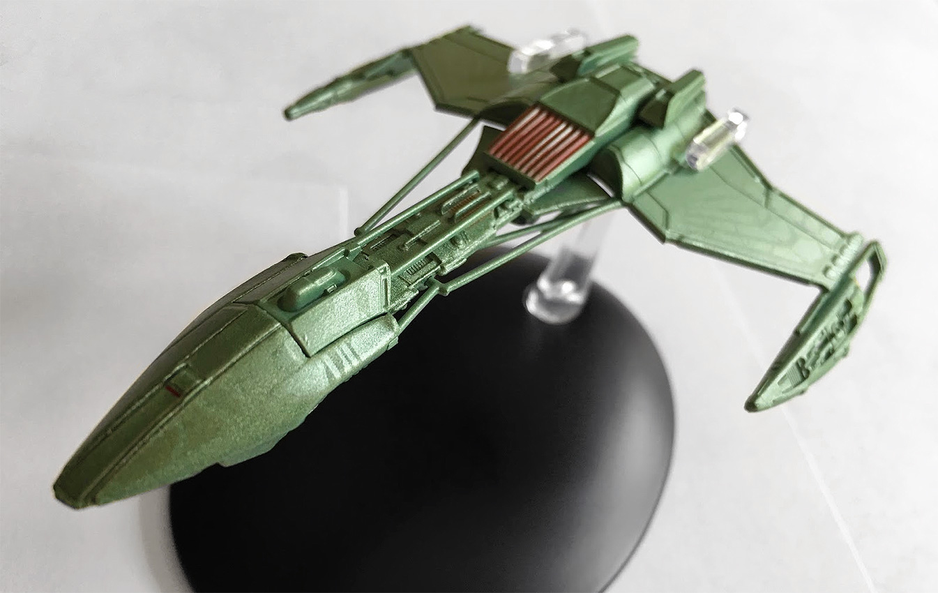
Perhaps one of their lesser known craft, the Klingon D5-class warship popped up in Star Trek: Enterprise to no particular fanfare, appearing first as little more than a tanker in Season 2’s “Marauders.” Subsequent appearances would lose those tanks and give way to a much more streamlined finish.

The D5 has all the hallmarks of the Enterprise-era Klingon ships; a more pointed nose, more angular warp nacelles, a more fierce and deadly finish with more in common to a Romulan Warbird than a Klingon Bird of Prey perhaps.

As always, the Enterprise ships are a fascinating addition to the collection because of their attention to detail — these ships have everything, surface texture differences, precise panelling and subtle variations in paint schemes which make them a die-cast wonder to behold.

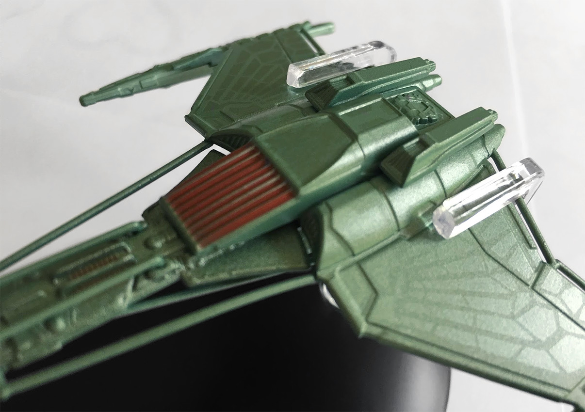
That nose has all the signs of the Raptor-class Somrawwith a sharp point and a bird-like appearance. It’s a smooth finish, which is unusual for a Klingon craft, and in this respect the D5 is their most streamlined vessel. That nose looks to be heavily armoured and sweeps majestically back into the neck of the ship.

There’s a touch of aztecing on here, but it’s almost undetectable because of it being such an oddly sleek finish. The joining of this nose “helmet” into the remaining section of the ship is clearly marked out but it all fits together cleanly. The neck, which protrudes back towards the engineering section, is a mass of detail.

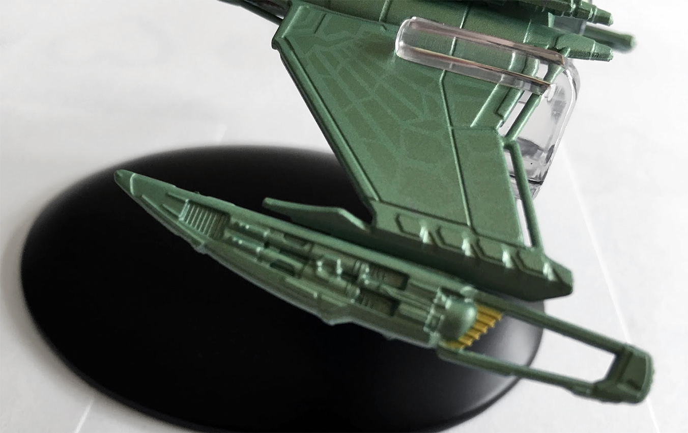
There’s the different layers of tech and mechanisms on the hull, plus the distinct 22nd Century Klingon feature of exposed cabling, which runs along either side of the connecting section. These are very cleanly moulded and attached to the model — and while the paint scheme of green doesn’t alter, it’s important to have them there for continuity, though a darker shade might have helped show them to be more heavy duty and less plasticy.

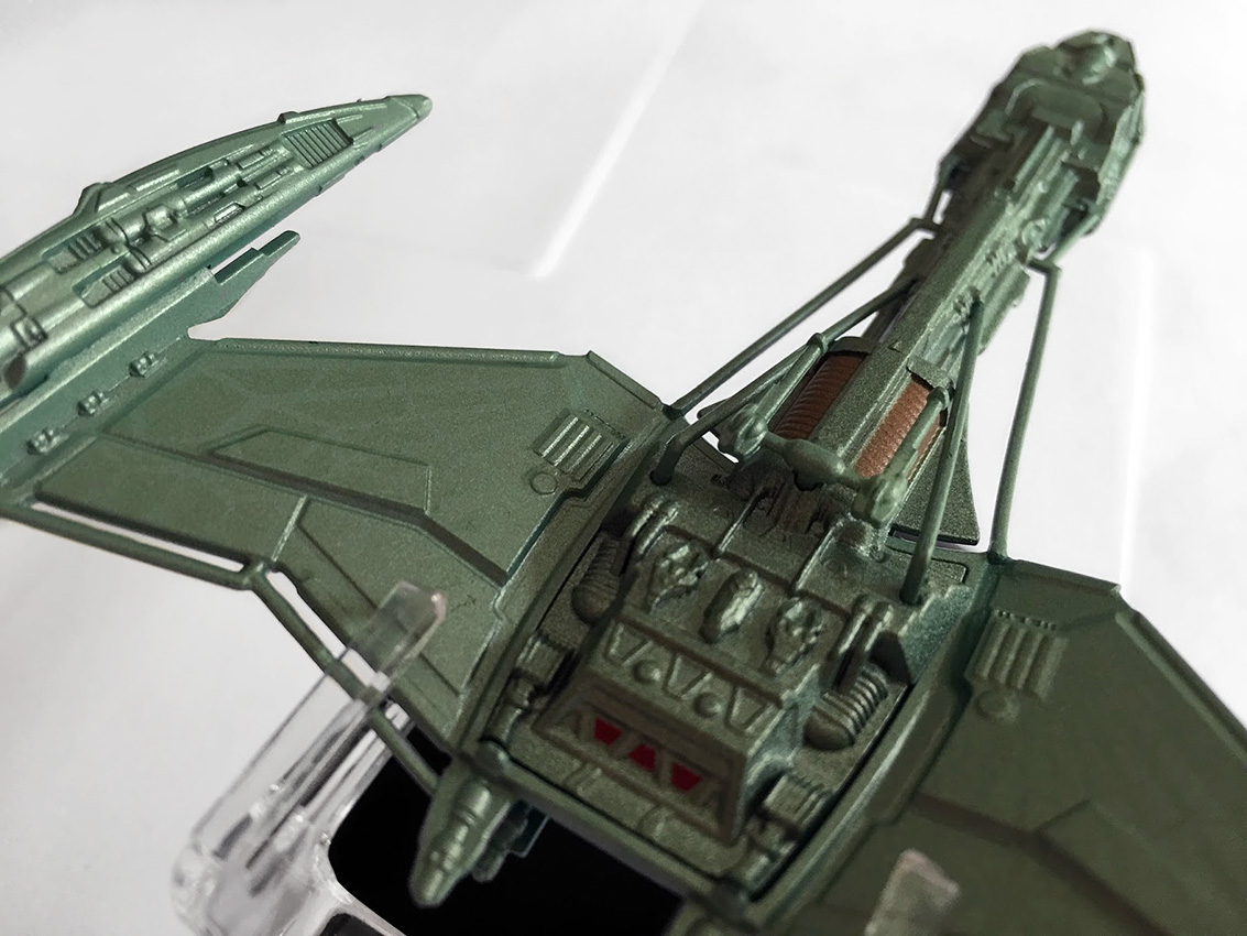
Down the neck and into the rear section once again there’s a familiar Klingon feature in the red slatted/grille section facing to the front. It’s evident on both the Augment ship and the Somraw and has translated across onto this craft too. There are even two distinct “hump” structures either side of it which scream out ‘Bird of Prey’ in regards to its slatted mechanism for moving the wings.

While these don’t have that luxury, you can see where the design has been retroactively slotted into the design journey of the Klingon fleet.

There’s also that impulse engine structure in the centre of the hull, which seems to appear all over the ships of the period: the 22nd Century Bird of Prey, as well as the Somraw, among others.

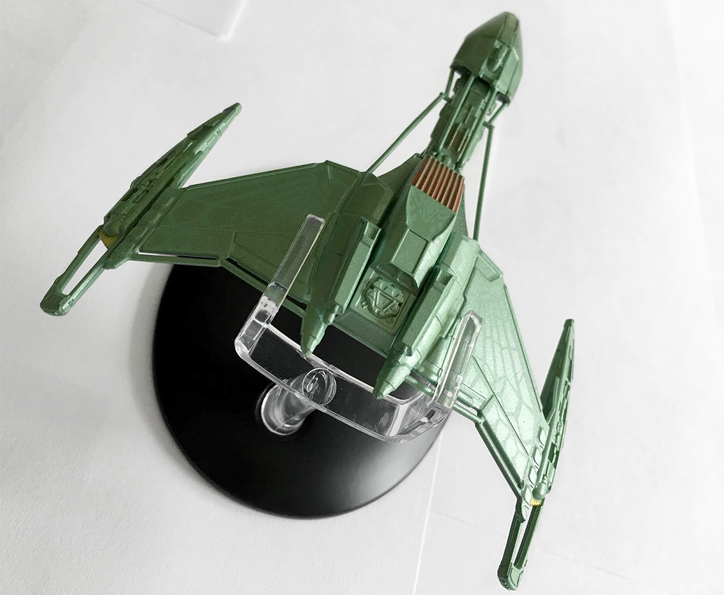
Eaglemoss have also reproduced the feather-esque paneling detail on the wings creating a more organic and “natural” wing effect, and you can see how this will be “developed” into the more notorious D7 craft of the Original Series. There is an evident kink in the wing, and the way in which it has been formed to meet with the warp nacelle that shows it’s evolution.

I think the wing design from Star Trek veteran John Eaves here is beautiful and nicely finished on the model as well, drawing your eye gradually down from the larger body to its narrower end and then onto the warp nacelles. It’s an incredibly stylish ship for the Klingons with some very sharp angles in that wing structure but the nacelles are something else with their dagger-like poise and open detailing.

To the rear they open up in keeping with other Klingon ships of the era and to the front there’s more exposed tech that is meant to echo the design features of the nacelles on the later D7’s and K’t’inga classes. This does seem the most sleek of Klingon designs from the whole of the franchise and oddly one of the more threatening at the same time. The sharp edges, the dagger-like appearance and the scything warp engines all work massively in its favour.

The metal structure in this one stretches from the nose and then onto the underside of the belly of the D5 via the connecting neck. That underside is extremely detailed including the addition of the double cannon.

There’s also more vent grille work on the underside of the ship and this section is the highest quality section. Lots of hull mechanics, panel detail and also impulse engine exhausts.

It’s a familiar placement for the stand on the D5, with it slipping around the rear of the ship giving the usual “flying” impression. It does look more at home alongside the 22nd Century Klingon ships, as there’s only a few similarities to this and the later D7s.

The magazine continues to emphasise the killer nature of the predatory D5 with reference back to its sporadic appearances in Enterprise, with lots of good tech detail in here about its armament and maneuverability, as well as how it compared to the NX-01.

From reading this I’d forgotten quite a bit about the D5s, and seemed to remember the Somraw and the Bird of Prey from this era much more clearly. Must be time for a flashback and rewatch, I think!

It’s the Vidiians — and I’ve been waiting a long time for this one! The dangerous species were one of Voyager’s genius moments. The concept of the organ harvesters ravaged by the Phage worked on every level, making them Voyager’s creepiest and most unsettling foe, a position I think even the Borg struggled to challenge.

While their makeup was first class as was the backstory, their ships were something of an acquired taste. Admittedly I acquired one for Attack Wing and that seemed pretty big but the latest Eaglemoss version is far superior – as you would expect.

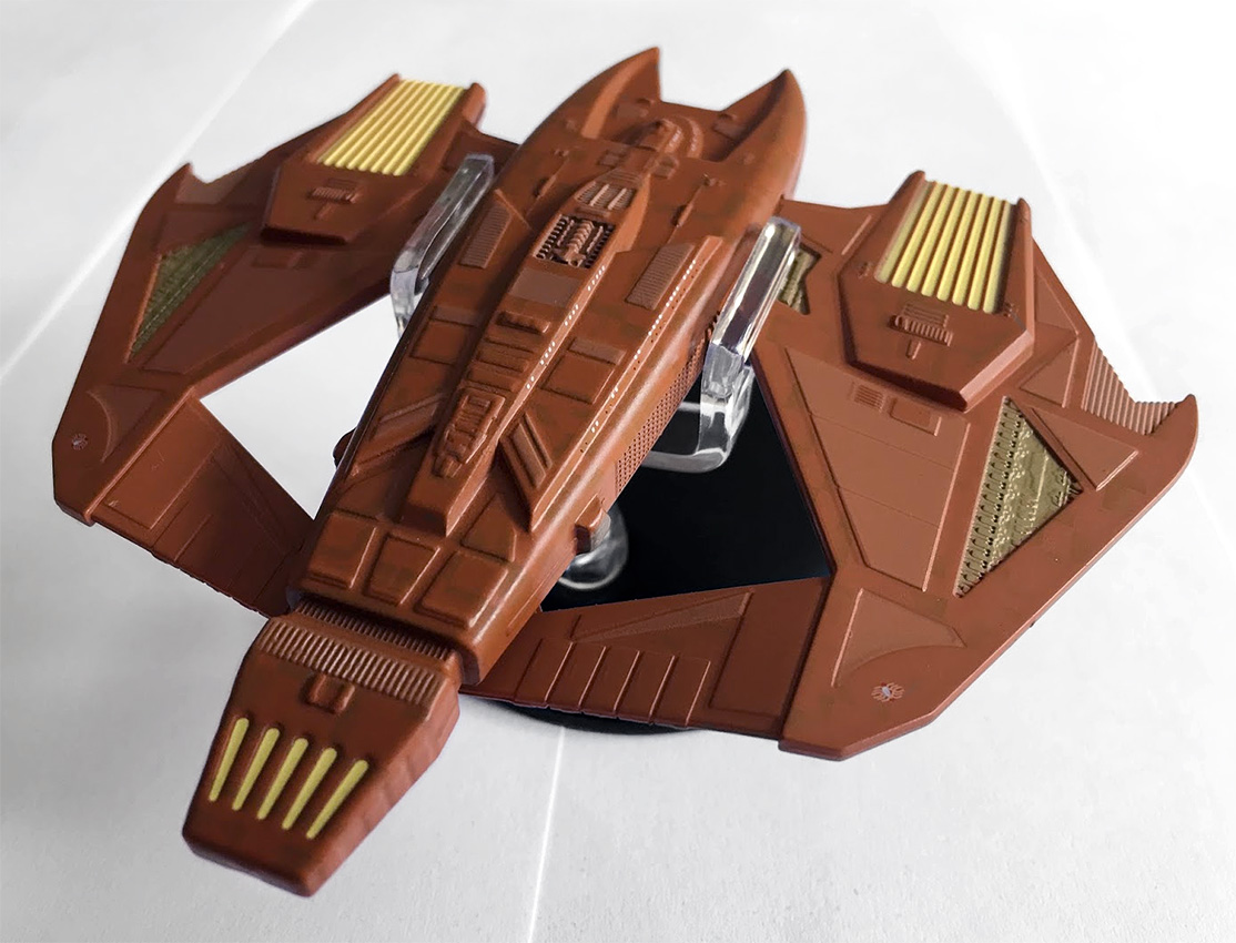
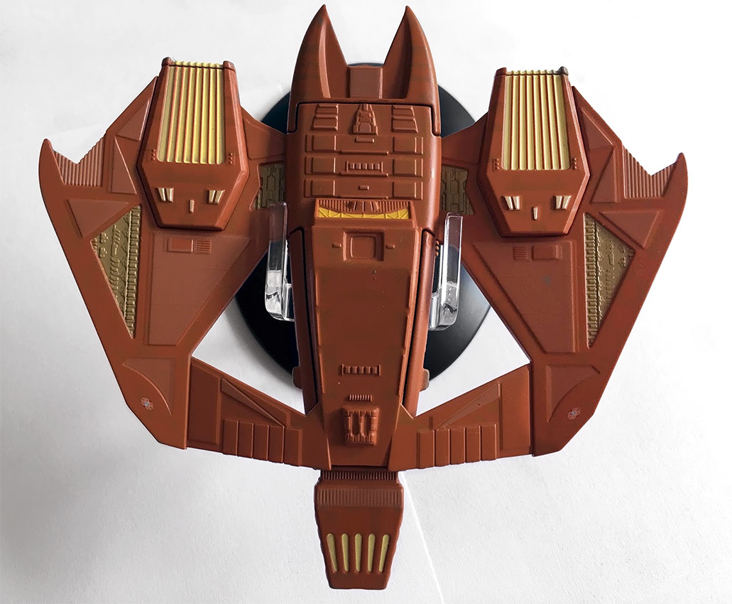
Filling out its packaging more than adequately, the Vidiian Warship is big. Easily as long as it is wide (to paraphrase the mag), you’re getting your money’s worth here. Now for note, the wider end is actually the front and just to reinforce that there’s a very clear bridge module marked out.

The colour scheme on this one is significantly less pink than I was expecting, but there’s still some hints of tonal differences plus some paneled highlights right across the surface of the Warship. These panel details are mirrored left to right, and then there’s the engine colouring which really lifts this ship out of the box.

At the front there’s a reaching pincer-like maw which arcs out and around the bridge module. That two tone paint finish is even evident on these areas of the ship and there’s even small panel colour differences as well as tiny porthole spots on the superstructure.

Along the metal spine there’s raised grille detailing and further aztecing, which stretches continuously to the almost-tapered rear that ends in another yellow engine housing. You do have to strain a little to see the shift in the paint scheme, but it’s definitely there. The Vidiian ship has a certain harshness to its finish with that very heavy frontal position.

It’s unusual for a Star Trek ship not to have a narrower front end — or something that is distinctly a front end — since you could think this flies either way round.

Out into the wings: these contrast materially to the upper hull being a central piece linked to the lower hull and totally plastic. As with the main hull, they feature highlighted sections to give them a more 3D and realistic finish. I love the sharp edges here and the “killer” finish to the design. The overall design is very aggressive, and looks ready to pounce with its forward sweeping wings and pincer maw.

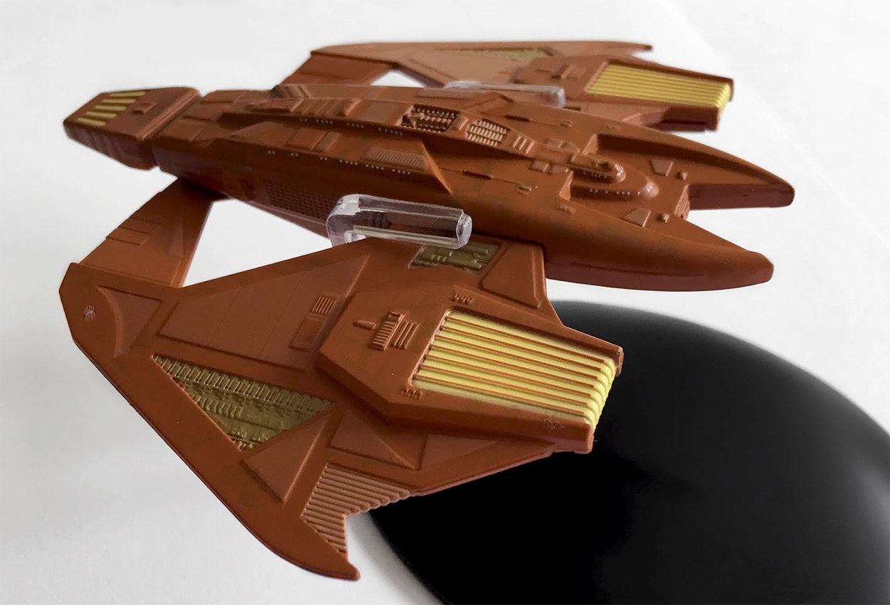
They have a slight kink in them, giving a slight inverted “V” shape as well as having cut-out segments toward the back, and I think the choice of metal here might have been wiser given their width and flexibility. However, I don’t think it’s a massive problem.

The clip-together top and bottom hull segments fit extremely snugly, although it’s not a straight centre-line crease; it notches into the lower half around some of the side detailing. Again, a good choice to ensure those clean lines and markings aren’t broken up with some lazy fixing.

In fact, the top hull section, being metal, fits into the lower plastic hull which spreads out to the wings. The panel lines are more striking on the metal upper section and the yellow engine field grilles, plus the yellow highlights really do stand out proud against the dusty brown of the hull.

The plastic sections – the wings and lower hull – actually appear to be a slightly lighter shade of brown, by perhaps a shade, which is a little odd. I also spotted that on the underside there is zero two-tone when it comes to the base brown coat. It’s a solid shade on the belly, with the segmented panels being in the lighter brown shade.

To finish, we find ourselves tapering to the rear, and what I can only assume is the impulse engine, providing a wedge-like tail to the warship. Nicely, the aztecing continues on this small section of the ship and on both sides even though the bottom of the ship is a single brown shade on the plastic.

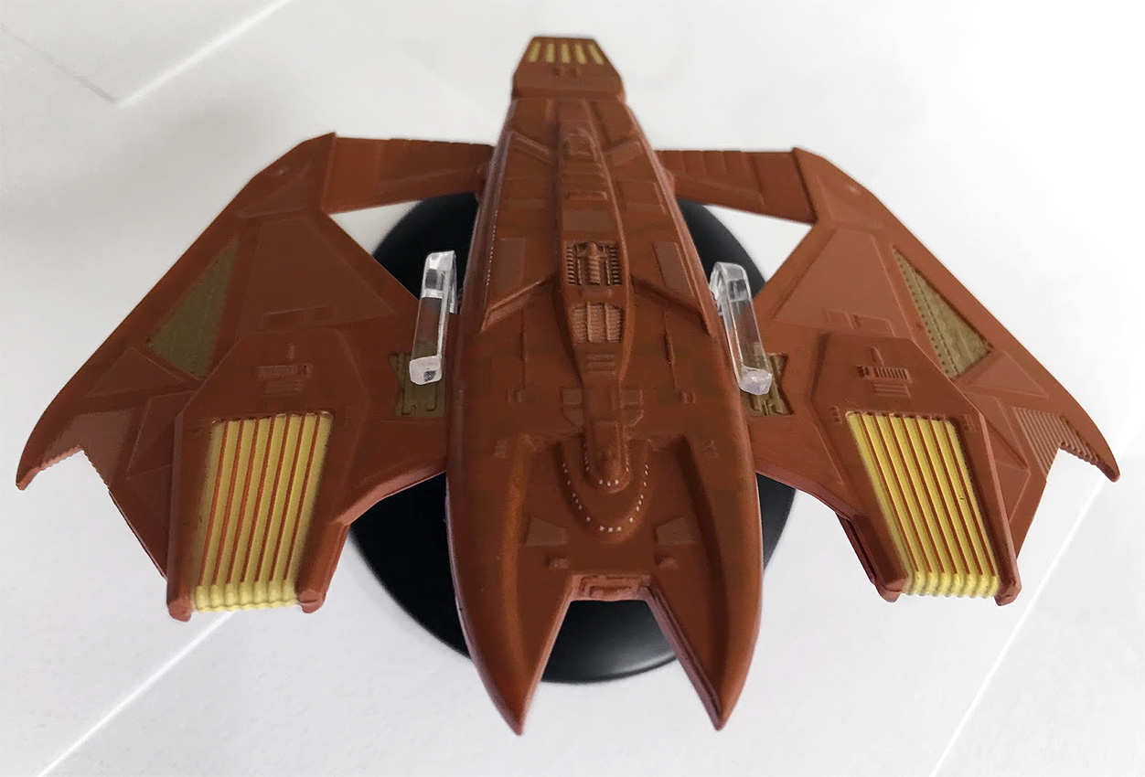
As for detail on the flipside, it is a virtual mirror of the top when it comes to the wings and the mechanical beige panelling sectioned out on both sides. The warp engine field grilles do have some slight variation, with yellow highlights, but are otherwise unchanged. Look closely, and you’ll spot that those beige sections are exactly identical to those on the topside.

Into the centre of the hull: as with above, there is more window detail around the central section indicating the overall size of the Vidiian ship. It is perhaps less complex than the more often seen upper section, yet we still have the evidence of panel detail, along with another yellow recessed section which I can only assume is the navigational deflector. It would make more sense for this to be it although it could be an intake of some form.

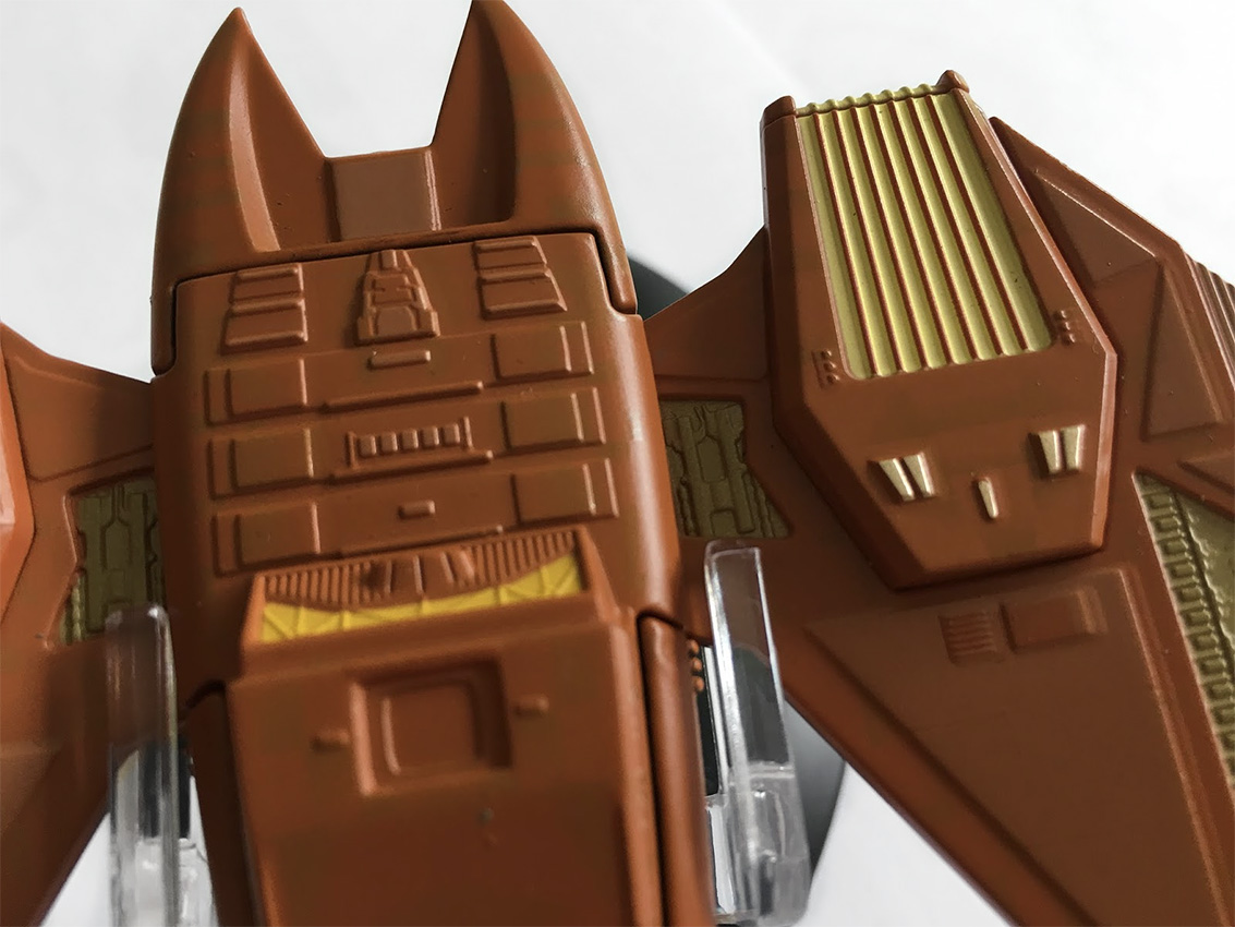
As for the join lines here, it’s a bit obvious with quite large gaps at the edges of the plastic and metal sections. Interestingly, the plastic bottom isn’t just a flat piece as it cuts around the tips of warp engine field grilles on the wings, as well as around some of the lower hull detail. In fact, it seems on inspection that the two lower halves of the grilles are actually separate pieces to the wings.

When you’re displaying this on its included stand, ignore the positioning suggested by the magazine, and go for the clip position as in the above pics. Going with the magazine position clips around the thinner wing sections, and isn’t very stable, while clipping to the central body gives a much firmer grip and stability.

The magazine recants the numerous encounters with the Vidiians during Voyager‘s early seasons. We get a good mix of images of CG ships, stills from episodes, plus a few of the Vidiians themselves thrown in. The plan views do show off the hull-wide aztecing a lot more than the model, and make the contrasting panels a lot more distinct than on the diecast item.

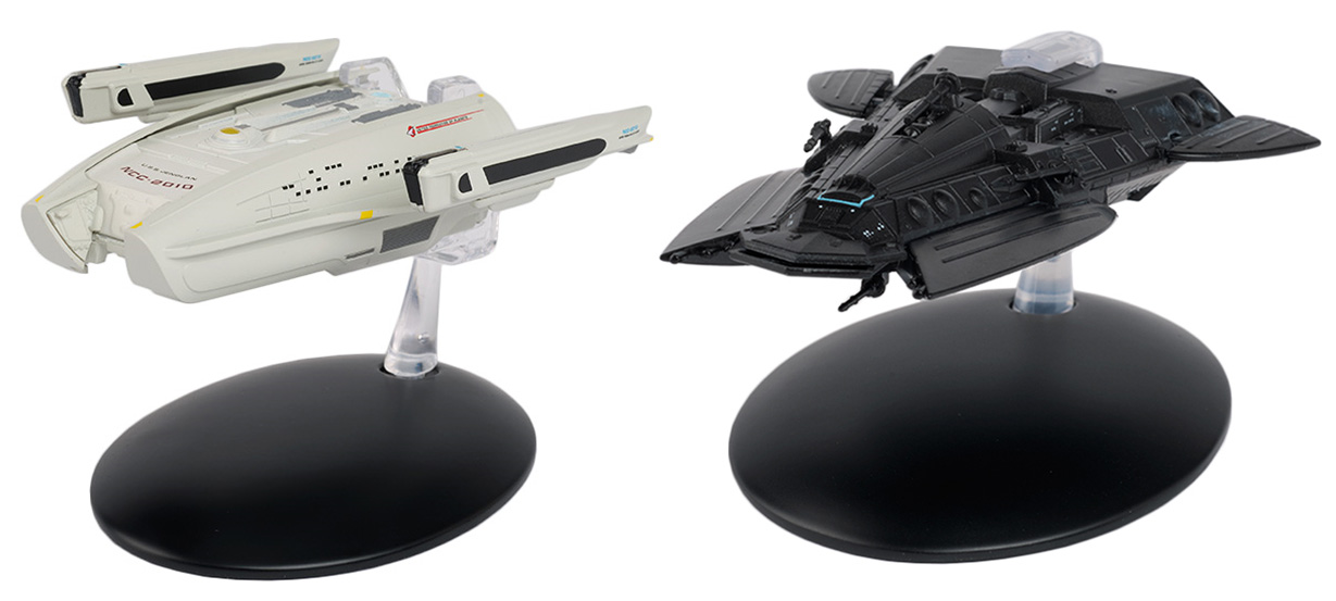
For my next review, I’ll be taking a look at a couple of Next Generation ships, and one I have waited for since day one: Scotty’s downed passenger ship, the USS Jenolan, from “Relics.” Paired with this Federation transport is the Smuggler’s Ship from “Unification.”

In the meantime, you can pick up the Klingon D5 class and the Vidiian Warship at Eaglemoss’ shop to add to your own alien fleet!

In Eaglemoss’ US store, TrekCore readers can use promo code TREKCORE at checkout for 10% off any ‘Star Trek’ collectible purchase $50 or greater (Starships, Plaques, Binders, Graphic Novels).

REVIEW: Roddenberry ‘Isolinear Circuits’ Prop Replica

After the release earlier this year of their Picard Desk Crystal replica, December’s new Picard Isolinear Circuits are the second item in Roddenberry’s “Picard Desk Set” line of screen-accurate prop recreation from Star Trek: The Next Generation.

These isolinear circuits first made their appearance on Captain Picard’s ready room desk in Season 2’s “Where Silence Has Lease,” when they replace a set of different, larger isolinear circuits seen throughout Season 1. These curios would be a familiar object of Picard’s fascination up until their destruction, along with the rest of the Enterprise-D, in Star Trek: Generations.

As with other items in Roddenberry’s prop replica line, the isolinear circuits and their base come in a sturdy, custom-designed box that keeps them snug and scratch free during transit. Multiple foam rubber inserts separate the three pieces from one another, and getting everything out of the box feels like a special, almost ceremonial, event. Also included in the box is a certificate of authenticity printed on a small, gold-embossed card.

Roddenberry prides itself on the screen-accuracy of their prop replicas, and the isolinear circuits and their stand are no exception. Two unexpected results of this accuracy immediately stand out: the color of the circuits, and the material they’re made from. As noted by Roddenberry on the product page, the isolinear circuits are bright pink.

This may come as a surprise given that they tended to photograph as bright orange. Walking around with the circuits and viewing them in different lighting conditions and against a variety of backgrounds, I found that the circuits most often looked closer to the expected orange-pink, not the “pure” pink that I first saw when taking them out of the black box.

The second noticeable thing is the material the circuits and base are made from: acrylic plastic.

Despite knowing that the original props were made of acrylic, and despite having a collection of other acrylic isolinear chips and circuits, I can’t help but think that the acrylic nature of these isolinear circuits is a little disappointing; their light weight and the telltale plasticky clack of the two circuits bumping up against one another breaks the illusion that these are pieces of sophisticated technological equipment.

This is not to say that Roddenberry’s isolinear circuits are cheaply made; they just suffer from a common issue among authentic Star Trek prop replicas: the original props on which they are based are limited by production budget, and are designed to provide maximum visual impact when filmed on a professionally lit set.

Whether the prop feels in one’s hand like it can really do what it’s supposed to isn’t important, it’s whether the prop looks like it can do what it’s supposed to. The isolinear circuits on Picard’s desk look like they can be plugged into the Enterprise-D’s computer somewhere, and so do the Roddenberry replicas.

If the circuits had been made of glass (or transparent aluminum!), they may have been more satisfying to play around with, but they wouldn’t be screen accurate – and considering the price point, it’s worthwhile to ask yourself whether you’re more interested in accuracy or heft.

(I tried installing the isolinear circuits in my own computer but nothing happened; I guess they’re not compatible with 21st century technology. Oh well.)

Overall, the Roddenberry isolinear circuits are quite nice — and I’m happy to add them to my collection, and after displaying them in my home for a few days I’ve come to really like how they look.

I recommend placing the circuits on their base somewhere that they’ll catch and reflect light; from across a room they’re very striking.

This replica is the second of a three-part “Picard Desk Set” after last year’s crystal replica, so should we expect to see a Roddenberry-produced desk monitor next year? It would be the logical choice, but its size will certainly come with an increased price – but it may just be worth it.

Roddenberry’s Picard Isolinear Circuits Prop Replica set is available for sale now at their web store for $149 — and we’ll bring you news on their next replica once announced.