Home Blog Page 215

New STAR TREK: DISCOVERY Cast Photos, Episode Images

It’s what people have been asking for for some time – finally, CBS has released the first official cast/character portrait photos of the new Star Trek: Discovery crew!

Arriving online from the studio today, this first (and likely not final) wave of cast shots feature several human and alien members of the series cast.

In addition to these stunning new cast shots, there’s also a handful of new episodic promotional photos arriving, from deeper into Discovery‘s first season.

As soon as we’ve got larger versions of each of these new photos, look for them to be added to our ever-growing Star Trek: Discovery image gallery!

More DISCOVERY Footage Revealed In Today’s New Promo

As we continue to count down the days until Star Trek: Discovery premieres – nearly two long years since its original announcement in November 2015 – CBS has released yet another new thirty-second promotional video for the series, with some brand new footage included.

https://www.instagram.com/p/BYqvx2lgoNu/

Included is an expanded bit of material from Michael Burnam’s (Sonequa Martin-Green) spacewalk, from her emergence and launch from the hull of the USS Shenzhou

…and her time floating about the Klingon obelisk vessel parked near the binary star pairing seen so often in these promos.

Back inside the ship, we also get a shot of the binary cluster from the Shenzhou viewscreen; note the navigator seen in previous shots of the bridge.

Flashing back to the show’s visit to the desert planet, see Captain Georgiou (Michelle Yeoh) using her Starfleet phaser rifle – with golden beam – towards something below her:

We also get to see some more from inside the USS Discovery, with Captain Lorca (Jason Isaacs) on the bridge — with Saru (Doug Jones):

…cadet Sylvia Tilly (Mary Wiseman) expressing her excitement over their current mission…

…and Lorca speaking to what appears to be a yet-unnamed Starfleet captain; note the rank stripes across the woman’s shoulders.

With the expected time jump between Burnham’s time on the Shenzhou and Discovery, we don’t see this as the commander of the ill-fated USS Europa, seen destroyed in prior trailer’s during Georgiou’s time in command of that ship – so we’re not sure what ship she might be captain of quite yet.

Finally, this new preview gives Lorca a bit of action, as the Discovery captain is seen sliding across a dark corridor wielding a phaser rifle of his own:

It’s not clear who – or what – he’s aiming at, but wearing that tactical vest you can be sure Lorca means business.

Check back often for more Star Trek: Discovery news!

Beam Down in Style With This Homemade Spock Helmet!

There sure was plenty of unique and captivating Star Trek cosplay at last month’s Las Vegas convention, from Star Trek: The Animated Series characters to barely-seen Starfleet officers from Star Trek: Discovery.

Perhaps the most creative and surprising costume choice, however, came in the form of Nick Duguid’s recreation of the infamous “Spock Helmet” from the 1970’s, who debuted his creation at the Tuesday night pre-convention “Landing Party” event and kicked off the week’s festivities with style.

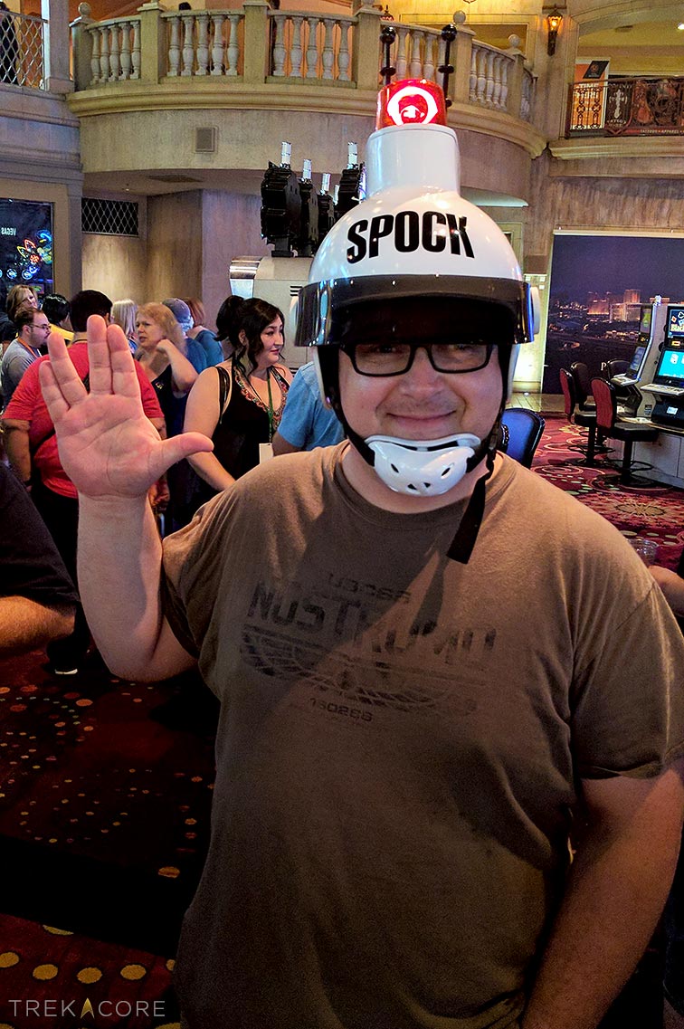
Luckily for all of us, Nick documented his build process – and he’s shared his construction story with TrekCore for all to enjoy.

*   *   *

by Nick Duguid

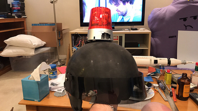
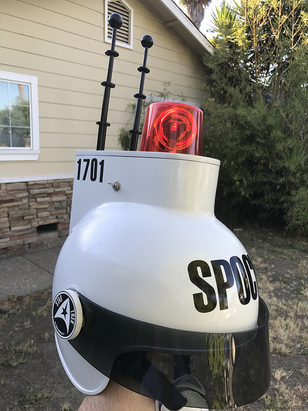
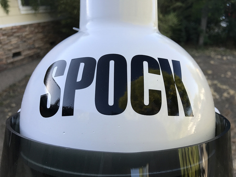
What I’ve made isn’t a prop or costume from any Star Trek show, movie, or video game, but rather it’s a reproduction of one of the most atrocious abuses of licensing that has ever occurred: I’m talking about the Spock Helmet!

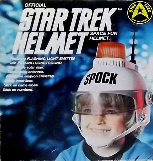
Officially, it was “The Official Star Trek Helmet,” a children’s toy released in the mid 70’s by AHI. By the mid 1970’s, the original Star Trek show had run its course and was in reruns.

In an effort to squeeze some more money out of it (before they saw Star Wars and decided to make movies), Paramount licensed out the Star Trek name to a lot of different toy companies. Most of those toy companies turned around and made toys that had something to do with the show.

Action figures, costumes, playsets, and more — AHI decided that they could just slap the Star Trek brand on whatever they already made, including a really stupid looking white helmet with a blinking light on top.

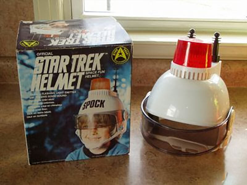
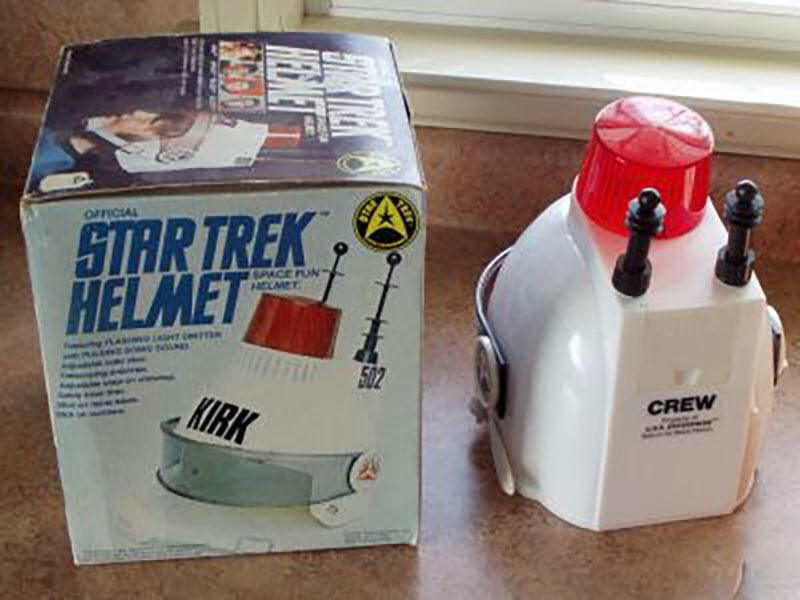
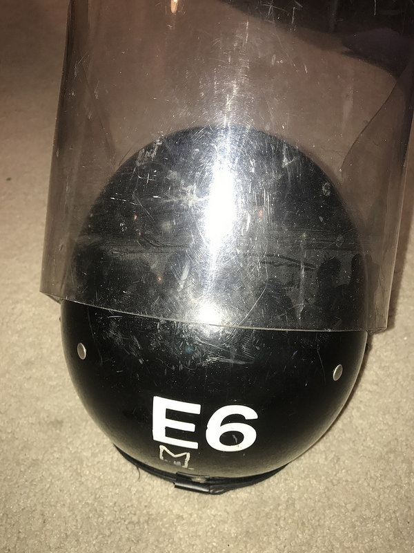
It has nothing to do with the show; it was never worn by any cast member. It was just a cheap kids toy. While fans at large may know it as the Spock Helmet — due largely to the original packaging image taking on life as a bit of a meme in the Star Trek crowd — in reality the helmet came with a number of different decals so you could label it as you liked.

I have a friend with a helmet he labeled SCOTT, because everyone knows engineers are the coolest.

So, for my part, I work as part of the Star Trek Online development team, and attend the big Star Trek convention in Las Vegas every year. I was talking with a friend about the helmet one day, and an image popped into my head of someone walking the halls at STLV, wearing the helmet, and how funny that would be.

The problem, though, is that the original item meant for child-sized heads, are less-than-durable, 1970’s kids toy quality, and frankly are nearly impossible to find — often selling for $400 or more in the rare instances they do go up for sale.

So I decided to make one.

I don’t have any prop making experience, really; I built plastic models as a kid, and I do some woodworking and minor electronics stuff. I have worked with acrylic and styrene before, but no hand crafting much.

To make matters worse, I didn’t think about making this helmet until less than a month before STLV. So this was all a bit of an adventure.

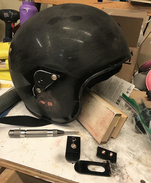
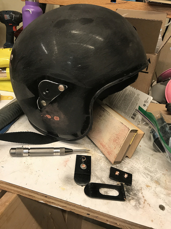
The first step was to find a helmet to base it off of. The original kind of looks like a police helmet, and I figured if I could find a riot helmet with the face shield, I could use it to form the visor, and use the mounting points for that. I have a big head, and ordering a random helmet online is a crap shoot — so I bought one off eBay labeled “Large,” for about $30.

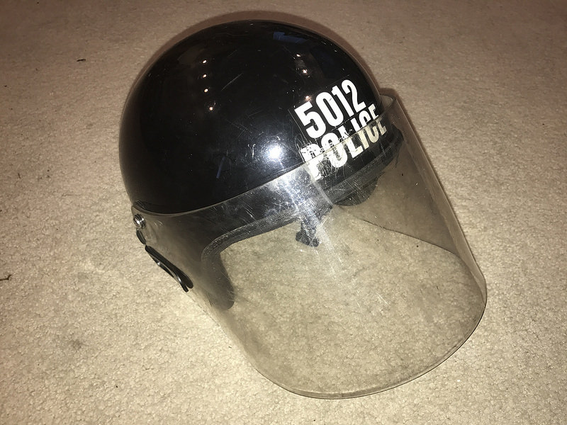
The helmet showed up on July 14th, and STLV started on August 1st, so I had just about two weeks to turn this thing around, and with a fair number of tools, but only questionable skills. Magically, when it arrived, it fit my head quite well.

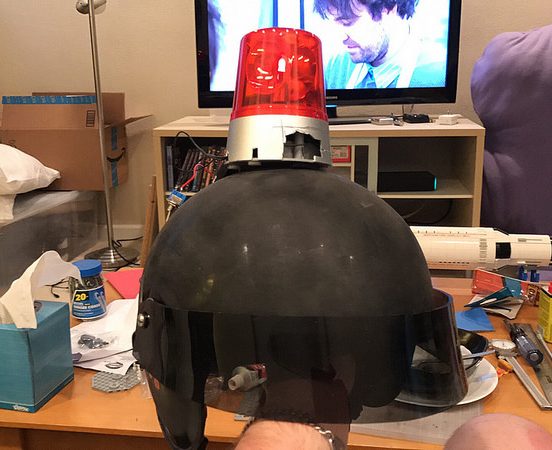
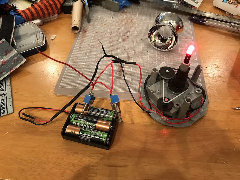
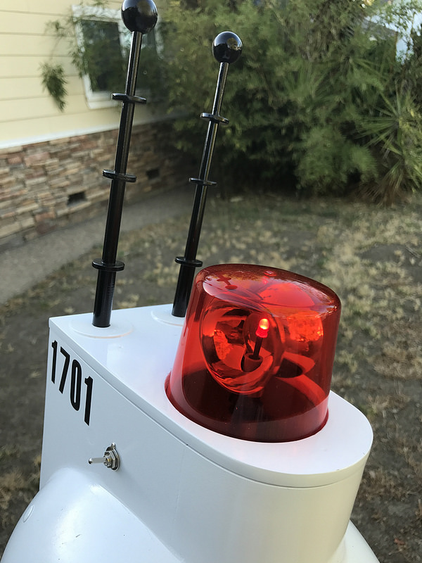
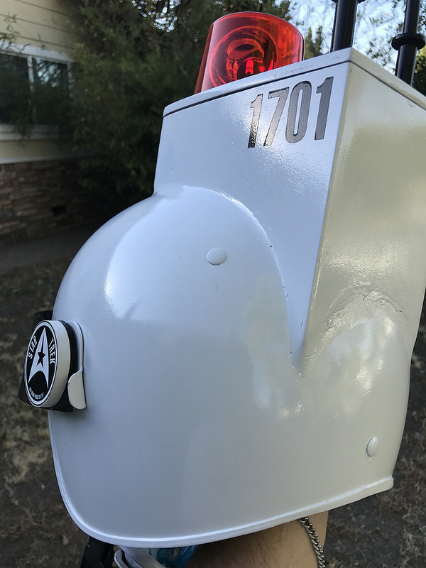
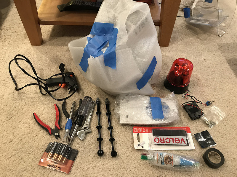
I quickly ordered up a spinning emergency light off Amazon, along with some toggle switches. The original had one of those little black sliding switches, but I wanted something easier to locate and flick with it already on my head.

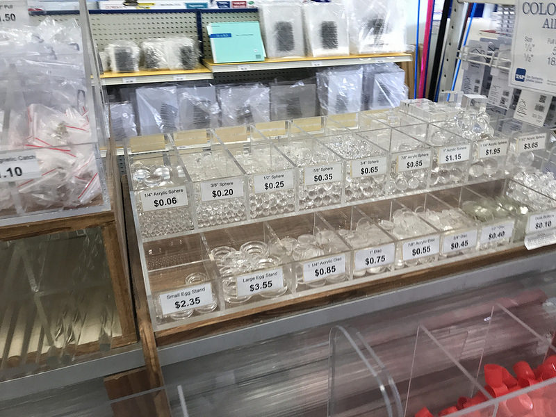
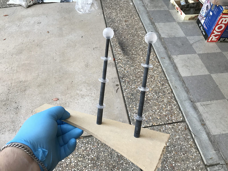
I headed off to Tap Plastics, a local plastics store I adore. There I bought a sheet of smoked 1/8″ acrylic, and a sheet of 1/16″ white styrene. I think they were both in the 2′-3′ square/rectangle range. I also grabbed some nesting tubes that appeared to be roughly the right diameters for the antenna, and some 3/4″ acrylic discs and balls for the antennas.

I then set to prepping the helmet itself. The brackets for the face shield were exactly what I wanted, but it also had these little plastic clips below that to hold the face shield down. They were riveted to the helmet. So I started drilling them out.

I didn’t realize it on the first one, but rather than drilling the rivet, the rivet was just spinning in place, and got hot enough to melt the surrounding plastic. It also burned off a little patch of my fingerprint.

Anyway, I got them off, and then filled the holes with some of that red Bondo Spot Putty, which would soon become my best friend.

The police light arrived and was just what I needed, but I wanted to wire it for an external switch and external battery so I could change out the batteries more easily.

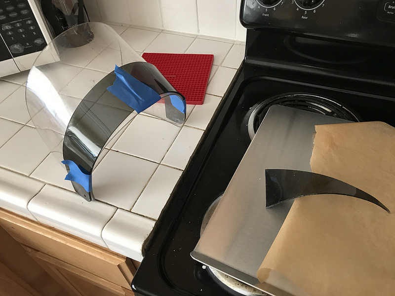
I failed to get any photos of the process, but I started working on the visor. I first covered the original face shield in a couple layers of blue painter’s tape. Then I drew out the shape I wanted the visor to be on that, and cut off the excess tape.

I marked where the mounting holes were, and then peeled the tape mask off, and stuck it onto a piece of 1/4″ hardboard. I used my band saw and belt sander to cut and shape that down to the shape of the tape, and then cut out a couple of blanks of the smoked acrylic for the visor.

I mounted a blank to the hardboard using more painter’s tape and superglue, rough cut it on the bandsaw, and then used a pattern cutting bit in my router to cut it down to shape. It made a mess, and all of the chips were staticky (and I’m still finding them places!), but then I sanded down all the edges afterwards.

I’ve only ever bent acrylic using a heat gun to make right angles, so I looked up some instructional videos on YouTube, and it sounded like my oven was the place. I did a test piece from one of the offcuts. Worked great. So I put the real one in the oven, and then used the original face shield as my mold, and some more tape to hold it on until it cooled.

Worked like a charm!

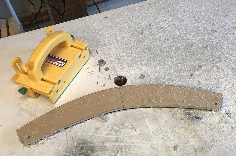
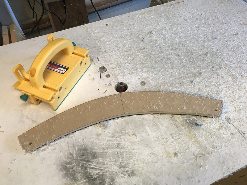
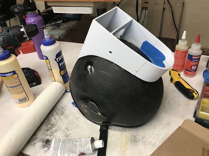
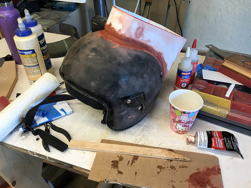
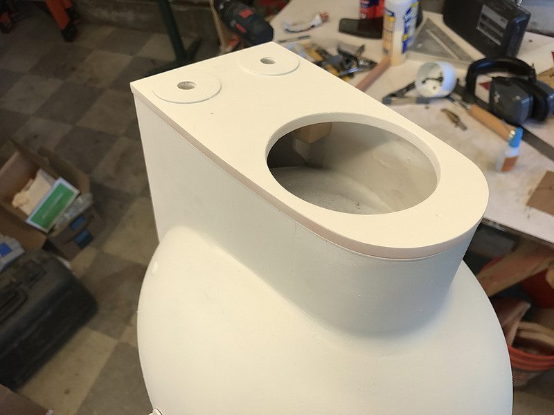
Next up was forming the superstructure. Again, I’m skipping some photos, but I marked some parallel lines, 4″ apart on the helmet, and then used cardboard to figure out the curve (roughly). Then used that cardboard to pattern the styrene. I didn’t think the 1/16″ styrene would be sturdy enough, so I doubled it up.

The side panels that have the curve to meet the helmet were glued up with a 1/16″ inset at the rear, and a 3/8″ overhang at the front. The rear rabbet would be used to give me some more glue surface for the rear panel, and the front is so I could mount and bend the curved part at the front.

Once I had the side panels, I made up the back panel and a center support just behind the switch hole, so I could glue those all up as a box using CA. Then once that was done, I cut out some strips for the front, one 3/4″ longer than the other. Unlike the sides and back, I didn’t want to laminate them before putting them in place.

I used a jar I have that was about the same diameter as the light, and my heat gun to bend the two pieces into shape. Then I glued them in place, and to each other. You can never have enough clamps.

After that cured, I placed it on the helmet, and used some epoxy to tack it into place.

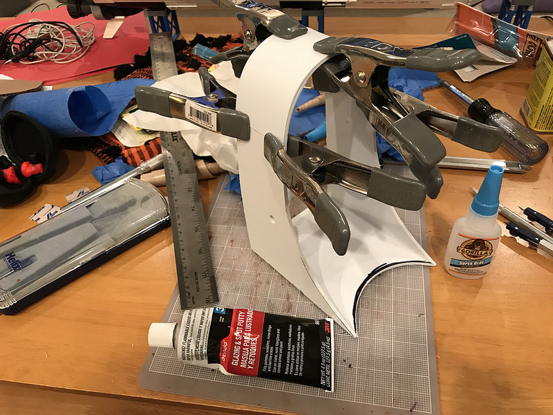
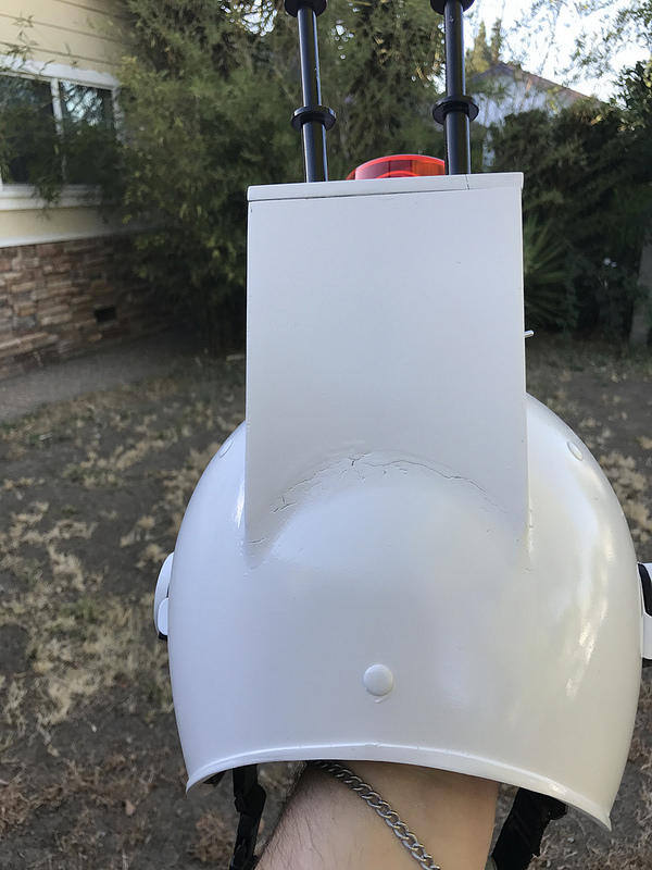
Then we start with my old friend, Bondo. Again, I’m new to this, and so I only had an inkling of what I was doing. It didn’t have to be perfect, it’s a joke of a prop, and as long as it was recognizable, I was going to be happy. My Styrene superstructure still had some sizable gaps around the base, so I slathered it up, putting more on than is reasonable, figuring I’ll just sand off what I don’t want/need once it’s dry.

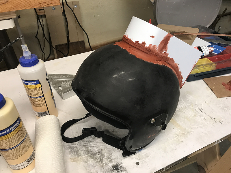
Dried and sanded, obviously it cracked because there was so much of it trying to fill too big of a hole in too short order. Again, I’m on a pretty strict deadline, so whatever. I’ll just smear more on and keep going with it.

While the Bondo was cracked and imperfect, I wanted to stabilize the top a bit, so I poured in a puddle of epoxy into the front and back, backing up the Bondo, and holding the superstructure in place for more Bondo/sanding/etc. In this photo you can see that my front curve bending wasn’t perfect. Luckily it wasn’t apparent in the end product.

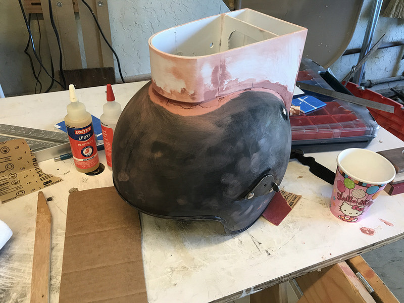
Superstructure now firmly in place. . . more Bondo.

At this point I’m also doing electronics stuff elsewhere, and it’s obvious that having everything being removable (for shipping), and also just accessible for repair, was key. So I had to reconsider my original plan of sealing it all up.

I decided that since the top was flat, it was reasonable to make up a cap piece that could just be held on with neodymium magnets. That way it’s easily accessible, but still strong enough not to go anywhere. The only thing the top has to hold up are the antennae. So I ordered some magnets from Amazon, and OF COURSE, they get lost in the mail.

So I checked online, and my local Home Depot supposedly has some in stock. I drive over, and find this.

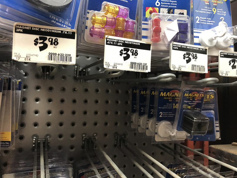
I check three more stores, all of which claim to have them in stock, and they’re all out. Eventually I find some neo magnets that I think will work, even though they weren’t quite what I was originally thinking of.

So I made some little blocks of MDF and mounted them in four spots around the helmet.

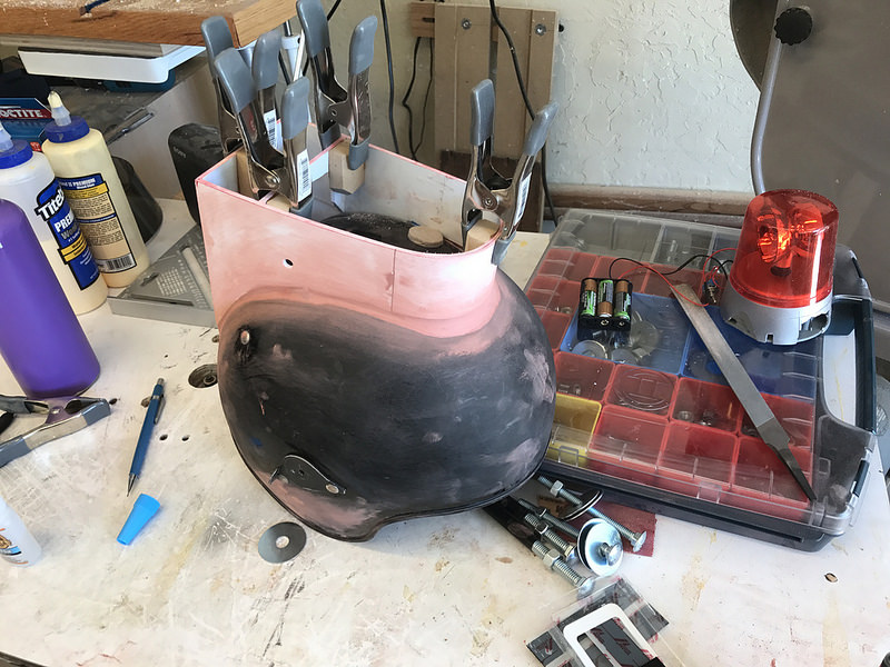
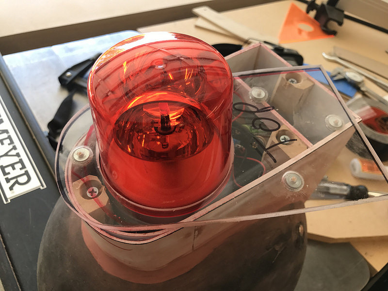
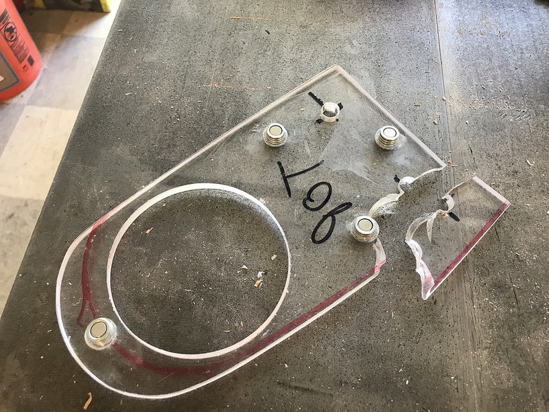
I cut a blank out of some 1/4″ acrylic I had laying around, marked a rough outline, and then drilled a 3 1/8″ hole for the light. Hindsight being what it is, I shouldn’t have used acrylic, but I had it around, it was thick enough, and fairly sturdy, and being transparent would make it easier to drill and mount the magnets.

Reinstalled the light using Velcro, and then placed the top piece in position. I taped it on so it stayed in one spot, and then used a narrow drill bit to drill through both the top and the four mounting blocks, so they were all aligned. Then I used a 1/2″ drill bit to recess into the acrylic a bit, and then epoxied the four magnets into position. (The top is still a big rectangle at this point.)

Once the magnets were in, I drilled out and added some small screws to the four blocks so that the magnets have something to grip. This is where I figured out that I should have used something more solid. The MDF split as I screwed them in. I glued it back together, and then used a smaller screw for the four blocks.

Worked out in the end, but I should have used a stack of plywood, or even some chunks of plastic. Whatever, it worked, right? Once mounted, I marked and cut around the top on the band saw, and then shaped it using my belt sander, and eventually hand sanding.

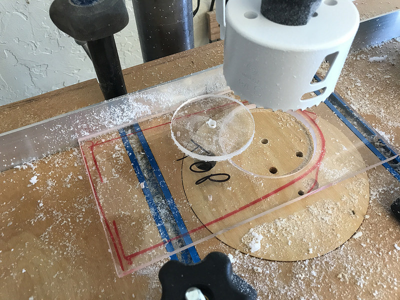
Next up, I had to drill the 3/8″ holes for the bolts that would hold the antennae in place. Again, I shouldn’t have used acrylic, but I did. I’ve drilled acrylic plenty of times, and as long as you go slow, and scrape, it works fine. First hole worked great. Second hole, not so much. The drilling went fine, but when the bit broke through, the piece climbed up the bit, and that’s when it broke.

Luckily it glued back up pretty well. I was going to use some big 3/8″ fender washers under the antennae anyway, so I used them and some 3/8″ bolts to hold everything together while it set. Ended up just gluing the fender washers to the top to help reinforce the holes, and that worked fine.

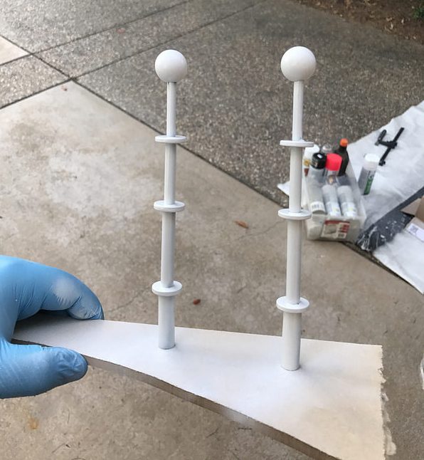
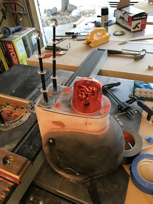
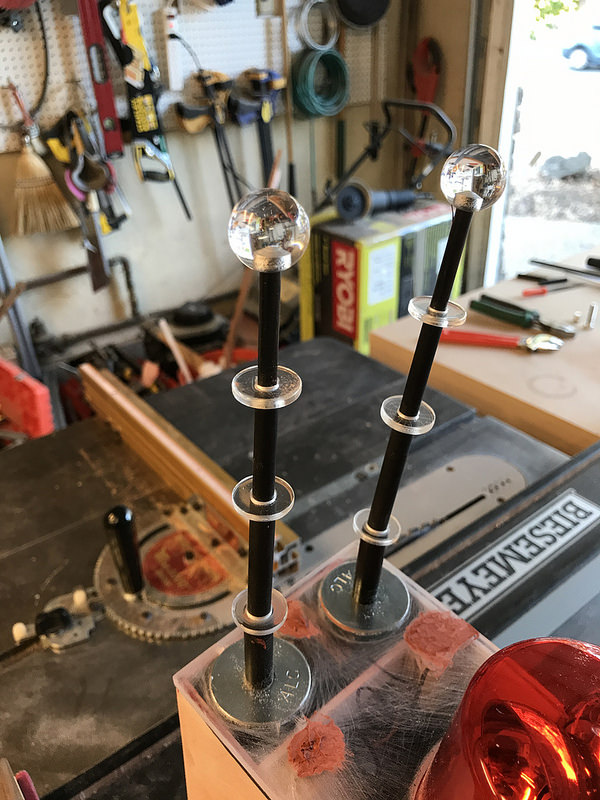
At this point, the bulk of the helmet is together, and I need to think about those antennae. I drilled some appropriately-sized holes in the acrylic discs, and the balls for the tops.

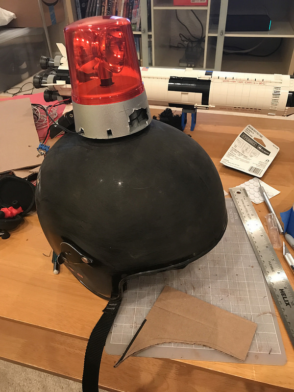
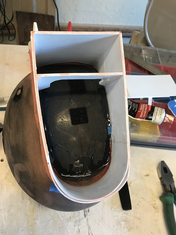
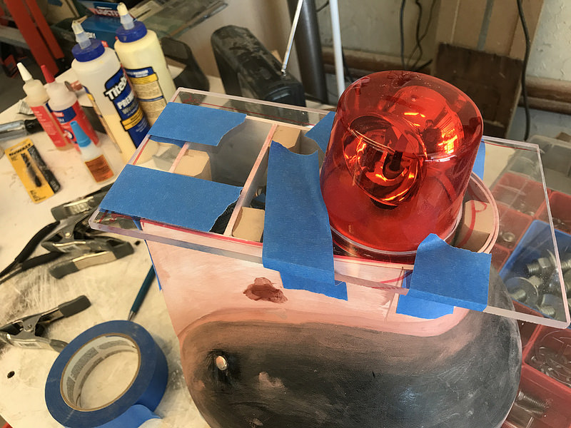
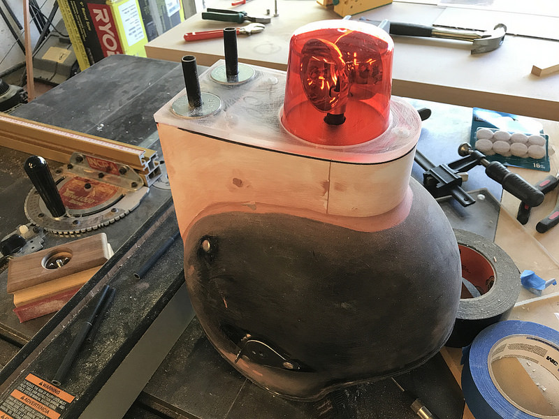
Here’s a dry fit. (Also featured: more Bondo for the holes in the top, and the original switch hole as I decided to move the switch forward a bit.)

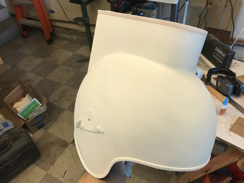
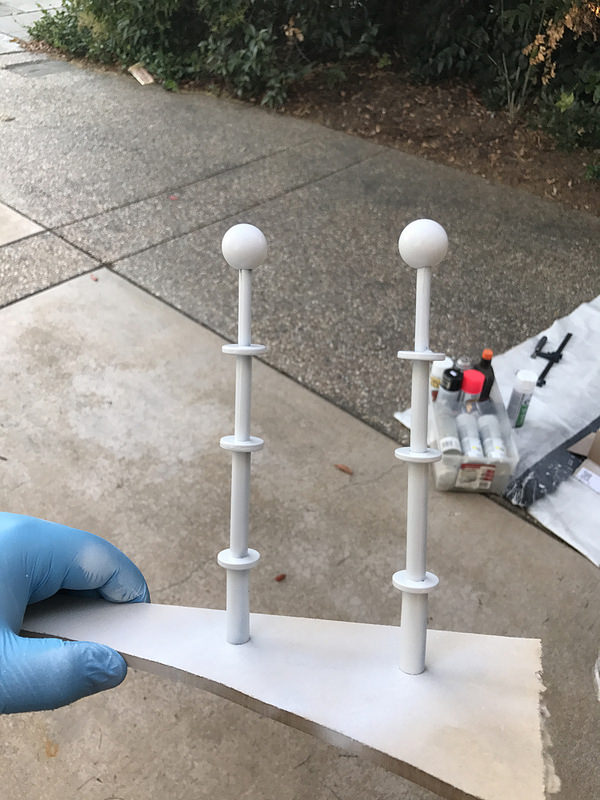
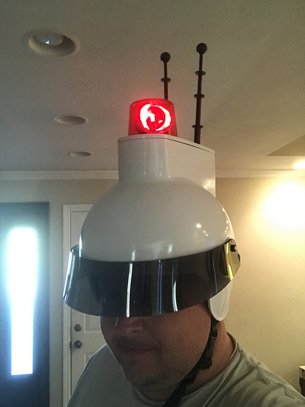
And with that, it’s time to paint. A couple of coats of whatever primer I had on hand, with a light sanding between, and then a few of coats of some high gloss white I also had left over from a drill press I rebuilt last year.

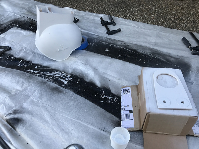
The Bondo in the back was still cracked, but I didn’t have time to mess with it.

Luckily, the front looked pretty good.

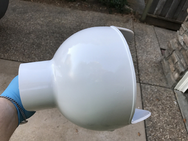
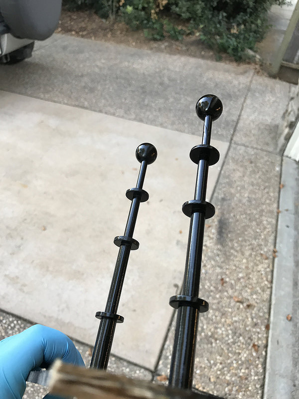
Time for the antennae. They got glued up with some epoxy. Each segment is inserted about 1″ into the one below it. The bottom segment is a little smaller than 3/8″ so I tapped them, and epoxied some 3/8″ bolts inside, and then cut the heads off of them.

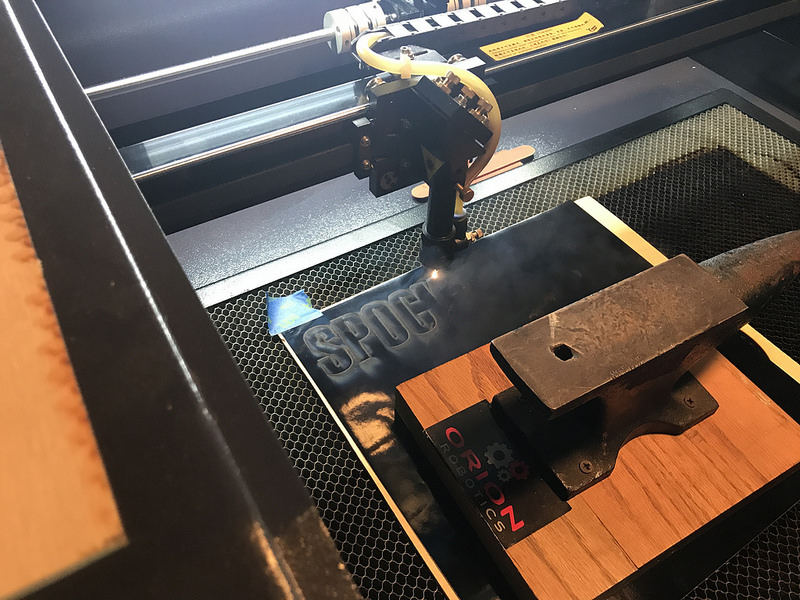
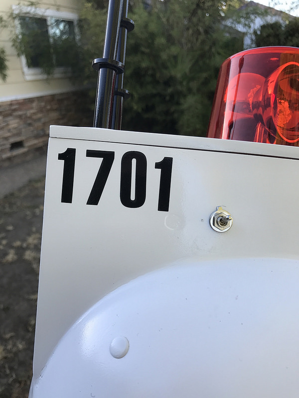
Next step was to think about the labeling. I ordered a couple of packs of adhesive 2″ vinyl letters, but nothing I could find was the right font. My local Michaels has a ton, but they’re all very whimsical. Luckily I have a friend with a laser cutter…

The original helmet made a really obnoxious siren noise, and at this point, as everything is coming together, I start getting notions of making up a little siren circuit to go with my spinner light. I didn’t want to annoy myself though, so I rewired the light with a second switch in line, so I could potentially turn off the siren.

In the end, I ran out of time and didn’t get the siren made, so I removed the second switch. Maybe someday.

Coming together…

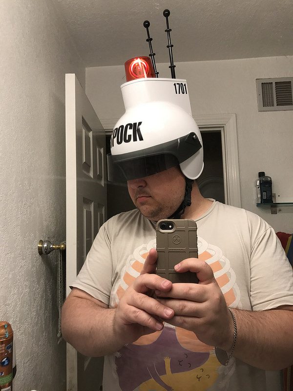
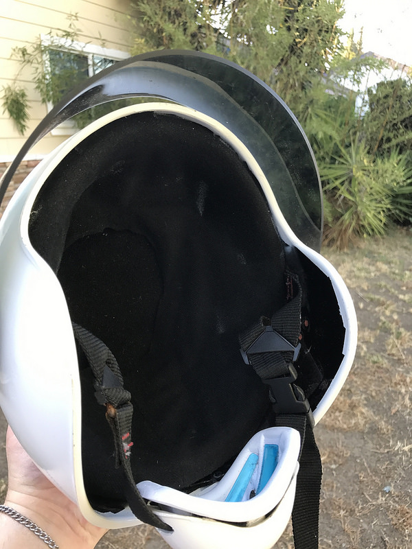
Down to the details now. I didn’t take any photos of it, but the chin strap was kind of a key element. I bought a chin strap/cup off amazon, but it was textured weirdly and had WILSON embossed on the bottom. I ended up going and getting a second one, a smooth American Flag covered chin strap, from a local sports store.

Initially, I had thought of replacing the actual helmet’s strap somehow, but that didn’t seem like a great plan once I got down to it. The original strap is riveted in, and those are the same rivets that hold the visor mounting plates. So I left it, and ended up just cutting wider slots in the chin cup, and slipping that over the real strap. Oh, and I painted over the American flag – forgive me, America!

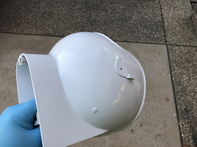
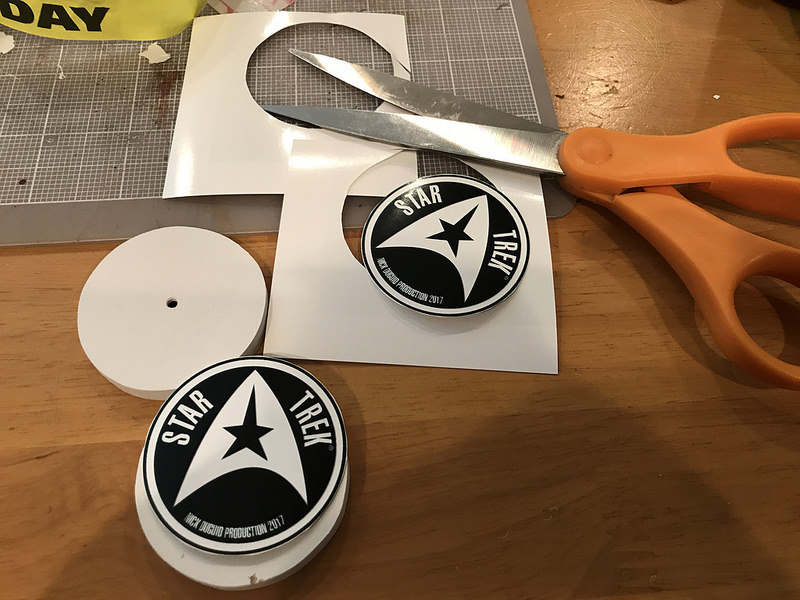
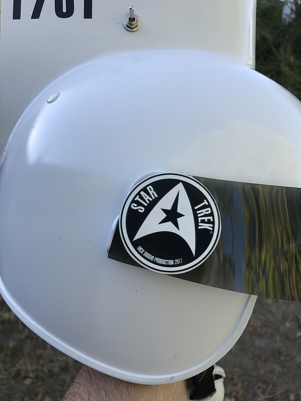
The original had these little Star Trek emblems on the sides of the visor, covering the pivot points. My visor didn’t pivot from the middle, so I made up some rounds out of the left over styrene, 3 layers thick. The bottom two layers had a 1″ hole drilled through them, so that the whole thing would fit over the mounting screws.

I drew up the emblem in Photoshop and then printed it out on high-gloss photo paper.
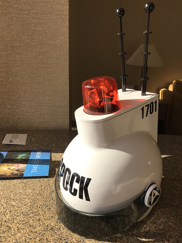
And there we are.

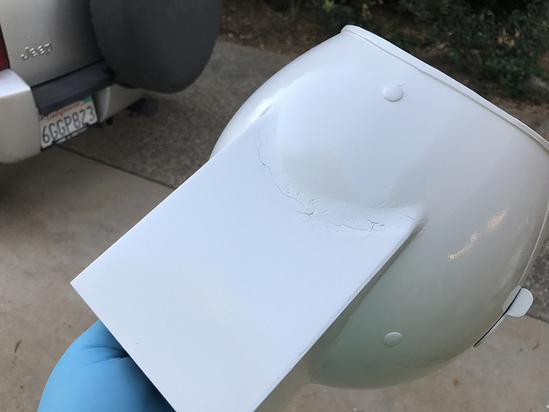
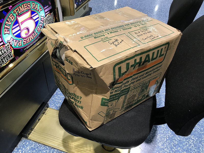
With the helmet done, I had to figure out how to get it to Las Vegas. It’s bulky, and wearing it on the plane didn’t seem like the best plan — I’m not sure what the TSA might think! — so I took a risk and boxed it all up and checked it as luggage.

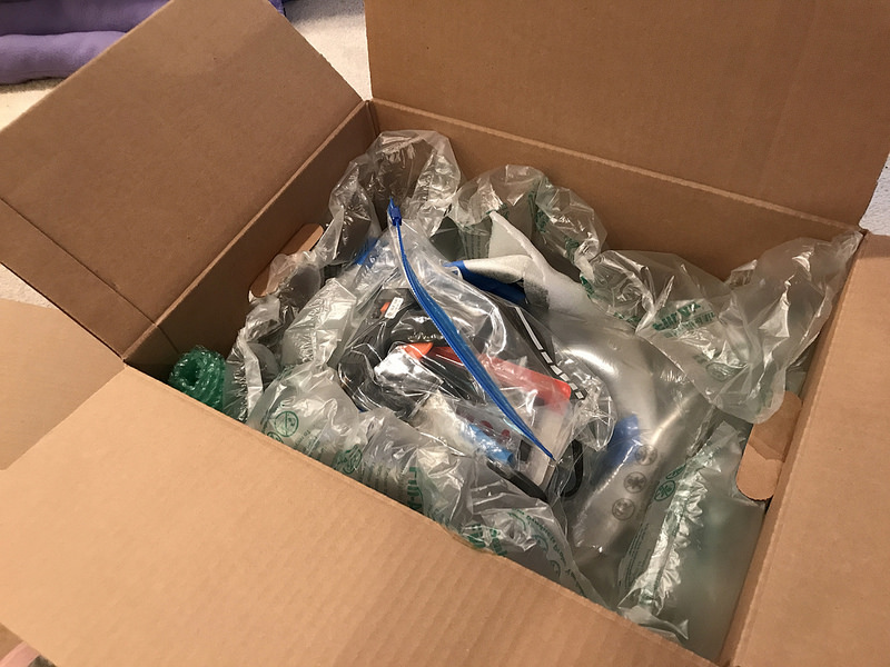
Lesson learned: checking a box as baggage isn’t a great plan. If I had had more time, I would have shipped it, but it was finished just a couple days before the con. The guy at the Southwest desk said that they could guarantee it would get there, but couldn’t guarantee it’s would be undamaged.

He was accurate in his promise.

Luckily I’d packed the helmet well enough that nothing was damaged inside. And in the end, nothing broke, and the only tool I needed was the adjustable wrench to tighten down the antennae.

The first day of the convention arrived, and I went in hoping that at least a few people would recognize it — the helmet is a deep cut, no doubt — and I was just praying that I wouldn’t end up getting blank stares all weekend.

Suffice it to say, that was not the case – and many people wanted to try it on! Here’s Avery, Holly, John, and (another) John strutting all ready to beam down for a dangerous away mission.

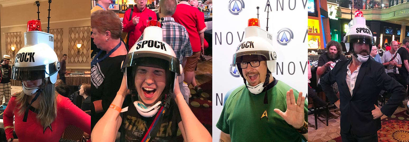
There was barely anything more to my costume other than the helmet. I wore a blue TOS-era Starfleet sciences top, because it seemed appropriate to the kid in the original photo, but that’s it.

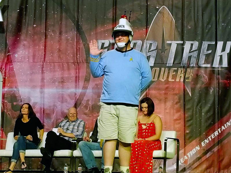
Despite this, I had numerous people tell me I should enter the costume contest — and I made it to the second round, and got to strut my stuff on the big stage in front of judges Terry Farrell, Michael Westmore, Neville Page, and Mary Chieffo behind me.

In the end it was a ton of fun, and well worth the rush job to get it there for STLV this year. It’s not a perfect reproduction. Its proportions are off, and there are some details wrong. But it was recognizable enough that I had a lot of people get excited when they realized exactly what it was, and many of them thought it was the original.

There were plenty who didn’t know what it was, but even of those, there were a lot of them who were excited to see it and learn the history of the Spock Helmet.

Nick Duguid is a senior environment artist for Star Trek Online.
You can follow him on Twitter at @tumerboy.
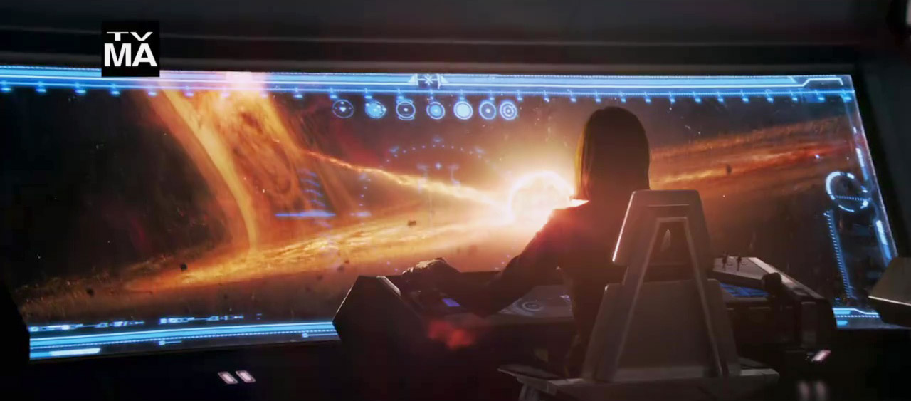
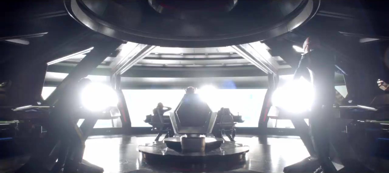
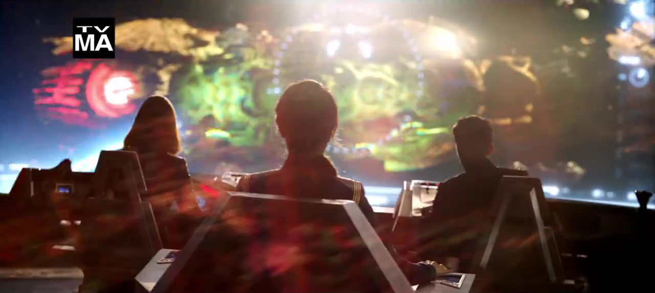
Recap: Fan Expo Canada’s DISCOVERY Production Panel

Saturday was a big day for a group of lucky fans who made it to Fan Expo Canada, as Star Trek: Discovery art director Matt Middleton and members of his team journeyed to the Metro Toronto Convention Center to share some exclusive insights into the design of the series.

While fans in the panel audience got to see a number of new concept illustrations, digital models, and photographs of the upcoming show’s sets and prop design, there were no photos or video footage permitted – so unless you were there, it may be a while until any of those new images get to the rest of us.

Matt Middleton, Art Director / Set Designer:

We ask that there be no photography during this portion and for the remainder; any images that we put up are for the benefit of your eyes, and not to be shared with the internet. September 24 is coming soon – be patient. We’ll be releasing these videos to the web and to some of our [distribution] partners.

Todd Cherniawsky, Production Designer:

You’re kind of a privileged group of people to be in this room, and you have to take that to heart. Leaks very, very much hurt the show, so take this as a special occasion for you to be a select group of people to see stuff that other people may not ever get a chance to see.

Though we don’t have new images to share — all the photos below are from previously-released promotion — we’ve sifted through the presentation to feature some of the best bits of new information shared by the Discovery creatives to give some additional insight towards the work that’s gone into the design of the series.

*   *   *

Production designer Todd Cherniawsky began by addressing the dedication of the the entire creative team involved in Discovery.

Cherniawsky: The first thing I want to say is that these endeavors take an incredible amount of people to mount, and an incredible amount of time. I think sometimes it’s very easy for the fan base to be very critical – and fairly critical – of the work we do.

But the one thing I want to enforce to this audience, and the entire Star Trek audience, is that for all of us here that have the chance to work on the show, this is very, very precious material to us. This is all part of our childhood; we’re all big fans.

So every decision that’s been made along the way has been really carefully thought out. But we appreciate criticism and concerns for the franchise – so hopefully we can shed some light on the process that takes a lot of time, a lot of resources, and a lot of very smart people.

John Eaves concept drawings of the USS Shenzhou. (STLV 2017)

It seemed to make sense to be as true to TOS as possible; that series was envisioned in the 60’s. We asked the [design] team to always that as our point of reference – what would the future look like in the 60’s? – but still, of course, utilizing all the great tools we have today.

I know that there’s been a lot of discussion about our show ships already, but please know that John Eaves and Scott Schneider who are our principle Federation ship designers — John Eaves has probably designed 70% of all the Star Trek television series fleet, so John knows these ships better all of us do.

We’re obviously trying to update things. Fabrication processes have changed so much since the 60’s, so we have to take those things into account. But all these ships again, were done by John Eaves, who is, essentially, the master of Federation designer and does beautiful work.

The USS Shenzhou’s bridge set.

We are always asked how accurate the exterior of our ships reflect the interior.

We go to great lengths to make sure the rooms fit inside the house. We obviously have to take cheats at times — one of the great classic examples is that you cannot fit the interior of the Millennium Falcon into the exterior of the Millennium Falcon! So there are times when we have to take artistic license, but it’s still most important [to work for] the story.

Reality and science are spring points, but remember, it is science fiction.

The Klingon sarcophagus ship set, under construction in late 2016.

As you may recall, Star Trek: Discovery is being filmed at the massive Pinewood Toronto Studios, in a 45,900-square-foot soundstage – the largest in North America – which also has nine acres of outdoor backlot space.

Supervising art director Mark Steel shares some insight into the huge undertaking a show of Discovery’s size and scope really is – and how much behind-the-scenes talent is involved in such a production.

Steel: I’m not going to try to go into details [of 50 years of Star Trek production], but a lot of the fundamental issues of bringing the creative vision of writers, directors, and production designers into the practical world of a TV series — on schedule — are more or less the same as fifty years ago.

But the big difference in terms of where we are now, compared to then, is that we have essentially episodic cinema that’s being produced now — and that brings with it a scale and challenge that pushes our design process into the realm of feature film. In our sets, in terms of detail and facility, are on par with major motion pictures now.

There are six stages in action right now, and what I want to point out about this is that my job, along with Matt Middletown, is to assemble a team of people to try to meet the demand of this scale.

What that means, is that in our modern television production, there are 7 art directors, more than 9 illustrators, more than 35 set designers, and more than 450 painters, carpenters, sculptors, model makers, welders, set dressers, prop builders — in shops in Toronto, Montreal, Calgary, and Los Angeles — all working together to bring us this volume of scenery to make the show.

Concept art of the Klingon sarcophagus ship. (San Diego Comic Con)

Art Director Matt Middleton also spent a great deal of time discussing the Klingon sarcophagus ship, which seems to be one of the primary vessels facing off against Federation forces in the opening episodes of the series.

Middleton: There were certain staging requirements for the [Klingon sarcophagus] ship — that it needed to have a cathedral-type presence to be a church, a ritual space, and a functioning bridge for the Klingon Empire.

The sources that the design team went to were feudal sources – so going back to Byzantine and medieval gothic and Islamic sources, to find references that would create a high level of sophisticated detail, for a race that had long been perceived as brutal, one-minded, and simplistic in order to breathe new life into the Klingon race and raise them to the worthy adversarial position that this new iteration of the series demands.

The Klingon sarcophagus ship, as it became known, [is] a flagship of sorts for the Klingons, [with] multiple levels, mezzanines, and focal points for dramatic staging of our Klingon leaders, orating to their followers, and creating dramatic spaces where power plays and shifts of power could occur.

[There are also] unparalleled views into the broader space so that we felt the space when we’re in the ship. You don’t just find yourself in a room with no windows and just interact with space on a viewscreen, we always want to maximize how much we feel the presence of space and our position within.

It’s a very large ship, massive, [but] this bridge [takes up] just a very small section of it, just the nose of the point of the head; the set itself is 40 feet tall, 100 feet long, and about 50 feet wide, with cantilevers, and lots of stairs and railings.

https://www.instagram.com/p/BSRhwjeD3ut/

Middleton also made several references to the 1984 Star Trek novel The Final Reflection, a seminal look into the Klingon Empire by author John M. Ford, a work that Discovery cast member Kenneth Mitchell (Kol) has also used in his character research – likely a suggested read from the show’s leadership team as a heavy influence on the series.

Middleton: We also sought not just to have fun with the architecture, but also the details that spoke to the history and culture of the Klingon race. As a touchstone, we looked to John Ford’s THE FINAL REFLECTION which was a work really used as a launching-off point for the Klingons by Bryan Fuller.

There is Klingon text on the steps [inside the ship], we have a lot of ritual torches and sarcophagi and glyphs, and other details. For example, [one section of] the Klingon text… was all carefully researched and taken from transcripts from THE FINAL REFLECTION, and we made sure that we had accurate Klingon translation.

This one, says [speaks Klingon to audience] which reads: “‘I will go now to Sto’vo’kor, but I promise one day I will return.’ Then Kahless pointed to a star in the sky and said, look for me there, in that point of light.”

Which is a big promise from Kahless!

This ancient phrase attributed to Kahless may be a clue to the purpose behind the Klingon Torchbearer we’ve now seen featured in multiple trailers – perhaps the key to “uniting the Klingon houses” is related to some kind of ‘return’ of Kahless the Unforgettable.

Klingon script carved into the floor of the sarcophagus ship’s central chamber.

Middleton: We always sought to ingrain these details into the actual set, and this adherence to detail and reverence for all things Klingon permeated our art department, and we had much delight in taking on the roles of the Klingons and thinking about how we can pay them the most honor.

This got into details like the game of Klin zha from THE FINAL REFLECTION, a game that warlords play against each other as a teaching game to teach military strategy… and bloodwine cups, which even have text on them — translated in this case to “May Your Blood Scream.”

The sarcophagus ship for us was an exercise in how can we make this even more intricate, more elaborate, and more worthy of Star Trek universe.

The Shenzhou bridge, located under the primary hull.

Set designer Matt Morgan has been helming all things Federation for the Shenzhou, the Discovery, and other Federation interiors set to appear in Discovery,

Morgan: One of the most unique things about [the Shenzhou’s] bridge is that it’s underslung on the bottom [of the ship], which presented some challenges for construction, that it’s built 12 feet off of the ground. It’s a challenge for the crew to work in, and it’s a massive set.

One of the main things for almost all of our sets is that they have integrated lighting. More than you can imagine.

Middleton: Integrated lighting is a very important thing – keep that in mind as you think of how many lighting sources you’re seeing… each one of those is individually installed, keyed, adjusted, and can be set from a central controller, so we can have different looks for different red alerts, black alerts, and yellow alerts.

Morgan: As there is two main Federation ships for the series, one of the main [goals] was, “How can we use these sets [to represent] two ships?”  Here’s a Shenzhou corridor. By switching different elements – graphics, paint – it becomes a Discovery corridor.

A darkened Discovery corridor (top); an abandoned Shenzhou corridor (bottom).

The Discovery transporter is in the exact same space as the Shenzhou transporter room; we were able to remove and add pieces to go back and forth [Same with] the Shenzhou turbolift and Discovery turbolift.

The challenge in switching sets over is trying to design things in a way that we can repurpose and go back and forth between different things. For every one of these sets, there are probably hundreds of pages of drawings on different details, breaking things down. It takes 8-10 different set designers working on different elements to achieve that.

One of the USS Shenzhou’s tactical display monitors.

Finally, graphic artist Tim Peel spoke about the new look of Starfleet computer systems, and – after paying compliments to Trek graphics wizard Mike Okuda – shared some information about how today’s technology can bring those display consoles to life.

Peel: I’ve done my best to give you something better than a cell phone[interface], so you believe we’re really in the 23rd Century.

One advantage [over previous series] is that we can animate them now, I can make them touch-interactive, and have access to 3D models. So I can keep the look the same, but the tech is just way more advanced than it used to be. So I try to honor the look and feel [of the previous interface designs], but the tech is a little better.

He also shared some insight to level of detail used throughout the different vessels – from the color of the Shenzhou display interfaces to the graphics featured in turbolift and transporter sets.

Shenzhou [interfaces have a] slightly blue-y restricting of the color schemes; we’ll slowly advance and become more colorful as we approach the Original Series [time period].

We really did work out deck plans, and have  [the ships] sliced into 3D models for all the possible levels to give you a true sense of transporting – or turbolifting – through the levels of the ship. [In the transporter room, the panels are] all interactive so this actually sliders actually work; I watched O’Brien many times!

When — and if — any of these tantalizing images are released for public distribution, we’ll certainly bring them to you here – so keep checking back with TrekCore for more Star Trek: Discovery updates!

DISCOVERY’s Lorca Helps Launch Annual UK Celebration

The annual Blackpool Illuminations lights festival, a tradition in England dating all the way back to 1879, launched for the year on September 1, projected to draw some 3 Million visitors to the city over the 66-day celebration.

Each year, the Illuminations kicks off with a star-studded concert leading up to the first-day “Switch On,” powering up the lighting displays for the upcoming season – and this year, the festival beamed in a little help from the 23rd Century to kick things off.

Headlined (somewhat ironically) by the street dance troupe Diversity, the Switch On seemed to be going well until a power failure delayed the Illumination… so a distress call was sent out, only to be answered by Captain Gabriel Lorca of the USS Discovery (UK native Jason Isaacs).

DIVERSITY: The problem is that we haven’t got enough power! This is the biggest Switch On yet – we need intergalactic power. I know just who to call… so let’s see if they can help. If we look [at the concert projection screens] I’m going to see if I can get him on video. Please come in!

ISAACS: Good evening – Captain Lorca here, from the USS Discovery, reading you loud and clear. I got a distress signal from your location. What’s up?

DIVERSITY: This is captain Ashley Banjo from the USS… uh… Diversity. We need intergalactic power, and we need a lot of it – right now! We need it to be the biggest Switch On ever – help us!

ISAACS: Really? You were instructed to use your communicator for emergencies only. I was in the middle of something of interplanetary significance and consequence…

[Looks offscreen] Just put it in the microwave. Two minutes.

[Looks back to camera] I’m not really supposed to help with this kind of thing… but, I have a friend from the UK who used to come and see the Illuminations every year switched on. Handsome guy, talented; very attractive to women. I wonder what happened to him?

But for his sake – I’ll see what I can do. So turn on your tower’s communication link so I can better assist!

Gabriel Lorca (Jason Isaacs) speaks to the crowd. (Photo: Manchester Evening News)

DIVERSITY: All right, tower on! Tower is ready.

ISAACS: That’s pretty cool for 21st Century technology. Connection to Blackpool now confirmed – initiating power transfer now.

[Fireworks display begins]

ISAACS: That was easy – glad we could be of assistance. Discovery out; have some chips for me.

DIVERSITY: Thank you Captain Lorca!

A few days prior to the September 1 Switch On, deputy leader of the Blackpool Council Gillian Campbell spoke to the then-upcoming Star Trek: Discovery tie-in in a press statement.

We are delighted that one of the world’s most iconic TV franchises is to take part in this year’s Illuminations switch-on.

A huge amount of work has gone on behind the scenes to produce what should be another truly memorable event. This year’s switch-on ceremony will be delivered in a totally unique and innovative way, creating a spectacular launch pad for the 2017 Illuminations season.

We can’t wait to see it unfold on the night.

Come back to TrekCore often for more Star Trek: Discovery news!

More STAR TREK: DISCOVERY Promotion Debuts

Another week ends, bringing us just over 22 days until Star Trek: Discovery finally launches with a two-hour premiere on September 24!

This week concluded with another round of promotional efforts from CBS and Netflix to raise awareness of the upcoming series, from a new commercial spot to a round of outdoor advertisements sure to catch the eye of those who pass near.

https://www.instagram.com/p/BYdzf3QgF-E/

Of note in this look ahead to Discovery are some more visual effects shots of the USS Shenzhou‘s deadly encounter with the Klingon Torchbearer ship and ‘obelisk’ vessel, hints of which we’ve seen in some earlier promotional video.

The Klingon ‘obelisk’ vessel, from the July Comic-Con trailer.
The obelisk begins to flare, blasting high energy into space…
…and overwhelming the Shenzhou with its intensity. Note what appears to be Saru (with hands to ears?) in command.
Another Klingon vessel approaches the Shenzhou.
The Klingon Torchbearer ship, from the July Comic-Con trailer.
Georgiou in command, the Shenzhou and Torchbearer ship face off.

In addition to the new digital imagery, the promo also features some new dialogue from Gabriel Lorca (Jason Isaacs), presumably directed to Michael Burnham (Sonequa Martin-Green) during his recruitment of the disgraced officer:

You are gifted. Gather your strength; find a way to help those who need you.

*   *   *

It’s not just another new commercial that brought Star Trek: Discovery advertising to the public this week, but several new outdoor installations of Discovery promotion also arrived.

At the Los Angeles International Airport (LAX), a giant rooftop advertisement debuted for incoming travelers landing in the city:

At the IFA Consumer Electronics trade show in Berlin, a mockup of a USS Shenzhou shuttlecraft was on display as a promotion for the Netflix debut of the series:

…and first spotted in New York City on Friday, this new T’Kuvma-themed Discovery poster is starting to appear at bus stops around the city.

*   *   *

Finally, several members of the Star Trek: Discovery cast and crew are appearing today at the Fan Expo Canada convention – and we’ll bring you full coverage of their panel soon!

REVIEW: The Art of Juan Ortiz – Star Trek: TNG

In reviewing the Star Trek art created by Juan Ortiz, where do you even begin? His work is simply transcendent. Criss-crossing disparate artistic styles, themes and ideas, he captures the essence of Trek over-and-over again with a few well-placed brushstrokes and a broad range of colors.

As a follow-up to his Star Trek: The Original Series book released in 2013, Titan Books has finally compiled Ortiz’s episode art for Star Trek: The Next Generation in one vibrant, 208-page masterpiece arriving in stores Tuesday, September 5.

Covering all seven seasons of TNG episodes, Ortiz’s episode artwork is presented here as an arthouse movie poster, one page for each show.

The work has incredible range and will allow each reader to take away their own private interpretations from his unique style. Some pieces will be favorites, others less so, but as it is with most art of this type, you’ll be taking something different away every time you flip through the pages.

There is just so much to take in here, you’ll be surprised anew every time.

When compiling his poster art for the Original Series, Ortiz used a more retro vibe in his designs. In this compilation of his Next Generation art, he translates each episode with more modern artistic styles, ranging from indie film poster looks to images that would fit right in on a street corner decked out with local bands and punk rock posters.

Images ™ & © 2017 CBS Studios Inc. STAR TREK and related marks and logos are trademarks of CBS Studios Inc. All Rights Reserved.

The book opens with an interesting Q & A with the author, who discusses his inspirations, his process and how long it took to create all 177 full-page posters featured in this collection.

From that Q&A, and from just perusing the pages, you never quite know exactly how Ortiz will approach a title.

  • A deep meditation on some of Trek’s heavy themes? (“The Drumhead,” featuring the propaganda of three pointing hands with the words “Saboteur!,” “Guilty!,” and “Traitor!” coming down hard on an innocent victim.)
     
  • A play on words with an episode title? (“Conundrum,” featuring only three large, disconnected puzzle pieces of the Enterprise-D.)
     
  • A light-hearted approach to a unique moment? (“The Naked Now,” featuring Tasha and Data in silhouette… about to get fully functional.)

Instead of continuing to wax poetic about Ortiz’s creative choices and artistic prowess, below is a snapshot of three all-time great episodes contrasted with three less popular picks. In these selections, you can how he approaches a broad cross-section of episodes in many ways.

Images ™ & © 2017 CBS Studios Inc. STAR TREK and related marks and logos are trademarks of CBS Studios Inc. All Rights Reserved.

Three Classic Episodes

  • “Reunion”  A very simple red and black image of three large hands representing Worf, K’Ehleyr and Alexander laying on top of each other. Simple, clean and effective.
     
  • “The Inner Light” — A powerful, muted blue-grey image of the tree planted in Kamin’s community layered on top of a rough profile image of an aging Jean-Luc Picard.
     
  • “All Good Things” — Picard and Q are just barely featured in profiles on the edge of both sides of the page, but it’s the white space between them, morphing into a silhouette of judge Q sitting in his chair, that makes the image so memorable. The Q silhouette is filled with a starry landscape, an iris and the final shot of the Enterprise D moving away from the viewer.

Three Unpopular Episodes

  • “Code of Honor” — An 80’s pop-art mélange of colors zeroing in on a close-up of Tasha Yar’s face as she hangs upside down in the midst of hand-to-hand combat. A very meta thought bubble saying, “Dang! I didn’t sign up for this!,” teases not only her predicament, but Denise Crosby’s upcoming departure from the show.
     
  • “Aquiel” — A sparse, but dramatic, design featuring a white page with only a large pink circle with an alien eye, the word AQUIEL and a simple black outline of Beverly Crusher’s replicated hand extending down from the circle. Effective.
     
  • “Masks” — An amazing art deco style poster featuring Data wearing his mask and standing at the top of Masaka’s temple. The imagery supporting the temple, however, is the saucer section and nacelles of the Enterprise-D framing the steps leading to Data’s perch. It’s a striking image of black and gold angles.
Ortiz’ NEXT GENERATION artwork on display at Star Trek Las Vegas in August 2017.

Art of this type always lies in the eye of the beholder, but even with that being the case, if you are a fan of Star Trek: The Next Generation, it’s impossible to think there won’t be something in The Art of Juan Ortiz — Star Trek: The Next Generation for you to enjoy and peruse again and again.

James Moorhouse is the creator of TrekRanks.com and the TrekRanks Podcast,
and can be found living and breathing Trek every day on Twitter.

Eaglemoss’ OFFICIAL STARSHIPS Shuttlecraft Set #1

Shuttle, shuttle, who’s got the shuttle? It’s Eaglemoss’ Official Starship Collection, of course!

Branching out from their standard-sized model collection into smaller 2.5″ designs, the company first launched their four-ship shuttlecraft sets in late 2015, and we’ve finally gotten our hands on the first wave of releases, which covers a century of Star Trek auxiliary crafts.

The complete four-shuttle collection.

Like Eaglemoss’ full-size ships, the set includes a mini-magazine for each of the four ships written in an in-universe style, detailing the history, configuration, and general usage of each shuttlecraft.

Along with each vessel comes a unique LCARS-styled “Okudagram” graphic card — specially created for this set by the master of Trek interface design, Mike Okuda — providing technical details on each shuttle.

First up is the original: the classic Galileo shuttlecraft — classified as Class-F shuttle — is that iconic crew transport from the Original Series, complete with brilliant red Starfleet pinstriping and stylized hull markings identifying it as being attached to the USS Enterprise.

Original and digital versions of the Galileo.

While the now-restored Star Trek filming model now resides at Space Center Houston as an attraction for visitors, the Eaglemoss Gailieo model stays true to the original Matt Jefferies design from 1966 and will fit in at home in a display case or on the corner of your desk at the office.

Composed of a die-cast metal top and plastic undercarriage/nacelle design, the red-and-black paint is crisp on the solid-feeling hull — but if there’s one weak spot on the Galileo, it’s the gold landing strut extending from the aft section of the shuttle.

The strut is a plastic attachment, and is easily bendable with light pressure due to the thin point of contact with the rest of the assembly. It looks fine at a glance, just handle with care.

Next up is the chunky Type-6 shuttlecraft, one of the most used shuttle designs featured on Star Trek: The Next Generation, brought into service for Season 5’s “Darmok” after the full-size set piece completed its duty as Galileo-type shuttle in 1988’s Star Trek V: The Final Frontier

The Type-6, used on TNG and Voyager.

The top half of the Type-6 shuttle is molded plastic, a necessary choice to capture the level of hull detail and shaping in this angular craft, while the base of the shuttle is the typical die-cast metal to which the warp nacelles are attached.

This version of the Type-6 is the Goddard, the shuttle donated to Montgomery Scott after his rescue from transporter stasis in “Relics” – and was also notably issued as a Playmates action figure accessory in the 1990s.

The only thing that would make this one a little bit better is if that rear hatch would open up…

The third craft in the collection is the barely-seen Type-10 shuttle, which only appeared in a single episode of Star Trek: Deep Space Nine: Season 6’s “The Sound of Her Voice.”

Chaffee, away!

Attached to the USS Defiant, the Chaffee transported Sisko, O’Brien, and Bashir to the surface of a desolate world in an attempt to rescue stranded Starfleet captain Lisa Cusak, only to find she’d been dead for years by the time they arrived (due to a temporal anomaly surrounding the planet).

The tiny vessel just barely seemed to fit in the Defiant’s hold, and its Eaglemoss counterpart certainly reflects the on-screen size of the Chaffee — but still features the same technological stylings as the Defiant around the top of the engine section, clearly pairing it to DS9’s resident warship.

Like the Type-6 shuttlecraft, the Chaffee has a metal base and plastic upper half due to the detail on the engines.

Finally, we round out the set with Star Trek: Voyager’s tiny, two-person Type-9 shuttle — sometimes called a Class-2 — which debuted as the shuttle Cochrane in Season Two’s “Threshold,” there souped up by Tom Paris to break the impossible Warp 10 speed barrier.

The small Type-9 shuttle.

This Voyager craft was the final shuttle built as a studio model for Star Trek, transitioning to a digital replacement for later appearances in the series, and continued to be featured in the series even after the Delta Flyer began serving as the ship’s primary auxiliary craft.

Despite its winged look, the Type-9 is a surprisingly solid model, as the top half of the shuttle – including the nacelle struts – is a single piece of die-cast metal, leaving only the nacelles themselves and the underside of the ship as molded plastic.

You could probably step on this one and not do a speck of damage to it.

We do have to make note of the generic stand included with each shuttle, which is a notable step down from the full-size starship releases.

Instead of a plastic cradle to hold each ship in place, the shuttlecraft sets come with just a flat-topped stand that offers no stability when placing a shuttle on display — if the ship isn’t centered just right, a glancing bump of the hand will knock the small ships right off of the pedestal.

(This is noticeably an issue for the Chaffee and Type-9 shuttles, which have thin-widthed bases that makes each difficult to keep balanced on the stand.)

Each shuttle has a different structure on the underside, which makes this generic flat stand a bit ill-suited for the intended use; perhaps a pedestal with a larger surface area would be more appropriate for future releases.

We recommend a bit of double-sided tape or temporary adhesive to keep your shuttles properly docked.

The four-ship shuttlecraft set can be ordered over at Eaglemoss’ shop, and a second wave of shuttles is also available as well – with at least two more collections like these in development now.

Come back to TrekCore often for more Trek product reviews!

In Eaglemoss’ US store, TrekCore readers can use promo code TREKCORE at checkout for 10% off any ‘Star Trek’ collectible purchase $50 or greater (Starships, Plaques, Binders, Graphic Novels).

New DISCOVERY Commercial, Plus More DSC News Bites

We’ve got yet another roundup of Star Trek: Discovery news to round out your Wednesday evening — from one more promo video for the upcoming series to reactions from the cast on social media.

https://www.instagram.com/p/BYbPbt0AytG/

First up tonight is a new Discovery promo released online today, which is mostly previously-released footage, but gives a good close-up to Chris Obi’s character T’Kuvma, angrily spitting the phrase “We come in peace!” to camera — likely aimed at Captain Georgiou and the USS Shenzhou crew.

This close-up gives us a great look at the false Klingon teeth worn by the actors, which Obi showed off once more in a humorous Twitter video this afternoon:

https://twitter.com/obidon1/status/902996384902561792

*   *   *

David Mack’s Desperate Hours, the first tie-in novel to the upcoming series, is due out in stores on September 25 — and the author took to Twitter this week to warn readers that if the book appears in stores ahead of the planned release date, which occasionally happens, the novel will contain spoilers for the September 24 premiere.

If you get your hands on a copy of the book early… keep those spoilers to yourself, fans!

*   *   *

Discovery actor Sam Vartholomeos — who we talked with at the Las Vegas Trek convention — is taking college courses in New York City this fall, and shared a view from one of his classes… where a professor showed off the Comic-Con Discovery trailer to his class without knowing Sam is featured in the video!

Hopefully Sam will have some new Star Trek insight to teach his professor!

Check back often for more Star Trek: Discovery news!

FanSets Reveals Expansion of DISCOVERY Pin Collection

Star Trek pin producer FanSets, who launched their first Star Trek: Discovery pins at the Las Vegas convention in early August, announced on social media this week that what started as a five-pin set is expected to expand at warp speed with almost two dozen more entries!

The company’s first Discovery releases include a pin featuring the series logo, as well as the USS Shenzhou, Starfleet officers Saru and Phillipa Georgiou, and Klingon leader T’Kuvma. In addition, a CBS All Access-themed Shenzhou variant has been produced by the company as a ThinkGeek exclusive.

On Tuesday, the company revealed they will be adding a whopping 19 more releases to their Discovery line.

With the six characters named above — Starfleet officers Stamets, Tilly, Lorca, and Culber; Ambassador Sarek; Klingon officer L’Rell — that leaves thirteen more pin designs yet to be revealed. Naturally we expect the USS Discovery, Michael Burnham, Harry Mudd, and Kol, but there’s still plenty of remaining slots to fill in that target number.

Lew Halboth from FanSets appeared on the TrekGeeks podcast earlier this month, where he confirmed a Burnham pin is on the way, and also detailed that while the company will be continuing to roll out Trek pins from across the franchise, they plan to heavily focus on Discovery for at least “the next eight months.”

We’ll bring you the latest news on this product line as soon as it breaks!