There have been plenty of Star Trek games over the years, but Deep Space Nine doesn’t get a lot of love specifically — which is why I’ve been so excited about the latest edition of the card game Fluxx: it’s entirely dedicated to Deep Space Nine!
You may already have Star Trek Fluxx, and its 24th century companion Star Trek: TNG Fluxx — both of which we reviewed last summer when they first arrived from Looney Labs.
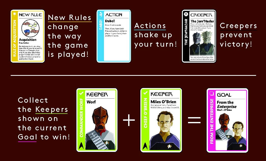
But if you’re a newcomer to the card game “with ever-changing rules,” here’s a basic rundown of how it works. It starts out simply enough, with the premise that each player will draw one card and play one card. You will be seeking out “Keeper” cards, in an attempt to fulfill the current goal card on the table.
Along the way, rules will change, Keepers will be traded, stolen, or discarded, and “Creeper” cards will try and stop you from — or help you succeed in — winning the game. A good game of Fluxx can take anywhere from 10 to 40 minutes to play, which makes it perfect for taking along to a Star Trek convention to play in line, or when you have a little downtime with some friends.
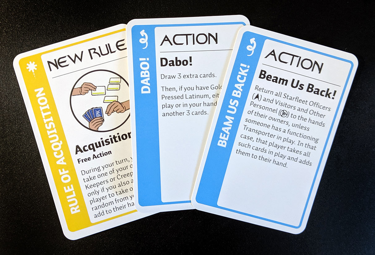
The new Deep Space Nine edition has some unique cards that help it stand out from the previous Trek versions, and one of my favorites is a “New Rule” card appropriately titled “Rule of Acquisition.” This allows you to take one of your opponent’s Keepers or Creepers, but only if you also allow that opponent to take one card randomly from your own hand to add to theirs. And since this is a rule change and not just an Action card, it means all players can do this on their turn, provided the rule remains in play. “Rule of Acquisition” has the potential to really shake up the game!
There are two action cards that I thought were themed nicely: “Beam Us Back!” and “Dabo!” The first says to return all Starfleet Officers, along with Visitors and Other Personnel, to the hands of their owners, unless there’s a Transporter in play (in which case, the player with the Transporter takes all of those cards and add them to their hand). The second, “Dabo!” lets you draw 3 extra cards. If you also have the Keeper “Gold-Pressed Lantinum,” you can draw another 3 cards.
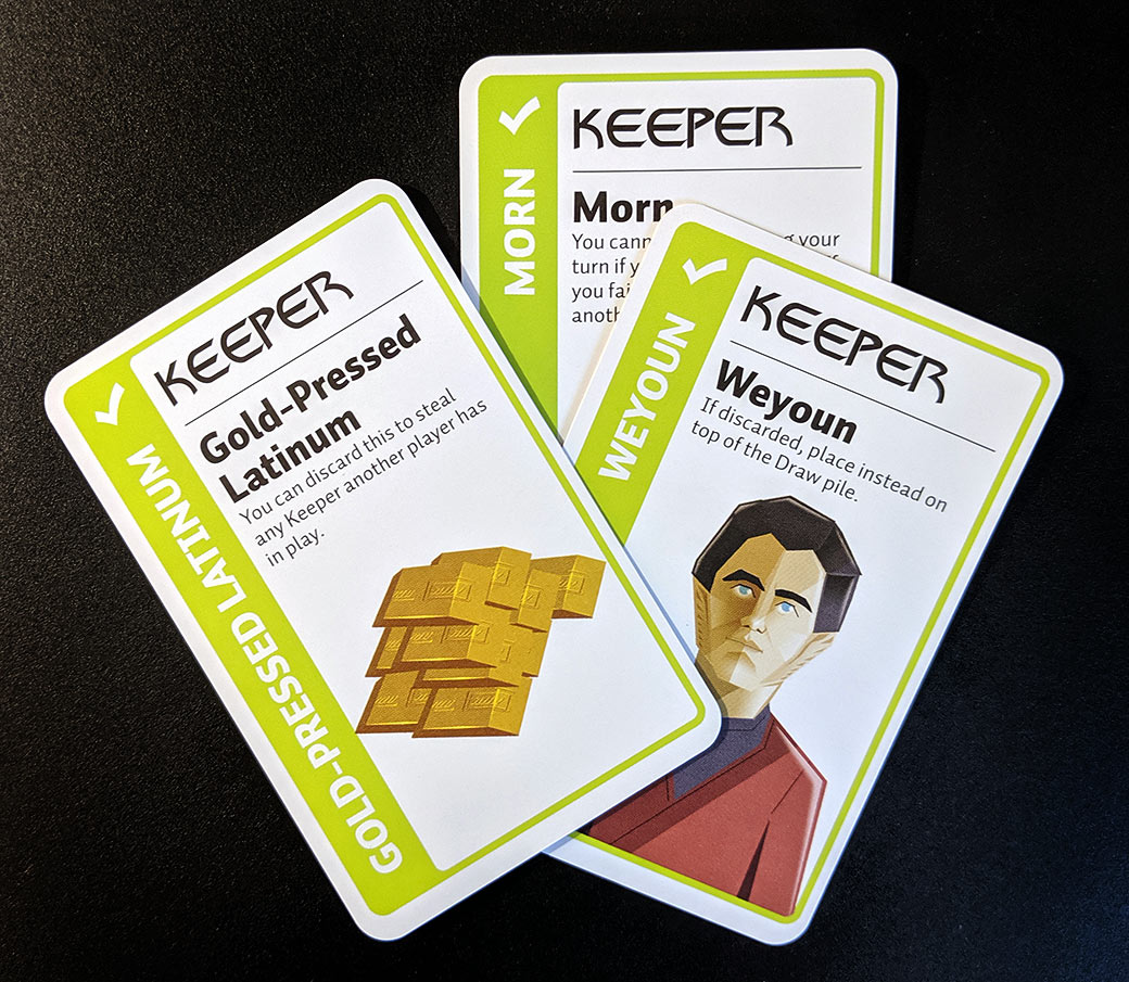
Speaking of “Gold-Pressed Latinum,” that card lets you steal a Keeper from another player if you discard the Latinum. Two of my other favorite Keepers: “Weyoun” and “Morn.” I won’t tell you the specifics on the Morn card, because I think there should be at least one fun surprise when you play for the first time, but trust me when I say that the Morn card alone is worth purchasing the game for. The “Weyoun” card says that if it is discarded, you can instead place it on top of the Draw pile to be picked up again… you know, since he’s a clone!
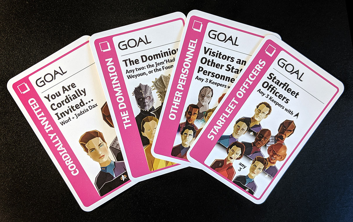
There are a number of Goal cards that are interesting, in that they allow you to win by having certain combinations of Keepers. “The Dominion” goal requires any two Keepers from among the “Jem’Hadar,” “Weyoun,” or “The Founders.” Similarly, “Visitors and Other Station Personnel” is a goal requiring any 3 Keepers with the station symbol on them (such as “Morn,” “Jake Sisko,” “Garak,” etc.). There’s a similar goal for collecting any 3 of the Starfleet Officers.
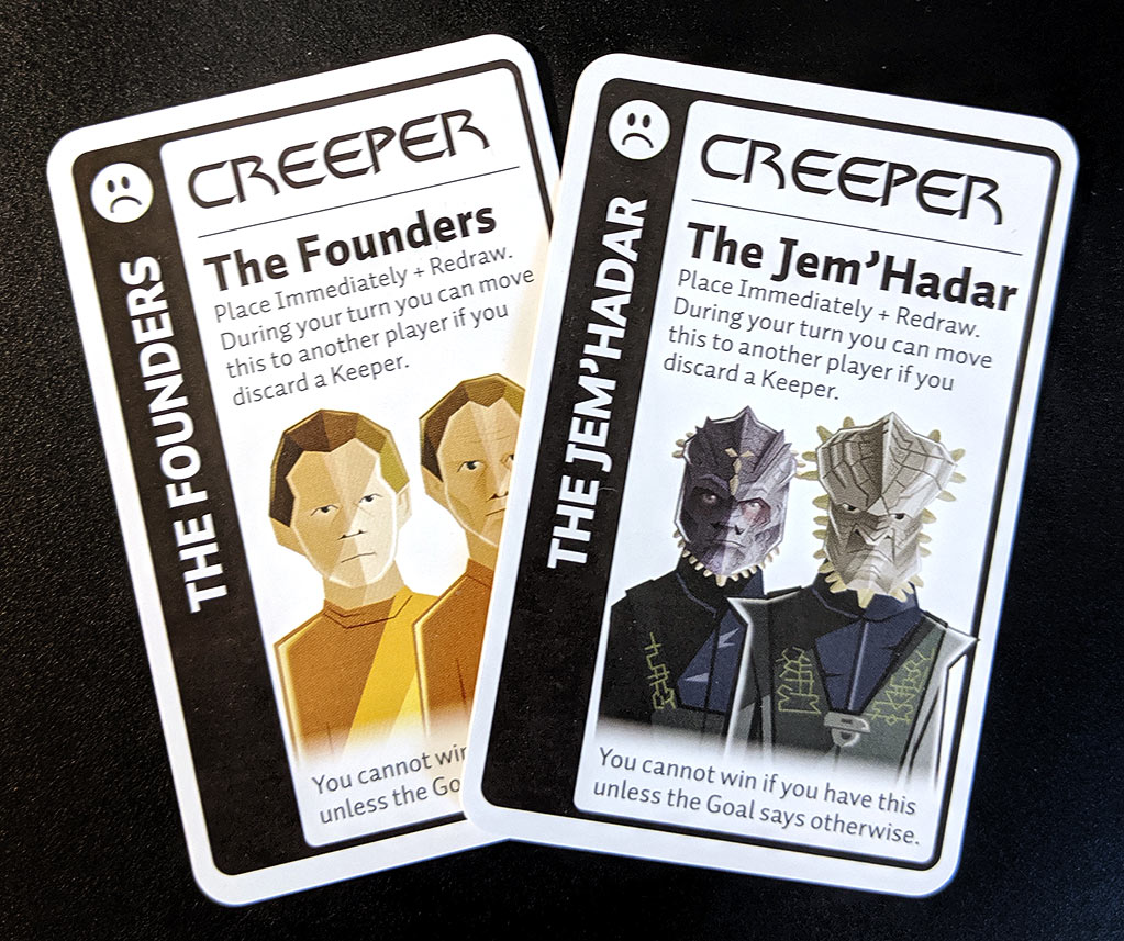
And finally, it wouldn’t be a Fluxx game without Creepers! The “Jem’Hadar” and “The Founders” were natural candidates for these cards. The “Jem’Hadar” card lets you move it to another player if you discard a Keeper. “The Founders” card works the same way. I think it would have been nice to see different mechanisms for these two Creepers, but it’s a small critique in what is otherwise a well themed edition.
In addition, the company continues to grow their Star Trek game library in an upcoming release called Chrono-Trek,which infuses card gameplay with pretty much every temporal event ever seen in the prime Trek universe — to stay tuned for our coverage of that once we get our hands on the time travel-themed set!
Anthologies are probably my favourite story formats.
Like a collection of appetizers instead of a full meal, an assortment ofcomic short stories makes for a refreshing change from reading a series. Maybe not all the offerings are to your liking, but there’s always something new to try.
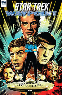
Sad to say, April is always a killer catch-up month for me and for that reason, I missed this particular variety of Star Trek treats. However, it’s definitely time to rectify that oversight and delve into 2019’s Star Trek Waypoint One-Shot without any further delay.
Following up on the original six-issue run of Star Trek Waypoint stories from 2017, the title returned last fall in a four-story special collection spanning the Trek universe — and IDW continues to explore facets of the prime Trek universe in this new one-shot release, touching on the Original Series era as well as the mid-24th century in this year’s new anthology.
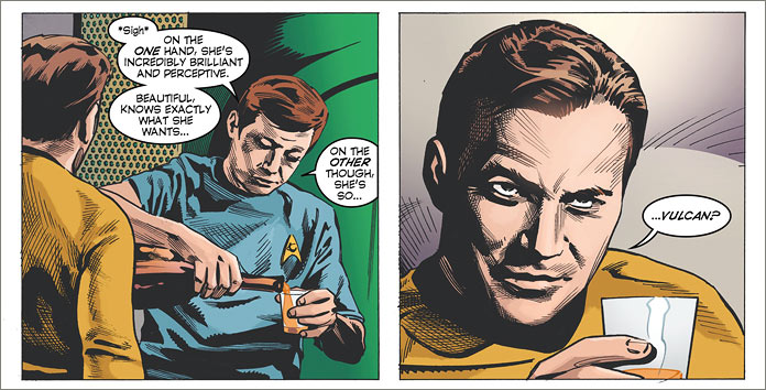
The first story up is “Hearts and Bones,” an Original Series story scripted and penciled by the incredibly talented Stephen Mooney. Tapping into the rivalry between Dr. McCoy and Commander Spock, my favourite Chief Medical Officer finds himself enamored of the most unlikely of romantic targets: a visiting Vulcan surgeon.
This is a delightful tale that sees McCoy seeking love advice from both Kirk and Spock. Mooney gives us a wonderful moment in Kirk’s quarters where we see the tables turned. Instead of Kirk leaning on McCoy for advice, it is McCoy on the receiving end of this relationship. Kirk’s impish smile effectively communicates the light humour of this story in a highly effective way, giving us not only a taste of McCoy’s discomfort but also provides for a flavour that is thoroughly TOS in nature.
This was certainly my favourite out of the entire book. Mooney is a rare talent, being able to script and pencil his stories. He also provides the art for the cover which is simply outstanding.
“Unfathom,” written by Corinna Bechko and drawn by Daniel Irizarri is a story from the earliest days of The Next Generation, where we see Doctor Crusher and Tasha Yar respond to a medical mystery in which most of the crew from a disabled starship have disappeared — both physically, as well as erased from memory of the remaining ones on board.
While I couldn’t find anything critically wrong with the straightforward art, I found the story’s resolution to be a little weak, as I didn’t fully understand how Crusher and the missing crew were able to affect things outside the storage container. I’m open to discussion on this one and be willing to hear what other people thought about it. However, it was a first introduction for me to these creators’ works and it’s always good to be introduced to new things.
The third story, “The Swift Spoke” by Malachi Ward and Matt Sheann, sees an episode from an early adventure in Kathryn Janeway’s career. Serving on board the USS Billings with a then-Lieutenant Tuvok, Janeway leads an away team to a planet known as Arali make first contact with a truly unique alien species known as the Adegeda.
I found this story to be less than satisfying. The away team accomplishes very little due to the differing nature of Adegeda’s reality, and Janeway’s team returns back to the ship with very little to show for their trouble. The story really doesn’t seem to go anywhere and I have to confess to a degree of disappointment.
Ward’s artwork made use of fluid and abstract shapes to represent the Adegeda and their mysterious ship. the background was fairly minimal yet I did like his interpretation of a young, short-haired Commander Janeway.
Finally, Thom Zahler and Andy Price give us “The First Year” – a touching story featuring Worf and Ezri Dax marking the first anniversary of Jadzia Dax’s death on the Klingon homeworld.
This story touched on a significant plot line, making it memorably authentic. After his duties concluded on Deep Space 9, we see Worf in his role as an ambassador in the First City on Qo’noS. However, in the story it is unclear whether he is a Federation or a Klingon ambassador, as even though he seems to have an office in the Federation embassy, he’s also referred to as ‘the Klingon ambassador’ so it’s not quite sure what was intended.
Despite that slight inconsistency, the meat of the story is a friend helping a friend. Ezri counsels Worf into acknowledging his loss and the truth he has kept from himself, as their discussion leads to flashes of Jadzia from within Worf’s memory. This is a touching interlude that sees Klingon angst express itself in the form of personal combat and passion. All in all, an entertaining read with acceptably good artwork.
Like I said, the anthology is an opportunity to try a variety of different flavours. While some are well-known favourites, others are new and are first time experiences.
Variety is the spice of life, after all, and with Star Trek, that’s not such a bad thing — and here’s hoping the Star Trek Waypoint title will be back again soon with more unique stories from around the galaxy.
I believe good storytelling depends on characters. Knowing how characters will behave in given situations creates believable dialogue, authentic behaviour and most importantly, reader acceptance. When writing about established franchises, writers need to know their stuff.
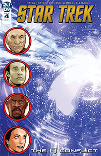
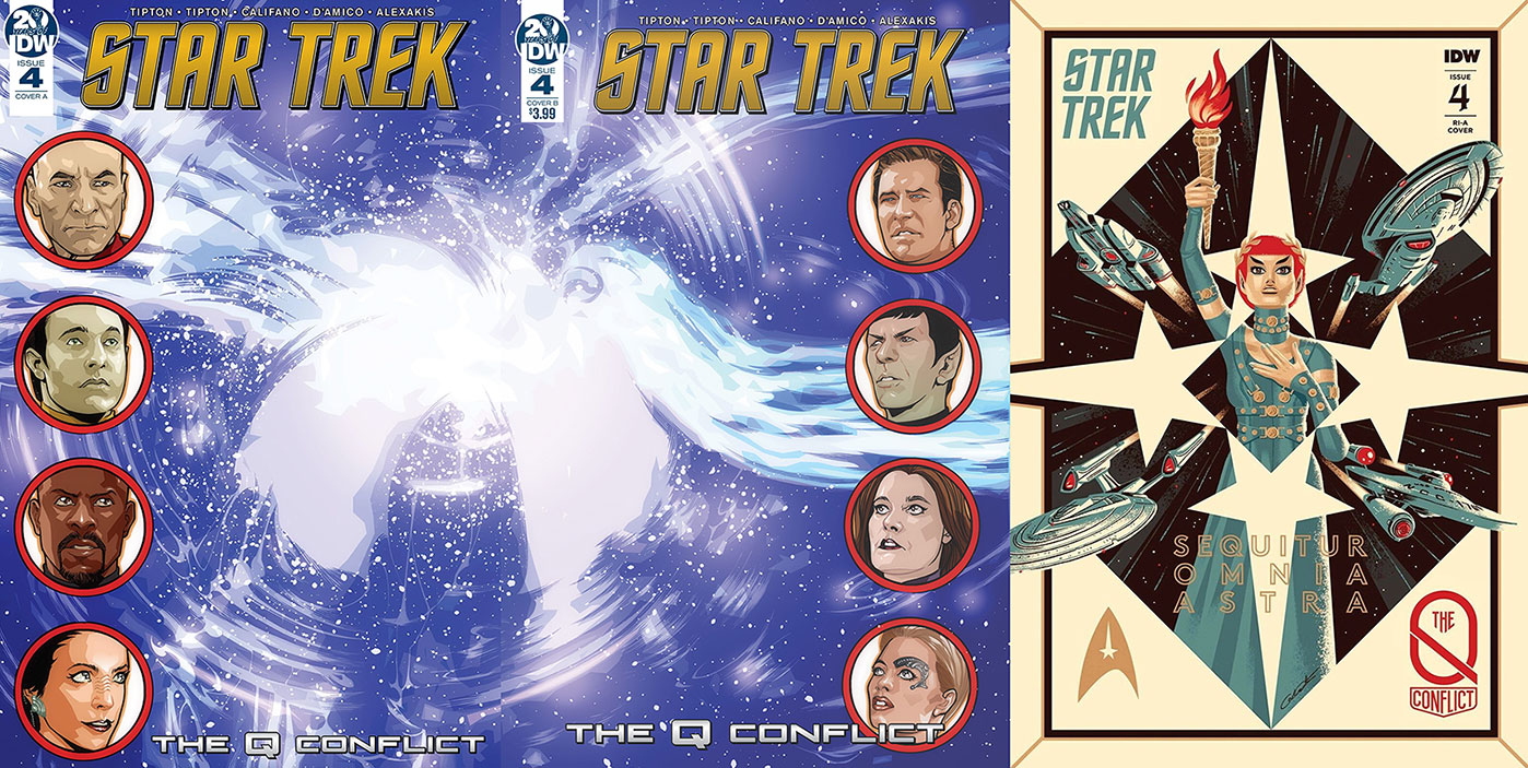
Looking at Star Trek: The Q-Conflict #4, Scott and David Tipton have easily achieved that measure in looking at the inter-dynamic relationships among the myriad of Trek characters they have assembled for this innovative Star Trek adventure.
But before we get to the shining examples of this effect in Issue #4, let’s recap the story so far.
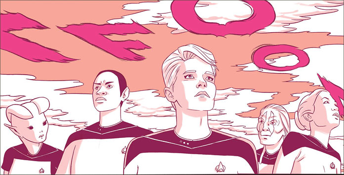
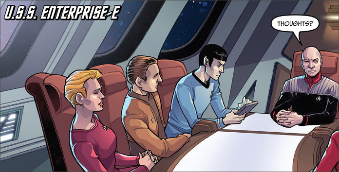
Threatened by the existence of Trelane, Ayelborne of the Organians, and the Metrons, Q has designed a challenge among these immortal beings to see who actually has the most power. Rather than extend the conflict through martial means and tearing the fabric of time and space apart, he has assembled four teams of Starfleet crews from various times in history.
Representing Team Q is Captain Picard, Spock, Dr. Crusher, Lieutenant Uhura, Constable Odo, Commander La Forge and Seven of Nine. For the team of Trelane, we have Captain Kirk, Worf, Quark, Miles O’Brien, Tuvok and Dax.
The Metron has on his team Captain Janeway, Commander Riker, Lieutenant Paris, Montgomery Scott, Major Kira, B’Elanna Torres and Ensign Chekov, for good measure. Ayelborne of the Organians claims Captain Sisko, Commander Chakotay, Lieutenant Sulu, Commander Data, Doctor Bashir, Deanna Troi and Ensign Kim.
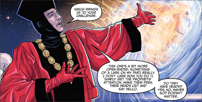
In his infinite capacity for annoyance, Q has decided that the Bajoran Prophets are to be the subjects of his next challenge for the different crews. There is a wonderful scene drawn by Silvia Califano that places all of the teams on the outer hull of station Deep Space 9, observing the wormhole. He tasks them with simply getting the Prophets’ attention and trusts that “Starfleet ingenuity” will allow each of the teams to accomplish this task admirably. Of course, all of the crews have their own unique ways of doing that.
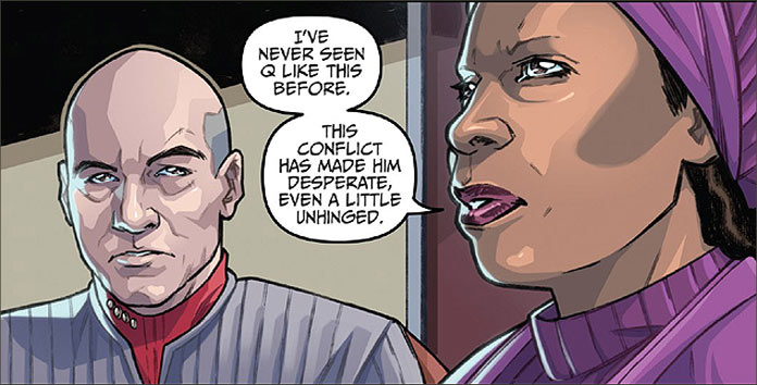
But even before this begins, there is a true-to-art interaction between Captain Picard and Guinan, who gives Picard the benefit of her own unique near-immortal perception. She knows Q very well and provides him with the notion that he may have more allies than he realizes and that Q may have over-taxed himself this time. This is a completely accurate character trait of Picard. A thoughtful captain, there are at least five episodes of The Next Generation that I can think of where Guinan’s wisdom was completely useful, and especially in their encounters with Q.
First of all, it’s to the Tiptons’ credit that they have such detailed familiarity with the character how to weave her presence into this story so well. It’s applicable, effective and provides the story with a degree of authenticity that Next Generation fans would see immediately and accept.
Second, it not only expertly resonates Guinan’s character with the reading audience but her presence also reinforces and validate both Q and Picard in this story. Q despises Guinan; thus, having her in this story not only adds verisimilitude to the story but an excellent pivot point in the plot for the crews to turn the tables on Q. The addition of this one character basically augments the entire story.
The Tiptons’ knowledge of these characters can even be seen in the crews’ methods of contacting the Prophets. Sisko, as their Emissary, simply chooses a passive and respectful way of contacting them through his thoughts. As they are within proximity of the wormhole, it just naturally falls into place that they will be able to hear his attempts.
Picard decides upon a direct, yet still thoughtful way of communicating with the Prophets. Flooding the wormhole with tachyons should be enough to get their attention but not forceful enough to be considered an attack.
Captain Janeway’s methodology is a bit simpler. Taking stock of the resources she has, she visits Deep Space 9 and with Major Kira’s help, asks the Vedeks to help her open one of the orbs on board the station for direct contact with the Prophets. While this is also a polite method, it is totally in line with Janeway’s character to consider the simplest of options.
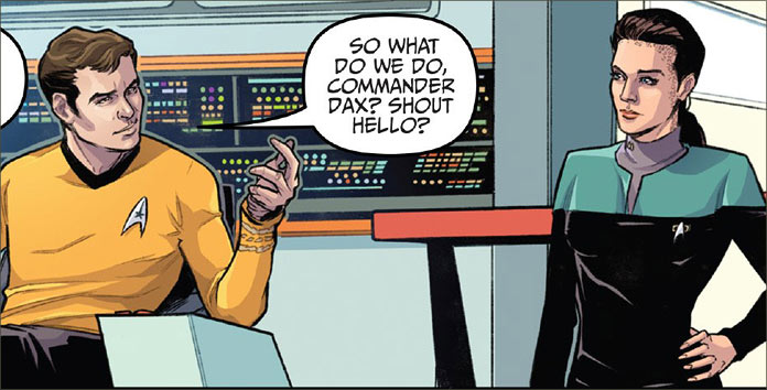
But then there is the boldfaced approach of James T. Kirk, surprisingly inspired by Commander Dax. The Tiptons successfully marry the characters of these two personalities so well that they complement each other ideally. As for results, well, you’ll just have to read the book and see who’s the successful team.
In terms or art, Silvia Califano does due justice to all the different characters. She achieves a highly creditable degree of excellence in pulling off likenesses but she also brings a thoroughly good degree of staging, body language and facial expressions that successfully augment the storytelling in this book.
Looking at the three covers for the book, we are treated to the work of David Messina who provides the art for covers ‘A’ and ‘B,’ which are two halves of a single image. Cover ‘A’ has the profiles of Picard, Data, Sisko and Major Kira on the left side of the book, with part of the wormhole in the background. Cover ‘B’ sees profile pictures of Kirk, Spock, Janeway and Seven of Nine on the right side of the cover with the rest of the wormhole likewise behind them.
The retailer-incentive cover by George Caltsoudas really takes the cake here. Another propaganda-style image, this one has a stylized Vulcan holding up a torch with the Latin motto “Sequitur Omnia Astra”, which means “Follow the Stars.” In the four corners of the image, each starship can be seen triumphantly soaring into adventure.
As competition is the main theme of this book, this is another example of how Caltsoudas manages to find an original image that captures the spirit of Star Trek, instead of episodic moments from the story. Caltsoudas has won me over with this one.
This story is an original adventure that uses Star Trek material from four versions of the continuing franchise in a way that shows that regardless of the time period, if authors, like the Tiptons, know their material, they can find new ways of presenting it to already-established audiences.
Knowing canon is essential, but knowing characters is more important. In this, Scott and David have established themselves as expert writers who can create stories that any solid fan of the franchise would expect and more importantly, enjoy.
It’s always a convention weekend somewhere, and right now our friends over at Eaglemoss / Hero Collector are on site at the MCM Comic Con in London, showing off some of the next additions to the ever-growing Official Starships Collection fleet of Star Trek model ships, warping into your sector this summer.
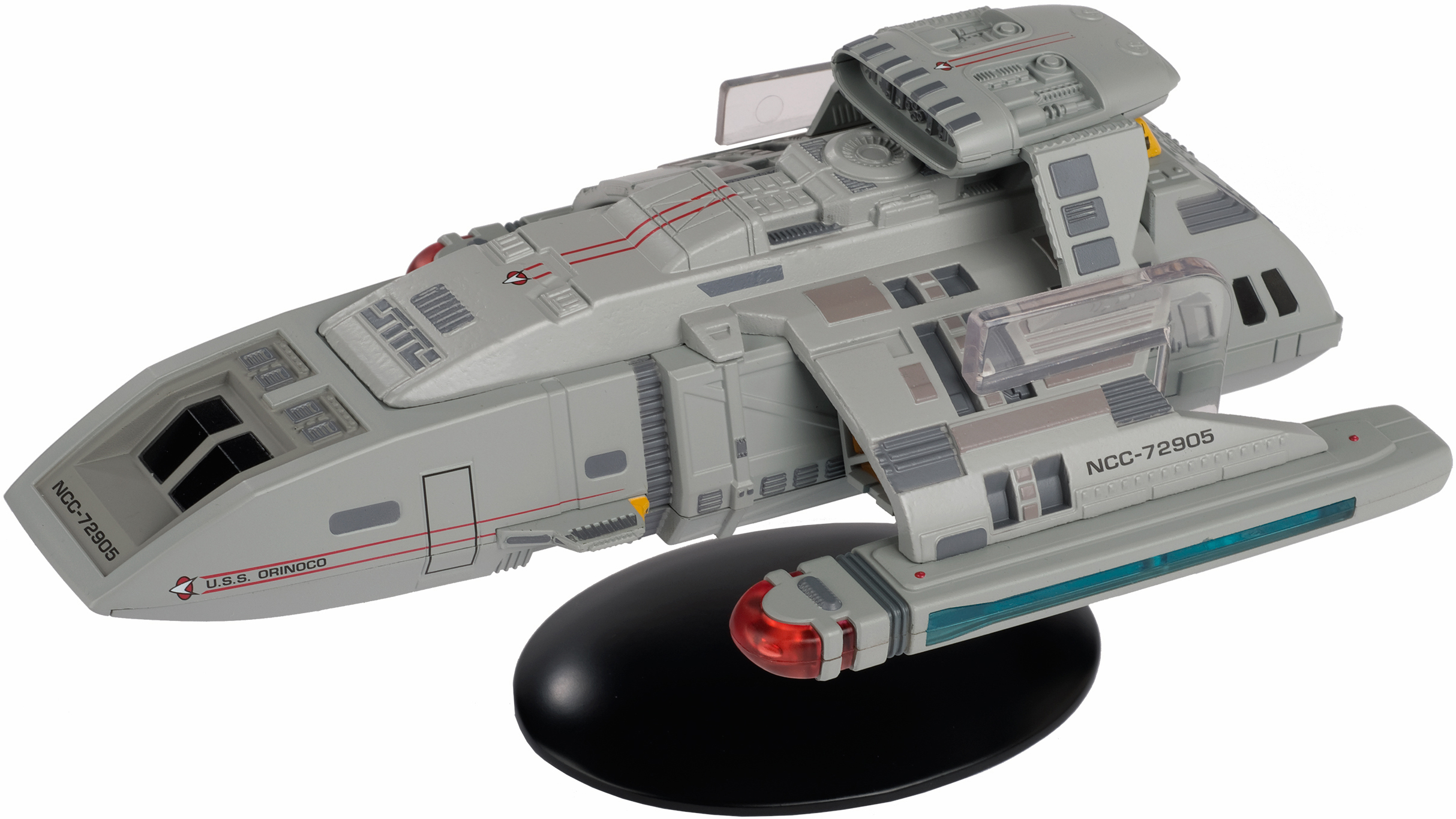
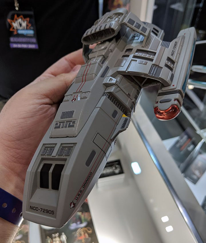
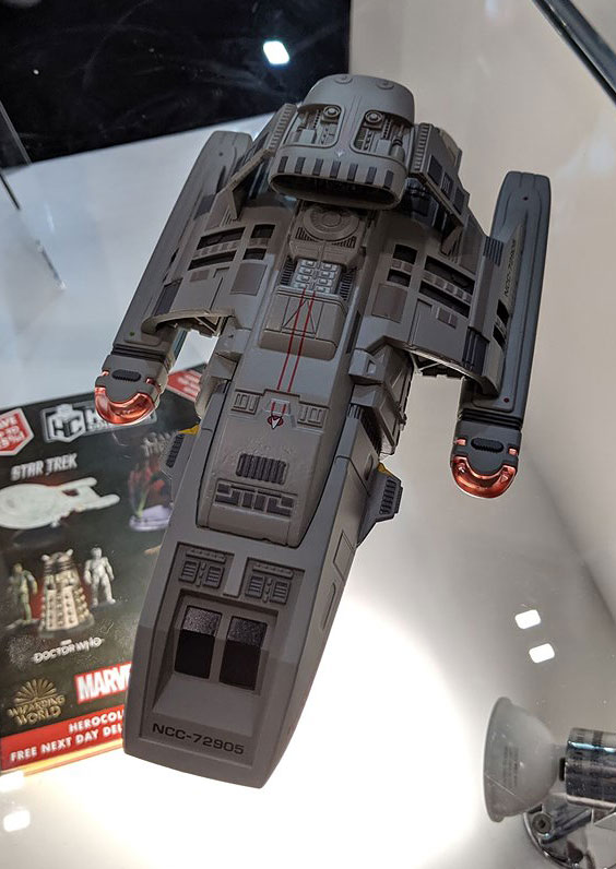
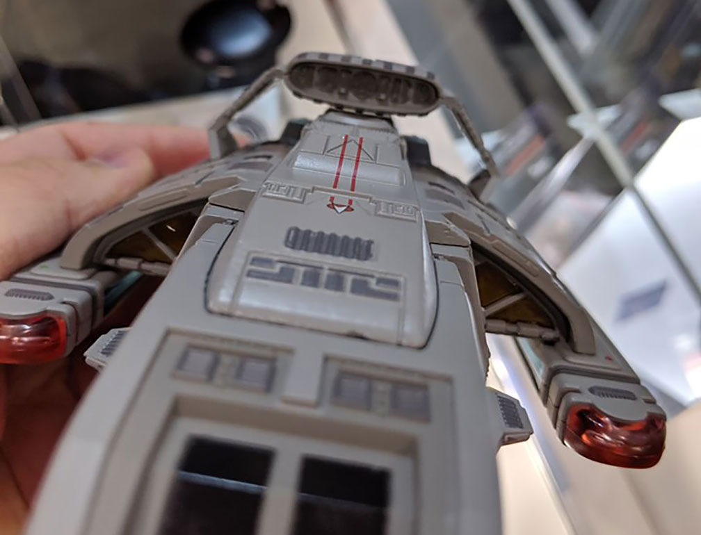
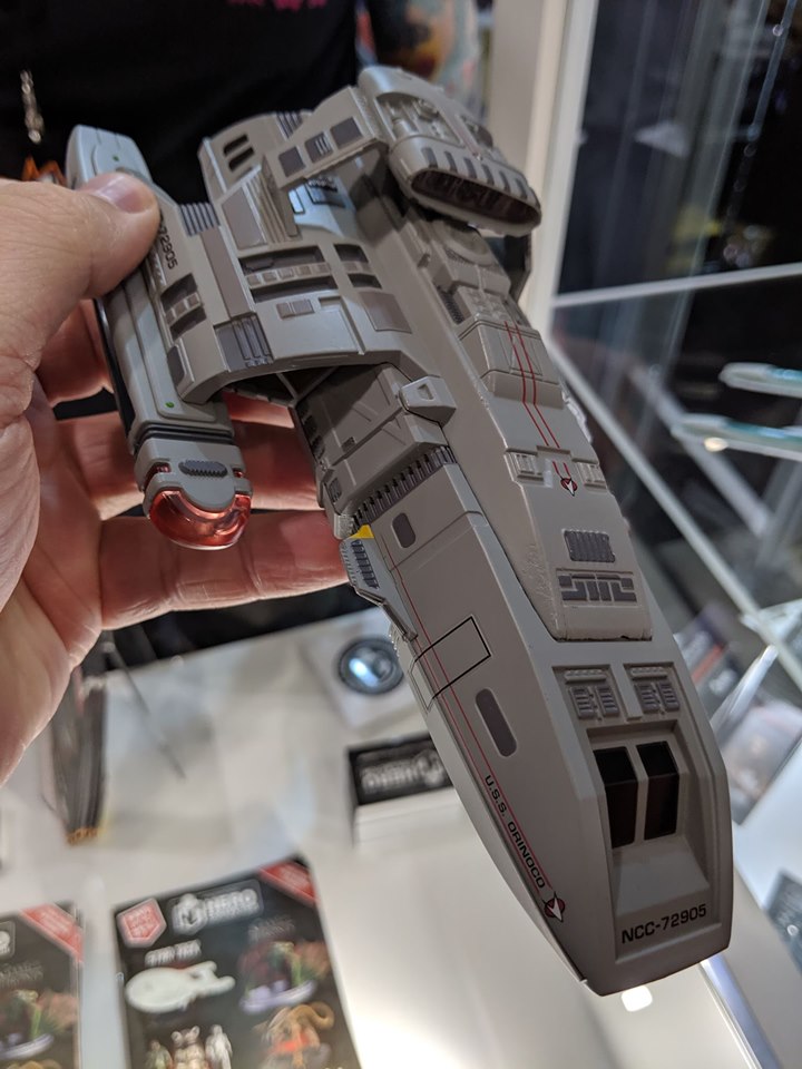
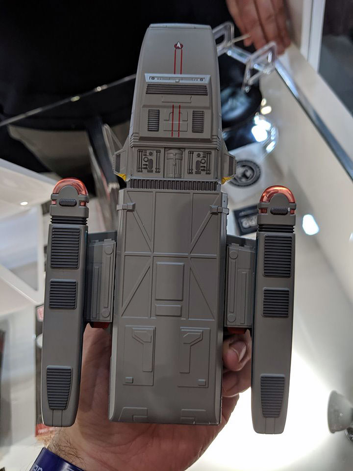
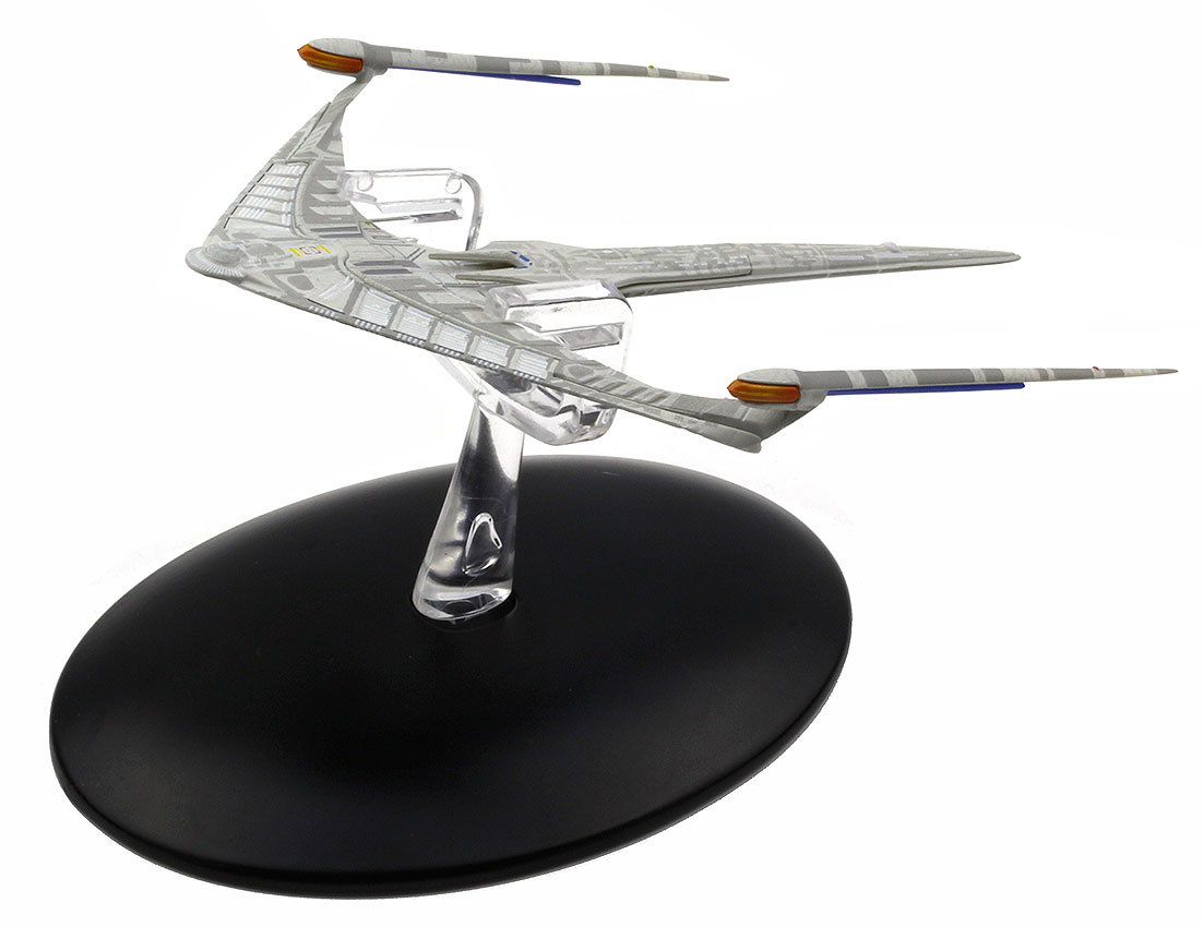
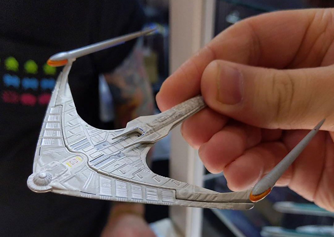
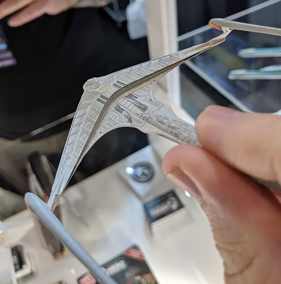
First up is the next entry in the larger XL Starships line, the Danube-class runabout as seen on Star Trek: Deep Space Nine. Unfortunately it seems the company has not chosen to make this the long-lived USS Rio Grande, but instead have set this to be a scaled-up version of the 2014 release USS Orinoco, complete with attached sensor pod and roll bar.
Eaglemoss Official Starships Collection -- XL Runabout
1 of 8
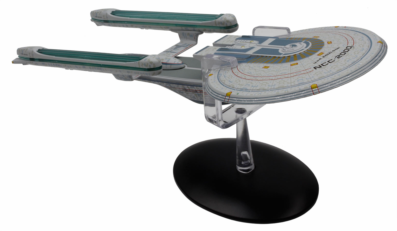
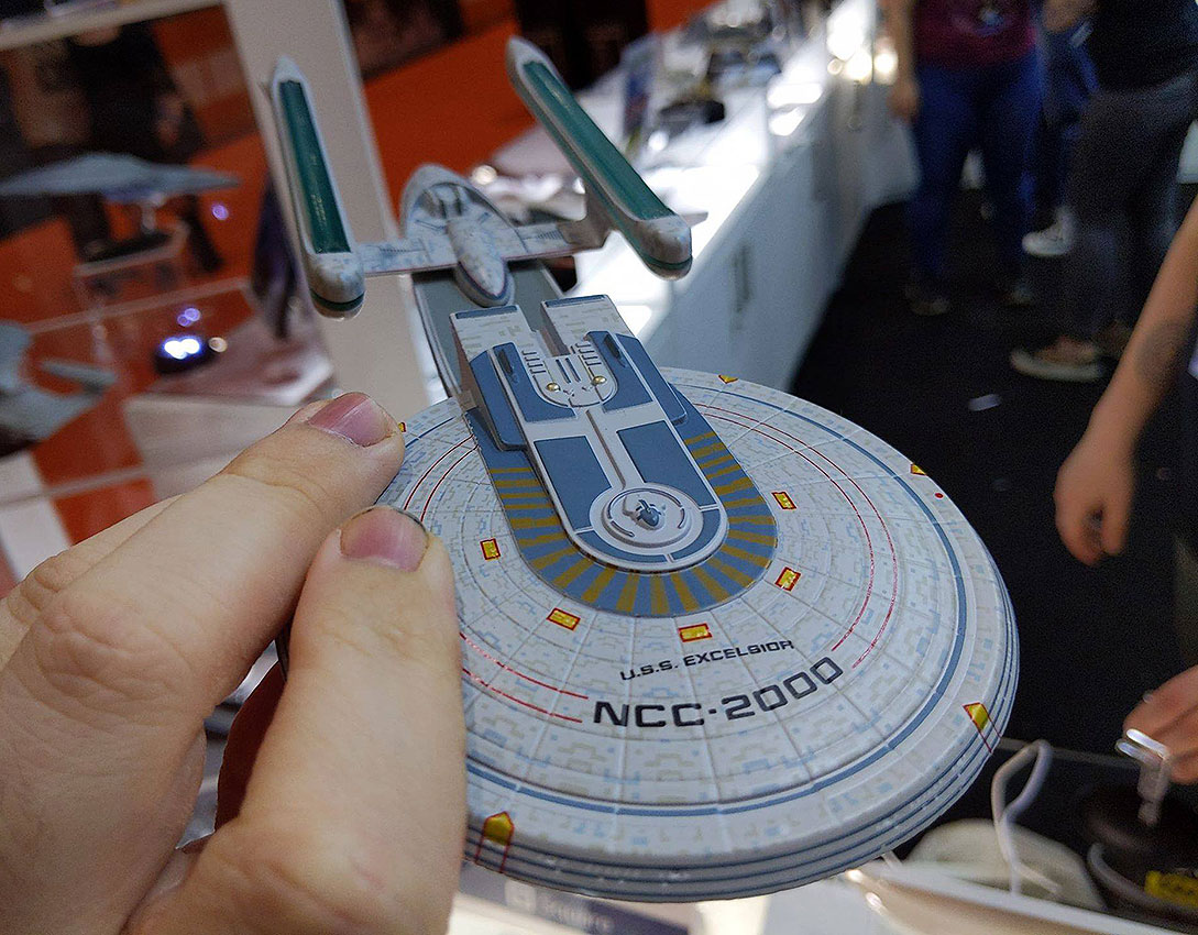
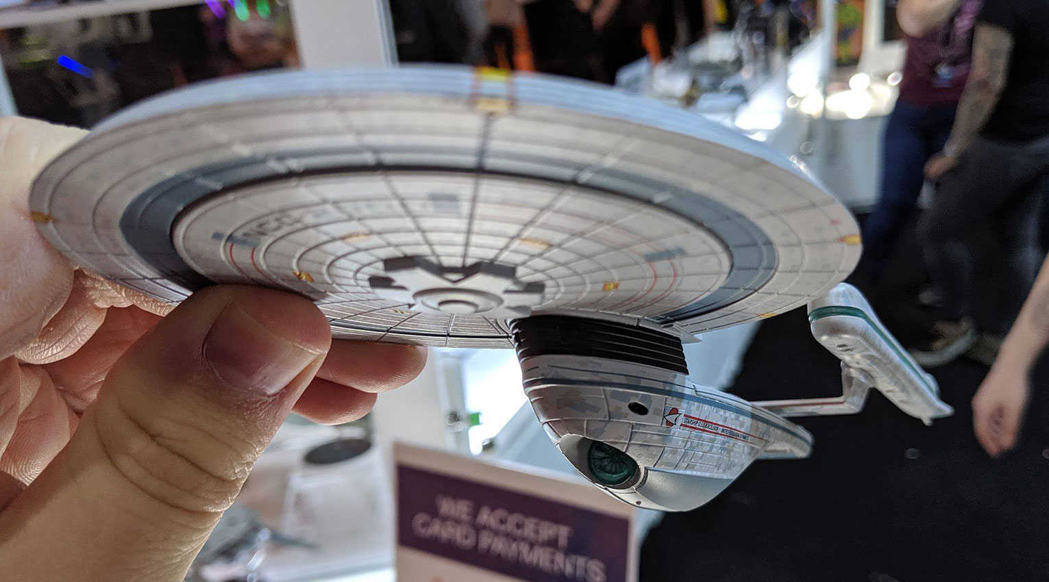
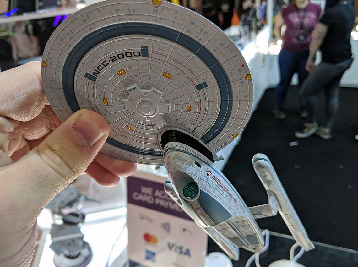
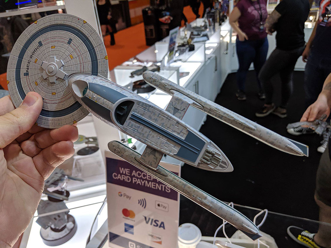
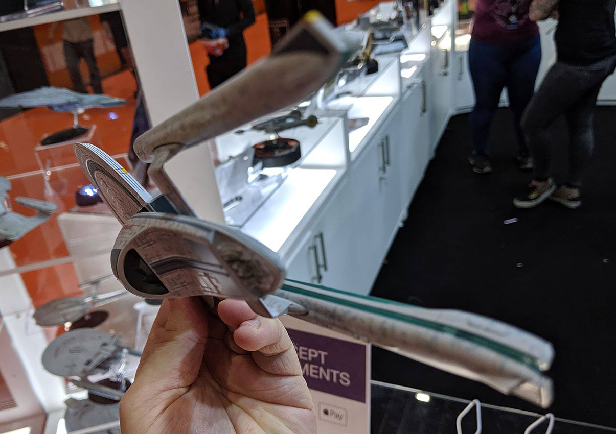
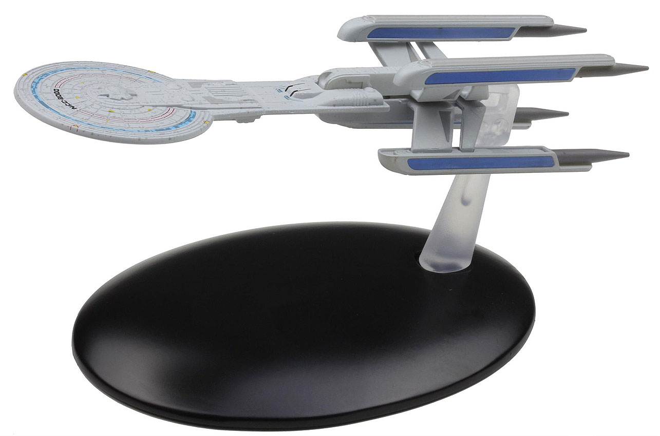
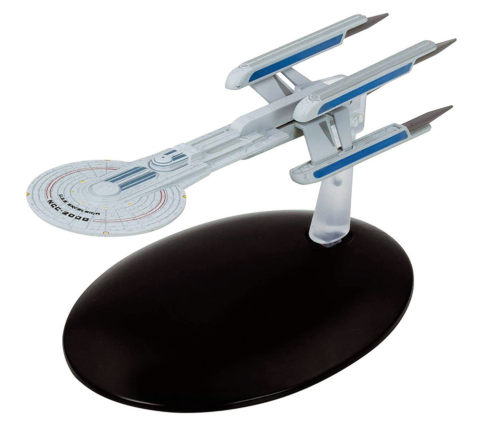
Following the Orinoco is the second Excelsior-class starship in the XL Starships series — following the Enterprise-B — the titular USS Excelsior (NCC-2000) as seen in Star Trek VI: The Undiscovered Country.
While the model on display was noted as being presented with an unfinished paint scheme, the blue rings around the edge of the saucer section — missing from the Enterprise-B model — are a welcome sight and hopefully will stay in place for the final release.
Eaglemoss Official Starships Collection -- USS Excelsior
1 of 7
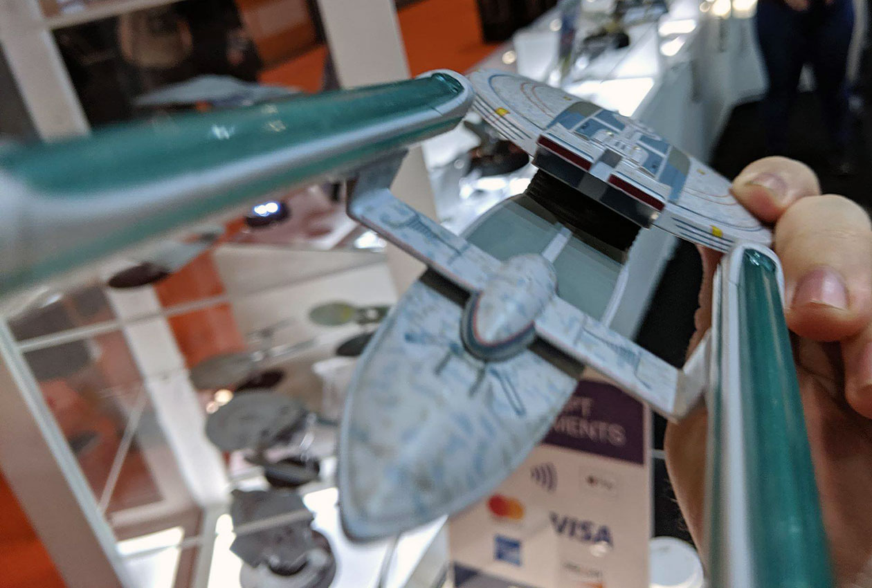
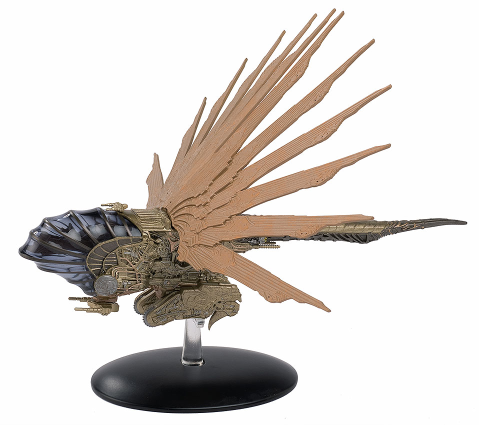
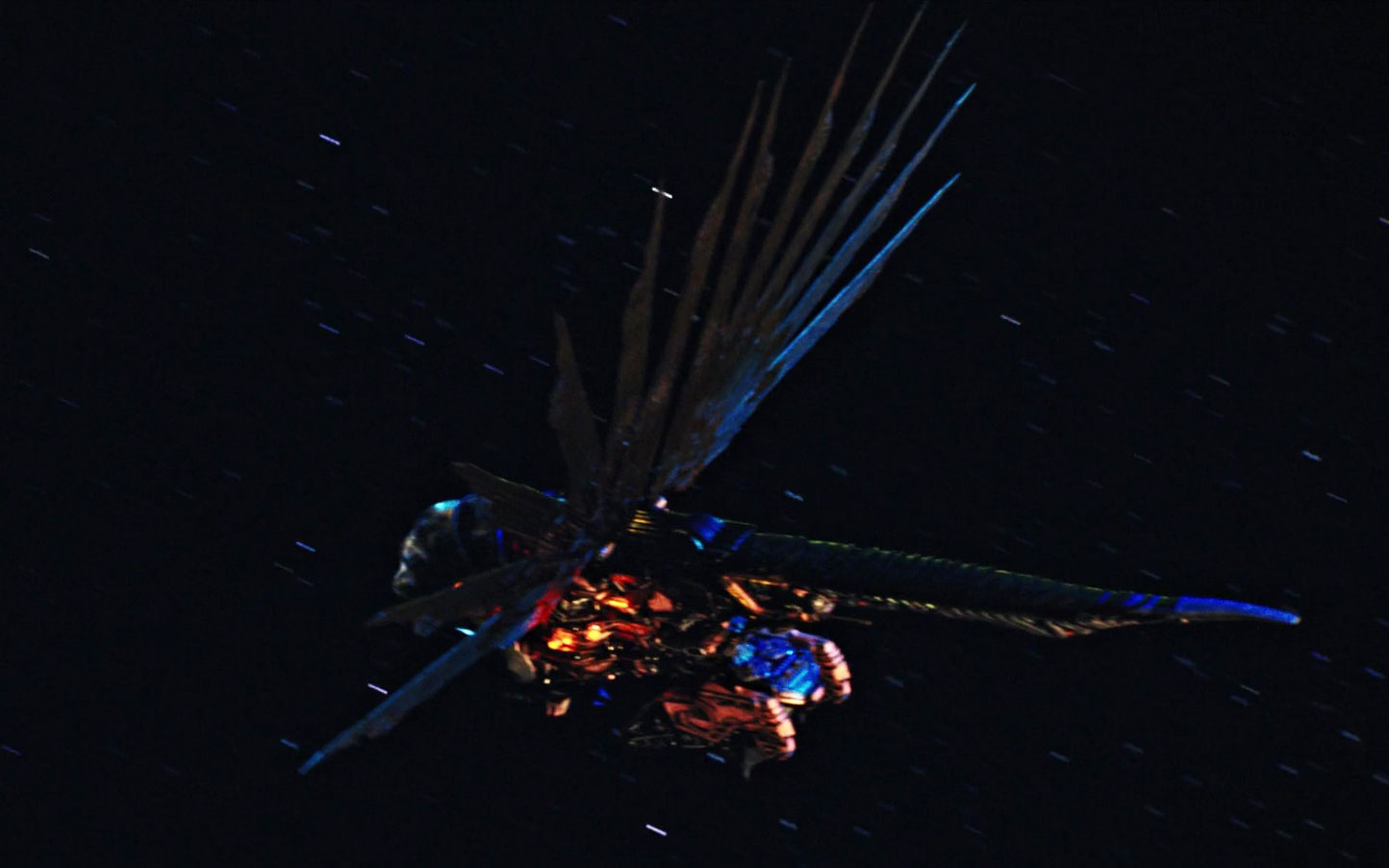
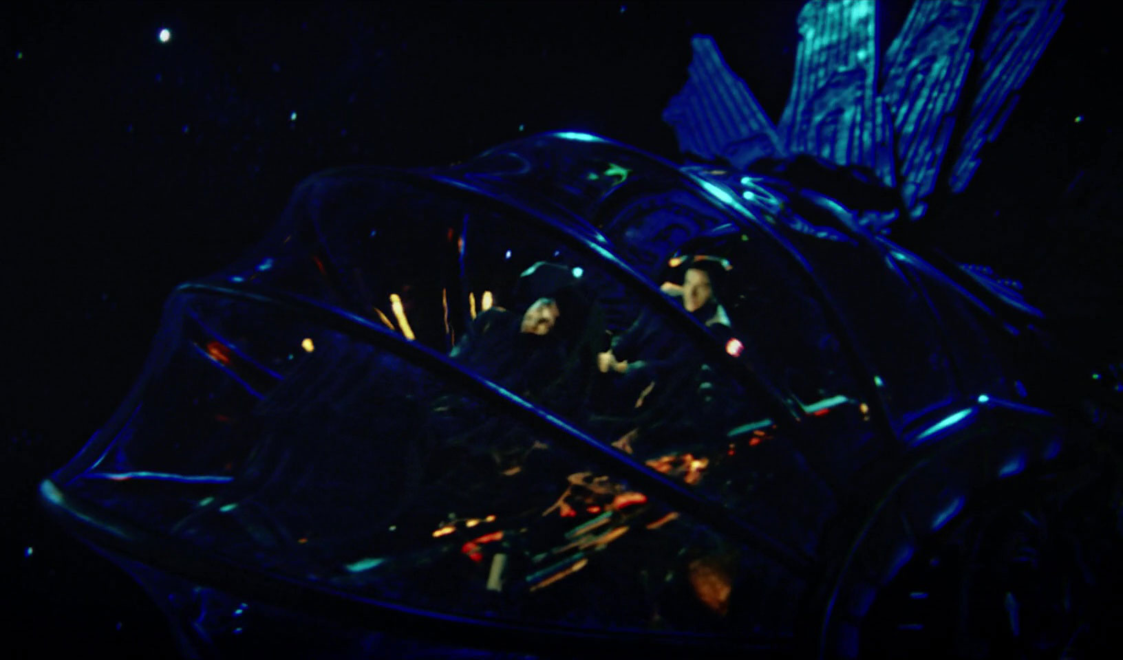
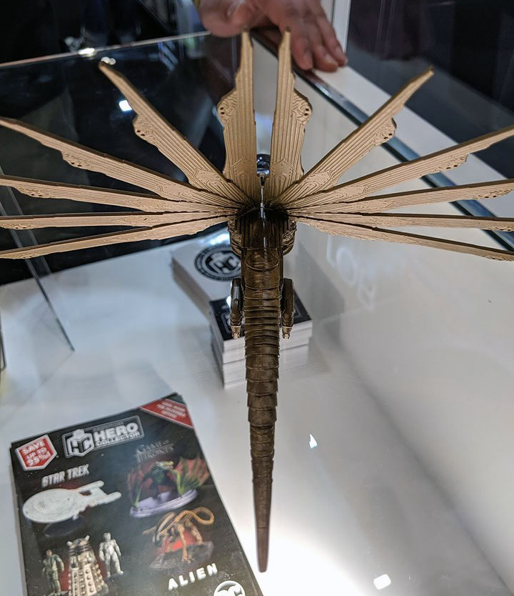
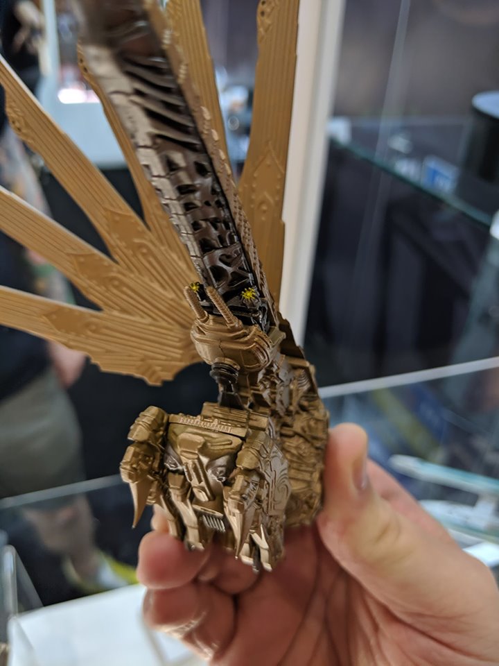
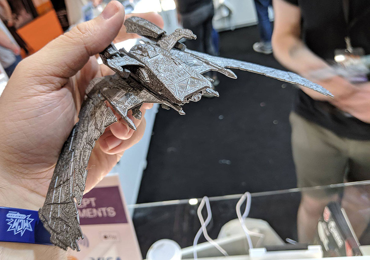
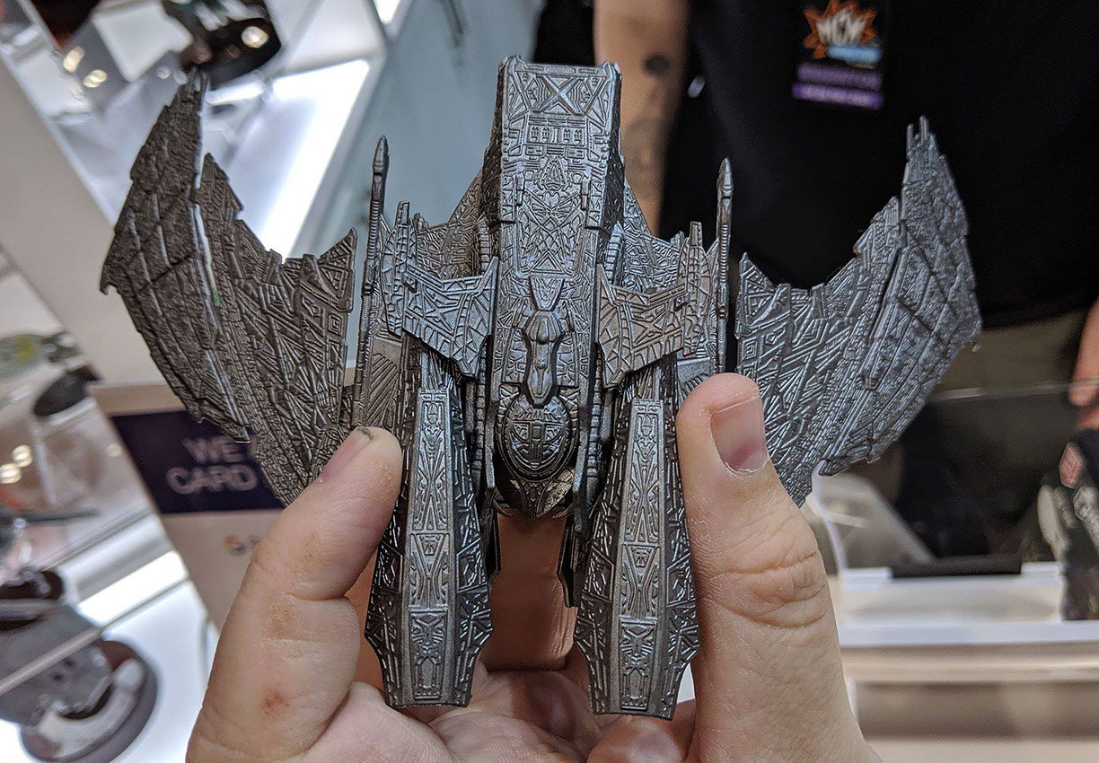
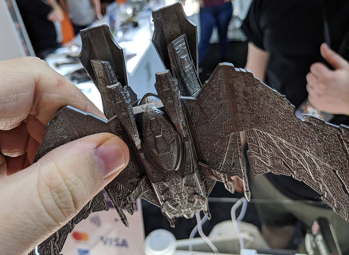
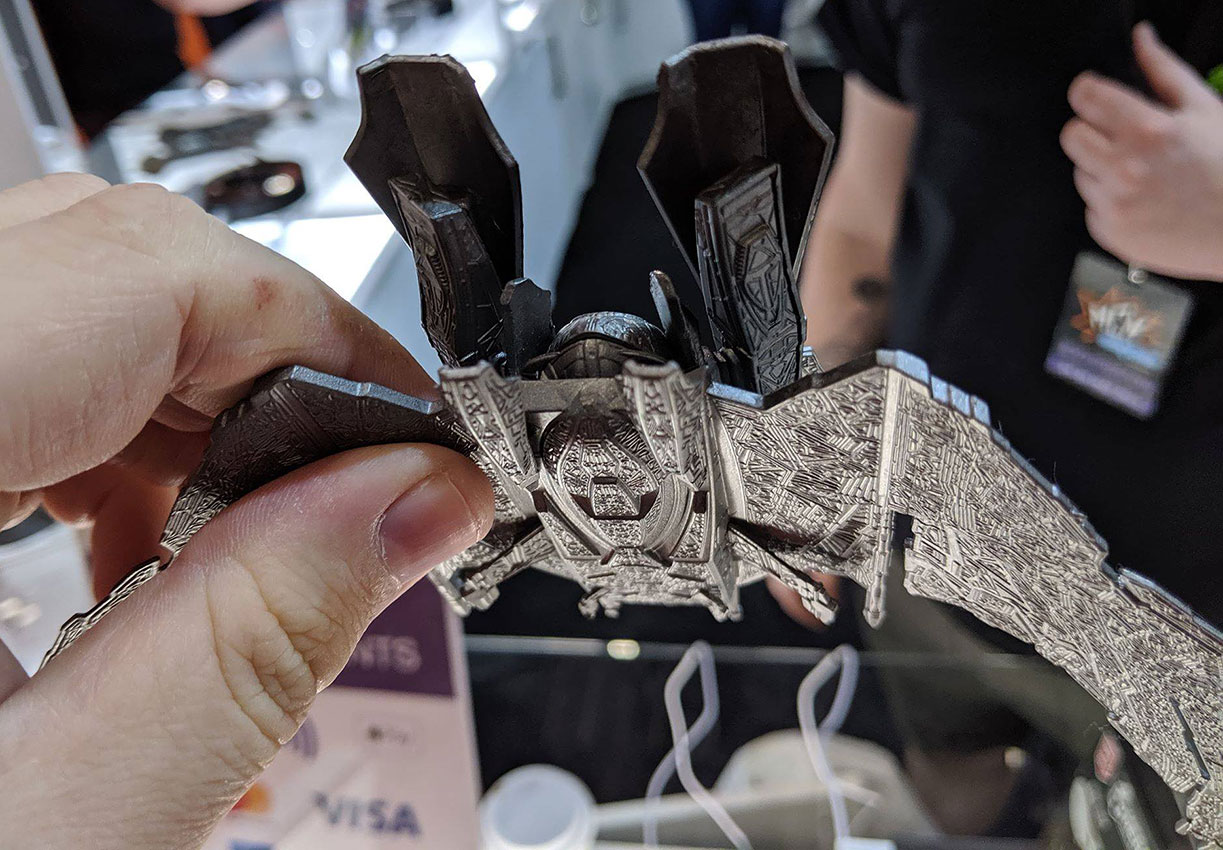
Moving on to the Star Trek: Discovery line, another member of the Klingon fleet is on the way: the dragonfly-like Klingon Raider, seen in Season 1 episodes like “Choose Your Pain.” This model includes a transparent canopy, a nice touch which matches the digital version of the ship seen on-screen, and a pair of flight wings which stretch out from the central hull.
Of note, this model is expected to have some assembly required if you purchase it — because of the delicate nature of the ship’s wings, they are expected to be packaged separately from the main model in the box, for buyers to clip them in place upon arrival.
Eaglemoss Official Starships Collection -- 'Discovery' Klingon Raider
1 of 9
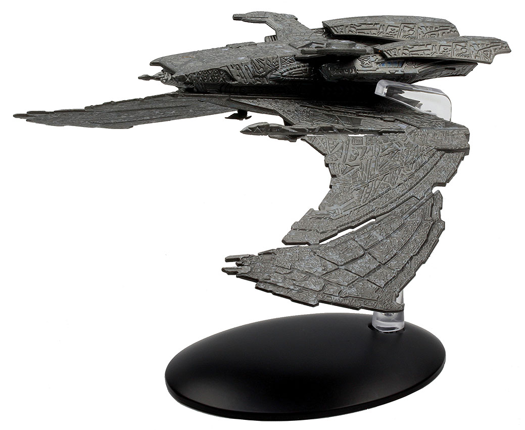
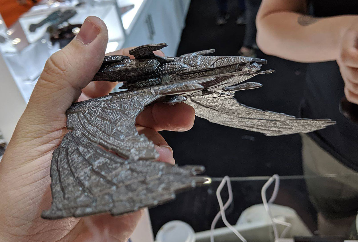
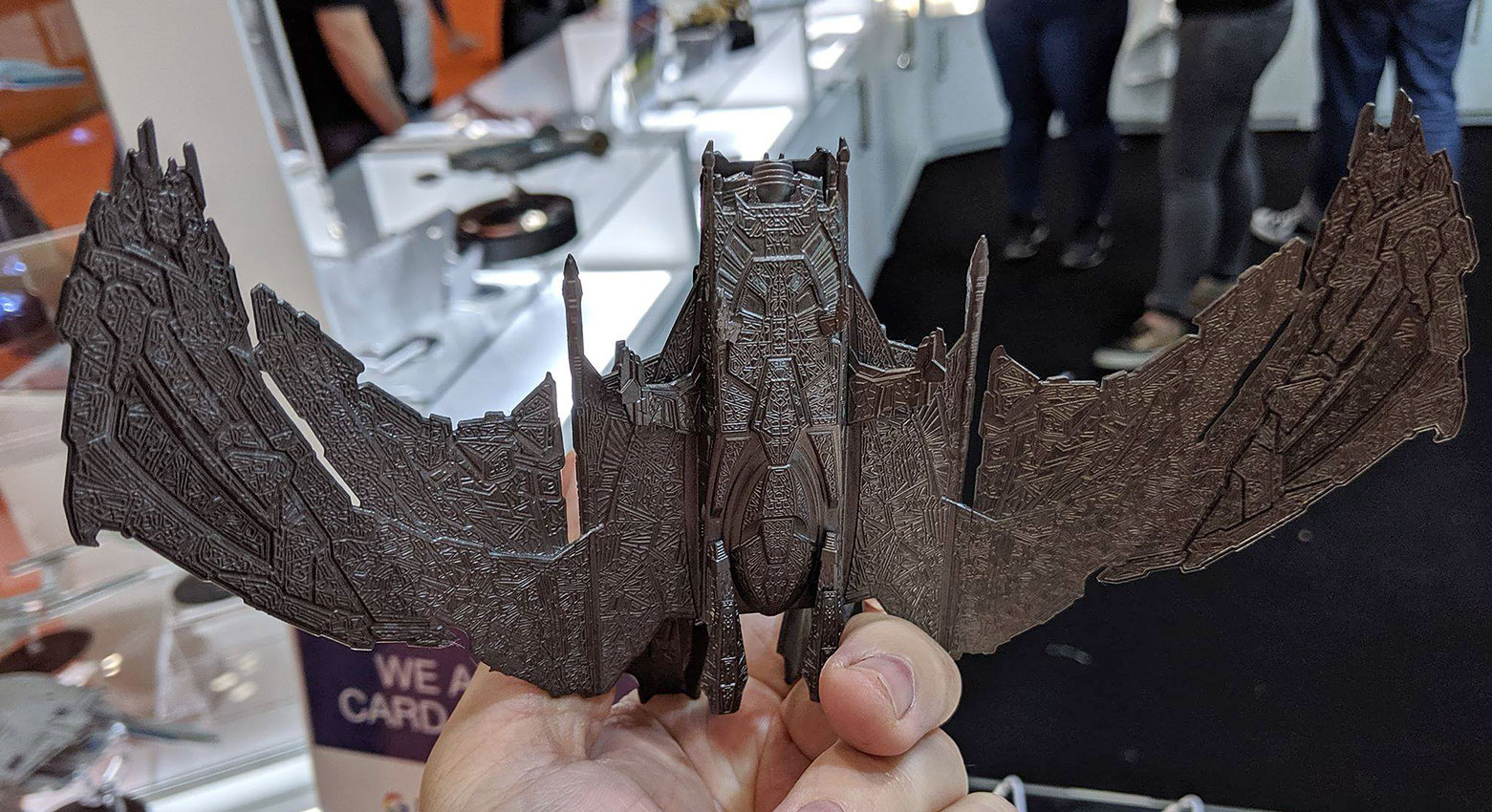
Returning to the Star Trek feature films, Shinzon’s Scimitar, the big baddie from Star Trek: Nemesis was showcased in an unfinished prototype form. The heavily-textured model is due to arrive as a special release later this year, with a darker paint wash still expected to be applied to the build to bring the ship closer to its on-screen appearance before final release.
Eaglemoss Official Starships Collection -- 'Nemesis' Scimitar
1 of 7
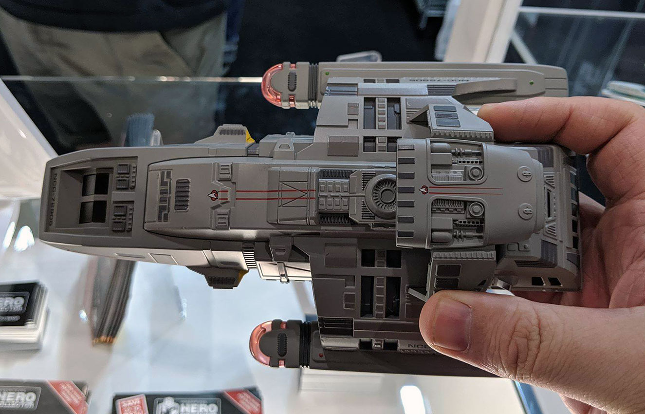
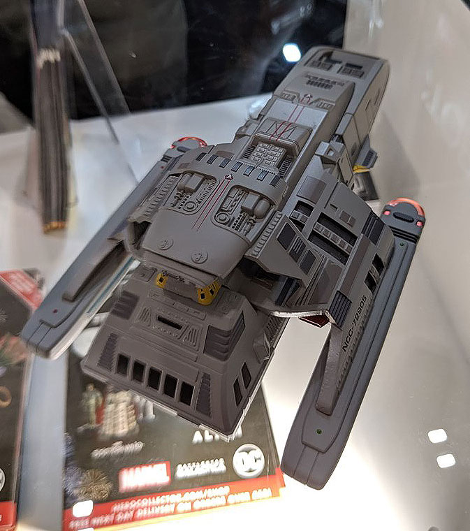
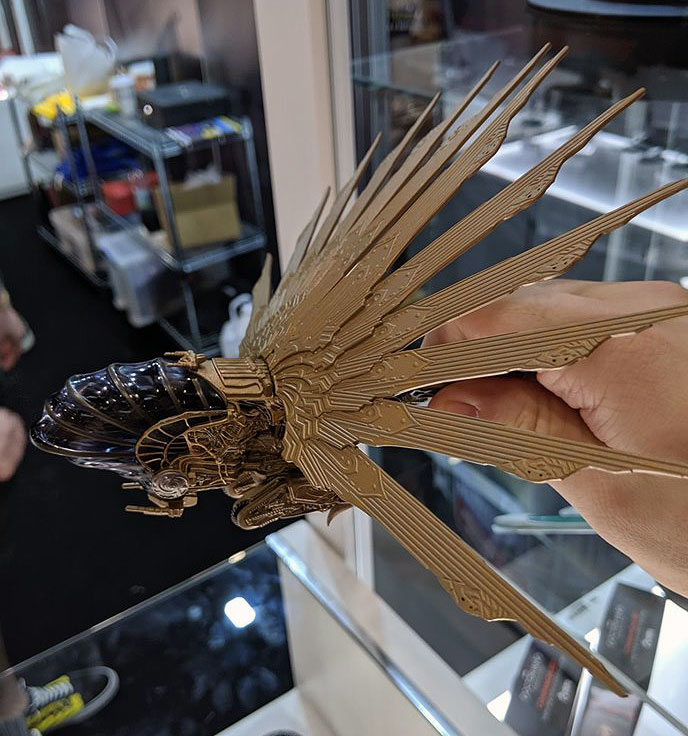
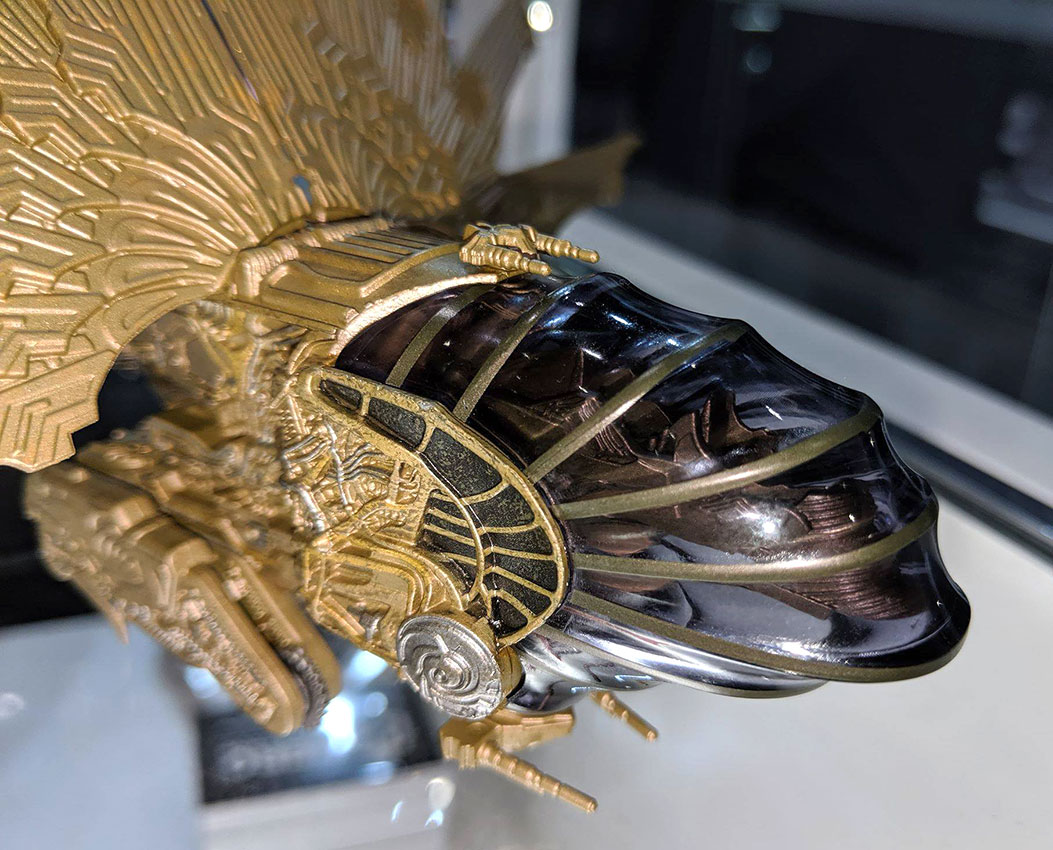
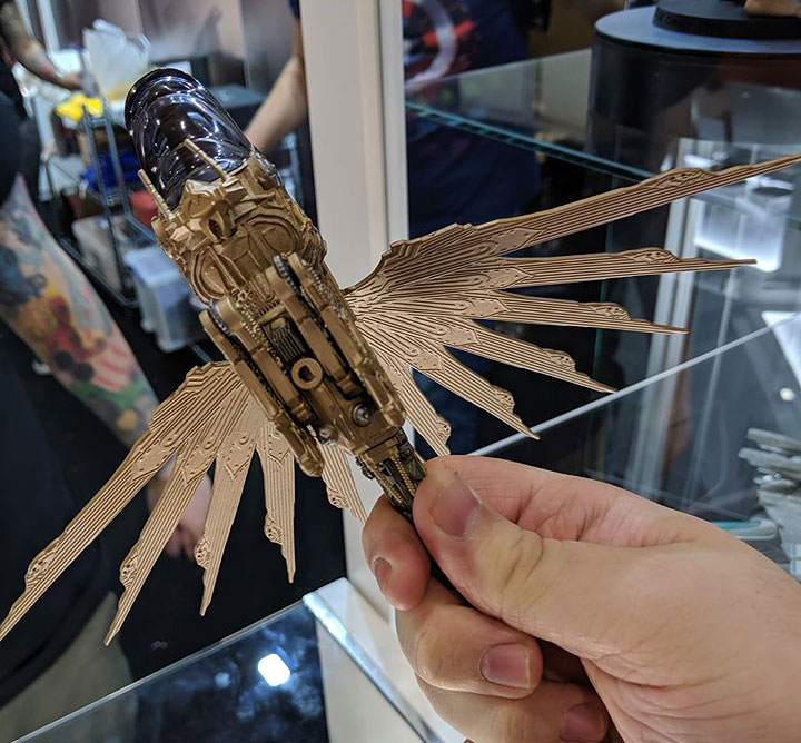
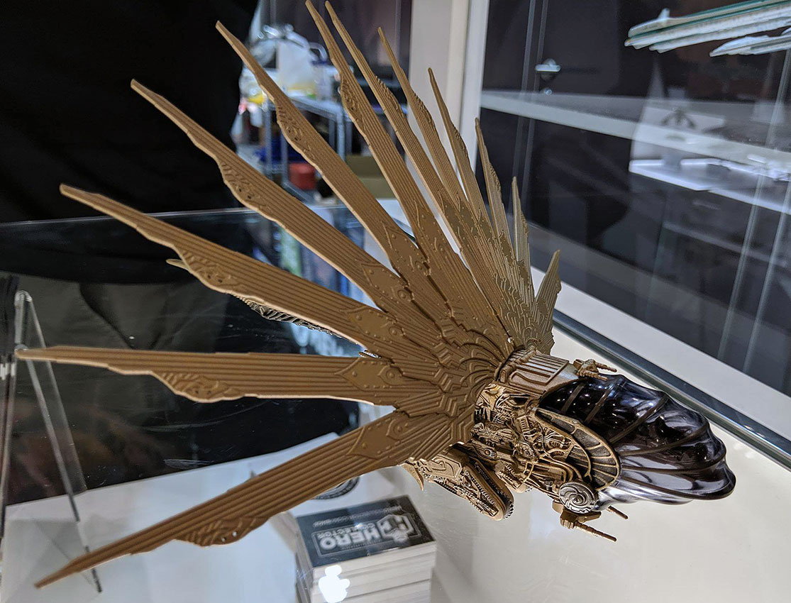
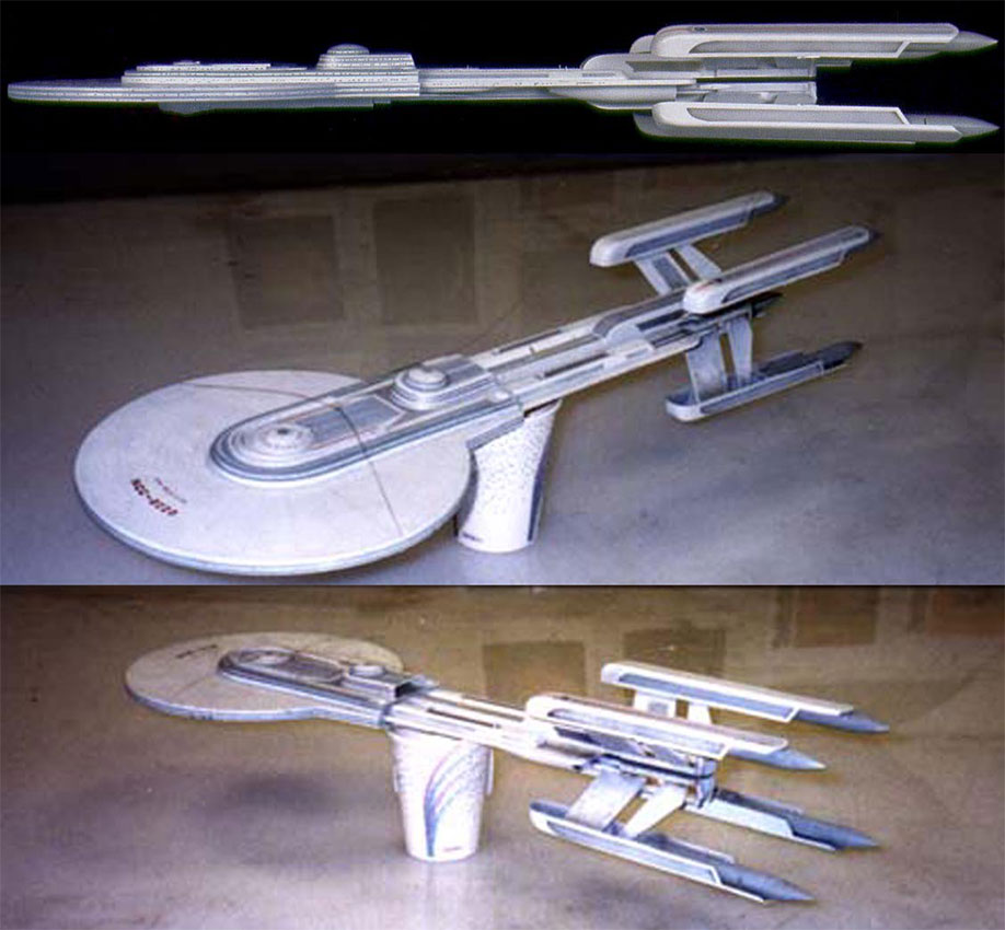
Skewing slightly sideways, another entry in the ‘not-quite-canon’ bonus series of Star Trek ships comes in the form of the USS Altair, a starship which began life as an Doug Drexler-designed early concept for what later became the USS Voyager.
While this Altair design never made it to televised production, a digital version of the ship did make an appearance in the 2007 Ships of the Line calendar.
Eaglemoss Official Starships Collection -- USS Altair
1 of 6
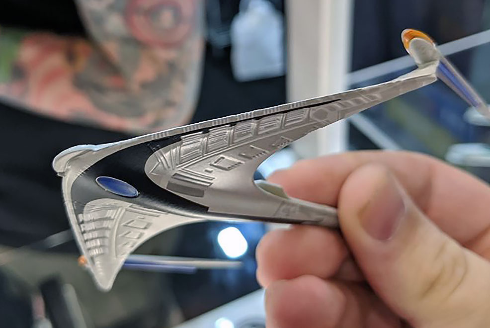
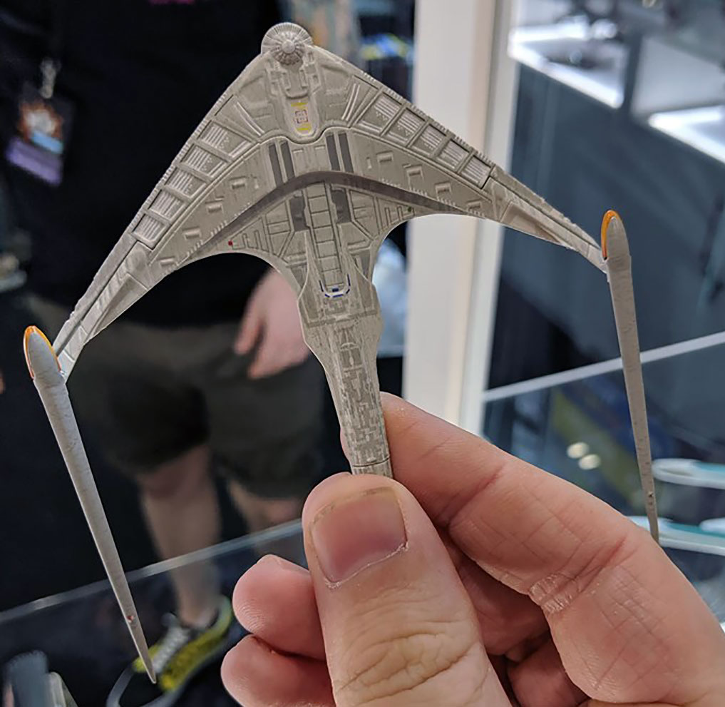
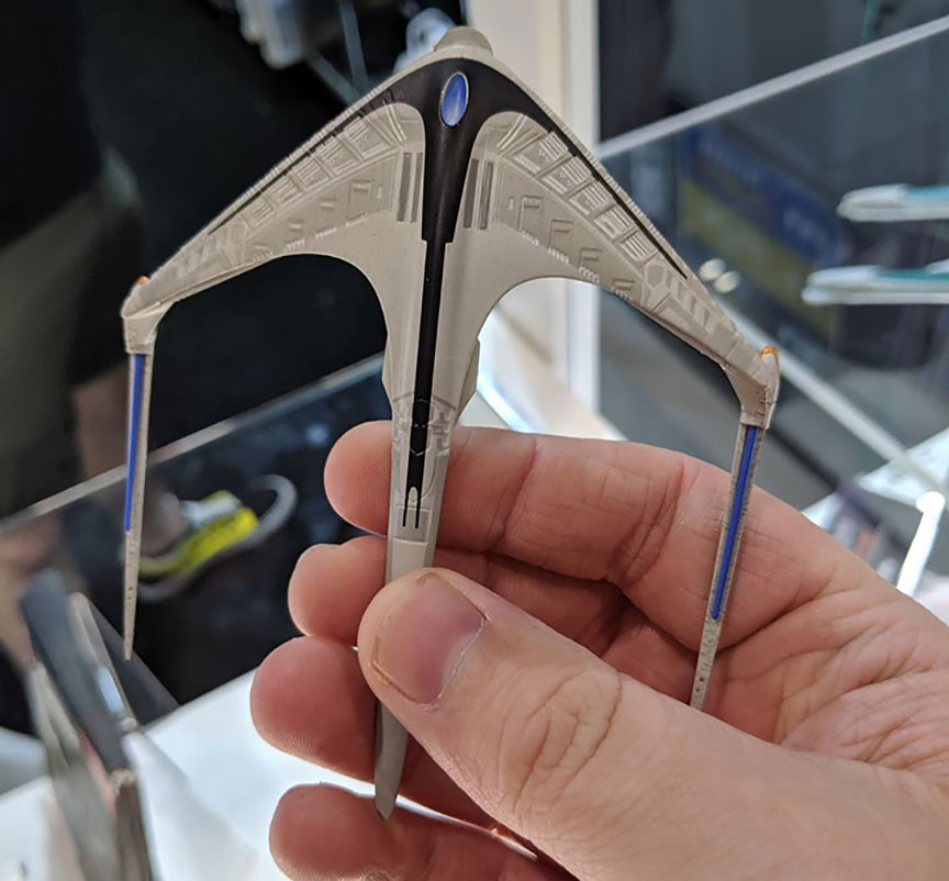
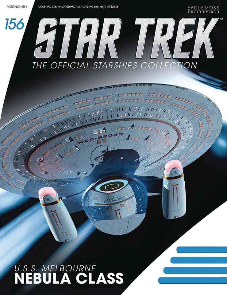
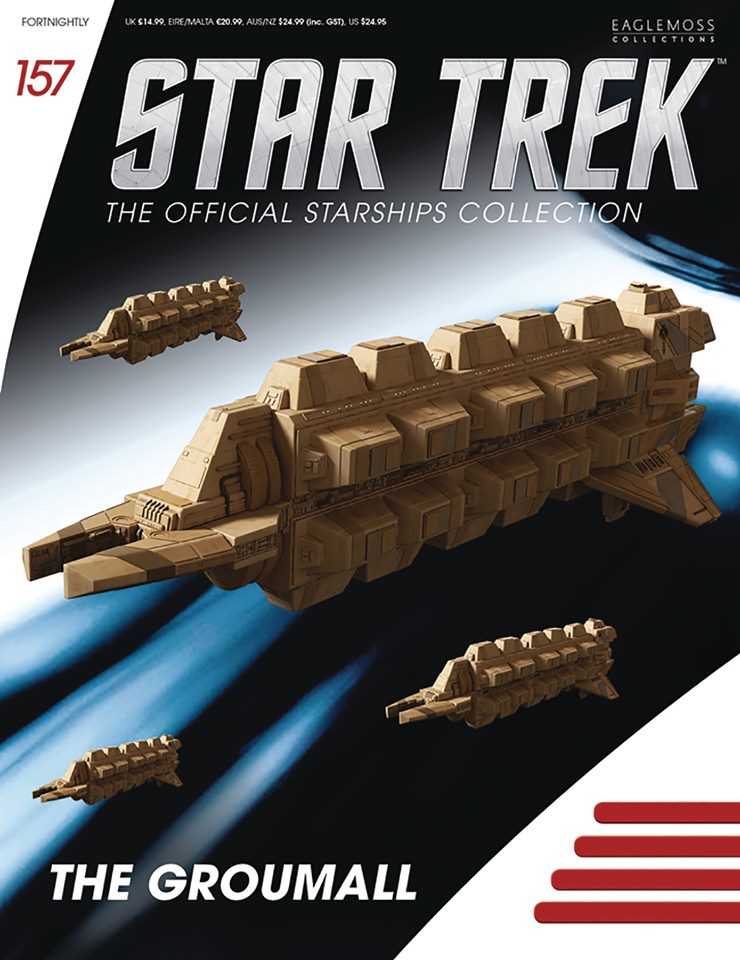
In addition to these display models featured at the London convention, we’ve also gotten a peak at some later ships on the way from Eaglemoss in 2019, including the Nebula-class USS Melbourne (destroyed at Wolf 359 in “The Best of Both Worlds, Part II), Cardassian freigher Groumall (from DS9’s “Return to Grace”), and the four-nacelled USS Excelsior concept design, based on a model built for Star Trek III by artist Nilo Rodis.
Eaglemoss Official Starships Collection -- Upcoming Releases
1 of 5
Keep an eye out for our next Official Starships Collection model reviews here at TrekCore, coming soon!
MCM Comic Con London model photos courtesy of Dave Combe.
Set in the sunny countryside of LaBarre, France, where the Picard family vineyard was last seen in “All Good Things,” the Next Generation series finale that just happened to air 25 years ago today in 1994 — a female narrator, actress Merrin Dungey, lays out the questions that fans will surely be trying to answer for the next several months.
Here’s a version for viewers in the UK:
The end is only the beginning. Star Trek: Picard, featuring Patrick Stewart will be coming to Prime Video pic.twitter.com/i1VYQUZk3Z
“Fifteen years ago today, you lead us out of the darkness. You commanded the greatest rescue armada in history — then the unimaginable. What did that cost you? Your faith? Your faith in us? Your faith in yourself? Tell us: why did you leave Starfleet, Admiral?”
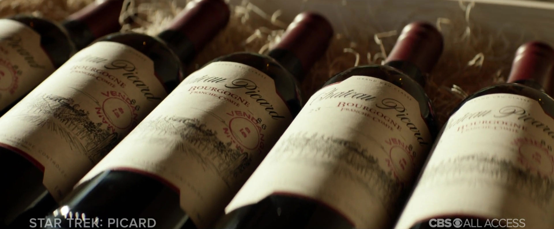
After a close-up look at a case of an ’86 vintage of Chateau Picard — likely 2386, midway between Star Trek: Nemesis and the setting of Star Trek: Picard — we get our first look at Patrick Stewart’s Jean-Luc Picard, about to venture on his first mission in nearly two decades.
When did Picard get promoted from captain to admiral? What fleet was he commanding, and who was the armada trying to rescue — perhaps the survivors of the destruction of Romulus? And why DID he leave Starfleet?
Chateau Picard, vintage 2386.
Production on Star Trek: Picard has been ongoing for several weeks now, with some leaked photos hitting the internet from location filming which occurred at the beginning of May showcasing Stewart on set, surrounded by civilians and Starfleet officers alike.
Director Hanelle Culpepper, who helmed the first two episodes of the ten-episode season, has confirmed on social media that the show has moved onto the third and fourth episodes of production, as longtime Trek director Jonathan Frakes moves to lead that ‘block’ of filming.
We don’t know quite yet when we’ll learn anything more about the details of Star Trek: Picard, but it’s likely that San Diego Comic Con will be a source of much more information, as the next big genre event of 2019.
Along with the trailer, here’s the first official key art for the series:
Keep your sensors locked here at TrekCore as we continue to follow the Star Trek: Picard journey with all the latest news as it breaks!
I’m a total prop guy, meaning I love seeing elements of craftsmanship, design principles and talented vision all come together in dramatic productions. Let’s face it: props add to the authenticity and realism of any dramatic production. They contribute to the performers’ abilities to present a character, and they also make any loyal fan covet and drool in envy when shown for the first time.
It’s no different in Star Trek: Discovery. Imagine how those folks feel in being the ones to decide what those props should look like. Luckily, I had a chance to find out, as I had an opportunity last month to chat with series prop master Mario Moreira about his work in the latest chapter of the Star Trek saga, and some of his favorite pieces from the second year of the show.
Blue flowers from planet Talos IV. (Photo: TrekCore)
Moreira’s credits include Starhunteralong with other rich Canadian sci-fi productions like Killjoysand The Expanse, and I had to ask about separated the prop design in Discovery from some of the items he constructed for those other shows.
“On Killjoys, we did what I call ‘mutt-builds,’ where we start with an existing product,” Moreira told me. “We did a lot of claddingof air-soft weaponry [to turn it into space weapons]. For Star Trek, everything in Discovery is straight from design; 3-D printed, aluminum-milled products. Nothing we work with is from another product, it’s all from our design.”
The debut of Discovery in 2017 brought many familiar Star Trek props into the 21st century, from the classic Type II hand phasers to new takes on the old-school flip-open Starfleet communicators and tricorders — and Season 2 added even more new builds to the Discovery collection, from all-new constructs to a reimagination of a memorable 1960s design.
In a time-crystal-induced vision, Pike sees his future self confined to this chair. (Photos: Mario Moreira/Twitter)
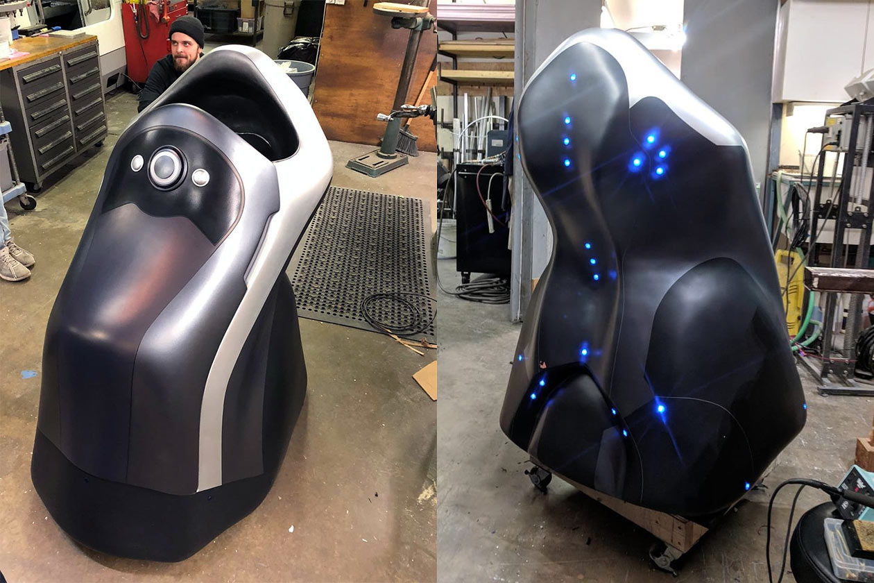
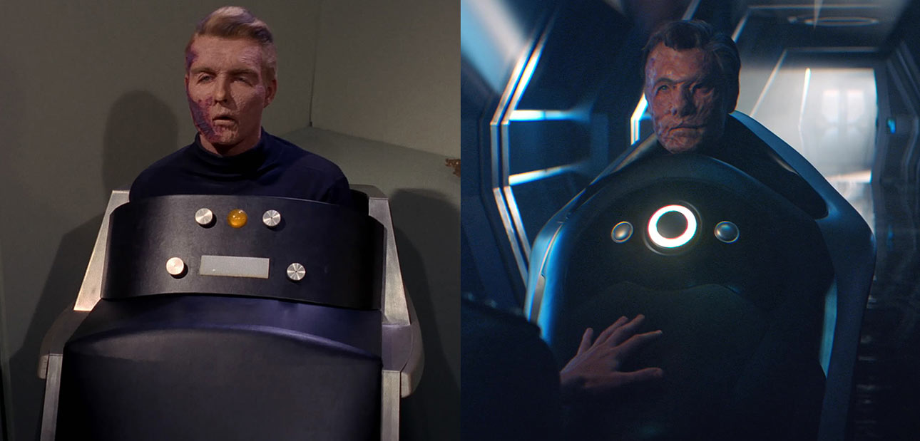
To start, I had to ask Moreira about the surprising appearance of Captain Pike’s iconic support wheelchair, updated from its appearance in “The Menagerie” for 2019’s “Through the Valley of Shadows,” where Pike (Anson Mount) experienced a vision of his own tragic future.
“That was a really fantastic build,” said Moreira. “Concept artist [and series lead creature designer] Neville Page when full steam ahead on that [and] presented me with the first design. I rarely do [design] tweaks when I work with Neville, because his mind is so out there – and he is so in love with Star Trek that he wouldn’t want to disrespect the canon in terms of the futurist look.”
Captain Pike’s support chair — then and now. (Photos: CBS)
“It’s probably as close to the original Trek prop as any of our [pieces] are,” he continued. “While I’m not sure exactly how the original was built – it was probably just a wooden box – our version was milled out of a thick piece of high-density foam, and the front door [for Mount to get in the chair] comes off with magnets. It was hand-carved, hand-smoothed, and built with auto body fiber-glassing, then it was glazed and painted.
In terms of the overall build, it was a pretty tight schedule to get that thing turned around, and we had one little tweak that had to be done to the back wheel, but it’s a very traditional build in a sense.”
I was trying to imagine the process as Mario described it: the tools, the worktable… it was a fascinating experience to hear about the work and Mario’s pride in it was obvious.
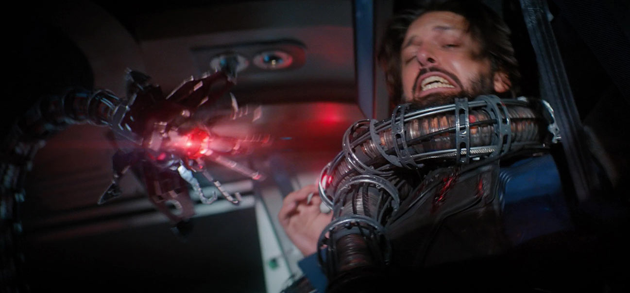
Shazad Latif ‘fights’ a physical tentacle prop on set, extended with CG magic. (Photo: CBS)
Moving from an homage to the past to a danger from the future, the next item on Moreira’s list of favorites was the deadly Control-powered tentacle from “Light and Shadows,” a largely digital effect that needed to become tangible for actors Anson Mount and Shazad Latif (Tyler) to grapple with.
“We had a real kick out of building the AI tentacle that came from the future,” Moreira said. “The big tentacle [the actors] were fighting off was largely computer generated, but at the heart of it was an actual physical prop that they were fighting with.”
While it may seem unimaginable that a robotic tentacle from a futuristic weapon might have some roots in reality, Moriera shared some of the technical work that went into building the real-life prop for the cast to work with on set.
“It started as a giant vacuum extruder hose that we ran ten-speed bicycle cables through,” he explained, “to give it both rigidity and flexibility. We gave it aluminum rings that we ran more springs through, and coated the outside body with little plastic pink and brown balls to give it ‘musculature.
A lot of its ‘life’ is just actor manipulation: as the actors moved, the thing actually fights against them, so it’s almost like a self-puppeteered prop. At first, we built it as a true puppet — that’s what the cables were for — to run it off-stage, but as the thing got heavier and more complicated, we realized it was going to be impossible to manage that way.
As I lifted it up, it kind of sprang away from me and I realized it was doing what we really wanted it to do on its own. It happens by accident sometimes!”
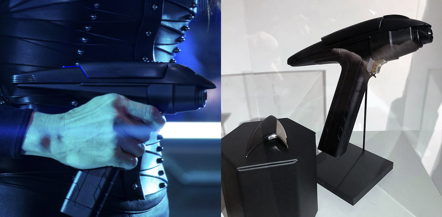
The new phaser design used by Section 31 agents. (Photos: CBS, TrekCore)
As for more present-tense weaponry, the new phaser design used by Section 31 operatives was one of my personal favorites of the year, and I’m eagerly hoping for some licensee to produce a replica that I can add to my already over-populated collection.
“We only built a few of the new Section 31 phasers [compared to the regular Discovery phasers],” Moreira laughed, “so we could be a little less cost-effective! We knew that it had to be fairly solid — since Leland was going to be in a big fight and it was going to get thrown around — so that version of the weapon is actually solid aluminum, anodized black.
The barrel actually retracts and extended for the ‘stun’ and ‘kill’ settings, which was a last-minute add to the design. We had the whole thing approved, and then [executive producer] Alex Kurtzman asked, ‘What if it did this?’ and I was like, ‘We CAN do that – because that sounds amazing!’
There’s a little motor in the body of the phaser that powers the whole thing, extending and retracting the barrel. It didn’t cost that much extra, but the detail on this thing is absolutely incredible — I love the Section 31 phaser, and if there was one prop I could take home myself it would be this one!”
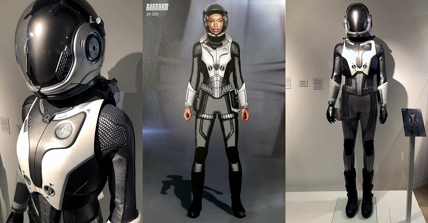
The new Starfleet spacesuit, along with concept art from “Project Daedalus.” (Photos: TrekCore)
While Michael Burnham (Sonequa Martin-Green) got to spend much of the show’s pilot episode in a bulky “long-haul” spacesuit with a large thruster apparatus, the opening of Discovery Season 2 allowed Moreira and his team to work up a new spacesuit design for the crew, first seen in the dangerous journey down to the Hiawatha crash site.
“I love working on space suits,” Moreira admitted, “and this show has given me a great opportunity to do that. It was so nice to work on something that was so ingrained in Star Trek lore, the new EVA suits we saw Pike, Burnham, and Nhan wearing in the beginning of the season.”
While “Brother” featured the trio in gold, red, and silver versions of the new spacesuit — along with ill-fated Lt. Connelly in blue — much of the Discovery crew got a chance to sport versions of the suit as the season progressed.
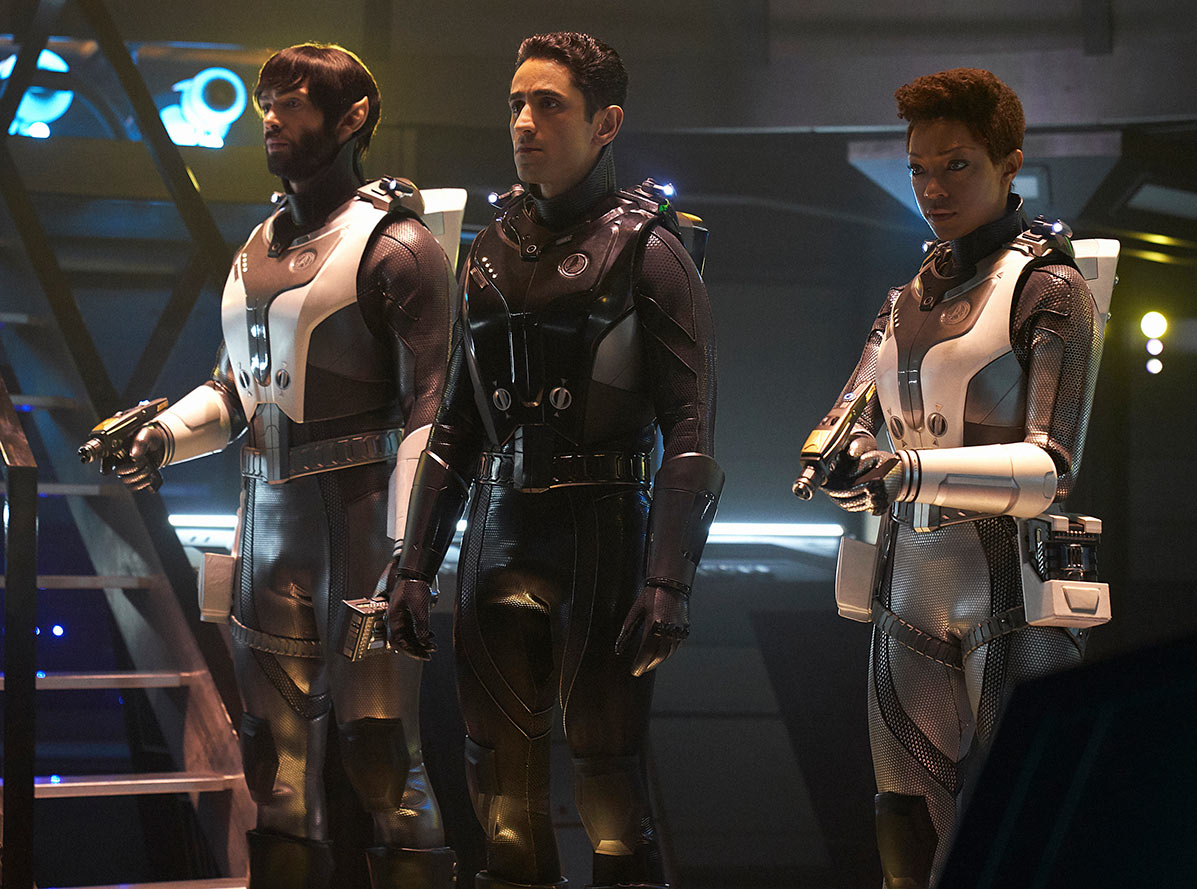
The standard Starfleet space suits, and the black variant used by Section 31 agents. (Photo: CBS)
“It was like improving on a prototype,” Moreira continued, “because we got to do it twice. We got a second chance to work on them [after “Brother”] when Airiam and Burnham got to go to Section 31 headquarters [in “Project Daedalus”], which allowed us to find solutions to problems we had been working on.
Later on, we saw Spock in is own suit, and then we did a color change for the versions worn by Georgiou and Section 31. Basically, we were able to work on the EVA suits over and over again [with each episode] to make them better.”
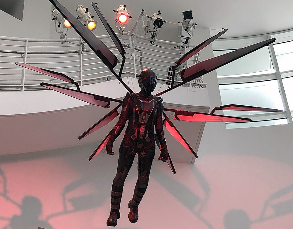
A variant Red Angel suit built with physical wings, on display in Los Angeles. (Photo: TrekCore)
With all of this talk of props from the past, future, and present, it was only fitting that our conversation on Discovery’s Season 2 props ended on the season’s temporal technology, the time-crystal-powered Red Angel suit.
There were actually three versions built for Discovery’s second season: a pristine version seen in the “Perpetual Infinity” flashbacks worn by Gabrielle Burnham (Sonja Sohn), a damaged version presented as a kind of mannequin after her capture by the Discovery crew, and the new build worn by Michael Burnham in the season finale.
“On-screen, the Angel wings were entirely CG, though we have built an actual, physical set [for the Paley Center prop display in Los Angeles],” Moreira explained. “The suit itself is 3D-printed fabric underneath a 3D-printed soft resin, all nylon-sewn into the suit; [Sonequa] can run and jump with it, and we can fly her!”
The damaged Red Angel suit, nearly destroyed by Leland in “Perpetual Infinity.” (Photo: TrekCore)
“Other shows usually wouldn’t build a visor into a suit like this,” he said,” but we built the visor into the helmets [rather than use CG], giving an authentic reflection for the camera to pick up and something for the actor to work with — but the helmet has more fans and blowers in it than any other helmet we’ve made, because the visor is so close to her face that we had to keep air blowing… otherwise it would fog up in an instant!
We went out of our way to create a helmet that was more breathable and authentic for the actors, and both [Gabrielle Burnham] and [Michael]’s suits are amazing pieces.”
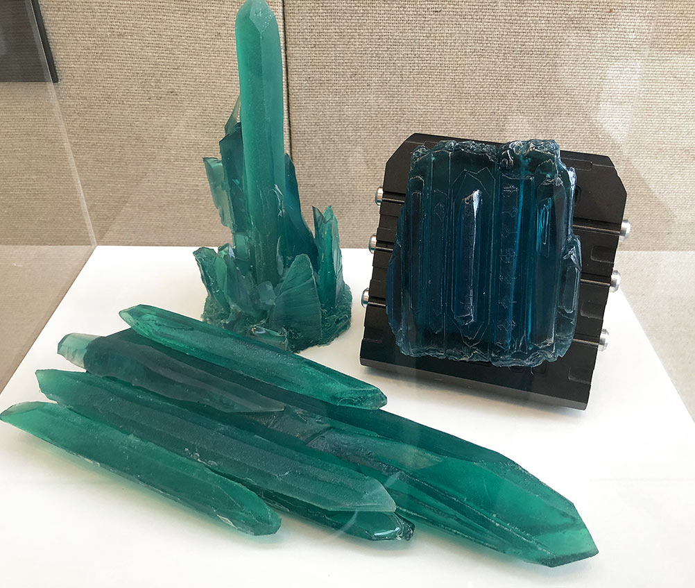
Mysterious time crystals which appeared throughout the season. (Photo: TrekCore)
The Discovery production team is already hard at work getting prepped for the show’s third season, which is set to begin filming back in Toronto this summer. After telling me about the Trek toys he keeps on his desk at work — models of the Shenzhou and Discovery, along with some classic Trek bobbleheads! — Moreira shared his excitement for what’s next for the show as it moves to the 31st Century.
“I would just say, as a fan,” Moreira said, choosing his words carefully, “getting ready for Season 3 — from what I’ve seen and read — is really going to blow some minds. It has been a fun season to design and build for, and will be an amazing season to watch!”
While an exact return date for the series has not yet been announced, Star Trek: Discovery is expected to return in 2020 sometime after the first season of Star Trek: Picard finishes its ten-episode run — and I’ll be keeping my eyes peeled for one of those Section 31 phasers while I wait!
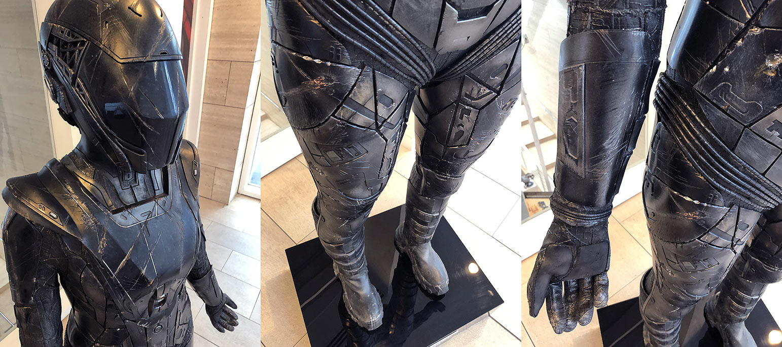
But for now, if you’re in the Los Angeles area, you can check out the real props from Discovery Season 2 at CBS’s Star Trek: Discovery — Fight for the Future exhibit, a free-to-the-public gallery which runs through July 7 at The Paley Center for Media.
While no formal plans have yet been announced, it’s hopeful that some or all of this exhibit will make its way to San Diego Comic Con and the annual Star Trek Las Vegas convention later in the summer as well, following the trend started by Discovery displays from 2017 and from 2018 at those events.
Portions of this interview have been condensed or edited for clarity.
Let us know in the comments below some of your favorite props from Season 2 of Star Trek: Discovery!
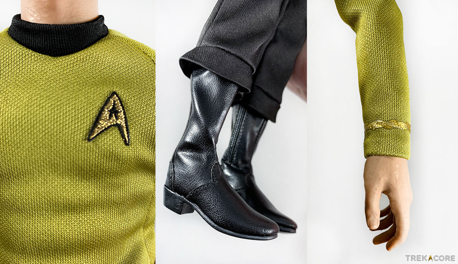
QMx continues to fill out the crew of the USS Enterprise NCC-1701 with their latest 1:6 figure release, helmsman Hikaru Sulu, the second addition to QMx’s Original Series line this year and fifth overall in the classic Trek lineup.
These popular figures are highly detailed replicas of your favorite crew members, and they command a hefty price — but even at $179.95, the company’s first release of 2019, Montgomery Scott, sold out within just hours of its release for online ordering. The figure that you receive for that price is incredibly detailed, however, and not just the sculpt of the body — the included uniform replica and accessories are really standout.
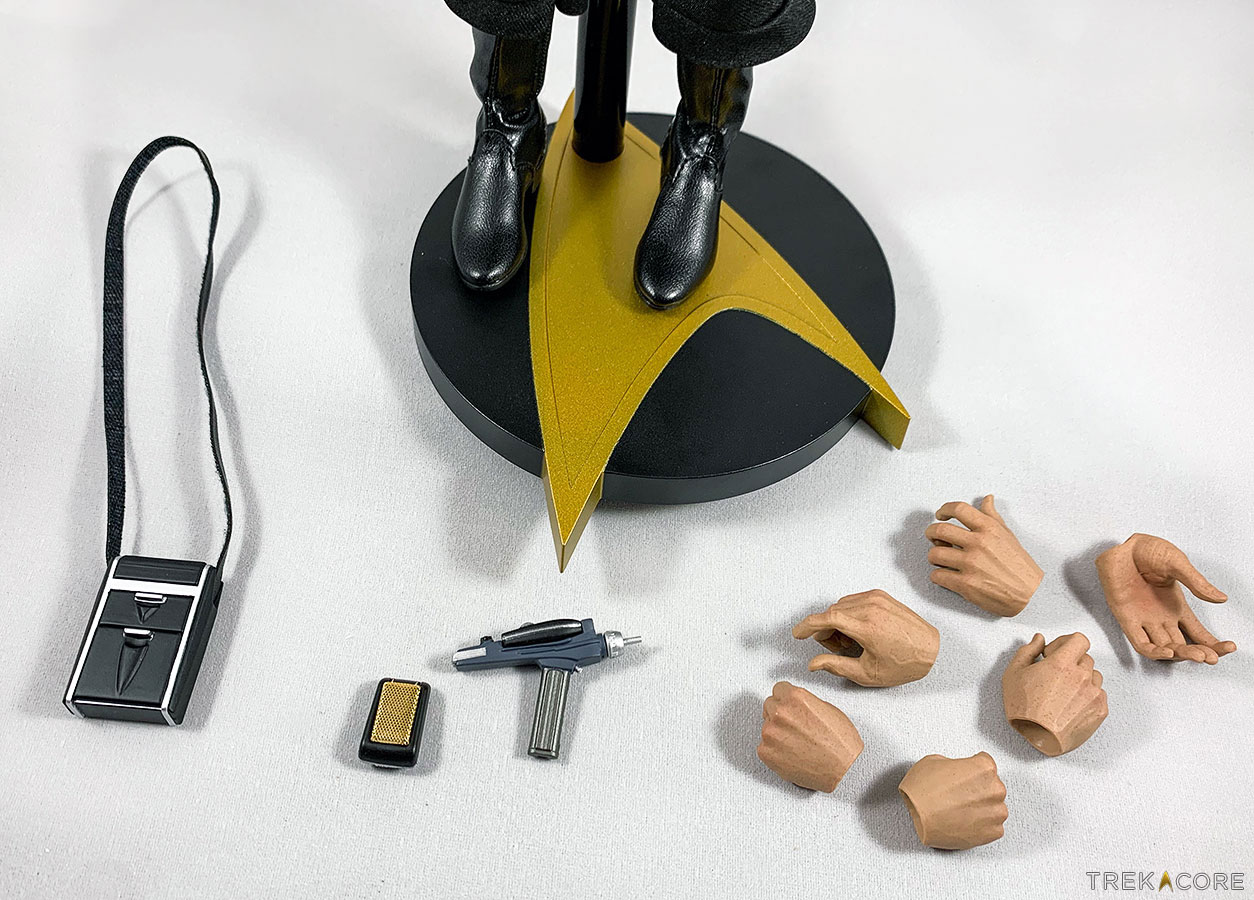
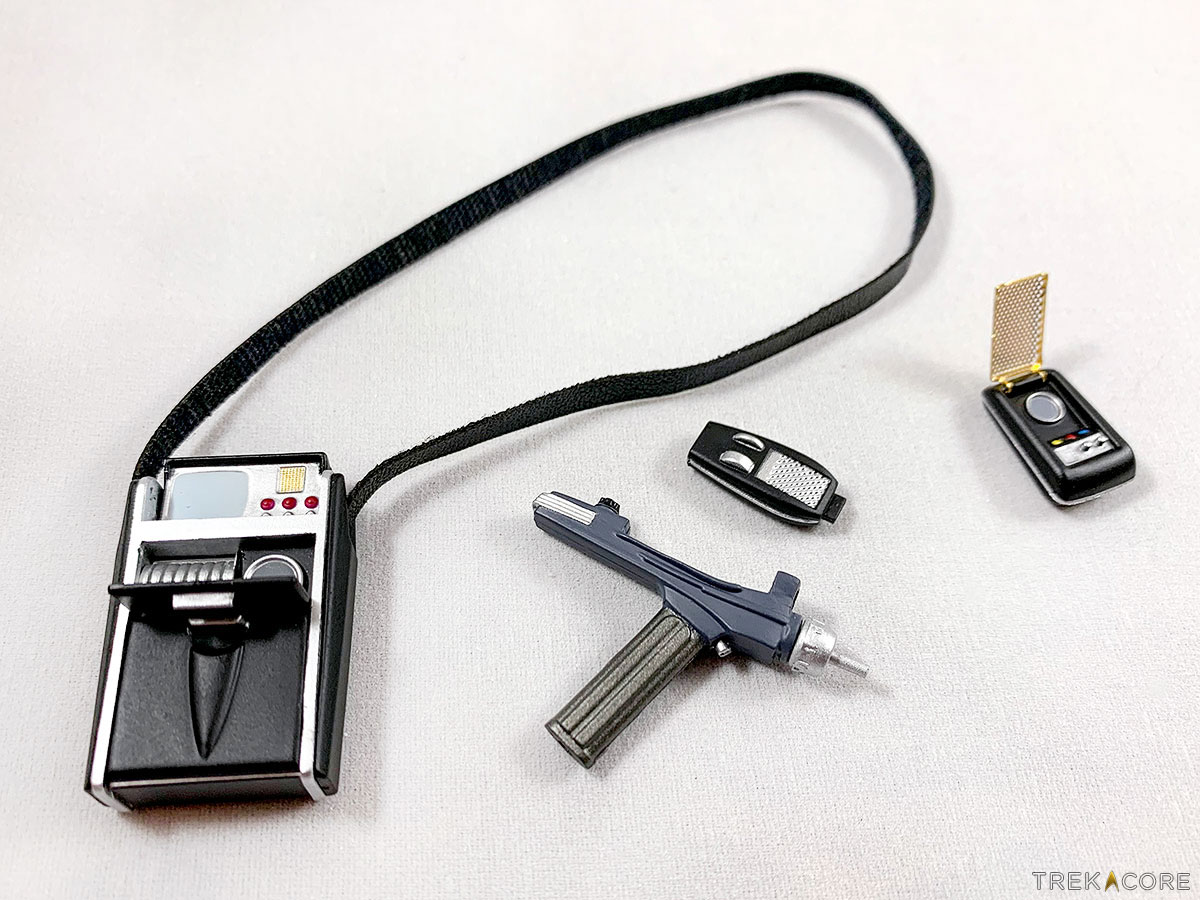
Standing approximately 12 inches tall, Lieutentant Sulu is depicted with his standard Original Series-era Starfleet uniform, and comes packaged with a display based, as well as a phaser, communicator, tricorder, and six different hand replacements that can be swapped out to allow the figure to handle the props.
QMx’s 1:6 line stands head and shoulders above the old Playmates Toys 12-inch figures, as well as they should given the high price point. The figure boasts a level of attention and intricate details across the whole design that elevates it above any other Star Trek figure products that are – or have been – on the market.
The figure also has a high degree of articulation, more than 30 points, allowing it to be posed in many different ways. Articulation of the head, elbows, forearms, hands, torso, legs and feet allow for the figure to be posed in a number of very realistic looking action poses that create a dynamic display product.
The likeness to original Sulu actor George Takei is decent from certain angles, though not as accurate as the prototype images QMx has posted on their website. The actual figure is not a dead ringer for Takei, but it is certainly the closest of any Star Trek Sulu figure release to date. So far, I think the retailer’s McCoy figure remains the highlight, in terms of nailing the likeness for the character.
To my eyes, the issue with the likeness stems from the way the mouth is sculpted. From the nose up, it’s all Takei, particularly the eyes and sculpting of the forehead. These figures are so detailed that there is even the faintest shadow of facial hair across the figure’s face, likely at the end of a duty shift or a long day of filming.
The real highlights on this figure, though, are the clothes and the accessories. The uniform looks like miniaturized versions of the real thing; the fabric for the tunic and pants matches the original versions, and the boots evoke the Western boots with the pronounced heel from the Original Series. The pants and the boots even have small zippers – in the same locations as on the original costume pieces – to aid their removal.
The seams on the tunic are in the exact same place as on the original costume, though there is no zipper on the tunic where you would find it on the original version, likely because at that size it would ruin the look.
The accessories are also amazing. Each of the three accessories -– Type II phaser, communicator, and tricorder –- has some action to them. The phaser has a detachable Type I unit, the communicator flips open, and the tricorder has two doors that open so that it can be displayed in its operational mode. The detail on these tiny pieces is absolutely incredible. The communicator and phaser also attach to the figure by way of several hidden magnets.
The figure is also packaged with a sturdy display base that the figure sits upon, providing support and ensuring that it will stay in place wherever you end up displaying it.
If there’s one disappointment, it is that the accessories did not include anything unique to the Sulu character, like the previous inclusion of the Vulcan lyre with the Spock figure, or an Earl Grey tea glass as with QMx’sNext Generation-era Captain Picard figure. It would have been fun to include Sulu’s famous fencing rapier from “The Naked Time,” for example.
Overall, this Lieutenant Hikaru Sulu figure is a very nice addition to QMx’s 1:6 Star Trek lineup. While the likeness might not be as close as some of the other figures in the line, it is still pretty good, and the quality of the piece overall is absolutely tremendous.
If you own any of these figures already you will not regret adding Sulu to your crew, but when ordering goes live at QMx’s web shop, it’s likely to go fast – so keep an eye on QMx’s social media feedsfor the availability announcement.
What are your thoughts on this new release — and do you already have any of QMx’s Star Trek figures in your collection? Share your thoughts in the comments below!
It’s been over a year since I opened my Star Trek closet to review several of ThinkGeek’s apparel options for women, and it’s important to note how long it’s been, because despite the growth in women’s apparel options across other fandoms, Star Trek continues to trail behind — so when I found out that UK-based Wild Bangarang not only had licensed Star Trek items, but multiple items ranging from leggings to crops and skirts, I was excited to beam them directly to my quarters!
Unveiling their line if Star Trek-themed products earlier this year, the new Trek vendor includes a wide range of licensed products from various genre properties, along with dresses, workout gear, and casual wear for men and women — and as a fan of similar offerings from Gold Bubble Clothing, I definitely wanted to see if this could be another source of fun apparel for female Trek fans.
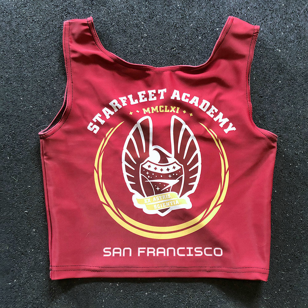
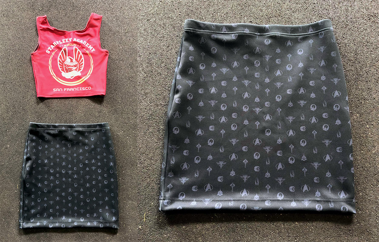
While tummy-baring attire likely violates Starfleet Academy’s cadet dress code, the Star Trek: TNG Command Red Vest Crop Top is a fun choice for your next shore leave adventure. Made of 80% polyester and 20% Elastane, the company describes their “glorious” material as “soft, stretchy, and silky.”
The logo printing on this crop top looks as though it came straight out of the replicator — it’s bold, bright, and definitely screams “school spirit.” Pay special attention to sizing for this item, though, as smaller sizes will wear shorter on your midriff. In the website photo, the model is wearing a size medium and the crop sits just about an inch or two above her belly button. In a size small (and with a larger bust), the crop sits about three to four inches above mine.
Overall, I think this crop top is a fun addition to any Star Trek fan’s wardrobe. While marketed to women, I think it can be worn by any willing Starfleet Academy student, especially during spring break on Risa! It also pairs nicely with the two items I’ll review next.
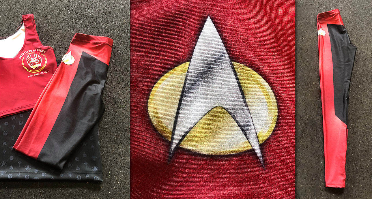
Made from the same fabric as the Starfleet Academy crop top, they feature the same shiny, sleek appearance as the top, but as leggings the material feels thin. While a lighter material allows for summer and gym wear, it also results in a sheerness that might not make these appropriate for all situations. Wearing a long shirt will easily conceal this problem, but doing so may cover up the Starfleet delta shields which are printed on each hip.
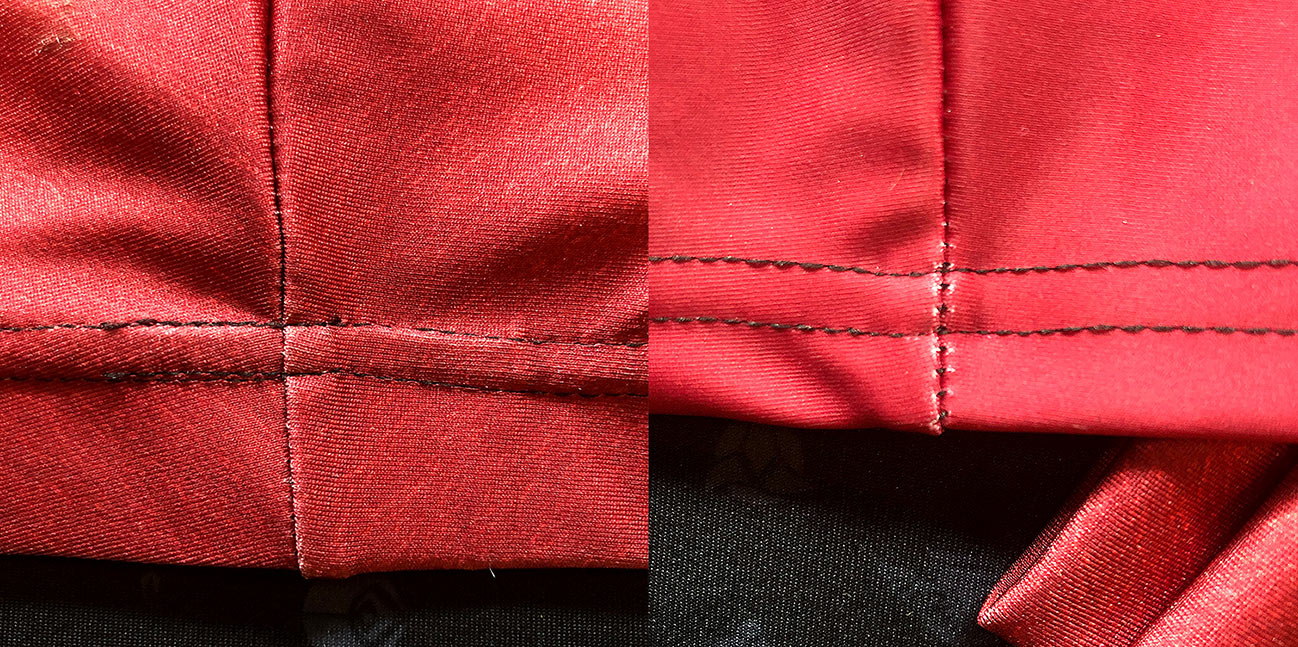
Be sure to keep an eye on the seams for stray threads and unraveling; although a common issue with this type of stitching, I was disappointed to find a few loose threads without even having worn these leggings outside.
What I love the most about these leggings is the bold color of command red; these are easily the most attractive Trek uniform-inspired leggings on the market.
Most of the Star Trek women’s apparel out there are T-shirts and dresses, so the rare appearance of a body con-style skirt is a relatively unique part of this collection, making the Star Trek Official Logo Mini Skirt my favorite of the three products.
Unlike the previous two pieces, the mini skirt is 95% polyester, 5% spandex, which feels thicker than the crop top and leggings, and does not go sheer. Featuring logos from around the galaxy — representing the Federation, the Romulan Empire, the Cardassian Empire, the Klingon Empire, the Ferengi Alliance, planet Vulcan, and the Borg Collective — the grey-on-black lends to a muted tone which makes this skirt acceptable for office wear as well as a night on the town, making this piece is the most wearable and versatile of the collection.
While the fabric is comparable to brands like Gold Bubble and Black Milk, the quality isn’t up to par — there’s a strange whitening effect occurring around the stitching at the seams, which seems to be an issue with all of the garments sent to us for this review, even with the heavier fabric used in the logo skirt.
I’ve never seen this with a fabric before so I’m not quite sure what the issue is. It’s not enough to discourage me from buying more from this licensee — at a price point of £30.00 (under $40 USD before shipping), I’m definitely thinking about buying the Operations Yellow and Medical Blue leggings for my wardrobe — but if these items were more expensive, I’d be less inclined to open my wallet for them.
Overall, I feel that the quality of Wild Bangarang’s items are on par with the price point, which makes this an affordable option for most. Although the company is based out of the UK, shipping fees are reasonable, but any overseas purchase can make returns or exchanges difficult. The leggings and crops come in the traditional Star Trek colors (blue, red, and gold), with additional options including a montage of artwork by Juan Ortiz as well as a robotic Borg-inspired variant.
It’s great to have another addition to the Star Trek apparel market, and I look forward to seeing what else Wild Bangarang does with their Star Trek license in the future!
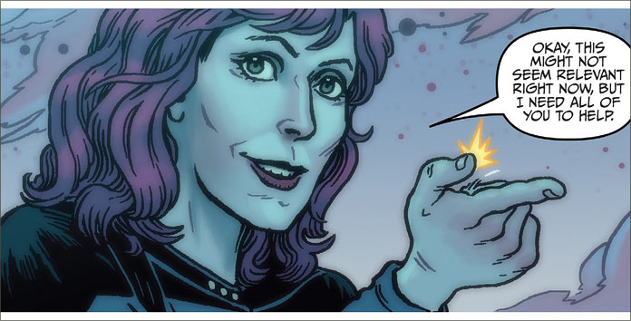
Written by Collin Kelly and Jackson Lanzing, the scripting in Star Trek Year Five #1 is thoroughly meaty. Lots of description and dialogue that is not only substantially in its detail but also does well in communicating a true sense of the characters.
In the last year of Captain Kirk’s famous five-year mission aboard the original Enterprise, we are shown a crew who is not only familiar with the challenges and discoveries of space exploration but who are also thoroughly well-known to each other.
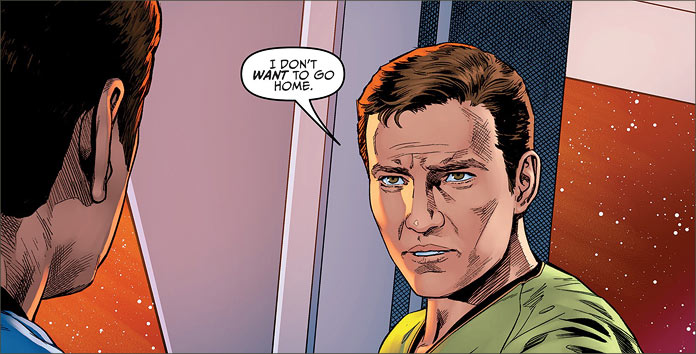
Kirk and crew are coming to the end of their mission and are about to be recalled. Their last scientific mission is interrupted by a distress call. Meanwhile, while all of this is happening, Kirk is pondering being offered an Admiral’s posting when he returns home. Of course, the major dilemma is this: he doesn’t want to go home.
This is a seasoned captain and crew. They are no longer surprised by the infinite diversity of space – they welcome it; they are used to it and each other. However, they are not tired of it or each other – they simply know their jobs and they do it very well.
In one panel, we see Chekov’s youthful excitement over the Enterprise’s final mission: to safely contain the energy of a collapsing hypergiant and save over 10,000 planets within its immediate explosive vicinity. This is the Chekov we know and in response to this exuberance, we are treated to a lengthy and overly rational diatribe from Spock who describes the danger of the situation and chastising the young ensign for his description of it being “fun.” Chekov’s muttered response is not only entertaining but also an authentic one well in tune with the character.
The beginning of the story is very sinister, however and lends itself to a great deal of curiosity. A shadowy figure is holding a pistol to a beleaguered Captain Kirk’s head, who is recording his final log and that opens the story by describing the aforementioned mission.
It’s also the mood that has been expertly captured in this story. It’s present in McCoy’s surliness, Sulu and Chekov’s banter, Spock’s elongated, overly logical statements and Kirk’s private, deeply brooding moments. Lanzing and Kelly’s dialogue precisely portrays the right dynamics among the characters and even their decision-making process is well-reflected.
There’s a lot happening in this story; a great multitude of different minor plotlines in this book that not only tease us with the promise of different pathways of exploration for the reader but also real concerns the characters have that are situated in their eventual canonical career choices. Lanzing and Kelly provide us with a script that is phenomenally rich in the texture and content that would be expected from a Star Trek episode script in the last of its five-year mission. It’s a difficult thing to surprise us with canon, but Lanzing and Kelly have accomplished that, and that is a truly awesome thing.
Of course, the scintillating artwork from Stephen Thompson is a true pleasure to discover as well. Thompson gives us his idea of rich texture in terms of expression, body language, camera angles of view and a tremendous amount of detail as well. When Kirk and McCoy are discussing the possibility of being an Admiral, we are treated to a real work of sequential storytelling that make this a true candidate for one of those missing fifth year mission stories.
This comic is a sheer work of genius art in that it collects the essence of the matured third-season Star Trek that made it such a memorable show.
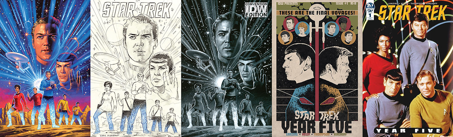
When a comic boasts five variant covers and three out of the five covers are versions of the same design by the legendary Greg Hildebrandt, then that’s a definite signal from IDW that they are really taking this particular Trek title seriously.
The regular cover is simply remarkable. Anyone who grew up in the eighties and read fantasy titles would know both Greg and Tim Hildebrandt’s work. It’s iconic and so unmistakable. Both Greg and Tim’s works were labours of love. They were characterized by emotional intensity and action. On this cover is a combination of sequential and stylistic art.
The crew, led by Doctor McCoy are in the middle of beaming down to a planet on the bottom half of the page, while the top half is a stylistic image of Kirk and Spock, accompanied by the Enterprise on the left-hand side of the cover, surrounded by shooting stars and stellar phenomenon. It’s a tricky combination of aspects but an absolutely incredible experience to enjoy.
Hildebrandt’s artwork also adorns the retailer-incentive cover ‘B’ as well as the convention-exclusive cover variant — a rough pencil image, and a finished pencil variant.
The retailer-incentive cover ‘A’ is by J.J. Lendl. I’m not very familiar with Lendl’s work but this is a really enjoyable piece of work as well. A stylized design that sees a split page of side portraits of Kirk and Spock with a rising Enterprise dividing the page. A litter of cameo portraits dot the top side of the page featuring various members of the crew. It’s quite a striking design and very intricate.
Finally, the Diamond retailer summit exclusive cover is a photocover featuring the all-familiar portrait of Uhura, Kirk, Spock and McCoy that fans will easily recognize. I’m not a photocover fan, but I understand the appeal.
Star Trek Year Five is a thick and juicy Trek story that begins with an event that clearly is at the end of this story arc. Given that this is a regular series and not an abbreviated mini-series, it’s a book that holds a great deal of promise for fans of this franchise.
I’d recommend that you adjust your orders wherever you purchase your comics for this one and prepare to go to Awe Factor 8!
Today in New York City, CBS Television held their annual “upfront” presentation for advertisers, where the company showed off their broadcast network schedule for the coming 2019-2020 season, their slate of new shows for the CBS broadcast network and CBS All Access — and where they finally, after months of waiting, revealed the first official details about Patrick Stewart’s return to Star Trek.
STAR TREK: PICARD, the finally-announced official title of the upcoming Jean-Luc Picard series — one that had seemingly been debunked by pilot episode director Hanelle Culpepper two months ago — got its moniker at the CBS presentation today, where the first footage from the upcoming production was showcased for advertisers and reporters in the room.
The "Star Trek" Picard series is apparently called … "Star Trek: Picard." #CBSUpfront
Despite the somewhat underwhelming title announcement — but at least we don’t have to call it “untitled” any longer! — a brief shot of Patrick Stewart was featured, showing the former captain in civilian wear… and it appears that a familiar-looking Starfleet uniform was in his vicinity.
We’re still waiting for an official press announcement or official release of the Patrick Stewart footage, but you can be sure we’ll update this post with that information as soon as it’s available.
They’ve released the official logo treatment through social media and on StarTrek.com:


