We’re back with another look at the recent subscriber releases from Eaglemoss’ Official Starships Collection, and today it’s a look at issues #108 and 109, the Cheyenne-class USS Ahwahnee from “The Best of Both Worlds, Part II,” and the Borg Queen diamond ship from “Dark Frontier.”
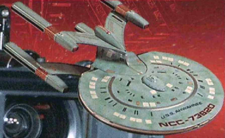
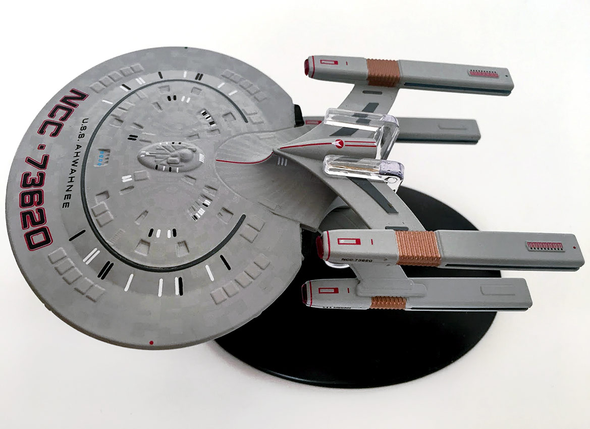
The fact that the Cheyenne-class USS Ahwahnee is a ‘kitbashed’model is fairly evident from outside of the box before you even get your hands on it. The Galaxy-class saucer is shouting at you from a distance, but the odd point here is that this primary hull is actually two bottom-halves of a Galaxy-class saucer mated together.
Take a look and you’ll see the recessed square windows near the center on both the top and bottom pieces plus the curvature of the saucer from outer edge to center starts a couple of centimeters from the rim rather than the doming effect of the top of the Enterprise-D saucer.
In fact, it’s brilliant that the producers of the Official Starships Collection have gone to the effort of replicating that saucer detail on both sides from the original source material — which is probably the AMT model kit for the Enteprise-D rather than the studio model itself!
There’s also an unusually-lage ship registry and name emblazoned across the front of the hull here. I mean, jeez, it’s massive. Maybe there’s a Federation standard size for ship numbering fonts, but this is out of proportion to the rest of the ship. Also, if you like your starship comparisons, the top of the saucer is in metal while the flip side has a plastic insert.
Detail-wise, the two sides of the saucer are identical in quality, with one exception — the top side has the bridge module in center spot, while the bottom appears to have a captain’s yacht docked. Otherwise, there’s only the rim to mark out where the plastic and metal come together.
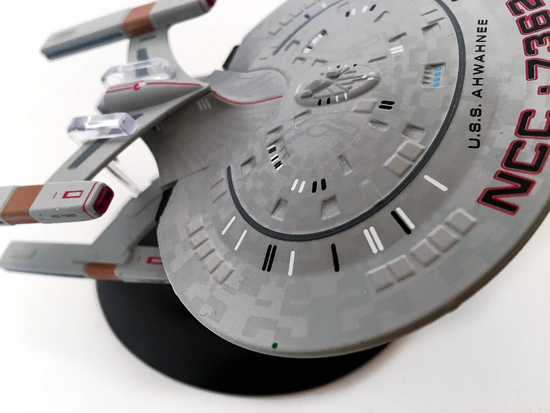
While this ship was designed and built to be a floating blob in the background of a scene – part of the destroyed Federation fleet in “The Best of Both Worlds, Part II,” rather than a center-screen hero ship, the Ahwahnee was was till afforded a decent finish with a great aztec paint job.
Moving backwards, there’s the double cobra-head lifting the quadruple nacelles above and below the oval main hull… and with the engines in this formation, it almost makes the Ahwahnee look like the lovechild of a Galaxy-class vessel and an Earthforce Starfury from Babylon 5!
There is, however, a reduced number of windows in the double cobrahead, as well as the saucer, since these are supposed to be much smaller than the model class they were pillaged from. What I do like here is the inclusion of the Starfleet pennant atop the engine pylon assembly. It draws the design together, and the simple red edging down the structure and (also on the engines) gives a boost to the two-tone shading on the hull.
This whole rear section is a scratch build, from the splitter engine bar and out into the nacelles themselves. As with the Springfield-class USS Chekov, the warp engines are heavily-disguised marker pens, but if you didn’t know, it’d be difficult to guess thanks to the golden vent detail, warp grilles and bussard collectors all sufficiently masking the structural source.
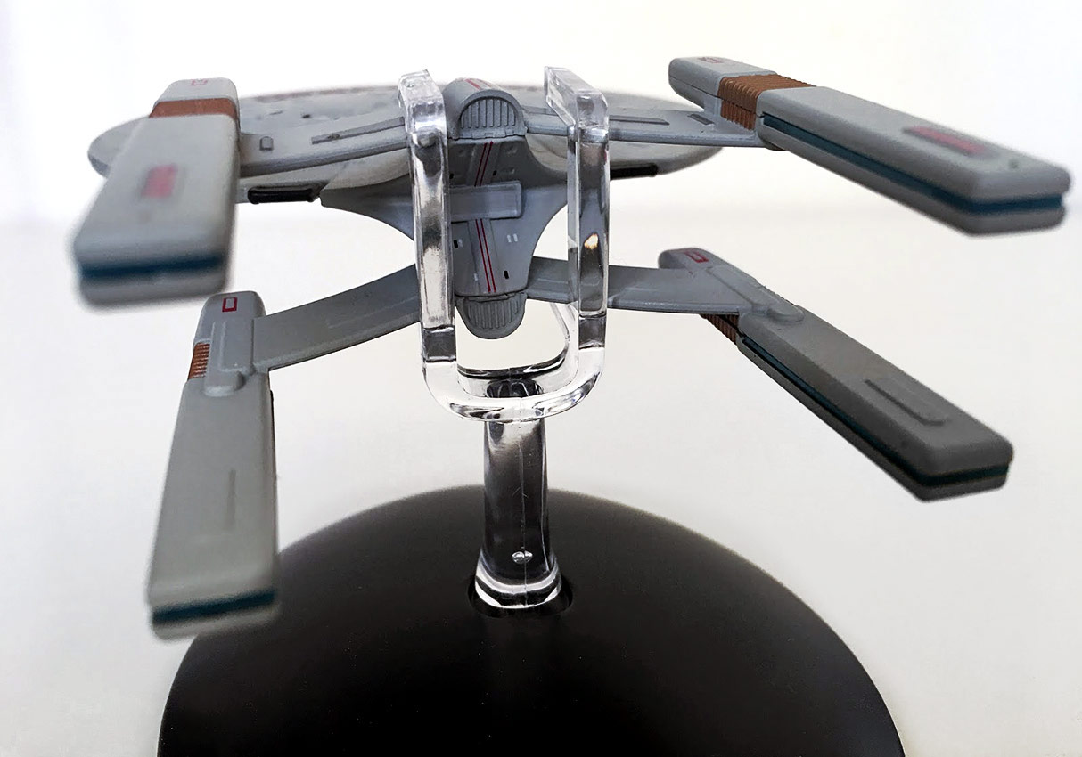
With as difficult to see as this model was in The Next Generation, you might think there’d be a lack of smaller detailing on the ship, but there actually appears to be a shuttlebay fitted to the rear of each nacelle assembly, set on either side of a tragically unpainted impulse engine bock. It’s too bad that this section wasn’t painted, and I recommend you find a good red marker to color it in manually.
For me, the consistency of detail on both top and bottom — especially when it comes to a ship that was only ever window-dressing — is stunning. She does look total class, even if she is simplistic in execution; for fans of all things Borg-related, the Ahwahnee is a certain addition.
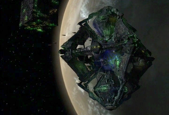
Next up is something equally incredible, the Borg Queen’s diamond-shaped vessel from Star Trek: Voyager’s “Dark Frontier.”
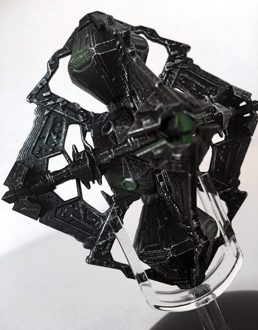
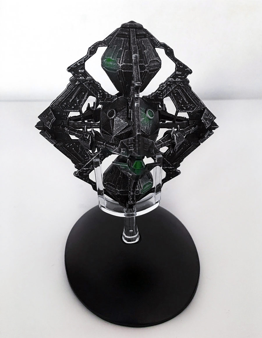
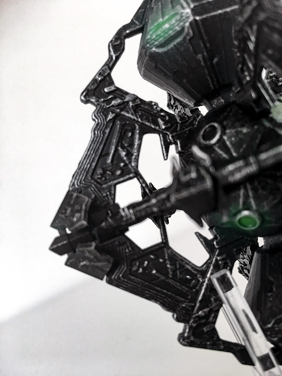
This has to be up there as one of the most intricate designs ever to cross from the screen into the collection, given all the angles, textures and pointy bits that mark every surface on the model.
The first thing that struck me is the paintwork. While there is still the metal-and-plastic combo in play, it’s hard to tell which is which material thanks to the textured paint finish that makes ALL of the octahedron look as though it’s brushed metal. However, the two component parts don’t have a defined top and bottom; rather they are worked together into the main frame each forming two ‘sides’ of the outer skeletal structure.
It’s a new step for Eaglemoss with this process, rather than doing certain pieces in metal and others in plastic, as one might normally see with a lot of the Federation ship models.
In the Borg Queen’s vessel, the parts are virtually indistinguishable since they all have the same surface panel detail, appendages and fantastic brushwork. It all combines for an impressive overall visual effect that really works.
At the center of this unique design is a core again painted in the brushed metal effect. The main thing to spot here are the ‘glowing’ green sections which gave the craft more depth on the screen. The challenge here is that the translation from screen to model means that the depth of the center block, and the indication that it rotates, does get lost somewhat due to the restrictions of cost if nothing more.
The energy signatures, spotted around the surface of the ship in green, emphasize the Borg nature of the diamond-shaped ship, plus it brings some life to what is a brilliantly realized model. This has to be recognized for the great paintwork at the least – that and some of the rather sharp edges.
Of all the Borg ships this, for me, is probably the most accurate and has the right feel to it, especially when compared to the Tactical Cube which suffered from being 100% plastic and losing something of the weight you’d expect from a Borg vessel.
While not totally metal, the overall effect that is carried across the whole surface is fascinating and varied from one side to another and creates a very unique and distinctive product. The intricate little interior details, cutouts and prongs are just perfect and add depth to the visual experience here. It feels alive and it looks spectacular at every angle… which is a good thing, since it is supposed to be fairly symmetrical.
The stand is equally as unique, as you would expect for a Borg ship, being two pairs of vertical prongs into which two sides of the outer diamond framework slot. Solid and secure is this one, with my only note being that the base needed a slight bit of filing to fit snugly into the black base.
While I did have to wait a little longer than expected for these two vessels, they were well worth the wait and have made me even more eager for the remaining Wolf 359 ships — and the hope that there might be a more accurate Borg Cube coming down the line at some point.
With these two arrivals, it’s really a pair of cracking ships and a firm flag planted that this collection is maintaining its quality — providing some real oddball stuff that’s got fans clambering for more.
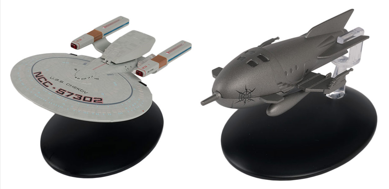
The next pair of subscriber ships I’ll be checking out is the Springfield-class USS Chekov — another casualty of the Battle of Wolf 359 — and one straight out of the holodeck: Captain Proton’s rocket ship, seen in Voyager‘s “Bride of Chaotica!”
Watch for my review of these two ships soon!
Clive Burrell is lead editor at Some Kind of Star Trek.