Our Trek Comics editor Patrick Hayes is back with a review of this month’s issue of IDW Publishing’s Star Trek comic series: the first chapter of “The Tholian Webs,” the next adventure in the new Five Year Mission.
Order Star Trek #46
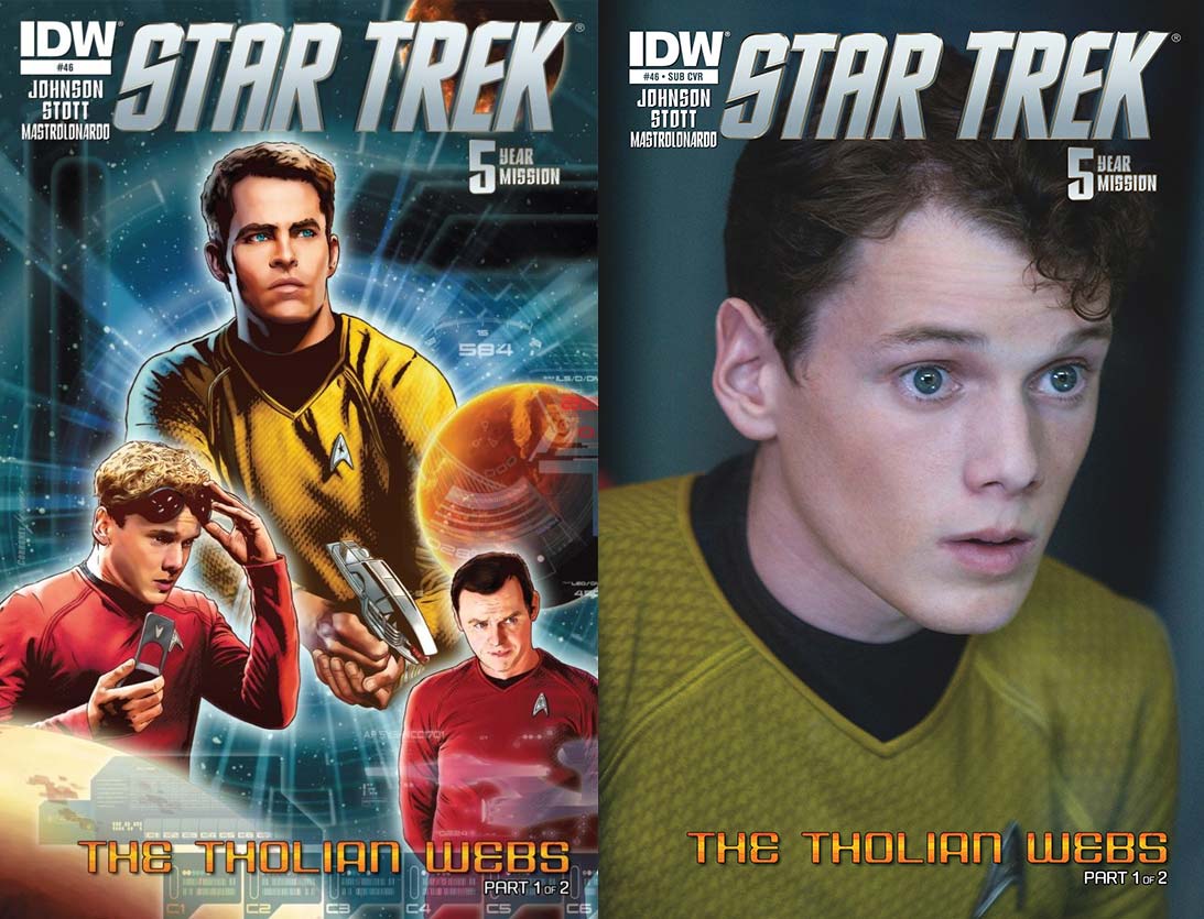
- The regular cover is another beautiful piece by Joe Corroney and Brian Miller. Kirk looks intently at a threat beyond the boarders of the image, holding a phaser ready. Scotty looks in the same direction, though his gaze is one of concern. On the left a crewman in red raises some protective goggles to speak with someone on his communicator. I’ve never seen this blonde crewman before and he’s wearing red, so I won’t become too attached to him. Three desert worlds swirl about the characters with a warp field coming out from behind Kirk. Computer overlays of Enterprise terminal screens are sprinkled throughout the image. Corroney always knocks it out of the park with his covers, and he does so here. Joining him as colorist is Miller from Hi-Fi who is just as accomplished. The glow around each character, the computer overlays, and the shading on each individual’s face is top notch. Corroney and Miller are a powerhouse team.
- The photo cover is of Anton Yelchin as Chekov. If Pavel is in this issue (and he is), the picture is appropriate because the lieutenant always seems to have that momentarily stunned look. This picture is so good Yelchin could use it to promote himself. I’m glad this is a full page bleed on this image as opposed to the previous issues’ horizontal cover images.
The Enterprise is streaking its way home to “re-establish contact with Starfleet, and make repairs after the events of the past few weeks.” All’s going well until the ship powers down out of a warp on her own. Kirk isn’t happy. “I don’t want to spend another second of this mission adrift.” The captain’s anger is tempered when Spock asks to show him something, and he puts his arm through one of the computer screens on the bridge.
The molecular cohesion of the ship appears to have been affected after their shifting out of warp-space. Chekov puts his hand through his console to illustrate it’s still occurring. Though when Kirk tries it on his chair, nothing happens. Spock believes the ship is encountering interphase. A trip to the conference room with Kirk, Spock, Scotty, Uhura, and McCoy explains what the theory is just before one of the individuals has an uncharacteristic outburst.
This is a sacred television episode for me and I was surprised to see that writer Mike Johnson was reimagining this episode. I approached this with a lot of trepidation. This was really good. Once interphase is introduced Johnson shows the physical threat to the crew and things escalate as the integrity of the ship continues to be questionable. I was nicely surprised by the sequence that begins on Page 10. This was a fantastic decision made by this character and a slick way to communicate information to Kirk.
Minor nit: the dialogue in the second and third panel completely dismisses the individual standing on the far left. I expected him to say, “Hey! I’m right here!” The fourth panel on the same page is a nice throw back to a previous page with the realization being too late. I like how trouble is coming from two separate parts of the ship.
The exterior antagonists don’t appear until the final four pages. Fans of Judy Burns and Chet Richards’ script will be pleased with what occurs because Johnson has taken the original problems of the Enterprise and doubled them. The justification for why the unknown ships are doing what they’re doing is nicely reasoned out by Kirk, but I’m hoping to see this alien threat make some reference to Star Trek: Enterprise’s history with this species. I’m looking forward to seeing and hearing this race next month in the conclusion.
Taking on “The Tholian Webs” is artist Rachel Stott, coming off her very successful run on Star Trek/Planet of the Apes: The Primate Directive. I was interested to see if she could do as well a job in creating the likenesses of the new crew of the Enterprise after doing a sensational job on the original crew. Oh, she does!
Kirk looks great on pages 1 – 3, 11, 13, and 19; Spock sharp on pates 4, 10, 11, 13, and 19; and “that character” on 5, 6, 8, 10, and 11. I’d like to draw attention to Page 11, which illustrates how deftly Stott can render her characters: the first and last panel focuses on the same two characters, but from different angles — one from on high and the other down low. The first panel allows the reader to feel he or she is eavesdropping on the conversation as a plot point is revealed, and the last has the reader join the characters in being startled at what’s occurred. Both views of the characters are superb.
Stott must also be recognized for doing something that no other Star Trek artist has done on this book in over a year — she draws her own backgrounds! Gone are the fuzzy, out of focus photographic inserts. I practically hooted and hollered at seeing this in the third panel on the first page. Engineering is the best it’s looked in a long time at the top of Page 3. This seems like something of little importance, but look at the corridor on Page 7: every recess in the wall can be clearly seen, and it’s shown in even more detail on 8. The location the story moves to on 10 is lavish in its geometry.
I have been waiting forever for an artist to come to this ongoing series who draws the entire panel. Ms. Stott, please stick around for a while.
Handling the coloring chores is Davide Mastrolonardo. He colors the interiors of the Enterprise with the same clean white and grey colors of previous colorists, but with more of the latter and some pale blues to break up the monotony of the setting’s palette. The shading of individuals’ faces is terrific with Kirk and Scotty being stand outs on Page 2 and Keenser being beautiful on 3. I also like the nontraditional use of orange used for a background color during stressful moments such as on 2, 6, and 11.
The coloring used for the title characters’ trap is the same shade as that from the famous episode, and I was happy to see it be so. This is some solid work from Mastrolonardo.
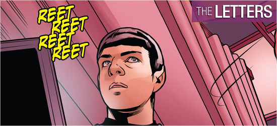
The captain’s log and dialogue (same font), computer signage, sounds, yells, the Enterprise’s computer voice, and next issue’s tease are all crafted by Neil Uyetake. I wanted to see the captain’s log and a character’s pre-recorded message in a different font from the dialogue, but what’s done is fine.