Our Trek Comics editor Patrick Hayes is back with a review of this month’s issue of IDW Publishing’s ongoing Star Trek crossover comic series: the fourth chapter of “The Primate Directive,” where the Enterprise crew visits the Planet of the Apes!
Order The Primate Directive #4
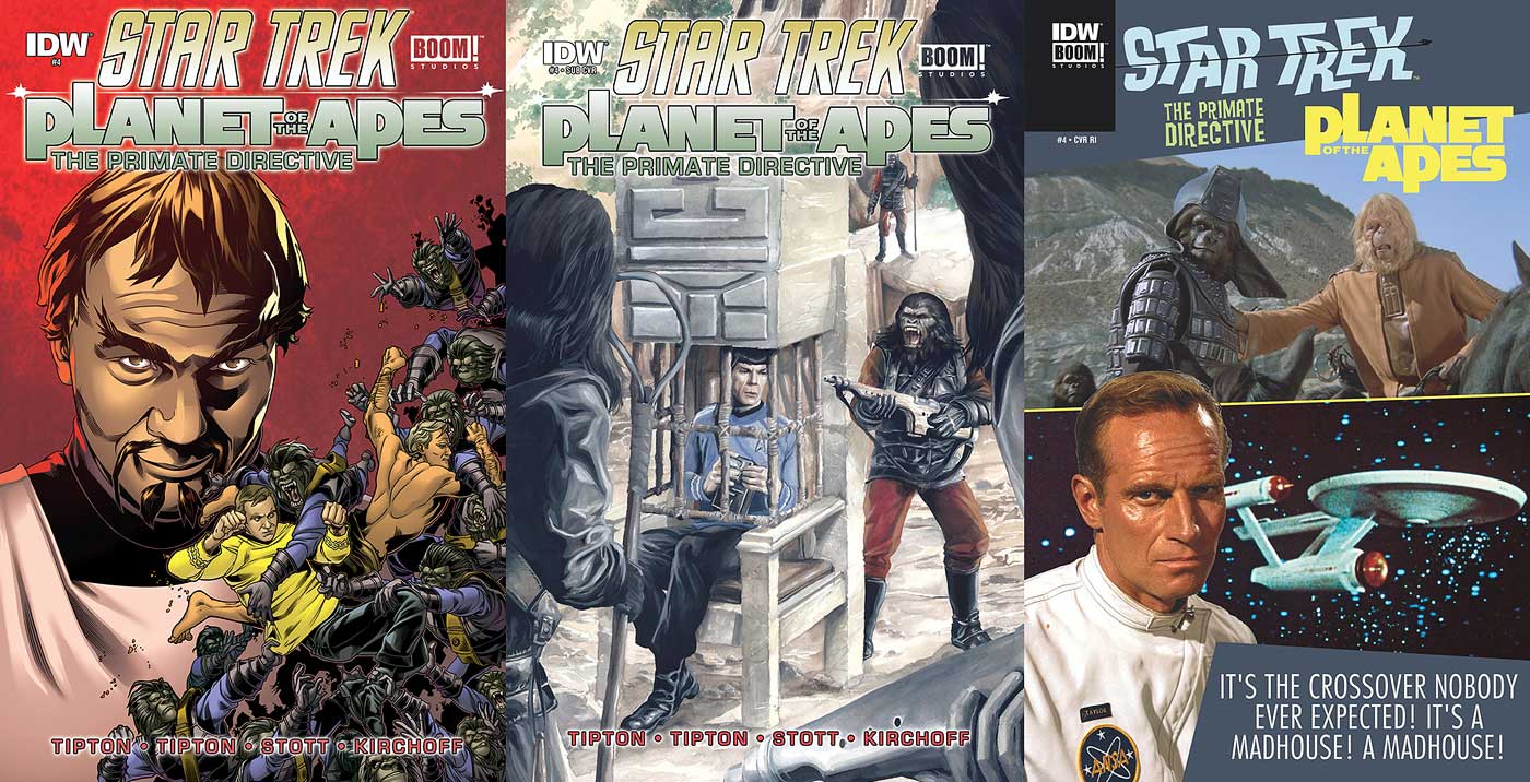
- Kor grins deliciously at the harm he’s thrust upon Kirk and Taylor as they’re drowning in gorilla soldiers trying to tear them apart. This infamous Klingon looks just like John Colicos. The two heroes of this regular cover look good and the ocean of apes excellent. I like how artist Rachel Stott has the simians appear to be nothing but teeth and grasping hands. The colors by Charlie Kirchoff are also good with that spectacular red to backlight Kor and how Kirk’s tunic and Taylor’s flesh stand out against the blue of the gorillas.
- A painted illustration by J.K. Woodward graces the subscription cover. Spock has been captured and placed in a prisoner’s chair within Ape City. He’s being watched by three gorillas who appear upset at the sounds his tricorder is emitting. The world’s greatest Vulcan looks great — love the expression on his face, and the apes also look good. Trivia note: Spock’s chair was not in one of the Apes films, but was a part of the now classic Mego Planet of the Apes toys. I didn’t know this until I saw it on an Ape’net site.
- The retailer incentive cover is another Gold Key-inspired photocover. At the top is Zaius and (I think) General Ursus, and below them is Charlton Heston as Taylor in his spacesuit, with the Enterprise behind him on a star field. I am absolutely in love with these mash-up covers. I love Zaius’s expression as if he’s saying the text at the bottom.
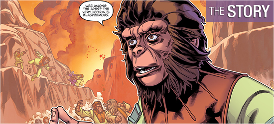
The penultimate chapter of “The Primate Directive,” by Scott Tipton and David Tipton, begins with the crew of the Enterprise — and Taylor — making plans to return to the planet of the apes and stop the Klingons. Once back on earth, they meet up with McCoy, Cornelius, and Zira and then make their way into the gorillas’ base.
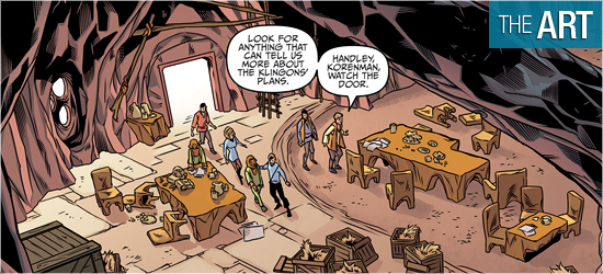
Inside they find several open crates. While Spock and Kirk examine the boxes, Scotty and Cornelius share a moment with the engineer answering the ape’s questions about time travel. Faster than you can say “Escape from…,” Kirk pulls his officer aside, “Scotty, we’ve got to be careful about what we say here.” With his head hung low, the Scotsman replies, “I’m sorry, captain, I don’t know what I was thinkin’. But he wasn’t makin’ heads or tails of it anyway.” I don’t think for a second the Tiptons would create this moment for a throwaway scene.
The issue continues to further the tension between the crew that can’t interfere in the natural growth of a world and a society that’s about to be changed by the Klingons’ intervention. Cornelius has got an issue stealing monologue on Pages 6 and 7 that illustrates this.
Zira gets to do something no ape has done before, which leads to a nice display of ape division in the second panel on Page 11. Just as it seems that words may save the day, one individual decides to escalate things for an excellent cliffhanger.
If you’re thinking this is just a talking heads issue, guess again. In addition to the always present tension steaming within characters shown with just a glance (panel two, Page 8 and panel two, Page 12), there’s a nice fight scene on Pages 13 – 15 that harkens back to George Perez’s cover from Issue #1. Additionally, there’s a meeting of forces on 18 – 20 that moves quickly, leaving readers hanging until next month’s conclusion.
Sensational visuals from Rachel Stott. Her triumphs creating likenesses of the characters, human and ape, have been praised before, and they still deserve that praise, but she deserves to have two other aspects of her art focused on: having characters convey emotions silently or while wearing the ape makeup.
Look at the silent concern on Spock on Page 5, panel three; the simmering anger on Taylor in the second panel of 8; the focus on Kirk on Page 13’s fourth panel and his disdain atop 14. To be able to create an illustration that contains a character that emotes silently is a skill readers relish. Having the apes do the same while maintaining the same look John Chambers created for original film is equally impressive.
Yes, it’s easier to do with the gorillas since they’re often shown with their mouths open in rage or snarling, but look at the chimpanzees and orangutans. Cornelius is stunning on Pages 3, 6, and 9; Zira is fantastic on 9, as well; and Zaius on 10 – 12 sharp. To get emotion out of illustration that’s essentially a mask is amazing.
Stott doesn’t shirk on the settings, either. The first page uses an excellent establishment shot of the conference room aboard the Enterprise. Page 2’s first panel expertly employs an opposing image of the forest of this primitive world. I’m also impressed with her architecture for Ape City.
Readers get a tease of these cinematic structures with the exterior of the gorillas’ building on Page 2. Its interiors are wonderfully rocky, with its furniture looking carved. Ape City is fully revealed on page 10 with a super panel that shows it to be a sprawling metropolis. Stott gets to take it a step further with an aerial view on Page 11. This could have been a fumble if Stott wasn’t good at exteriors, but she prevails gloriously.
The visual highpoint of the book comes with the double-paged spread on Pages 6 and 7. It contains a fantastic image of one character with the cliché sounding “cast of thousands”, but they’re all there, battling with the apocalypse breaking out in the background. It is absolutely worthy of the word spectacular.
The final image on the page contains an iconic visual from one of the sequels. This is a prime example why I love Stott drawing my primates.
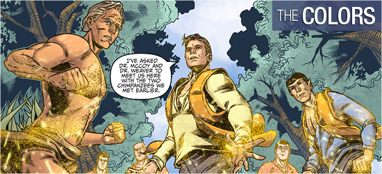
This book should have dynamic colors. I expect the settings to be bright because most of the action occurs planet-side in the daylight. Charlie Kirchoff does not disappoint. He begins the book with the bold primary colors of the Enterprise crew’s garb, but once on this earth, even with its muted colors, Kirchoff makes things pop.
The transporter effect looks sensational because of the coloring of the effect and the sound. Pages 6 and 7 has amazing show of destruction with faded colors, while keeping the character in the foreground bright. When characters are spied upon using a telescope they are muted to emphasize their distance to the reader. And the blue sky is to die for!
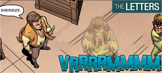
The Captain’s log, dialogue, exclamations, sounds, and a “To Be Concluded” are provided by Tom B. Long. I’m ecstatic that Kirk’s log is a different font from the dialogue, as it is a recording and should be different from actual speech.
I also love all the sounds, with the long transporter sound my favorite.