Our Trek Comics editor Patrick Hayes is back with a review of this month’s issue of IDW Publishing’s Star Trek ongoing comic series: the first chapter of “The Q Gambit,” a new six-part saga.
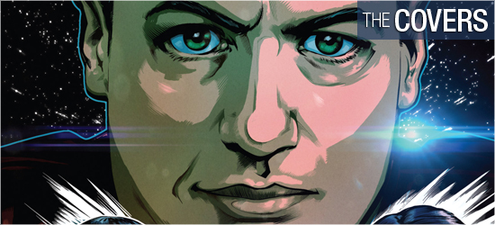
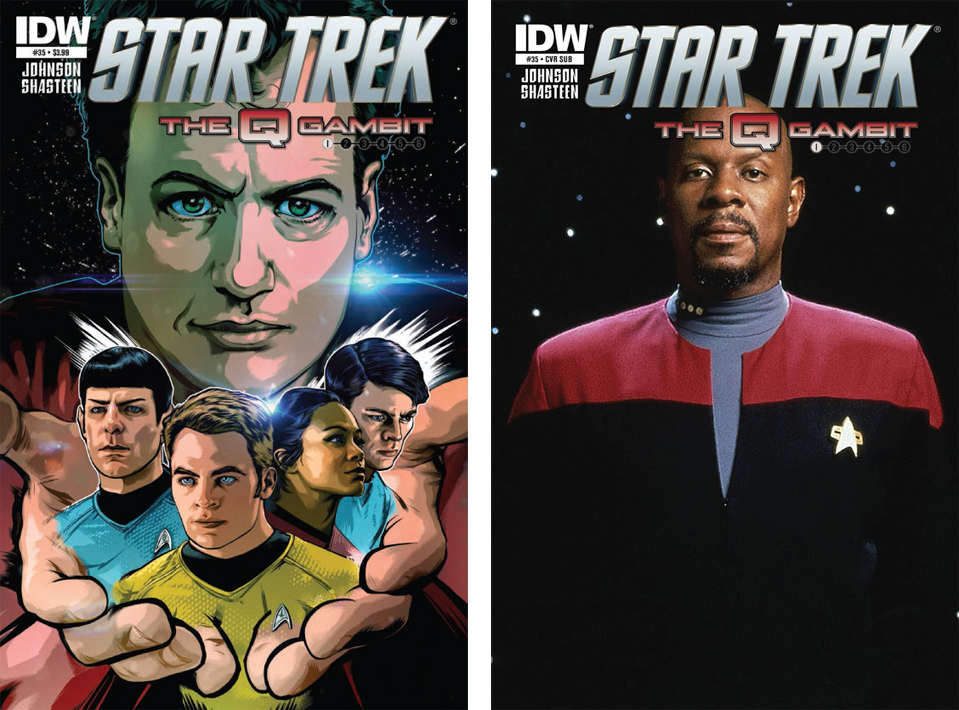
Interior artist Tony Shasteen is responsible for this month’s regular cover, featuring John de Lancie’s Q. He holds in his hands images of Spock, Kirk, Uhura, and McCoy from the rebooted Star Trek universe, and the depictions strongly resemble their on-screen counterparts. I was very impressed with these likenesses and the colors are exceptional.
This is a brightly colored cover that will stand out against others on the shelves, with Q outlined in a thin neon teal as a result of the star over his left shoulder. I also like that the story’s title is on the front with the saga’s installment colored so readers will know what part of the epic they’re picking up. I love this image, and it’s a totally poster-worthy graphic. Grade: A+.
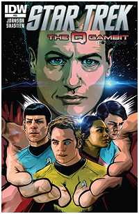
The photo cover is an utter stunner, as I hadn’t read the previews for this issue: Avery Brooks’ appearance as Captain Benjamin Sisko is the last person I ever expected to see in this series, let alone on a cover. Deep Space Nine is my second favorite Trek series after the original, so I’m overjoyed at seeing how writer Mike Johnson can combine Sisko and Q with the movie crew. Grade: A+.
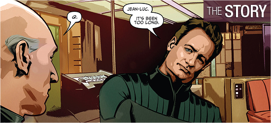
For those fans of IDW’s excellent Star Trek: Countdown prequel which led into the 2009 film, your heads will explode as you read the first five pages: they focus on Ambassador Jean-Luc Picard mourning the loss of Spock after he went into the “maelstrom” — the first return into the post-Hobus supernova era of the “prime” Trek universe. Mike Johnson opens this tale in flawless style, then he has Q intrude on this solemn scene. The dialogue between the Q and Picard is every bit as good as their sparring on the television series — and Q’s opening line in the second panel on Page 5 was awesome.
The story then moves to the Abrams cast and their introduction to Q. A quick meeting between two characters on Page 7 was a classic introduction, with the final word being hilarious. Fans should know instantly what’s going on with the actions on Page 8, and I’ll admit that it wasn’t until Page 9 that I knew exactly what was happening. The character that has the realization on Page 11 was very slick, because that’s not whom I would have expected to come to the right conclusion, which made the dialogue in the second panel on Page 13 all the more fitting. The conversation on Page 15 was neat because it hearkened back to a similar conversation in The Next Generation’s “True Q.”
I was ecstatic that Johnson read my mind as he used a scene from Into Darkness to address a character’s argument. This could be the Star Trek story of the year, and it’s going to continue for the next five months! Bring it on! Grade: A+.
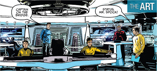
We welcome Tony Shasteen aboard as the artist for this six issue epic, and this is photo-realistic work on the characters. Everyone looks amazing. Just looking at Picard and Q on the opening pages made me smile, and Q’s cocky lean on Page 3 is a thing of beauty that I’ve missed in new stories. The close-ups of Picard in the second and fifth panels on Page 4 are terrific.
As fantastic as the characters look, it’s on Page 7 that I started to have concerns about Shasteen’s work on the backgrounds. It’s hard not to notice the low quality of the first interior shot of the Enterprise, which is either poor work or poor clip art inserted behind the characters. This happens several times, and in other places throughout the story, blobs of color are placed to suggest Abrams’s lens flares. What happened here? Was so much time spent on the characters there was no time left for the backgrounds?
The colors, however, are exceptional. The shading on Picard and Q’s faces, and all the characters, makes them three dimensional. I love how colors are used to show Q’s exit. The reflective sheen on Starfleet uniforms is brilliant under Shasteen’s hand. The infamous lens flares are present on the bridge, but not to the point where they eclipse the characters. The red alert sequence was extremely well done with the large panel on Page 10 being the stand out.
I’m in love with the characters and colors, but some of the backgrounds are leaving me lost. Grade: A-.
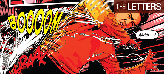
Narration, dialogue, and the captain’s log are all the same font which was a little disappointing. Italics should have been used for the narration or log to differentiate them.
There are a few select sounds from Neil Uyetake, though, sadly, none in space. Grade: A.
Bottom line:
This first chapter of “The Q Gambit” is an outstanding opening entry, but the artwork really leaves something to be desired. Grade: A.
– Reviewed by Comics Editor Patrick Hayes
![]()
 |
Order Star Trek #35: The Q Gambit, Part 1 |