Our Trek Comics editor Patrick Hayes is back with a review of this month’s Star Trek #29 from IDW Publishing, “Parallel Lives, Part I,” featuring our favorite Original Series characters depicted in a whole new way.
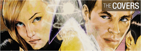
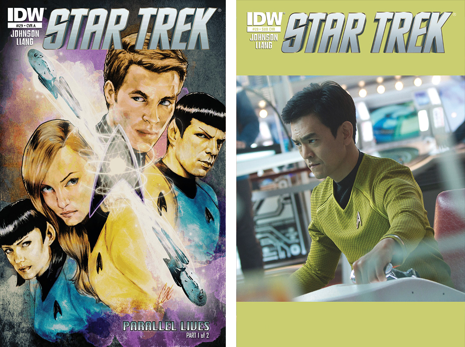
A pair of covers… for a pair of universes colliding.
The regular Star Trek #29 cover is by Cat Staggs, and features two Enterprises diagonally cutting the cover in half. To the left are the alternate Spock and Jane Tiberia Kirk, with our well-known Kirk and Spock fill out the right side. I like the layout of the of the ships cutting across the illustration, the looks on all four characters’ faces, and the great the coloring. I’m a fan of Cat Staggs, and once again I’m impressed by her work. Grade: A.
The subscription cover is good, but a John Cho photocover is odd choice for this issue. I like Cho, I like the photo, and I really like that his uniform’s colors were used for the bars surrounding the photo, but why this picture? Kiari Sulu only appears in five panels of this issue, and the Cho version doesn’t even show up once. As much as I enjoy this, it would have been thematically better to have a cosplayer dressed as Kirk on the cover. That may sound crazy, but Dynamite Comics has had models dressed as Vampirella on their covers and I doubt it hurt their sales at all. Grade: A–.
Star Trek #29 opens on the previously unexplored world of Kassen Five, Spock, Kirk, and Rand in holographic disguises — which are a terrific idea! — beam back up to the Enterprise after Kirk helps a group of slaves escape from one of their wagons. As they beam out, one of the freed natives spies Kirk, who smiles at the tiny alien and flashes the famous Vulcan salute. The cute little alien responds in kind.
But there’s something different about this Kirk: he’s a she! Welcome to an alternative universe where all your favorite characters are the opposite gender. The names alone are entertaining: Jane Tiberia Kirk, Jason Rand, Majorie “Scotty” Scott, Pavolvna Chekov, Kiari Sulu, and Nnamdi Uhuro, along with several other genderswapped versions of the Enterprise crew. I’d say the best one appears on Page 14!
Watching this crew go through the usual Trek-isms is fun, but not exactly engrossing. If you’ve read any Star Trek novels or comics in the last five years, you’ll be able to predict how each character will react and what they’ll say in any given situation. There are some fun visual moments to the story, such as on Pages 9 and panel four of Page 11 — now that would have been a stunning choice for the last film! When Page 22 rolls around, it does feel like this issue was an extended lead-up just to get to this moment.
Writer Mike Johnson and story consultant Roberto Orci have crafted a fun tweak to our favorite crew, and it’s one we’ve not encountered before… but outside of the visual change-up, there’s not much new here. Grade: B–.
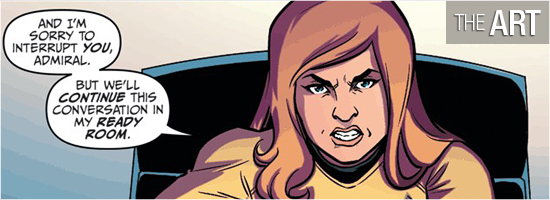
This is the most cartoonish art featured in a Star Trek comic since IDW acquired the license.
I thought Yasmin Lang did a good job on the two alien races introduced in the beginning of the issue, which made me want to see more of what could be done with these species. The larger ones were just bust shots, but the smaller aliens had a lot of personality.
The remainder of the book is set aboard the gender-switched Enterprise. I liked this style of art and am looking forward to seeing how the “normal” versions of our heroes are drawn. There aren’t a lot of full figure shots of the characters — most are from the waist up or bust shots — and it made me wonder if Liang was feeling insecure about drawing complete characters. Liang is doing a fine job, I just wish that focus has been pulled back a bit at times.
This issue’s story doesn’t allow Liang to do any action scenes with these versions of the characters; I’m hoping to see the artist stretch a little more next issue and have them in a more action oriented scenario. The only time I felt Liang’s art to be a little lacking was in the characters’ hands. Something’s just odd there, as off the joints are just a bit out of place. It’s a nit, I know, but it did catch my eye occasionally.
Overall, I enjoyed the visual change-up welcome more of Liang’s art. Grade: B+.
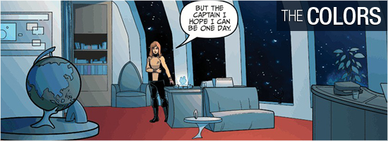
I really enjoyed the colors in this issue by Zac Atkinson. Atkinson doesn’t go overboard; in fact, the colors on the first four pages are very realistic for the alien wasteland. But once aboard the Enterprise, I was really wowed by the bright colors — I’m an old-school Classic Trek fan and I love the big, bold, over-the-top colors of the 1960’s.
I loved that the background for the character on the viewscreen was a strong pale blue, which really nicely contrasted the pristine white of the rebooted bridge. Even the captain’s quarters looked good, with the carpet being the same as that from the original series. The event that occurs on Pages 17 – 19 had coloring right out of “Where No Man Has Gone Before,” and I half-expected some characters to start featuring some glowing eyes.
The coloring here is just great. Grade: A+.
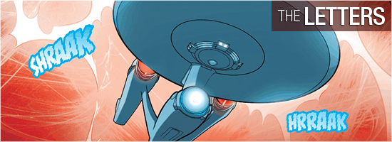
There aren’t many opportunities for sound effects on this issue, though there are a few space-based sequences. Most of Gilberto Lazcano’s work is seen in the character identification, dialogue, and opening Captain’s Log. It’s a solid job throughout, but I’m hoping he gets more to do next issue. Grade: A.
Bottom line: Star Trek #29 is the beginning of a gimmicky storyline, but this issue didn’t do more than make me smile once or twice. Overall grade: Grade: B+.
– Reviewed by Comics Editor Patrick Hayes
![]()
 |
|||