Home Blog Page 284

REVIEW: The Original Series — “Crisis of Consciousness”

tos-crisis
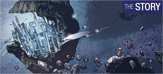
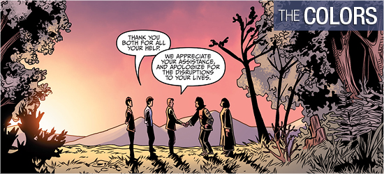
The crew of the U.S.S. Enterprise is completing a treaty mission with the Maabas, a peaceful alien race not native to the star system they currently inhabit, as descendants of refugees from a great war long ago.

Several hundred thousand Maabas once took shelter on their new world, and have now been here for millennia. They do not travel the stars, but seek to explore from within. The Federation’s interest is in the Maabas’s great intellectual resources–their science, while behind in some areas, excels in others, and their philosophy is in line with that of the Federation.

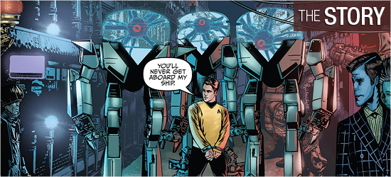
But just as the pact is signed, the Enterprise is attacked by an unidentified vessel. Enough force is shown to keep the alien assailants at bay, but a new danger arises.

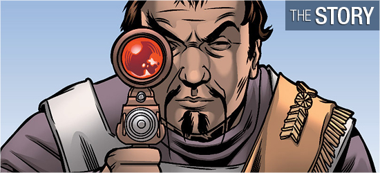
Their mysterious foes are the Kenisians–a race that used to inhabit the Maabas’s chosen world thousands of years ago, and who now want to take it back.

Order Crisis of Consciousness:

When Original Series five-year mission novels come up in the yearly release schedule, they tend to be my least favorite. Don’t get me wrong, I still enjoy them, but I definitely tend to prefer the continuation of the 24th Century shared universe, or more oddball novels such as those of The Lost Era or Seekers.

However, after reading the excellent novel Troublesome Minds, when Dave Galanter’s name pops up in the schedule, I sit up and take notice.

Like that earlier work, Crisis of Consciousness is an excellent novel. Galanter gets the character voices just right, and the alien characters are very interesting as well. I especially enjoyed the exploration of the Maabas and the Kenisians through the characters of Pippenge and the “multividual” Kenisian characters.

remember
We learn about the consequences of large-scale, long-term Katra transfer in this novel, long before McCoy would experience it in ‘The Search for Spock.’

At its heart, Crisis of Consciousness is about how different cultures react to wrongs perpetrated against them in the past, as well as the concept of cultural memory. For the Kenisians, that cultural memory is very long and acute due to the fact that the voices from the past remain an active part of their culture for so long. The effect of the older generations influencing the younger towards conservatism is therefore greatly amplified among the Kenisians.

Much like Troublesome Minds, Crisis of Consciousness deals a lot with issues of the mind and telepathy. The Kenisians are a unique extension of the idea of Vulcan “katras” and what carrying around hundreds of disparate voices inside your head would mean.

We saw how much of a deleterious effect carrying just one katra around had on a human’s mind in Star Trek III: The Search for Spock; even a Vulcanoid mind would have tremendous difficulty with hundreds!

palamas
Scotty and Carolyn Palamas meet for the first time in ‘Crisis of Consciousness.’

There is a lot to enjoy about this novel. We get some classic Kirk and Spock teamwork as each tries to figure out what the other would do, and in so doing, they are able to collaborate on a solution even while out of contact with one another.

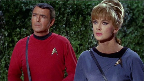
We also get a budding romance between Scotty and Carolyn Palamas, whom you might remember from the classic episode “Who Mourns For Adonais?”. We learn how they first met and how they came to be so close by the time of that episode.

Inside the UK’s STAR TREK: ENTERPRISE Blu-ray Collection!

Paramount UK’s Star Trek: Enterprise – The Full Journey Blu-ray collection, featuring all four seasons of the prequel series, is making its way to buyers this month, and we’ve got the first photos available of this 24-disc collection!

ent_front

ent_back

Inside the box itself, the set features one jumbo-sized, DVD-height plastic case, which contains all twenty-four Blu-ray discs, just like the double-cased “Full Journey” Next Generation box set.

ent_open

ent_case

Unlike the TNG set, however, there’s no printed booklet detailing the discs or the bonus features, merely the case insert behind the discs.

ent_inside

This collection is available from Amazon UK and other sellers, and a similar box set is also available from Amazon DE for German buyers.

If you’ve been waiting to pick up Star Trek: Enterprise on Blu-ray, this is the most cost-effective way to get your hands on the whole series, as this box set is much cheaper than the individual releases!

.   .   .

Special thanks to reader Dan Martin for providing TrekCore these shots!

div_spacer

ent-box Order Star Trek: Enterprise
“Full Journey” Complete Series
Region-Free Blu-ray Box Set! 

Smithsonian Update: The Experts Have Arrived!

As we first reported back in December, the Smithsonian Air & Space Museum has recruited a panel of experts — from both inside the Star Trek production team and outside talents — to assist in guiding the museum’s conservation team to prepare the classic USS Enterprise filming model for the next era of preservation.

Last week, most of that advisory team descended upon the Smithsonian’s Steven F. Udvar-Hazy Center in Virginia, where they got their first up-close-and-personal look at the historic starship and spent the day brainstorming their best ideas for the museum’s project with lead curator Dr. Margaret Weitekamp and chief conservator Malcolm Collum.

group
(L-R): Ariel O’Connor (Smithsonian Air & Space), Rick Sternbach, Adam Schneider, Dr. Margaret Weitekamp, Gary Kerr, Denise Okuda, Malcolm Collum, Mike Okuda, John Goodson, John Van Citters, and Andrew Probert with the model.

The team met for an all-day meeting on Wednesday, May 13, and that was so successful that Dr. Weitekamp reportedly estimated a “huge amount of time” was erased from the project’s expected timeline.

meeting
The team hard at work.

Model expert Gary Kerr had this to say about his visit:

We attended an all-day meeting on Wednesday, and everybody contributed great ideas. The meeting went so well that Margaret said we shaved a huge amount of time off the restoration. Thursday morning was devoted to wrapping up discussion of a few items, and to taping individual interviews with the committee members.

Some of the topics included corrections to be made to the model, how to conserve the model and prevent it from falling apart, the way it will be displayed in the new Boeing Hall, and other matters that we can’t discuss yet.

There’s a lot more work to do, but rest assured that the project is in good hands – and we have reference photos for the 11-footer that are a quantum level better than what was available in 1991-92.

nacelle
Malcolm Collum exposes the inside of the Enterprise nacelle cap.

Kerr also spoke about the renovation and ultimate display plans for the model:

Our thinking is to restore the model to its filming appearance, with only the markings on the left nacelle, which were on the filming model, remaining. We don’t want to open up all the holes and add fake wiring, but will have period photos of the model on the monitor.

The model will be in a big glass case that’s temperature & humidity-controlled to preserve the model. How would you feel about a two-sided approach, with the case oriented so the “pretty” side is arranged to provide better visibility and “Kodak moments” for visitors?

The “pretty” side would describe the theoretical spaceship, while the descriptions on the other side would describe the filming model.

denise
Denise Okuda gets up close and personal with the saucer section.

Star Trek production designer Rick Sternbach was also in attendance, diving into the technical needs of the modelwork:

I was mostly interested in examining the markings and some of the general paint concerns, as well as joining in the discussions about structural and display matters. We talked about various methods for restoring the hull markings; most hobbyists already know about things like paint masks, waterslide decals, and dry transfers. Still digesting what we’ve seen.

At the moment, the hull is a number of different colors; grays and browns and a bit of green. Over the years, different paint jobs have changed the look, going back to the original delivery model. A lot of research has been gathered in order to make a decision as to what exactly will be done with the surface paint (as in what point in the show production do you “freeze” the look).

Based on our smart committee member recommendations and whatever plan of action NASM comes up with (soon), the hull surface colors and markings will be physically worked on.

filming

In addition, the model inspection and group discussions were all recorded, along with one-on-one interviews with the various committee members in attendance.

When we visited the Udvar-Hazy Center back in January, the museum team hinted at possible plans for a Discovery Channel-like television special surrounding the Enterprise model project, and this may be the first evidence that such a broadcast is under production.

We’ll continue to follow this project throughout the summer — but what are your thoughts so far? Let us know in the comments below!

div_spacer

interview1interview2interview3interview3interview3interview3

Best Buy’s WRATH OF KHAN Steelbook Now Available

As we first reported back in March, Best Buy released a special Star Trek II: The Wrath of Khan Blu-ray Steelbook today, available in limited quantities at their North America retail locations.

side

This single-disc Blu-ray release has identical content to the 2009 Wrath of Khan edition, but this edition becomes the first original Star Trek film to receive the Steelbook treatment.

front-detail

The Steelbook replicates the original Wrath of Khan artwork, though the title treatment is replaced with the more recent catalog title text, used uniformly across the standalone releases of the first six Trek films.

inside

Our only nit with this design (aside from the title treatment) is that the attack on the Reliant featured on the inside artwork appears to have been flipped, as the Miranda-class starship’s registry number appears in reverse.

twok-steel-back

This Steelbook is, as of right now, a fairly limited release as Best Buy stores are receiving around three to five copies per location — so if this is on your wish list, we recommend you get moving and place your order today, because they’re sure to not last long.

Trek Comics Review #45: “Eurydice, Part 3”

Our Trek Comics editor Patrick Hayes is back with a review of this month’s issue of IDW Publishing’s Star Trek comic series: the final chapter of “Eurydice,” the next adventure in the new Five Year Mission.

trek45-covers

Order Star Trek #45:

  • Joe Corroney and Brian Miller have created another sensational cover for this series. Expanding images from the upper left include Vulcan, the IDIC symbol, gigantic Vulcan statues and buildings, Spock in an environmental suit, and to his left is Uhura at her station reacting to a something, a computer overlay of a series of circles and undecipherable writing draws the eye to this issue’s story title which is preceded by the Enterprise. Corroney is a master of capturing the likenesses of any franchise’s characters, and we should count ourselves lucky he’s a Trek fan. Coloring this piece is Brian Miller, who uses reds in this piece impressively. Red can be a harsh color that overpowers an image, but Miller tames this primary color by darkening it to rose or highlighting it with yellow, making this piece resonate dynamically. This pair continue to make magic.
  • The subscription cover is a photo of Zachary Quinto as Spock, holding a phaser rifle on Qo’noS (from Star Trek: Into Darkness). The emotionless Vulcan looks concerned with something that’s going wrong. It’s an okay picture, but I prefer full bleeds for my photocovers and this has too much of a border above and below the image. Besides, Spock doesn’t do much in this issue, only speaking in one panel. This makes it seem as though the first photo that’s found is the one being slapped on this issue as a variant.

trek45-story

The final chapter in this “Eurydice” trilogy, by Mike Johnson with ever-present story consultant Roberto Orci — and how long before readers see Simon Pegg in this position, I wonder — opens with the title character feeling guilty for selling the Enterprise crew to “a nefarious alien intelligence known as the Syndicate.” However her reason for doing so is immediately revealed, and, sadly, understandable.

The next two pages show the Enterprise being held in place by several massive clamps as Kirk’s supplemental log entry brings readers up to speed, ending with him being shown on a crowded street, manacled, and being led by three members of the Syndicate in twelve foot tall robot suits that allow them to move outside their enclosure. They order the captain to order his crew to surrender. He contacts Sulu, who reports they’ve received a delivery of dilithium, but the ship is locked in place. Kirk closes his conversation with the helmsman with an odd turn of the phrase that’s code.

This was a good introduction to the issue: ship captured, captain giving subtle code to crew, and away team in eminent danger. However, this has an unbelievably anticlimactic ending that had built so strongly in the previous two issues. The four members of the away team are in the greatest danger, but their escape is made with the easiest and least surprising way. Kirk’s escape is equally simple.

The retribution from the villains never appears. The ending, at least, closes in the tradition of classic Star Trek, but the story leaves one empty. The purpose of these three issues seems to introduce a supporting character and group of villains to reappear at a later date. This was incredibly milked and could have been accomplished in two, or even one, issue.

trek45-art

The saving grace of this issue are the visuals by Tony Shasteen. There is no faulting his fantastic creature design, beginning with the Syndicate, who look like Lovecraftian nightmares, and now gaining mobility in robot suits increases their coolness factor by ten. There is also a sensationally designed character that appears on Page 8 that is amazing. This is not the traditional Star Trek humanoid alien, but a spectacular creature whose appearance creates terror that actually matches its horrific goals.

Eurydice continues to be an excellent looking character who’s just different enough from humans to stand apart, but similar enough to gain readers’ sympathies and ire. She looked particularly good on Pages 1, 10, 17, 19, and 20. The Enterprise crew looks as sharp as ever under Shasteen’s skills: Kirk is dashing and Sulu and Chekov get a lot of page time.

The tech on the book is strong, with the Syndicate’s suits, Eurydice’s ship, and the Enterprise looking smart. Shasteen’s use of photographs for backgrounds is hit-and-miss, with the city streets and the interior of the title character’s ship looking slick, but the Enterprise bridge is a blur. I don’t know if this is a done to save time under the pressure of a deadline, but I’d love to see this artist do complete backgrounds. This technique sticks out so much as to hurt this book’s enjoyment.

trek45-colors

David Mastrolonardo does a solid job on this issue, starting with cold gray to match Eurydice’s mood, then moving to a blue and white double-paged splash to highlight the heroes’ vessel in space, before using the same two colors to represent complete alien-ness.

The bold colors on Starfleet’s finest make them instant eye catchers. Mastrolonardo’s work on Page 7 is very strong, given the depth of the space. This is followed by beautiful coloring on its inhabitant. Light effects are also really well done, from blaster shots, phasers, and transporter effects, with Page 12 being excellent.

trek45-letters

Dialogue, narration, and captain’s log (all the same font), the Syndicate’s speak, a unique individual’s speech on 8, and next issue’s tease are crafted by Neil Uyetake. The work is good, though I really believe that narration and the captain’s log should be a different font since they’re different forms of communication.

Simon Pegg: TREK 3 Script Draft Still Being Reviewed; Filming Begins in Just Six Weeks

In a brief new interview with Hey U GuysStar Trek 3 writer and co-star Simon Pegg revealed some more insight into the rush to complete the next Trek film ahead of the looming launch of production in July.

We’ve got a draft, and now we’re doing notes on the draft. The time’s all squeezed, you know, because it’s kind of like… uh… we start shooting in six weeks!

I laugh when I say that, but really, I am terrified. It’s a very compressed process, but I think it’s bringing out the best in us and it’s an interesting experience.

Pegg’s comments begin at the 1:50 mark below:

The third entry in JJ Abrams’ Star Trek series is set for a July 8, 2016 debut — and it’s crunch time to get this movie written, shot, and completed by next summer.

TREK 50: Silence Approaching the Big Anniversary

By Rob Heyman

With the mania surrounding the release of Star Wars: The Force Awakens later this year, it’s easy to forget that Star Trek will be celebrating something of its own very soon – its 50th anniversary. Yeah, that’s a pretty big deal. And yet there doesn’t seem to be much buzz heading into next year’s commemoration or the expected new movie. And that’s sad.

Let’s face it – the timing couldn’t be worse. Even for the most die hard of Trek fans out there (count me among them, of course), getting a new Star Wars movie is a pretty exciting thing. And it’s not just one movie but a series of new films over the next several years. The electricity in the air is simply hard to ignore.

Of course I’ll still be one of the first to stand in line to see any new Trek movie, but let me be clear: I don’t see myself as being either Team-This, or Team-That; I don’t debate “Which is better?” I think most of us think the same way.

When I was a kid in the ‘70s and ‘80s, I was a fanatical Star Wars fan. By the late ‘80s I had embraced Star Trek. Trek has dominated my life ever since. And yet I can’t help but be swept up in the excitement of The Force Awakens. Luke, Han, and Leia were my first real heroes. Yes, it does feel like getting to be a kid all over again. But a new Star Trek movie? Of course I’ll be there.

trek-vs-wars

I think the challenge for the powers-that-be will not be getting longtime fans on board for the anniversary by building early buzz and creating that charge of excitement in the air. This hasn’t been easy so far. With Abrams out as director of the next movie and other creative changes that have been wheeled out for public scrutiny, it feels like Star Trek is facing a rushed production to meet its anniversary deadline next year.

The last thing Star Trek needs is a bad movie on its 50th anniversary. It may be a little too late in the game to suggest a creative course-correction, so let’s hope the franchise is being steered where it needs to go. And that, folks, is far away from Star Trek II: The Wrath of Khan.

It’s time to bring Star Trek back to its roots of exploration and intellectual discovery. There’s certainly room still for some villainy and space warfare, but the movie franchise needs to stop copying the tired Star Trek II villain-versus-captain template. Secondly, it needs to position itself as a smarter and more optimistic counterpoint to the darker genre fare we’ve been getting for a better part of the last 15 years.

The only way Star Trek is going to succeed now and in the future is to rediscover what made it work in the first place, and that’s “discovery” – both the intellectual and interstellar kind. There’s certainly room for some smart, critical sci-fiction entertainment, as the movie “Interstellar” and its success reminded us.

redshirt-droid

I asked a longtime friend of mine, Earl Green of The Logbook, for his take getting Trek back on track: “Star Trek,” he said, “could probably have a renaissance if it did what’s happened with Star Wars — bring in new blood, which a lot of fans interpret as a course-correction from Lucas’ plotting and dialogue problems with the prequel trilogy.”

“If Paramount made a very public sea change in a similar vein for Star Trek, either mending fences with CBS to launch a new TV series or backing away from the Bad Robot interpretation of the universe, there’d be more optimism for the future. Having Simon Pegg co-write the next installment is only a minor change, and probably not enough.”

Star Wars is certainly changing the game again – at the very least when it comes to marketing. Anticipation for The Force Awakens is certainly Everest-ish in scale, thanks in no small part to a couple brilliantly crafted teaser trailers. You also give credit to the recent Star Wars Celebration in Anaheim, Califorina, reported to be the largest since 1999 (certainly no surprise, as that was the year The Phantom Menace was released).

With live-streaming and, of course, the second trailer’s big reveal — featuring the return of characters and actors the fanbase has known and loved for decades — the four-day gathering of Star Wars’ most devoted fans became a serious headline-grabber, helping to shape The Force Awakens as a movie that not only should be seen, but must be seen.

spiner-force

Can we expect a similarly epic convention event for Star Trek in advance of the 50th anniversary and the new movie, outside of the monotonous cookie-cutter Creation Entertainment events in North America, which seem to be geared more towards merchandising than meaningfullness? Aside from the recently-announced concert series planned for next year, my fear is that Star Trek is going recess into the background – at least for the short term.

There was a time when there was simply too much Trek out there, and that saturation (along with an unending creative sameness) led to its decline in popularity. It’s time to jumpstart the franchise again, but to do it right. And do it smart.

Star Wars is moving forward by going back to the familiar. It’s time Star Trek does the same.

Trek Comics Review #44: “Eurydice, Part 2”

Our Trek Comics editor Patrick Hayes is back with a review of this month’s issue of IDW Publishing’s Star Trek comic series: the second chapter of “Eurydice,” the next adventure in the new Five Year Mission.

trek44-cover

Order Star Trek #44:

  • Uhura, McCoy, Sulu, and Kirk look spectacular on the regular cover, illustrated by Joe Corroney and colored by Brian Miller. With the exception of Kirk, who is, after all, the captain, the characters are slightly covered by a series of schemata that give this image a fantastic futuristic feel. The pose and facial expression of each character is great: Uhura, intrigued by some bit of data up high; McCoy, deadly serious as he looks forward; Sulu, confident with his phaser held ready; and Kirk, confident in the captain’s chair. The coloring by Miller evokes the lens flares of the Abrams’s films without overshadowing the figures. The backlit border around every character makes them pop against the surrounding technology.
  • The photo cover is of Chris Pine as Kirk, holding a phaser rifle ready from Star Trek Into Darkness. It’s fine, and I’m a huge fan of photo covers, but unless the character is clearly seen, I’d prefer a vertical picture to that of a horizontal. Plus, I’d like the picture to somehow relate to the issue’s story.

comic44-story

The Enterprise is being towed by Eurydice’s ship, the Spectral. Kirk is not happy with this situation, but he realizes his job is to keep his crew safe. Stating his concerns to his ship’s savior, Eurydice transports him to her ship. She states her reasons for helping the Starfleet crew and in the process flirts very heavily with him.

This leads to one of the best page transitions at the top of 6. Once at their location, an away team and Eurydice make their way through some colorful characters until meeting the brains of the setting.

It’s difficult not to be thinking of Admiral Ackbar’s iconic phrase during this issue by writer Mike Johnson, and I’m glad to see that Kirk has the exact same concerns voiced on the very first page. Having the issue’s lead make this proclamation gives the reader a sense of menace throughout, but also an underlying sense of confidence in the captain which urges the reader on, even during a tense situation in the bottom two panels of Page 13.

The scene that begins on Page 16 is excellent. I wanted the crew to seek out new life and new civilizations, and this issue solidly goes there. The tone of the individuals introduced on this page is wonderfully dismissive and I’m looking forward to seeing how the crew can escape from this cliffhanger.

comic44-art

“Eurydice, Part 2” finally provides what I’ve been waiting for — an alien civilization that contains many new species and isn’t set in a wasteland of desert and/or rocks, or in a rural forest. Page 10 has the crew squarely set among a throng of new creatures. The exteriors are photo referenced, but artist Tony Shasteen has tweaked them just enough to make them alien. This follows the J.J. Abrams concept of familiar, yet different.

The first page that introduces this setting resembles New Orleans, but its characters are a wide menagerie of species. I liked that the character in the foreground was almost human looking, aside from the heroes, yet he requires a helmet to breathe. On this page are mammals, cyborgs, a plant creature, and two big headed individuals that look like Mardi Gras revelers.

A new batch of aliens appear on 11, also excellent looking, ending with the character the group interacts with on Page 12. This individual is humanoid and would easily fit into the cinematic adventures of the crew. The characters that appear on 16 are simple to describe (I won’t spoil them), but visually they are unlike anything seen in Star Trek. The different perspective shots of these creatures only made their size and obvious strength all the greater.

Kirk and his crew look great, as Shasteen has proven himself to be an excellent illustrator of all incarnations of Star Trek’s characters. Kirk is great on Pages 2, 4 (perhaps a tease?), and 17 – 20. Spock is emotionless perfection on 6, 7, 11, and 14. Eurydice, the major original character of this storyline, also looks good as she goes from seductress (5) to confident guide (10).

Special note should be made of the transporter effect that Eurydice uses, which is so startlingly different from the franchise’s standard effect as to be frightening.

comic44-colors

Excellent color work throughout from Davide Mastrolonardo. The story’s wide tapestry of characters and locations allows him to really showcase his skills.

The electrical field that tows the Enterprise on the opening page is dynamically bright, the darker colors of the interior of the Spectral nicely contrast the brightness of the Enterprise, the violets, blues, and reds make the alien city alive, while the cool blues of those on 16 make them otherworldly.

comic44-letters

Neil Uyetake does dialogue, narration, the voice of the Spectral’s computer, and the excellent voices of those on Page 16. I would like to see the Captain’s Log font be different from Kirk’s dialogue, but that’s a minor nit.

Trek Comics Review: “The Primate Directive #5”

Our Trek Comics editor Patrick Hayes is back with a review of this month’s issue of IDW Publishing’s ongoing Star Trek crossover comic series: the final chapter of “The Primate Directive,” where the Enterprise crew visits the Planet of the Apes!

apes5-covers

Order The Primate Directive #5

  • The regular cover features art by Rachel Stott and colors by Charlie Kirchoff. A game of 3-D chess is being played by Dr. Zaius and Mr. Spock. The orangutan appears to be winning because he’s smiling as the Vulcan makes his move. The pieces on the board are shrunken versions of familiar characters from both franchises: Taylor, Nova, Kirk, McCoy, and Kor. This is a great idea for a twisted cover and Stott and Kirchoff carry it off well.
  • The subscription cover is a stunning work by J.K. Woodward. General Ursus is holding a Bat’leth high above his head as he roars in triumph, with a spectacular explosion behind him. Below, under the gorilla’s foot, is a defeated Kirk. This is tee shirt, poster, and print worthy.
  • The retailer-incentive cover is again a photo mash-up of images from both series. Leonard Nimoy gets the larger picture, featuring his birth date and passing, serving as a tribute to him. Below are Kim Novack, Roddy McDowell, and Maurice Evans, as Zira, Cornelius, and Zaius. All of the photocovers on this series have been outstanding and whoever created them deserves recognition.

pota5-story

Picking up with the last panel from the previous issue, Ursus is about to be shot by Kor because he wants General Marius to lead the gorillas, ensuring the Klingon a new world for his empire to pillage. The phaser rifle is shot from his hands by Taylor, who has an excellent opening line on Page 2.

On horseback, all the heroes chase after him, but are lead into a group of hidden Klingons. A fight breaks out with lethal consequences. Page 5 has a dramatic escape and Scott Tipton and David Tipton use the last two panels to readdress a tease from the previous issue.

I didn’t think it was possible, but the Tiptons are able to wrap things up while preserving the familiar timelines of both franchises. This meeting of characters could have actually occurred–and this is only one reason why this is a successful final issue.

Every character is given perfect closure. I was very interested to see how the Marius and Ursus conflict would be resolved. It’s a five page battle that ends in dramatic style on Page 9 that would make the Lawgiver proud.

Taylor’s exit on 13 is equally strong, with him getting a spectacular cinematic moment in the third panel that resonates in Heston’s voice. The next three pages has Starfleet’s finest going after the Klingons, ending with explosive results. The final pages are a coda that had me grinning like a fool with glee. This was fun!

pota5-art

A skilled artist is one that creates characters that resemble the actors. Rachel Stott is a master of this skill — and this is a big and — she can place her characters in any pose and have them retain their likenesses. Her Kor is fantastic. Page 1 has him being wonderfully expressive, going from surprised to outraged in just a panel.

On Pages 4 and 5 when he submits to the victors, he’s deliciously smug, and his revelry in his own superiority on 15 is infectious. Also getting a good amount of face time are Marius and Ursus. They look just like the apes on the big and small screens and their battle is terrific — I love the opening punch on 6. Taylor’s final two pages are spectacular. His over the shoulder turn on 13 is as good as any director could hope to compose.

Also of particular merit are the settings. It’s rare to find a panel on any page by Stott empty of background. She could have done so at the bottom of Page 1, but she puts just the right amount of vegetation to show readers where Kor is located.

The large panel on Page 2 is as magnificent and dramatic as any western by John Ford. The scenes aboard the Enterprise are wonderful with detail. On Page 15 the first three panels have three classic point of view shots that have tons of fine details on every console and every switch.

The final two pages show the interiors of another ship and it’s just as sensational. As soon as I saw the top panel on 19 I knew exactly what was going on before I read any dialogue. This book began and ended as a visual treat.

pota5-colors

This component of the book is manipulated masterfully by Charlie Kirchoff. The first page demonstrates this excellently, beginning with the red sighting through a Klingon rifle. The dark red is mirrored in the second panel to direct the reader to the shooter, while the third panel uses bright yellow and white to show a dramatic change from the evil red, and an abundance of green is used to establish the environment of the character. This is a textbook example of how colors enhance storytelling.

The highlight of Kirchoff’s contributions comes on Page 13. He’s given a sunset from Stott to run with, and he makes the most of it. It perfectly represents one of the lead’s decisions and the brights and shades are cinematic. The highlights on the character’s skin visually show his decision to stay in the light, rather than run from it. The sky is a spectacular mix of violet and blue.

pota5-letters

Talented Tom B. Long closes out the book with super sounds, yells, dialogue, and chants. I’m an absolute sucker for the sounds of classic Trek transporters, and Long creates a fantastic noise on Page 14.

Smithsonian Update: New X-Rays for the Enterprise!

As we’ve been reporting since last year, the Smithsonian’s National Air & Space Museum is undertaking a comprehensive conservation of the classic USS Enterprise filming model — built for the original Star Trek series — to preserve the eleven-foot starship for years to come, under the leadership of Margaret Weitekamp and Malcolm Collum.

ent-xray1

Our exclusive interview with Dr. Weitekamp back in December first revealed that the Enterprise model would be undergoing X-ray analysis with help of the National Zoological Park, and today the Smithsonian team revealed the first shots from this massive undertaking — overseen by Peter Flowers and Marilyn Small of the Zoological Park team.

ent-xray2

The X-ray apparatus produced images in a special format called “dicom” (which Peter explained, “makes a jpeg look like a pencil sketch”).

To get each image, Peter and Marilyn worked with Engen Conservation Chair Malcolm Collum and Museum photographer Dane Penland to line up the radiography machine on one side of the artifact with the photographic plate positioned exactly opposite on the other side.

They got the perfect exposure on the first try, based on Peter and Marilyn’s expert calculations comparing the probable density of the model versus the known density of biological specimens.

nacelle-small
A close look at the nacelle image — click for a larger view!

The composite image of the left nacelle shown here has been put back together by Museum conservator Ariel O’Connor. When printed at full size, it gives the conservators a clear map of the interior of the model, without disturbing any of the original structure. It’s worth noting how much the technology has improved since the last time the Enterprise model was X-rayed in the 1990s.

Immediately, we could see the light bulbs inside the model as well as finishing nails, electronics, and wiring. Some of the images were so clear that we could see the grain in the wood used to build the model!

It looks like the team is making some great progress on the Enterprise analysis — but they’ve still got a long way to go until the model is returned to public view next summer. For a larger look at any of the photos we’ve presented here, be sure to visit the National Air and Space Museum’s blog.

What are your thoughts on the project so far? Let us know in the comments below!

div_spacer

interview1interview2interview3interview3interview3interview3