Home Blog Page 276

Trek Comics Review: “Star Trek / Green Lantern #2”

We’re playing a bit of comic catch-up this weekend! Our Trek Comics editor Patrick Hayes is here with his review of the second chapter of IDW Publishing’s Star Trek crossover comic: Star Trek / Green Lantern: The Spectrum War.

gl2-covers-small

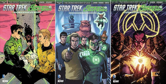
After last issue’s overdose of variants, there are only three different covers for you to go after as you wear your orange power ring.

Order Star Trek / Green Lantern #2

  • The A cover features art by Paul Pope and color by Jordie Bellaire. It’s been used extensively to promote this issue and I’m really surprised. This has got a definite style, to be sure, but I just don’t like it. Kirk is trying to turn Hal Jordan’s hand as the lantern’s power ring begins to project emerald energy. In the background, between the men, are the remains of a castle-like structure, with Uhura dressed as a violet lantern. Kirk looks terrible: his lips are enormous and his body is at an odd tilted angle compared to his head. His left arm looks too long for his body, though Hal’s right looks the same. I don’t recall ever seeing Hal wear a lantern suit with shoulder pads like this. Uhura is practically skeletal — look at her arms! The coloring is good, I do like the pink sky, but with art like this, there’s not much else to enjoy.
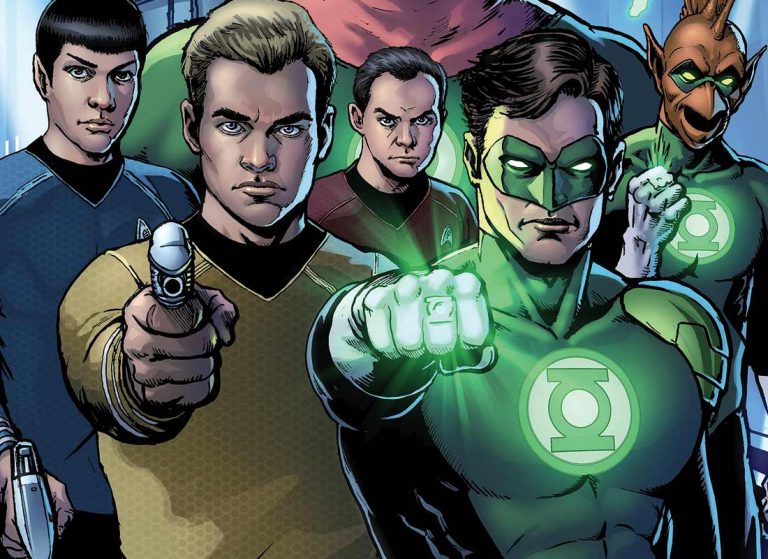
  • Darick Robertson does the art and Diego Rodriguez the colors on the B cover, and this is the one you’ll want to purchase. Kirk, Keenser, Kirk, Kilowog, Scotty, Hal, Tomar-Re, and Ch’p all look outstanding on this cover. I like how each looks ready for action, the lanterns with their rings, Spock and Kirk with phasers, Keenser with a welding torch, and Kilowog and Scotty just plain ole’ mad-dogging the reader. I really like the layout and the colors are perfect. I wish my local store had had a copy of this.
  • Sinestro has his typical ominous look on his face as his yellow power ring hovers above his open fist, radiating energy about the dark space, illuminating the Klingons that surround him. This was a good idea for the Subscription cover by Garry Brown with colors by Doug Garbark, but this comes across as a sketch. All the characters’ faces look incomplete and the coloring is very splotchy. The neon yellow Klingon insignia behind them looks good, but it’s against a sloppily rendered sky of streaks. What they’re supposed to be, who can say? Not me. A let down.
gl2-story

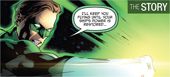
This installment opens with an ancient Klingon proverb: “Fear is power.” Aboard his ship, General Chang is bathed in the yellow light of the power ring that invaded in the previous issue. He screams, “Viq hos!” and flies off the bridge. As this is occurring, Green Lantern Hal Jordan is assisting the U.S.S. Enterprise, keeping it flying while the crew is trying to get the power up. However, he wants to know why “…you’ve got my friend’s skeleton on board.”

Kirk answers he’d love to explain, but he’s got his hands full. The fourth page reveals that both Chekov and Uhura are now wearing rings, he blue and she violet. Making matters a little more startling is their ability to fly about the bridge. Their strange powers take a back seat when Chang arrives, reveling in his newfound strength.

If one were unfamiliar with any abilities of what a power ring can do, this issue addresses them. Mike Johnson has the lanterns show rather than tell what the rings can do. Not answered is why certain people received specific colors, with McCoy’s ring being a very odd choice, since that those who wear them in the DC Universe have been revealed to be serial killers. Does Bones have a secret he’s not told? I don’t think it’s anything as heinous as mass murder, but I’m really concerned why he has “that” ring.

Two things that are shown in this issue is who receives the orange and red rings. They both go to Star Trek aliens, and both surprised me. Orange represents avarice and red rage. The orange ring has become something of a joke of a ring in DC comics, and, as with McCoy, I was really stunned to see who got this. The red ring wearer makes more sense, as this race has had very little shown of them in television, film, or comics, so this series is a good way to remind fans of them, and get them past throwing rocks off of mounds in a Los Angeles National Park.

Starting on Page 18, Johnson has a character doing something major in Star Trek history. Though the world that’s effected by these actions has gone though many tumultuous changes, I don’t recall something like this being so quick and so violent. The reason behind it is absolutely in line with that character’s mindset, but he actually went and did it!

Smartly, his changes are undone in one panel, with the last page’s reveal having me smiling in glee. I didn’t think that this character would make an appearance in this series. When he appears in other books, the power structure is always thrown out of whack, and he’s obviously going to do the same thing in this series.

I’m rubbing my hand in devious glee at his inclusion.
gl2-art

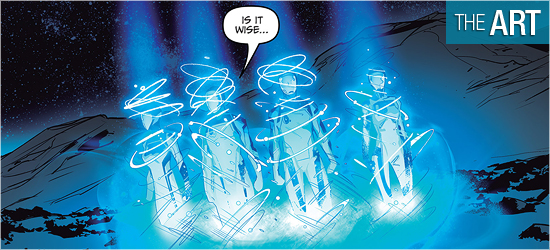
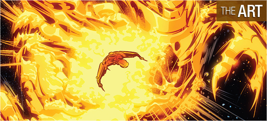
On first glance, the visuals by Angel Hernandez are good. However, looking closely some small flaws become noticed, and, looked at as a whole, hurt the book.

The first page starts strong with Chang getting zapped with power. Throughout the book, Hernandez does do an excellent job on the energy that the all the ring wielders sling, such as on 5, 7, 9, 10, 14, 19, and 20. The construct made by the individual on Page 7 looks ripped right out of a DC comic. The poses he gives to the three Enterprise crewmembers as they float/fly about the ship are beautiful. Each person looks lost in the wonder of what they are now capable, which is what anyone would feel. Chekov is particularly cool as he embraces his power.

It’s the non-ring wears that begin to bring the book down. The design of the characters on Page 8 doesn’t sit right. They are very different from how they were shown in their two television appearances, and are so hunched over to make them look as though they’ll fall over at any moment. Lovecraft seems more of source for their heads than the species for which they’re supposed to be related.

Take a look at the panel when one individual gets a ring. It’s very difficult to make out any details in either, with the one witnessing the event being severely undrawn. The next species to get a ring is shown on 13. The second panel is a huge crowd shot with faces sadly disappearing the farther they are from the focus of the image. The last panel on the page focuses on four characters, and even they, in a close-up, are generic. On the following page when the chosen person receives their ring, he flies above the crowd, which has become a faceless throng. This is really disappointing.

The most painful character is Hal Jordan when he arrives on the bridge to face off with Kirk, Page 16. Why is his head so flat? On 17 Hal’s hair has a part in the first panel that makes him look like he doing a comb-over on his ‘do.

The settings are also a mixed bag. The interiors on the Enterprise are strong. I really liked the different perspectives that Hernandez put into them, with Page 4 being really sharp. They continue to look good on 5 as the same set is shown from four different angles. Again, things begin to slump with the two new species. Page 8’s first panel suggests a structure with no real detail. The second panel has the characters in a room filled with gigantic statues of heroes from their past. Foreshadowing what’s to come with the next species, the farther the statues are from the reader the more their features disappear.

Page 9 is filled with a random series of rough columns to suggest an interior. The setting encountered on Page 18 is instantly recognizable, and this is good, but the second panel has me completely at a loss where the character is entering from. I can’t tell. I’m also surprised at the lack of items in the room in the third panel — it’s not designed in any way with what I’m accustomed to seeing with this species on television or film.

There are visual highs and lows throughout.
gl2-colors

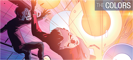
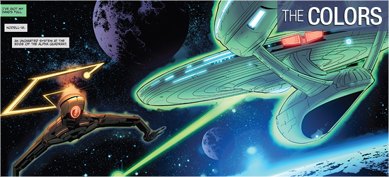
A Green Lantern book has got to be bright. There’s not a chance of readers believing in the power of the power rings unless the light emanating from them is strong — and Alejandro Sanchez does a fantastic job in bringing them to life.

When Chang is hit by the yellow power ring, Sanchez has the yellow dominate the rust colors inside the Klingon ship. When he flies out of his ship into space, the yellow illuminates his vessel. Even his dialogue balloons are now outlined in yellow to show how the ring dominates his being. Hal’s narration is nicely put in a calming green that is darker than the energy that he flings from his ring.

All characters wearing a ring have a neon outline around their bodies that matches their ring’s color. This is as it’s done in the DC comics, and it looks great on the Trek characters. The oranges that come out of the character that wears the orange ring are spectacular. Page 19 has the strongest work of the book, with a ring’s energy lighting up a very dark interior. It looks realistic.
gl2-letters

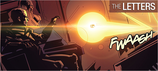
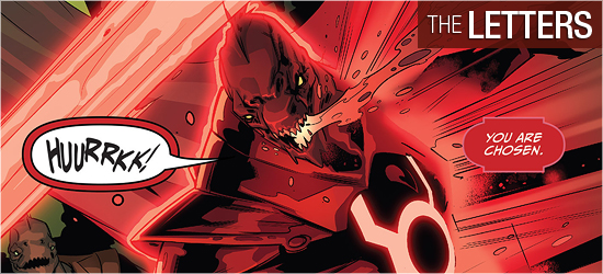
Neil Uyetake’s lettering this time around includes a quote, narration, dialogue, and scene settings (all three the same font), ring speak, sounds, and the “To Be Continued!” I was really taken aback that the new species shown on Page 8 didn’t have a unique font for their speech; of all the races in Star Trek, they truly deserve a change of font.

Having scene settings done the same as narration and dialogue was also sad to see. When is this ever done in a comic? It’s usually differentiated to show that it’s not dialogue. These choices make this look like a rush job.

Trek Comics Review: “Star Trek / Green Lantern #1”

0

Order Star Trek / Green Lantern #1

It’s been a bit of a busy summer, but this weekend our Trek Comics editor Patrick Hayes is back with a review of the first issue of IDW Publishing’s Star Trek crossover comic: Star Trek / Green Lantern: The Spectrum War.

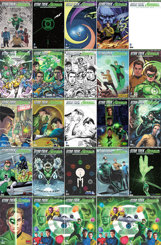
You’re going to have to be going at Warp 8 to catch all 25 covers for this first issue. That’s right: 25 covers to test your will, and wallet — and your power as a collector.

gl1-covers-small

  • The A cover is by Gabriel Rodriguez. This features Spock, Kirk, McCoy, and Uhura at the bottom of the image as if they’re on the bridge of the Enterprise. Above them is Hal Jordan as Green Lantern, flying forward, and behind him is a Guardian and General Chang, who is wearing the yellow ring of fear. There’s a good warp effect coming off the last two, colored in rose and pink. This is a decent image.
  • The B is by Francesco Francavilla. On a fairly empty starfield, the Green Lantern logo sits dead center as the Enterprise in silhouette zips through it diagonally, bottom left to upper right. A very simple design that’s strong.
  • Elsa Charretier is responsible for the C cover and it’s very colorful. In the bottom left the Enterprise is shown from the rear, as if it were escaping its pursuers. It’s being followed by four ring wielders, who leave solid colored streaks in their wake. There’s violet, orange, and yellow streaks — with the characters so far from the reader they can’t be made out, and in the top right is Hal Jordan beginning to leave a green trail. I like the lanterns in pursuit of the ship and the bright colors.
  • The Subscription cover is illustrated by Garry Brown with colors by Doug Garbark. Kirk and Hal are standing side-by-side on a rocky world, though the ground appears to be on fire before them. The captain holds his phaser ready and the lantern has emerald energy coming out of his hand. Behind Kirk is an image of the Guardian, while behind Hal is the Enterprise. A good combination of characters but the coloring is muddled with a focus difficult to find.
  • There’s a Sketch cover which is entirely blank, save the title at the top of the book and the companies’ names in the bottom left corner. This is ideal for taking to a convention to have one of the contributors sign or an artist to create an original illustration. Okay.
  • Freddie Williams II does the San Diego Comic-Con cover and it’s got a lot of detail. Sulu, Kirk, and Spock are running forward at the bottom of the image and above them flies four lanterns and three crew members who are now wearing power rings. Behind all of them flies Starfleet’s flagship. The characters look sensational and the colors are perfect. This is one to track down!
  • The first exclusive cover from Books-A-Million is illustrated by Neal Adams with colors by Paul Mounts. Kirk and McCoy are about to remove power rings from an alien’s fingers as Spock watches. They’re interrupted by Green Lantern who zips through a wall yelling, “Don’t…Touch…Those…Damn…Rings!” The officers look frozen in shock at the lantern’s appearance. This is Neal Adams, what is there not to like about this? Mounts colors are excellent.
  • The second exclusive from Books-A-Million is the same as the previous cover, without Mounts’ contributions. This is a pencilled and inked cover by Adams and it, too, looks good. If you’re a fan of untouched art, this is for you. I like it better with the colors.
  • The Boston Comic Con cover is by Gabriel Rodriguez, again. On an alien world with two moons in the sky, against a mountain range, Kirk is standing atop industrial equipment, his phaser aimed but not firing. Hal has just flown up next to him, his green trail in the sky visible, and his ring powered up. Nice, but nothing spectacular.
  • Tony Shasteen does the Comic Book Legal Defense Fund cover with a photo-realistic Kirk slightly behind Hal Jordan. The Starfleet delta is behind Kirk, and the lantern logo is behind Hal. Strong images with beautiful coloring.
  • Spock looks to have interrupted a human woman having a conversation with a Klingon after transporting into the Connecticut Comicon. It appears that at that same moment a green power ring has flown onto his finger, and he looks at the weapon in shock. Well, shock for a Vulcan. This exclusive to the Connecticut Comicon is drawn by Tim Seeley and colored by Mark Englert. There’s some good detail on it and the image is specific to this comicon, and that’s good. But it’s specific to that comicon, and since I didn’t attend I have no interest in obtaining this.
  • The Dynamic Forces exclusive has a terrific image by Jae Lee of Hal and Spock fighting each other on their own terms. Hal’s got his power ring sparkling, showing he’s about to release its fury onto the Vulcan. Spock has his left hand on Hal’s forehead, as if he’s doing a forced mind meld on the hero, while his right hand holds a phaser to blast the lantern if he has to. Great idea for a cover that’s carried out exceptionally.
  • The second Dynamic Forces is the exact same illustration minus the coloring. Again, like the Neal Adams cover, this is good for fans of an artist’s original art. However, I like this one, too, with the coloring.
  • The third and final Dyanmic Forces is the same image, with the colors, but without any text. This is often referred to as the “virgin” cover by some publishers. This is just as spectacular as the first cover by Lee.
  • Adam Riches does the Emerald City Comics exclusive and it’s really sharp. In the bottom center is a Lantern’s power battery. It’s emanating energy, shooting a strong stream upwards into a starfield. Within this energy blast is a totem pole of faces: Uhura, Spock, and Kirk. Hal is shown flying forward on the right, with the Enterprise flying forward on the left. Beautiful and cool.
  • The Four Color Grails exclusive is by Angel Hernandez and Alejandro Sanchez. Kirk looks determined in a bust shot in the bottom right, Hal is flying forward in the center with a lot of power shooting out of his ring, and in the background, in the upper left, is Chang giving an evil smile. The coloring by Sanchez makes a focus difficult to find. This would have looked better without the colors.
  • A humorous cover by Rachel Stott and Francesca Zambon on the exclusive cover for Gamestop. On the bridge of the Enterprise, Kirk and Spock are climbing on consoles to keep themselves above the sea of green tribbles that Kirk is up to chest in. Hal’s in the foreground smiling at his mischievous deed. Perfect art, perfect coloring, and it’s funny. This is the only cover out of all twenty-five that’s got a light tone. More please.
  • Brent Peeples does the Hastings exclusive. Hal’s flying forward from the center with the Enterprise flying below him. It’s an expected cover, from the expected perspectives. It’s a little darker than I like, but it’s a decent frontpiece.
  • Another cover is done by Francesco Francavilla. It’s another simple idea that looks fantastic. The Enterprise is in the center of the image, shown from the top. It’s surrounded by all nine logos of the power rings. The ship is pure white and the rings are colored in their given colors. It’s simple and it works, and it’s only available from Nerd Block.
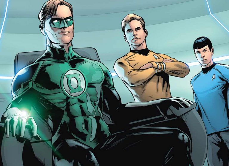
  • Newbury Comics has Angel Hernandez and Alejandro Sanchez and it’s much better than their cover for Four Color Grails. From an angle looking up, Hal is sitting in the captain’s chair and Kirk and Spock don’t look happy about it. The art is good and the colors excellent.
  • This perfectly geeky cover is by John Midgley for Think Geek. Against a starfield, Hal flies upwards making an energy construct of a giant hand giving the iconic Vulcan greeting. This, like the Francavilla covers, is a seemingly simple idea and it completely works. The green stands out spectacularly against the black.
  • The VA Comicon gets the cover by Brian Shearer which is cut in half vertically. Hal is on the left, looking forward, and Kirk is on the right in the same pose. A good idea for a cover with bright colors that make this look good.
  • The final three covers are from Previews and I bought the first two because I’m a huge fan of this artist and colorist. All three are by Joe Corroney with colors by Brian Miller. It features the right side of the lantern logo with the right side of the Enterprise flying out of it, set on the right side of the cover. Sinestro is at the top center flying to the reader. A Guardian is on the far left, looking composed of green energy. In the bottom left are Scotty, Uhura, and McCoy. Red, purple, and blue power rings are also on the cover.
  • The next cover is the right side of the image. The left side of the lantern logo and the Enterprise are on the left side of the image. Hal is the four o’clock position of the cover, balancing Sinestro on the previous piece. Chang is mirroring the Guardian’s position, also made of green energy. Spock and Kirk are in the bottom right corner. Orange, violet, and yellow power rings are on this cover. When placed side by side with the previous cover, it makes a larger image.
  • The final cover (WHEW!) is a wraparound cover of the previous two, so rather than chase both down, a fan could buy this one and be satisfied.

gl1-story

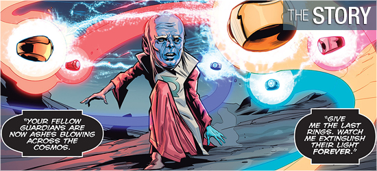
On the dead planet Mogo (which was a Green Lantern), Ganthet, the last living Guardian — the individuals who created the lantern power rings and oversaw them as force for peace — runs across its surface with six power rings flying behind him. He’s being spoken to by an unseen entity who tells him to surrender the rings so that they may be destroyed. All the lanterns are dead and all the other Guardians are “now ashes blowing across the cosmos.”

Defiantly, Ganthet says, “I am going somewhere you cannot follow. I go to preserve life in all its forms. That will be my victory.” As the unseen antagonist screams “Impossible!”, there’s a multi-colored flash of energy on the planet’s surface. “Another time. Another universe”, the Enterprise has come upon an orphan planet. Security officer Zahra, Spock, Uhura, and Kirk beam down to the planet and find someone’s remains and several pieces of jewelry.

This is a solid start up for this six issue series from Mike Johnson. The Enterprise crew do what one would expect, but things get complicated with the arrival of General Chang. I’m not going to count that as a spoiler since he’s on several of the variant covers. The justification for him to arrive at the moment makes perfect sense and I hope it’s not stepping on the toes of what might occur in the upcoming Trek film.

Pages 17 and 18 move the story into the DC hero’s universe, and I’m very interested to see what happens next issue in regards to this pair of pages. The final page is a solid introduction and a good cliffhanger. This final character’s dialogue is fully in line with his past appearances and I’m dying to see what happens next.

gl1-art

Artist Angel Hernandez does a good job on this issue. Things start very strongly with Ganthet on Mogo and the animated rings. When Ganthet is seen later he looks even better, though he’s changed considerably. The crew of the Enterprise looks solid.

Hernandez has done a good job in making the characters resemble the actors who play them, and not copied picture versions of them. Kirk and Spock get the most face time of the crew, but the rest get some decent scenes, with Page 18 being a highpoint for four of them.

I was really impressed with the away team suits on Pages 5 and 6. They’ve been streamlined quite a bit from how they’ve been in the films and there’s a cool distortion of the characters’ faces behind their masks.I really liked that little tweak. Chang also looks good, though he appears younger than his film counterpart in The Undiscovered Country.

Energy becomes a key factor in the final third of this book. It’s here that Hernandez gets a little looser with his pencils, allowing the colors to dominate the visual. This is the correct choice to make because the colors would overwhelm the characters, so it follows that they should also overwhelm the reader.

gl1-colors

Any book that features one, or more, lantern has got to have strong coloring. It’s a signal to readers who’s arriving from a distance and the intensity of each color shows the strength of each ring wielder. The book opens with the rings having soft pastel-like colors on the opening two pages. This rightly hints at their strength and their current level of weakness.

Aboard the Enterprise Alejandro Sanchez the expected cinematic silver and whites the franchise’s flagship now has, but he takes a few liberties in an small room in engineering. This is a much darker location and makes what’s going on down there much more sinister.

My favorite coloring of the book is on 18. I’m sure it wasn’t the most difficult page to color, but there are lots of variety on that page and it foreshadows where this story is heading.

gl1-letters

Unseen villain speech, scene setting, dialogue, and captain’s log (these three are the same font), sounds, yells, and the “To be continued!” are brought to life by Neil Uyetake. I have to express some big disappointment here. Having the scene setting, dialogue, and captain’s log be the same font is somewhat shocking.

I’ve seen the last two be in the same font, but never the scene setting. The ring’s speech — yes, they talk — also should have a different font. These differences can be found in every issue from DC comics that feature a lantern. Additionally, the ship to ship transmissions are relying on the shape of the balloons to show the reader the difference in who’s speaking.

IDW dropped the ball in this contribution.

Idris Elba Talks About His ‘Groundbreaking,’ ‘Complex’ STAR TREK BEYOND Villian Role

STAR TREK BEYOND lead guest actor Idris Elba has been fairly tight-lipped about his role in the upcoming film, which is wrapping up in Vancouver this week — but in a new interview with MTV News, he’s finally starting to open up about his Trek experience.

Simon [Pegg] and the team have written a very interesting, complex journey for my character. You’ve never seen me play a character like this.

I think ‘Star Trek’ has prided themselves as being quite classic when it comes to villains, like ‘he’s a guy who wants to end the world,’ there’s no doubt about that. But in this version of the film, there’s a slightly different twist to that.

It’s quite an interesting journey, which I think is groundbreaking for the franchise. But, it still keeps with the ‘classic bad guy is a classic bad guy’ tone.

Elba also spoke about the grueling pace of filming so far:

It’s been hard work. I’ve been doing 18-hour days. It’s tough work, but I’m looking forward to people seeing this film.

All we really know for sure is that Elba is not playing a Klingon role — so we may have to wait a while to learn much more.

*   *   *

https://www.instagram.com/p/8FIogxri8o/

div_spacer

Star Trek: Voyager
A Vision of the Future


Star Trek: Voyager
Complete Series on DVD


Star Trek: Voyager
A Celebration


Bon Voyage, Vancouver: STAR TREK BEYOND Wraps in Canada as Production Heads Next to Dubai

It’s been a busy three months, but after a dozen weeks of filming in and around Vancouver, production on STAR TREK BEYOND is wrapping in Canada.

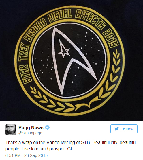
Perhaps Simon Pegg’s official fan feed put it best:

wrap-tweet

Guest star Joe Taslim and family, who temporarily relocated to the city for his time on the shoot, flew home to Indonesia after weeks up north.

taslim-home

Now that the crew is voyaging overseas for the next phase of the BEYOND adventure, all eyes are on Dubai where director Justin Lin and company will be finishing the shoot. While there’s still no known victors from the big extras casting call last month, Digital Production Middle East is reporting that Lin and Pegg will be participating in a press conference in the city sometime next week.

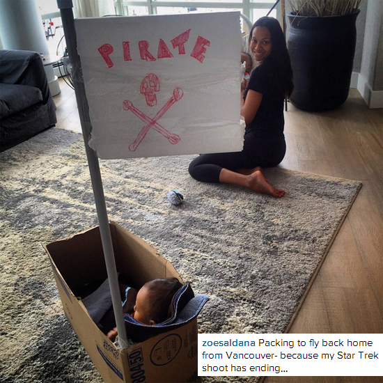
DPME is also claiming that Chris Pine, Zachary Quinto, Karl Urban, John Cho, Anton Yelchin, and Idris Elba will be the main cast heading to the Middle East. While we’re not able to confirm that directly, Zoe Saldana seemed to indicate she may not be part of the international team heading to Dubai (caption abbreviated).

zoe-inst

Update: Saldana did clarify on her Facebook page that she was referring only to her Vancouver BEYOND schedule, but still has made no mention of if she will be participating in the Dubai excursion.

*   *   *

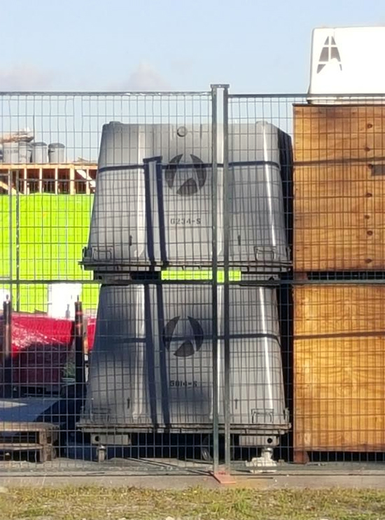
Just because filming is wrapped, that doesn’t mean we’re done covering news from up north. Some local Vancouver set spotters have kept their eyes open for the last vestiges of BEYOND in town, including some official Starfleet cargo gear parked on the edge of a fenced in production area.

cargoPhoto by @vancitychris_ on Twitter

There’s also been a few last looks at the location shoot at the Pitt River Quarries outside of the city, which we last saw a few weeks ago.

quarry-wrapPhotos by Robin Key on Twitter

quarry-airPhoto by August Ustare on Twitter

*   *   *

While we first reported on Omaze contest winner Audri Davis’ trip to the set the other day, Omaze released a lengthy blog post detailing the fan winners’ adventure when visiting Vancouver earlier in September.

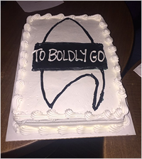
cakeWhen it was time to go to set, the production coordinator for Star Trek Beyond, Jason, met us at the hotel and we hopped into a van. The drive was beautiful (I’m in love with Vancouver) and when we got there, jaws literally dropped.


The set was insane and all the equipment—cranes, green screens, tents, cameras—was overwhelmingly cool. I can’t say much more than this! But the winners were so excited, and Erika, Mike and I felt the same.

Our grand prize winner won a walk-on role, so we got to watch him shoot a scene! We were all situated in a special Omaze tent that had a bunch of chairs, headphones and two monitors, so we could sit and watch Adam’s claim to fame. He was clearly visible in the background of the scene, and when he wrapped, the entire cast and crew clapped for him. Yay, Adam!

Zoe Saldana and John Cho came over to talk and take pictures, and they were so nice and cool. John introduced himself as Chris Pine, which was hilarious, and Zoe even recognized our week 5 winner, Linda, from our Facebook post! She pointed at her and said, “I know you!” That was one of Linda’s favorite moments.

The head of the special effects department came over with two aliens he created, and we got to see them up close and touch their squishy faces. The head of the props department showed us a bunch of different, really cool weapons. The screenplay co-writer, Doug Jung, came over to talk and asked our winners what they as Star Trek fans would want to see in the new film. I think they gave him some good ideas.

At the end of the day, we told our winners that we were headed back to our hotel. We weren’t—we had one last surprise for them. We took them to another set, on a soundstage. I can’t say too much! But it was cool. And THEN… we got a surprise visit from ZACH QUINTO, CHRIS PINE AND KARL URBAN! Ahhh!!!

*   *   *

Finally, a bit of BEYOND housekeeping: the set we first reported being built back in late August in Vancouver’s outskirts has officially been taken off the Trek watchlist.

As our sources reported to us at the time, the local construction crew had informed those who inquired that the location build was being prepped for BEYONDbut this week word came down that this is actually for the upcoming War for the Planet of the Apes sequel.

Despite this miscommunication, we’re still proud to be leading the charge on STAR TREK BEYOND reporting, being the first to cover the location shoot at Squamish Rocks, the cast appearances at the Squamish forest (including Sofia Boutella’s “white ponytail” later seen in the ScreenCrush photo leaks), actor Deep Roy’s participation (and Alice Eve’s ambivalence), and some of the first photos of the “crashed starship” set and Pitt River Quaries location shoot.

Stay with us as we follow the production’s trip across the ocean over the next several weeks while STAR TREK BEYOND lives the international life in the UAE — after all, we were the first to talk to the Dubai Film Commission as well.

div_spacer

Order Star Trek: The Next Generation Season 5 Blu-ray today!


Order TNG - "Unification" Feature Blu-Ray today!

Omaze Announces STAR TREK BEYOND Walk-On Winner, Fans Visit the Film Sets in Vancouver

Well, it’s been several months since the Omaze Star Trek: To Boldly Go contest began, offering fans a chance to not only visit the BEYOND set, but also for one lucky Trekker, a walk-on role in the upcoming film.

The first announced BEYOND set-visit winner, Audri Davis, posted a few shots from her Omaze welcome package on Twitter when she visited Vancouver in the beginning of September, surely an exciting adventure for any Star Trek fan. Don’t expect any secrets revealed from the fan visit, however, Audri told us about an (unsurprising) non-disclosure agreement she and the other visitors were asked to sign upon arrival.

This afternoon, Omaze announced the grand prize winner of the summer contest, the lucky fan to appear in front of the cameras in STAR TREK BEYOND.

The months-long fundraiser contest came to an end earlier this month, earning thousands in donations for nine wonderful charities.

Did any of you receive some of the giveway swag from donating funds yourself? Share below!

div_spacer

Order Star Trek: Enterprise Season 1 Blu-Ray today!


Order Star Trek: Enterprise Season 2 Blu-Ray today!


REVIEW: New Frontier — “The Returned, Part 3”

0

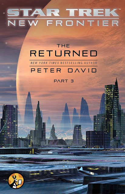
newfrontier3Captain Mackenzie Calhoun and the crew of the U.S.S. Excalibur are back, picking up three months after the stunning events depicted in New Frontier: Blind Man’s Bluff.

Calhoun’s search of Xenex has failed to find any survivors, and now he is bound and determined to track down the race that killed them—the D’myurj and their associates, the Brethren—and exact vengeance upon them.

His search will take the Excalibur crew into a pocket universe, where he discovers not only the homeworld of the D’myurj, but another race that shares Calhoun’s determination to obliterate his opponents. But is this new race truly an ally…or an even greater threat?

Order The Returned, Part 3:

Here it is: the conclusion to New Frontier’s e-book trilogy The Returned. Calhoun and crew witness the near-total destruction of the D’Myurj species and now find themselves leading an even greater threat back to our own galaxy. The Dayan, bent on the destruction of all life everywhere, are using Calhoun and the Excalibur to access the wormhole to bring them to the Milky Way galaxy, where they will presumably systematically wipe out all life.

Meanwhile, on New Thallon, Mark McHenry faces off against Q who is posing as “The Awesome,” the god of the Thallonians. Q is keeping his cards close to his chest, not revealing why he is showing such interest in the Thallonian line of succession and aiding Shintar Han in his desire to kill Robin Lefler and her son, Cwansi.

The Returned, Part 3 does an adequate job in resolving the various storylines that came out of parts one and two. The story was generally engaging, and it kept my interest throughout. The typical Peter David whimsy is definitely present, as is his tendency to go to dark places from time to time. However, I felt that something was missing. Some parts felt very “paint by numbers,” almost as though the author was kind of bored with writing these characters. The final act of the story is wrapped up at a breakneck pace, with a crazy, soap opera-ish ending. I suppose that is par for the course for New Frontier, but it still felt a little cheap.

As I mentioned above, there are a few “dark” moments in the story, most notably when Q assaults two of the characters by removing their lungs and allows them to suffer in order to force Mark McHenry to go along with his plan. And there is also a very unexpected sexual assault perpetrated on Captain Calhoun by Soleta. I would have been interested to see where this story might go, but the assault itself is dealt with just a little too flippantly for my tastes.

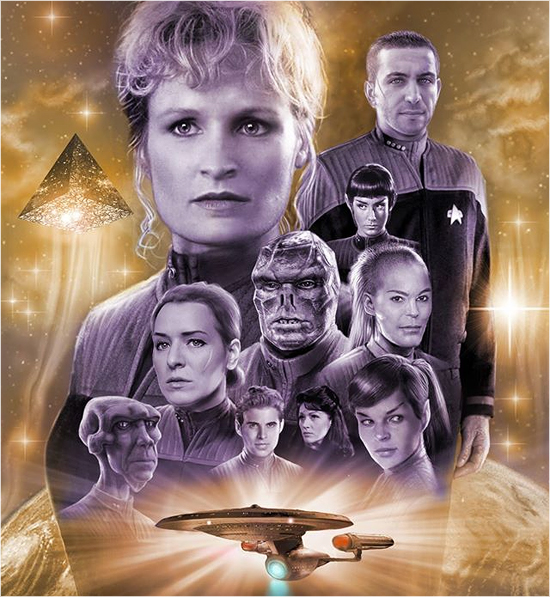
nf-cast

This happens a couple of times in the story. Ideas such as consent, lack of control, all-power beings, and even genocide aren’t quite given the depth that they need. I enjoy exploring these ideas, and I feel that literature should force us to examine our beliefs and worldview, but this story doesn’t quite get there for me.

Still, I don’t want to say to skip this story. If you are a fan of New Frontier, you will enjoy seeing the characters back in their element, with a huge, over-the-top galactic threat, facing off with the usual irreverence of the New Frontier gang. Just take everything with a grain of salt and try not to worry too much when the story gets pretty far off the rails.

Final thoughts:

New Frontier fans will be happy to see the gang back together, and the story features Peter David’s usual whimsy and dabbling in darker story ideas. I would have liked to have seen a deeper exploration of some of the issues at the heart of the story, but that is not to be in The Returned, Part 3.

Still, I don’t think you should skip this if you enjoy New Frontier. There are some developments that are important going forward, and I do truly hope that New Frontier continues to go forward.

STAR TREK BEYOND Beams to July 22, 2016

Next year’s release of STAR TREK BEYOND is adding a few more weeks to its summer vacation, as the Trek sequel has moved to a new release date of July 22, 2016.

This two-week push-out moves the film away from the previous July 8 release date, dropping BEYOND on the Friday between Paul Feig’s Ghostbusters reboot and Matt Damon’s return the Bourne franchise.

It’s not uncommon for films to shift around a bit depending on many factors, from theatrical competition to on-set or post-production tasks that necessitate additional time.

Since STAR TREK BEYOND is still in the middle of active production in Vancouver — and heading to Dubai in the coming weeks — this is likely more likely due to logistical issues rather than any “problems” with the film.

In addition, Deadline’s Anthony D’Alessandro points to the expected IMAX release of the film to be another major factor in this date bump:

Late July proved quite fruitful for the Melrose Ave. studio this year when they launched Mission: Impossible – Rogue Nation on July 31, clocking a FSS of $55.5M and a total cume to date of $189.2M.

The reason why M:I5 played late July, versus its original December 2015 date, was to take advantage of those Imax venues that were open, and that’s the same reason why Par is taking the Enterprise out on the late July date.

Apparently, Warner Bros.’ Tarzan has roped up all the Imax hubs on July 1, leaving none for Captain Kirk and Spock. Seven weeks into its play, M:I5 is still hanging around the top 5.

We’ll see how it works out next summer.

div_spacer

Order Star Trek:
The Compendium
on Blu-ray today!


Order Star Trek Into Darkness on 3D Blu-ray today!


Movie Poster Monday: Early STAR TREK Feature Film Artwork that Didn’t Make It to a Theater Near You

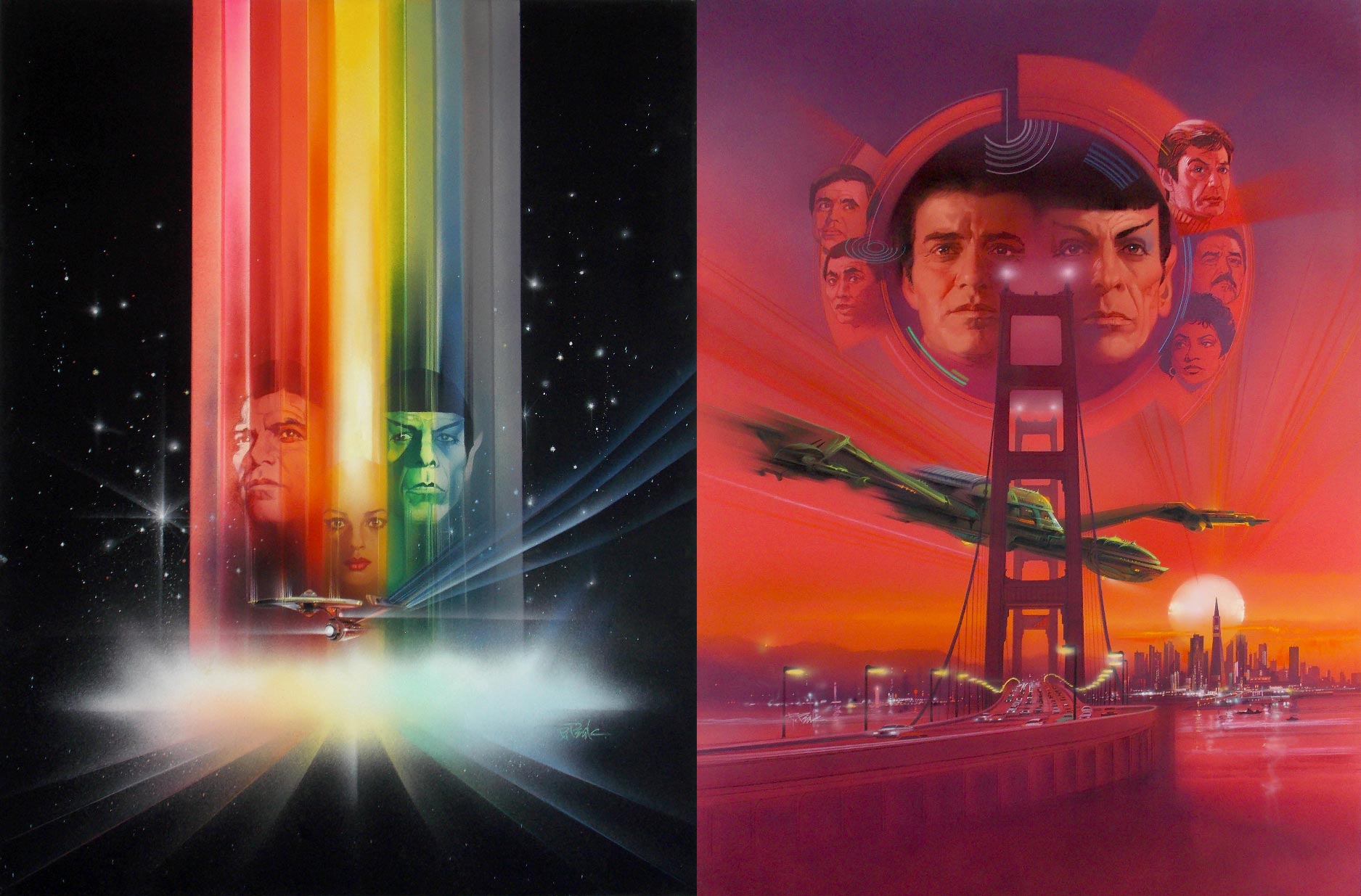
Earlier this summer, a poster in our Omega Sector forums shared a number of images of preliminary theatrical poster design for the first Star Trek features — we reached out to him, and Harry Angelikas shared with us high-quality scans from his private collection.

He’s the son of Spiros Angelikas, an artistic designer and partner to Paramount Pictures who worked with several illustrators (including the great Bob Peak) to create the feature film graphics we now associate so closely with the early Trek movies.

div_spacer

Harry Angelikas: My father, Spiros Angelikas, worked with Bob Peak on the theatrical illustrations for the first several Star Trek films. My father was the designer and owner of the agency, Spiros Associates, and Bob Peak illustrated the final pieces.

My father has worked on over 100 films; blockbuster kits like the Trek movies, Friday the 13th, Raiders of the Lost Ark, I could go on and on.

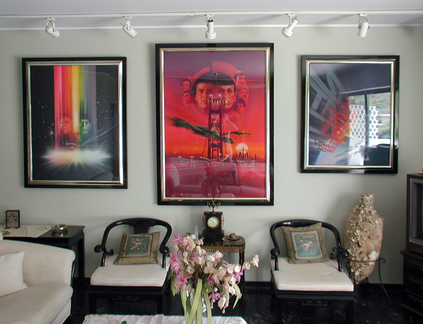
home-gallery
Some of the original Angelikas / Peak artwork hanging Harry’s home collection.

I’m sharing these with you — and Star Trek fans at large — to honor my father. The illustrators that did all the works my father designed were like ink jet printers back in the day.

My father would give the illustrator rough copies of his ideas, sketches, etc.; the illustrator (mostly Bob Peak, for Star Trek) would then put on canvas what he was instructed to do.

tmp-st4-posters
Original key art — illustrations minus text — for ‘The Motion Picture’ and ‘The Voyage Home.’ (Artwork design by Spiros Angelikas, illustrations by Bob Peak.)

I am in the same line of work as my father once was, though all my concepts and ideas are done in Photoshop and Illustrator 99% of the time.

khan1

They didn’t have that software back in the day, which is why I am trying to give more credit to the creator/designer of this stuff like my father. Google my father’s name along with “Friday the 13th poster”, you will learn more about some of his work.

khan2

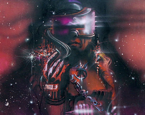
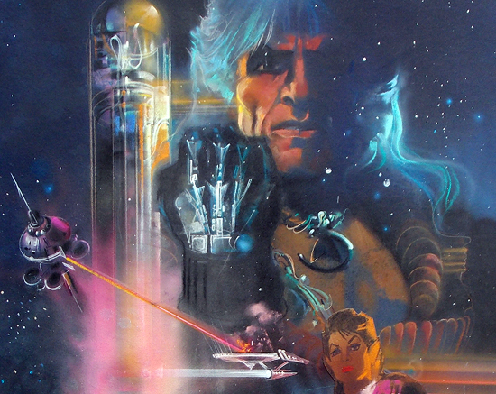
khan3Concept designs for ‘The Wrath of Khan’, later replaced with the final, well-known version.

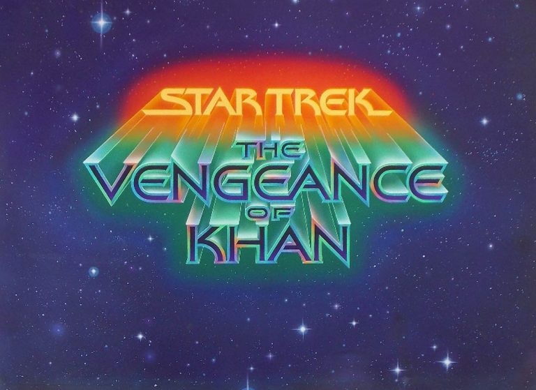
vengeance
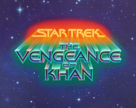
The original ‘Star Trek II’ title treatment, before being renamed ‘The Wrath of Khan.’

Regarding the ‘Vengeance of Khan’ top and bottom sections — that’s the way it was made. The artist began working on the title, but was later asked to make it bigger while he was working on it.

I would have cropped it to where the art was extended when I scanned it in, but when he completed the piece, he put his signature on the extended part.

spock-large

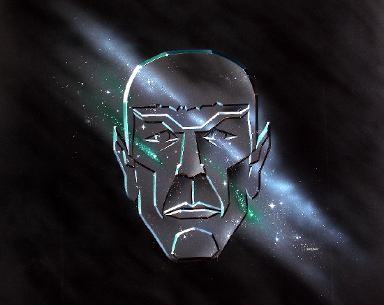
This is the original illustration for ‘The Search for Spock.’ The art does not contain the ship or title treatment — back in the day, those were done on separate sheets of acetate.

This was not illustrated by Peak; this piece was done by Gerard Huerta.

tmp-unused
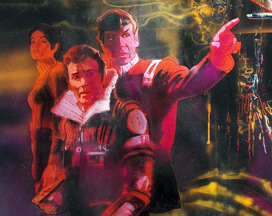
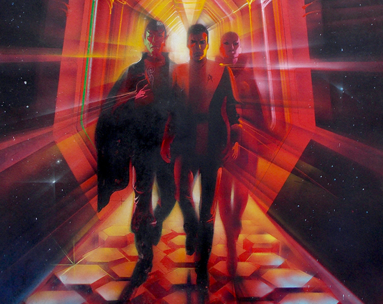
An early, unused concept for ‘The Motion Picture’ featuring Spock, Kirk, and Ilia.

The posters look great when scanned, but seeing the actual illustrated images up close is breathtaking. I’m one lucky SOB to be able to admire these things all day — and I’m so proud of my father!

*   *   *

Thanks again to Harry Angelikas for sharing these unusual and rare designs from Trek history with us!

div_spacer

Order Star Trek: The Next Generation Season 4 Blu-ray today!


Order TNG - "Redemption" Feature Blu-Ray today!

Beaming to Dubai: STAR TREK BEYOND Interview

It’s been a quiet week for STAR TREK BEYOND news — allowing us to catch our breath for a few days! — so we decided that it’s time to look forward to the next phase of the BEYOND buildup: the move from Vancouver, British Columbia to Dubai in the United Arab Emirates.

We’ve already seen the major casting call for extras ahead of the movie’s arrival to the modern city, and the launch of a new internship program, but while there’s still only rumors about what we’ll see when the crew of the Enterprise gets there, we wanted to reach out to those responsible for bringing the film into town.

We reached out to Jamal Al Sharif, Chairman of the Dubai Film and TV Commission, and Managing Director of Dubai Studio City, for a brief chat about STAR TREK BEYOND, which begins filming there later this month.

*   *   *

TREKCORE: In the United States, the Star Trek story is an indelible part of popular culture that even those who have never watched a Trek movie or television episode know of Captain Kirk and Mr. Spock, warp speed, phasers, etc. How would you compare the Arab world’s perception of Star Trek, and its role in the local pop culture?

al-sharifAL SHARIF: Star Trek is very well-known across the Arab world and a big part of pop culture here in the Middle East.

The excitement across Dubai and the region following the announcement that Star Trek will film in Dubai has genuinely shown how large the sci-fi and Star Trek fan base is here.

The Middle East Film and Comic Con, held in Dubai, also attracts thousands of visitors every year, and has pioneered a real community of sci-fi fans across the region.

The upcoming filming and release of Star Trek will connect Trekkies in the Middle East to those around the world, to celebrate the 50th anniversary of this global franchise together.

TREKCORE: In North America, many film sites are chosen based on local financial advantages – tax benefits, lower production costs, et cetera.

What type of incentives does filming in Dubai provide to draw international productions like STAR TREK BEYOND to the UAE?

AL SHARIF: Dubai enjoys a tax-free environment and the government is fully committed to positioning the Emirate as a film and TV hub, with the Dubai Film and TV Commission offering unique incentives to productions, such as discounted flights, hotels and logistics.

TREKCORE: As part of the agreement to filming in Dubai, does your agency have any say into how the city is represented in the film? What role do you see the city taking in the picture?

AL SHARIF: Production companies and location scouts tend to have their film’s story and location in mind when looking at different destinations. When visiting Dubai, I think the team were impressed at the diversity of locations the Emirate offers, as well as the ease at which filming can take place.

mi4
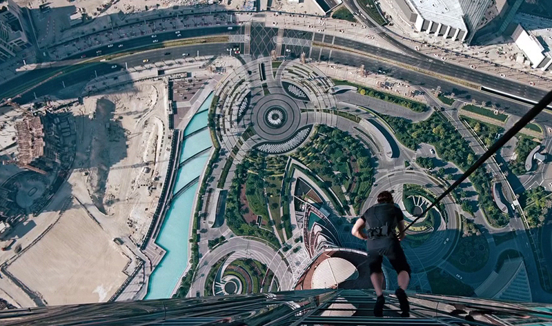
‘Mission: Impossible – Ghost Protocol’ was the last large Hollywood feature to film in Dubai.

We will not determine how the city is portrayed in the film, however, I am confident that Dubai will be an important part of the film.

TREKCORE: This is the first Star Trek production to take place outside of North America – as the first global Trek adventure, what do you think that Dubai contributes to the film as a filming location?

AL SHARIF: Dubai’s unique locations, excellent connectivity and cutting-edge infrastructure have set it apart as a truly dynamic filming destination.

Dubai’s diverse locations include skyscrapers, beaches, desert and more, and the production facilities on offer across the Emirate are world-class. This city is versatile and can add a rich variety of backdrops to any film, and Star Trek will be no different.

*   *   *

As production moves from Canada to the United Arab Emirates during the next few weeks, we’ll be eagerly watching to see what the trip overseas brings for STAR TREK BEYOND.

div_spacer

Order TNG - "The Best of Both Worlds" Feature Blu-Ray today!


Order Star Trek: The Next Generation Season 3 Blu-Ray today!


Final Omaze Video Released for STAR TREK BEYOND Fundraiser; Gag Reel and New Alien Included

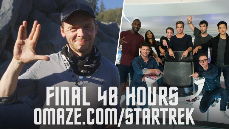
There’s just 48 hours left in the Star Trek: To Boldly Go contest, and to close out the charity drive, the STAR TREK BEYOND co-writer and actor Simon Pegg shot a quick farewell from the Pitt River Quarry filming site outside of Vancouver, highlighting a few new prizes and an Omaze filming gag reel — with a little secret at the end.

By contributing $10 or more to the Star Trek: To Boldly Go Omaze campaign, you are not only helping support nine global causes, but also have a chance to win a walk-on role in Star Trek Beyond and hang out with the cast on set.

Remember, this is the FINAL chance, so enter to win here: Omaze.com/StarTrek

div_spacer

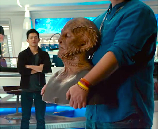
This last sneak peak at the cast and crew features another new alien design, a wonderfully-sculpted prosthetic mask revealed right at the end of the video.

final-omaze-alien

This creature is the second to be previewed in these fundraiser videos; the first was showcased last month in an earlier release.

div_spacer

Order Star Trek:
The Compendium
on Blu-ray today!


Order Star Trek Into Darkness on 3D Blu-ray today!