Home Blog Page 256

RUMOR: New TREK 2017 Production Designer Chosen?

We are still a bit away from learning any major casting news for 2017’s STAR TREK revival on the CBS All Access streaming platform, but we’ve got one new name that may be associated with the new show: award-winning production designer Mark Worthington.

While we have not yet been able to officially confirm this with CBS, Worthington has begun to list this appointment on his resume at Worldwide Production Agency, his professional representation.

If true, the sets for the new Trek series will be created by Worthington, who has been nominated for five Emmy awards and ten Art Directors Guild awards for his work on American Horror Story, Ugly Betty, and the pilot episode of LOST in 2004.

2004: Lost – “Pilot”

Worthington took the now-famous Oceanic Flight 815 plane crash set from sketch to screen for 2004’s launch of LOST on ABC, an outdoor location on Mokulē’ia Beach on Hawaii’s island of Oahu.

lost1

2011 – Present: American Horror Story

https://www.youtube.com/watch?v=nkFqMaPoikY

The imaginative sets of FX’s annual horror anthology have been crafted by Worthington each year since the show’s launch in 2011, with a wide variety of themes from a disturbing carnival, a mental asylum, and most recently, a terrifying hotel.

2015 – Present: Scream Queens

The Kappa Kappa Tau sorority house at Wallace University serves as home to FOX’s Scream Queens, a 360-degree set designed by Worthington for the network horror series.

sq

2006: Ugly Betty

Worthington brought a futuristic look to the ultra-modern offices of MODE Magazine, the main setting for the four-year run of ABC’s Ugly Betty.

ugly-betty

[td_smart_list_end]

*   *   *

In addition, Worthington has begun to include preliminary design sketches on his portfolio site, apparently by multiple artists.

Concept art removed by request. 

The production designer is a huge job, especially for a Star Trek series – where this person is in charge of crafting all the major and minor sets used in shooting, from the bridge of a starship to the cockpit of a shuttlecraft.

Of course, famed artist Matt Jefferies led design on the original Trek series. In the Next Generation era, Herman Zimmerman served as production design on TNG, Deep Space Nine, Enterprise, and six of the Star Trek feature films, while Richard James helmed production design on Voyager.

In the new Bad Robot-era films, Scott Chambliss served on 2009’s Star Trek and Into Darkness, while franchise newcomer Thomas Sanders has taken over for Star Trek Beyond.

UPDATE – JUNE 6, 4:45PM ET: TrekMovie.com is now reporting that Worthington confirmed his participation to them directly last month.

UPDATE – JUNE 6, 1:20PM ET: At the request of parties involved we have removed both the concept art and the previously noted project title.

Review: THE WRATH OF KHAN Director’s Cut Blu-ray

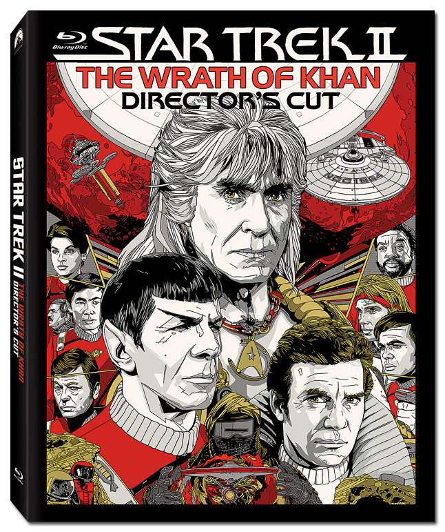
After seven years, the first truly new version of a prime-universe Star Trek film comes to Blu-ray, as Nicholas Meyer’s special Director’s Cut of STAR TREK II: THE WRATH OF KHAN arrives with a new 4K-sourced remaster, supervised by the director himself.

(You can check out the content differences between the theatrical and director’s editions here.)

Fans have long been asking for the original ten Star Trek films to get another look from Paramount Home Entertainment, as many of the 2009 Blu-ray releases are plagued by overuse of digital noise reduction (DNR) effects, inconsistent clarity and color, and other issues which could really use some attention.

Unlike the other films, however, Khan got a new scan before those discs debuted in 2009, as the original film negatives were in “terrible shape” when that project began.

The result was a much cleaner presentation than the rest of the movies, but fans were left a bit mystified when Khan arrived with a new blue-tinted look, permeating a large portion of the movie in its first high-definition release.

[metaslider id=25223]

After several years of repackaged releases of the 2009 edition, it was a great relief when we learned that Nick Meyer was overseeing a brand-new remaster of this classic film earlier this year – and that the long-awaited Director’s Cut version of Khan would also be included, something relegated to standard-definition DVD since 2002.

twok-dc-art

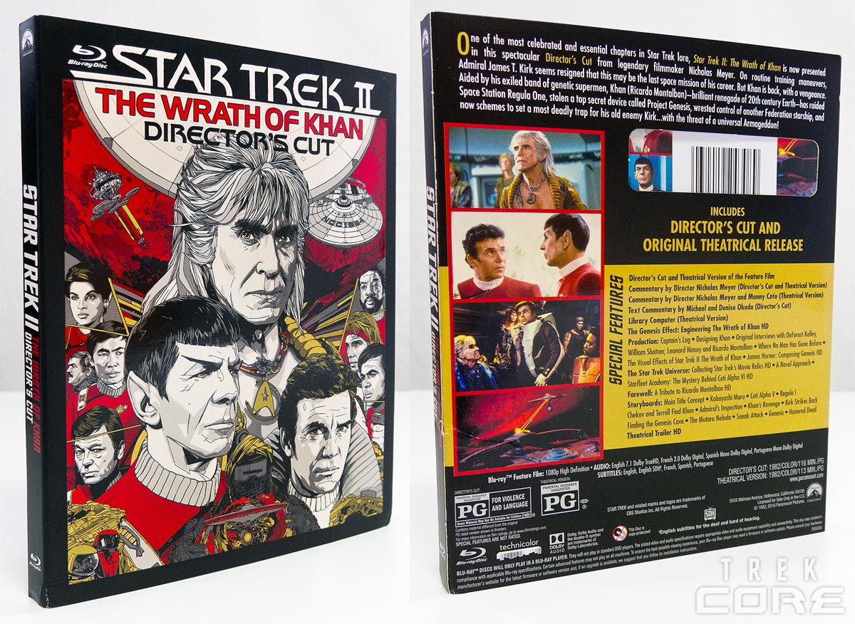
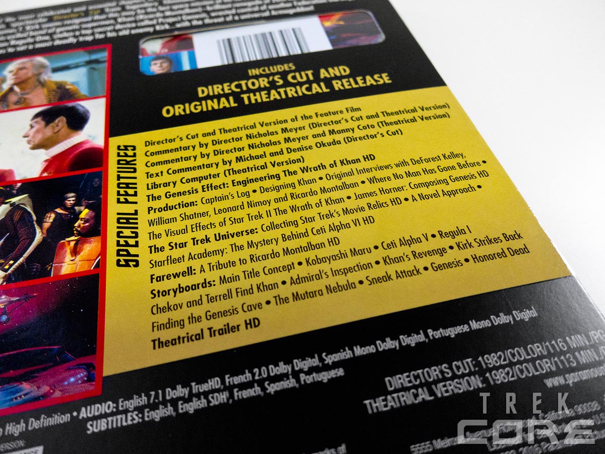
As we’ve reported previously, this single-disc Blu-ray release arrives on June 7 with all of the existing bonus material included, along with a new twenty-eight-minute documentary feature produced specially for this release.

This new feature (entitled The Genesis Effect: Engineering The Wrath of Khan) was put together by our old friend Roger Lay, Jr., who co-produced the great Next Generation and Enterprise Blu-ray bonus content.

nick-vam

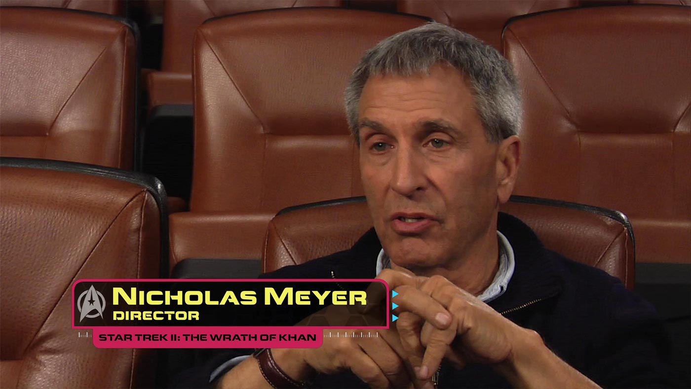
Featuring interviews with behind-the-scenes Trek talent who worked on the film – Nick Meyer himself, along with producers Bob Sallin and Ralph Winter – plus Adam Nimoy, Larry Nemecek, and several others, talking about everything from the rush into production, the $100,000 reshoots adding the shot of Spock’s coffin on Genesis to the ending, and the role of the characters in the film.

Some of the behind-the-scenes discussion was covered in the previous Khan bonus material when the film was released on DVD, but there’s enough additional content to make this doc a nice refresher on the history of the film.

Strangely, the clips of Khan used in this documentary appear to be from the ‘old’ DVD / HDTV master, as the color and brightness levels align nearly identically to the film’s pre-2009 look.

Additionally, it’s a bit disappointing that this Khan release doesn’t include any of the 1985 ABC broadcast’s alternate shots (composed for 4×3 televisions), nor any deleted footage from the film in the bonus material, as many such scenes are known to exist based on the workprint on file at the UCLA Library archives – the “Saavik is half-Romulan” scene, footage of Khan’s group’s baby, etc.

Perhaps someday that footage will be restored for fan viewing, but that day is not today.

twok-dc4

But that’s not what you’re here for, is it?

What people have hoping for in this release is a correction of the overly-saturated, blue-tinted picture that we’ve been watching for the last seven years – and we can tell you right now that blue is back under control in this Director’s Cut presentation.

[metaslider id=25231]

White and silver features of metallic walls, cargo containers, engineering worksuits, and starship hull plates all return to their neutral tones, while the green features of the Genesis Cave, display readouts, and control consoles all lose that soft aquamarine hue and become a vibrant emerald again.

That’s not to say that the blue levels are the only thing that’s changed in this new release. There has been a definite return towards the color levels of the pre-2009 look, something we know many of you have been wanting to see since the first Khan Blu-ray debuted.

While this may appear overly-desaturated in direct 2009 vs. 2016 comparisons, looking at all three versions together places the Director’s Cut into somewhat of a ‘middle ground’, losing the amber overtones that affected the old master, but keeping away from the 2009 Blu-ray extremes.

[metaslider id=25254]

In addition to these color adjustments, the overall clarity of the Khan Director’s Cut is a certainly a step above the previous release. This new 4K scan provides a notable improvement in texture and fine-detail visibility, from the signs in the background of the Kobayashi Maru testing facility to the cloth of the “monster maroon” uniform jackets.

One interesting thing that we discovered in our side-by-side comparisons was an apparent digital retouching of the Starfleet training set – implemented in the 2009 remaster – that seems to have been missed in the 2016 edition.

[metaslider id=25264]

Finally, there has actually been a deletion in the extended director’s cut! A quick shot of Kirk, Spock, and Saavik climbing up through the Enterprise decks after their return from Regula was added to the film for the 1985 ABC television broadcast, and with it, two lines of overdubbed dialogue:

Kirk: “That young man… he’s my son.”
Spock: “Fascinating.”

In this new edition, the film content remains, but the added dialogue is removed. Apparently this unneeded and somewhat clunkly bit of conversation wasn’t something that Nick Meyer wanted to keep in place, and was excised at his request (per The Digital Bits).

[metaslider id=25328]

The debate over which color presentation is truly correct will last until the end of time, as everyone has different memories of how a film is ‘supposed’ to look – but this is Nick Meyer’s authoritative version of the movie, and it’s a damned fine version in our opinion. It’s likely that some of the adjustments made to Khan for this release won’t please everyone; but there are several shots unarguably improved on the Director’s Cut disc.

Overall, the positives far outweigh any minor quibbles we may have, and it’s fair to say that Khan has never looked this good. If you’ve never picked up this film on Blu-ray, there’s no better time – and if you already have the 2009 version, it’s truly a well-deserved upgrade.

Here’s hoping that STAR TREK II: THE WRATH OF KHAN won’t be the last classic Trek film to get a second chance in high definition.

UPDATE JUNE 7: We’ve detailed an apparent editing error overlooked in our original review.

div_spacer

We’ve got plenty more comparison caps here for you to review, and we’ll be updating our Wrath of Khan image gallery with full-resolution screencaps soon. Check ’em out, then let us know your thoughts in the comments below!

[metaslider id=25268]

Paramount International Releases STAR TREK BEYOND ‘Living Poster’ Video

As has become a recent trend in media marketing, Paramount Pictures’ international outlets have released a new ‘living poster’ for STAR TREK BEYOND.

An animated version of the BEYOND Fan Event Exclusive poster, being used in some international regions as an additional publicity tool, has been uploaded to YouTube and other social media platforms.

It’s nice to see additional use of this homage to Star Trek: The Motion Picture after those lucky enough to score the rare poster from the May 20 event – and hopefully we’ll continue to see more unique publicity releases ahead of the July 22 film debut.

North America’s STAR TREK: TNG Blu-ray Box Set is Here!

To you patient fans in North America, waiting for your chance to purchase all seven seasons of Star Trek: The Next Generation in one collection: your time has come!

CBS Home Entertainment’s new all-in-one, 41-disc package, first announced back in April, will finally make its way to store shelves next week.

While the UK and other territories around the world have had their own full-series collection since the end of 2014 – you can check out our review of the UK set over here – we know that many of you in the US and Canada have been holding out on purchasing any of TNG on Blu-ray until this set became available in North America.

Let’s get this out of the way up front: if you already own the seven season releases, there’s really no reason to buy this new collection.

These are identical Blu-ray discs as what were put out from 2012 to 2014, and do not include the minor VFX fixes that were corrected for the streaming release of the series last year. (And no, there have been no changes to the Season 2 discs either.)

box1

box2

This set also does not contain the five Next Generation standalone companion discs – feature-length releases of “The Best of Both Worlds,” “Redemption,” “Unification,” “Chain of Command,” and “All Good Things…” – those must still be purchased separately.

box12

box11

Like the UK release, this box set is packaged in two large, DVD-height plastic cases. The first four seasons are grouped into the first 23-disc case, with the latter three seasons in the other 18-disc package.

The removable disc spindles lift right out of the plastic cases, allowing you to flip through four Blu-ray discs at a time; the lining of the case artwork has a breakdown of each disc’s content. The discs themselves have no artwork, and are the same plain blue design as previous releases.

box3

box15

box13

If you’ve been holding off on buying The Next Generation on Blu-ray, now’s the time you have been waiting for. The 41-disc set is a sure bet for anybody who hasn’t yet taken the leap to TNG in high definition – and it can be yours this week.

box6

Trek Comics: “TNG / X-Men: Second Contact” (1998)

We’re following up this week’s retro review of the classic Star Trek / X-Men crossover comic with the sequel, 1998’s meetup of the famous mutant heroes with Captain Picard’s crew aboard the Enterprise-E!

tng-xmen-cover

Order Second Contact:

  • This front piece shows readers exactly what type of visuals to expect in this book. Cary Nord provides pencils, Scott Koblish inks, and Liquid! the colors. From left to right are Riker, Worf, Wolverine, Sean Cassidy, Colossus, Data, Nightcrawler, and Storm. The character work is not good. Worf and Sean are lost in darkness, Data’s face is horrendous, and Nightcrawler is gaunt. The colors are strikingly bold, but are wasted on this art.
  • There’s a wraparound variant cover painted by Vince Evans that is a definite eye catcher. Looking at the image as a whole, the characters shown, from left to right, are Worf, Troia, Kitty, Angel, Colossus, La Forge, Storm, Data, Wolverine, and Riker. Behind Riker are head shots of a Sentinel and a Borg. The Enterprise flies above the scene through a bright orange cloudy mass. Several of the faces are too dark, but this is a much stronger cover.

tng-xmen-story

Picking up immediately after the events of Star Trek: First Contact, the Enterprise has wound up orbiting Earth circa the late 1990’s. After engaging stealth mode, the senior staff meets and La Forge reveals that the array’s processing core has fused and needs to be replaced.

Such technology shouldn’t be on Earth at this time, but scans have located Shi’ar technology in two locations: one is the Baxter Building and the other at Professor Xavier’s mansion. Two teams are sent to each location, with the second team comprised of Data, La Forge, and Troi.

They are discovered first by Wolverine and then Colossus. Their conflict is stopped when the Enterprise is mentioned, causing the Canadian to ask, “Are you some of Kirk’s people?” This causes Picard listening from the ship to say, “Captain James Tiberius Kirk, my most illustrious predecessor. It would seem the man made a habit of popping up where he was least expected.”

The two teams meet and all seems well until a classic Fantastic Four and Avenger villain appears and sets them on a quest.

planet-xWriters Dan Abnett and Ian Edginton have crafted a neat story for these two groups to meet. The crux of the story has two teams sent into two moments in the past to correct chaotic anomalies. One group revisits the classic Chris Claremont/John Byrne two-parter, while the other visits the opening moments of the third Star Trek series.

The action in both locations is very good, with the expected conflicts occurring, though Abnett and Edginton add some new spins. It was a bit disappointing to have the X-Men, who recognize the villain and know his reputation, willingly believe what he says. It’s only with the arrival of two Next Gen characters do they realize his sinister intentions.

That aside, the rest of the book is fun, though the final page is a cliffhanger that leads into the TNG / X-Men novel Planet X.

tng-xmen-art

The pencils are by Cary Nord and the inks by Scott Koblish. The first page is a splash of the Enterprise-E’s bridge showing five of the senior staff. Data’s not bad looking, but the characters behind him are not good: Riker and Worf have their faces blackened to create depth — though the bridge is never lit that darkly to have them be so, while Picard and Troi’s faces aren’t done well.

Things improve on pages 2 and 3 with a double-paged splash of the Enterprise above the Earth. The inserted panel of Data is good, but the second with Riker and Picard is not. The fourth page features the leads in the ready room looking close enough to their film counterparts, though Page 5 has a terrible Troi.

This happens throughout the book with characters looking okay to poor. The X-Men don’t fare any better; look at Colossus on 12 and 13. The villain is especially poorly rendered. Settings are also disappointing. They’re very remedial in the majority of the book, though the bridge of the Enterprise has a good amount of detail. The interior of the villain’s ship is very poor.

A crossover book deserves to be much better than this.

tng-xmen-colors

John Kalisz is working overtime on this book. He’s providing a lot of blending of colors to create depth in the art. However, given what he’s got to work with, Kalisz can only do so much; see that last panel on 4 and first panel on Page 5.

The book has a welcoming bright color scheme throughout, making the book bold, with the sequences in the Marvel Universe’s future especially vivid with a violet sky that represents night. Sounds are also colored well. Kalisz deserves applause for his work.

tng-xmen-letters

The captain and first officer’s logs, dialogue, the story’s title, the book’s credits, a transmission, the speech of two different mechanical characters, yells, three foreign words, and the tease for the novel are created by Chris Eliopoulos.

The unique fonts of the mechanical characters are excellent as are the powerful sounds. Eliopoulos is known to be one of the better letterers in the business and this book is a good example of why he’s kept that reputation.

tng-pinups

The final section of Second Contact includes a three-page text piece by editor Timothy Tuohy describing how this book came to be (“Making a Crossover”). It’s interesting for the candor in how the book came together, especially in regard to how it was difficult to find a writer, or two.

In addition, just like with the Original Series crossover, we get a few art pin-ups as well. The first of three is an unused ad piece by Nord, Koblish, and colorist Mel Sanchez. This is a very rough piece featuring Worf and Wolverine.

The next image is also by Nord and Koblish with colors by Liquid! This is better than the other, but all but two figures have too much black in their face.

The final pin-up is a great team-up symbol of Wolverine crossing claws with Worf’s ever-present bat’leth – a wonderful image!

Win a Copy of the New KHAN – DIRECTOR’S CUT Blu-ray!

TrekCore has teamed up with Paramount Home Entertainment to give away two copies of the brand-new STAR TREK II: THE WRATH OF KHAN – DIRECTORS CUT Blu-ray, coming next Tuesday!

khan-blu-png

We’ve got copies of the newly-remastered Director’s Cut Blu-ray release ready to ship out to two lucky TrekCore readers! All you need to do is reply to this post in the comment section below:

article-quote

Take your pick from any of the first twelve Trek films, and we’ll select two entrants to win a free copy of the TWOK Director’s Cut Blu-ray set!

If you are selected as a winner, watch your email on June 8!

div_spacer

Contest Rules

  • Giveaway open to residents of the United States only.
  • Contest runs through 11:59 PM Eastern on Tuesday, June 7, 2016.
  • Only one comment per user; users with multiple comments will be disqualified.
  • Must be a registered user of the Disqus comment system with a valid email address.

Trek Comics: “Star Trek / X-Men” (1996)

tos-xmen-cover

2016 is the first summer that both STAR TREK and X-MEN team films will be in theaters at the same time – not counting the ‘Wolverine’ standalone flicks – so we thought we’d take a jump back in time to Marvel’s 1996 crossover adventure between the crew of the original Enterprise and Professor Xavier’s team of mutant heroes!

The cover of this special issue features a head shot of Kirk looks to his left, while Cyclops looks straight into the reader’s eyes. Below this pair, from left to right, are Spock, Kirk, Bishop, Storm, Jean Grey, McCoy, Wolverine, Beast, and Gambit.

These running characters are superimposed over an orange gas giant, with the Enterprise speeding off to the right. This is a good introduction to the main characters by Marc Silvestri and Batt. The illustration of Kirk isn’t as good as Cyclops, but the artists are doing their best to have him look like William Shatner.

A much better job is done with the television figures at the bottom. The X-Men look really good, but they should since Silvestri drew them for a few years.

tos-xmen-story

From the captain’s log: “The Enterprise has returned to Delta Vega, the Federation quarantined planet where the ship lost two of its finest crew members…and I lost my best friend.”

A spatial anomaly circles the planet and it looks to be a “variation of the psionic energy which mutated Lt. Gary Mitchell and Dr. Elizabeth Dehner.” Just as the Enterprise goes closer to the phenomena a ship appears that dwarfs the iconic ship. An attempt is made to contact the new vessel but something occurs that thrusts the two teams together.

Credit must be given to Scott Lobdell for coming up with a viable way for the two teams to meet, with it remaining true to each franchise. McCoy is the first of the Trek cast to encounter the mutants and it’s good to see him wanting to help an injured person regardless of who he or she is.

Nurse Chapel initiates a funny bit with the doctor and a blue mutant. Wolverine, naturally, acts before thinking when discovered by another Trek character, though that one dispatches him with ease. The interactions between the characters is half the fun of this book, with Kirk even making a play on Jean Grey; good thing Scott wasn’t there.

The villains of the issue are a worthy pair, with one from each franchise. The X-Men baddie is a particular favorite and has ample history with the mutants for them to want to stop her plans. The Trek antagonist, though only in one episode of the series, is always resurrected to guilt Kirk, and the character does so in this book. However, the way in which he and the villainess are thwarted is new and very enjoyable.

tos-xmen-art

Hold on to something, there’s a slew of artists on this book.

The pencillers include Marc Silvestri (pages 1 – 21), Billy Tan (22 – 25 and 27 – 37), Anthony Winn (28 – 40), and David Finch (page 26). Background assists were done by Brian Ching on pages 1 – 21.

Inks were by Batt on pages 1 – 8, 10 – 13, 15 – 19, and 21; D-Tron did 22, 25, and 27 – 37; Billy Tan did 9, 14, 20, 23, and 24; Aaron Sowd did 38 – 40; and Joe Weems V took care of page 26. There were additional ink assists by the following, though no pages are specified: Victor Llamas, Team Tron, Jose “Jag” Guillen, Viet Troung, and Mike Manczarek.

Marc Silvestri is an obvious draw for fans to this book as he was a popular penciller on Uncanny X-Men. His version of these mutants look terrific. He uses a very thin line on his characters and his visuals also often have characters with big hair, usually with several strands falling in front of their faces: open to any pages he did and both traits will be instantly found.

His Trek characters don’t fare so well, with the likenesses to the actors being apparent but achieved with much less line work than done on the X-Men. When the characters share the same panel they look as though they’re drawn in two different styles.

Billy Tan gets the next largest portion of the artwork. He’s much more adept at having the characters look as though they co-exist, even when the build of some characters are immense, such as Bishop side by side with Scotty. Tan gets to illustrate the climax between the forces and he does an excellent job. The characters attack the primary villain on a full page splash and lot is shown on that page.

The visuals on this book are fine, but it is noticeable when a new penciller takes over.

tos-xmen-colors

There are also several colorists on this book: Tyson Wengler, Steve Firchow, Jonathan D. Smith, and Richard Isanove. Sadly, nowhere in the credits does it say who is responsible for which pages.

Compared to present day Star Trek comics, there are very many colors. The exterior shots of the ships and all that occurs there are particularly vivid, as is the confrontation with the villains on the planet. Narration and dialogue balloons are also given specific colors so the reader can tell who’s speaking aloud or telepathically.

This is a very strong element of the book.

tos-xmen-letters

Whew! Only one letterer, Dennis Heisler, and he creates dialogue, the captain’s log, sounds, character identification and narration, speech in the vacuum of space, telepathic conversations, and yells.

Having the dialogue employ italics at times allows the reader to hear the emphasis of a character’s speech makes the reading experience more real.

tos-xmen-pinups

There are seven pin-ups in this book, each providing a unique mash-ups and interpretations of characters.

  • Terry Dodson and Rachel Pinnock do the first and it’s a great illustration, by the future married couple, featuring head shots of Kirk and Cyclops with Uhura, Wolverine, and Gambit ready for action.
  • Mike Deodato, Jr., has a reclined Dejah Thoris (sporting horns to make her different from the Edgar Rice Burroughs character) beckoning to an agape Spock.
  • The three main Trek characters stand on transporter pads as the Enterprise files above them in a murky illustration by Steve Epting.
  • Garry Frank and Cam Smith have Beast and Spock playing chess on a page that looks nothing like what Frank does today: interesting to see!
  • Kirk is about to receive a massive blow from a huge Klingon as Spock aims his phaser in an exciting illustration by Joe Bennet.
  • The penultimate piece is by Pascal Terry and John Dell. This looks like house art from a mid-90’s Marvel; it’s okay.
  • Val Semeiks and Dell do the final pin-up showing Spock, Kirk, and McCoy encountering mechanical tentacled life.

Justin Lin Convinced Karl Urban to TREK BEYOND

In an interview released this week from IGN, McCoy actor Karl Urban revealed a few insights into his long-standing love of Star Trek – and how without the words of STAR TREK BEYOND director Justin Lin, he may have not come back for a third outing.

urban-stlv
Photo by @TrekMovie.

Urban is one of the few “new Trek” stars to make it to the convention circuit, having been involved with genre media going back to his Xena: Warrior Princess days in New Zealand. The Kiwi actor made sure to credit the fans for why he continues to attend those events.

[Attending Trek conventions is] a tradition that was established by the original cast, and I feel like it’s important to acknowledge the fanbase, because if it wasn’t for the fanbase, there would be no ‘Star Trek.’

Owning up to his Trek geekery, the actor was also quick to rattle off his favorite adventures of the classic Enterprise crew.

My favorite episodes would probably be “The Corbomite Maneuver,” “Amok Time” — I don’t know the name of it, but the episode where Kirk fights the Gorn. I love “The City on the Edge of Forever.” That’s great, that’s particularly brilliant.

Then there’s another one which I loved, which is essentially a submarine episode, where there’s a Romulan captain battling Kirk, and they’re at it the whole time, and there’s this cloak-and-dagger kind of vibe.

My favorite movie is ‘Star Trek: The Motion Picture.’ For the longest time I felt that it was too slow, but with age I’ve come to a great appreciation of it. I really love it. It’s still, you know, the essence of exploring the unknown.

mccoy-bling

Something we talked about the other week after the latest BEYOND trailer came out also turns out to be Urban’s homage to DeForest Kelley in that first big screen outing.

Spoiler warning on this quote!

I love when [McCoy] reappears, and he’s got this huge beard and this big medallion around his chest — and his chest hair! I love that! I actually put a nod to that in ‘Star Trek Beyond.’

You’ll see at the end of the film, I’m wearing an open shirt, and I’ve got a medallion on. Like, not a big one, but it’s there, and it’s a direct nod to DeForest.

Finally, because the Trek cast’s contracts for three films expired in 2014 due to early delays in the BEYOND development process, Urban almost didn’t return before he heard from Justin Lin.

[Having Justin Lin direct] was a breath of fresh air, and I really appreciated Justin’s intimate knowledge and understanding of the character dynamics.

I was on the fence about doing the movie until I spoke with Justin [because] I had a conflicting schedule, and I had a decision to make about which film to do, and I was no longer under contract to do a third picture.

So I had a decision to make, and it was talking with Justin that enabled me to commit to it. I mean, he gets [‘Star Trek’].

We already know that Chris Pine and Zach Quinto are contracted for at least one more outing; let’s hope Urban follows suit should Paramount move forward with TREK 4.

Kirk, Krall Round Out the TREK BEYOND Character Posters

The last week of buildup has culminated in today’s last round of STAR TREK BEYOND character poster releases, the awaited designs featuring Chris Pine’s Kirk and Idris Elba’s Krall.

kirk-poster krall-poster

If you missed it, Paramount also released corrected versions of the Sulu and Uhura posters overnight, putting their Starfleet badges back in the correct location.

As always, we’ve got all the BEYOND posters in our image gallery.

VOYAGER Novelist Kirsten Beyer Joins TREK 2017 Team

We thought it would be a quiet weekend with the USA on holiday, but today some more news has broken about next year’s STAR TREK television revival!

beyer2014Kirsten Beyer, who has been crafting the Star Trek: Voyager relaunch novel series since 2009, confirmed to TrekCore that she will be joining Bryan Fuller and the rest of the writing staff for the 2017 Star Trek series coming to CBS All Access.

Beyer has written eight full-length novels covering the ongoing adventures of the USS Voyager crew after the return from the Delta Quadrant, a role she took over from novelist Christie Golden, who left the Voyager book series in 2004.

The author has been praised for her knack with tying disparate bits of Trek continuity together in her novels, tying relatively obscure or one-time events from the Voyager television episodes into her writing, and may bring a similar skill set to the Trek 2017 writers room.

We’ve spoken to Beyer several times in the past, perhaps most expansively in our two-part 2013 interview with the novelist here at TrekCore, as well as in our 2014 follow-up – but be warned, those interviews contain spoilers for the Voyager novel series!

If you haven’t followed the Voyager relaunch series, you can get caught up with Beyer’s Voyager Relaunch Primer, written by the author for TrekCore covering her first four books, as well as our reviews for 2013’s “Protectors,” 2014’s “Acts of Contrition,” 2015’s “Atonement,” and 2016’s “A Pocket Full of Lies.”