Home Blog Page 254

Learn More About STAR TREK BEYOND’s Spacecraft

Ever since the USS Franklin concept art debuted here at TrekCore back in January, fans have been curious to learn more about this new ship set to debut in STAR TREK BEYOND this summer.

Along with that, speculation over changes made to the Enterprise herself, most recently seen in May’s second theatrical trailer, have lead some to believe we’ve already seen some new version of that ship, based upon physical differences to the warp nacelles, engine struts, and other features.

Minor spoilers below!

Well, this month’s new Popular Mechanics answers some of those questions directly, featuring a cutaway view of not only the two Federation starships, but the alien Swarm vessels as well – those countless ships seen tearing the Enterprise to bits in the preview trailers.

pop-mech-stb-diagrams
Illustration by Kemp Remillard for Popular Mechanics.

This illustration reveals several new pieces of information about these ships. First, the one thing many have gravitated to are the Enterprise nacelle struts – they’ve clearly been altered since the ship’s debut, from 90-degree support structures to swept-back nacelle stands, giving the ship a more fluid design.

This was likely part of the post-battle restoration efforts made at the end of Star Trek Into Darkness.

ent-stid
The Enterprise, with straight nacelle struts, seen in “Into Darkness.”

In addition, it also confirms the rumors that the multitude of escape pods seen in the film’s trailers are, in fact, being referred to as “Kelvin pods,” in reference to the ill-fated ship briefly seen the opening of the 2009 Trek film – presumably because that ship appeared to have no escape pods around the bridge (leaving George Kirk without an escape from the doomed vessel), Starfleet now includes them after learning a lesson about crew survival.

A few “Kelvin pod” props on display at a recent HP Enterprise tech conference.

The Franklin also gets time in this spotlight (with a handy reference to motorcycle storage, perhaps where Kirk finds the two-wheeled vehicle), and we now have a estimate of where this ship fits in the Trek timeline.

franklin-poster
The USS Franklin concept poster, revealed in January.

Detailed as “an early prototype ship that was the first to reach Warp 4,” this seemingly puts the Franklin just ahead of Jonathan Archer’s Enterprise NX-01, meaning this ship was launched sometime in the mid-to-late 2140’s.

NX-SHIPS
The “Star Trek: Enterprise” era NX-01 and NX-Alpha ships, seen as models in “Into Darkness.”

Lastly, one of Krall’s Swarm ships also makes this artwork, here revealed to be one-man fighter craft clearly designed to penetrate the hull of a starship.

The Swarm ships shred the secondary hull.

Looks like we’ve just been given a lot more to talk about – and we know you Trek tech geeks are going to be digging over every detail in this artwork.

Tell us your thoughts in the comments below!

A Look at the Newest NEXT GENERATION DVD Box Set

tng-dvd-box

We’ve been all-in on Star Trek’s leap to Blu-ray since the first Original Series release in high definition back in 2009 – but we know a good number of you haven’t yet made the transition to HD home media.

Several of our readers have asked about this month’s new Star Trek: The Next Generation DVD box set, so here’s our hands-on review of this latest release!

By our count, this is TNG’s fourth roll-out on DVD in North America, and the second in just three years.

After the original silver Next Generation DVD boxes arrived in 2002, they were all packaged together in a giant green-tray “20th Anniversary” collection in 2007 – and yet another round of single-season sets in 2013.

[metaslider id=25746]

This year’s new Next Generation DVD set arrives alongside the long-awaited TNG Blu-ray box set, as well as the first all-in-one Original Series Blu-ray set that hit stores this week.

[metaslider id=25767]

Like many of CBS’s recent home media releases (including the TNG Blu-ray collection), the first six seasons discs are packed into two oversized cases – along with a standard case for Season 7 – together in an outer slip box.

[metaslider id=25765]

For those of you who already own one of the previous Next Generation DVD sets, there’s really no reason to purchase these – they are straight re-pressings of the 2003 DVD masters, with no added or changed content from that first presentation; the remastered versions of these episodes remain Blu-ray exclusives.
There are two groups of content that are not contained in the box set, however. The first are the several standard-definition Best Buy-exclusive bonus features only available through that retailer in 2003 – but they were pulled out of the archives for the TNG Blu-ray releases… so if you already bought the series in HD, you have these features in your collection already.

The last content left out of this new set is the eighty minutes of material produced for the 20th Anniversary DVD set in 2007 – and not included in the TNG Blu-rays – so once again, that collection remains the only source for these three features.

[metaslider id=25769]

Let’s get down to the biggest question that this release raises: will we ever see a reissue of Deep Space Nine or Voyager on DVD (while the physical media market still has legs)?
We’ve grudgingly accepted that neither of these 90’s Trek series will be heading for HD anytime soon, but the fact that it’s been over a decade since either show were last released to North American consumers on disc – while TNG’s had three outings in the last ten years – is a bit disheartening.

CBS Home Entertainment has been releasing many, many series from the Paramount television archives over the last couple of years – but if shows like MatlockMacGuyver, Frasier, JAG, The Fugitive, Family TiesWalker: Texas Ranger, I Love Lucy, Have Gun, Will Traveland The Untouchables can all get another shot on DVD for less than $100 each…

ds9-voy-dvd

…then new boxes of DS9 and Voyager can surely be released in place of the expensive, unwieldy, and oversized twelve-year-old collections currently for sale.

Only time will tell if we’ll ever return to the Gamma and Delta Quadrants.

New Jaylah Poster Eyes Up STAR TREK BEYOND

A new STAR TREK BEYOND teaser poster arrived today, showcasing Sofia Boutella’s Jaylah character – up close an personal!

This new poster highlights the prosthetic makeup used in her character’s creature design, along with a wild, multi-hued contact lens for her eyes.

jaylah-poster

As always, we’ve got all the BEYOND posters in our image gallery.

PREVIEW: “I Joined Starfleet for STAR TREK BEYOND!”

If you’ve been following our STAR TREK BEYOND coverage, you know we kept close eyes on production from the first day of filming last June 25 in the Vancouver area, through the journey to Dubai in October, all the way to the final reshoot phase in March.

While we were watching from the outside, those who participated in filming both in-studio and on location had an entirely different experience – including one of our readers, who joined the Enterprise crew up in Vancouver last summer.

Their full story can’t yet be told, as non-disclosure agreements remain in effect until BEYOND hits theaters on July 22, but today we can share a preview of their Starfleet adventure!

If there was one word I can say about being involved with STAR TREK BEYOND, it was secrecy.

From the very beginning, everything was kept very under wraps: you weren’t there for STAR TREK, you were there for a WASHINGTON audition. While we quickly discovered that ‘Washington’ was the code-name for the film – even after every one of us knew – the process was never referred to anything other than auditions for ‘Washington.’

I wasn’t auditioning to join the Enterprise bridge crew, I was there to become an employee at the Oval Office – our group weren’t brought in as a group of “Enterprise officers,” we were “White House workers,” and so on.

From our audition to our wardrobe fittings, everything was kept secret – and if you dared breathe a word of anything seen or heard, you would be released from production… and we know that they weren’t kidding as some people had already been let go for that very reason.

washington
The “Washington” code-name being used on set.

The other word I’d use to describe my experience would have to be disbelief. Once I got conformation that I was cast in the movie, my first reaction was sheer joy – I’d be lying if I didn’t say I burst into tears of happiness – but that disbelief was still there, a little voice in my head, not sure if I was really going BEYOND.

I’ve been a huge Trekkie for a very long time, so this was truly a dream come true. On top of that, the opportunity to take part in a $200 Million production with top-tier stars was absolutely thrilling – but the secrecy and disbelief hit me hardest once I showed up to the wardrobe fitting.

No one had actually confirmed what production I’d be joining; they just told me that I would know what movie it was “once you get into your wardrobe.” I mean, that had to mean ‘Star Trek,’ right?

dubai-extras
Fans in Dubai, waiting to to be cast as extras in September 2015. (via @WhatsOnDubai)

After the crew confiscated my phone and handed over the paperwork I needed to sign, all I could do was stare at the rows of blue, gold, and red uniforms, almost shaking at the realization of what I was seeing. There I was, staring at rows of beautiful costumes, knowing everything I was seeing was top secret – I was nearly in a trance, it was so surreal.

As I was being passed between wardrobe and hairstyling and the costuming seamstresses – fitting me into my own freaking Starfleet uniform – I felt like I missed every word they told me: I was about to be in STAR TREK!

Stay tuned for our on-set insider’s full recounting after STAR TREK BEYOND lands in theaters later this summer!

New Omaze Charity Contest Launches for TREK BEYOND Premiere, New Film Photos

Following up on their multi-month charity campaign which ran during the filming of STAR TREK BEYOND in Vancouver last year, Omaze is back with a new fundraiser campaign, with a prize for one lucky fan.

Running now through July 14, the new Omaze campaign offers many possible prizes, including props and gear from the film – but one grand prize package to allow one fan (and a friend) attend the BEYOND premiere at San Diego Comic Con, with all expenses and hotel accomodations covered – plus go behind the curtain to meet the cast and crew at the premiere’s after-party.

In addition, two new BEYOND photos have arrived today to accompany the charity contest announcement; one of Chekov talking up an alien woman at Starbase Yorktown…

chekov-alien
Chekov (Anton Yelchin) converses with an alien woman on Starbase Yorktown. (Paramount Pictures)

…and another of the crew in uniform on the Enterprise bridge – featuring the large-headed alien woman spotted briefly in the December teaser trailer, whom we speculate to be played by Lydia Wilson.

stb-cast-bridge
The crew sees the oncoming Swarm. (Paramount Pictures)
1679
The same alien spotted in the first BEYOND trailer.

We’ll find out more about this alien come July.

Adam Savage’s TESTED Showcases New STAR TREK BEYOND Costumes

Former Mythbuster Adam Savage – who hosted the May 20 STAR TREK BEYOND fan event in Los Angeles – rolled out a new edition of his TESTED web show today, which features some of the best looks at the new costumes designed for this summer’s Trek adventure.

kirk-costume jaylah-costume scotty-uniform 25677 uhura-uniform franklin-uniform

New costume designer Sanja Hays’ work was on display at the fan event, and these close-ups are wonderful views at the gorgeous new wardrobe.

Trek Comics Review #58: “Legacy of Spock, Part 4”

It’s this month’s issue of IDW Publishing’s Star Trek comic series: the final installment of “Legacy of Spock,” the next adventure in the new Five Year Mission.

comic58-covers

There’s three choices of comic covers to pick from this month:

Order Star Trek #58

  • Tony Shasteen starts off the covers to collect with a fantastic triptych of Spock on the regular cover. The galaxy’s most famous Vulcan is shown at three specific points in his life.The left side of the illustration is Spock from the television series, the middle from the films, and the right from his final appearance in the J.J. Abrams’s films. A fantastic idea for a cover with smart coloring (blue, red, and gold) used to emphasize each era.
  • The subscription cover shows Kirk standing ready with a phaser. Behind him is Spock in profile, the delta shield, and a swirling mass that looks like a planet. This is a good layout by artist Alberto Silva, but Kirk’s face is just a bit off: his lips and eyebrows are really thick. Everything else on this, including the soft colors, looks great.
  • The last cover is one to track down: a photo collage cover created by Tom B. Long for the exclusive Montreal Comic Con cover. This is set up as a classic Dell Comic cover featuring iconic images of William Shatner as Kirk, Nichelle Nichols as Uhura, and the U.S.S. Enterprise. Outstanding!

comic58-story

“It has all come down to this. War in orbit over Ceti Alpha V. The Romulan empire has sent their fleet to eliminate the last surviving Vulcans, who seek to build a new home on this world.” So begins Spock’s narration as the reader looks at Vulcan ships being destroyed in orbit.

The iconic character is watching the one-sided battle from the planet’s surface. His father arrives and tells him he’s welcome to watch the battle from inside the camp, but Spock changes the subject to the emotional reaction from the council not to ask Starfleet for help.

In orbit the two surviving Romulans of Nero’s crew are readying to release the last of the red matter to destroy the last of their enemies. Back on New Vulcan, the inhabitants realize they will lose before the red matter is even released. “The logical course of action is to ensure the survival of our heritage and evacuate the elders at once!”

Things take a turn for the better on Page 5 and Mike Johnson has his story soar into heroic territory. The situation begins to turn, but Johnson rightly refocuses the characters and the reader’s attention to the true threat.

The conflict is resolved in a wonderfully emotional way that firmly grabs on to the reader’s heart and does not let go. Even after this crisis is resolved, the Vulcan’s new home world is an issue and they refuse to go. How this is addressed is also well done. If the reader assumes there is nothing to do after this, he or she is happily wrong.

I got goosebumps the first time I read the ending, and I’m getting them again writing this review. Johnson has given Spock the finale he deserves.

comic58-art

This issue begins with a jaw dropping full-paged splash of the smaller Romulan ships destroying the larger ships of the Vulcan fleet. It’s absolute chaos as the antagonists zip about destroying the Vulcan ships, which are exploding everywhere.

The second page is a sharp transition from the first, showing the arid surface of Ceti Alpha V as Spock and his father speak. The third page starts with a panel that makes the reader recall the movement of the red matter from the 2009 film. The two Romulans look great as they plan their fates.

The top of Page 4 has an outstanding layout showing a hologram of the battle surrounded by containers the Vulcans have yet to unpack. Page 6 is a spectacular entrance and it’s particularly neat to see that one laser blast cut into the bottom panel; directing the reader’s focus from the battle back to the inhabitants on the planet.

The characters and ship exteriors are exceptional work. This story wouldn’t have half its emotional pull if Tony Shasteen’s visuals didn’t work. This book is a love letter to Leonard Nimoy. I was afraid Shasteen was peaking too soon with the sensational full page splash on 16.

However, the next two pages are sensational. The exteriors are, again, the artist’s Achilles heel: the second and third panels on 2, every shot of the Enterprise’s bridge, and the mountains and statues on 20. I wish these elements were stronger.

comic58-colors

Davide Mastrolonardo provides some strong work that assists the reader in transitioning between this book’s settings: faded tans for the planet’s surface, cool blue’s for the Enterprise’s interiors, and faded greens for the insides of the Romulan ships.

Mastrolonardo does an outstanding job shading characters’ skin, making Shasteen’s art three dimensional. The final four pages are the best, creating the perfect warm environment.

comic58-letters

Dialogue, narration, and scene settings (the same font), transmissions, and the final line of the text are created by AndWorld Design. Sounds would have made the conflict in space more thrilling, but that’s not AndWorld’s decision.

However, a different font could and should have been used for the first three elements.

TREK BEYOND News Roundup: Movie Cash Promotion, FYE-Exclusive Funko POP! Coming in July

STAR TREK BEYOND stories don’t take the weekends off, and we’ve got a few news updates for you this Sunday morning.

First up: for those of you who still buy DVDs and Blu-rays, be on the look out for this BEYOND movie ticket promotion, which launched with the in-store release of the Wrath of Khan – Director’s Cut Blu-ray last week.

stb-cash-sticker

Commonly seen on home media releases in Wal-mart, Best Buy, and Target stores, these “movie cash” promotions often appear in the weeks leading up to new theatrical releases. While only available on the hard-to-find Khan release so far, watch for it to show up on other titles in the coming days – your best shot is at Best Buy, which has several Trek re-releases set to hit shelves this week (very likely with this promo included.)

twok-dc-cash

Once you have your promo sticker – which has a special code on the back – you can redeem it for $8 movie cash at ActivateRewards.com/StarTrekBeyond for use before September 9.

(Thanks to Patrick Lee for the photos.)

*   *   *

Savvy fans of the Funko POP! product line may have noticed that there were a few figures missing from the BEYOND POP! announcement made last month – release numbers 354 and 355 were not included with the initial rollout release.

Yesterday, we got our first look at #354: an FYE-exclusive variant, featuring Captain Kirk in his Starfleet “survival suit”, as seen in the BEYOND trailers.

fye-kirk-funko

Originally spotted by Instagram user meangene924, this store-exclusive release will retail for $12.99 and be at FYE in mid-July.

spock-franklin-uniform

BEYOND POP! #355 is still yet to be identified, but we’ll keep our eyes out for that news once it arrives. Our speculation would be for a variant of Spock in his USS Franklin uniform.

Trek Comics Review: “Manifest Destiny #4”

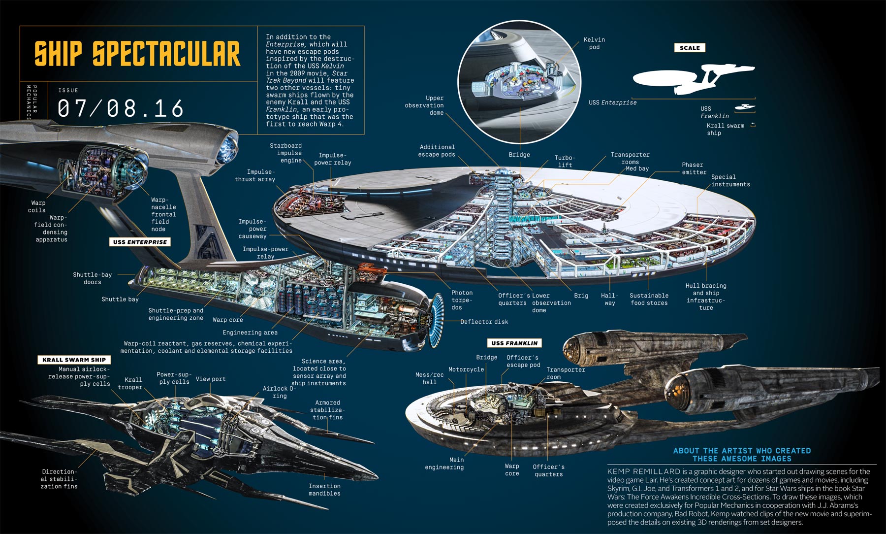
Celebrate the 50th Anniversary of the Star Trek franchise in 2016 with this all-new bi-weekly comics event, when Captain Kirk and the Enterprise crew faces off against the Klingons in an ultimate showdown!

md4-covers

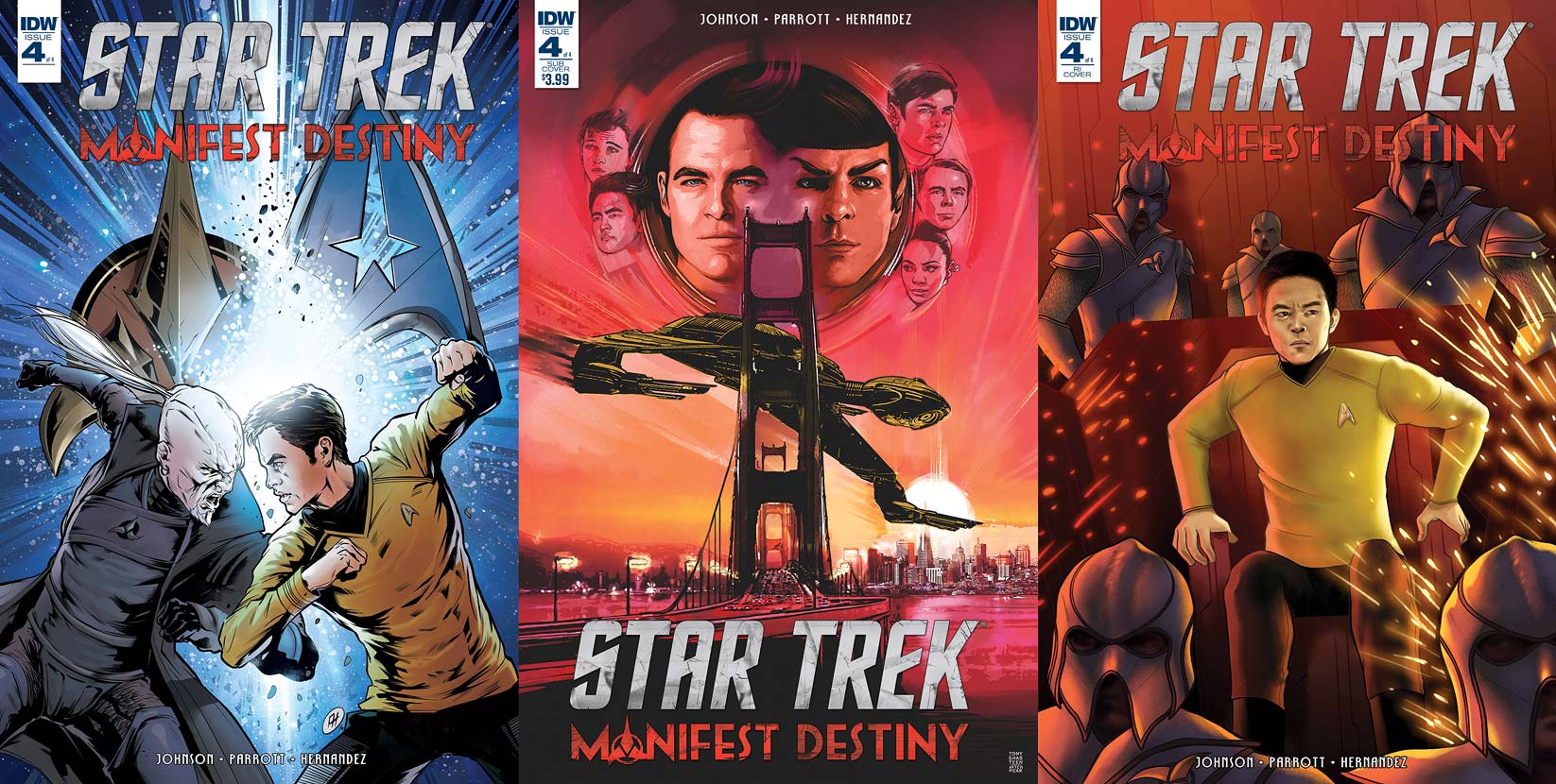
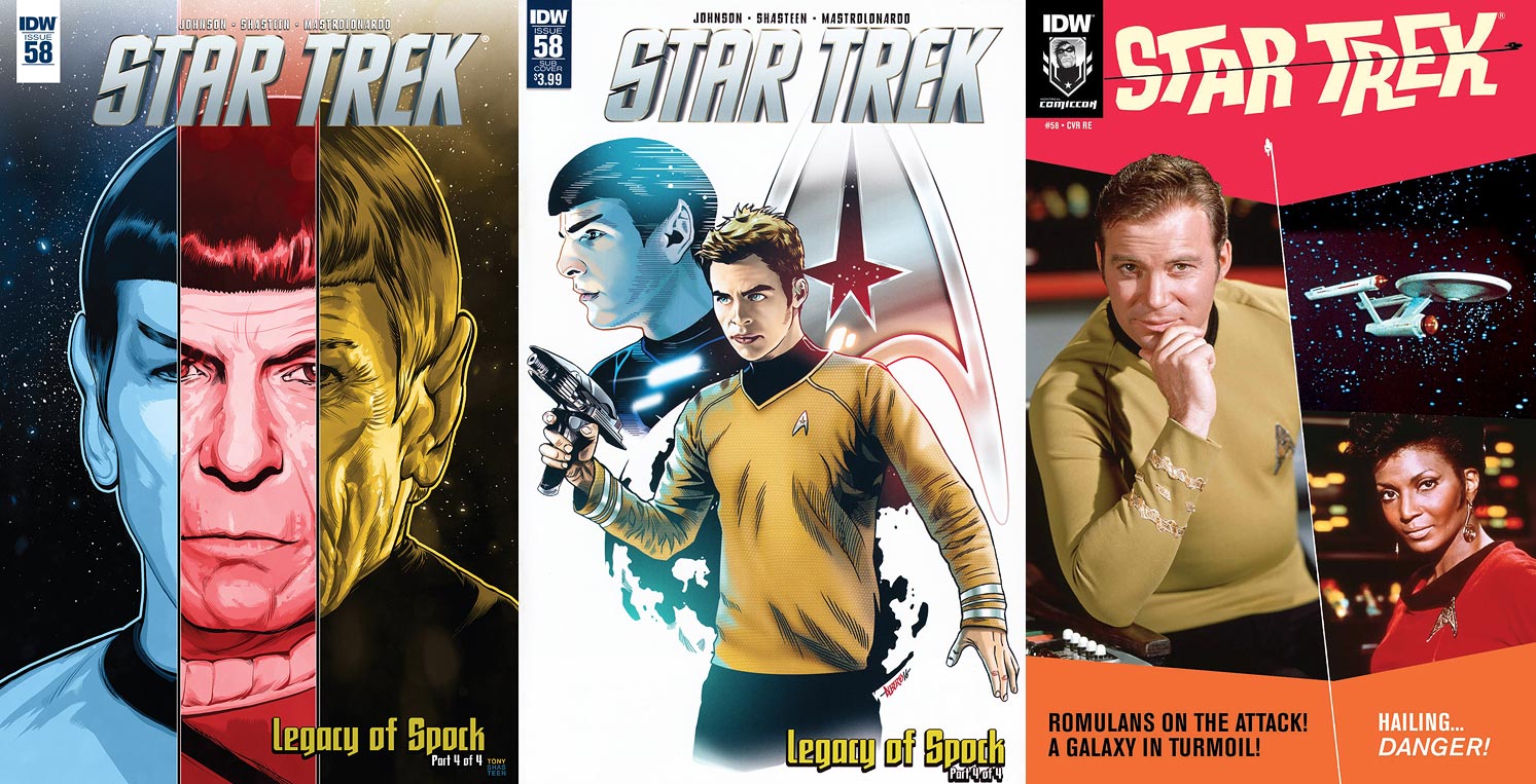
There are a trio of covers to collect for the final issue in this series:
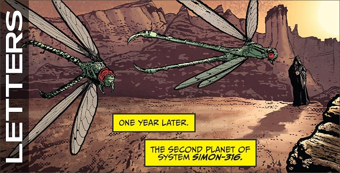
Order Star Trek:
Manifest Destiny #4

  • Kirk and Sho’Tokh square off with each of their people’s emblems behind them. This cover from Angel Hernandez with colors by Jose Luis del Rio is a strong one. It’s nice to see the two characters going at each other with their fists, rather than use the weapons associated with their cultures.

    This makes the fight more brutal, but definitely more in the mold of the classic series. Placing an explosion between the two men is an excellent way to up the explosive content of this image. The coloring on this is really nice, with that explosion in the center pulling the reader’s attention to two fighters.

  • The subscription cover is a final homage by Tony Shasteen to Bob Peak’s iconic posters from the films, this being a modernization of Star Trek IV. Above an image of the Klingon Bird of Prey avoiding entangling itself with the Golden Gate Bridge are all the new cast members to the Trek films; from left to right, Chekov, Sulu, Kirk, Spock, McCoy, Scotty, and Uhura. A beautiful take on this poster and this, and all of Shasteen’s previous covers for this series, should really be a poster or print.
  • The subject matter for the retailer incentive cover is a complete surprise. Sitting in the captain’s chair aboard the Enterprise, Sulu looks in focused concern at a console just off the page that’s erupting in a shower of sparks. His concern is either for the fate of his ship or the crew that surrounds him, helmeted Klingons.

    Great choice for a cover by Jen Bartel and it succeeds well. Sulu looks like actor John Cho and the coloring is fantastic — the reds intensify the situation and having him in yellow makes him stand out among his enemies.

md4-story

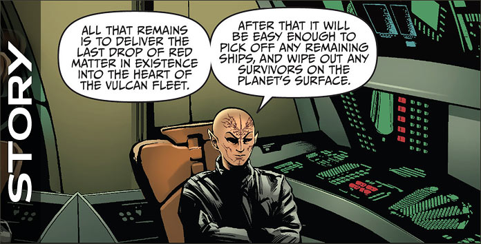
Sho’Tokh tells his origin. “I have been hated from my first breath…Despite my outcast status, the defense force could not deny my innate ability. They needed me. But I never needed them.”

This quick summary is only one page long but gives terrific insight into what made the monster that now has control of the Enterprise and is now holding his bat’leth to Kirk’s neck. Scotty screams at the Klingon to leave the captain alone, sparking Sho’Tokh to consider a different fate for Kirk.

He knocks the human unconscious and states to a lesser what’s to be done, and that’s when an explosion rocks the hallway. He rushes to the bridge to find that they are being hailed by Divash aboard the Chonnaq. She has “relieved” Grelm of his post and now she wants to do the same to Sho’Tokh.

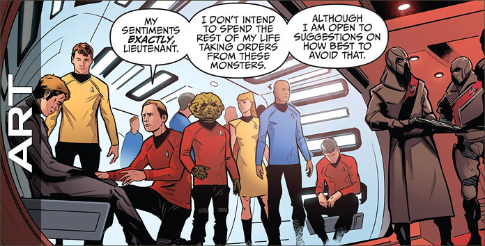
The Klingon ascension of command is fully on display for Starfleet’s finest. The commander’s reaction to Divash’s words is classic — a classic — Klingon reaction, with it ending with both characters being true to their natures. This conflict spells trouble for the crew of the Enterprise, who are caught between both sides of the Klingon battle and on two different ships.

This was a perfect ending to a perfect story from writers Mike Johnson and Ryan Parrott. I’ve longed to see Klingons return as antagonists to Star Trek and this issue, this series, more than satisfied.

Sho’tokh is an exceptional antagonist. He’s wholly original, but his motivations go beyond the norm even for those who’ve been following this franchise for decades. He gives Kirk the perfect foil to square off against, mentally and physically. Divash is also a terrific character, allowing the reader to sympathize with her wishes, but reminding one that she is Klingon and that takes precedence over the well being of the humans.

There are also some nice moments with the supporting characters, such as Sulu and McCoy, with the latter making the strongest change about Klingons by the end of this book.

md4-art

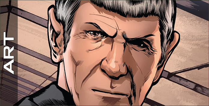
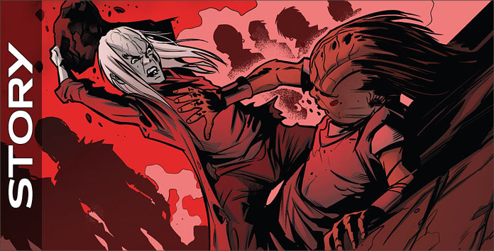
The origin of Sho’Tokh is told in four vertical panels on one page. It completely summarizes this villain’s life and brilliantly shows how he became the monster he is. The second and third panels are violent images, with the fourth being an excellent transition point for the character that wouldn’t mean much unless the previous two panels had been seen.

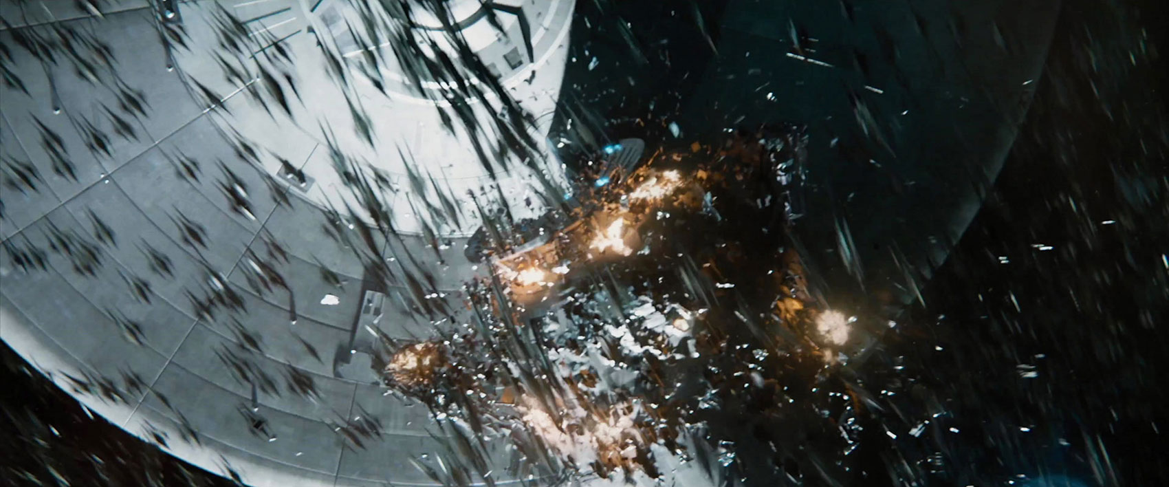
Being a Klingon, the antagonist towers over Kirk and this is an outstanding way to instantly have the hero of the book be at a disadvantage to the villain. The smoke effects of the first panel on Page 2 are an excellent way to remind readers that all is not well aboard the Enterprise.

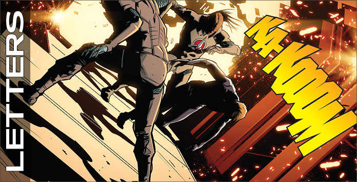
The explosion on 3 is great; I love seeing the point of view tilted like this as it instantly takes a reader back to the same effect from the television series. The final panel on 4 is terrific, with this crew realizing that their backs are against the wall as they command a wounded ship. Besting this hopeless image are the two panels that follow on the next page, with Sho’Tokh’s emotions fantastic, and even they are bettered by his final two panel on the same page.

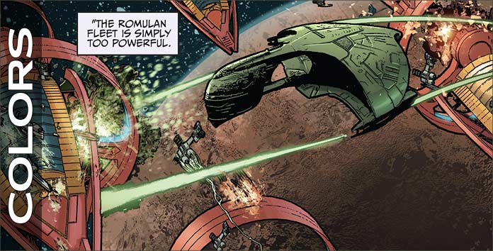
There’s only one panel of the two ships engaged in space and it’s great. It had me wishing to see more between the two ships, but the story rightly goes inside the ships to show the direct effects of the conflict on their crews. Page 11 is fantastic.

There aren’t any humans shown on this page, but Angel Hernandez has captured the damage to the ship handsomely, with that second panel rivaling Khan from the 1982 film. Pages 16 – 19 have the final conflict between the two leaders and it’s everything one would want it to be. Naturally, they’re exchanging barbs as they battle, but Hernandez makes every punch and slash felt, with the final blow being excellent.

Yeah, Hernandez should be drawing more Star Trek as soon as possible.

md4-colors

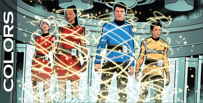
Two colorists are credited for this issue, Mark Roberts and Adam Guzowski. I wish that there had been some particular notation as to who was responsible for which pages so I could give specific commentary to each, but I can safely say that both gentleman did a good job.

The first page (Yeah, I’m harping on it, but it is that good) uses reds outstandingly to create a bloody path for the Klingon, with only his gray skin being the other color on the page, used to set him apart from the bloodshed. This red continues onto the next pages as the Enterprise is at red alert: this is a great way to show that the bloodshed of Sho’Tokh’s past continues into his present.

Colors are also used to show the reader two different settings, with the Starfleet ship’s interiors red and the Klingon ship’s green. The book’s final confrontation takes place in a fairly dark setting, but it’s colored so that the reader can still the characters in action, while realizing that it’s dark place. Excellence throughout.

md4-letters

Dialogue, sounds, an editorial note, ship-to-ship transmissions and Klingon speech (the same font), and yells are crafted by AndWorld Design. It’s a bit confusing to see the Klingon dialect done in italics because it’s already been set apart from Starfleet standard by an the greater than and less than symbols.

I was reading their speech initially as if they were yelling at each other in Klingon, as Klingons tend to do when conversing, but when Sho’Tokh and Divash had their conversation the visuals of the letters stopped my reading of the story to sort out what I was looking at. All else looks fine, though I’m still not understanding why the Klingon dialect was put in italics.

HP Enterprise STAR TREK BEYOND Technology Revealed

HP Enterprise’s technology contributions to STAR TREK BEYOND have now been revealed, as product designer Chris Carlozzi dished on his prop work to CNET this week.

Carlozzi’s work was done without any knowledge of the film’s plot, but rather, he “just put together things that [he thought] would be like that distant future-type experience.”

Minor spoilers below!

First up is THE BOOK, a flexible tablet device designed to “learn, teach, and aid [in] exploration. It educates and documents life, adding to [the Federation] database.”

stb-book
Photo by ITBusiness.ca.
stb-book-sketch
Photo by ITBusiness.ca.

This reimagined version of the ever-present PADD prop was actually first revealed back last summer during the Omaze fundraiser promotional campaign – though the on-screen version has a digital addition of the HP Enterprise’s product logo, that glowing green rectangle.

padd
The ‘book’ tablet prop featured in an early Omaze video.

The second new technology is THE QUARANTINE, a kind of cloud-storage and data analysis tool used in the Enterprise sickbay.

Carlozzi:

I really started saying, all right, if I’m doing a device like this, how would I make it [work] in like a Starfleet type of mentality? How would I get something to report back to a ship? How would I get something to report back to Starfleet? How would I have databases, when we’re talking about things that are like light years, or different solar systems apart?

As with The Book, the concept drawings for the digital displays also include HP Enterprise’s green rectangle design.

stb-quarantine
Photo by ITBusiness.ca.

The final new piece of tech is an upgrade to the traditional medical tricorder, known as the DIAGNOSTIC WRAPThis large-display scanner “analyzes the inside of the creature that it’s wrapped around and the data populates on the screen in real time.”

diag-wrap
McCoy scans an injured crewman during the Swarm attack. (Photo via CNET)

The prop lives as a handheld unit which appears to be manually expanded for use, while its compressed layout is held in place by magnets.

diag-wrap-prop
Photo via ITBusiness.ca.
wrap-sketch
Photo by ITBusiness.ca.

Marissa Freeman, vice-president of global brand and advertising at HP Enterprise, talked a little bit about the inclusion of the green HPE logo in this tech with IT Business.

Most marketers don’t find a perfect opportunity like this one, where what you have to talk about is exactly what the movie is about – which is the future of technology. [The green rectangle] is like our Nike Swoosh. It’s a bit of an easter egg, a hint in the movie about Hewlett Packard Enterprise.

Hopefully, the integration of the HP Enterprise logo will remain as subtle as these sketches indicate, usage that most filmgoers are likely to not even recognize.