Following up on his scoop from earlier this week, Deadline‘s Mike Fleming, Jr. reports today that not only is the Trek 4 development kicking along quickly, but that Tarantino has already “met for hours in a writers room” with writers Drew Pearce (Iron Man 3, Mission: Impossible – Rogue Nation), Lindsey Beer, and apparent “frontrunner” Mark L. Smith (The Revenant).
In addition, the biggest jaw-dropper of this story is that Tarantino has “required” that his Trek take be an R-rated endeavor, and both producer J.J. Abrams and studio Paramount Pictures have signed on with that rating.
From the Deadline report:
The film will most certainly go where no Star Trek has gone before: Tarantino has required it to be R rated, and Paramount and Abrams agreed to that condition.
Most mega budget tent poles restrict the film to a PG-13 rating in an effort to maximize the audience… the exception to this rule was Fox’s Deadpool, but that film started out with modest ambitions before it caught on and became the biggest R rated film ever.
That rating was crucially important to Tarantino, who hopes to direct this Star Trek and who has helmed R rated films his entire career.
Tarantino certainly is no stranger to violence and other R-rated elements from his past films like Resevoir Dogs, Pulp Fiction, Inglorious Basterds, The Hateful Eight, and Kill Bill — but what of that adults-only tone would he bring to a Star Trek film?
We’ll have to wait and see if his story moves past the scripting stage to find out.
Finally, we come to the end of this amazing thrill ride, and I have to be honest about the Star Trek: TNG — Mirror Broken story: I DON’T WANT IT TO BE OVER!
Scott and David Tipton with artist extraordinaire, J.K. Woodward have managed to create something truly memorable with this series, which wraps up this week with Mirror Broken #5.
My only complaint? It’s over too damn quickly. Five issues may seem like a decent length for a story arc, but when you have something this good, it’s only natural to want more.
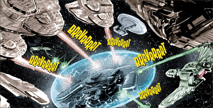
Just to briefly recap the events from when we last left Picard and his band of freebooters, they were being chased down by Imperial Starships to return the stolen ISS Enterprise. However, before any serious battle could ensue, they were surrounded by an overwhelming number of Cardassian and Klingon warships, making this a heck of a standoff. What’s Picard’s solution? He runs.
But, given that this isn’t the familiar Next Generation universe, we can’t expect a deft ruse or diplomatic solution, right? So, in true buccaneer fashion, Picard turns, stands, and fights… and the battle is monumentally epic!
I don’t want to give anything away – it’s an innovative and creative battle that makes use of this Enterprise’s special nature and needs to be enjoyed without any fear of spoilers. But this is a saga that sees the making of the stuff of legends. In this case, it’s a five-issue origin story that sees the crew of the Enterprise in this universe coming together. In all honesty, I find I actually preferred this adventure to “Encounter at Farpoint.”
Woodward’s art is spectacularly accurate to the finest degree. Not only are his likenesses brilliant, but he manages to fit in little details that might get unnoticed if you aren’t looking carefully. For example, in the mess hall party, watch to see who Riker is trying to impress, with a jealous Inquisitor Troi watching over his shoulder.
Also, when Picard stands up from his chair, just because his tunic is armless, it doesn’t stop him from executing the familiar tunic adjustment fans have come to know as “the Picard Maneuver.” It’s these details that drive home the realism of his imagery.
This iteration of the Mirror Universe makes this tale unexplored territory. The Tiptons and Woodward have created new pathways for these characters to follow and have ultimately made this trailblazing stuff to read. It’s more than just a new spin on old characters – these are new characters in terms of behaviour, dialogue and values.
There are also new potential storylines to explore in this arc as well. For example: what is the nature of the relationship between Guinan and Picard in the Mirror Universe? What about the next adventure, and, in thinking about the crew, to echo Mr. Barclay: how long can this last?
You can expect this to last a little bit more. In all candour, I can give you a full prediction right here and now, that this is NOT the end of this series. There’s too much fun for Woodward and the Tiptons to miss out on continuing the Mirror Universe adventures of the ISS Enterprise-D. So, I’m calling this one: expect another series of adventures from these creators.
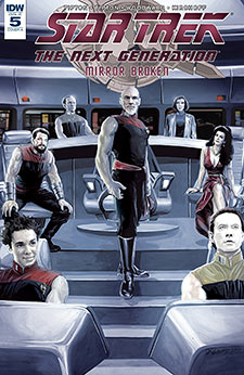
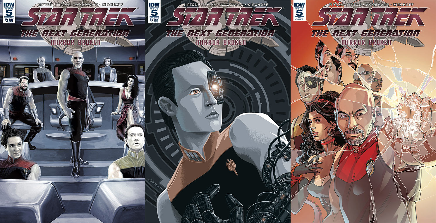
The regular cover by Woodward is the best one by far. Not only does it show a unified crew ready to tackle anything that threatens the Empire, but it also reinforces that sense that there are more stories to come. Boldly looking towards the future is what we’ve come to expect from the regular universe Enterprise crew – why should their Mirror Universe counterparts be any different?
The subscription cover is another one of George Caltsoudas’s stylized representations. In this instance, we see Data striking an intimidating pose, complete with Borg attachments. I don’t know if it fits this particular issue. In fact, it probably would have been a better choice as a variant back-up to the Loot Crate edition that featured Data’s origin story in this universe.
The retailer-incentive cover by Rachael Stott is certainly a dramatic one, with a dominant-looking Captain Picard breaking a window with his fist as the crew looks on from behind him. As this is a story about the crew’s “baptism of fire,” so to speak; this is a better choice of covers that shows a united crew, eager to crush the enemies of the Empire.
Overall, this is a story that’s too good to miss. Mirror Broken #5 ends with the same character this tale started with: Reginald Barclay, who expresses his curiosity about the crew’s future.
As for me, I take comfort in my shared opinion with Barclay that this isn’t the last we’ve seen of the ISS Enterprise-D, and I look forward to new stories set in this universe sometime in the future.
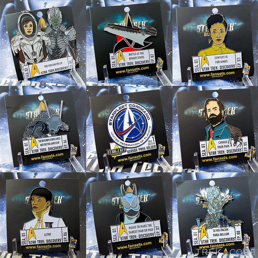
Each individual pin is up for sale for $15 each (with the larger “Vulcan Hello” pin at $20), which is certainly a relief to those of you who were concerned about the subscription price point.
If you still want to nab the entire collection – including those not yet revealed for the second half of Discovery‘s first season – you can still sign up for a subscription for $225, though the “Season Pass” Starfleet Command pin will no longer be included.
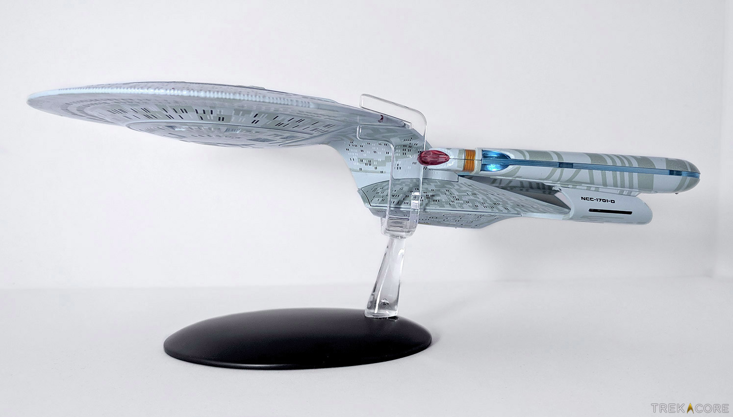
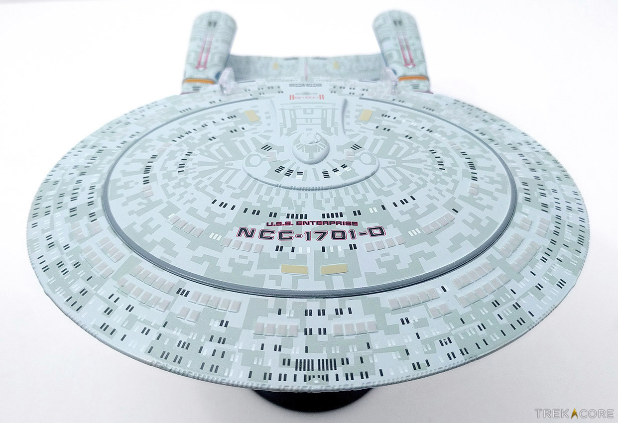
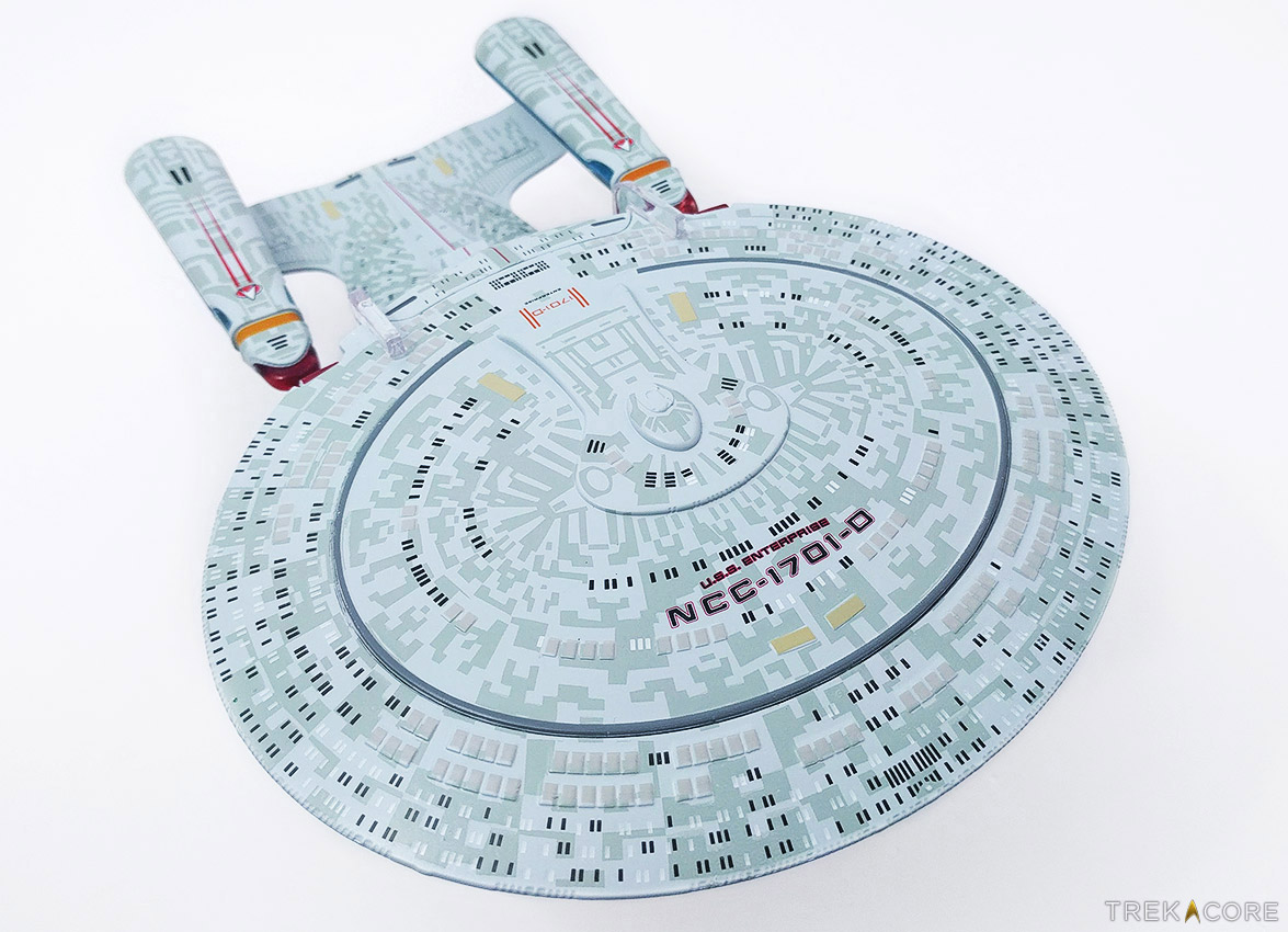
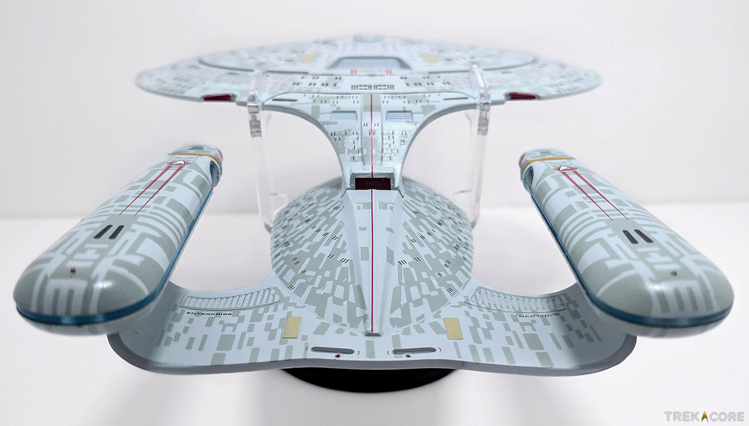
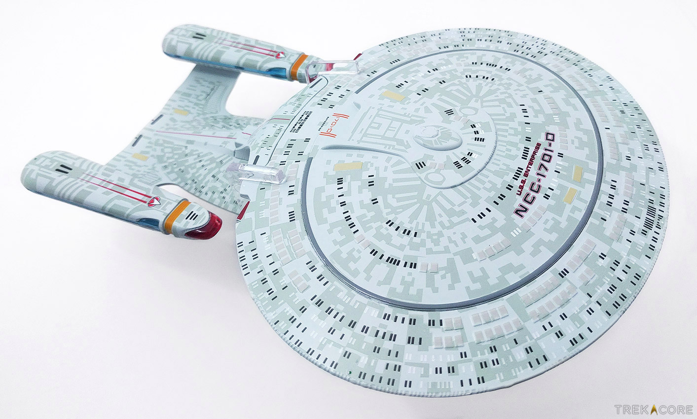
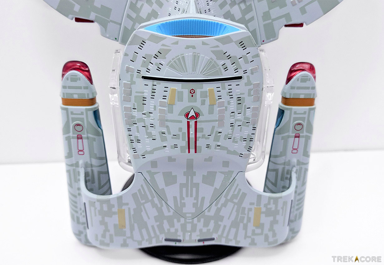
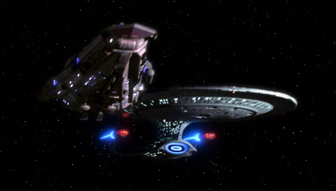
Last week we took a look at Eaglemoss’ large-size XL USS Enterprise-E, and now we’re jumping back a few years in the Trek timeline to the Galaxy-class Enterprise-D from Star Trek: The Next Generation!
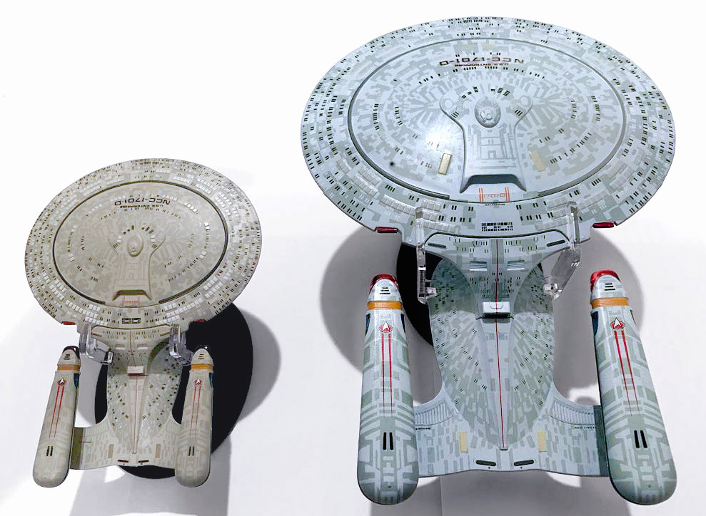
Measuring just over 8.5″ in length, this XL Enterprise-D is the third rendition of TNG’s hero ship, after their 2013 debut issue featuring the Galaxy-class ship in a smaller scale (and their “All Good Things” three-nacelled variant) as a subscriber exclusive — though with a revised paint scheme to bring the ship closer to its expected hue.
LEFT: The 2013 5.5″ Enterprise-D subscriber model. (Photo courtesy of Alex Perry)
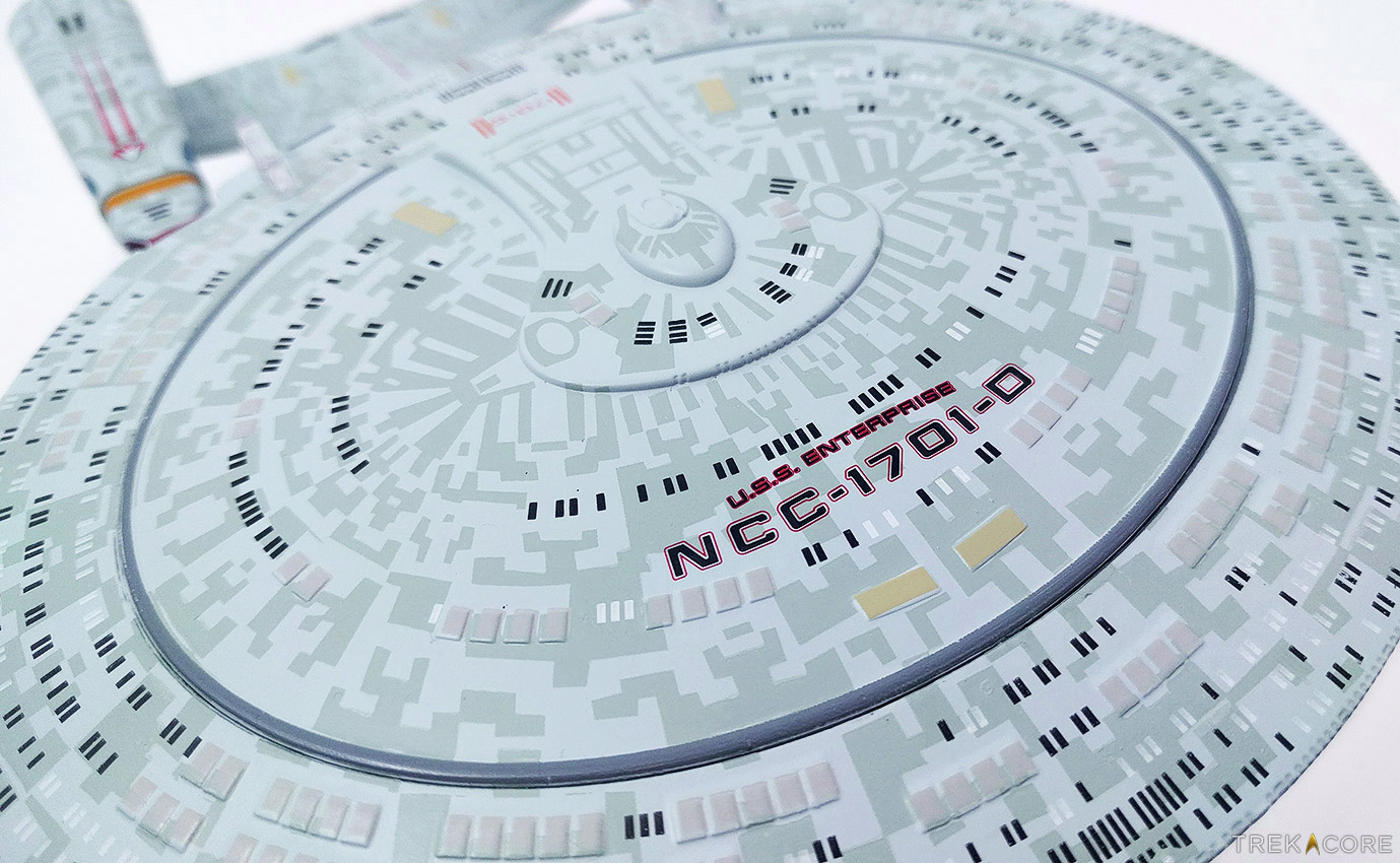
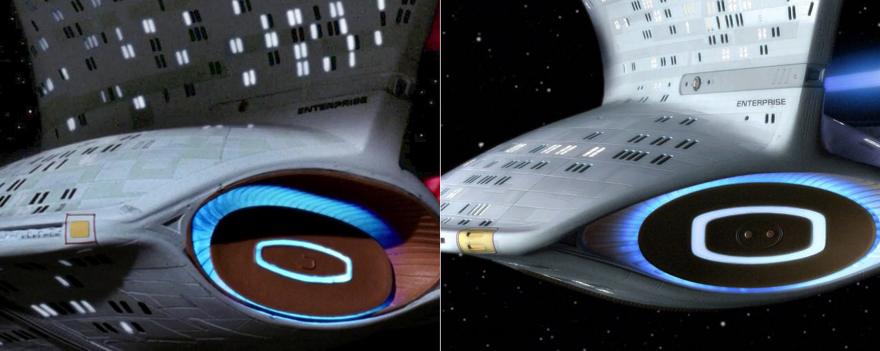
Rather than the khaki tan color on the first-run Enterprise-D, the XL edition of the ship is toned in a pale blueish-green paint which is much closer to the original filming models’ look, though featuring a great deal of hull aztec markings which are pushing a bit too heavy in this reviewer’s opinion.
The aztec design is nice in its detail and application, but toning it down by about 40% in contrast would make it a much more subtle effect which help smooth out the presentation, and also give the other hull markings a chance to stand out against the paint.
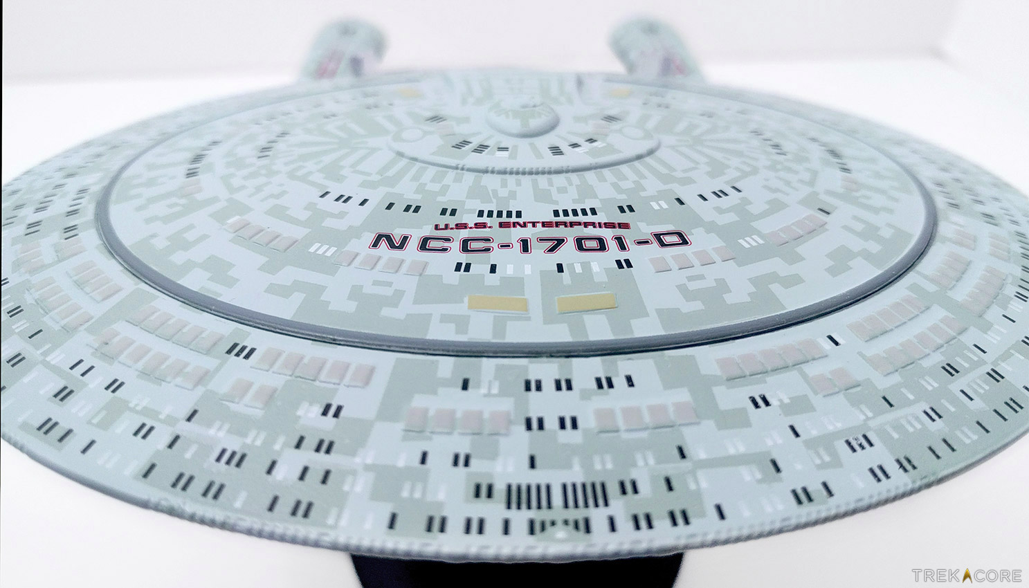
On the upper half of the saucer, the black and white window markings are all painted on, while the tan lifeboat hatches and yellow transporter emitters are painted on raised details; all which align nicely on our model.
The entire bottom of the saucer and outer area of the top are die-cast metal, while the area inside the oval-shaped phaser strip on top, including the bridge module, is a molded-plastic insert which is secured in the metal saucer with resin.
The seam between the two is visible, but the alignment with the dark-grey phaser strip helps blend it to a relatively unnoticeable join.
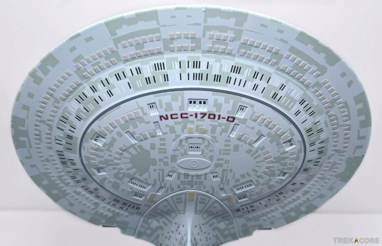
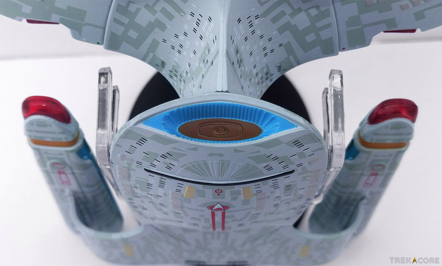
The underside of the saucer, all metal as mentioned, is again full of lifeboat hatches and painted-on windows – but here is where the first window alignment issues that we’ve covered before appear on this model.
Of the fourteen recessed window bays on the lower saucer, not one has the painted black window markings inside the grooved etchings in the metal. Again, if the manufacturing processes aren’t available to get the paint into the slots as marked, why are the sculpts still including these window indentations?
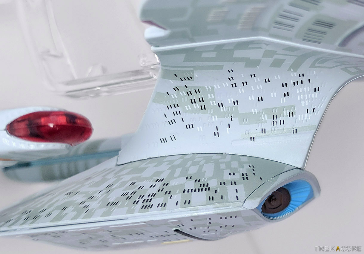
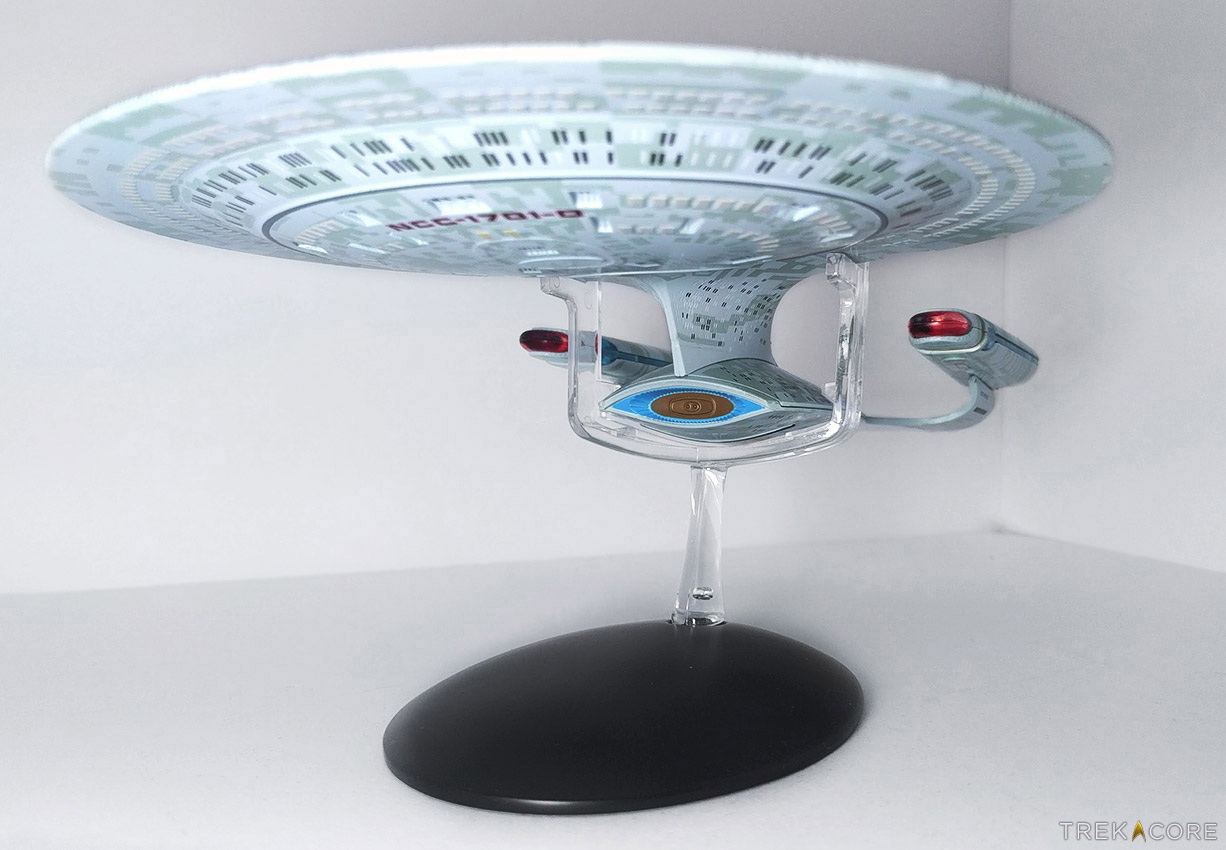
Moving down to the secondary hull, the neck of the Enterprise-D (and everything below it) is entirely molded plastic, with more noticeable joins for assembly. The neck area has a really odd window situation, as once again, the window paint doesn’t align with the indentations — but here the markings are all over the place, even overlapping a bit with the torpedo launcher groove.
(The XL Enterprise-E model also has these faint window grooves on its neck, but they were left unpainted — a wise decision, frankly, compared to this implementation.)
There is also a lack of Enterprise labeling on the side of the neck, and no sign of the yellow RCS thruster on the outside of the deflector; these yellow thrusters are also missing from the edges of the saucer section. While we can forgive the tiny ship name for going absent due the tiny font and unusual placement, the absence of the yellow thrusters is a bit of a glaring omission from the ship.
The deflector itself is copper ringed in bright blue plastic, but missing the detail of a second ring of blue in the inner dish as pictured above.
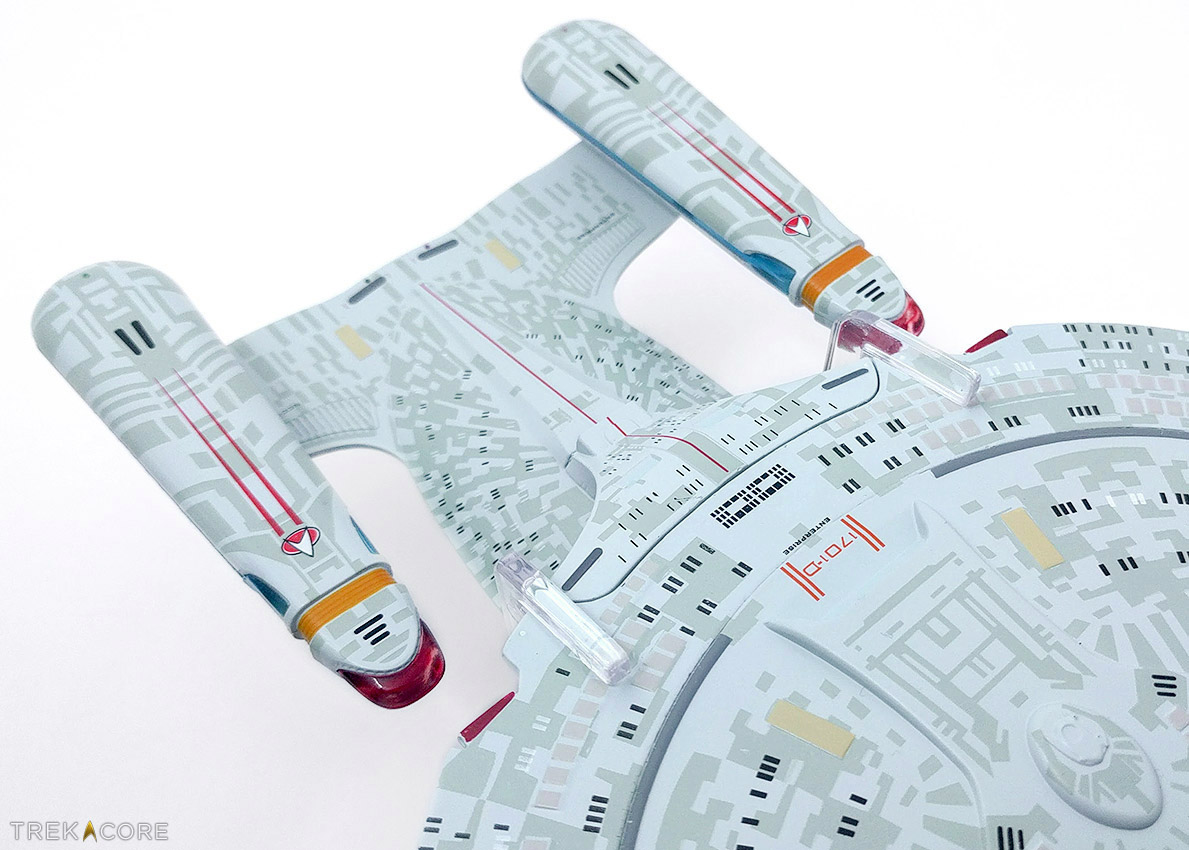
Moving around to the rear of the Galaxy-class model, the ship is a mostly-faithful recreation of the on-screen Enterprise-D, with appropriate hull markings and nacelle component coloring.
The bussard collectors at the front of each nacelle are a brilliant ruby red, backed by the yellow intake grilles and bright blue warp field emitters. The Starfleet pennants on each are crisp and clear, and red and green running lights are marked appropriately.
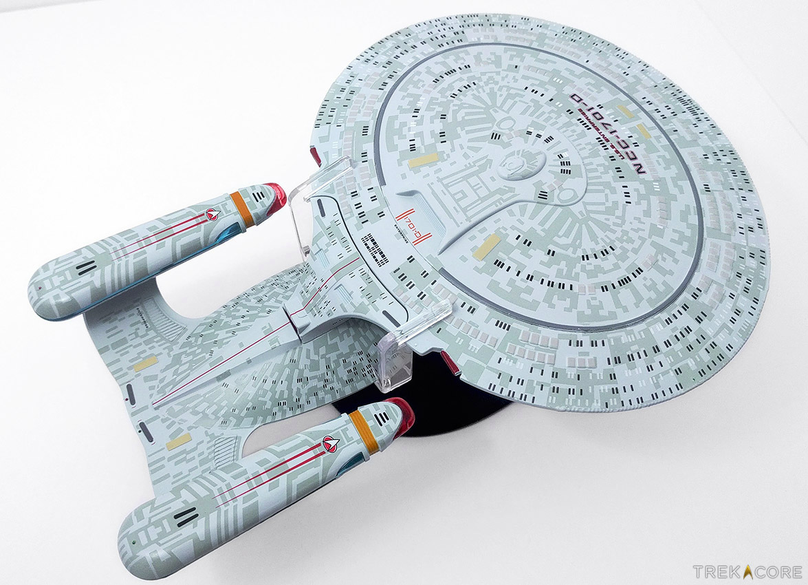
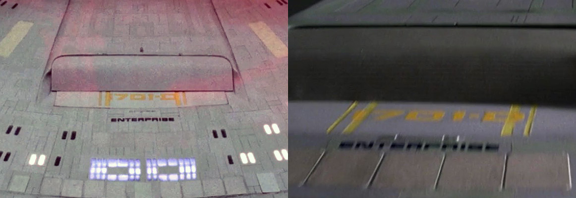
And now for the disappointing area of this section of the model: the shuttle bay and impulse engine area of the upper neck section. Several inaccuracies from the smaller edition of the Enterprise-D have carried over to the XL edition of the ship, ones that really could have been addressed in this larger-scale ship.
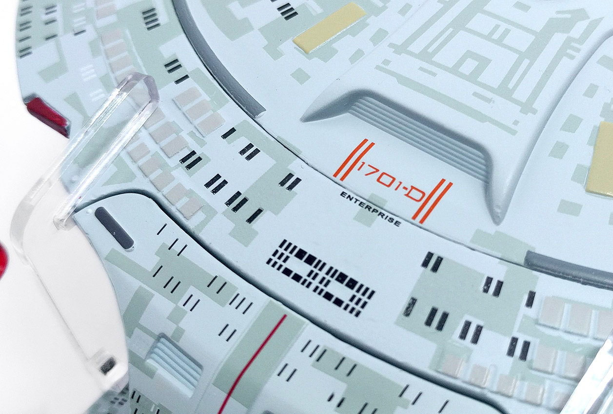
First, the coloring of the “1701-D” main shuttlebay markings are a bright orange-red, when the Enterprise in TNG featured yellow entry detailing. This might be a visibility thing — that the yellow may not have been legible on the hull — but it just bugs a little.
In addition, the red paint on the two saucer-section impulse engines feels very unfinished, with parts of the engine extrusions left unpainted around the edges. Just a quick moment with a hand paintbrush would have cleared that up, or replacing these with red plastic inserts would have made a nice improvement.
The real frustration in this part of the ship, though, is the middle part of the neck, home to Shuttlebays 2 and 3, and the stardrive’s impulse engine. Rather than the traditional (and screen-accurate) small and large bay doors, each of the secondary shuttlebay hatches are equal in size and placement, a carryover from the 2013 small Galaxy-class model.
Virtually every other Enterprise-D model we’ve seen have sized these hatches to match the filming model — dating back to the early Cheerios cereal model toy in 1987 — and it’s not clear why that this wasn’t addressed when scaling up the design to the XL size.
The primary impulse engine is also a bit of a rough patch, where the barely-visible red plastic insert joins with the rest of the hull — true, our photo above is a macro shot enlarging the area significantly, but it’s not that hard to see in person, either.
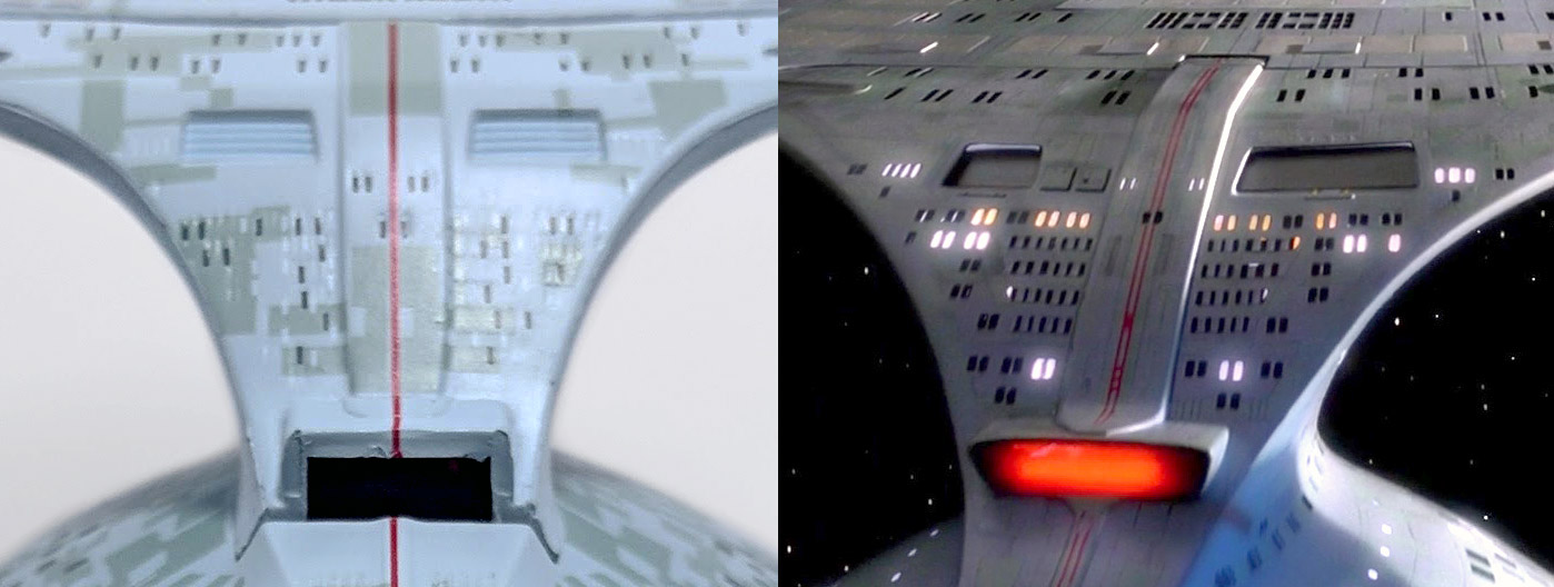
Finally, the red stripe down the back of the neck really should be two parallel lines; a minor nitpick, admittedly, but that’s part of the ship’s design.
We know that no model from any manufacturer is going to be perfect; there are always certain details not carried over or altered due to production requirements.
Screen-accuracy isn’t always possible — and while we admit that some of the criticisms we note above are perhaps a little too nitpicky, certain details like the shuttlebay sizes and missing yellow thrusters are hallmark details of the Galaxy-class, and it’s unfortunate that they’re not in place on the XL Enterprise-D.
That being said, if you’re able to accept the minor issues we’ve covered here — and really, they are relatively minor issues — this Enterprise-D model is a solid, well-balanced ship that is held well on its included display, and looks pretty great on the shelf among the Eaglemoss fleet – just stand back a little bit.
We’ll be back with reviews of the XL Enterprise NX-01 soon, along with more coverage of the Official Starships Collection throughout the month of December.
What are your thoughts on the Enterprise-D? Sound off in the comments below!
In Eaglemoss’ US store, TrekCore readers can use promo code TREKCORE at checkout for 10% off any ‘Star Trek’ collectible purchase $50 or greater (Starships, Plaques, Binders, Graphic Novels).
The galaxy’s newest Star Trek reference book — The Art of Star Trek: The Kelvin Timeline — is in stores today, and while we’ll bring you our review of this new book later in December, we’ve teamed up with publisher Titan Books to get a copy of this new hardcover into the hands of one lucky TrekCore reader!
This contest has ended. Congrats to winner Brett L.!
Check out our summer preview of this book from back in August, then enter to win your own copy by simply answering the question below in our comments:
From the Narada to Yorktown Station, and from Officer 0718 to Krall and Jaylah, the Kelvin Timeline Star Trek films have been full of visual wonders from digital landscapes and space sequences down to the incredible makeup effects of Joel Harlow from last year’s Star Trek Beyond.
Tell us your favorite starship, best-loved alien design, visual effects sequence, or anything else you love about the look of the Kelvin Timeline films!
Good news for our international readers, as this contest is open to residents in the United States, Canada, and the UK — so sound off in the comments below, and watch your email for the winner notification on December 11!
Add TrekCore.com to your ‘safe senders’ list so we don’t go to your spam folder!
Contest Rules
Giveaway open to residents of the USA, Canada, and the United Kingdom only.
Contest runs through 11:59 PM Eastern on Sunday, December 10.
Only one comment per user; users with multiple comments will be disqualified.
Must be a registered user of the Disqus comment system with a valid email address.
For those of you who prefer digital downloads, presales will begin this Friday for an availability day of December 15; sales for physical media — both on CD and vinyl — will coming early in the new year.
Here’s the full listing from this first release:
1. Main Title (Aired Version)
2. We Come In Peace
3. First Officer’s Log
4. I’ll Go
5. The Day Is Saved
6. Torchbearer
7. PTSD
8. Persistence
9. Stranded
10. What Did You Mean By That?
11. I Can’t Dance
12. Captain Mudd
13. Stella
14. Facing Off
15. Undetermined
16. Watch The Stars Fall
17. Weakened Shields
18. What’s Happening?
19. Personal Log
20. The Charge Of Mutiny
21. Main Title (Extended)
Discovery producer Alex Kurtzman praised the composer’s score in the announcement:
Grand, glorious, hopeful, heartbreaking, intimate, bittersweet, tense, soaring, surprising. Over 51 years, in its many iterations, there’s been no shortage of adjectives to describe the music of Star Trek. On the other hand, the list of composers capable of capturing them all is short, and this is where Jeff Russo comes in.
Jeff manages to hold each note in beautiful balance, evoking the nostalgia of Alexander Courage’s original theme while scoring Discovery with his own unique ear and heart. We’re lucky to have him, and we hope you’ll love his music as much as we do.
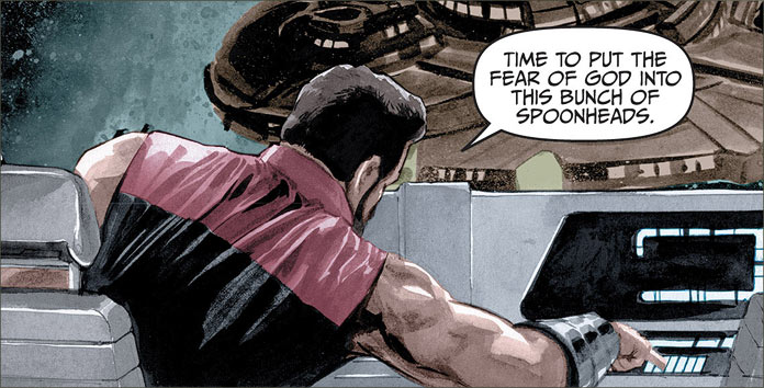
Back in 2015, famed director Quentin Tarantino talked a bit during a Nerdist interview about his thoughts on Star Trek, calling out some favorite episodes like “The City on the Edge of Forever” and “Yesterday’s Enterprise,” and also expressing an issue with the current film series that forces the storytelling to include all the established characters rather than allowing a focus on the main leads (Kirk, Spock, and McCoy.)
They might have trapped themselves a little bit by the simple fact they have to use all the crew now.
In all the films they’ve established it so much, that you need Uhura, you need a Scotty, you need Bones, you need all that stuff going on all the time — everybody has to be represented in some big story where they all have to deal.
Tarantino talks Trek in that interview, also touching on the casting of Cumberbatch as Khan in Into Darkness, the greatness of “Yesterday’s Enterprise,” and more:
https://www.youtube.com/watch?v=rzNnfKT6IrM
Now, after months of silence from the Paramount side of the franchise during the lead up and opening season of Star Trek: Discovery — remember, CBS owns the television half of Star Trek — Deadline is reporting (and The Hollywood Reporter has confirmed) that Tarantino has actually pitched a story to Trek film producer J.J. Abrams, and the studio is putting together a team of writers to explore the idea.
From Deadline’s Mike Fleming, Jr.:
Sources said that Tarantino has come up with a great idea for a Star Trek movie at Paramount. After sharing his idea with JJ Abrams (who himself is busy prepping Star Wars Episode IX), I’ve heard the plan is to assemble a writers room of scribes who’ll hear Tarantino’s take and begin to put together a movie. If it all works out, Tarantino might direct it, with Abrams producing.
While Tarantino has always come up with his own original films, many have wondered what he might do if he took the reins of an existing franchise. He has only done that on television, twice directing episodes of CSI and once an episode of ER. He has spoken about the appeal of taking on one of the James Bond movies, but the hard part of something like that is getting the rights holders to give him a wide creative swath that comes along with a final cut auteur like Tarantino.
This would give a remarkable boost to the venerable franchise for Paramount, which is looking to build them under studio chief Jim Gianopulos.
Safe to say this is way too early to call Tarantino’s involvement with the Star Trek film series anything close to a done deal, and there’s no way of knowing if Tarantino’s idea even includes the current roster of Kelvin Timeline actors.
Until we know more, we’re certainly filing this under “wait and see” status — but it’s nice to hear that there are still some signs of life in the Star Trek movie business.
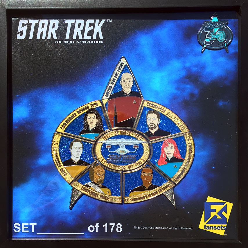
The 30th Anniversary year of Star Trek: The Next Generation is coming to a close, but before 2017 wraps up, our friends at FanSets are giving TrekCore readers a chance to win a fantastic Next Generation 30th Anniversary prize set to celebrate the series!
This contest has ended. Congratulations to winner Linda H.!
One lucky TrekCore reader will win one of FanSets’ limited-edition framed Star Trek: The Next Generation30th Anniversary pin set — along with a TNG 30 commemorative pin to match, seen above — for a prize package worth more than $225!
This numbered pin set features the entire crew of the USS Enterprise-D, and the starship itself, in a lovely framed shadowbox for display at your home or office.
To enter for your chance to win this amazing TNG package, just leave a comment below and tell us the following:
From the main bridge down to main engineering, there’s 1,014 members of the Enterprise-D crew to choose from, so make your pick and tell us about why they top your list –then watch your email for our winner notification on December 8!
Contest Rules
Giveaway open to residents of the USA only.
Contest runs through 11:59 PM Eastern on Thursday, December 7.
Only one comment per user; users with multiple comments will be disqualified.
Add TrekCore.com to your ‘safe senders’ list so we don’t go to your spam folder!
Editor’s note: While TrekCore has been covering the larger-scale Official Starships XL Editions from Eaglemoss’ line of ship models, we’ve not spent much time focused on the ongoing subscriber editions, but that’s changing today!
Our UK-based friend Clive Burrell from Some Kind of Star Trekis an expert on the smaller-scale monthly ships, and we’ll be bringing you his reviews of the smaller ships here at TrekCore, starting with some catch-up reviews of this past summer’s new releases.
* * *
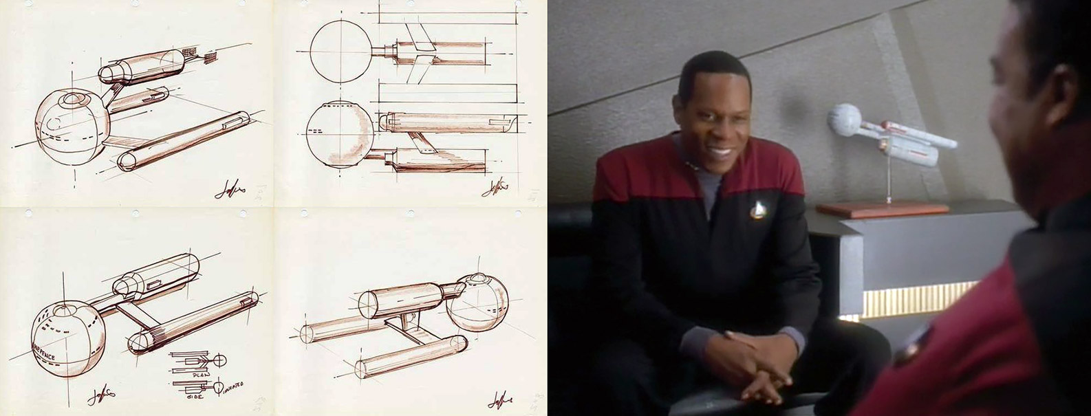
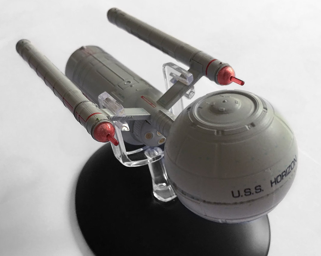
Back in the day, Matt Jefferies designed the USS Enterprise — but what first spewed forth onto the page wasn’t the familiar shape we know today from the Original Series but this, what is now known as the Daedalus-class.
Jefferies’ original sketches suggested a more cylindrical secondary hull and a spherical primary hull to get away from the cliched ‘flying saucer’ however we know how that turned out!
LEFT: Matt Jefferies’ sketches. RIGHT: The Daedalus-class model in Sisko’s office.
What we have with issue 100 is an amalgamation — a fusion of Jefferies design, the enhancements Mike Okuda made for the colour and black and white editions of the Star Trek Chronology, as well as some updates included for this collection.
Let’s get down to it: you know this is one of those essential models, one that you have to have because of its place in franchise history and it will entice discussion since it’s the first ship that hasn’t really appeared on screen (aside from a model in Sisko’s office).
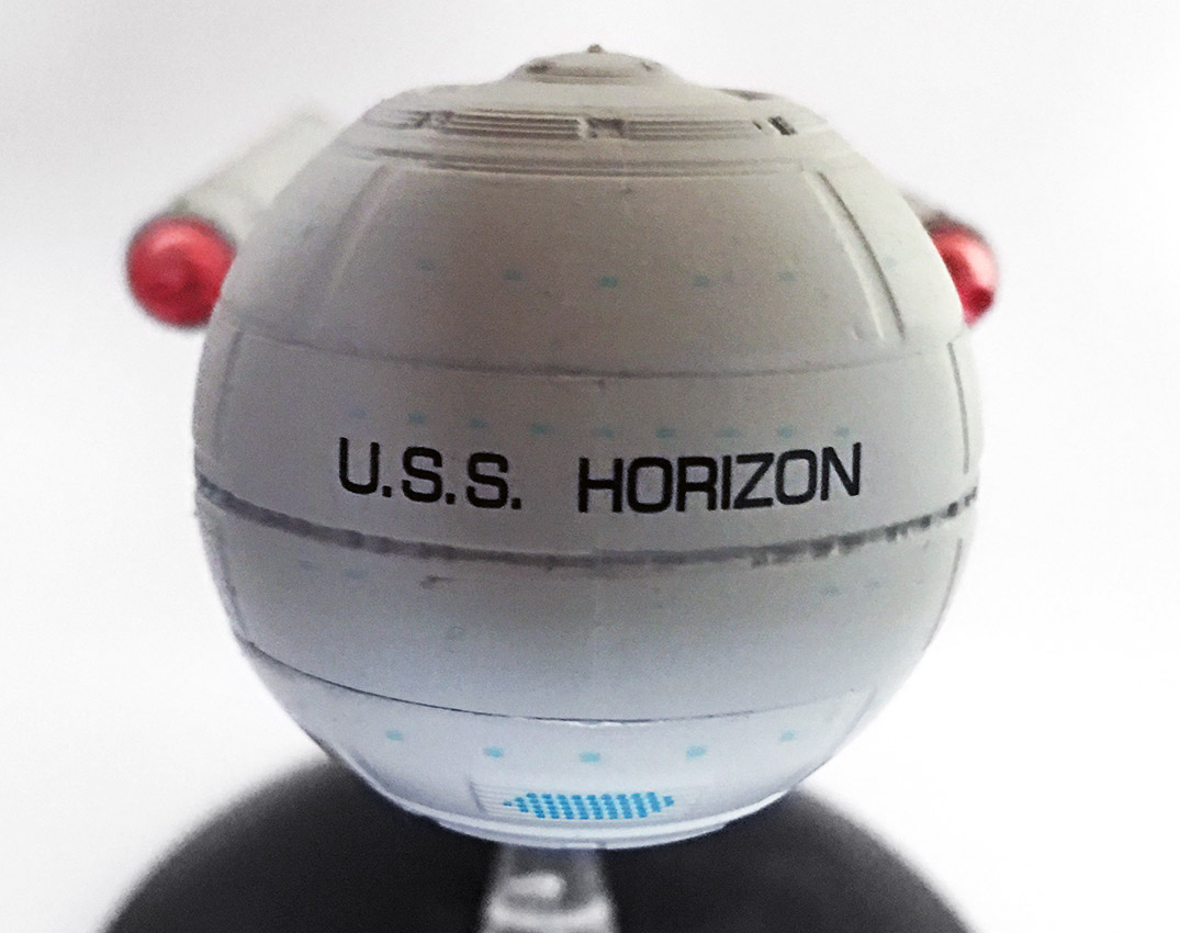
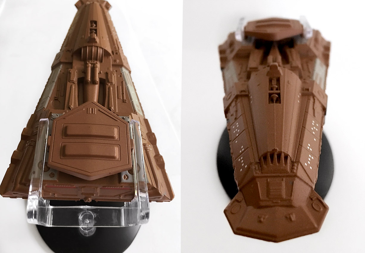
Labelled up as the USS Horizon, the ship firmly placed its links to the Original Series episode “A Piece of the Action,” in which this craft was mentioned. At the front the spherical primary hull sits bold and proud emblazoned with the ships name – but it actually seems to be lacking in any finer detail.
There’s the grey colour scheme all over, but when it comes to windows and definition that can be clearly seen on the magazine it’s oddly devoid of such precision. The mold is a good quality finish with the metallic ball joining to the secondary hull through the spindly, horizontal neck section which seems better finished than the ‘head’.
As with many of the Eaglemoss releases, the window alignments on the hull are unfortunately out of place to the physical window spots, and honestly, the deflector looks a bit boring. Comparing it to the plan views, it should be a more subtle colour shade of grey rather than an emblazoned blue.
Given that this is an interpretation of a classic design/sketch, I’m going to go a little easy on this one, but in some ways it does feel uncomfortably unfinished. The panel lines fee washed out and faint, almost over-simplistic which provides a very severe opposite to the back end, though moving back to the cylindrical secondary hull the detailing does increase noticeably. Panel lines are more clearly etched in and form is given much more shape and finery.
While you could probably push to say that the primary hull has nice impulse engines and no bad join lines, the rear section feels like a ship, and looks like a ship.
It’s complete, worked, and feels like they didn’t give up halfway through. For example, there is much more structure to the additional airlocks on either side and fortunately the registry decals are perfectly aligned unlike we saw on the early prototype. Oddly, the back end looks like a crisp metal finish while the sphere feels like a half-finished plastic blob.
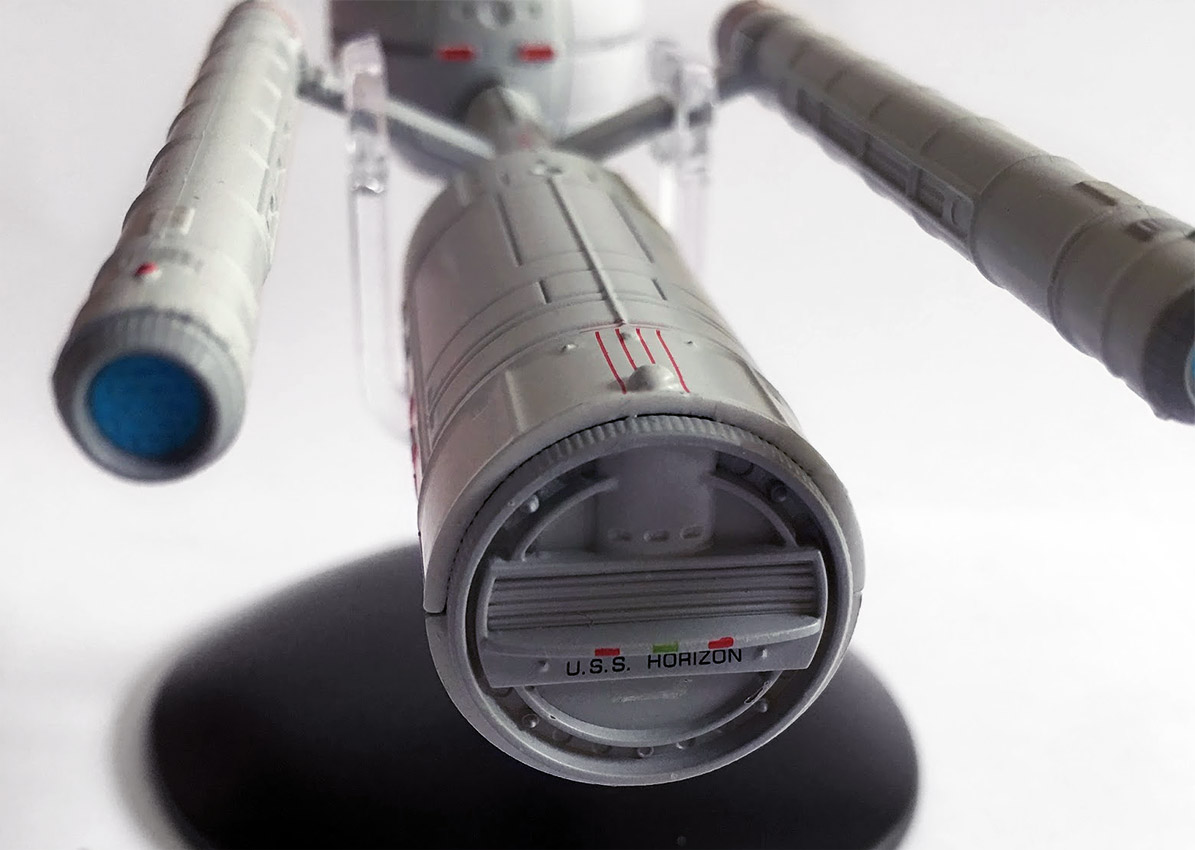
Now head out sideways from the barrel-shaped hull to the parallel warp nacelles. As with the secondary hull there is much more definition and the lines provide something of a primitive and industrial visualisation to the class. The rear exhausts are open as opposed to the grilles or ‘balls’ of the later Constitution-class and once more evoke a more basic sense of space exploration in the 22nd Century.
What does seem over basic are the red bussard collectors at the front of each nacelle. The finish on the Mirror Universe’s ISS Enterprise engines had smaller spikes to the front but here they are molded into the caps and seem ridiculously out of place. Definitely oversized for the ship, and certainly lacking in the subtlety that we saw on the ISS Enterprise.
Stand fitting is straightforward slipping right over the warp pylons and holding the USS Horizon firmly in place. No movement today people and she’s nice and level for display.
The great thing with the USS Horizon model is the percentage of metal over plastic. The whole of the sphere plus the neck, pylons and top half of the secondary hull is all metal; only the lower half of the barrel-shaped engineering section plus the nacelles and the shuttlebay doors are plastic.
Given the way that production has come on, the difference in surface quality is pretty good and at one point I couldn’t tell if the whole of the secondary hull was metal or not — and what is really nice about the secondary hull is the way in which the rear is properly finished with ship registry and, significantly, a shuttle bay and navigation lights. It makes the Horizon a complete ‘thing’ from every angle and makes her functional.
The magazine does offer some general background to the fictional class of starship, though the ‘Designing the Daedalus-class’ section misses a trick I think, choosing to focus more on the redesigning of the ship for the Chronology and this publication. Of course that’s not something that will have been extensively documented, but the omission of the original Matt Jefferies sketches in a piece about something he was ultimately responsible for envisioning is glaring.
This still remains a good read as you get more of a grip on what was altered and how the class came to look as it does now in the Starships Collection, particularly on how some of the smaller detail was incorporated such as the navigational deflector and impulse engines which weren’t considered back in those original drawings.
The first appearance of the Bajoran freighter in “Ensign Ro.”
Issue 101 was a bloody good surprise. I genuinely lined myself up to give this one a bashing as I expected it to be just as ‘brilliant’ as the other Bajoran ship models, including the magically unstable and home-movers nightmare, the Bajoran Solar Sailor vessel.
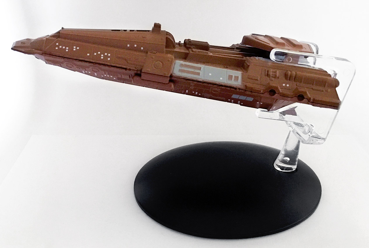
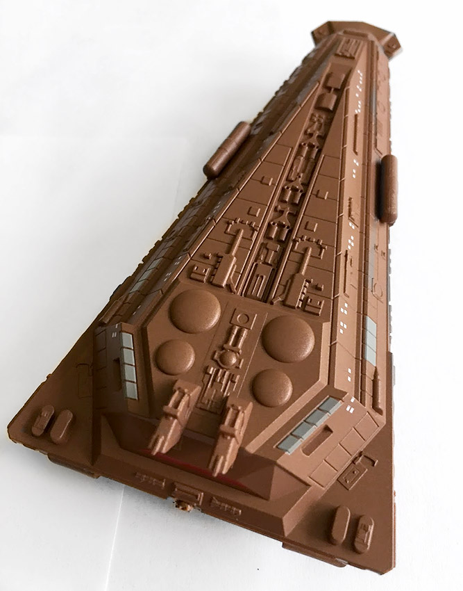
The Bajoran Antares-class freighter is a right chunky wedge of a starship and possibly the best offering from the nasally ridged humanoids. A ship of this shape may not immediately seem like the biggest draw but there’s a good deal going for it here.
The solid brown tone on the hull help to back the aged craft and make it feel fairly rustic. It is a very basic paint scheme with only a few sporadic grey panels to relieve the single shade. Right across the surface there are a considerable number of windows/portholes clearly visible although there does seem to be a discrepancy between the number on the ship and the number of the CG model in the magazine.
What helps to set it apart is the external detail bolted onto the freighter’s skin. There is trunking, machinery and general macguffins to help build up the detail and enhance the overall look of the craft. It might in essence be a single hulled slab but the finishing intricacies help pull it towards being something more interesting. The upper half of the ship is a chunk of metalwork with the exception of the dorsal sensor array while the underside is a single piece of plastic.
This is a really solidly constructed craft and there is a bit of weight behind it too because of that huge metal topside. The joins between metal and plastic are pretty smooth and the hull detail seems to be aligned pretty perfectly. It’s not the most glamourous of ships by a long shot but Eaglemoss have managed to construct something decent from a very average model and one I’m oddly impressed with.
The outer layers here make this ship something interesting because of the undulation and the surface intricacies both top and bottom. The machining for this one is fantastic and there’s no mould bleed or fade from one raised element into the main hull of the ship. It feels like there’s substance to this one and imagine if there had been a little more of the effort displayed here on the rather super-bland Federation Holoship then that release might have been a completely different story.
On the underside as well the model retains this superb attention to detail continuing the layered hull effect and multiple windows to give strength to the depth of the design. The differentiation in surface height provides a certain realistic impression to the cumbersome freighter. Perhaps my only negative observation is that the nose ‘fan’ does appear slightly washed over with its finishing detail more smoothly edged than the rest of the ship.
Actually the underside (in plastic) is far more detailed than the top with a few outward protrusions at the mid-point and also to the back. At the rear where the two different materials meet there’s no evident difference in the quality around the engines nor as your eye follows the hull around the horizontal join. It is a very clean, well finished ship with almost no variant quality. Ok, there are a few details missing such as on the support struts to the sensor array and in some of the fin-work just behind the polaron beam weapon yet it still is a great model.
To the all important stand fit and the wide-angle clip slides easily over the rear of the freighter. No movement, easy grip and a stable model all round. Just keep in mind that it is heavier than some others so I’ll be keeping an eye on how the stand copes in the next few months.
The freighter’s magazine recounts the ship’s appearances and uses within Deep Space Nine’s corner of the Alpha Quadrant, along with the history of the model itself, one of the most re-used builds of the entire Berman-era Star Trek production period, starting as Kivas Fajo’s ship Jovis in “The Most Toys,” and eventually serving as the basis for several CGI models used all the way through third-season Enterprise episodes.
You can pick up your own copies of Eaglemoss’ USS Horizon and Bajoran Freighter models at their web store now — and we’ll be back soon with more reviews of the Official Starships Collection models here at TrekCore!
In Eaglemoss’ US store, TrekCore readers can use promo code TREKCORE at checkout for 10% off any ‘Star Trek’ collectible purchase $50 or greater (Starships, Plaques, Binders, Graphic Novels).
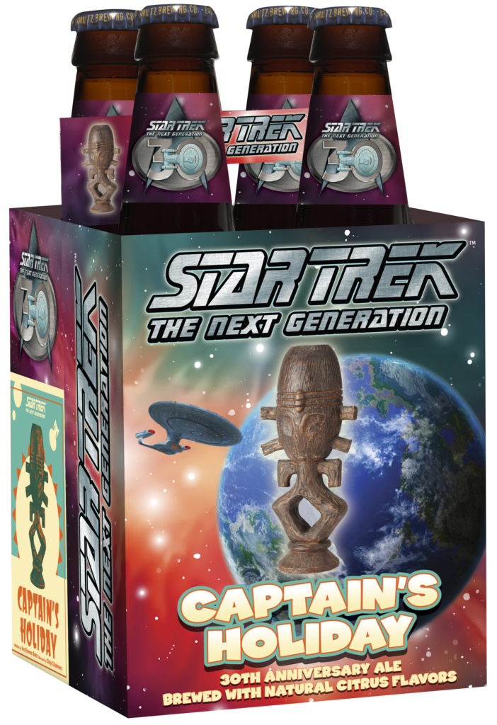
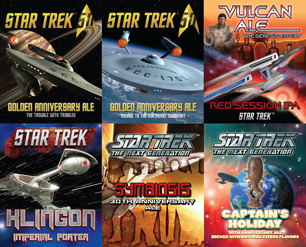
Based north of Albany, New York’s Shmaltz Brewing Company has been distributing their own Star Trek-themed craft beer since last year’s 50th Anniversary celebration, and in 2017 they’ve expanded their line of Trek beers to center around the 30th Anniversary of The Next Generation.
Their TNG Season 1 anniversary beer “Symbiosis” made its debut at this summer’s San Diego Comic Con and August’s Las Vegas Star Trek convention, and now the company is rounding out the year with a holiday beer named for one of Captain Picard’s personal adventures: “Captain’s Holiday.”
(Clifton Park, NY) – Just in time for the upcoming holiday season, Shmaltz Brewing Company nationally releases a new Collector’s Edition beer commemorating the 30th Anniversary of Star Trek: The Next Generation.
2017 marks 30 years since Star Trek: The Next Generation premiered in September 1987, and Shmaltz Brewing follows its summer release of Star Trek Symbiosis® with the latest tropical getaway that’s brewed with orange peel and lime, Star Trek Captain’s Holiday®. CBS Studios has teamed up with Shmaltz for the only officially licensed Star Trek beers in the United States.
In 2016, Shmaltz debuted two critically acclaimed Star Trek Golden Anniversary Ales to celebrate the 50th Anniversary of the iconic franchise. 2017 brings triple the excitement with the limited release of three Star Trek specialty beers rolling out throughout the year. Under license by CBS Consumer Products, the first extraterrestrial elixir of 2017 was Star Trek Klingon Imperial Porter® (7.3% ABV).
Star Trek Symbiosis® launched at Comic-Con International in July 2017. This week, Star Trek Captain’s Holiday® transports itself in 4-packs to retail outlets in 35 states across the country and will be on draft at select bars.


 Novel #4:
 Novel #5:
 Novel #6:
 OrderStar Trek Beyondon Blu-ray!
 OrderStar Trek Beyondon 3D Blu-ray!
 OrderStar Trek Beyondon 4K Blu-ray!


