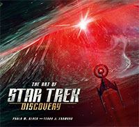
With Season 3 of Star Trek: Discovery behind now in the rearview mirror, it’s time to finally dive into our long overdue review of the series’ first behind-the-scenes reference book: The Art of Star Trek: Discovery by Paula M. Block and Terry J. Erdmann.
As legends in the field of Trek research and reference books, Block and Erdmann have previously penned more than half a dozen comprehensive Trek tomes throughout the years, including the Star Trek: Deep Space Nine Companion, Star Trek: Costumes and two Star Trek 365 books focused on behind-the-scenes photographs from the Original Series and The Next Generation.
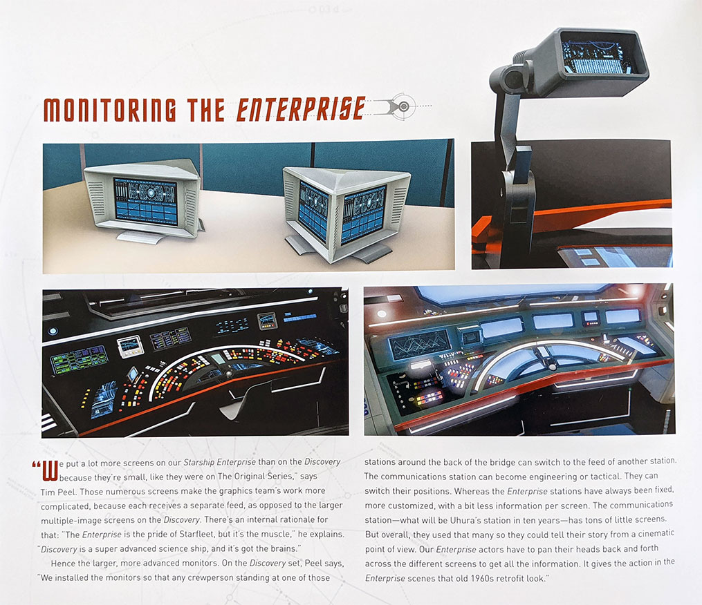
And now they’ve done it again with the The Art of Discovery, another spectacular addition to your growing Trek reference library. The massive, 208-page oversized coffee table book is an enthralling deep dive into the art production history of Star Trek: Discovery, detailing everything from tricorders to tardigrades with original sketches, storyboards and a number of long-awaited schematics.
The book covers the first two seasons of Discovery — as it was released in the early weeks of Season 3 — and does a great job of showcasing Alex Kurtzman’s creative goal, to “eliminate the line between movies and TV, because the way consumers are watching content now has totally changed.” In The Art of Star Trek: Discovery, this vision is certainly prevalent in the art and designs showcased.
While the book doesn’t dive into the turmoil surrounding the revolving door of creatives in the first two seasons — and why would it, this book is about the art after all — it does highlight the challenges in a few spots where new artists had to step in and pick up where someone had left off.
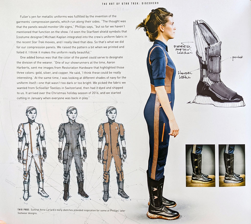
That happened with Gersha Phillips, who replaced Suttirat Anne Larlarb as the lead costume designer, and Scott Schneider who replaced Todd Cherniawsky as the concept set designer mid-way through the first season. In both cases, the authors do an excellent job of highlighting exactly where the new creatives began their process and the challenges they faced in integrating their vision with what had already been worked on.
It’s a welcome insight on the creative teams responsible for so much of the visceral look and feel of a show that excelled despite some leadership challenges.
Broken into the five major sections, the book is extremely well organized and great to read for both the details revealed, as well as for the visual stimulation of the art. It’s broken into five major sections, each featuring several standout chapters.
One Face, One Civilization features a look at Kelpien design, from the evolution of Saru’s look (including that first, multi-eyed design) through the creation of Kelpien villages, Kelpian attire and the Ba’ul obelisks seen in Season 2.
For Section 31 fans, The Freaks Are More Fun expands upon the set design of the secret agency’s ships and more, this section showcases production designer Tamara Deverell’s impressive work on the murky Starfleet organization — and how that interior design work influenced the look of Section 31’s distinctive ships.
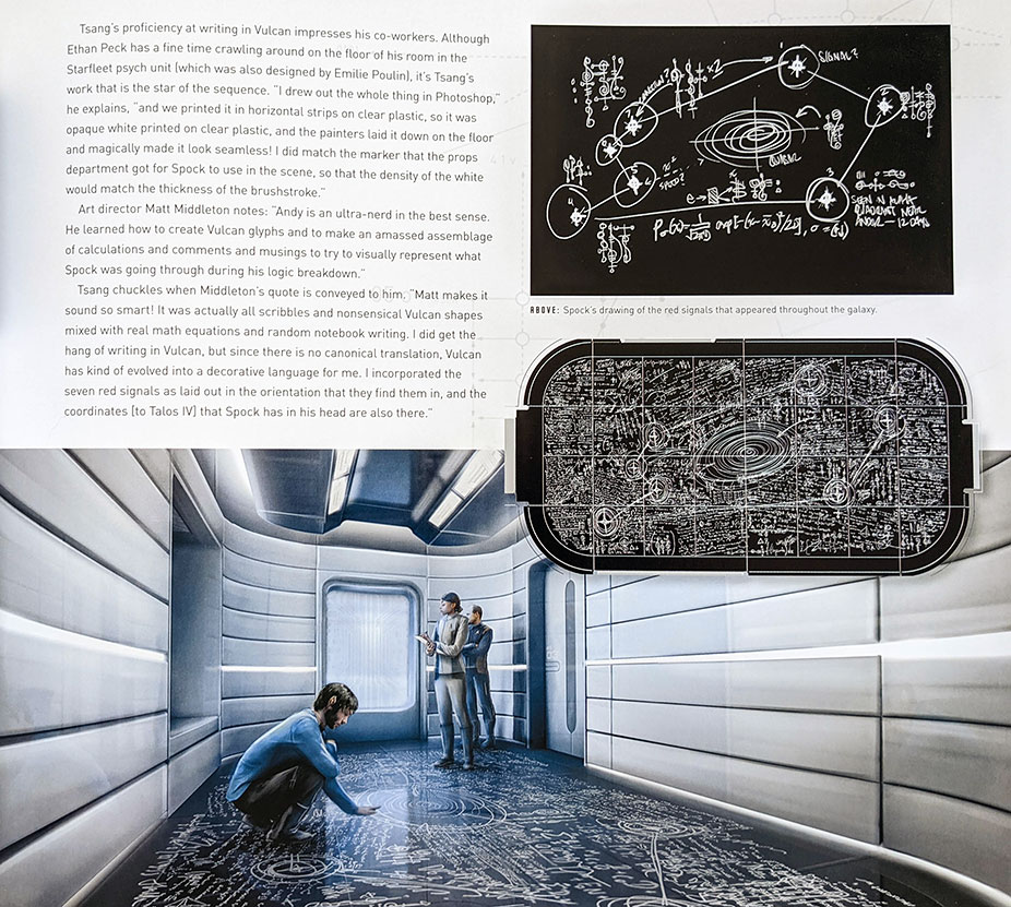
Finally, we learn A Few Things You May Not Know About Vulcan, which gives us a close-up look of Spock’s scribbled drawing from the floor of his Starfleet psych unit (“If Memory Serves”), as well as a look into the art design for Sarek’s home (“Brother”), Vulcan eyebrows, and the Vulcan Science Academy graduation ceremony showcased in “Lethe.”
Spock’s drawing was created by Andy Tsang, who included not only the seven signals, but Vulcan glyphs, language and actual math equations, which was then transferred to the floor of the cell by art director Matt Middleton with printed strips of clear plastic.
Where the publication really shines is in its depiction of a number of detailed schematics that help fans visualize some of these creations in more detail — and which provide some answers to some of those “Hmm, where is THAT on the ship?” questions may fans have been asking.
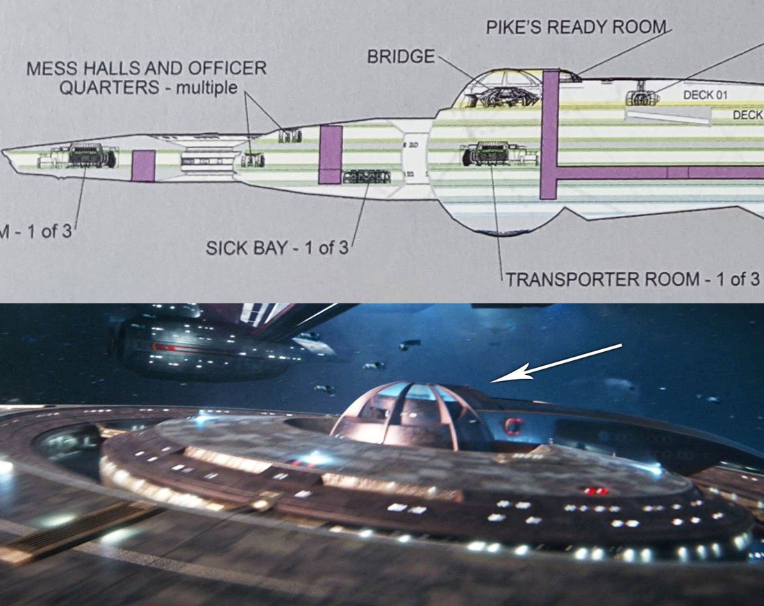
A standout example is the cutaway diagram of the pre-refit USS Discovery, created for the show’s writing and production team to reference when staging scenes aboard ship.
Reminiscent of the classic Next Generation-era master systems display diagrams, this breakdown of the ship’s interior (shown in both top and side views) illustrates where many of the familiar on-screen locations exist within the ship’s structure — like the transporter rooms, sickbays, mess halls, Captain Lorca’s menagerie, and even a large open “systems hub” space… which might be the home to everyone’s favorite theme park ride.
Notably, we can finally identify where the new, large ready room was built for Captain Pike in the show’s second season; it sits within the small ‘hump’ located behind the bridge dome, atop Deck One.
Other fascinating diagrams within The Art of Star Trek: Discovery include:
- Engineering / Spore Hub schematics: Stamets’ Spore Drive research area, originally designed and built as the Crossfield-class’ torpedo room/weapons bay.
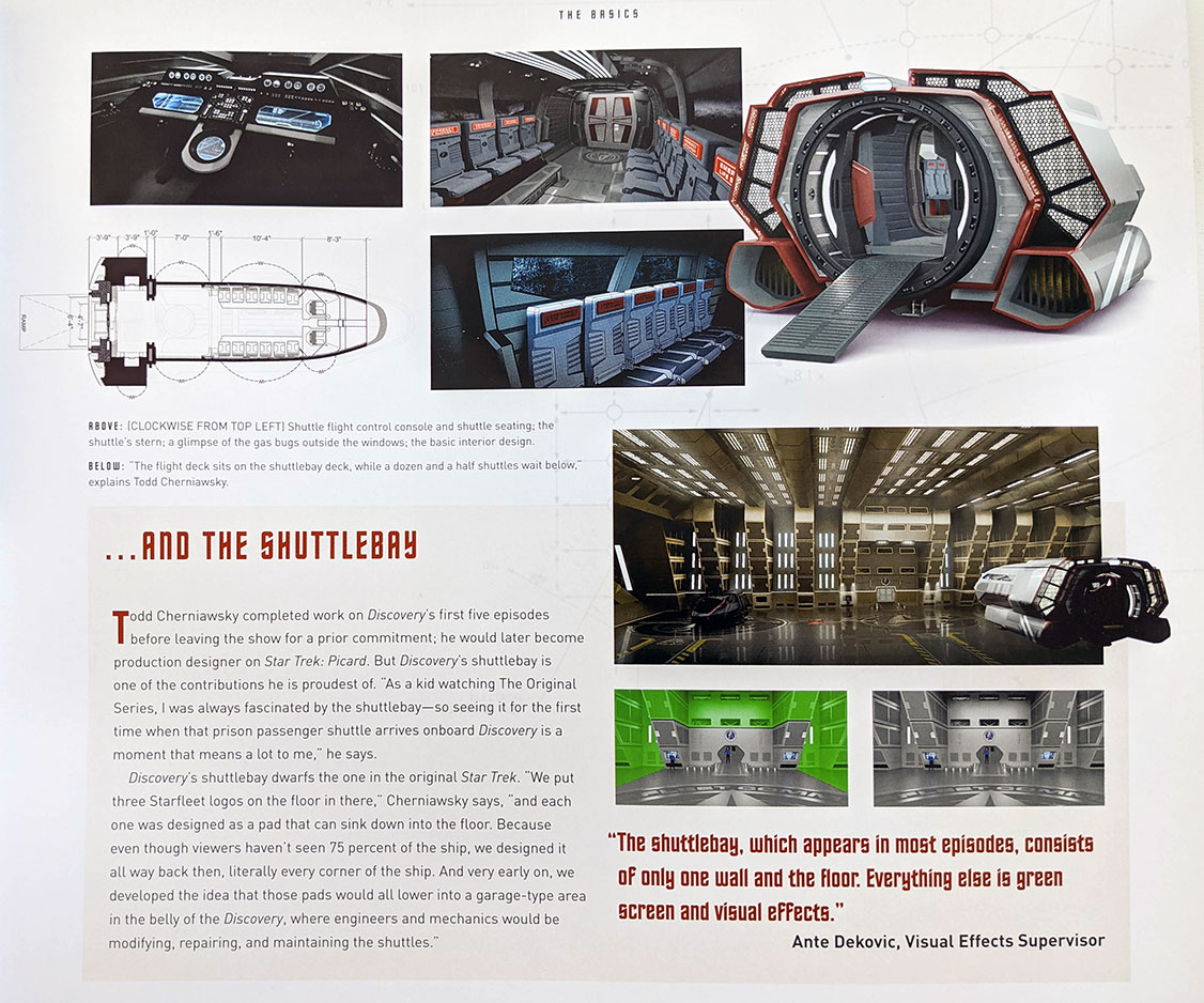
- Shuttlecraft: An overhead diagram of the Discovery-era shuttles, with measurements.
- Construction layout for the bridge and corridor sets: This top-down look at the interior sets used for filming also detail how the corridors were repurposed for the inside of the USS Shenzhou.
- The ISS Charon: There’s a detailed, albeit too-small, series of diagrams of the Terran Empire’s flagship, revealing locations of photon torpedo launchers, docking bays, Bussard collectors, and more.
- Starship size reference chart: A comparison of all the Discovery Season 1 ships, showing the scale of all the Federation and Klingon ships relative to each other, created by visual effects art director William Budge.
As the journey in to Secret Hideout’s years of Star Trek continues, we’ll hopefully get some follow-up editions covering future seasons of Discovery, along with similar books for Picard, Strange New Worlds, and even the animated Lower Decks and Prodigy shows.
But for now, the Art of Star Trek: Discovery basically covers all of the first streaming Trek, from storyboards to sketch art, and from detailed schematics to finished artwork. The game-changing art design behind the first two seasons of the show shines through here in vibrant visuals and detailed analysis.
The Art of Star Trek: Discovery is available now.
![]()
Jim Moorhouse is the creator of TrekRanks.com and the TrekRanks Podcast. He can be found living and breathing Trek every day on Twitter at @EnterpriseExtra and @TrekRanks.

