There’s nothing I like more than when a cloud passes overhead on a blazing hot day, bringing a such a cooling relief – the day slows down, everyone gets to take a breath and relax for a moment.
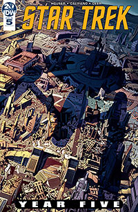
That’s kind of the sense I get from Stephen Thompson’s cover for Star Trek: Year Five #5.
The pace on this book has been frantic. It was great for the first two issues; it was a new series and the energy level matched the sense of excitement over the new book. Plus, Jackson Lanzing and Colin Kelly are undisputed talents. But, as in long-distance running, one can’t keep up that pace without bringing a sense of discomfort or a state of unfocused attention.
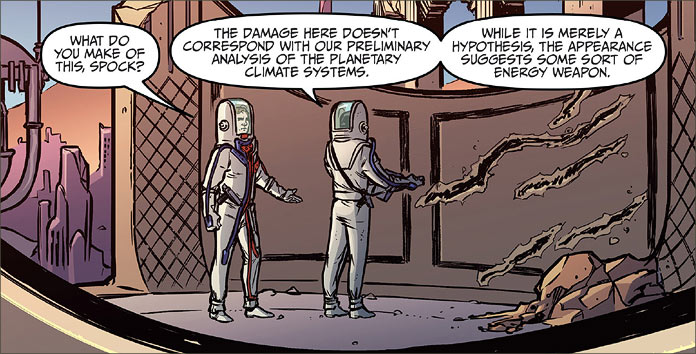
Luckily, the issues that forced that pace have slowed down a bit, and that brings us to Issue #5. Written by the talented Jody Houser, this issue sees the Enterprise conducting an archaeological survey of the extinct civilization of the planet Hesperides I. In the meantime, Lieutenant Uhura is still making attempts to communicate with the refugee Tholian child, now colloquially known as “Bright-Eyes”. Artifacts have been brought aboard and the ship’s crew is experiencing issues of intense emotionality and miscommunication.
That’s it; that’s all we have to worry about in this book. It’s a simple premise and completely within the vein of classic Star Trek.
The best writing isn’t in what surprises you, it’s what makes you think. In order to do that, you have to understand what the writer is trying to portray. Houser’s style is crystal clear. We know what’s going on but now we also get to enjoy her excellent presentation of the characters from this series who we love. With the premise, Houser allows us the freedom to explore the story and think about the interrelationships among the crew.
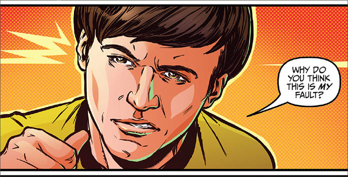
For instance, in the senior officers’ briefing scene with Kirk, Spock, McCoy and Scott, Houser slips in an excellent example of the miscommunication phenomenon that is occurring on the Enterprise. It’s a well-crafted sequence that evokes the memory of the ominous background music that would have played when any of the crew made a significant observation. Completely Trek, and the vibe was right on target.
Part of the enjoyment of reading Star Trek comics for me is to see how close the writer and artist can replicate that sense of watching an episode of Trek. Each iteration of the franchise has its own unique vibe; for instance, I see the Original Series as having a slower, emotional pace that sets it apart from its descendants. It’s a relief to me when a writer gets that sense because that’s what allows the reader the freedom to enjoy the characters in new situations, behaving as loyal fans will remember them.
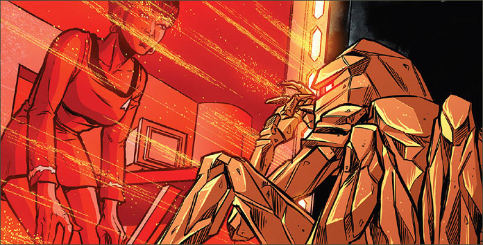
Uhura’s work with Bright-Eyes is one of those moments. Uhura has always been presented as a person of kindness and deep empathy. Given her role as the communications officer, these traits are expected within her skill set. Being asked to establish some form of communication with a lost child is not only endearing to see but something that we would expect of this character. It’s an excellent opportunity to showcase this character and Houser certainly takes full advantage of it.
I’m also fully enjoying Silvia Califano’s art in this issue as well. Califano is gifted in likeness work, but I think what I’m really appreciating is the level of emotionality that’s present in her representation of these characters. In this issue, Kirk is usually presented with a very sensitive expression on his face which is very much in line with the reflective perspective Kirk has sported since the beginning of the series.
Again, another comfort to know that an artist is consciously aware of presenting a character to fit into the expectations of the comic’s audience. I think I need to add some of Califano’s work to my private collection!
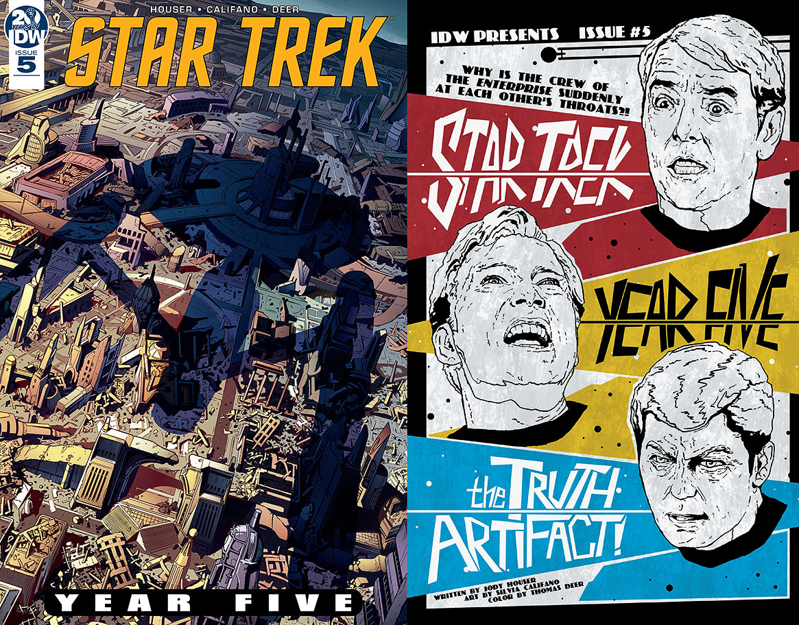
The same goes for Stephen Thompson’s work. As I’ve already indicated, his work on the regular cover for this book is really striking. In my opinion, cover art sets the tone for this book, but I like how this cover actually prepares the reader for the whole story by depicting the Enterprise’s arrival to Hesperides I. Thompson has acquitted himself magnificently with this cover and is definitely my favourite out of the two options.
The retailer-incentive cover from J.J. Lendl is a glorious homage to those B-movie posters. It fits the emotionality issue of the issue with a wondrous flair and I’m quite enamoured of it! In fact, I’m reminded of those amazing moments in the cinema foyers when you got to see amazing art like this before you saw the film and that’s the vibe I got from this. So, to J.J. Lendl: it really worked! Love it.
The sense of relief that there are creators out there who not only pay attention to the canonical values of Trek but also get its emotional resonance is appreciated. You can care about their work because it is definitively clear that they care about the franchise as much as their audience does. That goes a long way with a Trek audience and out of all the licensed properties a comic company can adopt, I don’t think that there is an audience more charged up about this idea than a Trek audience.
Comic aficionados have nothing on Trek fans. But, if you’re both a comic lover as well as a Star Trek fan, then you’re in good company with IDW and the talented creators they bring to continuing the enjoyment of the franchise.

