If there’s one quality I look for in a Star Trek comic series, it’s sustainability.
A story can’t stand unless there is a reasonable degree of authenticity that surrounds it. In this case, the pillar of that authenticity is the familiarity with canon. Canon is the lingua franca that all fans speak, and that storytellers in this particular franchise need to be proficient in to reach the fanbase that is their audience.
Scott Tipton, David Tipton, and David Messina have a long-established and successful track record in this regard and have decidedly proven themselves to be an impressive storytelling team in previous Star Trek works from IDW Publishing, and this month’s The Q Conflict #3 continues the story begun in the last two issues, excellent examples of a sustained storyline of recognizable Trek allies forming new partnerships to catch fans’ interest.
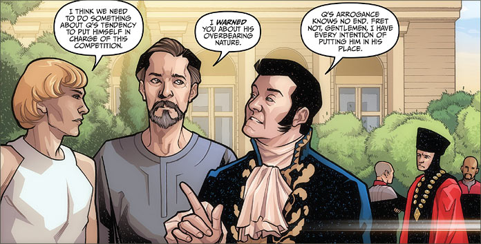
Of course, this also takes shape on the antagonist side as well, and we see relationships formed from the most unlikely collection of classic enemies in the Star Trek universe, which I like to call ‘the Infinites’ — Q, Ayelborne, Trelane, and the Metron are all beings with infinite capabilities, and the latter three present enough of a threat to Q that an outside contest is required to settle their differences.
In this particular issue, Trelane — the Squire of Gothos — decides upon a game of “Capture the Flag” amongst starships for this challenge. But, given Trelane’s usual immaturity, this game isn’t enough for him to settle his competitive urges, as he ups the ante by adding the presence of a classic Planet Killer to the mix.
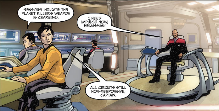
There’s no complaint from me about this change-up; “The Doomsday Machine” is one of my all-time favourite episodes, and it’s very satisfying to see the four captains — Kirk, Picard, Sisko, and Janeway — combine their tactical abilities in a showdown confrontation with such a memorable and deadly foe from one of the best episodes of any Star Trek.
I’ve always wanted to see a re-match with one of these machines and given that the Tiptons have a seemingly inexhaustible repertoire of Trek knowledge to draw on, they not only have the ability to write an entertaining story but to make it an authentic one as well.
Of course, the characters behave as canonically as we’d expect. Q is devious, Trelane is spoiled, and Ayleborne and the Metron prove themselves to be the thoughtful ones in this book as they clearly dislike this situation and openly discuss their misgivings with Q and the whole notion with the humans. Of course, the Starfleet officers behave as we would expect them to, and account for their actions with the distinction of their careers.
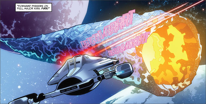
David Messina accounts for himself well in this issue also. Lots of action scenes and starship combat; it’s a starship lover’s delight. The entire action against the Planet Killer is an intricate collection of dazzling battle sequences as the planet killer faces down the two Enterprises, the Defiant, and the starship Voyager. I particularly enjoy the coordination of tactics and weapons as well.
One issue I had a question about was the strange speckled patterning on the black portions of the characters’ uniforms or clothing. I wasn’t sure if it was an effect only found in digital versions of the comic or if it was a colouring issue. It would be great to get some feedback from readers to confirm this.
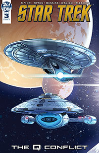
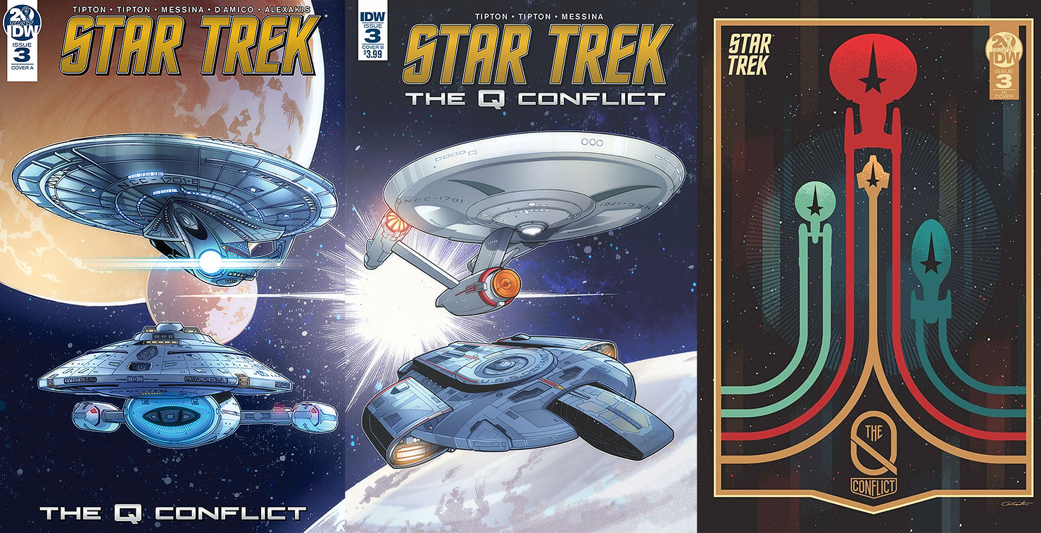
- Both of the two regular covers are from artist David Massina. Cover ‘A’ shows the Enterprise-E and Voyager both in flight. It’s quite a dramatic image and showcases both vessels in a good light.
- Cover ‘B’ is the same sort of an image yet of the original Enterprise and the Defiant in similar positions. The Original Series and Deep Space Nine are my favourite vessels in the different incarnations of Trek, so I’ve got to give this cover my preference over the ‘A’ design.
- George Caltsoudas brings us another spectacular retailer-incentive cover design, inspired by the 1980 Moscow Olympics logo. Both emotional and striking, the highly-abstract design is best suited towards the spirit of starship command, and definitely adds a sense of drama. Caltsoudas has a gift for the stylistic, and this of all three covers would be one I’d hang on my wall.
In short, this is a story that fans love because of the nods to the canon that Star Trek fans are so proud of knowing. Scott and David Tipton are loving fans and it’s that dedication that makes this a Trek story to thoroughly enjoy.

