Last night’s debut of Star Trek: Discovery’s long-awaited USS Enterprise bridge set has been met with pretty positive feedback from Trek fans — with a few outliers, naturally — and today series production designer Tamara Deverell made the press rounds to detail some of the design secrets that went into updating this classic set for the modern age.
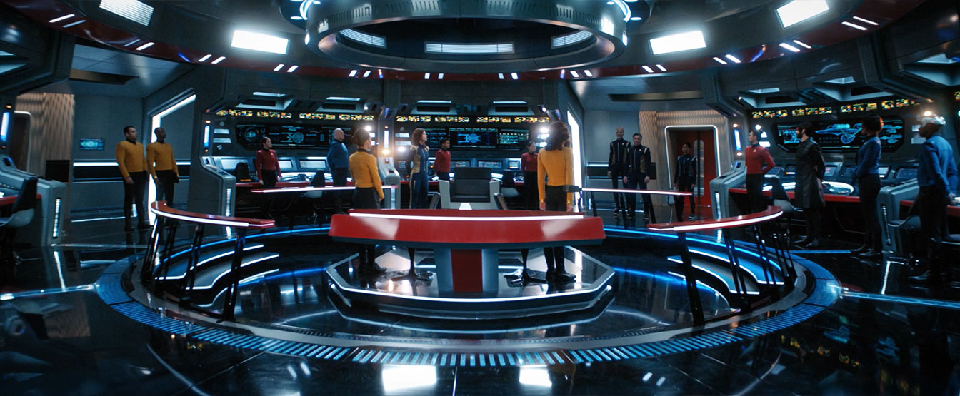
Speaking with the official Star Trek website, Deverell shared several insights into the year-long development process that went into the new Enterprise bridge.
There was always a strong desire to build the interior. I actually started designing the interior of the Enterprise in season one. There was some thinking that the writers wanted to [use those interiors] earlier, but then we revealed the Enterprise at the end of season one.
Starting the design work way back then… was a good thing because when we came to the end of season two, they actually had concept illustrations and most of the bridge of the ship worked out.
She also shared with IGN that at one point, budget concerns postulated a mostly-greenscreen virtual set — but the final rendition was in fact brand-new construction on a stage adjacent to the USS Discovery sets.
It’s always a bit of a dance and a bit of money game and can we afford this? [But] we felt like we owed it to the world to be on the Enterprise. We went down many roads with this. We did discuss building it [as a] green screen set. Which it wasn’t. Just the front portion, the physical view screen that we normally build around it — we just did the green screen template for that. The rest of it we built.
She elaborated to SyFy Wire:
The Enterprise set was completely new. We got a new stage and away we went. There was not one single element of it that was reused. What you’re seeing was really there.
In updating the bridge, Deverell and team also wanted to make sure to include as much of the classic Enterprise components for the new Discovery edition, from the captain’s chair to the layout of the circular bridge stations, as she told IGN:
We did the Sulu eye scanner, we did the Spock eye scanner, we did the Uhura [communications] station — we copied that layout of her station.
We did the [motion indicator] light thing in the turbolift. The Enterprise had this funny light that goes up the back of it in the Original Series. Of course, ours was a monitor, but we did that.
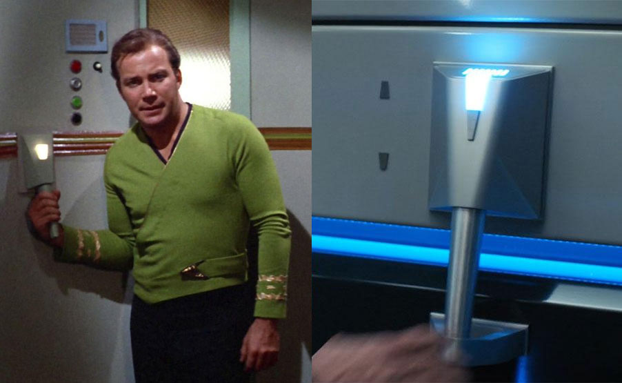
The weird handle things in the turbolift? We did a version of those. We were like, what are these? We spent hours looking [at TOS]. They sort of twisted them and we tried to figure out what they were. We did a version of those, although they didn’t really make sense! They still don’t but they’re cool.
The ultra-wide aspect ratio of Star Trek: Discovery also contributed to the shape of the new set, with a second turbolift added to the screen-left side of the bridge, and a short corridor tucked behind the aft stations.
When I was showing [Alex Kurtzman] the initial model, he was like, ‘Let’s do a corridor behind the bridge, which never really existed [in the original set]. We built a part of it, and that’s one major thing that he contributed.
We’re designing to [widescreen,] essentially. It stretches things out. Our tendency is to bring down ceilings, so that we can see them more. Fortunately for us, like on the Enterprise bridge, the ceiling was actually adjustable and we were able to tweak it with a chain motor system. So, oh, let’s bring it down a little bit more in this shot so we can see here a bit more.
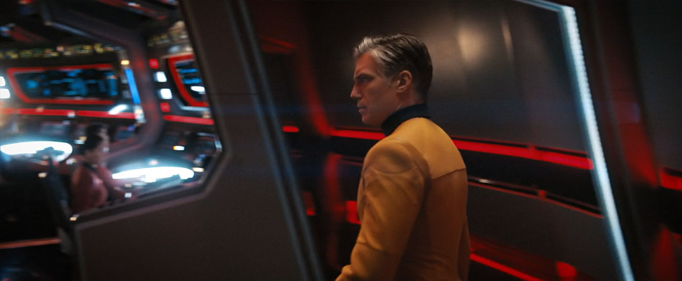
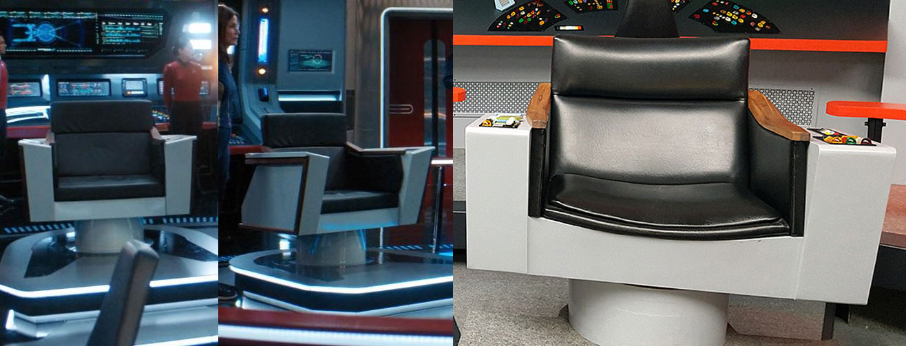
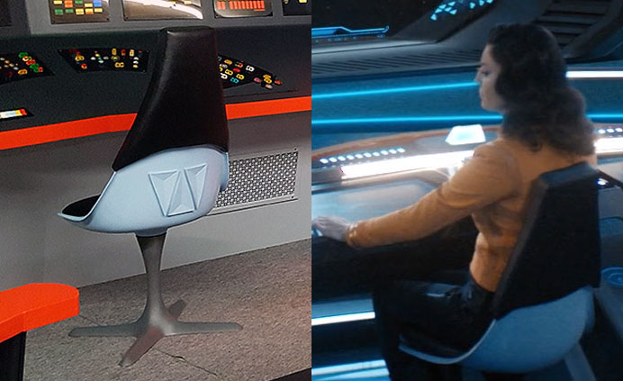
The designer also got into detail about the classic console station chairs which the team was able to reproduce for Discovery, and how she slightly modified the iconic Enterprise captain’s chair for the new production.
I think we did a little change in the back, but we really tried to replicate [the classic black-and-blue] chairs.
The same thing with the captain’s chair… we were really looking at that. I think we matched the wood, cause there was wood on Kirk’s chair, Pike’s and Kirk’s chair. But especially Kirk’s chair I was looking at…
We sharpened some of the angles, we did a little bit more wood, but the basic shape and essence of it is the same. The black leather, all of that.”
And more detail shared with StarTrek.com about some of those console stations:
We actually got some reproductions of the original buttons on the console, the same exact size and color, and we used those as the basis of our buttons.
Regarding those classic ‘jellybean’ console buttons implemented around the new Enterprise set, those were actually materials acquired from the upstate-New York Official Star Trek Set Tour team, where owner James Cawley supplied a great deal of material from his Original Series set recreation facility for use in Discovery production.
Wow! Do these buttons look familiar? They should! James sent hundreds of buttons to the @startrekcbs production team last year for their version of the Enterprise bridge for Star Trek Discovery!
Come see our buttons @startrektour ! https://t.co/y1EYEEfAay pic.twitter.com/Q4szB4rSH7— @startrektour (@startrektour) April 12, 2019
Lastly, one of the biggest challenges in bringing the Enterprise bridge into the modern age of Trek was importing the bright colors from 1966 into 2018, from the bright orange-red accents to the greys and greens around the rest of the command center.
Speaking with StarTrek.com, Deverell shared her exasperation at trying to take the official ‘Enterprise red’ color from the CBS archives and apply it to the new set in Toronto.
The Enterprise had different colors. They changed it over time. The way it was lit, sometimes it looked really orange and sometimes it looked very red. The orange we’d picked, which was the original orange, was really red.
I actually went to the writers [when reading that Georgiou was going to scoff at ‘orange’ coloring] and said, “I’m uncomfortable with this line.” I did this whole layout of the different oranges and the red we decided we were using, and all of that. We had powder-coated this metal in this red, so there was no going back.
I went on and on and on. Alex Kurtzman wrote back, saying, “This is why we love you, Tamara. It’s okay. We’re gonna say orange. It’s okay, don’t worry.” It was just a funny story. I loved Michelle’s line, but to me, like any production designer would think, it was all about, “Do I have the right color?”
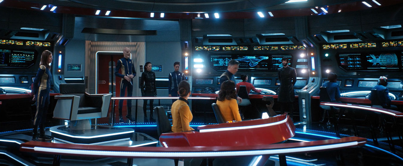
She also got a bit deeper into color with IGN, including how lighting would affect the viewer experience:
“The particular reds and the green, the greeny-grays, which I was really trying to match what they had in the Original Series, that was a big nod for me.
I think that was something I really struggled with and … colors come easy for me and I usually don’t struggle. And I struggled with the colors of the Enterprise bridge to just get that right essence and that right reddy-orange and that right grey tone.
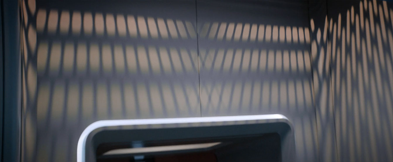
The lighting — not that it was a struggle, but [we] really worked hard to get some of the gobo lighting effect that they had in The Original Series. There’s these grids that form these shadows, so we were playing a lot with that.
It wasn’t a lighting that everybody necessarily liked and I really pushed hard, ‘Let’s put a bit of that in.’”
Additionally, Discovery graphic designer Timothy Peel shared that the Enterprise bridge set features over 250 individually-animated displays, a mix of practical and added-in-post digital elements.
#startrekdiscovery For the Enterprise bridge we animated at least 250+ screens. Both practical and for VFX. Such an extreme honour to add to this iconic set! Congratulations to the whole cast and crew. pic.twitter.com/AZ772Q5JSs
— Timothy Peel (@timothypeel1) April 12, 2019
We also learned, courtesy of Discovery digital compositor Charles Collyer, that at least one member of the Enterprise bridge crew is actually a member of the series production team:
Lastly, this week’s Moments of Discovery interview video lets castmates Rebecca Romijn (Number One) and Anthony Rapp (Paul Stamets) share their wonder at the new set.
![]()
We’re sure to see a lot more of the USS Enterprise bridge in next week’s season finale — so stick around as “Such Sweet Sorrow, Part 2” brings Star Trek: Discovery Season 2 to a conclusion on Thursday.

