It’s amazing that after all the hubbub about comics and Star Trek at this year’s San Diego Comic Con, I actually have time to sit down and read a Star Trek comic!
But Star Trek: TNG — Terra Incognita #1 was well worth the wait and this story provides a true taste of television accuracy.
Terra Incognita takes off where Mirror Broken left off back in May. The doubles from the Mirror Universe found their plans thwarted and had to return to their dimension… with the exception of Lt. Barclay, who managed to slip away, unseen and remain in the prime universe.
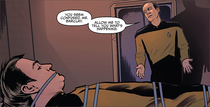
Sure enough, we find the “good” Barclay taken captive in his own quarters, force to listen to the archtypical villainous diatribe of the “evil” Barclay. It’s a good choice of characters for writers Scott and David Tipton to pick as the focus for this story.
Barclay has always had a lot to offer: technological acumen, comic relief, and the fact that he is played by veteran and fan-favourite actor Dwight Schultz has always given this character a great deal of range to play with for story writing.
In this case, Reg not only gets to play victim, but also villain. It’s a great combination of character expression for the Tiptons to display and adds an authentic Next Generation flavour for this story.

Speaking of authenticity, there is a great sense of relaxation in the way that the Tiptons portray the characters. It comes across in the nuances of character presentation like dialogue, mannerisms and even the sarcastic disdain that Mirror Barclay has for his counterparts in this universe is so evocative of Schultz’s acting style that this story could easily find its place in a television rerun.
Riker’s easy-going sense of loyalty to his captain — and his closeness with Troi — are perennial features of these characters’ personalities, and they are well-represented and placed in the story. I also have to point out that the even phrases like Data’s response to Wesley about refusing to replace his components (something his Mirror double did) for fear of losing his identity are very consistent with the types of character issues we saw on the show. Data’s concern for discovering his own nature is very much a part of the show and it comes out clearly in this comic.
But in terms of visual consistency, IDW made the right choice in getting Tony Shasteen on penciling duties. I’ve been on record for saying this in the past, but there’s no one who can pencil likenesses like Shasteen. His version of Ensign Sonya Gomez is perfect, as are his representations of other members of the crew. In terms of adding to the authenticity this book projects, Shasteen has a lot to contribute in this regard.
(Getting some personal work commissioned from this incredibly talented artist is on my to-do list!)
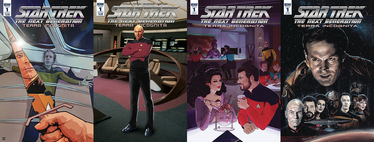
- Cover “A” is by Tony Shasteen himself, and it’s a dramatically wonderful lead-in to the story. Barclay’s reflection in the Terran dagger’s blade is not only completely apt for the story, but it’s also a clever thematic interpretation. After all, it’s the reflection that’s in control of the situation here, and as “our” Barclay is in peril for his life, it’s a perfect choice of covers. Shasteen deserves extra credit for dreaming this one up.
- Cover “B” is a photo cover, which I’m not a fan of normally — but there’s something odd about this one. The background is a stock image of the Enterprise-D bridge, but the full-portrait render of Captain Picard is an attempted photo-real illustration of Patrick Stewart’s character. Unfortunately, it doesn’t quite hit the mark, as the likeness seems off in more than a few areas — it’s definitely not my favorite.
- The retailer-incentive “A” cover is a lovely romantic interlude between Deanna Troi and Will Riker by Elizabeth Beals. It veers a little too “cutesy” for my tastes, but I like the accuracy of the moment it’s portraying. It definitely captures the mid-series closeness we saw the two characters find in each other during The Next Generation.
- Finally, we get to the retailer-incentive “B” cover by J.K. Woodward. This is a hard choice for me, as I have to put Shasteen up against Woodward’s work and decide which cover I like the most. Woodward’s accuracy with a brush is uncanny, and speaks to a talent that I don’t think I’ll be able to properly comprehend.
In this cover, we see an imposed Barclay’s head hanging menacingly over the crew of the Enterprise like a cloud of dark malevolence. It’s a striking cover and I’m sure that Tony Shasteen would forgive me if I named this one my favourite of the bunch.

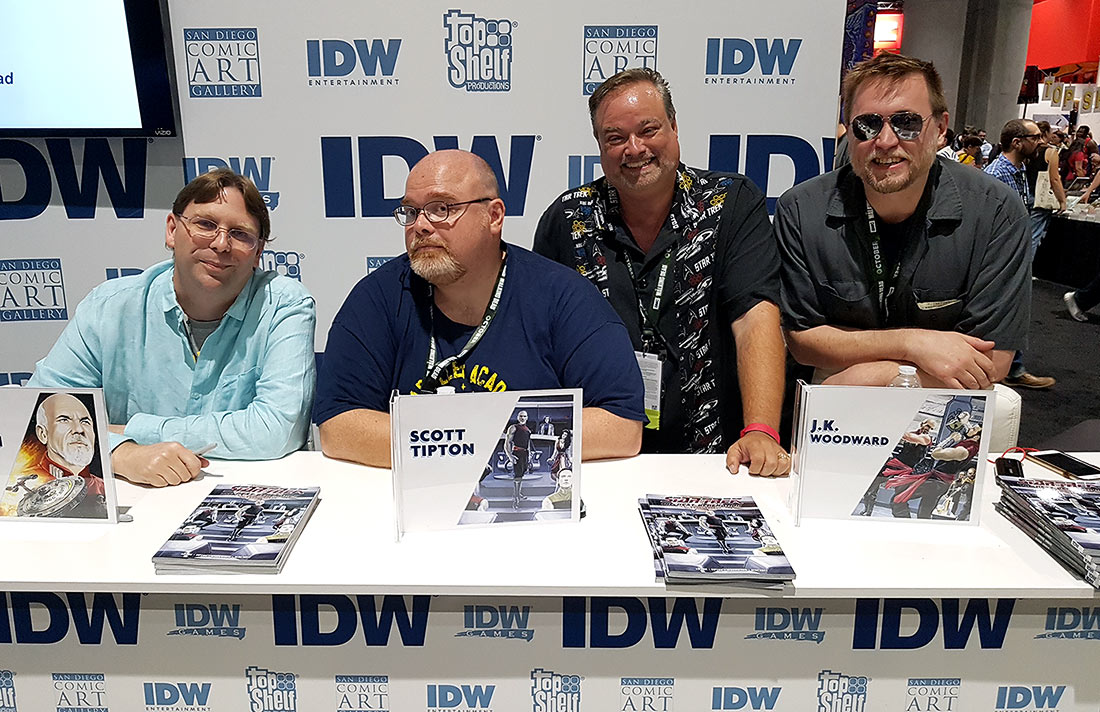
I was most fortunate to sit down with both the Tiptons and J.K. Woodward at IDW Publishing’s booth at Comic Con, and Scott Tipton tells me that progress is coming along quite nicely with the series — I’m very sure that readers are going to enjoy what they’ve got in store for us next.
The Tiptons are fans, and their writing not only reflects quality but a love of the subject they’re writing about. Writers like that are clearly devoted to it, and that adds to the enjoyment of the reader. When you add quality artwork like that by Shasteen, Woodward and Beals, you get a comic of unbeatable entertainment that will undoubtedly be a standard for other Star Trek comic creators.

Next week is the annual Las Vegas Star Trek convention, where we’ll once again hear from the creative minds at IDW Publishing about the future of the Trek comic line — check back to TrekCore later in the week for all the news from their presentation!


