The opening credits sequence to Star Trek: Discovery stand alone from the five live-action series which preceded series, filled with stylistically-animated graphics of many iconic technologies and other bits of Trek imagery throughout its 90-second running time.
Today, in a special behind-the-scenes interview with the creative team behind the sequence, Art of the Title revealed many new details about the creation of the Discovery credits and what inspiration came from shows past.
Creative agency Prologue designed the Discovery credits, lead by creative directors Ana Criado (designer) and Kyle Cooper (producer) — while Cooper was a longtime fan of the franchise, Criado was a relative newcomer to the world of Star Trek.
Criado was familiar with Star Trek but had never seen an episode in its entirety. The Discovery main titles were her first real opportunity to explore the final frontier in a more meaningful way. “Ever since I was a kid, I have always been fascinated by the aesthetics of Star Trek, specifically that of the technology they use in the show,” said Criado.
“When we got this project, I finally had the chance to look closely and investigate the way that all of this tech had been designed on The Original Series and beyond.”
Prologue co-founder and Creative Director Kyle Cooper… grew up watching The Original Series and later Star Trek: The Next Generation. “Both of them impacted me in different ways, but especially the former,” said Cooper. “I always loved that right off the bat, with The Original Series, you got that mission statement: ‘To boldly go where no man has gone before…’
You didn’t have to worry about continuity or missing episodes. Any new viewer could turn on any episode of Star Trek and immediately have all of the themes established for them during that one simple sequence.”
Designer and historian Kurt Mattila also contributed to the look of the sequence:
[Matilla] joined the team as a consultant of sorts, becoming Prologue’s resident Trek guru for the project. Part of his job was to ensure that Discovery’s opening title sequence adhered to the established universe, characters, and canon as much as possible. “My role was basically ‘How do we take this great idea and make it relevant to Star Trek?’ said Mattila. “It was like Sarek, I was like the ambassador to this portion of things.”
[He] also felt a huge burden — both as a designer and a fan — but, after the initial shock wore off, he began to view the project as an opportunity to check something off of his bucket list. “When I got back up off the floor and sat back into my chair it was kind of like ‘Uh… What?!” said Mattila with a laugh.
“In the world of science fiction, doing the opening crawl to Star Wars or a Star Trek title sequence — if you can hit one of those two or be a part of the team that does one of those, that’s pretty good!”
The Discovery producers and writers all had a part in the discussions behind the sequence, wanting to make it stand apart from past Trek shows; an early design concept involved heavy use of transporter effects, though it didn’t make it out of the pattern buffer, so to speak.
While the show’s staff were initially uncertain about the direction Discovery’s opening should take, according to Criado that first meeting established the parameters for what they didn’t want the sequence to be. “They wanted it to look kind of vintage and distinct from previous title sequences,” she said.
Mattila recalled the specific mandate set forth by the showrunners: “We don’t want where we were, we want to go past it… Boldly go where no Star Trek has gone before!”
Both Criado and Mattila characterize those early discussions with the producers as a very collaborative process that laid the groundwork for what the title sequence would become, but despite a few promising starts during this phase more work was needed to hammer out the final concept. “We all — including series co-creator Alex Kurtzman — had ideas and they were grounded in Star Trek,” Mattila said.
“We had this whole piece that was like an ode to beaming. You would have all these beautiful moments and characters that kind of get beamed to one side of the lens to the next and that kind of becomes the bed for the sequence.”
“The phrase that came out that we all latched on to is that this is the second renaissance of man,” Mattila said. And with that idea in mind the concept for the title sequence began to take shape. “Our concept was to show how the starship Discovery and its crew came to be a part of this new adventure,” said Criado.
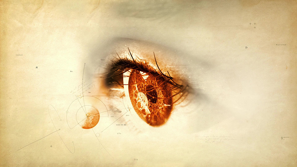
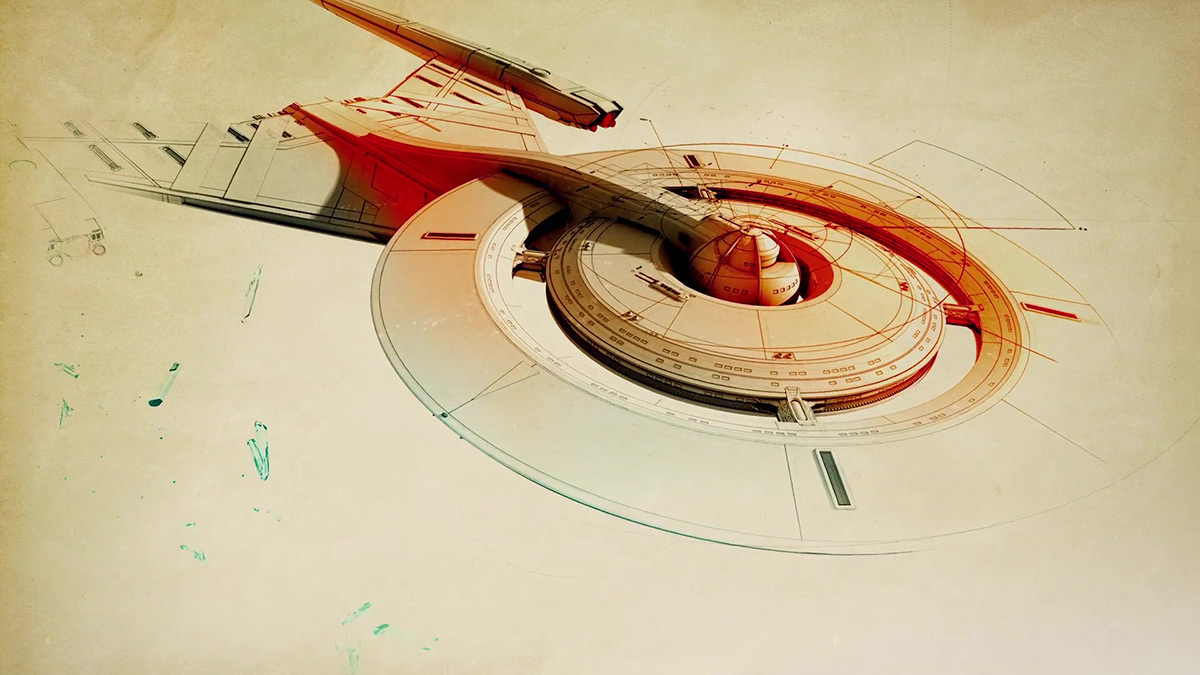
“To do so, we decided to take things back to the drawing board, literally.”
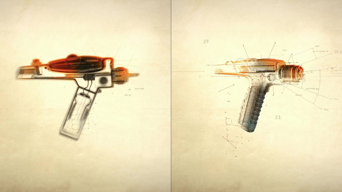
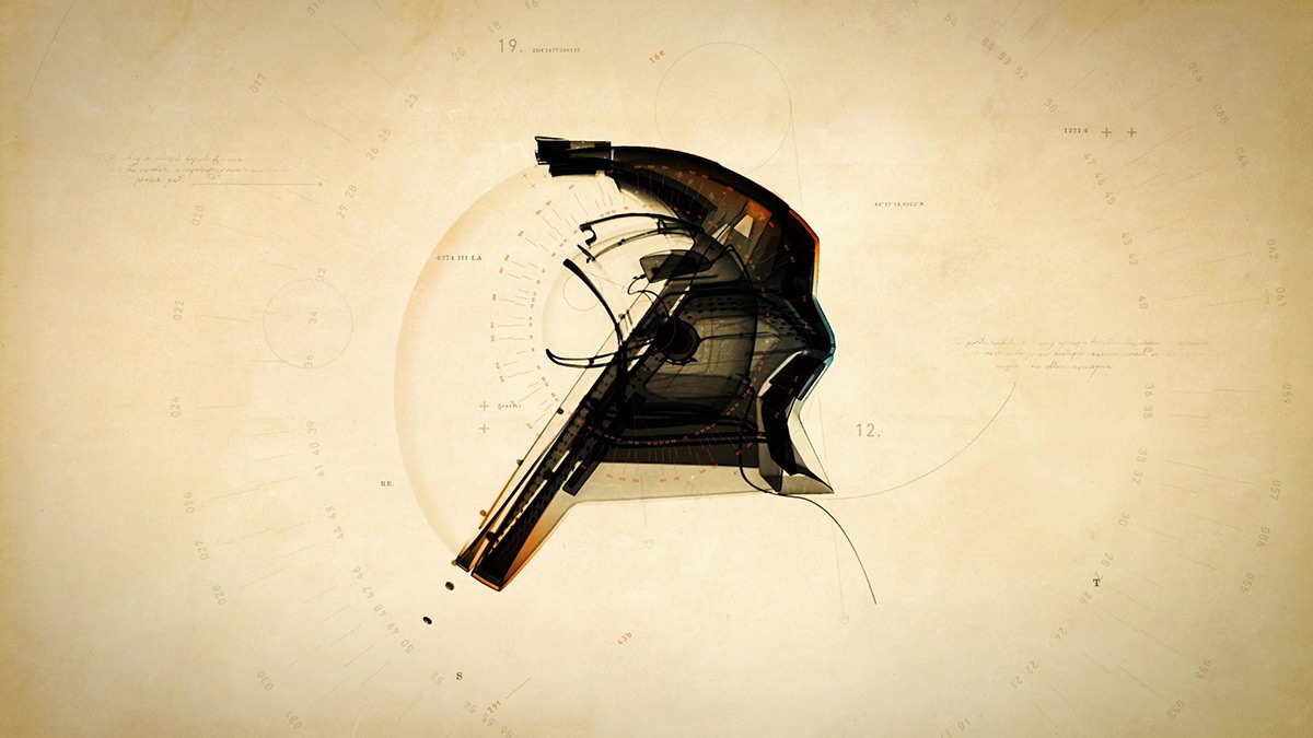
The team focused on the technological development of the Trek universe, leaning towards a theme of ‘blueprints and devices’ to chronicle the evolution of Trek tech, from sketch to science.
“It was as if the graphics themselves tipped their hat to the show’s history and the ephemeral process that went into the design and creation of all of the equipment blueprints and devices over the years,” said Cooper of Criado’s approach to Discovery, noting that her early concept boards presented the material in a completely unorthodox manner.
Criado’s blueprint concept allowed the team to work through the idea of the “second renaissance” in a very direct way. Through this concept the main titles could metaphorically hit on every major scientific breakthrough and exploratory milestone that had happened in Trek canon up until the beginning of the show, and at the same time transfigure the tenets central to Kirk’s famous mission statement into something the viewer could actually see.
“We recognized that this was a very strong concept straight away, and poured all of our efforts and resources into realizing it,” said Criado. From there designing the sequence became a process of posing questions and figuring out what the answer might look like. “How does a bidimensional sketch transform into a complicated starship? What were the original designs for a phaser, a communicator, etc.?”
Criado’s unfamiliarity with Trek‘s nitty-gritty details made for some interesting design choices that sparked inspiration in the team, and gave the sequence some of the more unique elements, such as the field of dilithium crystals from where the Discovery emerges.
“In the opening bit where the blueprints of the ship come on and you see all these crystals go by, those are dilithium crystals — that’s the stuff that powers the warp drive,” explains Mattila. “Ana didn’t know that those crystals go in the ship, but she made this beautiful field of crystals and we were all like ‘That’s awesome!’”
It was here that Criado’s unfamiliarity with Trek collided head on with Mattila’s depth of knowledge on the subject. “I felt myself turning into a nerd, but then it was like ‘It’s a metaphor, just go with it!’” he said. “That’s what I’ve learned from Kyle over the years: the best thing you can do as a creative director or an art director is not stand in way of something that’s naturally evolving.”
The team also addressed why there’s no classic Star Trek opening monologue, as the series centers around Michael Burnham (not a captain) and had a somewhat sinister commander in the center chair: Gabriel Lorca, not of the Trek universe.
“This is actually not about a captain,” said Mattila, noting that the main character of every previous Trek series had either been a starship or space station captain. “From moment one we’re entering this universe from a new perspective, you’re following the path of Michael Burnham, who’s a first officer.”
There was also the somewhat pressing issue that Discovery’s commander, Lorca (Jason Isaacs), was not exactly the selfless, by the book Starfleet captain viewers were accustomed to. “Reading the scripts you quickly realized ‘Wow. Well, we can’t really have the captain say any of this!’” he said. “The captain turns out to be kind of an asshole, so you don’t want him giving the mission statement. So what do you do?”
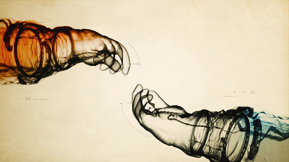
The focus eventually settled on inspiration from real world history, from the notebooks of Leonardo da Vinci to the artwork of Michelangelo, and that it’s about the journey of the Burnham character, who, like many of the conceptual images in the credits, is still developing.
The fix, according to Criado, was to turn their history of mankind’s fictional future into what amounted to a history lesson of sorts. “We wanted to illustrate the learning process of [Michael Burnham], and bring [the viewer] into this complicated world the same way… one piece at a time.”
That decision transformed Discovery’s main titles from a visually arresting historical compendium into a fascinating window into Burnham’s character — an ambitious young officer with more education than actual experience. “She doesn’t have a captain’s log but maybe she has a first officer’s log,” said Mattila. “[Burnham] is a great student of Starfleet history, so it would stand to reason that she would be gathering these blueprints and studying those….
“That’s the story of Michael’s career — at the start of the show she’s not done, she’s finding her way in Starfleet.”
You can read more about the intricacies of developing the Discovery main title sequence, from the requirements of fitting in a large number of contractually-required credits into the 90-second window to integrating composer Jeff Russo’s scored main theme music into the sequence at Art of the Title.
![]()

 S1 Soundtrack: Chapter 1

 S2 Soundtrack