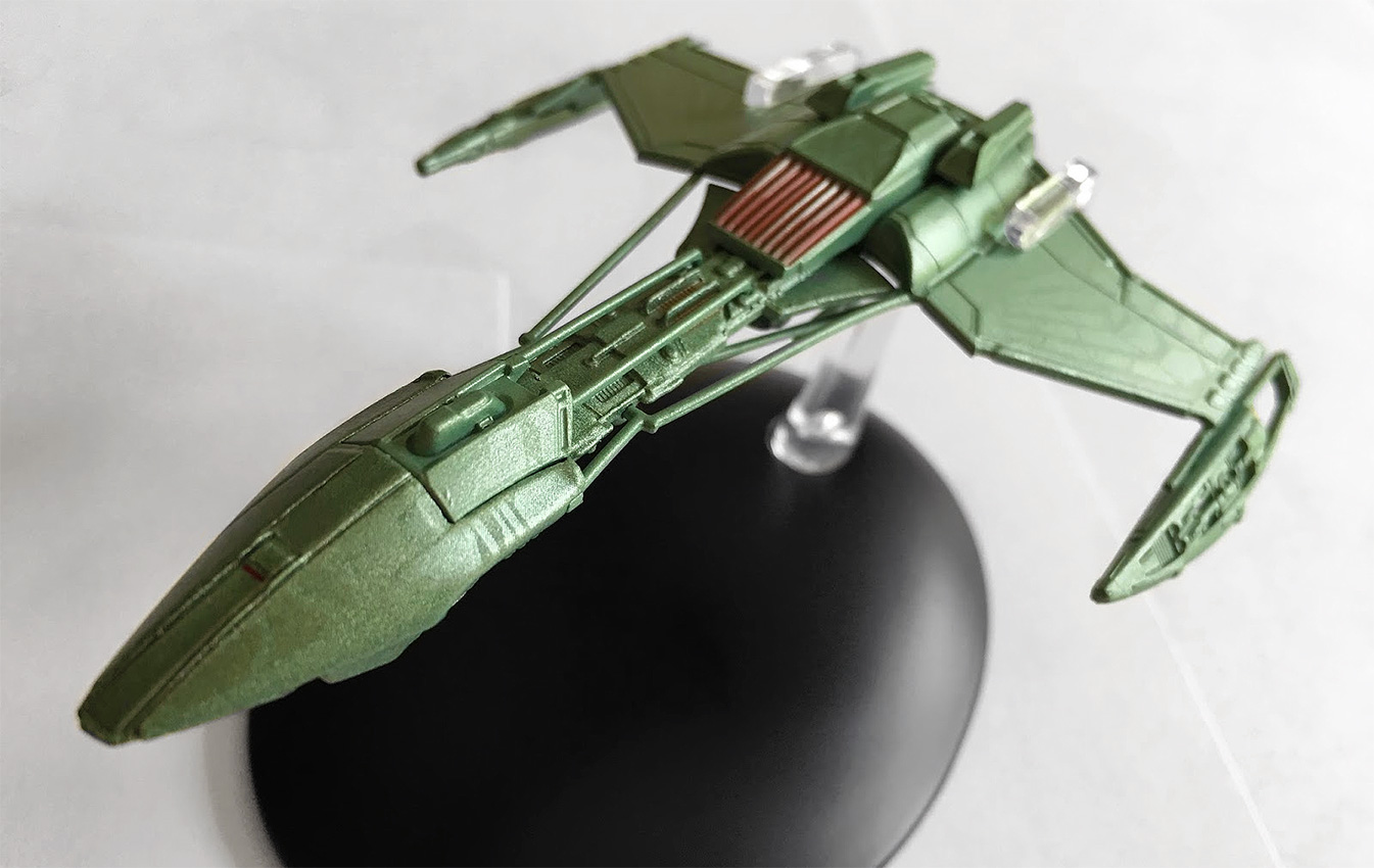
Perhaps one of their lesser known craft, the Klingon D5-class warship popped up in Star Trek: Enterprise to no particular fanfare, appearing first as little more than a tanker in Season 2’s “Marauders.” Subsequent appearances would lose those tanks and give way to a much more streamlined finish.
The D5 has all the hallmarks of the Enterprise-era Klingon ships; a more pointed nose, more angular warp nacelles, a more fierce and deadly finish with more in common to a Romulan Warbird than a Klingon Bird of Prey perhaps.
As always, the Enterprise ships are a fascinating addition to the collection because of their attention to detail — these ships have everything, surface texture differences, precise panelling and subtle variations in paint schemes which make them a die-cast wonder to behold.
That nose has all the signs of the Raptor-class Somraw, with a sharp point and a bird-like appearance. It’s a smooth finish, which is unusual for a Klingon craft, and in this respect the D5 is their most streamlined vessel. That nose looks to be heavily armoured and sweeps majestically back into the neck of the ship.
There’s a touch of aztecing on here, but it’s almost undetectable because of it being such an oddly sleek finish. The joining of this nose “helmet” into the remaining section of the ship is clearly marked out but it all fits together cleanly. The neck, which protrudes back towards the engineering section, is a mass of detail.
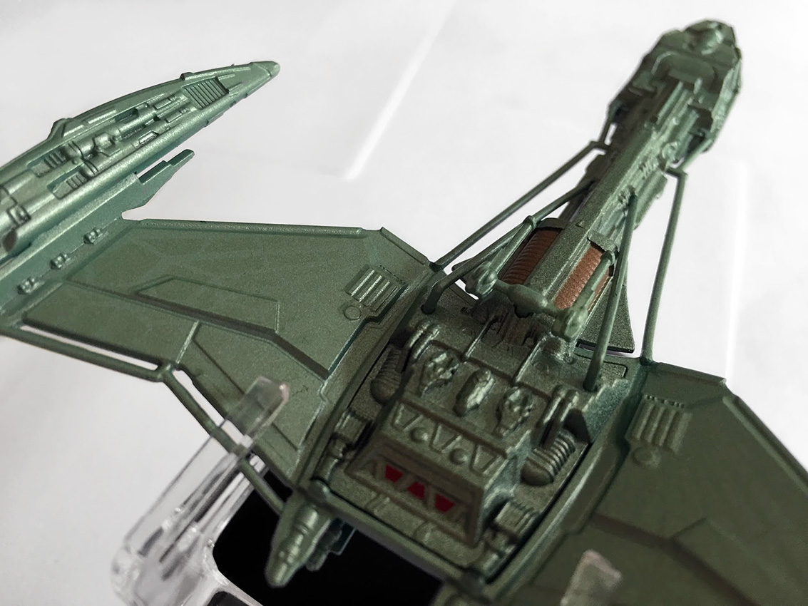
There’s the different layers of tech and mechanisms on the hull, plus the distinct 22nd Century Klingon feature of exposed cabling, which runs along either side of the connecting section. These are very cleanly moulded and attached to the model — and while the paint scheme of green doesn’t alter, it’s important to have them there for continuity, though a darker shade might have helped show them to be more heavy duty and less plasticy.
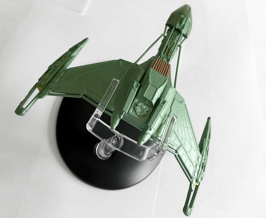
Down the neck and into the rear section once again there’s a familiar Klingon feature in the red slatted/grille section facing to the front. It’s evident on both the Augment ship and the Somraw and has translated across onto this craft too. There are even two distinct “hump” structures either side of it which scream out ‘Bird of Prey’ in regards to its slatted mechanism for moving the wings.
While these don’t have that luxury, you can see where the design has been retroactively slotted into the design journey of the Klingon fleet.
There’s also that impulse engine structure in the centre of the hull, which seems to appear all over the ships of the period: the 22nd Century Bird of Prey, as well as the Somraw, among others.
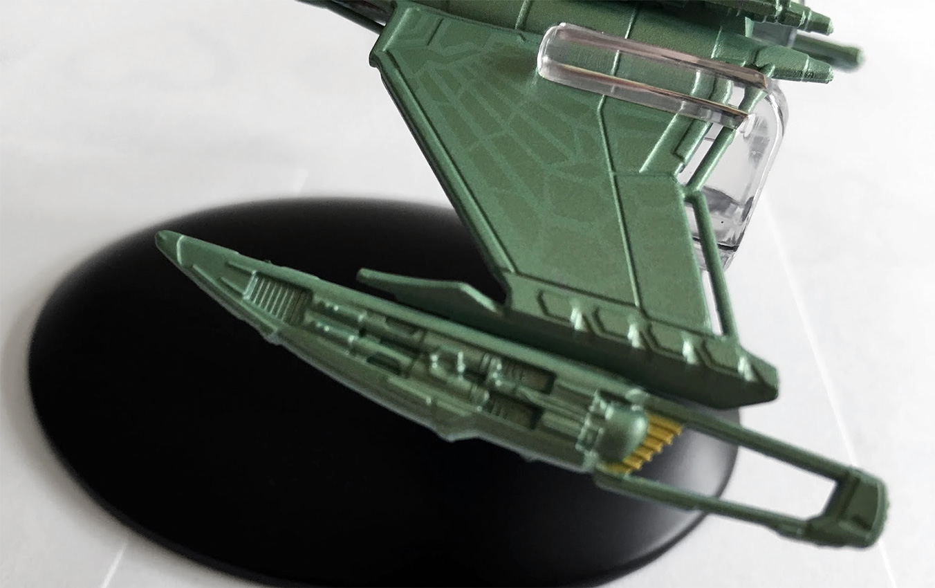
Eaglemoss have also reproduced the feather-esque paneling detail on the wings creating a more organic and “natural” wing effect, and you can see how this will be “developed” into the more notorious D7 craft of the Original Series. There is an evident kink in the wing, and the way in which it has been formed to meet with the warp nacelle that shows it’s evolution.
I think the wing design from Star Trek veteran John Eaves here is beautiful and nicely finished on the model as well, drawing your eye gradually down from the larger body to its narrower end and then onto the warp nacelles. It’s an incredibly stylish ship for the Klingons with some very sharp angles in that wing structure but the nacelles are something else with their dagger-like poise and open detailing.
To the rear they open up in keeping with other Klingon ships of the era and to the front there’s more exposed tech that is meant to echo the design features of the nacelles on the later D7’s and K’t’inga classes. This does seem the most sleek of Klingon designs from the whole of the franchise and oddly one of the more threatening at the same time. The sharp edges, the dagger-like appearance and the scything warp engines all work massively in its favour.
The metal structure in this one stretches from the nose and then onto the underside of the belly of the D5 via the connecting neck. That underside is extremely detailed including the addition of the double cannon.
There’s also more vent grille work on the underside of the ship and this section is the highest quality section. Lots of hull mechanics, panel detail and also impulse engine exhausts.
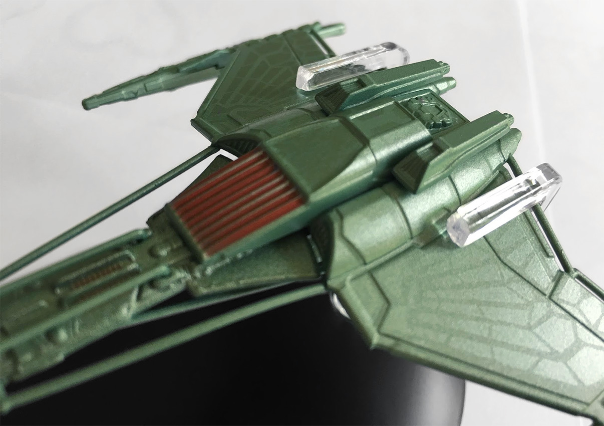 It’s a familiar placement for the stand on the D5, with it slipping around the rear of the ship giving the usual “flying” impression. It does look more at home alongside the 22nd Century Klingon ships, as there’s only a few similarities to this and the later D7s.
The magazine continues to emphasise the killer nature of the predatory D5 with reference back to its sporadic appearances in Enterprise, with lots of good tech detail in here about its armament and maneuverability, as well as how it compared to the NX-01.
From reading this I’d forgotten quite a bit about the D5s, and seemed to remember the Somraw and the Bird of Prey from this era much more clearly. Must be time for a flashback and rewatch, I think!
It’s the Vidiians — and I’ve been waiting a long time for this one! The dangerous species were one of Voyager’s genius moments. The concept of the organ harvesters ravaged by the Phage worked on every level, making them Voyager’s creepiest and most unsettling foe, a position I think even the Borg struggled to challenge.
While their makeup was first class as was the backstory, their ships were something of an acquired taste. Admittedly I acquired one for Attack Wing and that seemed pretty big but the latest Eaglemoss version is far superior – as you would expect.
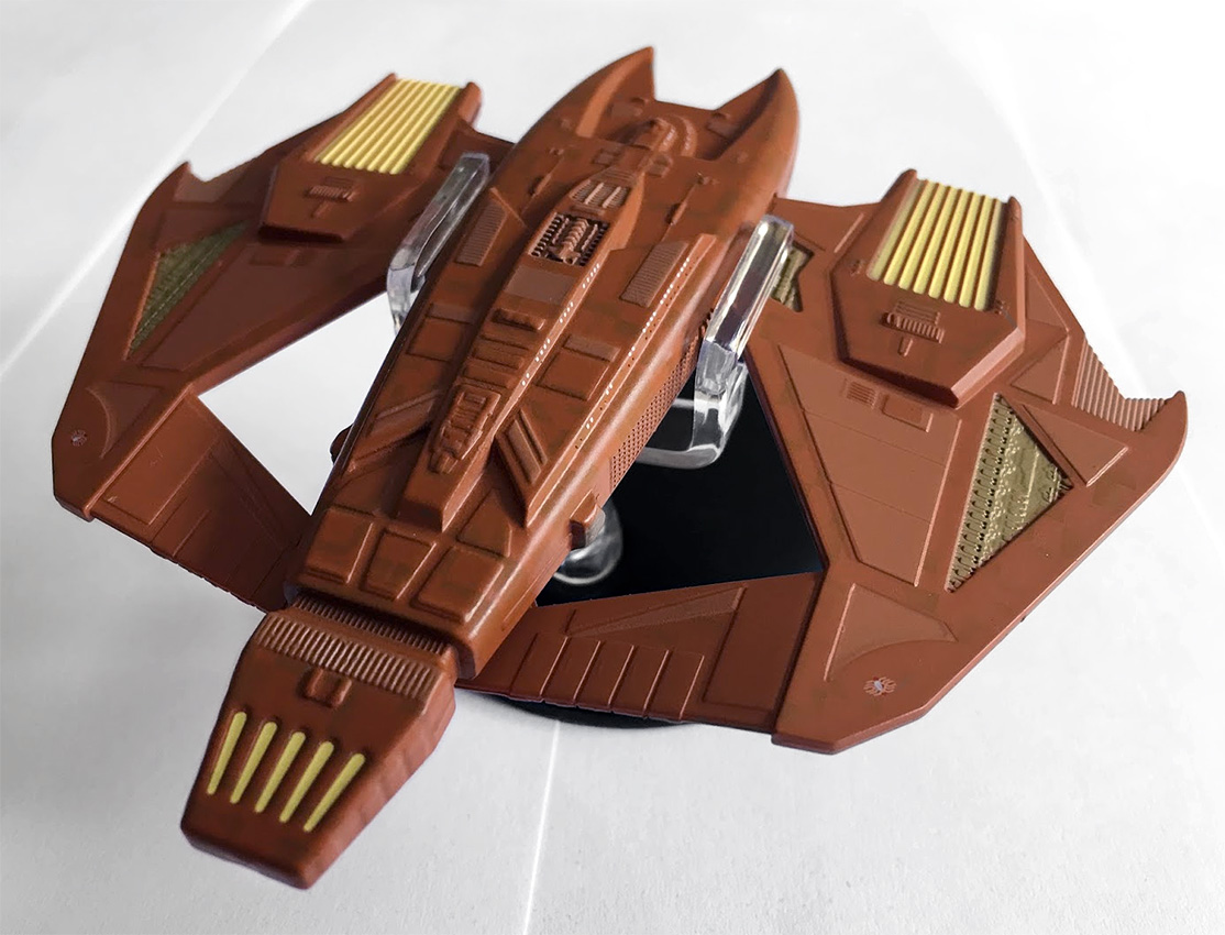
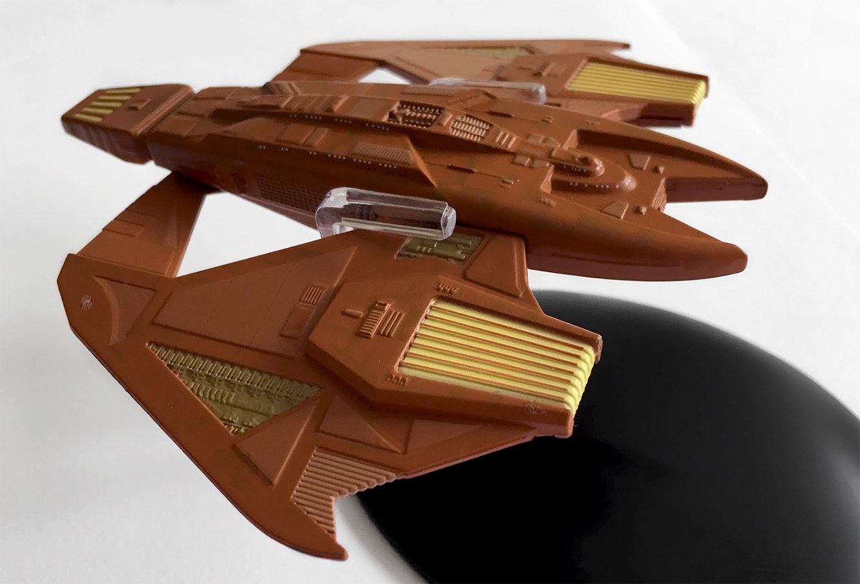
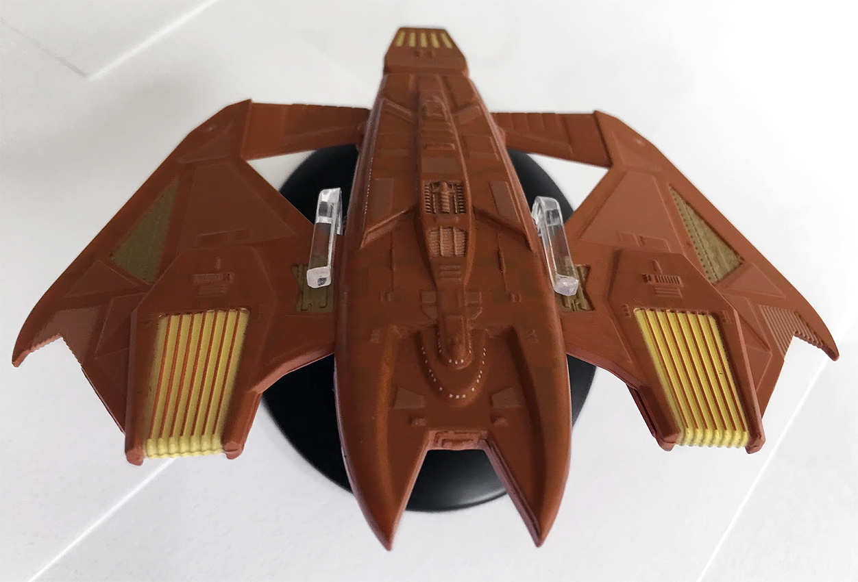
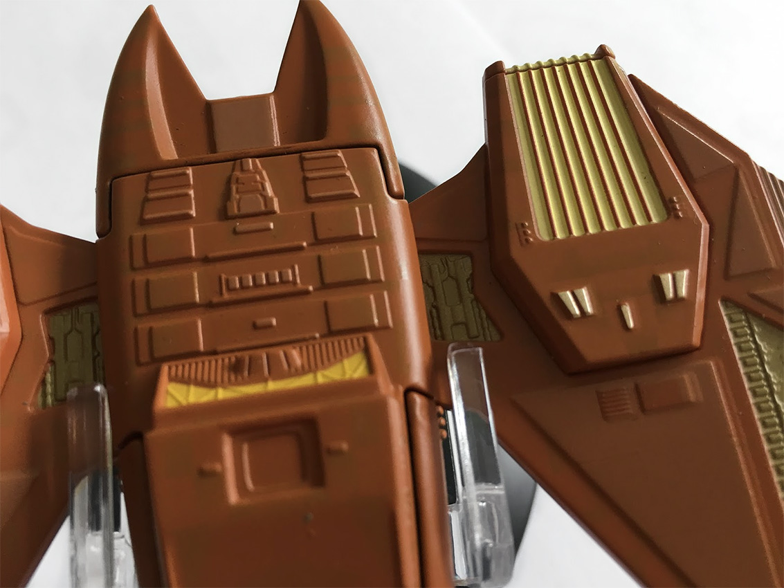
Filling out its packaging more than adequately, the Vidiian Warship is big. Easily as long as it is wide (to paraphrase the mag), you’re getting your money’s worth here. Now for note, the wider end is actually the front and just to reinforce that there’s a very clear bridge module marked out.
The colour scheme on this one is significantly less pink than I was expecting, but there’s still some hints of tonal differences plus some paneled highlights right across the surface of the Warship. These panel details are mirrored left to right, and then there’s the engine colouring which really lifts this ship out of the box.
At the front there’s a reaching pincer-like maw which arcs out and around the bridge module. That two tone paint finish is even evident on these areas of the ship and there’s even small panel colour differences as well as tiny porthole spots on the superstructure.
Along the metal spine there’s raised grille detailing and further aztecing, which stretches continuously to the almost-tapered rear that ends in another yellow engine housing. You do have to strain a little to see the shift in the paint scheme, but it’s definitely there. The Vidiian ship has a certain harshness to its finish with that very heavy frontal position.
It’s unusual for a Star Trek ship not to have a narrower front end — or something that is distinctly a front end — since you could think this flies either way round.
Out into the wings: these contrast materially to the upper hull being a central piece linked to the lower hull and totally plastic. As with the main hull, they feature highlighted sections to give them a more 3D and realistic finish. I love the sharp edges here and the “killer” finish to the design. The overall design is very aggressive, and looks ready to pounce with its forward sweeping wings and pincer maw.
They have a slight kink in them, giving a slight inverted “V” shape as well as having cut-out segments toward the back, and I think the choice of metal here might have been wiser given their width and flexibility. However, I don’t think it’s a massive problem.
The clip-together top and bottom hull segments fit extremely snugly, although it’s not a straight centre-line crease; it notches into the lower half around some of the side detailing. Again, a good choice to ensure those clean lines and markings aren’t broken up with some lazy fixing.
In fact, the top hull section, being metal, fits into the lower plastic hull which spreads out to the wings. The panel lines are more striking on the metal upper section and the yellow engine field grilles, plus the yellow highlights really do stand out proud against the dusty brown of the hull.
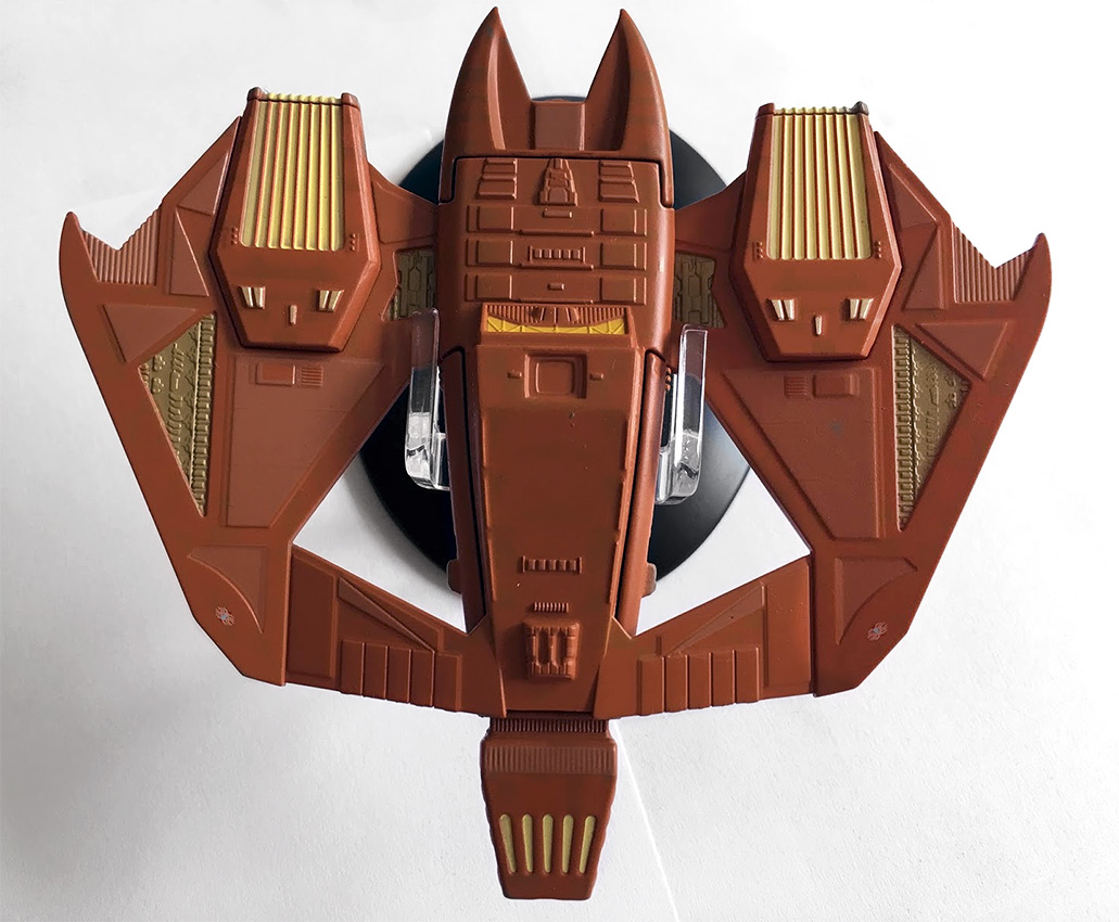 The plastic sections – the wings and lower hull – actually appear to be a slightly lighter shade of brown, by perhaps a shade, which is a little odd. I also spotted that on the underside there is zero two-tone when it comes to the base brown coat. It’s a solid shade on the belly, with the segmented panels being in the lighter brown shade.
To finish, we find ourselves tapering to the rear, and what I can only assume is the impulse engine, providing a wedge-like tail to the warship. Nicely, the aztecing continues on this small section of the ship and on both sides even though the bottom of the ship is a single brown shade on the plastic.
As for detail on the flipside, it is a virtual mirror of the top when it comes to the wings and the mechanical beige panelling sectioned out on both sides. The warp engine field grilles do have some slight variation, with yellow highlights, but are otherwise unchanged. Look closely, and you’ll spot that those beige sections are exactly identical to those on the topside.
Into the centre of the hull: as with above, there is more window detail around the central section indicating the overall size of the Vidiian ship. It is perhaps less complex than the more often seen upper section, yet we still have the evidence of panel detail, along with another yellow recessed section which I can only assume is the navigational deflector. It would make more sense for this to be it although it could be an intake of some form.
As for the join lines here, it’s a bit obvious with quite large gaps at the edges of the plastic and metal sections. Interestingly, the plastic bottom isn’t just a flat piece as it cuts around the tips of warp engine field grilles on the wings, as well as around some of the lower hull detail. In fact, it seems on inspection that the two lower halves of the grilles are actually separate pieces to the wings.
When you’re displaying this on its included stand, ignore the positioning suggested by the magazine, and go for the clip position as in the above pics. Going with the magazine position clips around the thinner wing sections, and isn’t very stable, while clipping to the central body gives a much firmer grip and stability.
The magazine recants the numerous encounters with the Vidiians during Voyager‘s early seasons. We get a good mix of images of CG ships, stills from episodes, plus a few of the Vidiians themselves thrown in. The plan views do show off the hull-wide aztecing a lot more than the model, and make the contrasting panels a lot more distinct than on the diecast item.
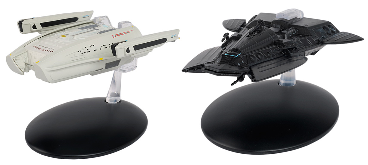
For my next review, I’ll be taking a look at a couple of Next Generation ships, and one I have waited for since day one: Scotty’s downed passenger ship, the USS Jenolan, from “Relics.” Paired with this Federation transport is the Smuggler’s Ship from “Unification.”
In the meantime, you can pick up the Klingon D5 class and the Vidiian Warship at Eaglemoss’ shop to add to your own alien fleet! ![]()
In Eaglemoss’ US store, TrekCore readers can use promo code TREKCORE at checkout for 10% off any ‘Star Trek’ collectible purchase $50 or greater (Starships, Plaques, Binders, Graphic Novels).

