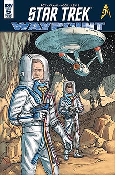
Deep Space Nine and the Original Series provide the settings for the two stories in this month’s issue of Star Trek: Waypoint #5.
I respect IDW for their work on this iconic franchise. Their stewardship has been both true to the fabric of the series and to the spirit of Roddenberry’s philosophy.
Giving new and rising creators a chance to showcase their work on a prolific a franchise as Star Trek is a testament to this practice… but anthologies are a tough gig.
The first story, Frontier Doctor, is set on the Deep Space 9 station, primarily revolving around Doctor Bashir. As a side note, I felt it was a curious choice of titles, being so very close to the John Byrne run of Leonard McCoy, Frontier Doctor, one of my favourite Byrne Trek collections. I was wondering if there was going to be a tie-in to that story when I first saw it.
Alas, it was not to be. I enjoyed the story for what is was – don’t get me wrong. The idea of Dr. Bashir learning a little about the danger of hubris is an excellent story angle that is completely in tune with DS9 and Bashir’s introductory characterization in the early season episodes, but I just found that the title was a bit misleading in terms of expectations, given the similarity to the other title.
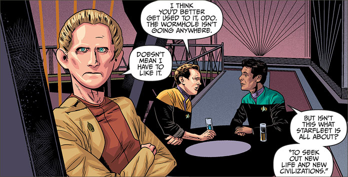
In this story, we see what clearly is an early career Bashir dealing with an unknown species and understanding the danger of making assumptions. When one of the many travelers who passes through DS9 demonstrates behaviour that Bashir assumes as unhealthy, his medical skills are called upon and he discovers that his initial assessment of the situation is wrong.
However, despite his youthful pride, he acknowledges the need to go back to school, so to speak, and to continue honing his skills in order to properly meet the unknown on its own terms.
I hate to give away details – so I won’t – but that’s essentially the thrust of the story, and writer Cavan Scott does a fairly good job of creating a concise story that has the right DS9 flavour to it.
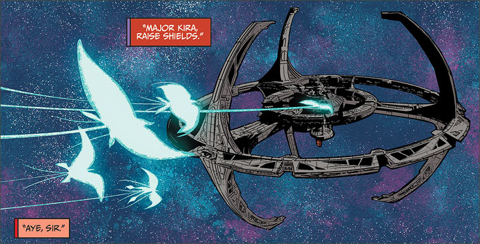
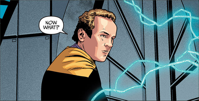
The art stylings of Josh Hood hold themselves to good account. Likenesses are challenging, but Hood acquits himself admirably, particularly with Miles O’Brien; I felt his representation of the Chief of Operations was very well done. Though the proportions were a little off, or awkward-looking in places, it was an admirable job.
If there was a criticism I could levy, it would be the length and the relative newness of the talent. But the former is more of a function of the anthology nature of the book rather than any fault of the writer or artist, and the latter is something that can be dealt with as time progresses.
Yet everyone has to have his or her start. However, with regards to the former, perhaps editor Sarah Gaydos might consider lengthening the book to accommodate either a fuller pair of stories, or just a greater amount of them? Just some food for thought.
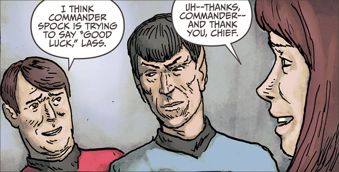
The second story, Come Away, Child is a bit of a different case. While I can appreciate the innovative nature of the story, I have to say that the artwork did not impress me.
Simon Roy fields both artist and writer roles in this Original Series story in which we see a scientist’s obsessive study of a primitive culture override her sense of personal safety and rationality. It’s a clever story that avoids the typical tale of Kirk, Spock or the rest of the TOS cast and expands the reader’s perceptions of the Federation in this 23rd setting.
It’s an emotionally challenging story in which we see a young Starfleet officer’s need for personal acceptance and human contact subvert her sense of protocol and the dilemma she faces that ends with tragic results – which I quite liked. However, it was the art that I felt detracted away from the quality of the story.
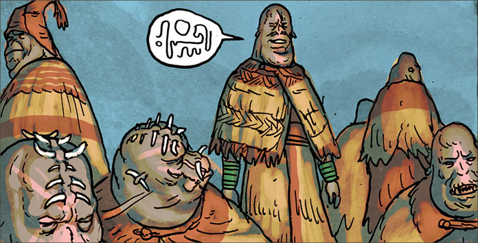
I found that Roy’s images were rough and undefined. The uniforms, for example, were baggy and shapeless and hardly the professional aspect of the Starfleet we have all known for the past fifty years. The same can be said about the Enterprise on the cover. It’s clean lines and graceful curves are wavily drawn, drastically affecting its appearance in a disproportionate and rough-hewn manner.
The characters also lack definition. Expressions are difficult to make out and postures are awkward. It was a difficult task to separate the artistry from the story, but as I said, the story was very evocative and enjoyable.
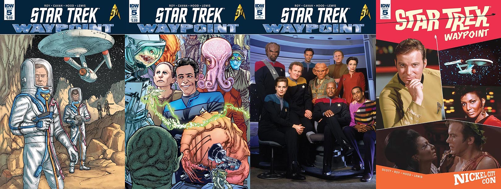
- Looking at the covers, the regular one is drawn by Simon Roy. There is more definition in the cover than can be found in the interior, particularly with the standard issue Starfleet EVA suits we saw in “The Tholian Web.”
- The subscription cover is dawn by Tony Shasteen, and is definitely my favourite one of the four. It’s a Deep Space Nine cover that features an egotistical and brash Julian Bashir flanked by Odo amidst the alien diversity that travels through the station. It’s one that definitely sets the reader up for relevant expectations and is certainly a treat. It’s great to see Shasteen back on art duties and I am looking forward to more of his work in upcoming issues.
- The retailer incentive cover is simply a stock cast photograph of the DS9 crew. I pretty much used it as a guide to mark off which of the DS9 cast I’ve interviewed in the past. As I’ve stated before in past reviews, photographs shouldn’t be on a cover of a comic and deprive artists of the opportunity.
- Finally, we see retailer exclusive photo cover made especially for the Nickel City Comic Con which features a combination of Nichelle Nichols and William Shatner, who I believe were guests of the convention. However, the cover is styled in the same trappings of the old Gold Key Star Trek comic covers from the early 70’s, which is a fairly unique and interesting design.
All in all, not a bad delivery for this month’s issue of Waypoint. As I said earlier, anthologies are a tough gig. But I like the challenge and discovery of new talent and seeing what unfolds.
You’re not always going to get what you like, but you will always have that thrill of discovery as you read, and quite frankly, that’s what Star Trek is all about.

