Top: Sean Hargreaves
STAR TREK BEYOND had some of the most radical new designs in all of the Trek movies, from the beautiful Yorktown Station to the worn-out USS Franklin to the underground caverns on Altamid… and of course – spoilers! – that other new starship, too.
This week, artists Victor Martinez and Sean Hargreaves have begun to release their amazing concept artwork for this summer’s new Trek adventure, showcasing the brilliant design work that goes into bringing the film to life.
Spoilers below!
* * *
Victor Martinez shared much of his work around the crew’s visit to planet Altamid, and Krall’s facility located on that abandoned planet.
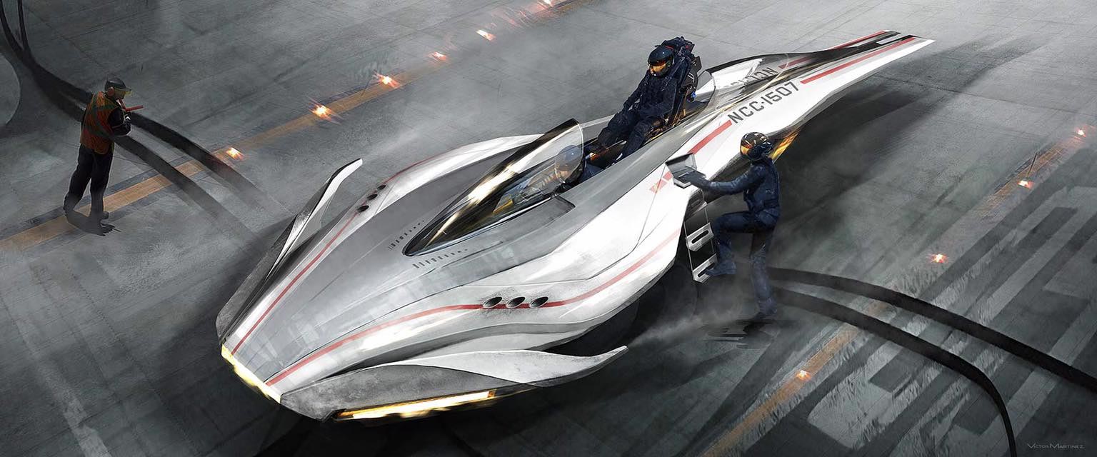
This “battle shuttle” was an early design ultimately cut from the film after script revisions, which Martinez described as ” a small, agile fighter able to house [a few] passengers riding tandem like a toboggan, ideal for situations requiring nimble maneuvers…perhaps influenced the enemy Swarm ships seen in the final film.”
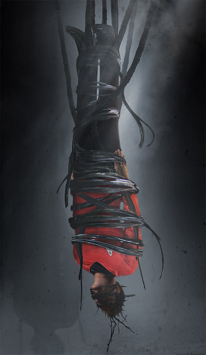

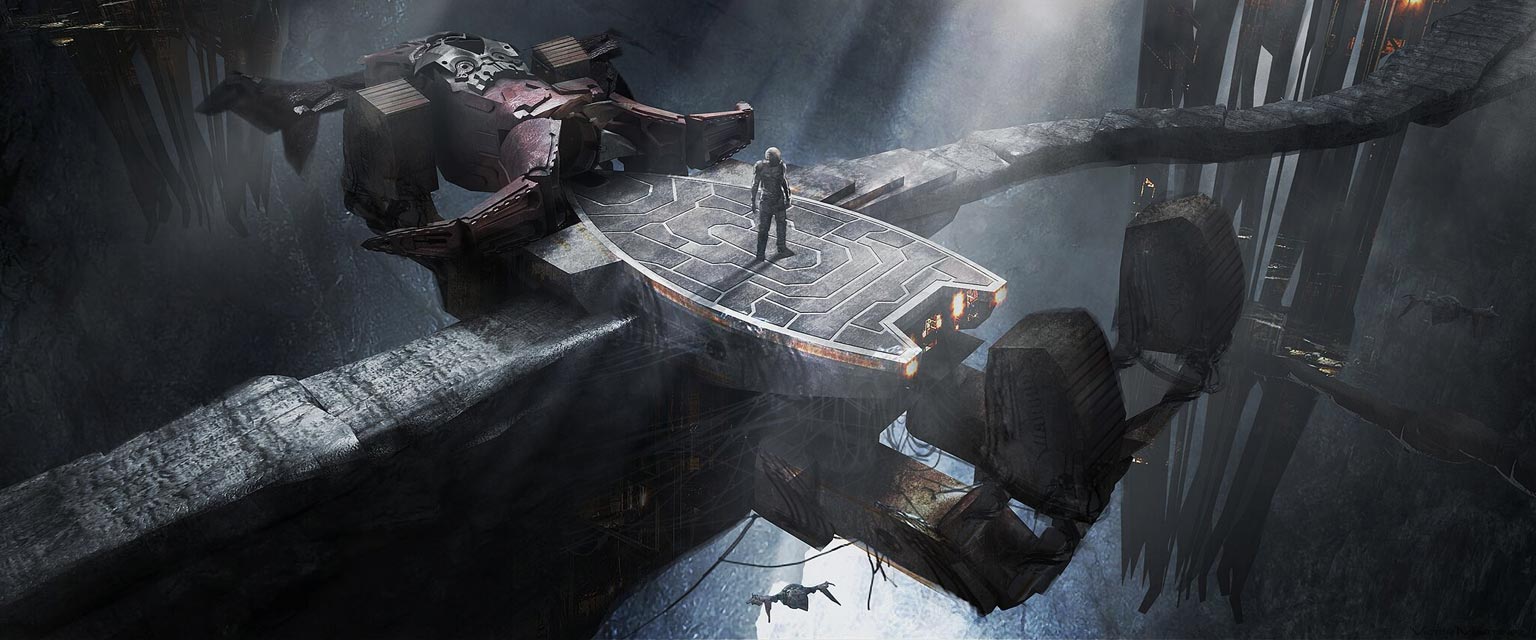
You can see more of Martinez’s work for STAR TREK BEYOND at his Facebook page.
* * *
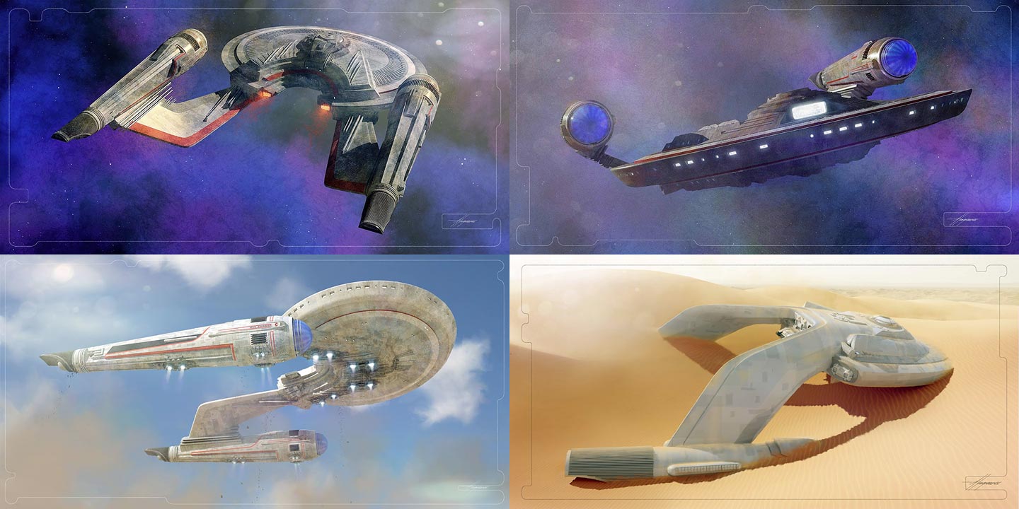
Sean Hargreaves’ work for BEYOND centered around Starfleet’s industrial design, from the gargantuan Yorktown Station to the relatively tiny Franklin – and the newly-revealed Kelvin Timeline’s Enterprise-A, which made its first appearance at the end of the film.
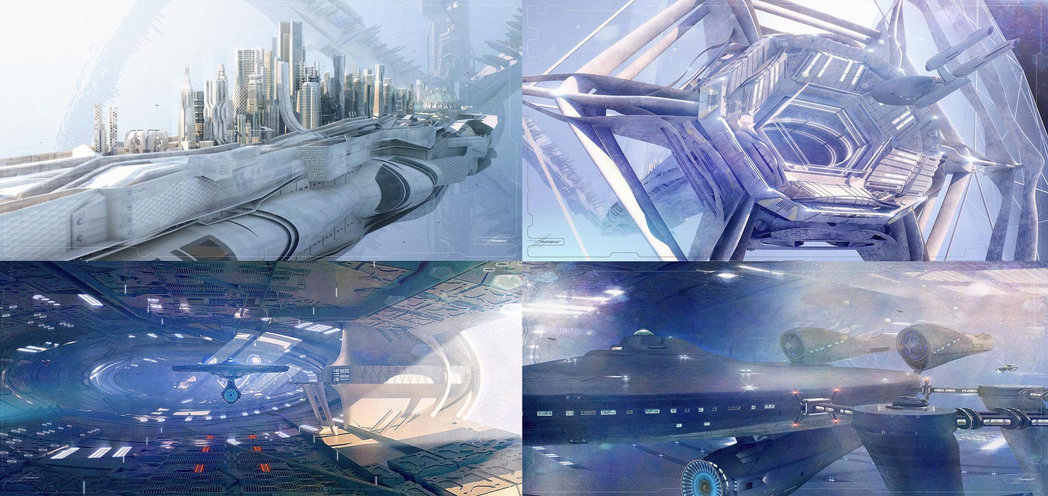
Looks at the Franklin – and the flipped, early version known as the Pioneer. (Credit: Sean Hargreaves)
The Franklin, which first revealed itself to the world back in January right here on TrekCore, originally began as an inverted-nacelle ship called the USS Pioneer, which was able to take off vertically right from the surface of a desert where it was half-buried.
As the BEYOND script evolved to have the Franklin buried in rock and rubble on Altamid, Hargreaves eventually flipped the nacelles to the upper position to allow for Sulu’s “kick-start” maneuver seen in the film.
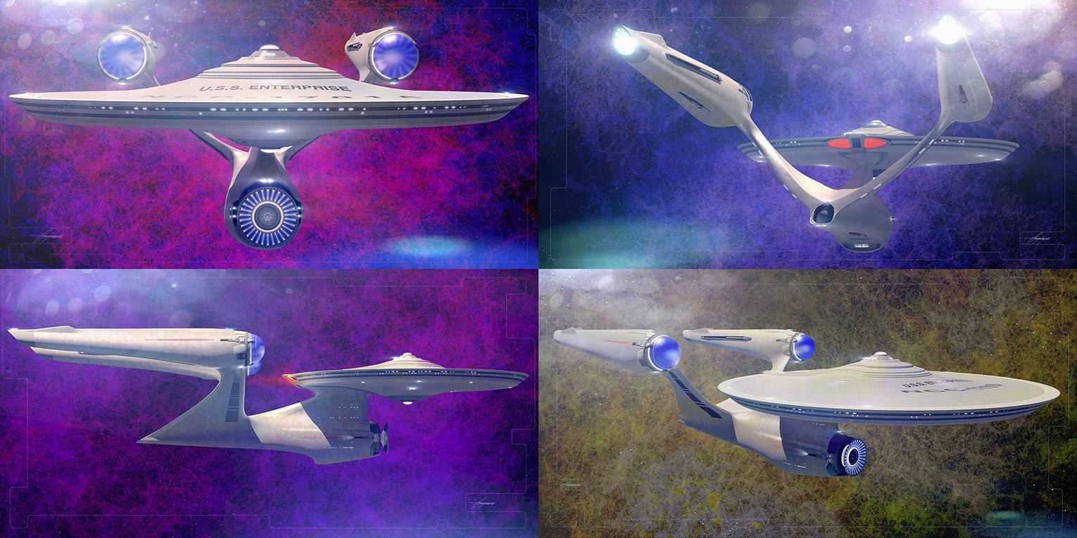
Hargreaves’ final contribution to the Kelvin Timeline is the newly-constructed Enterprise-A, launching from Yorktown at the end of the movie.
As the artist noted on Facebook today:
This was the design I gave visual effects, so any changes beyond what you see here were out of my hands, but looking at the film, it’s pretty close. The brief was to beef up the neck and arms, but I took it upon myself to go further.
Only one [revision was needed], an adjustment on the engine taper… this was accepted quickly.
You can see more designs, and larger versions of what’s posted above, at Sean Hargreaves’ Facebook page.
![]()

 OrderStar Trek Beyondon Blu-ray!
 OrderStar Trek Beyondon 3D Blu-ray!
 OrderStar Trek Beyondon 4K Blu-ray!