It’s a special of IDW Publishing’s ongoing Star Trek photonovel series: an adaptation of “The Cage,” the first adventure of the starship Enterprise under the command of Captain Pike!
Order New Visions: “The Cage”
Against the pale violet sky of Rigel VII that contains the Enterprise, a giant Talosian gestures to Captain Christoper Pike who’s surrounded by several familiar faces: Yeoman Colt, Mr. Spock, Dr. Boyce, and Number One.
He’s pulled a phaser on four others — all different versions of Vina. A beautiful cover created by John Byrne that combines some of the iconic characters from this episode into one image. I’m a huge fan of Captain Pike, so this really works for me.

“Based on the television episode written by Gene Roddenberry,” this adaptation by John Byrne captures all of “The Cage” to celebrate Star Trek’s 50th Anniversary. If a reader hasn’t seen this episode, it’s a fantastic look at the voyages that could have been.
This fifty-page giant opens with the Enterprise receiving a radio wave that’s transmitting a distress signal: a ship in trouble is making a forced landing. It’s coming from the Talos star group, but there are no known ships or colonies out there. The signal matches that of the S.S. Columbia, lost eighteen years ago, which would explain why the radio signal took so long to be received.
Captain Pike is unwilling to investigate, given that there are no indications of survivors. He goes to his quarters and summons the ship’s doctor to include his opinion in the ship’s log on the signal, but the conversation turns to a recent mission that’s gives the captain pause to consider what he’s doing with his life. Their discussion provides much backstory to the captain, but their dialogue ends when Spock interrupts that are crash survivors on Talos IV.
Pike then finds himself in a situation that no other captain has encountered before. It’s neat to see his reaction to the characters on Page 17 and how he how interacts with both characters on 20. Pike’s response at the bottom of 24 and his dialogue on all of 25 nicely shows how he’s a man that doesn’t succumb to his animal nature, but wants answers to his questions.
As Pike is trying to learn what’s happening to him, his crew isn’t just sitting idly by; they are taking some extreme measures to get to him. The give and take between Pike and one of the antagonists on 31 and 32 has always been a favorite scene of mine: each character believes they have the upper hand and the give-and-take is still strong after all this time.
If one wants to see the definition of Star Trek cool dialogue, the final two panels on 43 that contain text are just awesome. Also commanding a strong punch is the scene on 48 — it’s still haunting. Where the characters end up is great, with the dialogue in the fourth panel on 49 an awesome climax.

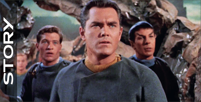
Photomontage work is done by John Byrne using images from the episode, manipulating them so that the story may be told in the visual form of a comic book. Byrne is not just finding frames from the episode and cutting and pasting them into a format to be read; he’s combining and creating images to make a larger picture and to intensify the drama.
For example, at the bottom of Page 3 Pike is making his way to the turbolift. The panel’s focus is on him, but the dialogue balloons lead the reader to move toward Number One, who responds to her captain’s orders. This is a combination of several images because Number One is not in the original shot of the television episode; I know, because I double-checked on Netflix.
The inclusion of Number One in the panel gives a reaction of disappointment from the bridge crew, showing that not all agree with his decision and giving one character some individuality. Due to the time period of this episode, the dimensions weren’t in the widescreen format that today’s audiences get from their programs. If Byrne had followed the dimensions of the broadcasted image, this book would be a series of six squares on every page, and that would be unbelievably boring to look at.
One of my favorite images is on Page 17, where one character’s reflection is placed on another character. This is terrific way to show a character’s visual reaction to another’s speech and reinforces the setting for the protagonist. The look on the antagonist’s face is sensational, as he shows fear at the lead’s words. This point of view is repeated on 31 and 32 for a similar, outstanding effect.
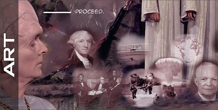
There’s a neat montage on 48 and I love that it only goes up to a specific point in human history, giving a nod to when this television episode would have been filmed. The visuals that should have the most effect on the reader occur on 48. It works better as a series of stills in this book, than the limited dissolve effects of the 1960s.
The imagery of this book tells the story well and does so in such a smooth way that some fans might think they’re looking at cut and pasted images. This only shows that Byrne has a masterful command of this format.

The series title and creator, the dedication, dialogue, the story’s title and adapter, sounds, and a yell are also crafted by John Byrne. I’m so happy to have sound effects in this story, because many of these noises have become so iconic their absence would be instantly noticed, such as those on 14 and 23.
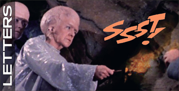
Several of the sounds are colored outlines and this is absolutely the right thing to do; if the sounds had been colored solid they would have obscured too much of the imagery in the panels. My favorite bit of lettering in the book is the absence of dialogue balloons for several characters. I don’t recall ever seeing this form of communication done without the balloons and it’s an extremely clever way of visually reinforcing for the reader how these characters have specific dialogues.
I didn’t even notice this until I went through the book a second time. Very, very smart.
Final thoughts:
I’ve read some commentary online with some fans challenging the publication of this adaptation of “The Cage,” essentially arguing “Why should I buy it if it’s an episode?” First and foremost, the story is excellent. This episode was notoriously cast aside because it was too cerebral. Heaven forbid a story should make one think. The message of the story still resounds, fifty years after the fact.
Even if one has more than a passing familiarity with the story, having it in this format makes it easier to access than pushing several buttons to call up to view. The visuals are wonderful. Star Trek has a look to it that has become ingrained in the minds of millions. I count myself as one of those who could just pour over the visual aspects of this series, and I have in more than one publication.
Looking at these images is thrilling. I linger over every panel, soaking in each element. It’s far easier to enjoy the images of this book than to continually hit pause during a viewing, let alone go back and forth to try and find the right image. This is an incredible reference for an incredible episode. It’s the perfect special to celebrate Trek’s golden anniversary.
