Celebrate the 50th Anniversary of the Star Trek franchise in 2016 with this all-new bi-weekly comics event, when Captain Kirk and the Enterprise crew faces off against the Klingons in an ultimate showdown!
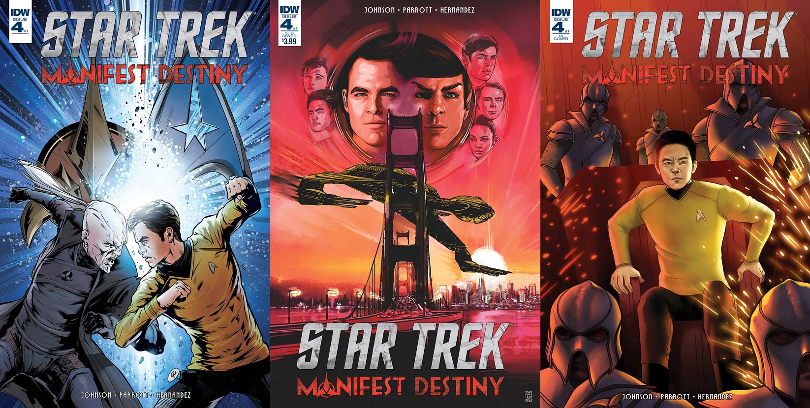
There are a trio of covers to collect for the final issue in this series:
Order Star Trek:
Manifest Destiny #4
- Kirk and Sho’Tokh square off with each of their people’s emblems behind them. This cover from Angel Hernandez with colors by Jose Luis del Rio is a strong one. It’s nice to see the two characters going at each other with their fists, rather than use the weapons associated with their cultures.
This makes the fight more brutal, but definitely more in the mold of the classic series. Placing an explosion between the two men is an excellent way to up the explosive content of this image. The coloring on this is really nice, with that explosion in the center pulling the reader’s attention to two fighters.
- The subscription cover is a final homage by Tony Shasteen to Bob Peak’s iconic posters from the films, this being a modernization of Star Trek IV. Above an image of the Klingon Bird of Prey avoiding entangling itself with the Golden Gate Bridge are all the new cast members to the Trek films; from left to right, Chekov, Sulu, Kirk, Spock, McCoy, Scotty, and Uhura. A beautiful take on this poster and this, and all of Shasteen’s previous covers for this series, should really be a poster or print.
- The subject matter for the retailer incentive cover is a complete surprise. Sitting in the captain’s chair aboard the Enterprise, Sulu looks in focused concern at a console just off the page that’s erupting in a shower of sparks. His concern is either for the fate of his ship or the crew that surrounds him, helmeted Klingons.
Great choice for a cover by Jen Bartel and it succeeds well. Sulu looks like actor John Cho and the coloring is fantastic — the reds intensify the situation and having him in yellow makes him stand out among his enemies.
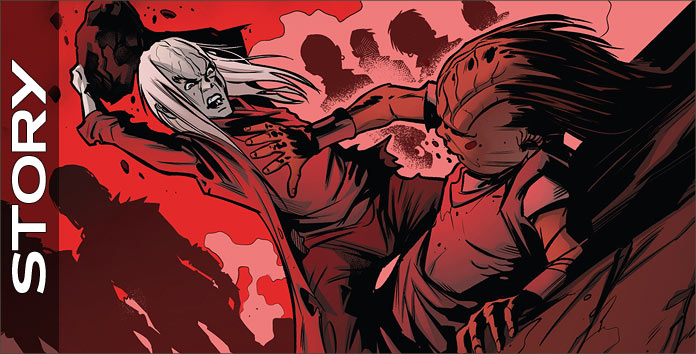
Sho’Tokh tells his origin. “I have been hated from my first breath…Despite my outcast status, the defense force could not deny my innate ability. They needed me. But I never needed them.”
This quick summary is only one page long but gives terrific insight into what made the monster that now has control of the Enterprise and is now holding his bat’leth to Kirk’s neck. Scotty screams at the Klingon to leave the captain alone, sparking Sho’Tokh to consider a different fate for Kirk.
He knocks the human unconscious and states to a lesser what’s to be done, and that’s when an explosion rocks the hallway. He rushes to the bridge to find that they are being hailed by Divash aboard the Chonnaq. She has “relieved” Grelm of his post and now she wants to do the same to Sho’Tokh.
The Klingon ascension of command is fully on display for Starfleet’s finest. The commander’s reaction to Divash’s words is classic — a classic — Klingon reaction, with it ending with both characters being true to their natures. This conflict spells trouble for the crew of the Enterprise, who are caught between both sides of the Klingon battle and on two different ships.
This was a perfect ending to a perfect story from writers Mike Johnson and Ryan Parrott. I’ve longed to see Klingons return as antagonists to Star Trek and this issue, this series, more than satisfied.
Sho’tokh is an exceptional antagonist. He’s wholly original, but his motivations go beyond the norm even for those who’ve been following this franchise for decades. He gives Kirk the perfect foil to square off against, mentally and physically. Divash is also a terrific character, allowing the reader to sympathize with her wishes, but reminding one that she is Klingon and that takes precedence over the well being of the humans.
There are also some nice moments with the supporting characters, such as Sulu and McCoy, with the latter making the strongest change about Klingons by the end of this book.
The origin of Sho’Tokh is told in four vertical panels on one page. It completely summarizes this villain’s life and brilliantly shows how he became the monster he is. The second and third panels are violent images, with the fourth being an excellent transition point for the character that wouldn’t mean much unless the previous two panels had been seen.
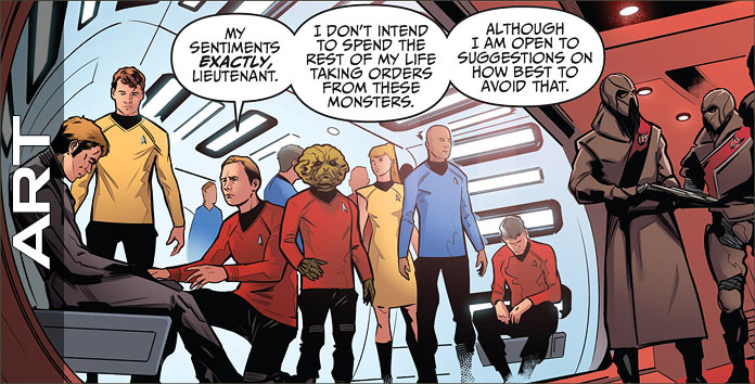
Being a Klingon, the antagonist towers over Kirk and this is an outstanding way to instantly have the hero of the book be at a disadvantage to the villain. The smoke effects of the first panel on Page 2 are an excellent way to remind readers that all is not well aboard the Enterprise.
The explosion on 3 is great; I love seeing the point of view tilted like this as it instantly takes a reader back to the same effect from the television series. The final panel on 4 is terrific, with this crew realizing that their backs are against the wall as they command a wounded ship. Besting this hopeless image are the two panels that follow on the next page, with Sho’Tokh’s emotions fantastic, and even they are bettered by his final two panel on the same page.
There’s only one panel of the two ships engaged in space and it’s great. It had me wishing to see more between the two ships, but the story rightly goes inside the ships to show the direct effects of the conflict on their crews. Page 11 is fantastic.
There aren’t any humans shown on this page, but Angel Hernandez has captured the damage to the ship handsomely, with that second panel rivaling Khan from the 1982 film. Pages 16 – 19 have the final conflict between the two leaders and it’s everything one would want it to be. Naturally, they’re exchanging barbs as they battle, but Hernandez makes every punch and slash felt, with the final blow being excellent.
Yeah, Hernandez should be drawing more Star Trek as soon as possible.
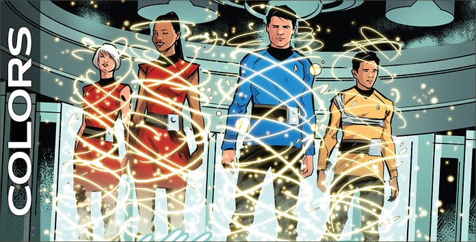
Two colorists are credited for this issue, Mark Roberts and Adam Guzowski. I wish that there had been some particular notation as to who was responsible for which pages so I could give specific commentary to each, but I can safely say that both gentleman did a good job.
The first page (Yeah, I’m harping on it, but it is that good) uses reds outstandingly to create a bloody path for the Klingon, with only his gray skin being the other color on the page, used to set him apart from the bloodshed. This red continues onto the next pages as the Enterprise is at red alert: this is a great way to show that the bloodshed of Sho’Tokh’s past continues into his present.
Colors are also used to show the reader two different settings, with the Starfleet ship’s interiors red and the Klingon ship’s green. The book’s final confrontation takes place in a fairly dark setting, but it’s colored so that the reader can still the characters in action, while realizing that it’s dark place. Excellence throughout.
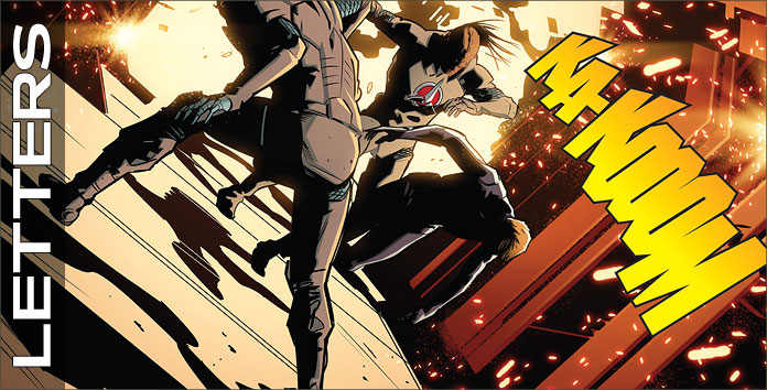
Dialogue, sounds, an editorial note, ship-to-ship transmissions and Klingon speech (the same font), and yells are crafted by AndWorld Design. It’s a bit confusing to see the Klingon dialect done in italics because it’s already been set apart from Starfleet standard by an the greater than and less than symbols.
I was reading their speech initially as if they were yelling at each other in Klingon, as Klingons tend to do when conversing, but when Sho’Tokh and Divash had their conversation the visuals of the letters stopped my reading of the story to sort out what I was looking at. All else looks fine, though I’m still not understanding why the Klingon dialect was put in italics.

