Suit up, cadets! We warp back to San Francisco in the second chapter of IDW Publishing’s Starfleet Academy comic miniseries!
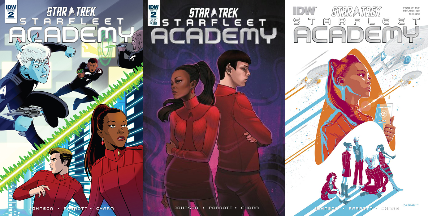
There are a trio of covers to collect for the next issue in the series:
Order Starfleet Academy #2
- The first of three covers is by interior artist Derek Charm. I enjoyed his visuals on the first issue and I’m liking this regular cover just as much. Split diagonally by a burst of green energy, the top image shows Shev engaged in a zero gravity phaser battle, while below Kirk and Uhura are trying to find someplace to secret themselves to look at classified information.I love the design of the characters and the coloring, which is delightfully bold.
- The subscription cover is by Elizabeth Beals and it’s the most realistic looking of the three covers. Against a swirling miasma of violet space, Uhura and Spock are back to back, representing the current state of their relationship. She looks more emotionless than Spock as she tries to hide what she’s feeling, while the Vulcan appears to be more distraught than one of his species would normally show.The likenesses are good and the coloring on this is also strong.
- Pictured above. George Caltsoudas provides the retailer incentive cover and it’s the most stylized of the three. Against a white background, an orange delta shield contains a bust of Uhura looking thoughtfully to the right, holding a PADD. Behind her are three Constitution-class ships leaving colorful orange and powder blue streaks.Below her are the leads of the 2261 story: Lucia, T’laan, Shev, Vel, and Gracie. There’s an almost Breakfast Club vibe to the way these characters are posed. The coloring on this cover really makes it pop.

As with the premiere issue, this story goes back and forth between 2258 and 2261. The former date opens this issue in the Academy dining hall with Chekov telling Uhura he doesn’t think he should continue to help her in her quest to decipher the hundred-year-old message coming out of restricted space.
She’s frustrated by his response, but understands. “I just need to find,” she says to herself, “someone with a blatant disregard for authority and an ego the size of…” Cue James T. Kirk walking by. She cuts to the chase and tells him she needs his help.
Writers Mike Johnson and Ryan Parrott then move the story to 2261 during the Academy Centennial Games, where Shev is shooting combatants in a zero gravity environment. He’s doing exceptionally well, until another character begins to get a bead on him.
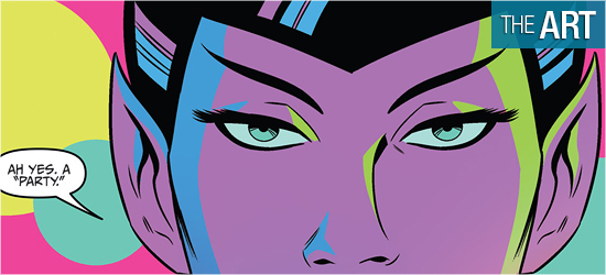
Johnson and Parrott use the games to allow the new characters to show themselves to the reader, and what they show is good. There’s even a few pages where there’s a party that night with more of their character traits on display. The most telling page is 13, after their day at the competition, with one member showing a hot-headed nature. 19 is the most surprising, with one character doing something that shows some things never change with time.
The story set in 2258 has Kirk helping Uhura, in the most unpredictable way, and with Kirk’s annoying questioning of his companion. This continued the mystery of what Uhura thought she heard, with the truth just within the future communication officer’s grasp. The strongest scene between the pair occurs on 10, with the final bit of dialogue being strong stuff and the perfect button push.

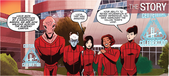
Looking at Derek Charm’s artwork is like gazing at an animated episode of a Star Trek series, but better than what Filmation provided. The first two panels of the book show Charm’s ability with settings, starting with an exterior shot of the Academy before going inside the enormous dining hall. The zero gravity battle is a very abstract setting, but works tremendously well because of the poses Charm gives his characters.
Pages 13 and 14 are a new setting for the film characters and it looks not too far removed from a similar setting in today’s world. I have to give major kudos for the chairs used on Page 12 which are fantastically retro! The party sequences are great, with details of the gathering shown in three small circles.
The characters continue to look great. Charm’s aliens are outstanding. They populate the background seamlessly, showing the diverse student body of the Academy. The first set of these characters are shown in the foreground at the top of Page 2, returning in the zero gravity scene, and at the party.
The lack of gravity allows Charm the opportunity to draw characters have several twisted positions that are wonderful. Page 18 is the highlight of the book with one character’s actions at the party. Kirk and Uhura also look good, with his “wing it” attitude continuously causing her consternation.
There’s no credited colorist, so I’m going to assume that Charm did this element as well. It, too, looks great. The way the cadets’ uniforms stand out against the ivory interiors of the Academy are terrific. When the non-human cadets appear, their colors allow them to stand out even more.
The settings of 2258 are more strict in their color schemes than that of 2261: they are white, black, and gray. These colors make what Kirk and Uhura do a little more serious than the bright pastel colors of the new cadets. I like their colors just as much, with the zero gravity and party scenes particular stand outs, and their sequences seem more lighthearted.

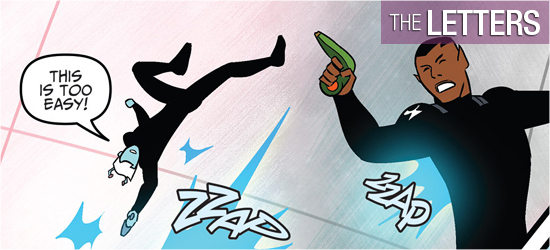
Scene settings, dialogue, and narration (all three are the same font), computer text, sounds, and Vel’s speech are brought to life by Neil Uyetake.
It’s an adequate job, but I’m disappointed that the first types of lettering I’ve listed were done in the same font; they should be differentiated.

