Our Trek Comics editor Patrick Hayes returns with a review of November’s edition of New Visions, IDW Publishing’s Star Trek photobook comic series.
Order New Visions #9
Spock is front and center of this issue’s cover, and looks to be intense pain, actually making a fist with one of his hands. To his right is Dr. McCoy, who looks as though he’s saying something of concern to the Vulcan, and to Spock’s left is James T. Kirk, who is concerned at what his best friend is enduring. Behind all three is a luminescent blue mass with a pulsing pink center. Tendrils resembling that of a jellyfish writhe out from its center, perhaps seeking to entwine the iconic trio?
A great image that suggests much but reveals nothing, created by John Byrne. Having this image underneath that classic Trek font is like the cherry on top. I want this as a poster/print. Grade: A+

The Enterprise is making its way through space when Spock receives a message from a civilian channel that causes him to ask for a rare leave of absence for personal reasons. Respecting his privacy, Kirk allows his first officer to go. Once off the ship, Spock books a private shuttle and goes to the source of his message.
It takes him a few days to get there and in the meantime McCoy and Kirk are having a drink in the captain’s quarters where the doctor expresses concern at the Vulcan’s leave. Kirk’s response is fantastic, “The issue is Spock’s privacy…and that is something I will not violate.”
Spock gets the focus of this issue, but it’s punctuated by Kirk and McCoy wondering if Spock’s mysterious trip might need their help, with the captain battling his desire, and McCoy’s suggestions, to see what the Vulcan is up.
I liked these brief reminders that Spock has a group aboard the Enterprise — a family — that is concerned about him. Uhura is the first one to question him about his message before the captain or the doctor chime. It’s this sense of family, Spock’s safety net, that he’s abandoned to go far away on his journey. It’s always great to see the crew looking out for each other.
I can’t, and shouldn’t, reveal who has called him, but it’s a supporting character that meant much to Spock on one of Trek’s famous television episodes, and just seeing her sent my heart soaring, as it must also do to Spock. The reason he’s gone to visit this character is revealed at the bottom of Page 12 and it’s a, pardon the phrasing, fascinating reason.
The position he’s been placed in is a problem for which there seems no way he can assist, and he states as much on 17. However, some dramatic irony has occurred just before this moment and the reader is drawn further into this tale by John Byrne to see what Spock’s reaction will be. The dialogue between Spock and the character on Pages 22 – 25 is pure Trek joy; it’s completely original, but has the feel of an episode.
The solution to the problem is not smooth for the characters, with the final two pages of the story being undeniably moving. All that was missing was the music to accompany it. Another fantastic story from Byrne. Grade: A+.

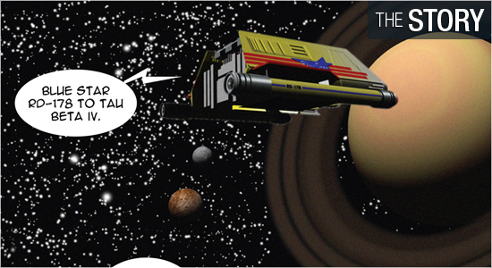
The photomontage skills of John Byrne are as slick as all of his previous issues, and this installment seems to have the most original content yet. Two pages of scenes on the bridge, which feature the five core members of its crew, transition to a new location with a neat panel at the bottom of Page 2.
The third page contains the opening narration of the series with the title and introduces a new setting with a design that fits smoothly with the show. Helping to make it so is not just the setting itself, but the clothing on the individuals that share the panels with Spock: I really like the young couple in the center, the couple off to the right, and the individual that Spock speaks with — such a cool design on that uniform.
The location that Spock goes to share similar elements of settings from the show, but has just enough differences to make it different. It’s similar to what set designers on the show had to do: recycle as much as possible, but change just enough to make it a new environment.
With the exception of the clothes worn, the individual that has summoned Spock looks exactly the same. I love the lighting on this character in the second panel on Page 10; this panel had me hearing the music that accompanied this person. There is a new character in this story and there are several scenes involving him. It’s really neat to see this character fit into the scenes with these characters from the 1960s and I really liked him on 23 – 25.
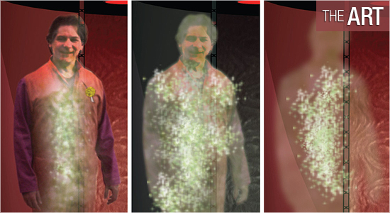
Coloring becomes key to this character and it continues to make the reading experience similar to watching an original episode. There are several scenes that would have been financially impossible for the show to accomplish, let alone attempt, and Byrne makes them showstoppers when they appear: Pages 21, 22, 27, and 32 — which is a sweet highpoint. Grade: A+.

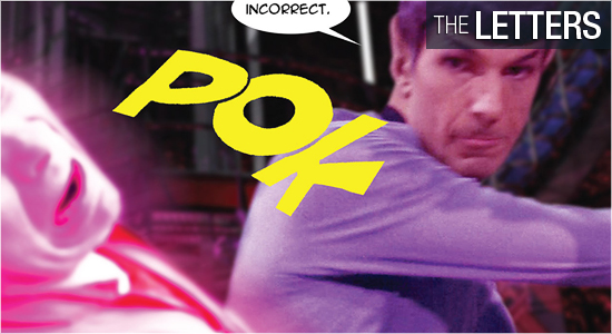
Dialogue, captain’s log and narration (same font), opening series’ narration, title, credit and dedication, writing on a ship, sounds, and yells are all created by John Byrne. I like that on Page 2 Byrne uses a different font and colors to visually show the difference between dialogue and other forms of communication.
Some letterers will use the same font for dialogue, thoughts, and narration, but it should be differentiated because they’re all different. I’m glad Byrne does so, and I’m also extremely glad for the sound effects he employs. Sounds are often not in books, but I relish their use and I’m glad they’re here. Grade: A+.
