It’s this month’s issue of IDW Publishing’s Star Trek comic series: the second installment of “Live,” the next adventure in the new Five Year Mission.
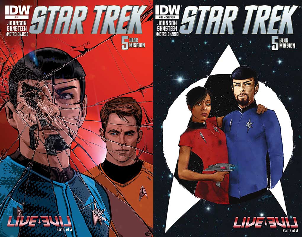
This month’s release brings a pair of complementary covers:
Order Star Trek #51:
- Interior artist Tony Shasteen does the regular cover this month, and it’s fantastic in concept and carried out flawlessly. There have been countless interpretations of Spock from the Mirror Universe, but not one like this before. Spock and Kirk face the reader and in a terrific three-dimensional effect, the image has shattered, much like a mirror, and the broken pieces of the mirror have distorted the characters. Kirk looks great as he he stares at Spock before him, but it’s the Vulcan that steals all focus as he’s put together in jigsaw puzzle fashion, with some pieces showing the Spock that fans are familiar with, with others showing the bearded villain of the Mirror Universe. Spock looks sensational. The impact of where the glass was damaged is on Spock’s left eye and draws the reader’s focus to him and then allows him or her to look at both Spocks visually trying to top the other.Having the background be a blood red color is a smart way to have the characters’ flesh and uniforms stand out.
- The subscription cover is by Lorelei Bunhes, and features Uhura and Spock of the Mirror Universe side by side within the outline of a delta shield. Their poses say a lot about them: she looks brutally confident, sporting a phaser in one hand and her arm wrapped around her man; he stands straight and rigid, as if he is unbending. With the delta shield in white and black the characters pop out against it, and having all set on a starfield make the entire image pop. This shows both characters nicely.
Picking up from the last installment on Arronia Two, mirror-James T. Kirk and mirror-Harry Mudd are discussing the price of the object that Mudd has purloined for the supposed dead man. Mudd tells Kirk all the work it took to get and James agrees.
Their discussion settled dramatically, the story moves to Ceti Alpha V where the Mirror Universe’s Khan — another version of Benedict Cumberbatch — is telling our Kirk that “Given the circumstances, we have no choice but to trust each other.” Their position was hammered by the Enterprise in the previous issue and they were lucky to escape with their lives.
Having dealt with Khan, in Star Trek Into Darkness, Kirk is leery of trusting the genetically enhanced man. Going against his judgment and the concerns of his crew, especially Dr. McCoy, he realizes he has only one play and that’s to go with Singh (the name this Khan prefers). On Page 5 writer Mike Johnson begins the “Wow” moments of this issue with how the survivors plan to escape the planet.
There have been many additions to the Mirror Universe story for the classic crew, but this is the first time the reboot crew has encountered them and Johnson has plenty of outstanding moments to make this feel like a fresh experience.
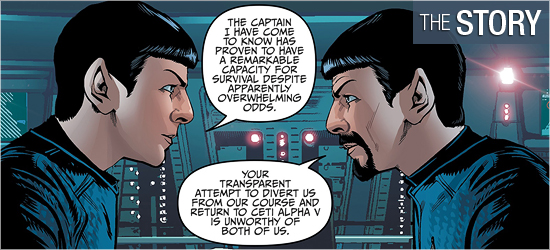
Spock meeting mirror-Spock is an obvious go-to moment, and it happens, and it’s got all the intensity fans would expect, but with a super twist at the bottom of Page 8. Then Johnson outdoes himself by having another group of characters go to another location, this one stated at the bottom of 10. Going to both of these locations is worth the price of the cover.
The Mirror Universe characters are really fun. The alternate Uhura is an absolute buttkicker, staying close to the man in charge (and I hope he’s watching her) and making a disturbing comment issue from her on 8. Mirror Sulu has a whole page with his counterpart, 11, and it shows splendidly how similar and different they are.
There’s an absolute gut punch on 12 and 13 where two mirror characters have strong moments, with one individual being just like his counterpart from the original television episode. I could have gone the entire issue just having both crew interact and been completely happy.
The character work of artist Tony Shasteen continues to be strong, and he’s outdone himself in this issue. The film characters continue to look exceptional, but now he gets to put unique spins on their Mirror Universe counterparts.
Kirk is subtly different with a few days of facial growth, Spock is fantastic sporting his iconic “evil” beard, Uhura is magnificent with her shorter hair, Sulu is more hardened than the Hikaru I’m used to (and Shasteen shows this in only three panels!), Scotty has got a roguish new look, and Chekov’s hair is flippin’ fantastic — I didn’t think it would work on him, but he’s just awesome to look at it and makes him so intense.
Khan also impresses; his long hair, with strands always perfectly draping across his face, is beautiful. I didn’t care for this character in the last film, but looking at him like this makes me, somewhat, forget that movie.
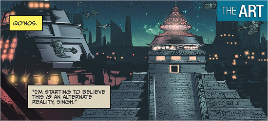
I’ve not been thrilled with the backgrounds that Shasteen has done in previous issues, but this issue has them better. This is due to a good portion of the book not being on the Enterprise, and that’s where I’ve had most of my complaints.
The book begins with Kirk and Mudd in a seemingly abandoned port; it’s completely disheveled, the perfect location for Mudd to operate out of. The first panel establishes the exterior and the panels that follow go inside, where the setting is not blurry like the bridge of the Enterprise has been.
Better still, Shasteen uses a nice lighting outline for the characters to work against on the second page and it works perfectly. I’m not liking the rock work on Ceti Alpha V which has the blurred effect that bothers me, however, what’s revealed on on Page 5 left me gobsmacked and was pure perfection — different enough, but similar enough, to leave me agape.
Once on the Enterprise the background images are the sharpest I’ve seen Shasteen use and they were much appreciated: I could easily seen the smooth linework in the design of the bridge and its consoles. This was a big improvement. It’s only on Pages 12 and 13 does the background go blurry. The final two worlds return to the crisp linework, though the top of 19 is blurry.
This was a big improvement over the previous issues.
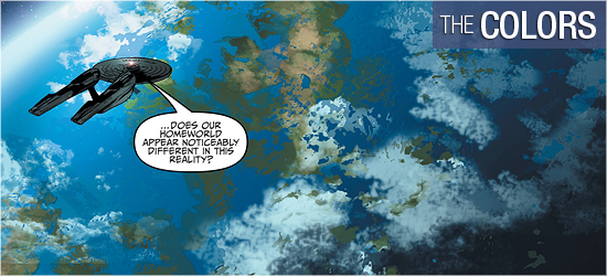
The first two pages have colorist Davide Mastronlonardo using tans, browns, and oranges to make Arronia Two appropriately broken down.
The interior of the MU Enterprise have a darker blue than the ship fans are used to, but, take note, one character has two panels that go burnt crimson, showing this individual to have a fiery personality. The color scheme on the second ship brilliantly has the same colors as its counterpart from the episode that spawned this tale.
The bright colors on the world shown on 15 are so unlike what this world should be make it a showstopper. The final world has all the dark colors expected, though the lighting effects with colors and a door give it good sense of life and menace. Words should also be given to the exceptional coloring done on each characters’ skin, making Shasteen’s creations look three dimensional.
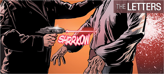
Scene settings and dialogue (the same font), a yell, two key sounds, and the tease for next issue come courtesy of Neil Uyetake.
There’s no need for more sounds in this story, as it needs to be primarily dialogue, but I still want to see a different font used to differentiate scene settings and dialogue, as one is spoken and one is not.

