Our Trek Comics editor Patrick Hayes is back with a review of this month’s issue of IDW Publishing’s Star Trek comic series: the final chapter of “Deity,” the next adventure in the new Five Year Mission.
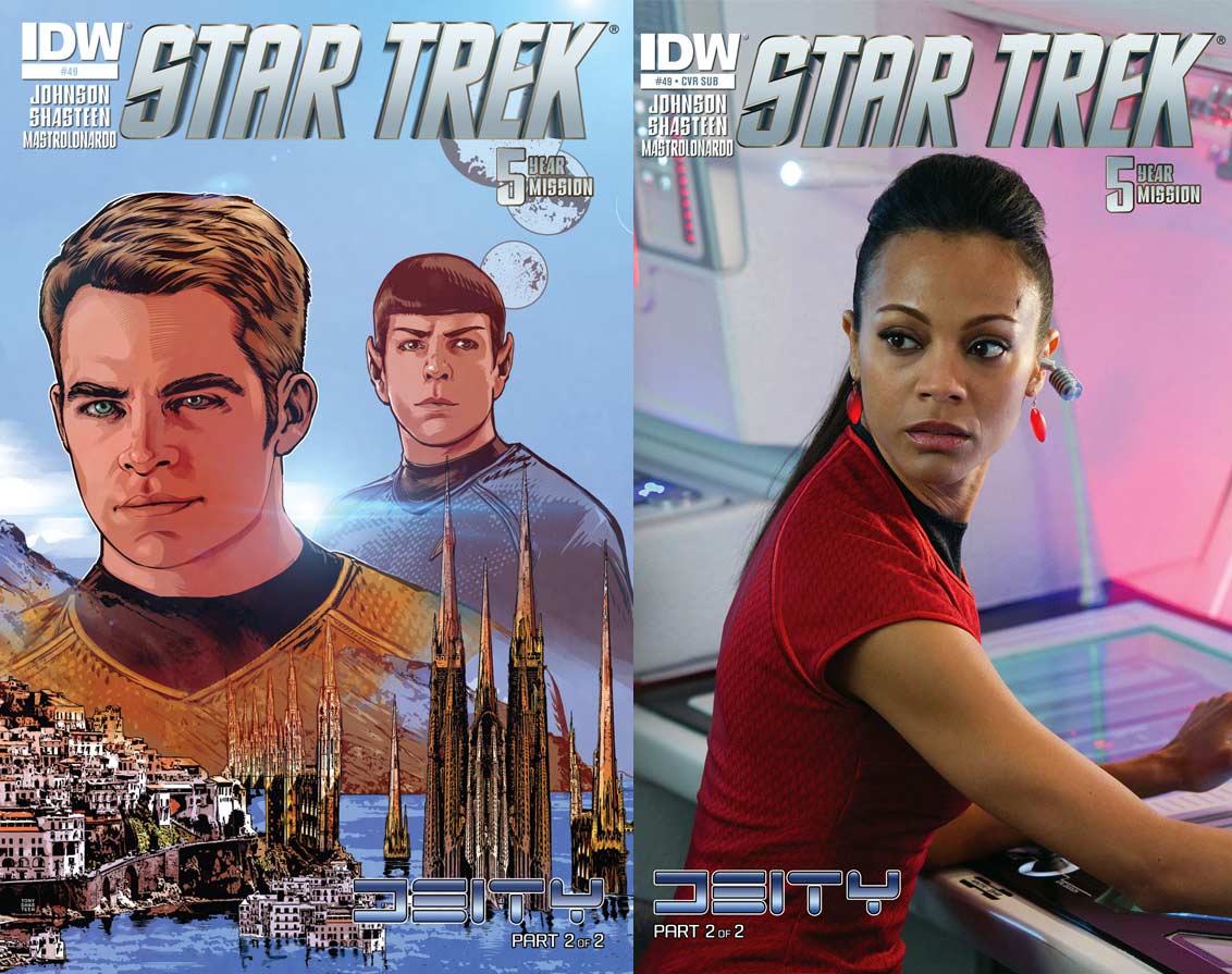
As usual, this release is available in two different covers, both spectacular in their own right.
Order Star Trek #49
- The first cover of this month’s pair begins with the regular cover by Tony Shasteen. This is a terrific cover featuring images of Kirk and Spock above the Drowning City, home to the natives of Banks-216.Kirk and Spock look just like their film counterparts and the city is quite spectacular. It resembles the Sagrada Familia, the giant Bascilica designed by Antoni Gaudi. The coloring is also really good; it’s been a while since a calm cityscape has been on the front of Trek comic.
- The subscription photo cover features Lieutenant Uhura turning to seek clarification on an instruction that’s been given. It features Zoe Saldana at her station with a nice white and violet color scheme on the setting. This character doesn’t do much in this issue, but who am I to slight a cover featuring Saldana?
Sulu starts off the tale with a recap of Issue #1 in his supplemental log: the Lieutenant lead a team to this world where their observation blind failed and they’ve been captured by the locals. They’re marched though large fields of wheat to the Drowning City. Sulu tries to speak to the native leading them, but is told to be silent until before the Aerie.
High above the planet, the Enterprise is face to face with a ship shaped like a crescent that dwarfs them. Chekov reports that they’re being scanned, while Spock adds that an energy transfer has been completed between the unknown ship and somewhere on the surface. The Prime Directive has been broken, now Kirk has to decide how much further he has to strain it to save his people.
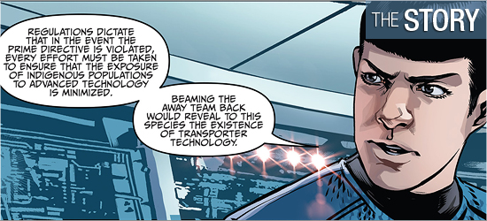
This second and final chapter of “Deity,” by Mike Johnson, has a split story that showcases the risks involved with observing a new race. Sulu demonstrates the expected amount of courage and regret at what’s occurred and it was neat to see him in his first leadership position on an away mission. This will keep readers wondering how long it will be before he’s promoted to captain of his own ship; hopefully, it won’t take seven films.
The action on the Enterprise is the A-story of the issue, as Kirk has to make some tough choices. It was good to have Spock towing the Federation’s line before Kirk’s emotional considerations, but knowing who the captain is, the final say is never in doubt, making the action taken on Page 9 predictable.
It’s at this point that the story takes a turn, and not for the better. A new voice appears on Page 10 and changes the focus for the Enterprise’s crew. Within two pages Kirk is fielding opinions from his senior staff and they approach their problem from very different directions.
I was very surprised at Kirk’s reaction on Pages 14 and 15; this seemed well beyond Kirk’s established pattern of interference, but then I realized I’m thinking of pre-reboot Trek. This Captain Kirk is still evolving. There is a fantastic change in a group’s thinking on 16, but it’s never expanded on, nor is the location ever returned to. This is followed by an action on 17 that has a surprising result on 18. The final two pages wrap up the preceding 38 pages (if one were to include the previous issue) far too quickly.
There is much unresolved, with no mention of how it will be resolved, save a one panel explanation on 19. The final page of the issue addresses Sulu’s performance. I’m not concerned with Sulu, I know he’ll be fine. I’m more concerned with the natives on Banks-216. Additionally, the wonderful addition of new characters introduced in the previous issue have become silent and useless, serving only to represent crewmembers: characterization abandoned for a body count.
This story seems as if it were edited down from something larger and needs four to five pages to answer the unanswered at its close.
This is some of the best character work I’ve seen from Tony Shasteen, but those backgrounds are still looking like photo inserts. The first page shows super work on the Enterprise away team being marched off by the natives. Sulu and Scotty look terrific, which just the right amount of regret on the lead officer’s face.
The crew on board Starfleet’s flagship also look good: Spock displays nice looks of surprise and terseness for a Vulcan, Kirk just the right amount of displeasure at the decisions he’s weighing, and concern from Chekov at the peril they’re facing, though why he’s smiling at the bottom of 13 eludes me.
The aliens look great. I’m always pleased when alien creatures look bizarre, yet somehow familiar. The residents of Banks-216 certainly fall under this description. They could be simply dismissed as giant bird people, but there’s too much detail to allow for a such a simplistic definition. The work on their eyes is great, as is the decorations on their beaks and the piercing in their ears.
The close-up of one of the Aerie on Page 7 is great: I love the feather work around the throat, giving the character an aged look, and the expression on its face gives it quite a bit of gravitas. A nice twist in this species is that Shasteen gets to illustrate a detailed picture of one of their young. In drawing one of their children next to one of their elders makes this species more realistic, as one can see how they age.
However, the backgrounds are again the bugaboo of the visuals. The double-paged spread of Pages 2 and 3 is spectacular, but looks an awful lot like a picture dropped in and manipulated with slight additions. There are two tell-tale signs of this on Page 2 alone: the sky and the beach. The sky contains a photo of some clouds placed in. How can one tell? Look at the sparse linework in the top left corner over them to suggest they were drawn in, yet on Page 3 there’s no linework — it’s just the photo. Now I could be wrong, Shasteen might have painted those clouds in, but it doesn’t look like it.
Another example is the beach. When a photo is run through a computer sometimes shadows come out as dots or smudges because the machine can’t process the image flawlessly. There’s a pier that starts on Page 2 and runs on to 3. Just below where the base of the pier leaves the beach there are several dots and smears of shadows. They look more like a photographic after effect rather than an artistic contribution.
The interiors of the Enterprise are even worse, containing the blurry computer console backgrounds that have haunted this series for almost a year. The first two panels on Page 5 illustrate this, and I’m reviewing this book from a tablet — I can only imagine how imprecise this setting looks in a comic sized illustration.
These settings leave me shaking my head in wonder.
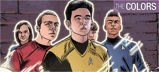
Davide Mastrolonardo’s contributions to this issue are excellent. The opening panel has a wonderful job done on the large wheat fields the characters are walking through, which highlights the bright colors on our heroes’ clothes and the native’s clothes and crests. The appearance of the Drowning City is also well done, colored in a very natural way.
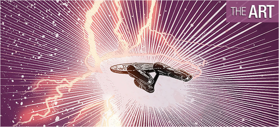
The double-page splash that follows on 4 and 5 is outstanding with the coloring on the alien ship superb, as is its energy wake on the Enterprise. Added to this are the panel inserts of what’s occurring on board the Enterprise — cool blues for settings and white boarders around them make them stand out.
The best coloring is on Page 11 where this same color pattern is just perfection.
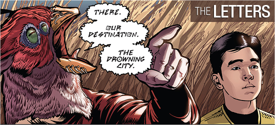
This was a revelation by Neil Uyetake this issue. In addition to dialogue and narration, there are two types of alien speech and they’re incredible.
One of the joys of reading a comic book is the lettering because a font is another way to suggest to a reader the alien-ness of a character and Uytake does double duty this month. I would love to revisit this world just to look at the natives’ speech. As for the second font, I won’t spoil whom it’s from, but it, too, is awesome. I hope this group is also revisited in a later issue.
There’s a transporter sound in this issue; it’s the only sound for it’s the only one the story requires. I have to add that I still believe that a crewmember’s log should be in a different font from the actual log as it’s a different form of communication.

