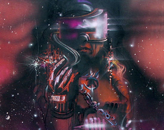
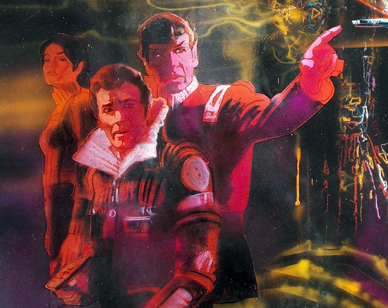
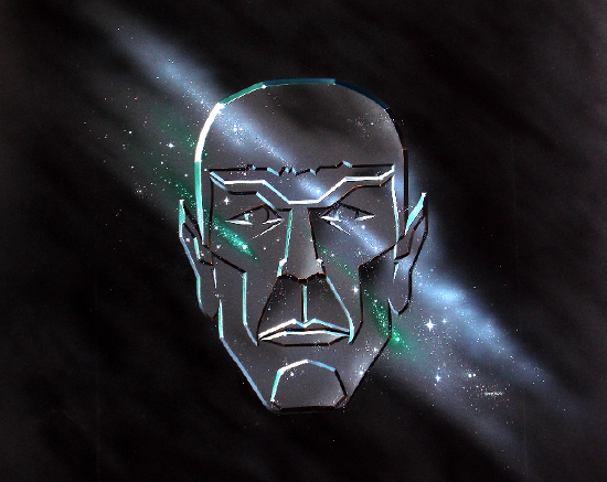
Earlier this summer, a poster in our Omega Sector forums shared a number of images of preliminary theatrical poster design for the first Star Trek features — we reached out to him, and Harry Angelikas shared with us high-quality scans from his private collection.
He’s the son of Spiros Angelikas, an artistic designer and partner to Paramount Pictures who worked with several illustrators (including the great Bob Peak) to create the feature film graphics we now associate so closely with the early Trek movies.
![]()
Harry Angelikas: My father, Spiros Angelikas, worked with Bob Peak on the theatrical illustrations for the first several Star Trek films. My father was the designer and owner of the agency, Spiros Associates, and Bob Peak illustrated the final pieces.
My father has worked on over 100 films; blockbuster kits like the Trek movies, Friday the 13th, Raiders of the Lost Ark, I could go on and on.
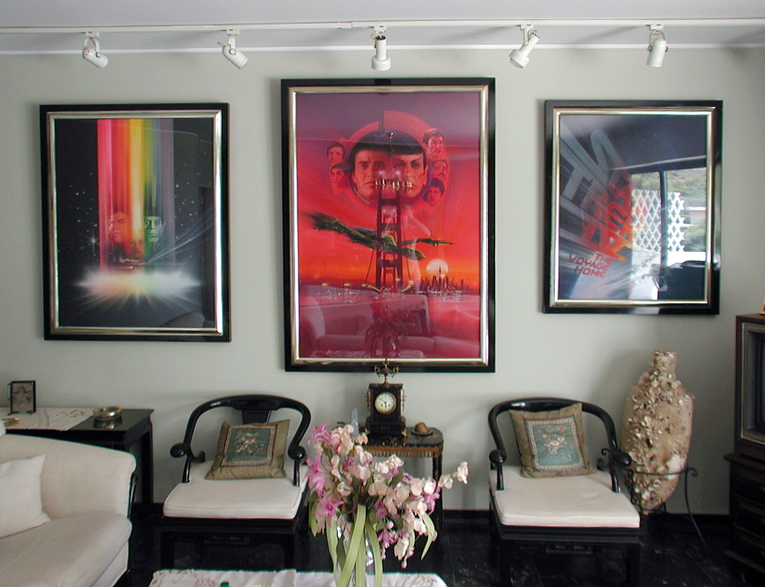
I’m sharing these with you — and Star Trek fans at large — to honor my father. The illustrators that did all the works my father designed were like ink jet printers back in the day.
My father would give the illustrator rough copies of his ideas, sketches, etc.; the illustrator (mostly Bob Peak, for Star Trek) would then put on canvas what he was instructed to do.
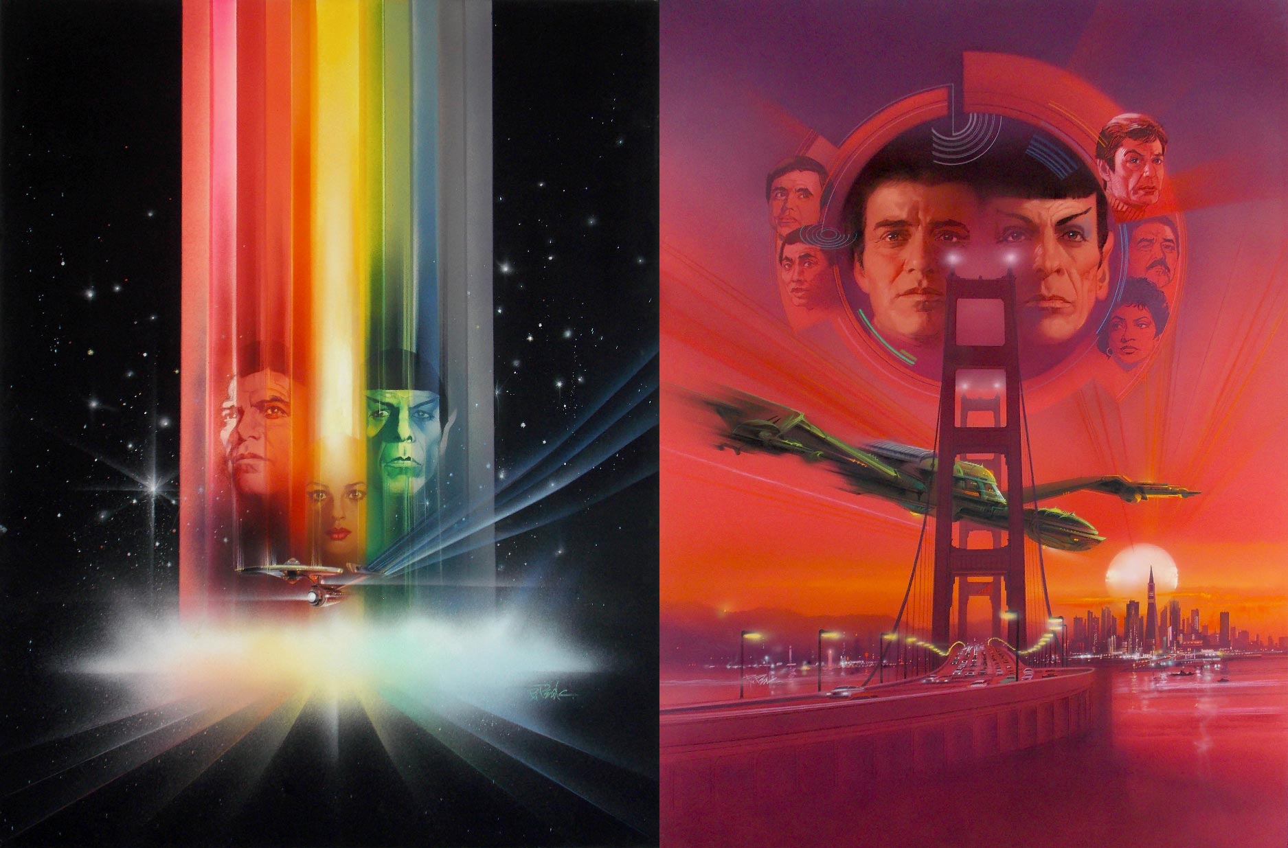
I am in the same line of work as my father once was, though all my concepts and ideas are done in Photoshop and Illustrator 99% of the time.
They didn’t have that software back in the day, which is why I am trying to give more credit to the creator/designer of this stuff like my father. Google my father’s name along with “Friday the 13th poster”, you will learn more about some of his work.
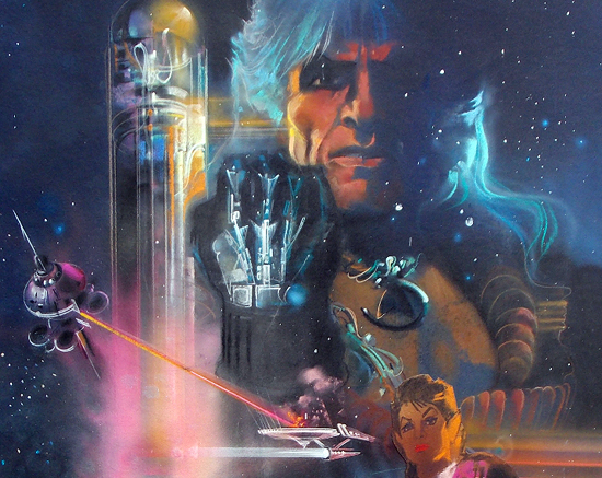 Concept designs for ‘The Wrath of Khan’, later replaced with the final, well-known version.
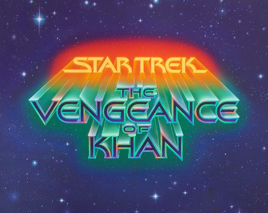
Regarding the ‘Vengeance of Khan’ top and bottom sections — that’s the way it was made. The artist began working on the title, but was later asked to make it bigger while he was working on it.
I would have cropped it to where the art was extended when I scanned it in, but when he completed the piece, he put his signature on the extended part.
This is the original illustration for ‘The Search for Spock.’ The art does not contain the ship or title treatment — back in the day, those were done on separate sheets of acetate.
This was not illustrated by Peak; this piece was done by Gerard Huerta.
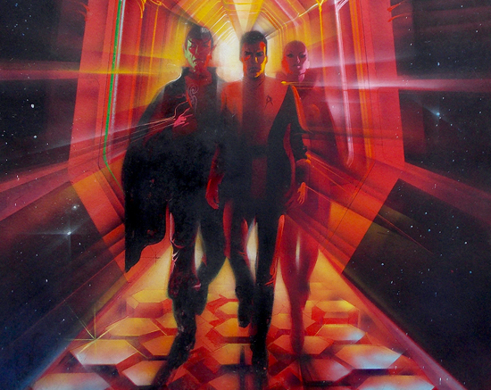
The posters look great when scanned, but seeing the actual illustrated images up close is breathtaking. I’m one lucky SOB to be able to admire these things all day — and I’m so proud of my father!
* * *
Thanks again to Harry Angelikas for sharing these unusual and rare designs from Trek history with us!
![]()
 | Order Star Trek: The Next Generation Season 4 Blu-ray today! |  | Order TNG - "Redemption" Feature Blu-Ray today! |
|---|

