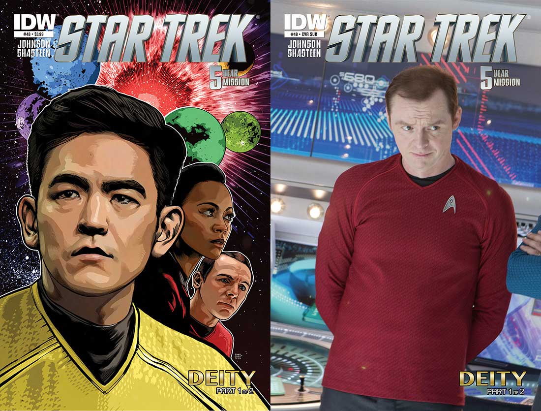
Our Trek Comics editor Patrick Hayes is back with a review of this month’s issue of IDW Publishing’s Star Trek comic series: the first chapter of “Deity,” the next adventure in the new Five Year Mission.
Order Star Trek #48:
We’ve got another pair of covers to add to your collection (if you’re going to go all Kivas Fajo on this issue).
- The regular cover is by Tony Shasteen, who’s also the interior artist. This features a super close-up of Sulu, with Uhura and Scotty behind him. The trio have a starfiled behind them including four planets and, what appears to be, an explosion. The art is really good, as Shasteen is, but the coloring isn’t working. When I look at this image I’m instantly drawn to the swirls of colors on Sulu’s face, and then it’s the same on Uhura. It seems too random. The shape of these colors and their combinations lessens the image.
- The subscription cover is a photo cover of Simon Pegg as Montgomery Scott. He’s got his hands behind his back, looking concerned about something that’s occuring off to his left. He looks great and the background, with all the technology, looks awesome. However, if one were to look to the right it appears that Dr. McCoy is also in the shot; I assume it’s the doctor and not Spock because the person’s arms are crossed. With this extra person included in the image it seems as though this was created at the last minute — there really wasn’t any other picture of Scotty to be found where he was solo?
The first half of Mike Johnson’s “Deity” opens with Sulu being called into Kirk’s ready room where the captain tells the helmsman that he’s going to lead an away team down to one of the planets of the Banks-216 system. He’s allowing Sulu to lead because “…one thing I’m sure of is that you’ll be the captain of a starship one day. The more experience you have in every facet of the ship’s operations, the better prepared you’ll be.”
Just as Sulu is ready to leave and pick his team, Scotty enters to show off a new piece of technology he’s created: a holographic screen to allow survey teams to watch native civilizations without being seen, such as in the beginning of Star Trek: Insurrection. The next page deals with whom Sulu chooses and then it’s off to the planet’s surface where the adventure begins.
It was extremely smart of Johnson to include certain elements from previous Trek incarnations: he keeps Kirk off the planet (as captains are supposed to do on The Next Generation), he nudges Sulu toward becoming a captain (Star Trek: The Undiscovered Country), and technology from the ninth film. Doing this allows him to bring Trek 2.0 up to where the original Trek left off more quickly.
It was also nice to see the focus taken off the big three characters and fall on Sulu, Scotty, and three other characters. Every member of the away team contributes to the understanding of the civilization they encounter, though none of them are prepared for what happens, and Page 14 is pretty spectacular.
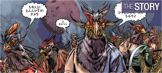
Helping with the mystery of the story was having an untranslatable race. By having the natives’ speech be so foreign the universal translator is worthless draws readers into the story more; they’re trying to discover what’s going on just as much as the crew is — and if the language wasn’t creating some tension, the occurrence on 18 certainly will.
I’m confident that Johnson will have a logical explanation for what’s going on, but this looks like something Lovecraftian.
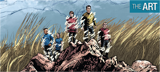
This is Tony Shasteen’s best Star Trek work to date. The familiar characters look great, as they always do, but the addition of three new crewmembers shows he is adept at creating individuals that haven’t appeared on the big screen. I was especially pleased with Ferdowsi’s look; drawing him in the likeness of NASA engineer Bobak Ferdowsi really sets him apart from anyone else from the film franchise.
Scotty is the big standout of the classic characters, with some amazing facial expressions, particularly when showing Kirk his invention and on Page 18. Even if there were no dialogue, Shasteen flawlessly communicates what Scotty is saying and feeling.
The real show stopper of the issue is the natives’ structure first encountered on 7. I’ve never seen anything like this in a Trek comic and it’s both alien and familiar, which is the perfect pairing for a Trek civilization. I was so glad that the story allowed Shasteen to go up close to the landmark to show readers what is on it, and to give him the opportunity to add sweet little details into the object. I really like the angle of the third panel on Page 12, and 14 is a terrific “Uh, oh” moment.
The aliens have a very specific look. They’re bipeds, but, as with the structure, they’re a combination of alien and familiar things. Without spoiling them, this type of lifeform hasn’t been shown before that I can recall, with only a species from the animated Star Trek series episode “Jihad” coming the closest; those these characters are much more sophisticated looking. Their size is also impressive, and their wearing of jewelry and paint slick. I really like the way they look.
The only mark against this work is the five pages that feature photo backgrounds on board the Enterprise that look unbelievably fuzzy compared to the sensational linework of the characters.
I just wish Shasteen wouldn’t continue to use photos for backgrounds.
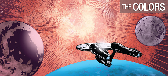
Some nice work on this issue from David Mastrolonardo. The planet that the team goes to has some excellent work done on the tall grass, with realistic light and dark shades on the blades to make them incredibly realistic. I also like the ominous colors on the strucuture–it draws attention and makes the reader a little off balance. Electricity is a key component on this world on 14 – 18.
It’s an incredibly powerful coloring job that matches the dramatic events. As with my cover concerns, the shading on some characters’ faces seems too random, almost like their Rorschach-lite, such as on Sulu at the bottom of 1 and Kirk at the bottom of 4. This occurs infrequently, but still caught my eye.
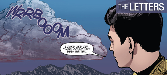
Dialogue and helmsman’s log (the same font), sound effects, the natives’ speech, and the last page’s “To Be Continued!” are created by Neil Uyetake. I was especially taken with the natives’ speech. I love seeing new fonts that infer speech, but is so alien there’s no chance in understanding it. I loved their scratchings of font.

