Our Trek Comics editor Patrick Hayes is back with a review of this month’s issue of IDW Publishing’s Star Trek comic series: the final chapter of “Eurydice,” the next adventure in the new Five Year Mission.
Order Star Trek #45:
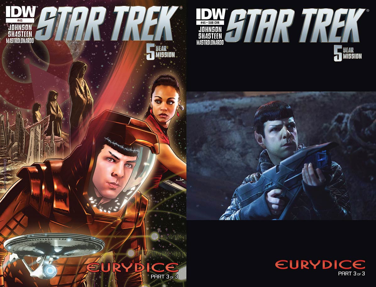
- Joe Corroney and Brian Miller have created another sensational cover for this series. Expanding images from the upper left include Vulcan, the IDIC symbol, gigantic Vulcan statues and buildings, Spock in an environmental suit, and to his left is Uhura at her station reacting to a something, a computer overlay of a series of circles and undecipherable writing draws the eye to this issue’s story title which is preceded by the Enterprise. Corroney is a master of capturing the likenesses of any franchise’s characters, and we should count ourselves lucky he’s a Trek fan. Coloring this piece is Brian Miller, who uses reds in this piece impressively. Red can be a harsh color that overpowers an image, but Miller tames this primary color by darkening it to rose or highlighting it with yellow, making this piece resonate dynamically. This pair continue to make magic.
- The subscription cover is a photo of Zachary Quinto as Spock, holding a phaser rifle on Qo’noS (from Star Trek: Into Darkness). The emotionless Vulcan looks concerned with something that’s going wrong. It’s an okay picture, but I prefer full bleeds for my photocovers and this has too much of a border above and below the image. Besides, Spock doesn’t do much in this issue, only speaking in one panel. This makes it seem as though the first photo that’s found is the one being slapped on this issue as a variant.
The final chapter in this “Eurydice” trilogy, by Mike Johnson with ever-present story consultant Roberto Orci — and how long before readers see Simon Pegg in this position, I wonder — opens with the title character feeling guilty for selling the Enterprise crew to “a nefarious alien intelligence known as the Syndicate.” However her reason for doing so is immediately revealed, and, sadly, understandable.
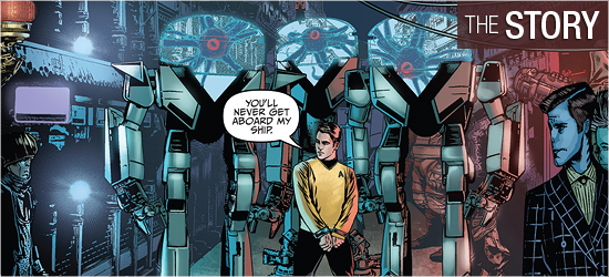
The next two pages show the Enterprise being held in place by several massive clamps as Kirk’s supplemental log entry brings readers up to speed, ending with him being shown on a crowded street, manacled, and being led by three members of the Syndicate in twelve foot tall robot suits that allow them to move outside their enclosure. They order the captain to order his crew to surrender. He contacts Sulu, who reports they’ve received a delivery of dilithium, but the ship is locked in place. Kirk closes his conversation with the helmsman with an odd turn of the phrase that’s code.
This was a good introduction to the issue: ship captured, captain giving subtle code to crew, and away team in eminent danger. However, this has an unbelievably anticlimactic ending that had built so strongly in the previous two issues. The four members of the away team are in the greatest danger, but their escape is made with the easiest and least surprising way. Kirk’s escape is equally simple.
The retribution from the villains never appears. The ending, at least, closes in the tradition of classic Star Trek, but the story leaves one empty. The purpose of these three issues seems to introduce a supporting character and group of villains to reappear at a later date. This was incredibly milked and could have been accomplished in two, or even one, issue.
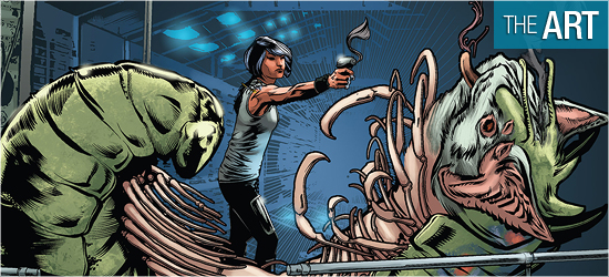
The saving grace of this issue are the visuals by Tony Shasteen. There is no faulting his fantastic creature design, beginning with the Syndicate, who look like Lovecraftian nightmares, and now gaining mobility in robot suits increases their coolness factor by ten. There is also a sensationally designed character that appears on Page 8 that is amazing. This is not the traditional Star Trek humanoid alien, but a spectacular creature whose appearance creates terror that actually matches its horrific goals.
Eurydice continues to be an excellent looking character who’s just different enough from humans to stand apart, but similar enough to gain readers’ sympathies and ire. She looked particularly good on Pages 1, 10, 17, 19, and 20. The Enterprise crew looks as sharp as ever under Shasteen’s skills: Kirk is dashing and Sulu and Chekov get a lot of page time.
The tech on the book is strong, with the Syndicate’s suits, Eurydice’s ship, and the Enterprise looking smart. Shasteen’s use of photographs for backgrounds is hit-and-miss, with the city streets and the interior of the title character’s ship looking slick, but the Enterprise bridge is a blur. I don’t know if this is a done to save time under the pressure of a deadline, but I’d love to see this artist do complete backgrounds. This technique sticks out so much as to hurt this book’s enjoyment.
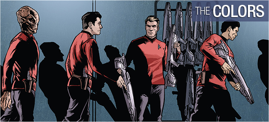
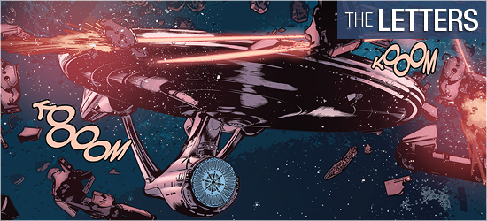
David Mastrolonardo does a solid job on this issue, starting with cold gray to match Eurydice’s mood, then moving to a blue and white double-paged splash to highlight the heroes’ vessel in space, before using the same two colors to represent complete alien-ness.
The bold colors on Starfleet’s finest make them instant eye catchers. Mastrolonardo’s work on Page 7 is very strong, given the depth of the space. This is followed by beautiful coloring on its inhabitant. Light effects are also really well done, from blaster shots, phasers, and transporter effects, with Page 12 being excellent.
Dialogue, narration, and captain’s log (all the same font), the Syndicate’s speak, a unique individual’s speech on 8, and next issue’s tease are crafted by Neil Uyetake. The work is good, though I really believe that narration and the captain’s log should be a different font since they’re different forms of communication.

