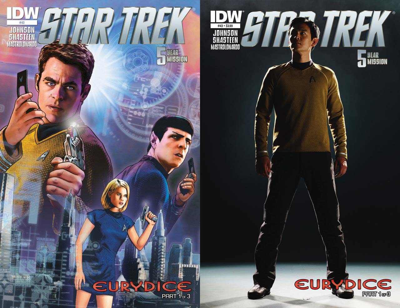
Our Trek Comics editor Patrick Hayes is back with a review of this month’s issue of IDW Publishing’s Star Trek comic series: the first chapter of “Eurydice,” the next adventure in the new Five Year Mission.
Order Star Trek #43:
- Wow! Talk about a gorgeous cover! The regular cover has Kirk and Spock trying to contact each other with their communicators, but something has got the Vulcan’s ear and he turns to look upon an unexpected foe, revealing a surprising show of disbelief from him. Against the backdrop of a futuristic city, Carol Marcus has her phaser ready at the dangers that seem to be closing in on her. Before and behind the characters are technical schematics that bring a harder sci-fi edge to the illustration. The coloring on this is also amazing. Joe Corroney has knocked this one out of the park. This is print, poster, and tee-shirt worthy.
- The photo cover is of John Cho as Sulu, and he’s ready for anything. His hands are at his side and his legs slightly spread to leap into action at a moment’s notice. His gaze is skyward, as if he’s ready to return to his starship. Making this stand out is the simple black background and white stage, with Cho lit slightly to the side from behind, creating a somber tone for the Enterprise’s navigator. Sulu’s not a major character in this issue, but I really love this photo.
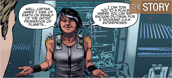
“Eurydice,” by Mike Johnson, begins with the crew in isolated danger. They escaped a gigantic creature that tired to consume them last issue, only to find that their dilithium stores are empty. They’ve only got impulse power, leaving them decades from home.
Faster than you can say Voyager, Kirk decides to go with Spock’s suggestion to journey to a system of 17 planets which may possess the crystals they seek to power their ship.
Johnson does a nice job elevating this above the expected slow ride through space. He begins with a great ship-wide speech by Kirk informing the crew of his decision, which has a great line in the second panel of Page 5. My heart rose at what he said. In four pages, 50 days pass, with each focusing on a different crew member or pair; Page 7 has a solid emotional exchange.
The arrival of the title character propels the issue into familiar territory, but with new perspectives from this rebooted crew. I was glad to see all options put on the table before Kirk, with him listening to all and their choices being surprising. McCoy’s comment was perfect!
The final page didn’t really surprise, but I did enjoy it. Johnson was right to move the perspective to this character. The third panel has a nice bit of commentary which promises a possible turnabout.
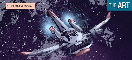
The visuals on this book are by Tony Shasteen, who did a very successful job on the recent Q Gambit storyline. I like his artwork on this issue even more than on that epic. The characters in that earlier saga were good but often looked like copies from photographs. This issue seems like Shasteen is doing more original artwork.
For example, on Page 4 the characters in the second and fourth panels have not been seen before from those angles. The large panel of Kirk on 7 looks great, and I don’t recall seeing him look like that before. The person Chekov is speaking with on 9 has not been in any of the films and she looks wonderful.
The title characters that appears on 12 is an original creation of Shasteen, and her design is very good. She has projections from her arms and shoulders that instantly identify her has alien, which is a nice change from the eyebrow and nose changes from the Westmore aliens.
Eurydice also has a good emotional range, with a nice streak of confident smugness, as shown on Pages 14 and 15. I was enjoying this characters so much I wanted to clearly see her face in the last two panels of the book. That doesn’t happen, but the words or so strong the visual isn’t necessary to get the emotional punch across to readers.
As in previous issues of this series, the backgrounds are photographs. However, unlike previous issues, they don’t stick out as much. I don’t know if Shasteen is picking them or editor Sarah Gaydos is, but the bridge of the Enterprise looks better than it did in Issues #41 and #42.
They are still, obviously, stock photos, as they are unfocused and/or blocky at times, but they just don’t bug as much. I still would like to see artists such as Shasteen given the opportunity to fully illustrate an entire book.
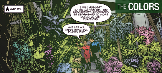
Piggybacking on my last comment, it’s in the coloring where the backgrounds lose their reality in this artistic endeavor.
I can’t blame Davide Mastrolondardo too much because there’s not much he can do to salvage the work. Take, for example, Page 3. Set in engineering, all three panels use faded colors in the backgrounds and in the characters in the foreground to make them blend together better. However, what this does is make everything a faded mess. This location was not this dark in either film, so it follows it shouldn’t be so in the comic. A pale background works better on the bride, but why is it necessary to mute the colors of the characters as well?
The only bright page of the issue is page 7. More color would have made the moment even stronger to the reader, and there’s some excellent shadow work on the couple in the second panel, but even it should have been punched up with more colors in the backgrounds.
Since when has Star Trek been such a dull looking future?
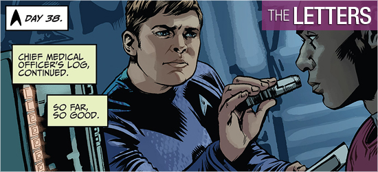
Dialogue and narration (the same font), transmissions, and a bridge alert are the work of Neil Uyetake.
I think that the character narration should be a different font from the dialogue since it’s a different form of communication, and Eurydice’s dialogue font slightly different to show her alien-ness more, but what Uyetake does is fine.

