Our Trek Comics editor Patrick Hayes is back with a review of this month’s issue of IDW Publishing’s Star Trek comic series: the second chapter of “Behemoth,” the next entry in their Five Year Mission.
Order Star Trek #42:
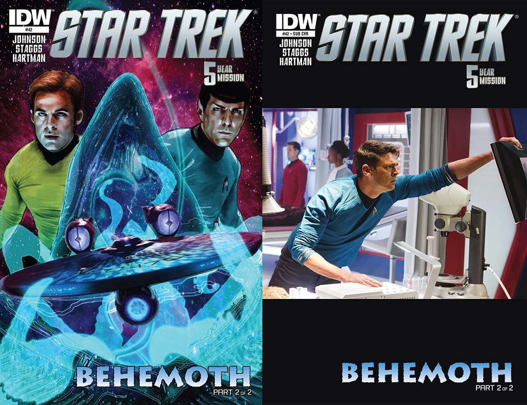
- An interesting pair this month. The regular cover is by interior artist Cat Staggs featuring Kirk and Spock looking serious as the Enterprise is about to be swallowed by the titular Behemoth. Starfleet’s finest look good, as does the pink and purple starfield behind them, but the showpiece of this cover is the Behemoth and the Enterprise. The oversized creature’s maw looks designed similarly to the sandworms from David Lynch’s Dune. Coming out of its gullet are several transparent, glowing tentacles which are wrapped around the starship to pull it in. Great looking and exceptional coloring.
- The photo cover is a horizontal image of McCoy in sick bay looking flustered as he checks a monitor. It’s a decent picture but has absolutely nothing to do with this story, outside of McCoy actually making a few appearances. I’m not thrilled with the huge amount of black space above and below the image. This choice of photo seems extremely random. I don’t understand why IDW doesn’t go with vertical photos to have an image that covers the entire space. Why not have covers that focus on the crew? Retitle the cover “Crew Photo Cover.” At least that would make more sense than an image like this.
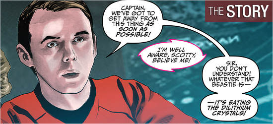
This is the concluding chapter of “Behemoth,” with Mike Johnson returning as writer. The crew of the Enterprise is on a ship that dwarfs their own., and they’ve just learned from its sole occupant that something it calls Behemoth destroyed its world. Said planet killer has just arrived and is draining the energy of the Starfleet ship.
Spock, onboard the Enterprise, suggests the away team return. Not willing to leave the injured alien behind, Kirk has it beamed back with them to the hangar bay, since the creature is too tall for the transporter pads. Once aboard, they’re thrown about as Behemoth attacks the ship.
This story went too quickly and concluded abruptly. Page 8 is a good passage of time and advances one character, but the information on 9 could have been told in half a page or edited down to a single panel. An expected debate breaks out on Page 10 but is left entirely unresolved as an action interrupts it. Then another action renders it moot. This was an opportunity to see this crew make a hard decision, advancing their characters, but instead any growth is pushed off for a later book or film. The reveal on 14 made the remainder of the issue predictable. There is a teaser on the final page of the crew being in a new desperate situation. This is good and has me hopeful for next month.
I was really disappointed in the alien that was introduced last month. He was given a good backstory and shown to have a range of emotions, even with his limited vocabulary. To spend that much time on a new character in the first half of this story and not use him until the climax is a disservice to what’s been previously established.
Having him reenact “The Immunity Syndrome” was the final nail in the coffin of this issue.
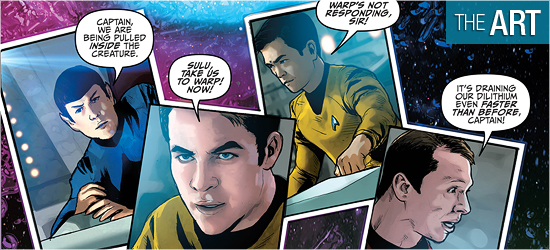
Last issue had painful visuals because of the nonsensical use of photos employed as backgrounds, and things don’t improve this time around — and things may even be worse here.
The interiors of the Enterprise are painful to look at. The hanger bay is a horrible splotch of gray and black, as if slapped together in seconds. The bridge of the Enterprise on Page 6 shows the problems with the setting: the captain’s chair and the helm and weapon’s console are crisp and clean and look good. All surrounding them, however, are melted shapes and colors that suggest rather than state.
The ship fares much better with its exteriors, though it and a shuttle sometimes resemble the bad rotoscoping of a Ralph Bakshi film.
This traced look appears occasionally on the characters. Carol Marcus looks the best of all, especially in her close-up in the center of Page 10. Kirk and Spock look good, as do Chekov and Sulu. Not faring so well are Uhura and Scotty, with the latter looking like he’s in his early fifties. There is a scene on Page 12 where the crew is tossed about, but rather than going to one side in classic Star Trek fashion, the characters are posed as if the slam the ship endures emanates from the table, as all the crew members are blasted backwards in their seats.
The look of the alien introduced last issue has only grown more on me. This is the type of alien I’d like to see the crew encounter. Behemoth is also well drawn, living up to its daunting name. Each time it appears it is stunning.
Cat Staggs is a tremendous artist based on her previous work on other books. This story looks unlike anything she’d done before. I don’t know if this book was a rush job or IDW mandated the backgrounds, but I can’t believe this wholly came from her.
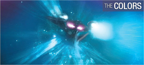
I’m really hot and cold on the coloring from Wes Hartman. The away suits that looked excellent first issue come off as clunkily colored, with the face shields looking like a blanketed blue, rather than a layered effect. The colors on people’s faces on this page are very blocky. I don’t know if this is due to Stagg’s shading on her art or Hartman’s colors.
Much better is the Behemoth which glows amazingly in the darkness of space. Lighting effects are also good, such as on Pages 4 and 5.
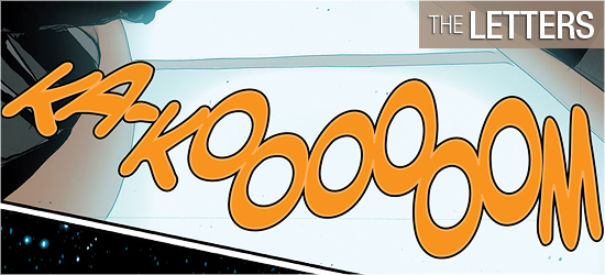
The contributions to this book by Neil Uyetake are very good. There are the expected dialogue and sounds, but Uyetake also does transmissions which are in italics, to make them visually different from dialogue. His best font is given to the alien whose dialogue is different from every character, cementing his alien-ness completely.

