Our Trek Comics editor Patrick Hayes is back with a review of this month’s issue of IDW Publishing’s Star Trek comic series: the final chapter of “The Q Gambit,” the last entry in the six-part saga.
Order Star Trek #40:
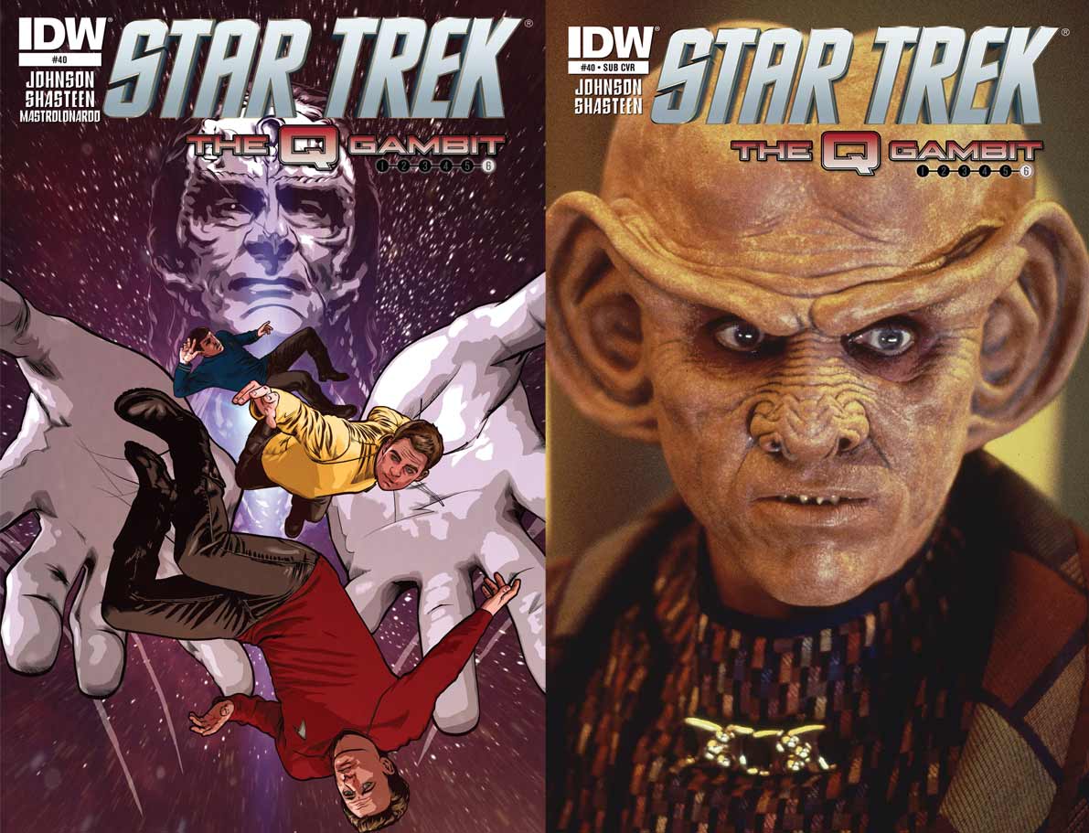
- On the illustrative cover, Gul Dukat — the god — has transported Spock, Kirk, and Q to deep space and released them. They tumble from his hands and into the cosmos, not long to survive in this environment. This is another great cover from interior artist Tony Shasteen. The image is a good representation of what fans are expecting from the Cardassian that’s bonded with a Pah-wraith.
- The photocover is an extreme close-up of Armin Shimerman as everyone’s favorite Ferengi. His eyes are as wide open as his ears after probably hearing some new tidbit of information that’s upset his plans. This is a great photo, but as Quark is not in this issue, so this choice of photo seems like filler that was handy.
The final chapter of “The Q Gambit” by Mike Johnson, begins with Kirk’s narration (rather than a traditional captain’s log). He’s aboard the Defiant in his future. The Enterprise is under the command of new newly-enhanced Dukat, along with several Jem’Hadar.
Kirk is questioning Q’s motives for pulling him and his crew to this horrific time period. He learns the Q Continuum is going to fall before the Pah-wraiths, so the seemingly-omnipotent being yanked Kirk and company forward to stop them since the Q have been unable to do the deed. “So, yes, captain, though it brings me no joy and no small amount of embarrassment…I need you help.”
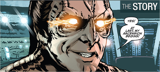
Meanwhile, deep inside the wormhole, the captured Enterprise is being swarmed by the tell-tale sign of Pah-wraith energy as its new commander raves with orange eyes, “Yes! At last, my ascension begins!”
How could this get any worse? Instantly! On Page 5, the Pah-wraiths do something that surprises Dukat. The tables are then turned as the Cardassian surprises the Pah-wraiths, and has a proposition for them. When wasn’t Dukat manipulating a situation to his advantage on Deep Space Nine?
Events go quickly on Page 12, with quite a shock occurring on 13. Just as readers may think there’s no hope for our heroes something happens that was standing in front of everyone for some time. Johnson has got each character’s voice ringing true, and it’s impossible not to hear Chris Pine, Avery Brooks, Zachary Quinto, Marc Alaimo, or John de Lancie delivering their lines.
Highlights include the fourth panel on Page 14, the final panel on 15, the second on 18, all of 19, the final dialogue between Q and Kirk (which includes a great admission), the final dialogue between Kirk and Spock, and the final page’s coda which bookends this saga and will leave Next Generation fans smiling.
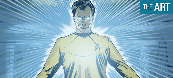
Tony Shasteen closes this out with the same high standards he began with. The characters look great.
The standouts are Kirk, Q, and Dukat. Much of Shasteen’s work is photo realistic, and this issue is no exception. Dukat is one of my favorite Trek villains and to have him rendered so powerfully — so evilly — makes me want to jump into the book and take him out myself. He looks amazing on Pages 6 – 8, 13, 18, and 19. Kirk looks particularly strong on 10.
Often artists draw character’s faces in two facial poses: mouth open or mouth closed. By adding teeth to Kirk on this page Shasteen has made him more intense. Q steals the book, though. He looks sensational throughout, with Pages 16 and 19 excellent.
I’m finding myself torn with the backgrounds. It’s fairly obvious that photographs are being used for several panels, such as aboard the Enterprise. Is Shasteen choosing his point of view based on what’s available, or does the art come first and a photo is dropped in? Is this a cheat for an artist?
Before the digital revolution artists would draw all of their backgrounds. I wince at some of the backgrounds in this issue because they stick out like poor bluescreen effects. This doesn’t happen all the time, but enough to get picked up on.
With Shasteen doing this, would his character work have suffered if he hadn’t used the pictures? A reader shouldn’t be noticing this or having such thoughts while reading a book.
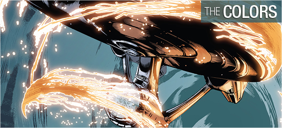
There’s some impressive skin tone work on this issue from Davide Mastrolonardo. Faces in close-ups (Spock, Q, and Kirk) look particularly good. On board the Enterprise, backgrounds are pale blue and gray with the prerequisite lens flares. This puts the focus squarely on the characters, but had me wondering if it also wasn’t done to blur the photographs used.
The light effects, used for the characters’ eyes and what transpires on Pages 13, 14, 18, and 19, are great. Those background colors, though, just drew more focus to the photos.
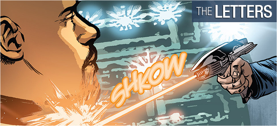
Neil Uyetake has created narration and dialogue (the same font), sounds, a perfect whisper (Page 15), and the closing word.
All are fine, but I wanted the narration to be a different font from the dialogue as it’s an internal monologue — a different form of communication to the reader. If this were a novel, it would be in italics. A minor nick, but one nonetheless.

