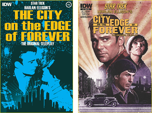
Our Trek Comics editor Patrick Hayes has his review of IDW Publishing’s third City on the Edge of Forever comic adaptation, based on writer Harlan Ellison’s original teleplay.

She’s finally on the covers! Edith Keeler, drawn as Joan Collins, debuts in this issue, and seeing her on the cover already has my heart breaking.
Juan Ortiz provides the artwork for the regular cover. This is a great 1960’s inspired mash-up of Kirk and Edith, looking longingly into each other’s eyes against a star field, while below is the silhouette of the city. Absolutely gorgeous and tear inducing — if you know what’s coming. Grade: A.
Don’t you dare think that Paul Shipper is going to slide on the subscription cover, because his cover looks great! Kirk, Edith, and Spock look just like the actors who played them. Kirk looks worried, Edith looks to the sky, and skeptical Spock considers his captain’s relationship with their focal point in the past. These three are above a city that looks terrific, as an automobile goes down the street. This is just as good as the regular cover. Grade: A.
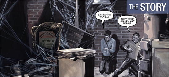
Scott and David Tipton continue with their excellent adaptation of Harlan Ellison’s original teleplay, and this contains the entrance fans have been eagerly awaiting.
But first — having just escaped an angry mob — Kirk and Spock hide in a basement. Spock makes some very emotional commentary on humanity that has Kirk’s temper rise as well, until they both realize they’re under considerable stress. The officers find some familiar-looking clothing to blend into their new surroundings. They’re discovered by a “native” that restores the pair’s faith in humanity.
Morning finds them at work and Kirk making the decision to use a damaged piece of technology to get some answers. The commentary from this device on Page 6 reminded me of the Enterprise’s computer being delightfully out of whack. The clue it gives is super and isn’t solved for a few pages.
Spock’s job brings a new depth to what he endured in the past. It’s only hinted at in the aired episode, but in this original version of the story he’s not working with Kirk and he’s treated very differently than his captain. Who couldn’t understand his response?
The dialogue of his boss is infuriating to read, but, sadly, not surprising. Spock’s response on Page 9 is beautiful. Even more beautiful is what he finds on 10. I was so glad to see this reveal done slowly and the Vulcan’s reaction is great.
Starfleet’s most famous science officer has all the best lines in this issue and it’s impossible not to hear them in Leonard Nimoy’s voice. His closing comments on Pages 14 and 16 are chilling with their foreshadowing. It’s also impossible not to hear the music of Fred Steiner when Kirk and Edith first meet. Their banter is sweet, yet someone watches with trepidation.
This issue stepped things up with our leads finally in the past and Edith being found. I loved this. Grade: A+.
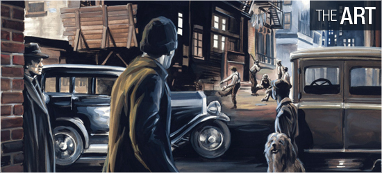
I was completely swept away by J.K. Woodward’s artwork this month.
To see any emotion out of Spock is always a revelation, and he’s emoting strongly: Page 1, panel four; Page 2, panels one, two, four, and five; Page 5, panel seven; and all of Pages 9 – 11. Kirk has all the humor and passion that William Shatner brought to the role, complete with that roguish smile: Page 1, panel four; Page 2, panels three and six; Page 3, panel eight; Page 7, panel six; Page 13, panel six; Page 15, panel three; and all of the four final pages.
And Edith Keeler — wow! Any reader can understand why Kirk falls for her. Her sincerity beams out of her brilliantly on Pages 11, 12, and 17 – 20. Edith’s smile would stop any man in his tracks. The supporting characters on this book, such as the gentlemen that first appear on 3 and 8, are original characters by Woodward, but they look as though they stepped out of the series.
The settings also look great. This story goes to several locations not shown in the episode, and, again, they look fantastic. Woodward moves the point of view around like an expert director, making every shot interesting with details. This may sound sacrilegious to the story, but if a page were wholly devoted to one of the characters just walking though one of the environments in silence, I’d be a happy camper.
This issue has the best visuals of the series yet. Grade: A+.
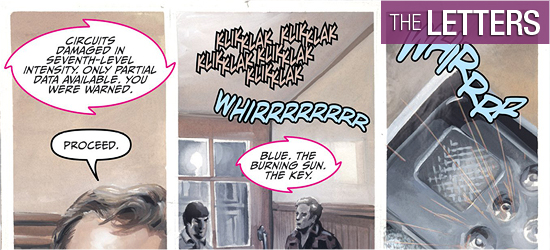
Dialogue and sounds are all produced by Neil Uyetake. He perfectly places each — and there’s a lot of dialogue — without stepping on the superior visuals. It takes a talented letterer to do this, and Uyetake has got plenty of talent. Grade: A+.
Bottom line:
City on the Edge of Forever #3 is the best chapter yet, and is an absolute must-read. It definitely earns my highest possible recommendation. Grade: A+.
– Reviewed by Comics Editor Patrick Hayes
![]()
 |
Order Harlan Ellison’s City on the Edge of Forever #3 |

