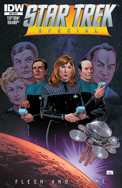
Having just gone through my comic collection trying to decide what to take to this year’s San Diego Comic-Con, I stopped on IDW Publishing’s early Trek comics and pondered what had ever happened to the Sharp Brothers. Well, here they are, with this month’s new medical-centric one-shot release, “Flesh and Stone.”
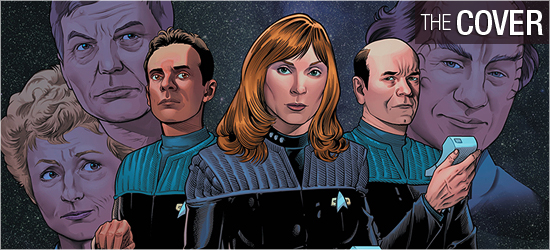
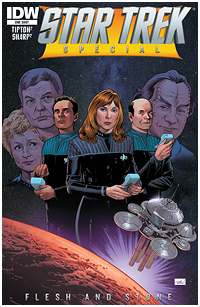
There’s only one cover for this one-shot, featuring doctors from every Star Trek series: the original Enterprise’s Leonard McCoy, Julian Bashir from Deep Space Nine, Beverly Crusher and Kate Pulaski from the Enterprise-D, Voyager’s Emergency Medical Hologram, and Phlox from the NX-01. They’re posed above a planet that space station Diamandis 1 orbits.
Just having all these characters united on one cover is special. The art is good but the coloring is bland, save the yellow-gold under the title. Decent. Grade: B+.
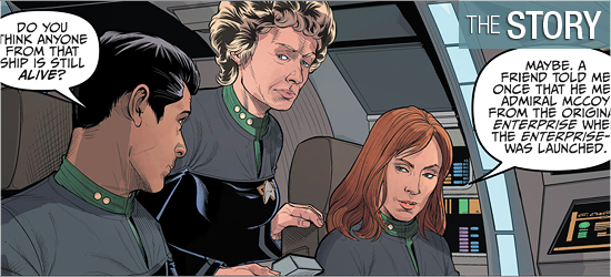
It’s also good to see Scott and David Tipton back on a Trek book because they’ve written some of the better stories. The space station is holding one of the biggest medical conferences, with the EMH already in attendance. Sharing a shuttlecraft are Pulaski, Bashir, and Crusher, who drop their discussion on nanoprobes when Bashir notices the station is sending out an emergency broadcast. Something has infected the entire station, and it’s up to this trio to find out what it is. It will involve them seeking guidance from a famous character, in an outstanding locale, and will involve the first Enterprise’s first doctor.
I was not expecting Pages 11 – 14, and was so glad to get them. I was thrilled to see the alien race appear, as their evolution as characters was only being touched upon in one of the shows. The gift on Page 15 gave me goosebumps. The conflict on Pages 18 and 19 was good, and the solution to the problem very smart — however, the explanation for the problem’s occurrence was a big information dump, as evidenced by how much of the art is lost in providing the space to explain everything. It was also enjoyable to see the two most polar opposite doctors have the final scene. Grade: A-.
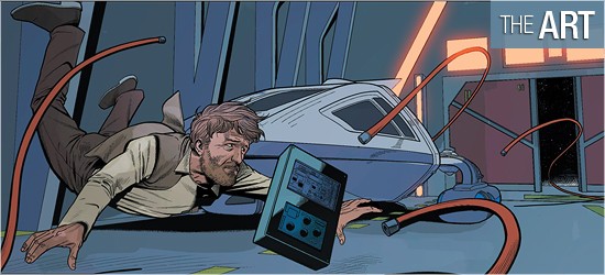
The Sharp Brothers do a good job in making the familiar characters look like the actors who portrayed them, with DeForest Kelley looking the best. The doctor who next gets the most face time is Robert Picardo’s EMH, and t his character has some outstanding emotions in the last quarter of the book. New characters are also good, with the opening pair of Starfleet officers looking sharp (no pun intended) and Commander Travers reminding me of Captain Styles from Star Trek III: The Search for Spock.
Looking gaunt in his brief appearance, though, is Julian Bashir — there’s just too much shadow-work on his face, and his zombie-like appearance makes him seem he’s a panel away from dying off.
The settings are universally excellent, and the story is not confined to starship or space station interiors: Page 9 introduces a classic locale, and I was ecstatic to see the first panel on Page 11. How could not anyone not brighten up at seeing that panel on Page 11?
With the exception of Bashir, this is a fine looking book. Grade: A-.
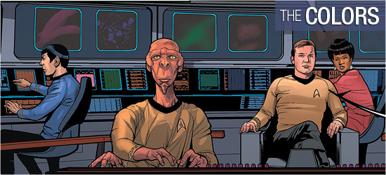
Excellent work on every page from Andrew Elder. I can always tell a colorist knows what he or she is doing on a Star Trek comic if the control panels for technology pop, and they certainly do on that first page. I was afraid this was going to be a grey comic because of the interiors, which are colored appropriately, but have that standard pre-reboot Starfleet dullness.
Page 9 gives Elder the opportunity to expand the colors of this book and he does. Colors are used very well on the sound effects, with the transmission atop Page 4 my favorite. Grade: A+.
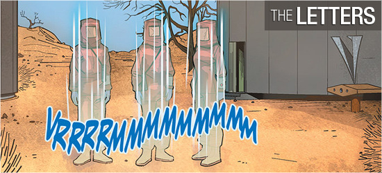
Dialogue, transmissions, and sounds on this one-shot are created by Neil Uyetake. I would have liked to see the character descriptions and the alien dialogue in a unique font, because if it wasn’t for the coloring it would have been difficult to tell them apart. Grade: B.
Bottom line:
It’s great to see all these famous doctors involved in one story, and I could have had this go on for much longer. The visuals in “Flesh and Stone” are solid, and this will make a fine addition to anyone’s collection. Grade: A-.
– Reviewed by Comics Editor Patrick Hayes
![]()
 |
Order Star Trek: Flesh and Stone |

