Our Trek Comics editor Patrick Hayes is back with a review of this month’s issue of IDW Publishing’s Star Trek ongoing comic series: the final chapter of “Lost Apollo.”
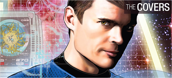
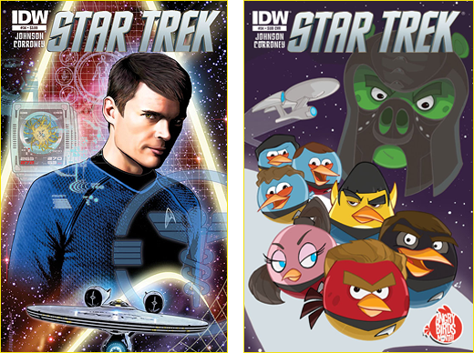
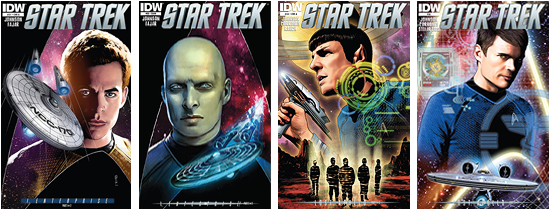
The regular cover is by Joe Corroney with colors by Brian Miller. It is a drop-dead gorgeous shot of Doctor McCoy before a neon delta shield, with a computer screen overlay atop Bones in the left corner and the medical insignia overlay on his chest. There’s also an unbelievable amount of computer readouts and grids within the shield. The Enterprise flies below the good doctor to complete the image. What isn’t on this cover? This had to have been a planning and coloring nightmare, but it is magnificent. Corroney and Miller have outdone themselves on this one. Grade: A+.
The subscription cover is by Craig Rousseau and it’s got the entire Trek cast as the Angry Birds. Yes, it’s finally happened — Angry Birds have gone Star Trek. What transporter accident caused this to happen? IDW has acquired the license to produce Angry Bird comics, which has its first issue coming out this month, so this was done as a bit of cross promotion. It’s not for me. Grade: B.
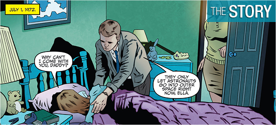
Writer Mike Johnson closes out “Lost Apollo” in excellent fashion. As with the first part, this issue begins with a flashback. In 1972, Florida, a soon-to-be astronaut is giving his daughter a kiss tonight, promising that he’ll keep the picture she’s drawn for him on his flight.
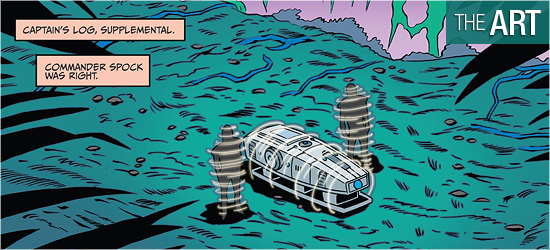
Cut to the present, as a huge creature is under attack by two away team members after knocking out one crewman and holding Kirk’s limp body high. The beast cannot be killed, but is scared off after taking six phaser rifle shots. The away team beams back to the Enterprise and science provides some interesting findings about the hostile planet, with the fourth panel on Page 5 being a stunner that intrigues Kirk.
I began to get an inkling on what was coming with the action of Page 10, but I was still surprised by the end of 13. Page 17 is a nice bit of lost history revealed and Spock’s conclusion on 19 was aces. The final three pages were Trek perfection. A hard decision must be made and Kirk’s solution was a gut-wrencher.
This was the first comic story that felt like an episode of the original series. Once I was done, I was so pleased with what I had read. This felt like Star Trek. From the surprises and the conclusion, Johnson has delivered gold. Grade: A+.
I am a big fan of Joe Corroney and was happy to see him back on the pencils for this book, and inking his own work (with Victor Moya and Rob Doan also providing inks).
I love how the first page was a Norman Rockwell moment — and upon turning to Page 2, the content couldn’t be any more different. I really like the design of the creature. The action on the second page rates a splash page and Corroney makes the most of it; it sets up everything a reader needs to know… so much so that the dialogue isn’t really needed if you read the previous issue.
Corroney does an exceptional job of having his characters look like the actors. Even if the characters are in their environment suits, any reader can see that it’s Chris Pine as Kirk in this book. The close-ups on Page 4 are particularly fine. The characters also look good out of their suits for the scenes aboard the Enterprise, with Scotty’s nervous look on Page 12 being great.
Like last issue, some of the backgrounds on the Enterprise (fifteen of them that I counted) are photos from either of the films. I don’t like these. They stand out horribly; it’s like bad blue screen of the early 1970s. I know that using them allows artists, and several have been using these lately in books I’ve been reading, to spend more time on other parts of their books. The majority of the book looks great, I just wish Corroney hadn’t done this.
This grouse aside, the final three pages are the perfect closer for the story. I swear I could hear melancholy music playing as I read them. And that last page is practically poetic. I’m kicking the grade on this up notch, because last issue prepared me for the few backgrounds that bugged, but the rest of the book was beautiful. Grade: A-.
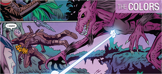
A great source of coloring lately has been coming from Stellar Labs, and Sakti Yowono is from this group doing a bang up job this month. She does a really good job in shading the characters’ faces, giving them a lot of depth. Look no further than Page 1, panel four, and Pages 6 and 7 for proof. I love the violet coloring of the creature. Trek fans got scarlet red on the creature that chased Kirk in the first film, and I’m glad to see a different color being used for a “monster.”
The color of the creature was also similar to the deep dark colors of the world it inhabits, so it made sense. Nice creation of a computer overlay on 9 through colors. The bright sound effects also really stand out on the dark planet. Yowono is doing a solid job. Grade: A+.
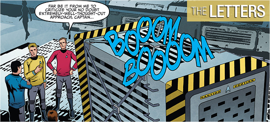
Go-to IDW letterer Neil Uyetake does a good job on this book with dialogue and narration, but his sound effects are exploding off the page. This story has a lot of them and they look great. I especially like how the creature’s sounds have a little border around them that Yowono picked up on. This issue has some classic phaser and transporter sounds. What more could you want? Grade: A.
Bottom line:
“Lost Apollo” was the first time there wasn’t a flashback or a gimmick to tell a story. This was all original and I loved it. This felt like Star Trek. It’s got a good secret, science, and a moral dilemma, all with great visuals. Grade: A.
– Reviewed by Comics Editor Patrick Hayes
![]()
 |
|||

