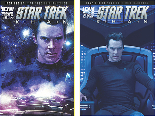
Our Trek Comics editor Patrick Hayes is back with a review of this week’s Star Trek: Khan #5 from IDW Publishing, the conclusion of the Star Trek Into Darkness tie-in series.
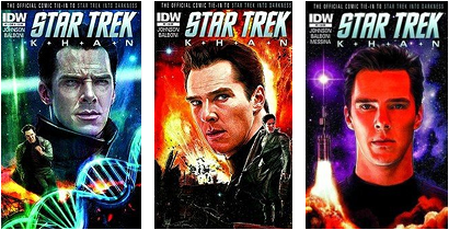
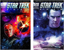
A pair of covers, each sporting evil’s face…
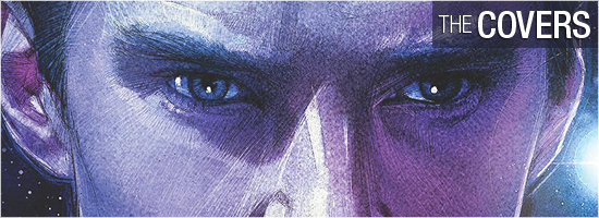
Paul Shipper’s standard cover for Khan #5 is a great image of Khan, inspired by the photograph on the subscription cover. Above him is the Vengeance — the Federation battleship he designed for Section 31 — and below him is the rest of the Botany Bay crew in their status pods. I like the line work on the ship, the pods, and his hair. That’s right, I said it: his hair looks cool. Really great coloring as well; very spacey and alien. Grade: A–.
The photographic subscription cover is the go-to Into Darkness photo of Benedict Cumberbatch sitting in the Vengeance captain’s chair. His face is swimming in power, and was obviously the source image Paul Shipper used for the artwork cover. Grade: A+.
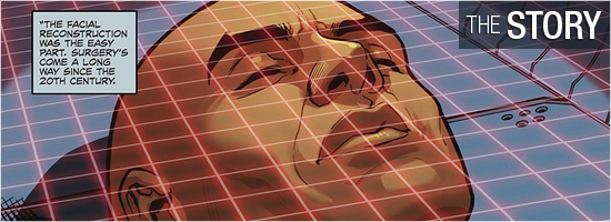
All I expected from Khan #5 was an explanation of Khan’s “new” face and some pre-Into Darkness gap-filling. Writer Mike Johnson, along with story consultant Roberto Orci, gives readers all this and a bit more.
The final issue opens at Khan’s continuing trial, where he’s being questioned by Kirk. The prisoner expresses his rage at learning his true past, and discovering where the bodies of his frozen family are kept. His rage changes into one desire: “…to be reunited with them.”
A plan is hatched, ending in a fantastic confrontation on Pages 8 through 17 — including a five-page flashback that every Trek fan should wish had been in the movie. It would have eaten up too much time, but, oh, it would have been so sweet! The explanation on Page 13 might seem too easy to some, but I bought it; it makes sense.
I like how Khan didn’t have every angle figured out for his conversation, which foreshadows a technique he’ll later use in the film. By Page 19, the origin story is over, but the tale is not yet done. The conversation by the pair on the final three pages is awesome; a brilliant analysis by each character with the final page’s last panel a Wow-er.
I think more fondly upon this version of Khan after reading this book. Johnson is to be congratulated. Grade: A+.
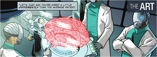
This issue is entirely illustrated by David Messina, with inks by Giorgia Sposito. It’s different from previous issues because all of it is set in the “present” of Star Trek. I am a huge fan of Messina because his characters always look like the actors who portray them, and not once do they look like he’s copying them from photos. He can also draw the heck out of technology — even if it’s of his own design, such as the Io facility on Page 2.
His interiors also are top notch, and his overlays (computers and reflections) look great. Some exceptional images include Khan on every panel; the individual at the bottom of 3; the bottom of 10; the bottom of 11 (Yes! Yes! Yes!); Page 19, panel two; all of Page 21; and the book’s final panel.
David Messina is an artist that should do an original Trek hardcover graphic novel, because he’s the only illustrator since Adam Hughes that could pull it off. Grade: A+.
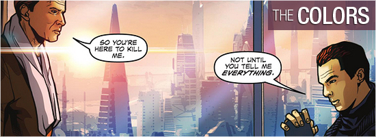
One of my favorite colorists who I’m not seeing enough from is Claudia ScarletGothica.
She is exceptional; just look at Page 1. The first two panels show the pristine, bold, lens flaring light of the Federation, and then Khan appears against a blood splattered crimson background. This fluid appears often as Khan silently meditates upon something and it perfectly matches his ferocious undertones.
Blues and whites rightfully appear in Federation locales. A private residence nicely uses bright, warm tones to establish normalcy, but becomes harshly brighter as tensions increase. Color assists are credited to Valentina Cuomo. If she did some pages or panels solo, I can’t tell because whatever she did meshes so smoothly with ScarletGothica.
Another super job. Grade: A+.
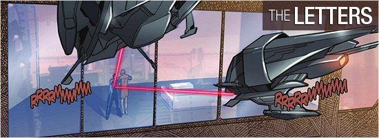
Khan #5 features scene setting, dialogue, and two key sound effects from Neil Uyetake. This, too, is expertly done because Uyetake is able to place quite a bit of wordage down without overstepping the art. A sign of a pro, to be sure. Grade: A.
Bottom line: Khan #5 — and this whole series — gave me what the movie did not: a backstory to this villain and a coda completing the story. It’s making me reconsider my feelings toward the film.
An amazing feat, and one I thank all involved for doing. Overall grade: Grade: A+.
– Reviewed by Comics Editor Patrick Hayes
![]()
 |
||
 |
|

