To mark the second season release of Star Trek: The Next Generation on Blu-Ray in just over a week, I spoke with the consultants on the TNG: Remastered Project, Mike & Denise Okuda. We talked about the different challenges of Season 2 and how the remastering team at HTV with the help of Dan Curry have brought the show into high-definition.
Mike & Denise Okuda: Season 2 TNG-R Interview, Part 1
Interviewed by Adam Walker for TrekCore.com
![]()
TrekCore: Does the different film stock that was used for Season 2 change the look on Blu-Ray? Season 1 was very glossy and vibrant, Season 2 seems more matte and dramatic, almost filmic.
Denise Okuda: Star Trek: The Next Generation, as in many incarnations of Star Trek had almost from episode-to-episode a different look. You would have different directors and cinematographers who would try things. There may be a little bit of a different look, but there are different looks within seasons as well.
Mike Okuda: Occasionally the Director of Photography would experiment with a different film stock. Sometimes they would change the film development process – that is – shooting it at a film speed so you have more light sensitivity which gives you a different contrast ratio. Those kind of things happened all the time.
TrekCore: Both of you had the pleasure of having a TNG Staff Reunion with Season 2 as Dan Curry, Doug Drexler and David Takemura came on board. You must have had a real sense of nostalgia…
Denise Okuda: Well it was a lot of fun. We were so thrilled to have Doug, David and especially Dan Curry with us for Season 2. It was a reunion. We all worked on Star Trek, and as with any organization where you work together for a long time – you almost have a shorthand, you almost read each other’s mind. That gave us a great deal of artistic comfort and also a great deal of fun. To have Dan Curry there who was Visual Effects back in the day was really a hoot. We felt so honored to have him with us.
TrekCore: Quite often there was a different style with Dan Curry’s episodes and Rob Legato’s episodes as they alternated episode-to-episode. Did that affect the look of the second season as a whole?
Mike Okuda: One of our missions was to try – as much as possible – to respect the original creative choices by the original Visual Effects Supervisors. One thing that Dan did, he had a slightly different – in some episodes, not all – style for his transporter, a subtle difference. He told us what the style was and he actually preserved the differences, so in shows that were originally supervised by Rob Legato he preserved it the way Rob wanted it. If it was one of his episodes, he did it the way he wanted it back in the day. We were trying as much as possible to respect what the original artists wanted to do, so that you get a sense that you’re watching the original show. It’s just brighter and clearer and sharper.
Denise Okuda: That really is the mantra for this project. We are trying – as much as we can – to respect the original artists and have that come forward in the remastering process.
TrekCore: Was the approach HTV took in creating the planets for Season 2 different to Max Gabl’s approach in Season 1?
Mike Okuda: The approach for the planets in Season 2 was fundamentally the same as Season 1 which was – where HD elements existed, we generally use those elements. Where they didn’t hold up, we asked them to experiment with different looks, different ways to try to recreate the original experience. That said, our request to all the people involved in creating the planets was to try to create a diversity of planets. Star Trek is all about going to strange new worlds and different places, so we very much wanted them to experiment with different looks. We did that back when we remastered the Original Series, and that’s how Max [Gabl] ended up with his style at CBS Digital, simply by experimenting over a number of episodes.
Denise Okuda: But also remember that we had Dan Curry! He would put forth his opinion of his artistic view on the planets and many other things. That also was a great deal of fun, to have a guy who has worked on the original help us with the decision making and keep an eye on the remastering.
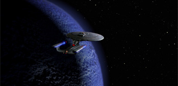
Season 2’s planets are a departure from the style we saw Max Gabl use in Season 1. Mike Okuda mentions that their aim is still to recreate the original viewing experience.
TrekCore: With having a second team involved for the second season, was it very difficult for you both to ensure there was consistency between the CBS Digital look and the Dan Curry and HTV look for Season 2?
Mike Okuda: We didn’t really see it as being a separate team. We saw it more that the HTV group was joining the team. We were all one team and Denise and I were the common element. We were overseeing everything. The main thing is that all of the effects artists at HTV and CBS Digital – they’re all consummate pros. These are people with an awful lot of experience. That’s the main thing – we had top-notch people.
TrekCore: Looking at the second season as a whole, do you have a favorite shot or favorite episode from that season that you were desperate to see in high definition?
Denise Okuda: I think that – Mike and I both agreed – that ‘Q Who’ was an episode that we looked forward to and were very excited. We are really, really thrilled with the results of remastering that episode.
TrekCore: I was blown away when I saw the new digital matte painting done for the Borg Cube interior with all the steam coming from the vents – it looks fantastic. Was the old matte painting lost? How did it come about that it was replaced by a digital painting?
Mike Okuda: A lot of the original matte paintings – not all of them, but a lot – were done by the legendary visual effects company Illusion Arts by the great Syd Dutton and Bill Taylor. A lot of those were done old-school style, that is – composited in-camera from the matte painting – and in many cases those original film elements still existed, and that was the case here. Usually when we have something like that, we will simply clean up the shot a little bit and use it. However in this particular case, because there was that very dramatic pull back, at the beginning of the shot, they were quite close to the painting and as a result you could see some of the brush strokes. Now this was not at all a problem in standard definition – even though the brush strokes were there, you didn’t really notice them. Now suddenly in high definition, it became an issue. Dan [Curry] suggested – and CBS concurred – that this was a case where it was appropriate to try to recreate the sense of the original but make it look better in high definition.
Denise Okuda: And this is a point where we really want to give a shout out to CBS – Ken Ross, David Grant and Ryan Adams. They’ve been extraordinary in the support for this project. We’ve worked on Star Trek a long time and many different projects before, but we continue to be amazed at the support that this project has received. This matte painting, and the extra love that was given to it, is a prime example of how the folks at CBS really want this to be the best it can possibly be, even when we’re running at warp speed to a deadline, they will support us and give us the OK to do wonderful things like that Borg matte painting.
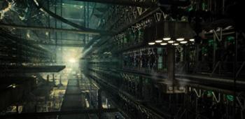
The iconic matte painting of the interior of the Borg Cube from ‘Q Who’ was digitally recreated for the Blu-Rays (exclusive preview shot shown)
TrekCore: In the painting itself, it’s interesting that it has been designed to almost take on a look of future Borg Cubes with more of a greenish-tinge, whereas ‘Q Who’ had a somewhat unique look before. Was that a conscious decision to bring it in line with future episodes?
Mike Okuda: It wasn’t so much to bring it [in line] with future episodes, it was simply that adding that green flicker – to our eyes – brought it to life a little more.
TrekCore: Let’s talk a bit about the other matte paintings we see in Season 2. They’re spread throughout the season – did you have to recreate any others, or are they the same as we see them in standard definition?
Mike Okuda: For the most part when they existed on film in high definition, we generally kept them on film in high definition, albeit with a little bit of clean-up. The Gagarin station in ‘Unnatural Selection’ was another Syd Dutton painting – I think it was Syd – and it got a little bit of clean-up, a little bit of work on the sparkles in the water, a little bit of work on the shuttle – but other than that, it’s the original painting. On the other hand, not all the matte paintings were shot on film. Some of them were actually created in Paintbox at standard video definition, so if you blow them up they really don’t look very good. One such example is ‘Loud as a Whisper’. Fortunately, we literally had the original artist there. That was a painting that Dan [Curry] did back in the day, so it was great to have him there.
Go to Part: 1 2
With just over a week to go until release… be sure to pre-order Season 2 below so you get it on release date in your country. All Amazon stores have significantly discounted the title – at the time of writing it’s under $65 in the U.S., £47.00 in the U.K. and under 57,00EUR in Germany!
 | Order Star Trek: The Next Generation Season 1 Blu-Ray today! |  | Order Star Trek: The Next Generation Season 2 Blu-Ray today! |
|---|
