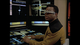
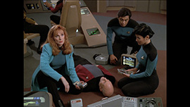
In the second of two new exclusives, TrekCore is taking a look at the new TNG Blu-Ray with brand new HD Screencaps from the remaining two episodes, “Sins of the Father” and “The Inner Light”. As with “Farpoint”, we’ve taken a selection of screencaps showing different scenes from the episode and present them without watermarks and in full 1080p HD resolution. Check out our comments and thoughts on these shots below!
 |
 |
 |
 |
 |
 |
 |
 |
 |
 |
 |
 |
 |
 |
 |
 |
 |
 |
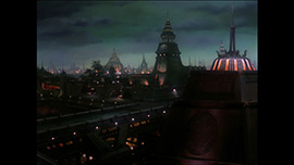
TrekCore Comments: In comparison to the pilot episode “Encounter at Farpoint”, the other two episodes on the sampler are pretty ‘ordinary’ visually speaking. There were no specific scenes which jumped out to us as being of special importance when grabbing screenshots. That said, we’ve tried to include a varied selection to once again give you an idea of how the remastering team have responded to specific challenges.
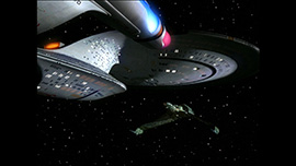
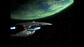
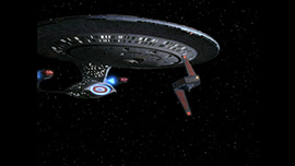
The shot of the Enterprise orbiting the Klingon homeworld Qo’noS has only been seen before in a heavily compressed YouTube video, so it’s nice to be able to look at it here in full HD. The CGI Qo’noS is spectacular to look at, with seas, continents and even clouds visible – it’s going to be quite impressive when you see this shot in motion. Upgrades like these are necessary due to the original planet effects – like phasers and photons – being done only on video, and not being stored on film.
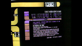
A note about the SD scene in “Sins of the Father”. This seems to last a few seconds longer than we previously indicated. In our earlier report, we described how the scene ends when we cut to a view of an LCARS display on the bridge terminal, however from the new screenshots, it’s clear that the LCARS display itself (a readout on the USS Intrepid) is also in SD. We’re not sure why this particular part couldn’t be recreated in HD, but thankfully the shot is still relatively brief.
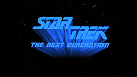
The familiar streaking effect on the “Star Trek The Next Generation” logo seen in the fifth season has been recreated for “The Inner Light”. Love it or hate it (personally, I’m a fan!) it’s back with a vengeance in all it’s HD glory!
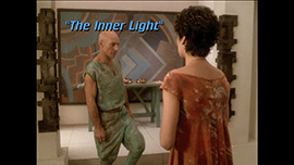
We wanted to get a screenshot of the font used for the episode titles and credits to see if the team have managed to recreate it. Looking at the shot, the first thing that jumps out is that the quotation marks are far too big and clunky compared to the style used in the original version. The team have clearly used a different font set here, giving the titles a somewhat bulkier look to what we’re accustomed to. Perhaps we’re being overly analytical, but when we saw this we were slightly dismayed that the team couldn’t have reproduced the original font more closely.
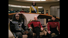
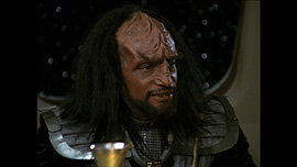
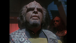
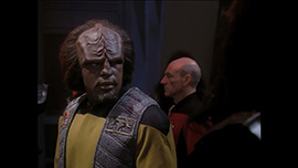
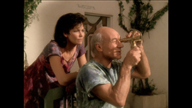
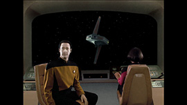
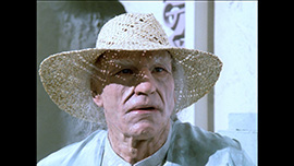
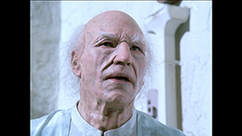
The remaining shots are very much standard fare. Another blue-screen composited shot of Data against the viewscreen shows again just how well these shots are being handled and what a huge improvement over the original they represent. The final two shots illustrate nicely that the makeup on TNG holds up very well indeed against the scrutiny of high-definition. Kudos is definitely owed to the makeup team for doing such wonderful work on a TV show’s budget!
 | Order Star Trek: The Next Generation Season 1 Blu-Ray today! |  | Order Star Trek: The Next Generation Season 2 Blu-Ray today! |
|---|
