Wow! Talk about a sneak preview! The CBS trailer for Star Trek TNG’s HD Remastering certainly whetts the appetite for the project and gives away a few nice hints about what we should expect from TNG in high def. Interestingly, the two scenes which are presented in the trailer are given in different aspect ratios. The live-action shot of Picard at the end of the TNG pilot, ‘Encounter at Farpoint’ is shown in the original 4:3 fullscreen whereas the visual effect of the Enterprise entering warp, familiar to fans from the opening title sequence, is shown in 16:9 widescreen. This issue has since been clarified by The Digital Bits and TrekMovie who confirm through a statement from Mike Okuda that the presentation will be in the original 4:3 fullscreen aspect ratio – a relief for purists!
Now for some analysis… It’s somewhat difficult to get a handle on quality differences in the live action shot from ‘Farpoint’ as the trailer has incorporated this shot into their own little CGI sequence, however we were able to pull a frame off and do some comparison with the standard def version from the DVDs:
 SD (DVD) Screencap |
 HD (Trailer) Screencap |
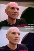 Comparison |
The first thing that stands out is the huge difference in color palette. The HD cap is a far more balanced image, with better blacks and an all-round nicer contrast, especially on the red striping on Picard’s uniform. The increase in quality is best seen in the comparison – look at fine details such as Picard’s eyes and the stripe on Picard’s uniform (especially the left side) to see how detail is far sharper in HD.
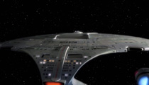
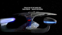
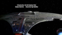
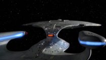
The most shocking difference comes in the visual effects shot of the Enterprise jumping into warp as you can see in the images below:
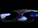 SD (DVD) Screencap |
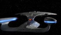 HD (Trailer) Screencap |
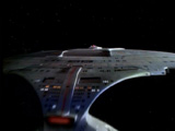 SD (DVD) Screencap |
 HD (Trailer) Screencap |
 Comparison |
 Comparison |
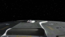
The difference in clarity, detail and color balance is striking, and I must say I’m amazed at how good this shot looks. If this is any indication of how TNG is going to look remastered in HD, I’d say the fans are in for a wonderful surprise! Here’s some more HD goodness of the Enterprise’s warp-out effect shown in the trailer:
 |
 |
