In reviewing the Star Trek art created by Juan Ortiz, where do you even begin? His work is simply transcendent. Criss-crossing disparate artistic styles, themes and ideas, he captures the essence of Trek over-and-over again with a few well-placed brushstrokes and a broad range of colors.
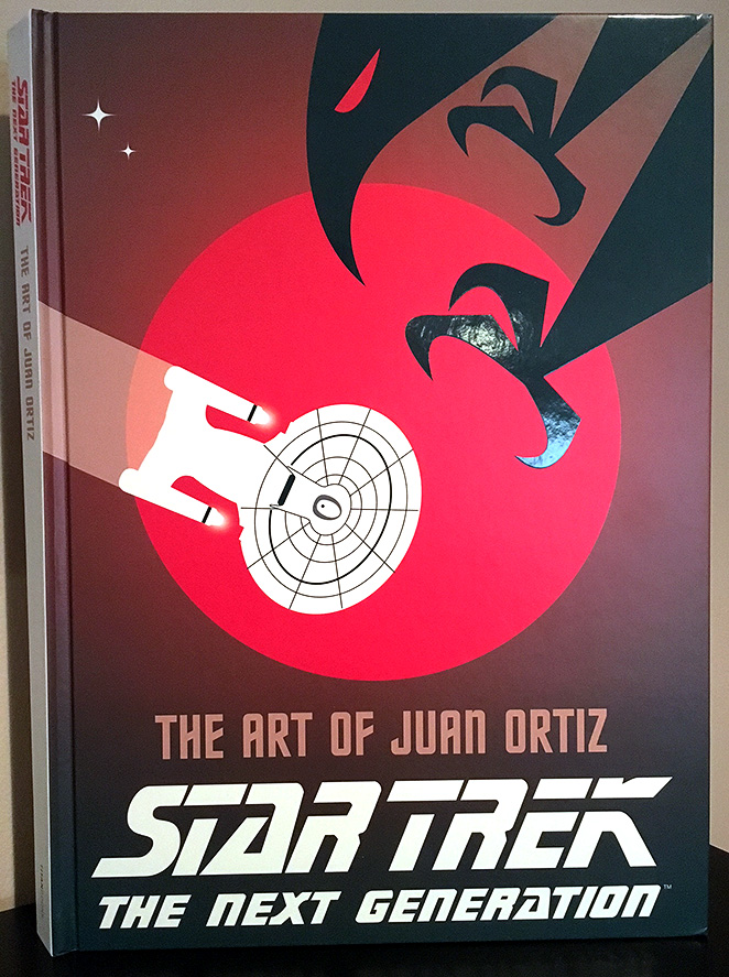
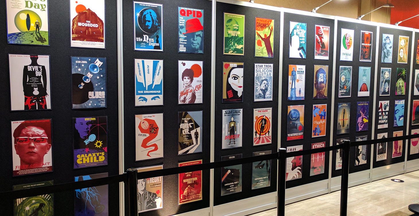
As a follow-up to his Star Trek: The Original Series book released in 2013, Titan Books has finally compiled Ortiz’s episode art for Star Trek: The Next Generation in one vibrant, 208-page masterpiece arriving in stores Tuesday, September 5.
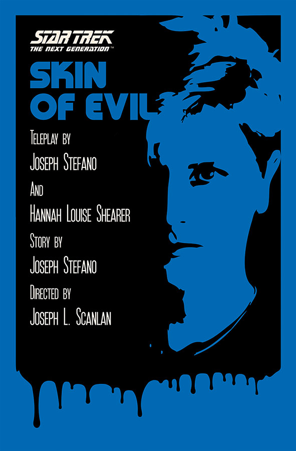
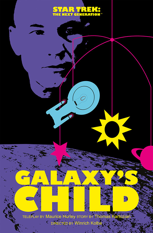
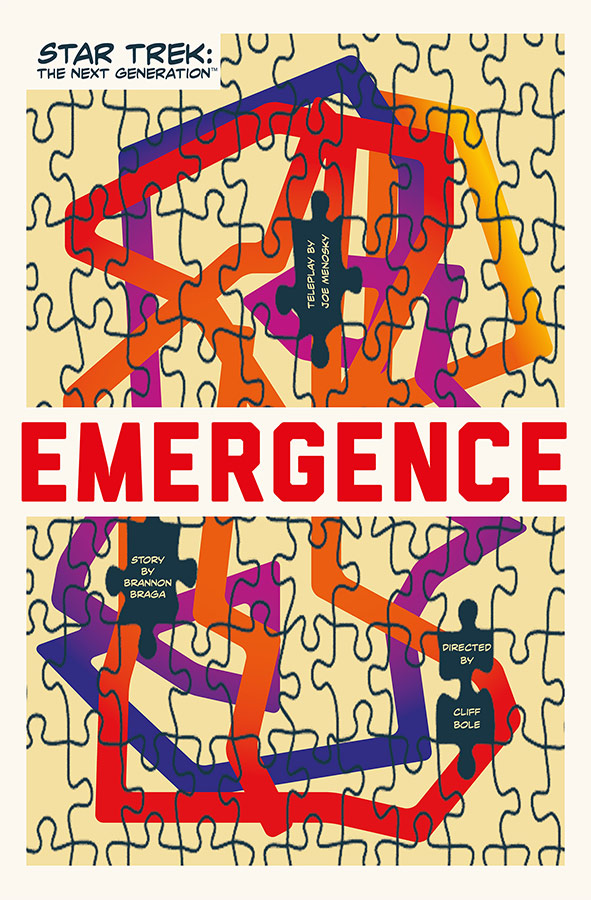
Covering all seven seasons of TNG episodes, Ortiz’s episode artwork is presented here as an arthouse movie poster, one page for each show.
The work has incredible range and will allow each reader to take away their own private interpretations from his unique style. Some pieces will be favorites, others less so, but as it is with most art of this type, you’ll be taking something different away every time you flip through the pages.
There is just so much to take in here, you’ll be surprised anew every time.
When compiling his poster art for the Original Series, Ortiz used a more retro vibe in his designs. In this compilation of his Next Generation art, he translates each episode with more modern artistic styles, ranging from indie film poster looks to images that would fit right in on a street corner decked out with local bands and punk rock posters.
The book opens with an interesting Q & A with the author, who discusses his inspirations, his process and how long it took to create all 177 full-page posters featured in this collection.
From that Q&A, and from just perusing the pages, you never quite know exactly how Ortiz will approach a title.
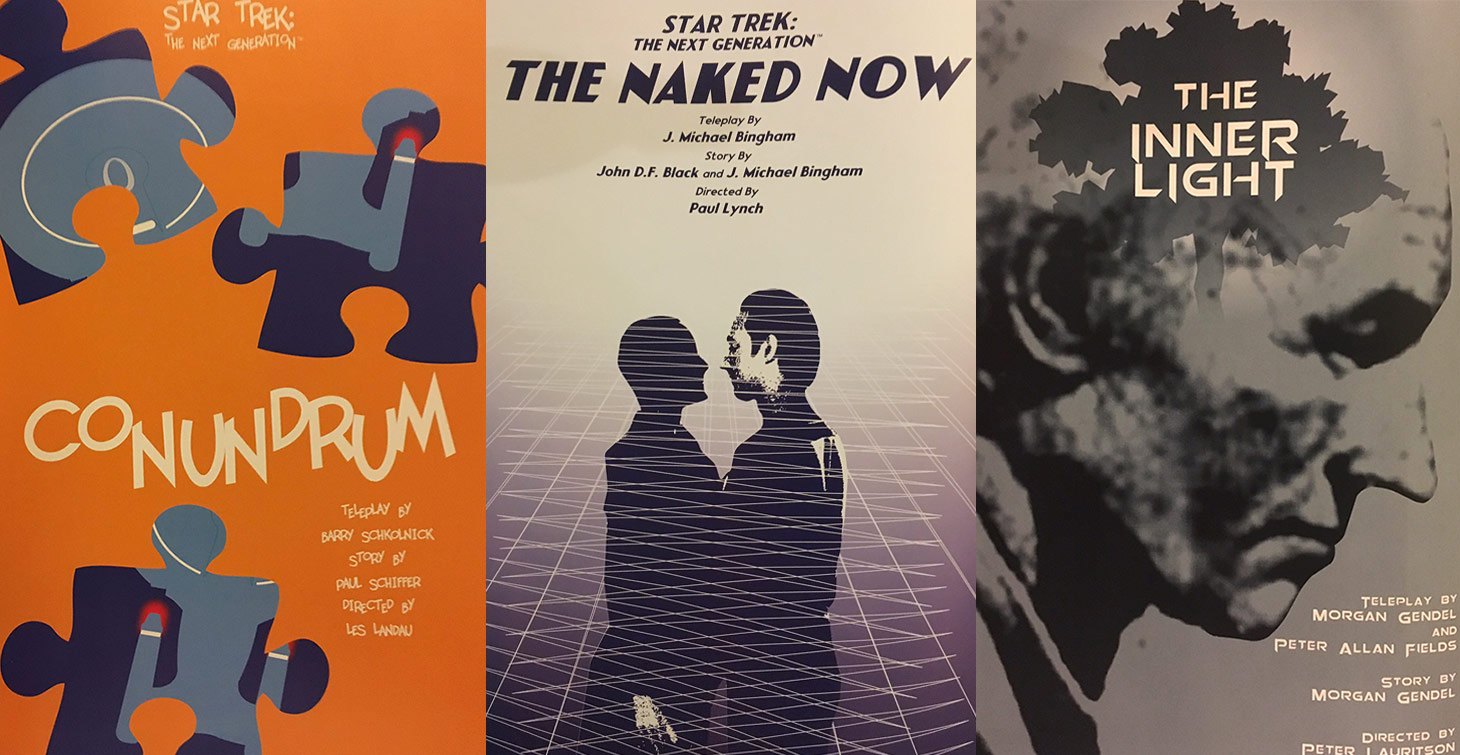
- A deep meditation on some of Trek’s heavy themes? (“The Drumhead,” featuring the propaganda of three pointing hands with the words “Saboteur!,” “Guilty!,” and “Traitor!” coming down hard on an innocent victim.)
- A play on words with an episode title? (“Conundrum,” featuring only three large, disconnected puzzle pieces of the Enterprise-D.)
- A light-hearted approach to a unique moment? (“The Naked Now,” featuring Tasha and Data in silhouette… about to get fully functional.)
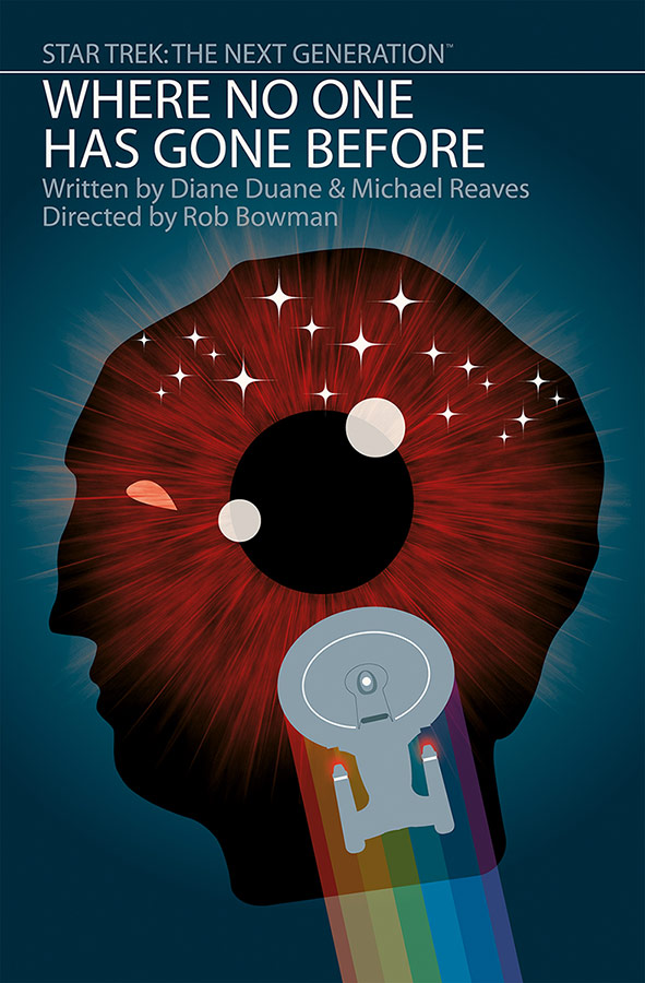
Instead of continuing to wax poetic about Ortiz’s creative choices and artistic prowess, below is a snapshot of three all-time great episodes contrasted with three less popular picks. In these selections, you can how he approaches a broad cross-section of episodes in many ways.
Three Classic Episodes
- “Reunion” — A very simple red and black image of three large hands representing Worf, K’Ehleyr and Alexander laying on top of each other. Simple, clean and effective.
- “The Inner Light” — A powerful, muted blue-grey image of the tree planted in Kamin’s community layered on top of a rough profile image of an aging Jean-Luc Picard.
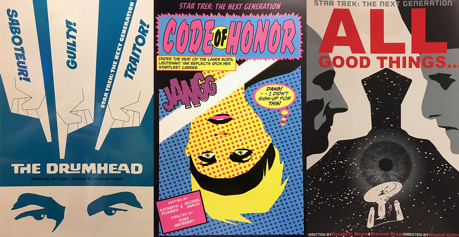
- “All Good Things” — Picard and Q are just barely featured in profiles on the edge of both sides of the page, but it’s the white space between them, morphing into a silhouette of judge Q sitting in his chair, that makes the image so memorable. The Q silhouette is filled with a starry landscape, an iris and the final shot of the Enterprise D moving away from the viewer.

Three Unpopular Episodes
- “Code of Honor” — An 80’s pop-art mélange of colors zeroing in on a close-up of Tasha Yar’s face as she hangs upside down in the midst of hand-to-hand combat. A very meta thought bubble saying, “Dang! I didn’t sign up for this!,” teases not only her predicament, but Denise Crosby’s upcoming departure from the show.
- “Aquiel” — A sparse, but dramatic, design featuring a white page with only a large pink circle with an alien eye, the word AQUIEL and a simple black outline of Beverly Crusher’s replicated hand extending down from the circle. Effective.
- “Masks” — An amazing art deco style poster featuring Data wearing his mask and standing at the top of Masaka’s temple. The imagery supporting the temple, however, is the saucer section and nacelles of the Enterprise-D framing the steps leading to Data’s perch. It’s a striking image of black and gold angles.
Art of this type always lies in the eye of the beholder, but even with that being the case, if you are a fan of Star Trek: The Next Generation, it’s impossible to think there won’t be something in The Art of Juan Ortiz — Star Trek: The Next Generation for you to enjoy and peruse again and again.
![]()
James Moorhouse is the creator of TrekRanks.com and the TrekRanks Podcast,
and can be found living and breathing Trek every day on Twitter.