Saturday was a big day for a group of lucky fans who made it to Fan Expo Canada, as Star Trek: Discovery art director Matt Middleton and members of his team journeyed to the Metro Toronto Convention Center to share some exclusive insights into the design of the series.
Just finished #StarTrekDiscovery production panel.Amazing stuff, new info, unseen photos fantastic! #FanExpoToronto #StarTrek pic.twitter.com/NBzyweL3rD
— Chadwick (@TrekkieChadwick) September 2, 2017
While fans in the panel audience got to see a number of new concept illustrations, digital models, and photographs of the upcoming show’s sets and prop design, there were no photos or video footage permitted – so unless you were there, it may be a while until any of those new images get to the rest of us.
Matt Middleton, Art Director / Set Designer:
We ask that there be no photography during this portion and for the remainder; any images that we put up are for the benefit of your eyes, and not to be shared with the internet. September 24 is coming soon – be patient. We’ll be releasing these videos to the web and to some of our [distribution] partners.
Todd Cherniawsky, Production Designer:
You’re kind of a privileged group of people to be in this room, and you have to take that to heart. Leaks very, very much hurt the show, so take this as a special occasion for you to be a select group of people to see stuff that other people may not ever get a chance to see.
Though we don’t have new images to share — all the photos below are from previously-released promotion — we’ve sifted through the presentation to feature some of the best bits of new information shared by the Discovery creatives to give some additional insight towards the work that’s gone into the design of the series.
* * *
Production designer Todd Cherniawsky began by addressing the dedication of the the entire creative team involved in Discovery.
Cherniawsky: The first thing I want to say is that these endeavors take an incredible amount of people to mount, and an incredible amount of time. I think sometimes it’s very easy for the fan base to be very critical – and fairly critical – of the work we do.
But the one thing I want to enforce to this audience, and the entire Star Trek audience, is that for all of us here that have the chance to work on the show, this is very, very precious material to us. This is all part of our childhood; we’re all big fans.
So every decision that’s been made along the way has been really carefully thought out. But we appreciate criticism and concerns for the franchise – so hopefully we can shed some light on the process that takes a lot of time, a lot of resources, and a lot of very smart people.
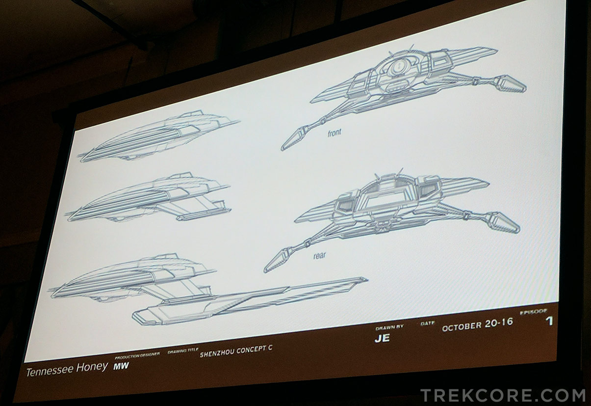
It seemed to make sense to be as true to TOS as possible; that series was envisioned in the 60’s. We asked the [design] team to always that as our point of reference – what would the future look like in the 60’s? – but still, of course, utilizing all the great tools we have today.
I know that there’s been a lot of discussion about our show ships already, but please know that John Eaves and Scott Schneider who are our principle Federation ship designers — John Eaves has probably designed 70% of all the Star Trek television series fleet, so John knows these ships better all of us do.
We’re obviously trying to update things. Fabrication processes have changed so much since the 60’s, so we have to take those things into account. But all these ships again, were done by John Eaves, who is, essentially, the master of Federation designer and does beautiful work.
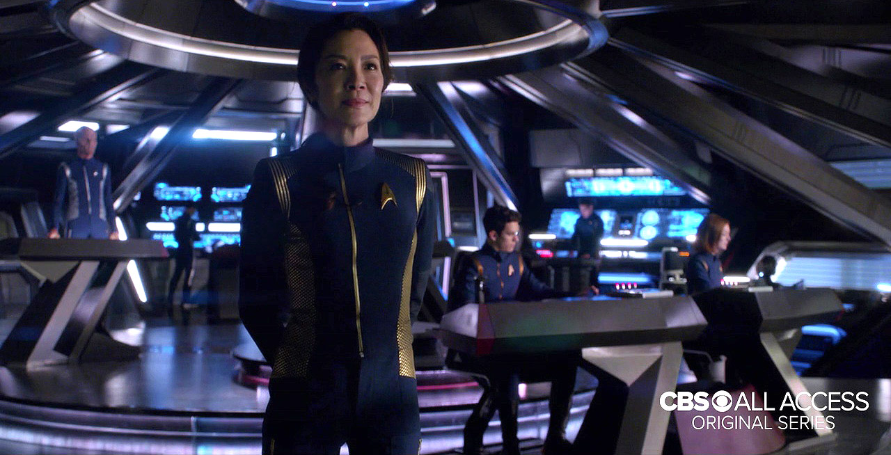
We are always asked how accurate the exterior of our ships reflect the interior.
We go to great lengths to make sure the rooms fit inside the house. We obviously have to take cheats at times — one of the great classic examples is that you cannot fit the interior of the Millennium Falcon into the exterior of the Millennium Falcon! So there are times when we have to take artistic license, but it’s still most important [to work for] the story.
Reality and science are spring points, but remember, it is science fiction.
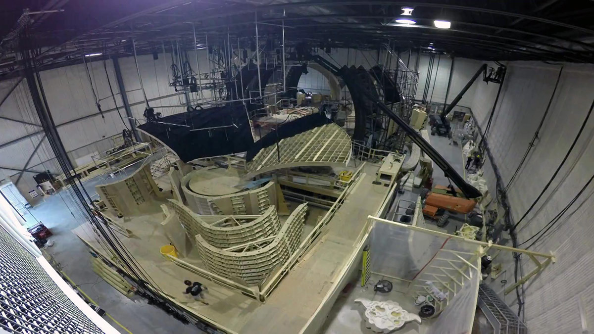
As you may recall, Star Trek: Discovery is being filmed at the massive Pinewood Toronto Studios, in a 45,900-square-foot soundstage – the largest in North America – which also has nine acres of outdoor backlot space.
Supervising art director Mark Steel shares some insight into the huge undertaking a show of Discovery’s size and scope really is – and how much behind-the-scenes talent is involved in such a production.
Steel: I’m not going to try to go into details [of 50 years of Star Trek production], but a lot of the fundamental issues of bringing the creative vision of writers, directors, and production designers into the practical world of a TV series — on schedule — are more or less the same as fifty years ago.
But the big difference in terms of where we are now, compared to then, is that we have essentially episodic cinema that’s being produced now — and that brings with it a scale and challenge that pushes our design process into the realm of feature film. In our sets, in terms of detail and facility, are on par with major motion pictures now.
There are six stages in action right now, and what I want to point out about this is that my job, along with Matt Middletown, is to assemble a team of people to try to meet the demand of this scale.
What that means, is that in our modern television production, there are 7 art directors, more than 9 illustrators, more than 35 set designers, and more than 450 painters, carpenters, sculptors, model makers, welders, set dressers, prop builders — in shops in Toronto, Montreal, Calgary, and Los Angeles — all working together to bring us this volume of scenery to make the show.
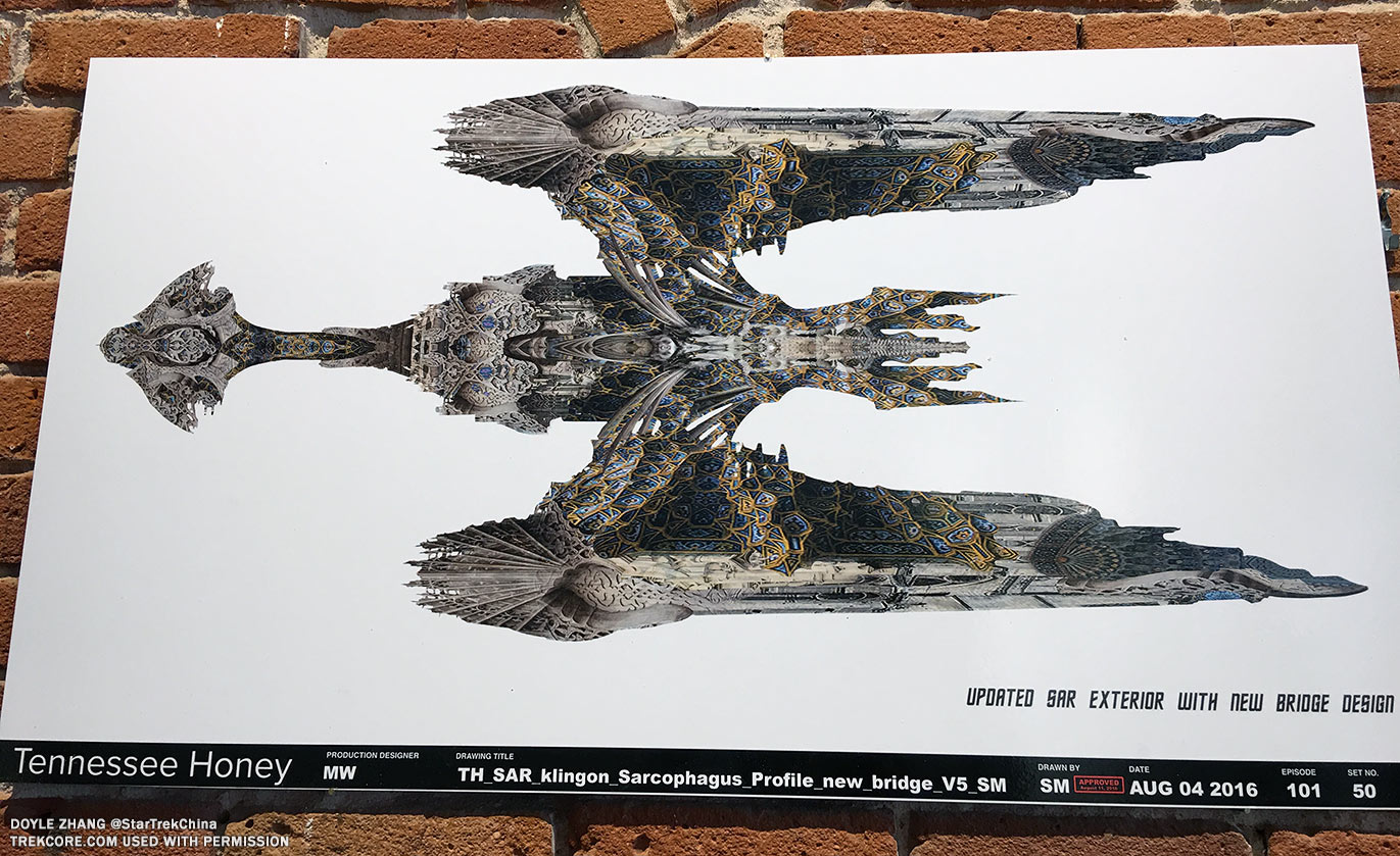
Art Director Matt Middleton also spent a great deal of time discussing the Klingon sarcophagus ship, which seems to be one of the primary vessels facing off against Federation forces in the opening episodes of the series.
Middleton: There were certain staging requirements for the [Klingon sarcophagus] ship — that it needed to have a cathedral-type presence to be a church, a ritual space, and a functioning bridge for the Klingon Empire.
The sources that the design team went to were feudal sources – so going back to Byzantine and medieval gothic and Islamic sources, to find references that would create a high level of sophisticated detail, for a race that had long been perceived as brutal, one-minded, and simplistic in order to breathe new life into the Klingon race and raise them to the worthy adversarial position that this new iteration of the series demands.
The Klingon sarcophagus ship, as it became known, [is] a flagship of sorts for the Klingons, [with] multiple levels, mezzanines, and focal points for dramatic staging of our Klingon leaders, orating to their followers, and creating dramatic spaces where power plays and shifts of power could occur.
[There are also] unparalleled views into the broader space so that we felt the space when we’re in the ship. You don’t just find yourself in a room with no windows and just interact with space on a viewscreen, we always want to maximize how much we feel the presence of space and our position within.
It’s a very large ship, massive, [but] this bridge [takes up] just a very small section of it, just the nose of the point of the head; the set itself is 40 feet tall, 100 feet long, and about 50 feet wide, with cantilevers, and lots of stairs and railings.
Middleton also made several references to the 1984 Star Trek novel The Final Reflection, a seminal look into the Klingon Empire by author John M. Ford, a work that Discovery cast member Kenneth Mitchell (Kol) has also used in his character research – likely a suggested read from the show’s leadership team as a heavy influence on the series.
Middleton: We also sought not just to have fun with the architecture, but also the details that spoke to the history and culture of the Klingon race. As a touchstone, we looked to John Ford’s THE FINAL REFLECTION which was a work really used as a launching-off point for the Klingons by Bryan Fuller.
There is Klingon text on the steps [inside the ship], we have a lot of ritual torches and sarcophagi and glyphs, and other details. For example, [one section of] the Klingon text… was all carefully researched and taken from transcripts from THE FINAL REFLECTION, and we made sure that we had accurate Klingon translation.
This one, says [speaks Klingon to audience] which reads: “‘I will go now to Sto’vo’kor, but I promise one day I will return.’ Then Kahless pointed to a star in the sky and said, look for me there, in that point of light.”
Which is a big promise from Kahless!
This ancient phrase attributed to Kahless may be a clue to the purpose behind the Klingon Torchbearer we’ve now seen featured in multiple trailers – perhaps the key to “uniting the Klingon houses” is related to some kind of ‘return’ of Kahless the Unforgettable.
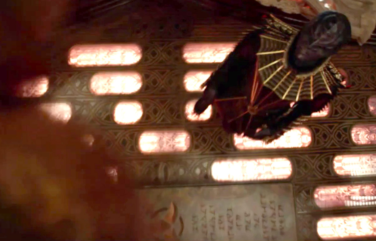
Middleton: We always sought to ingrain these details into the actual set, and this adherence to detail and reverence for all things Klingon permeated our art department, and we had much delight in taking on the roles of the Klingons and thinking about how we can pay them the most honor.
This got into details like the game of Klin zha from THE FINAL REFLECTION, a game that warlords play against each other as a teaching game to teach military strategy… and bloodwine cups, which even have text on them — translated in this case to “May Your Blood Scream.”
The sarcophagus ship for us was an exercise in how can we make this even more intricate, more elaborate, and more worthy of Star Trek universe.
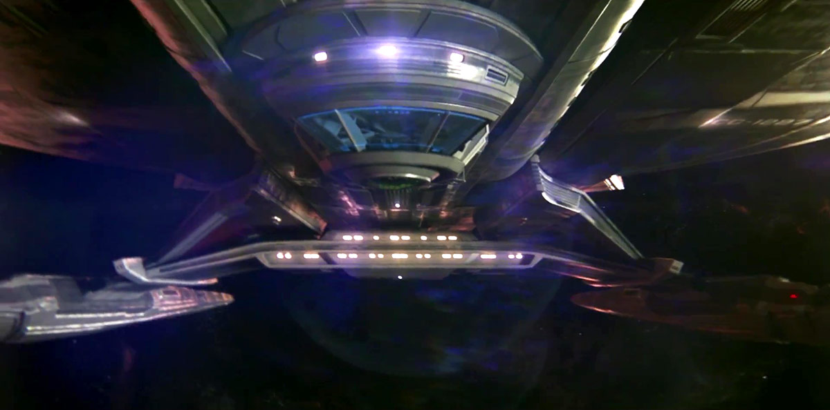
Set designer Matt Morgan has been helming all things Federation for the Shenzhou, the Discovery, and other Federation interiors set to appear in Discovery,
Morgan: One of the most unique things about [the Shenzhou’s] bridge is that it’s underslung on the bottom [of the ship], which presented some challenges for construction, that it’s built 12 feet off of the ground. It’s a challenge for the crew to work in, and it’s a massive set.
One of the main things for almost all of our sets is that they have integrated lighting. More than you can imagine.
Middleton: Integrated lighting is a very important thing – keep that in mind as you think of how many lighting sources you’re seeing… each one of those is individually installed, keyed, adjusted, and can be set from a central controller, so we can have different looks for different red alerts, black alerts, and yellow alerts.
Morgan: As there is two main Federation ships for the series, one of the main [goals] was, “How can we use these sets [to represent] two ships?” Here’s a Shenzhou corridor. By switching different elements – graphics, paint – it becomes a Discovery corridor.
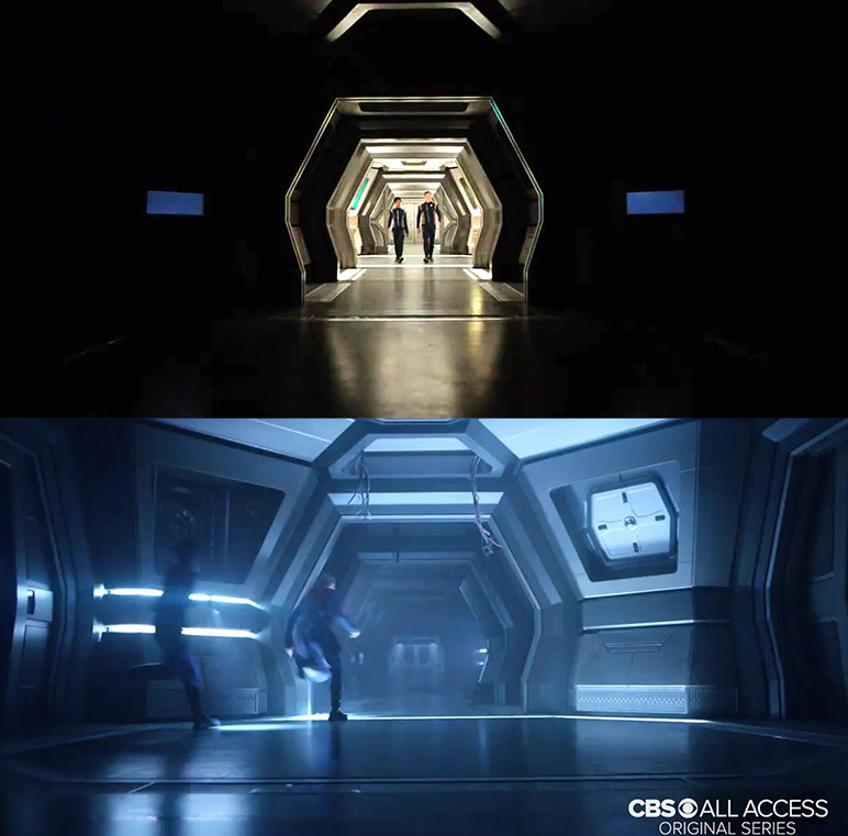
The Discovery transporter is in the exact same space as the Shenzhou transporter room; we were able to remove and add pieces to go back and forth [Same with] the Shenzhou turbolift and Discovery turbolift.
The challenge in switching sets over is trying to design things in a way that we can repurpose and go back and forth between different things. For every one of these sets, there are probably hundreds of pages of drawings on different details, breaking things down. It takes 8-10 different set designers working on different elements to achieve that.
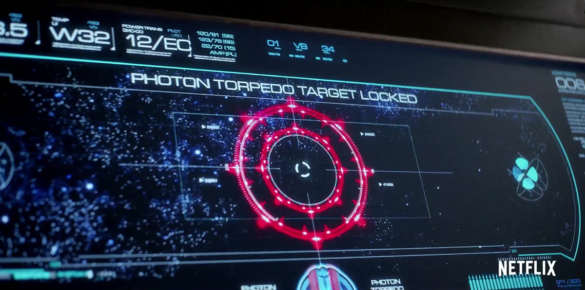
Finally, graphic artist Tim Peel spoke about the new look of Starfleet computer systems, and – after paying compliments to Trek graphics wizard Mike Okuda – shared some information about how today’s technology can bring those display consoles to life.
Peel: I’ve done my best to give you something better than a cell phone[interface], so you believe we’re really in the 23rd Century.
One advantage [over previous series] is that we can animate them now, I can make them touch-interactive, and have access to 3D models. So I can keep the look the same, but the tech is just way more advanced than it used to be. So I try to honor the look and feel [of the previous interface designs], but the tech is a little better.
He also shared some insight to level of detail used throughout the different vessels – from the color of the Shenzhou display interfaces to the graphics featured in turbolift and transporter sets.
Shenzhou [interfaces have a] slightly blue-y restricting of the color schemes; we’ll slowly advance and become more colorful as we approach the Original Series [time period].
We really did work out deck plans, and have [the ships] sliced into 3D models for all the possible levels to give you a true sense of transporting – or turbolifting – through the levels of the ship. [In the transporter room, the panels are] all interactive so this actually sliders actually work; I watched O’Brien many times!
![]()
When — and if — any of these tantalizing images are released for public distribution, we’ll certainly bring them to you here – so keep checking back with TrekCore for more Star Trek: Discovery updates!
