This article was originally posted on TrekCore on June 24.
At the publisher’s request, we held it and restored it for public view today.
Ever since the first STAR TREK BEYOND teaser trailer arrived in December, eagle-eyed fans have been speculating about changes to the Enterprise digital model – some of which we first saw June’s revealed cross-section diagrams, and of course now seen in film as it has arrived in theaters.
A new expansive interview with Peter Chiang – founder of effects house Double Negative, and VFX supervisor on BEYOND – spoke to HD Video Pro magazine’s Kevin H. Martin in their August issue, where the digital designer goes into great detail on not just the revised Enterprise, but also the breadth of CGI work that’s gone into this summer’s new film.
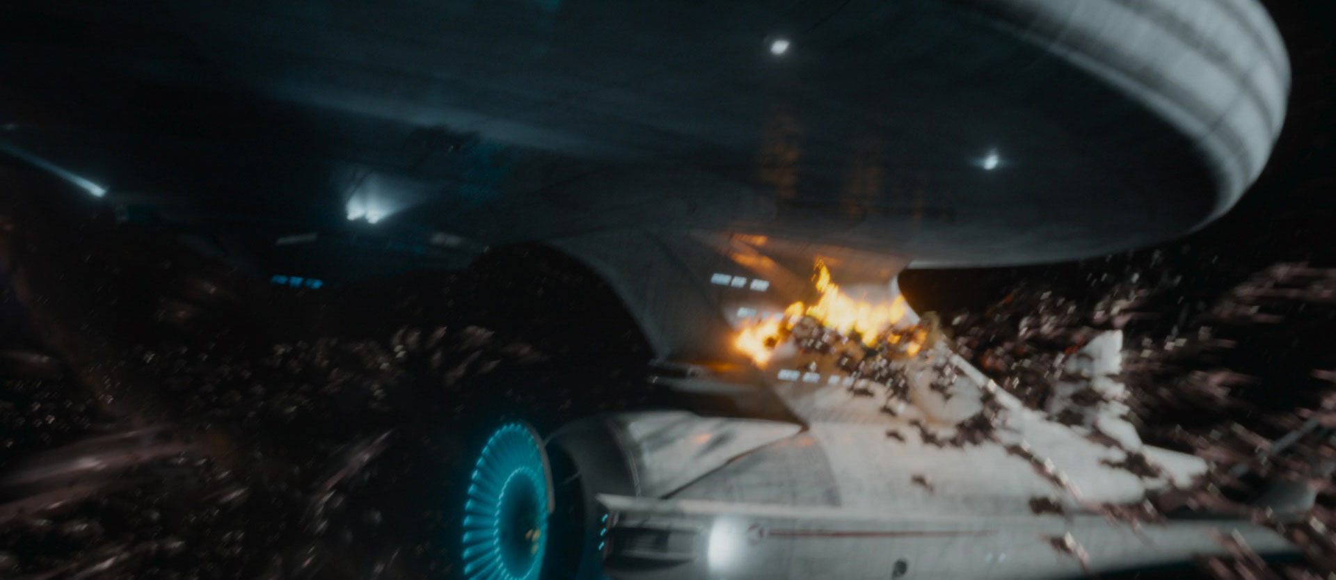
While we noticed a few design updates to the Enterprise when comparing the December 2015 and May 2016 BEYOND trailers, it turns out that the digital model first created by Industrial Light & Magic has received more of an overhaul than we previously assumed.
All of the [previously-created] digital assets belong to Paramount, so we inherited the ILM model [of the Enterprise]. Even so, there was a lot of shader work needed to translate that into the ship we wanted to see onscreen, which is the Justin Lin version of the Enterprise.
It goes back in time a bit stylistically, looking closer to the original TV version, which always seemed a littler vulnerable with those slender segments linking the saucer, engineering, and the nacelles.
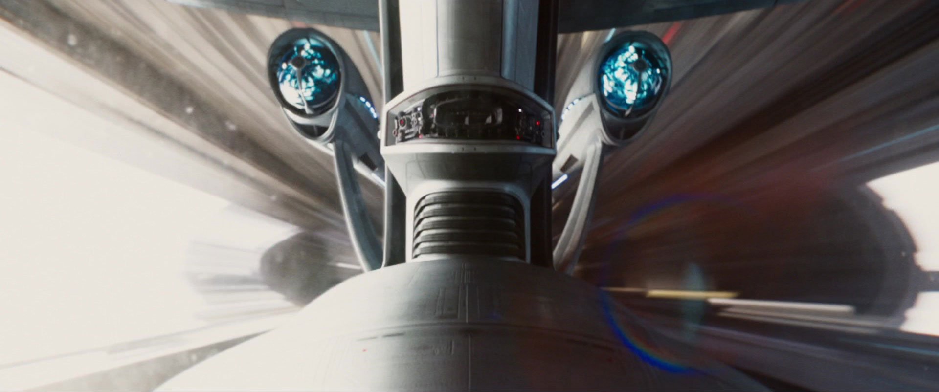
Our new changes included adding a ‘fastback’ aspect to the nacelles, which formed a bit of a ‘V’ shape [angling inward towards the rear]. We also stretched and thinned both the nacelles and the ship’s neck, making them more obvious targets for the [Swarm attack].
We also took the opportunity to give fans close looks at parts of the ship they’ve never previously seen from these angles, a way pay tribute to the fantastically-original design of the TV ship.
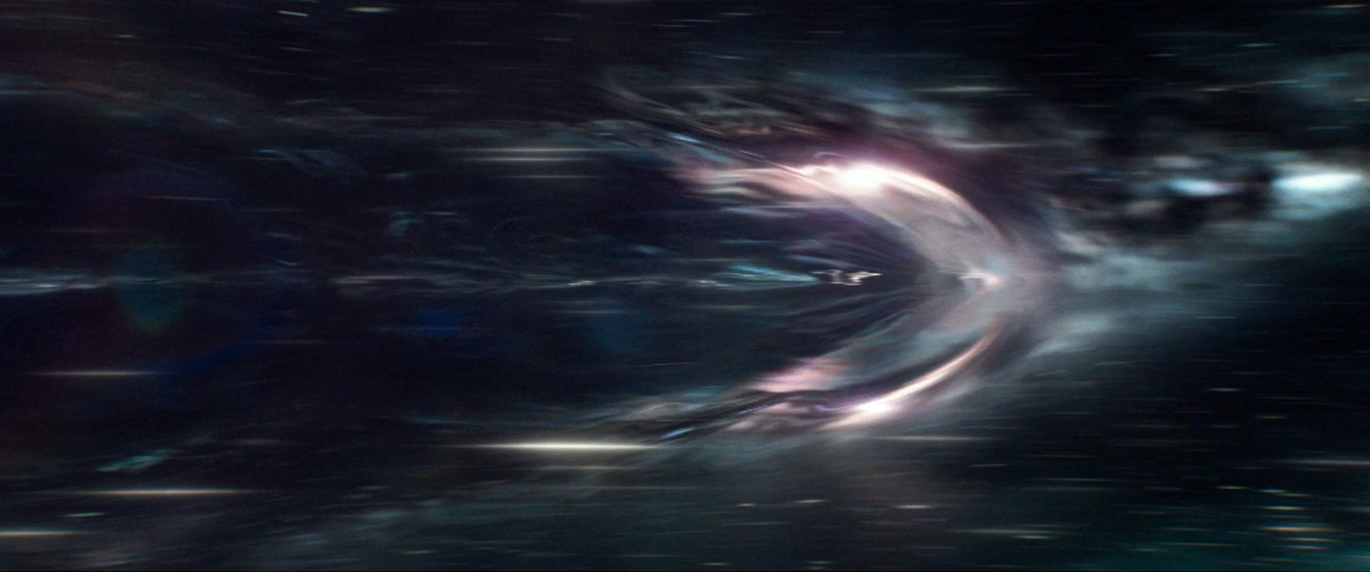
The wild ‘warp bubble’ effects seen in last month’s trailer blew us away when we first saw them, and it turns out that a lot of work went into designing this new high-speed vortex, a significant change from the warp graphics seen in the prevous films.
In the past films, there was always kind of a light-driven way they had for showing the stream to warp speed. In reevaluating our options, this gave us a chance to take inspiration from real physics for our warp effect.
Right from the outset, I was presenting Justin with ideas on how this could look. We did studies on how light is bent by gravitational lensing, then looked at high-speed shooting of 3000-4000 [frames per second] to see how bullets create a wake as they travel through water.
We also scrutinized images of planes and their vapor trials as they go beyond the sound barrier. I imagined multiple shock waves building up and stacking on one another, forming this layer in front of the vessel. This tells us we’re traveling at high speed and gives a dimensional quality to it.
Chiang also discussed his goal of expanding the look of space travel:
We looked at a lot of NASA footage to see how the whites blow out in genuine conditions of harsh direct sunlight [in space], and I wanted to introduce a lot more of a feel for 3D space this time, in terms of ship and camera movement.
That way, it wouldn’t all be so linear, and instead reinforce how there’s no up or down in this environment.
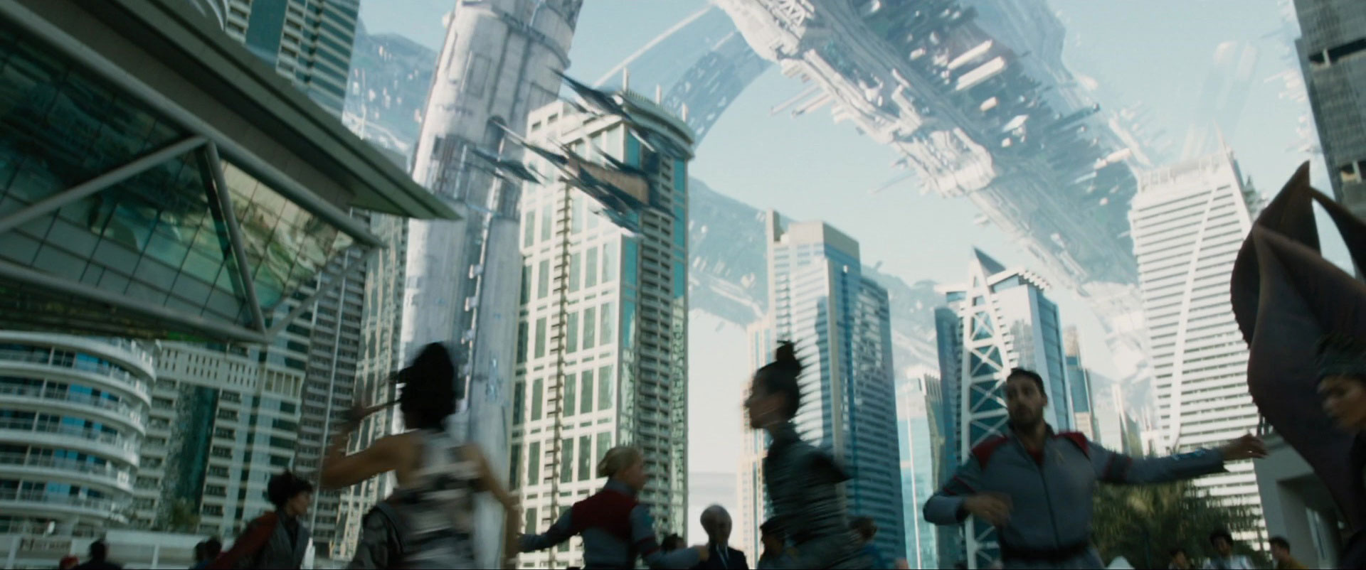
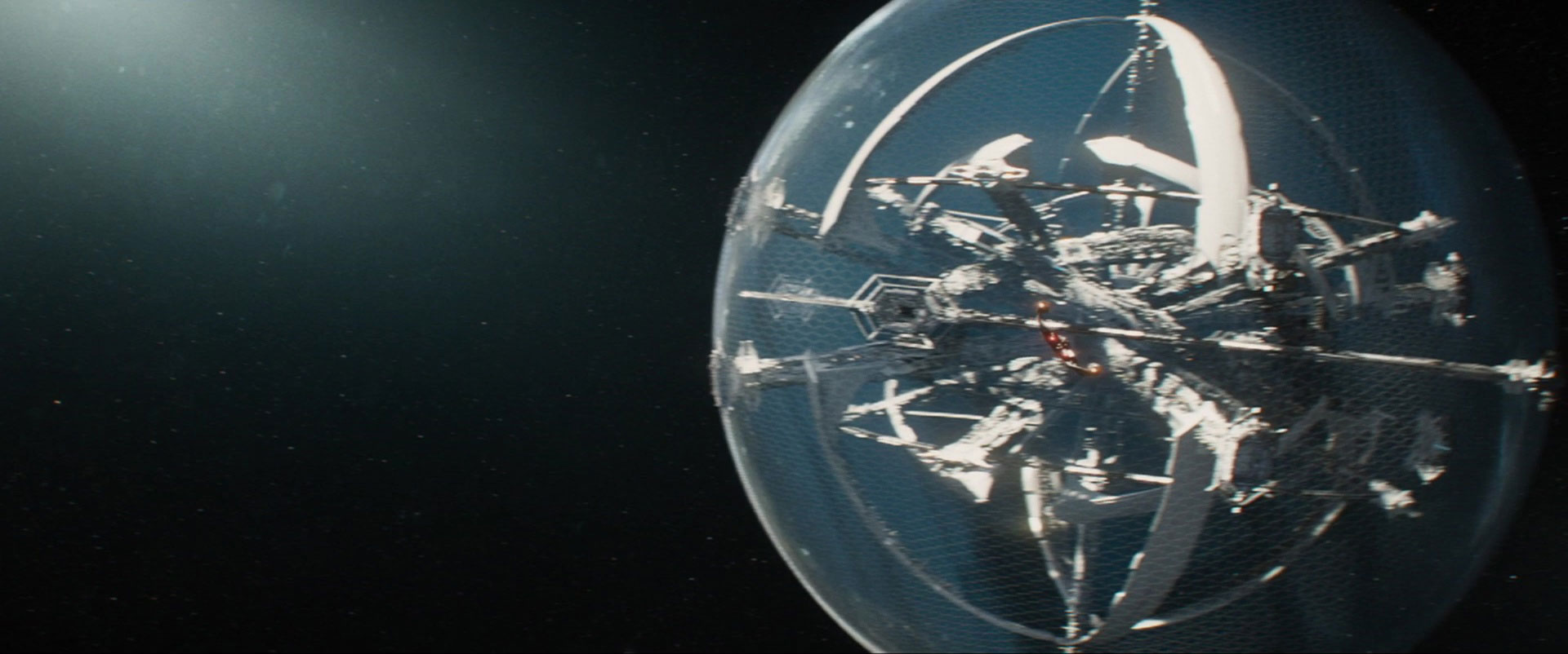
The bbiggest digital creation for BEYOND is Starbase Yorktown, a spidery structure held within a great spherical forcefield – and the end result of last fall’s overseas visit to Dubai, where the practical footage was shot for this deep-space destination.
The base is out at the frontier of Federation space, constructed as a series of angled structures… within a 16-mile diameter sphere. Using a volume of space in the most efficient and economical manner would absolutely be the way to go with structures out there, and that meant maximizing the inner volume.
We played with the idea that the sphere surrounding the station was opaque during the day, but the inner hemisphere becomes more transparent at night, letting the inhabitants see stars outside; that would be a comfort for space travelers.
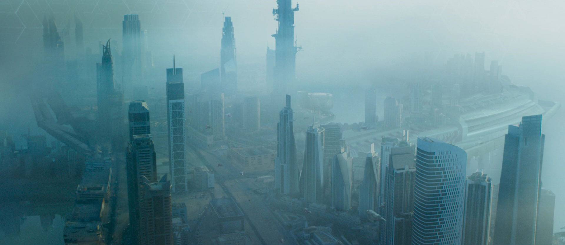
The [background footage of Dubai] served as a basis for our final [designs], but we had to embellish very extensively for pretty much every view. Everything changed color-wise, since the Federation is principally blue, white, silver, and black, but Dubai feels very beige and yellow.
During shooting [in Dubai], we were very conscious of what was to be visible overhead. We had LIDAR scans done of about forty buildings there that worked for our purposes architecturally… to populate the background [of Yorktown].
Finally, Chiang also weighed in on how his colleagues in the various VFX teams working on the film used their own knowledge of Trek history to keep the digital designs in check.
We found that every [VFX] facility working on [Beyond] had what I call “Star Trek Yodas” working there; each of them was like a kind of brain trust you could question to find out if some design or maneuver went against what had been established on other Trek shows and films.
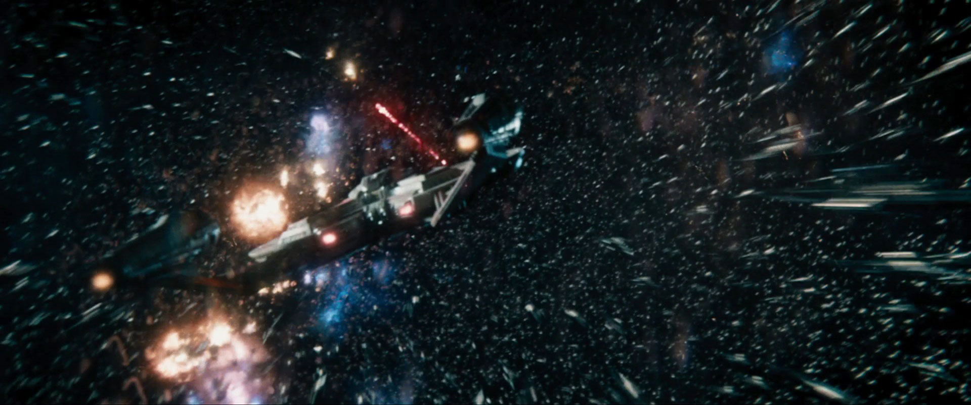
We had sequences with a vessel from an earlier century and the design process took a bit of a hit when the Yodas told us [the USS Franklin] should reflect what had been seen in the [time of Star Trek: Enterprise].
STAR TREK BEYOND arrives in just over four weeks.
